There is a lot to cover on Wednesdays. We should know, as collectively, we read an insane amount of comics. Even with a large review staff, it’s hard to get to everything. With that in mind, we’re back with Wrapping Wednesday, where we look at some of the books we missed in what was another great week of comics.
Let’s get this party started.

Written and illustrated by Bridgit Connell
Reviewed by Reed Hinckley-Barnes
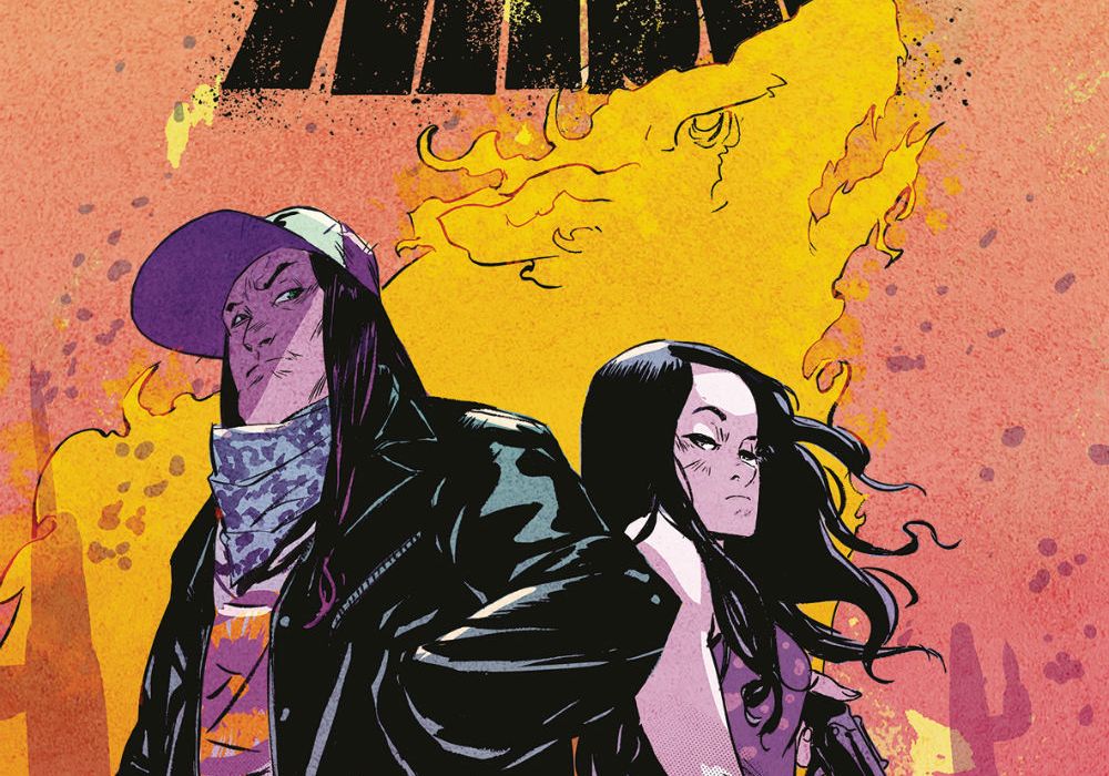
In “Brother Nash” #1, Bridgit Connell handles all artistic and writing duties in her first published comics work. For the most part, “Brother Nash” #1 is a really enjoyable story that mixes truckers with mythology. The titular Nash exists between these two worlds, and while I won’t spoil exactly what his deal is, Nash is well versed in the supernatural aspects of the world around him. Throughout the issue, he helps to guide the other characters through their interactions with the supernatural elements of the world around them. The story is entertaining, especially if you like stories set in modern America with a supernatural bent to them. The solicit for this issue mentioned “American Gods” as an influence, and story-wise, that isn’t a bad touchstone for what this series is.
However, the book is also a bit rough in places. This is Connell’s first work, so that understandable. But there are some hills and valleys in terms of the art throughout the issue. There are certain pages where everything looks great, the lines are nice and clean, characters expressions and body language are all well done, and the coloring looks both natural and adds to the story. But there are other times, where the lines feel a bit rushed, the faces and body language feel a bit off, and the coloring feels a bit too muddy in an unintentional way.
But I think “Brother Nash” #1 is still worth checking out. When all the elements click together, “Brother Nash” #1 is a work that shows Connell as an artist and storyteller with a lot of talent, and someone who probably has a lot of good work ahead of her.
Final Verdict: 7.0 – “Brother Nash” #1 is a bit uneven, but in the parts where it works, it’s a well-done book.
Written by Mark Waid
Penciled by Alan Davis & Leonardo Romero
Inked by Mark Farmer & Leonardo Romero
Colored by Irma Kniivila and Jordie Bellaire
Lettered by VC’s Joe Caramagna
Reviewed by Alexander Jones
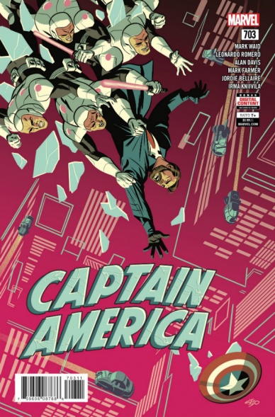
Steve Rogers might be largely absent from “Captain America’ #703 but his legacy is honored in the installment. Protagonist Jack Rogers isn’t even portrayed to be a truly noble and selfless individual either. However, when taken as a whole, the issue is a staggering portrait of a father showing just how far he will go in order to fight for the life of his son.
The Marvel Universe is a big place and Jack struggles to find his role in it especially in the previous issues of this run. However, after getting the short of the end of the stick and being abandoned by his government, Jack is truly in dire straits here and the stakes of the comic definitely reflect this. In this issue, he’s being forced to shed his morality and find a shade of gray that Captain America could easily punch his way out of, too bad Jack doesn’t have a fancy serum. With the moniker of the name and the shield being involved in this installment, Jack’s parallels to Steve are more interesting to analyze than ever before.
Leonardo Romero is one of the best new artists at Marvel and does a phenomenal job drawing the installment. Each page holds lots of detail and plenty of the mood in his character expressions. Due to Romero’s recent work like “Hawkeye,” it is fascinating to see Romero in this darker context. This storyline veers away from some of the more traditional work he has penciled and has a rather Jack Kirby sensibility to it all. The tale has a few elements of Marvel cosmic and still evokes a more futuristic setting like previous entries in the series.
Continued belowWriter Mark Waid took a sizable risk with this issue which definitely pays off here. It is curious why he would push Steve Rogers off to the side so soon after working on re-establishing him after the greater events of “Secret Empire,” but the quality and stakes from Jack’s story certainly pushes forward the themes of Captain America. I also wonder how much connective tissue between Steven and Jack Waid has planned as this issue featured the introduction of Steve in just a couple pages.
When it comes to a storyline like the one featured in “Captain America” #703, people have a tendency to write off a story such as this. Finding an angle for a character on the ground and making him seem novel or interesting is also exceedingly difficult but I’m clearly invested in this new direction closing out Waid’s run and reinvigorating chance to redefine this hero for a modern age. Getting to see Romero’s take on the material is a great, cohesive way to tie this issue back in with the earlier material from Chris Samnee.
Final Verdict: 7.4 – “Captain America” #703 is a heartbreaking look at the terrifying quest for Jack Rogers embarks on to save his son.

Written by Magdalene Visaggio
Illustrated by Laura Braga
Colored by Rachelle Rosenberg
Lettered by VC’s Joe Sabino
Reviewed by Tom Baker
I didn’t realize until the very final page that this was a one-shot! It turns out “Dazzler: X-Song” #1 is just supposed to set up the character’s return in the forthcoming “Astonishing X-Men” #14, yet it spends a good chunk of its pages with new characters who, presumably, we’re never going to see again. Writer Magdalene Visaggio is also behind DC/Young Animal’s “Eternity Girl,” a series whose intentions and thematic focus I appreciated in theory, but whose execution left me disappointed. There’s a similar issue here with the growing discord between Inhumans and mutants.
Metaphorically that conflict can be read as an allegory for any number of divides in similar real-life spaces (be they the divides that can occur in queer communities, splintering of radical political factions over ideological conflicts, or what have you), and one that works really well here as an extension of the multi-purpose “mutants as representative as [insert minority here]” concept. But besides that nuanced thematic resonance, the majority of the writing is perfunctory. That’s something I’d blame more on editorial edict than Visaggio’s skills. The reason this book even exists is to be exposition for another series!
Laura Braga’s pencils — which favor clean, thick lines and have a focus on the character’s outfits — are reminiscent of contemporaries like Jen Bartel and “Jem and the Holograms” artist Sophie Campbell, especially when paired with Rachelle Rosenberg’s pastel colors. Her strengths lie in designs and layouts, while the two action-based splash pages are more awkwardly posed and lacking in weight. I’d be interested to see the pair develop their collaboration and possibly figure out some of these niggles with an ongoing “Dazzler” book, but you can’t always get what you want, eh?
Final Verdict: 5.5 – A fairly middle-of-the-road reintroduction of Dazzler to the X-family
Written by Skottie Young
Illustrated by Nic Klein & Scott Hepburn (backup story)
Colored by Nic Klein & Irn Herring (backup story)
Lettered by Jeff Eckleberry
Reviewed by Gustavo S. Lodi
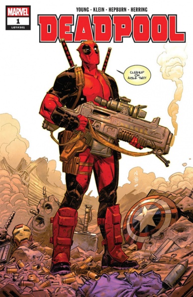
“Deadpool” #1 marks the fresh start for the merc with a mouth after the just completed lengthy run by Gerry Dugan. What Skottie Young and Nic Klein goal seems to be is an approach that focuses on the core aspects that make Wade work as character, tying as much of a movie sensibility they can muster. And for the most part it works well, if not breaking any new ground.
Klein’s art style suits this book in two main areas. First, his close-up moments, in terms of facial expressions, design choices and paneling allow jokes and one-liners to land more effectively. The world built around Deadpool react to what the script is cracking at and deliver some of the best moments of this issue. Second, his ability to convey action is up to the level of insanity and violence one would expect from a series like this: a battle between Wade and a leader of a biker gang is a great example of that. Having Klein doing the full art package with colors as well further adds to that consistent tone: as weird as that may sound, his choices for Wade’s skin tone and rashes are actually beautiful to look at.
Continued belowYoung’s script is able to walk that thin line of movie-recognition and independence. This very much reads and feels like the Deadpool from the big-screen adaptations… and still, it has its own voice, separate from the type of joke and delivery by Ryan Reynolds and crew. While some inclusions seem more ham-fisted (like Negasonic’s visual interpretation), they are minor and are little more than a distraction. The overall ambition of the series seems to be larger than at first glance though, and readers should be interested to come back to see how far Wade is willing to go this time.
Finally, note that this issue offers a backup story with Hepburn and Herring on art that retells Deadpool’s origin… and of course, it does not do that in any conventional way.
Final Verdict: 7.5 – A solid start for this new run, with promising dialogue, situations and possibilities for the future.

Written by Jeff Lemire
Illustrated by Max Fiumara
Colored by Dave Stewart
Lettered by Nate Piekos
Reviewed by Chris Egan
The final issue of the “Doctor Star” mini-series offers up a bittersweet conclusion. Lemire once again brings us a beautifully written tale that straddles the line of Golden Age satire and love letter so perfectly that said line blurs. In this world of imperfect heroes, Doctor Star is quite possibly the least likable and most selfish and yet, his motivations are completely relatable. His journey for recognition in his work, helping others as an intergalactic superhero and the love of his family are clear. His choices, mistakes and all, end up being what most everyman-turned-hero would make in his fantastical position. Seeing the culmination of choices come to a head ends up being incredibly satisfying.
After decades of being lost in his work and in the far reaches of space, Star must decide between giving time to what is left of his real family or joining his surrogate family of the Star Children, a wonderful ode to the Green Lantern Corps.
Max Fiumara’s illustrations have a range that can capture grand intergalactic moments or intimate one on one conversations and Dave Stewart’s colors pull the appropriate emotions to the forefront. If we truly are in a new Golden Age of comics, works like “Doctor Star” have ushered us to it and the power evoked from their collaboration is a testament to that.
Final Verdict: 9.0 An emotional rollercoaster that is sure to please comic book fans from all walks of life and it is a must-read for fans of the “Black Hammer” universe.

Written by Mark Waid
Illustrated by Jesús Saiz
Colored by Jesús Saiz
Lettered by Cory Petit
Reviewed by Alan Buxbaum
“Doctor Strange” #1 is a great start to a promising series. It feels very much like a story-driven issue with Saiz’s art masterfully supporting Waid’s writing. I am a huge fan of the overall arc of the plot for this first issue: take Stephen Strange, one of the most knowledgable heroes on the mystic arts, and make him feel helpless and useless. The opening pages do a fantastic job of showing just how strong the Sorcerer Supreme is, making his fall that much more meaningful.
I like how much of the issue is written from the narrator’s perspective. Strange’s lack of speech during these pages becomes more meaningful, for he is a lost man with no hope. Whether or not he secludes himself (which its quite evident that he does), the narrator’s control of the narrative gives that feel by not allowing any dialogue for a whole five pages. It gets pretty depressing when done for this long, especially given the content of the pages. I really felt for Strange. Its incredibly reminiscent of his origin story; the only difference is that instead of losing his hands this time, he’s losing his magic. In both scenarios, a prodigious skill that took years to foster and perfect is gone in the blink of an eye. What better way to start off “Doctor Strange” #1? I’m a big fan of the direction Waid took with this, given all of the parallels.
Continued belowAnd what better way to make Stephen Strange feel inferior than to put him next to Tony Stark? Marvel sure is currently using that relationship in both the MCU and its comics to its fullest potential. One of my favorite parts of these two’s interaction is when Strange references Tony’s personal demons and how he overcame them. This is solidified by Saiz’s drawing of club soda in conjunction with the straw-impaled olives that Stark is snacking on, thus representing Stark’s control over his alcoholism. This was a great way to show the reader exactly why Strange was seeking help from Stark. Sure, he’s a genius who can solve virtually any problem. But at the bottom of it, Stark was able to do what Strange so desperately yearns for: control his destiny, no matter how big the obstacle.
The only part where I felt the plot fell short was towards the end with Strange’s arrival and capture on another planet. While this gave the issue some symmetry (starting and ending in a place other than Earth), it felt unnatural to the arc of the story. I don’t want to make too big a deal of this, as it has much potential in setting up future issues. It just didn’t feel as cohesive as the rest of the story.
I haven’t touched as much on Saiz’s art as it deserves. His style blends with Waid’s storytelling seamlessly and does much to lift it to higher levels. Examples of this are when we see Strange sewing up reality (a moment that highlights his sorcery as well as his surgeon skills) and page 14 with Saiz zooming out on Strange feeling hopeless and alone as he holds the Cloak of Levitation. Saiz deserves just as much credit as Waid for this issue.
Final Verdict: 7.8 – “Doctor Strange” #1 is an excellent start to a series that has a lot of potential. This first issue does a great job in highlighting both Strange’s power while showing us his grit in the face of hopelessness.
Written by Mark Russell and Brandee Stilwell
Penciled by Mike Feehan and Gus Vasquez
Inked by Sean Parsons and Gus Vasquez
Colored by Paul Mounts and Ross Campbell
Lettered by Dave Sharpe
Reviewed by Elias Rosner
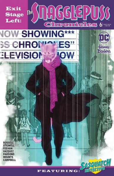
Mark Russell has put out the two best Hanna Barbara series bar none. His capacity for social satire and commentary is apparent on every page of “The Flintstones” and “Exit Stage Left,” even though they operate in different modes. The former is a comedy while the later, the one this review is concerned with, is a tragedy. Not Shakespearean, with the deaths of almost everyone central to the story, but a tragedy nonetheless – bittersweet, although more bitter than sweet.
I said last month that “Snagglepuss” was paced and written like a stage play and it seems Mark Russell followed through, while also introducing an interesting twist into the mix. Turns out the simple cartoons this comic was based on, according to the comic, are the product of these complex characters’ attempts to get work in an industry that had blacklisted them for their sexuality. There’s a lot that can be unpacked from this, such as the erasure of queer history through sanitized, marketable versions of historical figures or the damaging effect HUAC had on artistic vibrancy. I don’t have the space to do that here but I hope someone does.
The art is the same as it has been, balancing realism with the cartoony in ways that sometimes turns humans into less textured versions of themselves, which in turn makes the talking pink lions and blue dogs look more real in comparison. Feehan and Parsons do a fantastic job, however, of capturing the melancholy and slowness of the day to day for Snaggle. Each page takes its time, letting the characters breathe and say what they need to say, with words, with actions, and with the sentiments that go unsaid.
As for the “Sasquatch Detective” back-up, I could have done without it. The tonal whiplash was too much and the pacing for the six pages was way too fast. The concept, while interesting, has overstayed its welcome without doing anything new. It’s trying to be a screwball comedy, a buddy cop serial, all in not enough pages, with too few jokes.
Continued belowFinal Verdict: 8.9. A poetic and bittersweet ending to a series that is more historical fiction than a “funny animal cartoon” adaptation. The back-up, despite its creativity, should have ended last issue.

Written by Charles Soule
Illustrated by Matteo Buffagni
Colored by Jim Charalampidis
Lettered by VC’s Joe Sabino
Reviewed by Gregory Ellner
When it comes to a noir detective story in a superhero setting, Charles Soule definitely delivers. Using the combined forces of Daredevil, Misty Knight, Cypher, and Frank McGee, he crafts a tale of mystery and investigation that allows us to look deeply into what is going on with Wolverine, or at least with one segment of his ongoing return story. By using a variety of locales and peoples, along with a clinical, yet compassionate narration by Daredevil himself, Soule gives a sweeping story for Marvel’s Earth while also allowing it to stay contained to these few characters.
Matteo Buffagni’s artwork, with its soft pencils making for realistic linework, adds to the noir, gritty nature of the tale told through the “Weapon Lost” miniseries. Each of the locations in the story seems distinct, helping show how global the search really has become for the resurrected mutant.
Jim Charalampidis’s generally darker or at least muted color palette helps sell the grittiness of the story. The red of Daredevil’s outfit stands out a lot against the more “street” outfits of everyone else in the story, and while the brighter greens are shown at one point in the story with a forest scene, the overall use of dark shades, especially the monochromatic way that background characters are presented to allow them to be ignored, draws readers into the street-level investigation far more than a brighter set of colors may have.
Overall, “Hunt for Wolverine: Weapon Lost” seems to really be shaping up as an interesting investigative story, one that fits into the general Marvel Universe, but in many ways could be almost anywhere else due to its tone.
Final Verdict: 8.0- Muted colors, soft pencils, and an engrossing script keep the ball rolling in this second installment of the “Weapon Lost” miniseries.

Written by Grace Ellis
Illustrated by Shae Beagle and Kat Fajardo
Colored by Caitlin Quirk
Lettered by Clayton Cowles
Reviewed by Michael Mazzacane
After a first arc that I heard consistently good things about, it sounded like time to check out “Moonstruck.” It helped that the solicit for “Moonstruck” #6, had me curious. The prospect of seeing fairies reimagined as fraternity bros is the kind of high meets low mashup I can get behind. The Finals Break Gala of Beta Psi Epsilon makes up the back half of the issue and this arc moving forward, it isn’t what really struck me about this issue. It was how effectively the creative team uses settings, the coffee shop, traveling to the party, and the party itself, as broad playgrounds for little character beats as things build through the nominal progression of a scene to work through the various character dynamics.
Take for example the opening sequence wherein Chet goes on about their virtual pet, only for a page turn reveal that the coffee shop is in fact, swamped. The scene progresses, the rest of the cast show up. Shae Beagle progressively draws Chet in various states of cartooned melodramatic emotion. Julie and Selna do adorable things together. Until these isolated bubbles are burst by the exasperated anger of the head barista. The paneling where they burst in, literally placed over the top of the Julie-Selna one with a linked word balloon is an effective visual to pull everything back out to the coffee shop as a whole and end the scene.
Once at the party things follow a similar course, Chet tries to figure out ways to “party,” while Julie attempts to leave. These two on top of the band, make the sequence feel like a party as the book just drops in an out of their moments. Much of the entertainment in these moments is due to Shae Beagle’s wonderfully cartooned art. The Asian dragon rock band designs are already effective, but the level of acceptance and disdain from the other bandmates once the lead singer goes on a rampage creates this sense of history with these side characters. Same goes for the Vampire Mark as he saves Lindi from himself, the facial design and posture just give the moment the feeling that they’ve had to do this many times before.
Continued belowThe micro episodic nature of this issue makes it a solid jumping on point. Obviously, there is a history to the series, but this issue gives enough of an overview of the core cast that you could jump in because of how it dramatizes the group dynamic.
Final Verdict: 7.0 – “Moonstruck” is off to a solid start for its second arc, one that shows off character dynamics and sets up the overall arc plot nicely.
Written by Gail Simone
Illustrated by Walter Geovani
Colored by Adriano Augusto
Lettered by Simon Bowland
Reviewed by Eric Goebelbecker
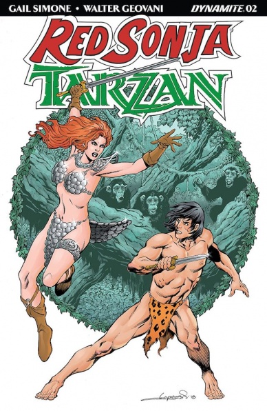
“They are more than warriors. More than adventurers. They are legends. The Jungle Lord and the She-Devil.” This is how Gail Simone opens “Red Sonja/Tarzan” #2, as Walter Geovani’s Tarzan threatens Red Sonja with a knife, his weight forward and the weapon inches from her throat. Sonja stands still, not looking like herself in a 1920s-era dress and no weapon. It’s an effective first page that draws you right into the story.
Even though the story opens with Red Sonja standing at the entrance to Tarzan’s British estate, we’re spared the obvious fish-out-of-water gags. The action moves to the jungle where we see a flashback (of sorts) of Red Sonja’s and Tarzan’s first meeting, which neither of them remembers. This mystery raises the stakes in the story and makes Eson Guul an enigmatic villain. What has he done to them?
The meeting in the jungle is an exciting centerpiece for this tale. The battle between the heroes is visceral, carrying a lot more weight than the typical good-guys-spar-over-misunderstanding cliché. Geovani’s layouts animate the confrontation: Tarzan jumps and climbs toward Red Sonja in four panels that convey his speed and determination, Sonja slashes his side from a crouch as he loses his balance lunging. The final page of the bout, a splash where Tarzan confronts Sonja with an army of gorillas, ends the fight with a stand-off. Simone and Geovani might be a team we associate with Red Sonja, but they bring us a Tarzan to reckon with.
Simone raises the stakes yet again when she moves the story to London. Tarzan takes Red Sonja to visit H. G. Wells, where they learn that they are amid the “breaking of the signal of time.” We’re left looking at the famous author’s time machine and wanting more.
Final Verdict: 8.0 – “Red Sonja/Tarzan” #2 is an exciting episode in what is building into an exceptional crossover story.
