
There is a lot to cover on Wednesdays. We should know, as collectively, we read an insane amount of comics. Even with a large review staff, it’s hard to get to everything. With that in mind, we’re back with Wrapping Wednesday, where we look at some of the books we missed in what was another great week of comics.
Let’s get this party started.
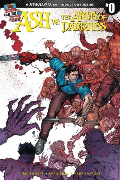
Ash vs The Army of Darkness #0
Written by Chad Bowers and Chris Sims
Illustrated by Mauro Vargas
Colored by Triona Farrell
Lettered by Tom Napolitano
Reviewed by Matt Lune
Whilst the Evil Dead franchise is relatively small on the big screen, the comic book adaptations and continuations have been too numerous to count, with Ash crossing over with everyone from Xena to The Marvel Universe. Writers Bowers and Sims already have big shoes to fill with the movies, but they also have a tough job of creating something that feels fresh and new after so many preceding stories. Luckily, they have opted to wipe the slate clean and appeal to the widest possible fan base, by not only picking up exactly where Army of Darkness left off but providing a couple pages of flashbacks to bring everyone up to speed. It’s unlikely that many readers won’t have at least a passing familiarity with the franchise, therefore the catch-up pages, rather than being pointless exposition, are included within the narrative, used as a way for Ash to defend his actions (killing a possessed S-Mart customer) to his boss before promptly being fired.
Although there must have been plenty of comics that covered this time period before, there’s a conscious effort here to ensure you don’t need any prior knowledge before diving in. If you have watched the movies, however, Ash and the world he inhabits feel instantly familiar. Vargas’s art is expressive and cartoonish while still maintaining a sense of realism. Ash is reminiscent more of the character rather than the actor who played him, something that adaptations often get hung up on, and while there’s no actual Deadite fighting in this issue, there are a few tantalising panels where Vargas gets to let loose and show scenes in a school that’s being slowly possessed by Ash’s grotesque enemies. There’s also a surprising artistic nod to a seminal moment from “The Amazing Spider-Man” that is entirely appropriate, and perfectly captures the sense of humor that should be the backbone of “Ash vs the Army of Darkness.”
The purpose of a zero issue is to provide a tantalizing prelude to the main series, and “Ash vs The Army of Darkness” succeeds admirably, providing not only an epilogue to what you may already know from the movies but setting up a fun new direction for Ash. The script is engaging and funny, and Vargas’s art is accessible and vibrant; even though there are no outright action scenes in this issue (adding to the sense of this zero issue being the end of one thing and the start of another) there’s still a dynamic feeling to the issue that will make you want to check out the main series when it starts.
Final Verdict:7.8 A fun and engaging zero issue that sets up a potentially hilarious status quo moving forward.
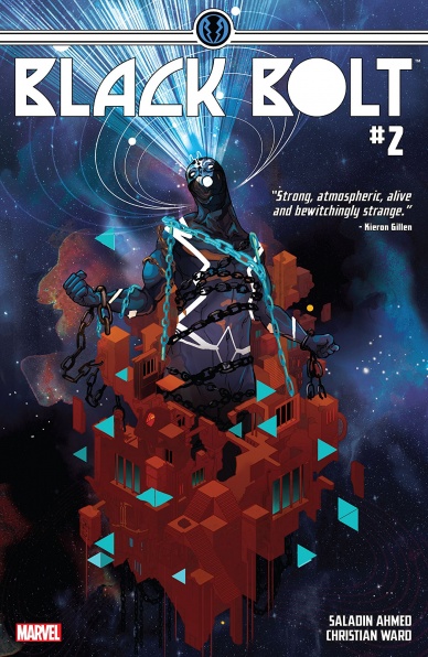
Black Bolt #2
Written by Saladin Ahmed
Illustrated by Christian Ward
Colored by Christian Ward
Lettered by VC’s Clayton Cowles
Reviewed by Elias Rosner
The silent king, no longer forced to be silent. It’s a scary prospect, not least of which for an audience used to his all-powerful voice but, at least for now, this seems to be a gamble that is paying off. “Black Bolt” #2 continues the solo adventure of Blackagar Boltington (a name which Crusher rightly makes fun of) and it does so in a majestic, mysterious style. Marvel has been hitting it out of the park with its cosmic stuff lately, particularly in the art department, (“All-New Guardians” and “Mighty Thor” come to mind) and this is no exception. Plus, this series works really well as an introductory story to Black Bolt, very little exposure to the Inhumans necessary (as is the case with me).
Continued belowWard has such a great command of his panels, from slowly zooming in to build tension or literally blurring the gutters between panels to show the power of Spyder. His layouts flow so smoothly, especially during the fight in the second half of the issue, where the actions carry you from panel to panel, directing you so that when, for a short time, the panels switch to being read left to right, it feels completely natural.
The only problem I have with Ward’s art is that his faces can be a bit too simplistic and the people sometimes look as if they were clay figurines that have been brought to life. You can see the lines where the sculptor molded and shaped each character (possibly due to the inking lines) and, as such, you can also see where too much clay was added or a smile was extended too much. However, what this style really helps with is the details of each character. Because of this, the facial expressions are all able to change very subtly but noticeable and this goes for the posing of the characters as well. Crusher, especially, talks with his body as well as his mouth and is given the posing to reflect that.
This plays into Ahmed’s characterizations and dialogue perfectly. Each of the newly introduced characters (Molyb, Raava, Spyder and Crusher) have not only a distinct design but their dialogue, the way they talk, and the way they treat Black Bolt all reflect their personalities, even if we, the audience, don’t fully know these people yet. The repetition of the narrative captions from the first issue also helps to ground us to the rules of the prison and, if my guess is correct, will be very useful in future issues for helping us follow what I believe will be a much more trippy narrative.
I didn’t talk much about the story but that’s because, at this point, we’re still left with more questions than answers. This issue served instead to introduce and develop a few new characters and to entrench us deeper into the prison that they’re trapped in than to further the story too much. Questions such as who is the Jailer? What does it want? Why don’t they have their powers? How’d they all get there and, more importantly, how was its location revealed to those not aware of the Terrigen codex? And, most importantly, how will they get out of a constantly changing, death-proof prison?
Final Verdict: 8.8. A worthy second issue filled with mystery, dynamic characters, and wonderfully, grand artwork.
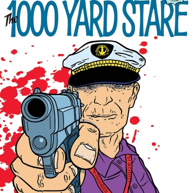
A Bulletproof Coffin One-Shot: The 1000 Yard Stare
Written by David Hine
Illustrated and Colored by Shaky Kane
Lettered by Richard Starkins and Comicraft’s Jimmy Betancourt
Reviewed by Christopher Lewis
Do you like inappropriate humor? How about laughing at unique and weird imagery? Great, then look no further than this installment of “Bulletproof Coffin.” This issue is a one-shot that any new reader of the series can pick up and without knowing the backstory and easily follow and enjoy the issue.
Hine writes an absurd story using Shaky Kane himself as the main character of this issue presenting him as a bitter comic book artist with an over inflated ego who hates Hine. The book itself is satire and makes fun of the creators, comic collectors, big two publishing (i.e. DC and Marvel), comic-cons, and more. Outside of the Shaky Kane storyline, there is a mini-plot within the book using the Coffin Fly character from the previous “Bulletproof Coffin” issues as the main
character. The mini-plot ties into the main theme of the story and are the impetus of the climax and end of the story.
Kane’s line art is very simple with extra lines added to emphasize facial expressions and wrinkles, which accentuate the characters’ age and emotions. Kane also uses bright, solid colors that are well balanced and give a softness to the story. When reading the story, the mixture of line art and color makes you feel like you are watching a cartoon from Cartoon Network’s Adult Swim.
Final Verdict: 7.5 – Overall a fun comic that makes you inappropriately laugh at the subject matter, even if you don’t want to.
Continued below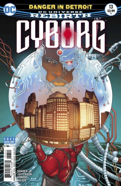
Cyborg #13
Written by John Semper Jr.
Illustrated by Allan Jefferson
Colored by Guy Major
Lettered by Rob Leigh
Reviewed by Gregory Ellner
The most glaring pitfall of this issue appears to be its dialogue. John Semper Jr. provides the readership with a lot of force-fed dialogue and character speeches especially by the more often colloquial Victor Stone. From the very first line he speaks, Semper’s Cyborg seems to be interested in spelling out the events as if it were an encyclopedia, rather than a conversation between people. In general, the dialogue seems to indicate that Semper does not trust his readers to figure out anything by themselves, instead indicating a desire to spoon-feed everything, including such speeches as Cyborg’s sudden desire to be a hero for his hometown, as if this never occurred to him before and needs to be stated aloud.
Outside of the dialogue, some of the developments don’t seem to make a lot of sense. The idea that quantum technology is so far beyond Cyborg that it violates the laws of physics doesn’t seem to make any sense at all, as it would have to follow some laws to even function as technology.
The artwork by Allan Jefferson is variable in its quality. In calm scenes, it seems well detailed, with faces seeming relatively natural. Unfortunately, that amount of detail seems to fall away in action scenes, focusing on the backgrounds over the foreground. This artwork is saved in part by Guy Major’s coloring, which can be downright psychedelic in the trans-dimensional scenes, even when the narrative nature of those scenes appears bizarre.
Though comedic moments do exist in “Cyborg” #13, it is far outweighed by rather poor writing and inconsistent artwork.
Final Verdict: 5.5- While a well-drawn and colored issue, “Cyborg” #13’s stiff dialogue makes reading it fairly hard to see as natural conversations.

Dark Knight III: The Master Race #9
Written by Frank Miller and Brian Azzarello
Penciled by Andy Kubert
Inked by Klaus Janson
Colored by Brad Anderson
Lettered by Clem Robins
Reviewed by Michael Mazzacane
This is going to sound crazy, but after reading the conclusion to “Dark Knight III: The Master Race” I couldn’t help but think of the similarities to the Wachowski’s latter Matrix films. In both cases, these later entries act as reflections on the more popular, seminal, works and question the surety of the conclusions drawn from them. Which feels fitting for both DC’s original deconstructionist cape comic and an erratic co-writer whose main consistency has been taking the piss out of the fandom his works have developed. Deconstructing (reconstructing?) the deconstruction ends this book on a surprisingly hopeful note for the story and world. I wouldn’t mind seeing more of it. Maybe the Dark Knight Universe is the next pop up imprint from DC.
For a finale that bears one of his many names, Batman plays a surprisingly small role in it. The hulking mass that would fill panels in Miller’s original work, is made small by Andy Kubert and Klaus Janson. His mass limited to the many small reactionary panels that litter the pages. Reduced to a bystander, he reacts like Krillin during any Goku fight in Dragon Ball Z, as Superman takes care of Quar and his family.
While the aesthetic sensibilities of “Master Race” have largely hued to Frank Miller and Klaus Janson’s “The Dark Knight Returns,” in the finale, Andy Kubert does an interesting act of fusion. Kubert welds together the iconographic, more minimalist, style of Miller-Janson and the more contemporary widescreen sensibilities of artists like Bryan Hitch or Frank Quietly. It’s a bit of a rough weld, the cartooned physiques and flattened depth don’t immediately mesh with the latter styles sleek designs. Kubert’s designs and Janson’s strong line work are elegant in comparison to Miller’s pencils from the “Action Comics” #1 mini comic. The area that wields the strongest are in page design with that majority being unbound by a grid, often overlapping a single page encompassing panel with multiple small reactionary panels. Take for example the page where all the bats engulf the rampaging Kryptonians. The reactionary panels guide the eye and effectively pull out to reveal the spectacle, creating a level of sleekness and flow.
Continued belowThe 12-page backup “Action Comics” mini by Frank Miller and Co. is some effective bare bones craftsmanship. It isn’t flashy and gets the point across. It feels like an ode to the original “Action Comics” and the madcap pace those original stories unfolded.
<b 7.5 – “The Master Race” ends effectively and in a manner, I did not expect when this began 18 or so months ago.

Deathstroke #20
Written by Christopher Priest
Laid Out by Larry Hama
Penciled by Carlo Pagulayan
Inked by Jason Paz and Sean Parsons
Colored by Jeromy Cox
Lettered by Willie Schubert
Reviewed by Alexander Jones
As much as I enjoyed the past the “Lazarus Contract,” I don’t think it reached the awesome heights that the solo “Deathstroke” series has over the past couple of issues. This new chapter of the book has a back-to-basics feel that brings all the black humor and inherent darkness Christopher Priest has channeled over his run with the character back to Slade Wilson’s life.
This issue sets up a brand new status quo for the series and checks up on all the supporting characters of the book in an interesting manner. Slade Wilson’s new lease on life is probably going to be short-lived but watching the interesting supporting cast react to the damage that he has done in their relationships is a strong way to use the page real estate in a serialized comic book. Priest’s writing has been so complex that each interaction sparks a sense of intrigue. One of the best moments in the issue is where someone close to Wilson confesses that Deathstroke dragged him to rock bottom as the supporting cast member tries to pick up the pieces from the damage Slade dealt.
While the first half of the book, in particular, looks a little choppy and rushed, “Deathstroke” #20 features some excellent-as-usual pages from Carlo Pagulayan. Pagulayan has a lot to do in this book. There are silent scenes, scenes with lots of talking and just a little bit of action sprinkled here and there throughout the comic. One of the aspects about comics that pencillers rarely get right are moments that have lots of humor requiring varied interaction from each cast member and a strong sense of timing. Pagulayan delivers here even with some muddied inks and art that doesn’t feel as polished as it could. With this book swapping back to a monthly series I think there’s a good chance that the standard of art will rise with the new schedule.
When comics introduce big, sweeping changes, the new status quo will often feel forced. Fortunately, Priest has made all of the supporting cast so desperate and in need of a new direction that they are willing to come with him on his new journey. Even though the “Lazarus Contract” was a huge storyline for this book all of these cast members are reeling from the events prior instead of the actual crossover itself.
“Lazarus Contract” be damned, “Deathstroke” #20 pushes deep into the supporting cast illustrating a bleak portrayal of lost human beings looking to pick up the pieces. “Deathstroke” #20 hints at a new solution and presents logical steps in getting there. All eyes are on Slade Wilson now but so long as Christopher Priest, Carlo Pagulayan and the full creative team are still in charge of this insane comic book, then that’s a good thing!
Final Verdict: 8.3: “Deathstroke” #20 executes the first steps of a new status quo and paints a bleak picture of the Wilson family along the way.
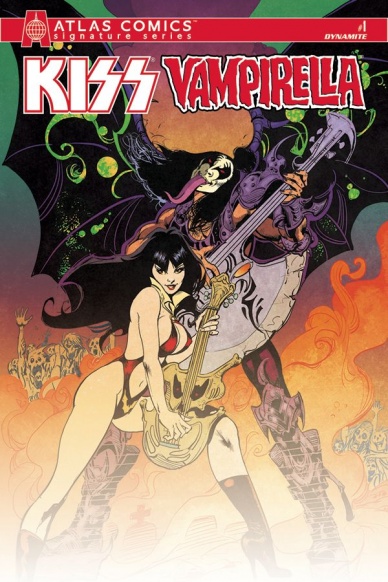
KISS / Vampirella #1
Written by Christopher Sebela
Illustrated by Annapaola Martello
Colored by Valentina Pinto
Lettered by Troy Peteri
Reviewed by Chris Partin
“KISS/Vampirella” is a crossover that had to happen once Dynamite announced they were going to be publishing “KISS” comics. The question is how to bring these iconic characters together without feeling forced? Music – of course!
Christopher Sebela takes the history of these characters and places them in a time where their own histories line up and put them in Los Angeles. Vampirella and hunting down Earthbound Drakulon inhabitants and KISS is set to record their second album, but there’s something happening in the music scene, something dark and deadly. Sebela sets the tone for the series in this issue and doesn’t waste the pages. Each of the players are set on the board and moving into place as the dark forces around them remain hidden from them while making its presence felt even before these characters arrived.
Continued belowThe pencils by Annapaola Martello are strong, clean, and expressive. The characters never feel static on the page. What really blows the art off the page is Valentina Pinto’s colors. The story is dark, and Pinto’s colors provide that darkness without muddling Martello’s linework which is a perfect melding of pencils and colors. Pinto’s attention to detail with the various levels of colors and tone really can’t be appreciated to their fullest potential if this issue is only being read in hard copy. This is definitely a perfect example of picking up the digital copy so that you can zoom in and really take it all in.
Final Verdict: 8.0 – This is a good first issue that doesn’t pander to fans of both Vampirella and KISS but gives them good character interaction and development.
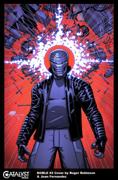
Noble #2
Written by Brandon Thomas
Illustrated by Roger Robinson
Colored by Juan Fernandez
Lettered by Saida Temofonte
Reviewed by Forrest Sayrs
There are a lot of reasons to be hyped about the Catalyst Prime universe. But two issues in and “Noble” isn’t quite delivering the experience I had hoped for. From a somewhat lackluster first issue to a rambling jaunt through the status quo in #2, and I’m becoming concerned that “Noble” isn’t actually going to get an origin story.
“Noble” looks like a fantastic book. Roger Robinson is absolutely killing these action sequences. Body poses, facial expressions, even the motion lines look great and contribute to a cinematic/realistic style. It’s that realism that also helps land the book’s quieter moments. Astrid’s sequences talking to the people of Argentina look just as good as the action and don’t even feel out of place when sitting on the same page as David telekinetically ripping some goon’s gun away.
Unfortunately, part of why Astrid’s story is so compelling is because David’s story isn’t. The action in issue #2, while pretty, amounts to David beating up some extortionist thugs. No real plot advancement, no big villain revelation. Nothing. We still don’t even have a good idea of what Noble is capable of, aside from some kind of telekinesis and possibly enhanced strength. The problem here is one of the basic mechanics of origin stories.
Brandon Thomas seems to be trying to pull off a high-wire act that other, more established books use when relaunching a hero. By snapping back and forth between the origin and the present, you keep readers who know what’s going on in the origin entertained, while still covering all the bases. The problem is that “Noble” doesn’t have an established origin, just the sketch of one provided in the FCBD Catalyst Prime launch book. Instead of being able to fill in the blanks, we are left with two incomplete narratives that are taking a long time to develop.
Telling fresh, new origin stories is hard. There just isn’t a lot of ground that hasn’t been tread. But they are critical elements of establishing new characters. Right now, “Noble” isn’t hitting the mark, but it would be very easy for the book to improve just by raising the stakes and sticking to either the story at hand, or David’s origins.
Final Verdict: 6.6 Phenomenal art isn’t enough to compensate for the lack of a cohesive story.
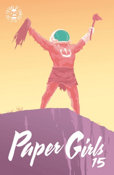
Paper Girls #15
Written by Brian K. Vaughn
Illustrated by Cliff Chiang
Colored by Matt Wilson
Lettered and Designed by Jared K. Fletcher
Reviewed by John Schaidler
Like the issues that precede it, “Paper Girls” #15 delivers (pun intended). From the first panel to the last, Brian K. Vaughn’s dialogue-driven writing and Cliff Chiang’s simple but arresting panels tell a laser-focused story, full of action, heart, and humor. This book is so well constructed, in fact, that at first glance, it might seem a bit simplistic. Linger for a while on any page or sequence, however, and the elegant efficiency that powers the storytelling becomes immediately apparent.
Note, for example, how basic geometry shrewdly conveys subtext throughout this issue, tying like elements together, subtly aligning our protagonists with one family of shapes and the antagonists with another. Things that menace our heroes tend to be triangular. The levitating time travel device, the time travel portal itself, and the piercing stone head of the ax wielded by ‘Captain Caveman’ (as he is sarcastically dubbed by Mac), all feature sharp points and angles. Later, when the girls are kicking ass in the final, climactic scenes, by contrast, a series of arcs, circles, and curves visually dominate the action. Even the head of the ax that K.J. swings has a blunt, oval shape. It’s a simple artistic choice, but genius nonetheless – emblematic of the entire book.
Continued belowMatt Wilson’s gorgeous colors work on a similar plane. His greens, blues, oranges, and yellows are electrifying, to be sure, but don’t ever descend into mere eye candy or indulgence. The dynamic interplay between warm colors and cool tones consistently drives the story forward, without ever feeling rote or predictable. In fact, some of Wilson’s panels feel downright iconic, with opposite sides of the color wheel in a dramatic tension with each other that feels simultaneously textbook and incredibly fresh – a phrase that also describes Vaughn’s lively writing that threads it all together. The retro wisecracks, alone, are pretty much worth the price of admission.
I’ve been into this book from the start and it hasn’t disappointed yet. Even so, “Paper Girls” #15 is a high point, rounding out this latest arc with a well-constructed elegance that almost belies the powerhouse talents behind it. As the last issue of the latest arc, it might feel like an awkward place to jump in, but the storytelling is so vivid and so effective that most readers will easily follow the action and connect with the characters. And that way you’re primed for the next arc. I mean, the cliffhanger reads: “The nerds were right. Y2K actually happened.” Not too many books can get away with spoofing pop culture like that.
Final Verdict: 9.3 “Paper Girls” #15 is an almost breezy, yet highly satisfying read. Outstanding color work, great illustrations and snarky dialogue combine to make it a series high point.

Rocket #2
Written by Al Ewing
Illustrated by Adam Gorham
Colored by Michael Garland
Lettered by Jeff Eckleberry
Reviewed by Kent Falkenberg
“In space,” Rocket recounts, “super-fights got weird.”
Let’s amend that: when Al Ewing is involved, everything gets weird. And if he teams up with an artist like Adam Gorham, that insanity just volleys back and forth off the wall like some whacked-out game of intergalactic jai alai.
“Rocket” #2 continues to buck expectation as Ewing and Gorham split their page count between more traditional comic-bookery and illustrated prose. With Guardians of the Galaxy Vol. 2 shuttling cash from theaters to the Marvel coffers by the dump truck load, it seems like an obvious mandate to keep as many ancillary titles floating around comic shops as possible. But I have no idea what kind of mandate could have birthed this: part heist comic, part courtroom drama, with a light sprinkling of the aforementioned space-brawl. All the while, Rocket spends most of his time decked out in a suit that Gorham draws so slick that Ewing has to call it out several times in the dialog.
Really, it’s full marks for effort for Al Ewing this go-around. Whenever he throws himself into a title, it always feels fresh and a little – or a lot – left of center. Blowing dust of the Technet is one thing. But when he’s not reviving obscure bounty hunters, he’s steering this whole ship head first into the ridiculous. Rocket’s defense attorney is an Echomelian, a blind alien race with a familiar propensity for sensing heartbeats and using it advantageously during litigation. Of course, Rocket’s specific lawyer is one Murd Blurdock – a victim of childhood tragedy, who lost this sense, yet seems somehow supernaturally gifted. “As if he can tell the expressions on a jury’s faces through some unknown ‘visual sense.’” says Froggy Frelson, before Blurdock abandons them all to go fight ninjas.
While things look slightly reminiscent of Alan Davis – though that might be the Technet talking – there’s a refreshing revelry in “Rocket” #2’s oddities. Gorham’s layering of panels helps bring out an off-kilter rhythm to his clean, somewhat posed character work.But where pages lack movement, they pack in the enthusiasm. It’s written on everyone’s faces: whether it’s a man with four arms and flaming swords getting subdued by a baby who grants wishes or the whole crew futilely stretching and diving across a full page splash as Rocket caps off the heist with a hail-mary toss of a well-engineered paper airplane.
Ewing and Gorham might not bring the snark you expect, but they’ve nailed the swagger of our favorite cosmic trash-panda. And that confidence and self-assurance carry over into their mad-cap tone as they blaze their way through a blend of genre and farce. Solo spinoffs shouldn’t all walk and talk like “Rocket” #2, but what a wonderfully weird world this would be if they could all have a similarly unique personality.
Continued belowFinal Verdict: 7.5 – Murd Blurdock – seriously, we need to see more of “the sentient without self-preservation.”

Wonder Woman: Steve Trevor #1
Written by Tim Seeley
Illustrated by Christian Duce
Colored by Allen Passalaqua
Lettered by Josh Reed
Reviewed by Nicholas Palmieri
DC’s Rebirth initiative has finally brought Steve Trevor beyond the flat characterization we got throughout the New 52, where his only trait was belonging to an ill-defined shady government organization. While not as significant as other relaunches, this issue serves as a sort of Rebirth for Trevor, continuing the work Rucka has done in the “Wonder Woman” title and incorporating elements from the Wonder Woman movie that came out last weekend.
Seeley seems to have realized that, even while his military past and strong connections to Wonder Woman have been brought back and fleshed out, Steve Trevor still lacked a distinct personality. So, he tries to define the character by contrasting him with others, whether against Diana in the beginning and ending scenes, or against the Oddfellows. The scenes with Diana worked well enough, though I did find his voice for Diana cruder than it should have been, just for the sake of jokes. Still, the scenes served their purpose and injected some welcome humor into the story.
What really made the book memorable were the scenes with the Oddfellows, the group of three men that were created for the Wonder Woman movie. Seeley may not have done anything revolutionary with these characters, but he wrote some fun interactions with clear personalities that Steve could bounce off. Fun when taken on their own, they’re also perfect foils for our title character. I’m glad they exist in the comics world now, and I hope they’re used in future stories.
Duce’s art and Passalaqua’s colors fall strictly into the serviceable category. The monster looks sufficiently creature-like; the hostage scene looks sufficiently dreary; the Fountain of Youth scene looks sufficiently positive. All visuals do their job without ever standing out as memorably good or bad. The one thing of note were the character designs for the Oddfellows, which use the movie actors as a base and drop or accentuate certain features as Duce sees fit. This should make things simpler for future artists who may draw the characters.
Taken as a whole, “Wonder Woman: Steve Trevor” works as a way to please fans of the movie, as well as give Trevor a direction and supporting cast going forward. Seeley has successfully Rebirthed this character, so let’s see where this takes us!
Final Verdict: 7.5 – A fun one-shot for fans of the movie and a nice Rebirth of sorts for Steve Trevor. Hopefully, this leads to more from these characters!


