
There’s a lot to cover on Wednesdays. We should know, as collectively, we read an insane amount of comics. Even with a large review staff, it’s hard to get to everything. With that in mind, we’re back with Wrapping Wednesday, where we look at some of the books we missed in what was another great week of comics.
Let’s get this party started.

Batman: The Detective #3
Written by Tom Taylor
Penciled by Andy Kubert
Inked by Sandra Hope
Colored by Brad Anderson
Lettered by Clem Robins
Reviewed by Brian Salvatore
There’s almost no reason to ever do a story set in the past of Batman’s life in 2021. In all of comics, there may be no character with a more familiar backstory and origin than Bruce Wayne. However, as he keeps doing across a variety of books, Tom Taylor is giving the reader something unexpected from his work, even if, on the surface, we know exactly what the book is. But with “Batman: The Detective” #3, Taylor brings Henri Ducard and Wayne’s relationship to the forefront in interesting ways, and gives the reader something new from Bruce’s ‘lost’ years.
What really sells this, however, is the art by Andy Kubert, Sandra Hope, and Brad Anderson. The book has a lived in, muted look that explodes with Anderson’s colors in key moments. Kubert’s Bruce is not exactly broken, but he’s bruised, and he’s worn out. Hope’s inks add a level of darkness, both literal and figurative, to the pages, giving us subtle reminders that this Bruce is not at the top of his game, or at least is holding off for dear life.
Ducard is a not one of the more featured characters in the DC Universe, and so his ‘death’ in this issue shouldn’t shock people too much, but it adds a sense of finality to the title that underscores the sense of the golden days being over. There’s a line in the pilot of The Sopranos where Tony mentions that he got in to the mafia game too late; the boom is over. That’s how this book feels; Batman is still doing all he can to succeed, but the results just aren’t there anymore. And even when it does succeed, the spoils may not cover the costs anymore.
Final Verdict: 7.4 – A really strong issue of a surprisingly nuanced miniseries.
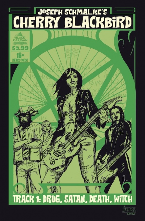
Cherry Blackbird #1
Written, Illustrated, and Colored by Joseph Schmalke
Lettering by Joel Rodriguez
Reviewed by Alexander Manzo
“Chery Blackbird” #1 is a story that feels like it should be a series on FX. From the jump, you get some explicit sex scene that turns into a “What the hell is happening?!” sequence. It doesn’t take long before the actual story kicks and we find out our protagonist, Cherry, has made a deal with the devil and it is almost time for her to pay up. The comic shifts gears into a Rocky training montage that feels a little confusing because it’s unclear whether she’s going to bulk up to fight The Devil or the demons. Either way, it becomes a few pages of her being knocked down before she stands up and decides she’s ready. There’s a lot more set-up for the next few issues rather than any action in this opening chapter. Aside from the “opening” scene, not much else happens that feels demonic.
Cherry herself is written more as a side character because she seems more of a messy drug addict rather than a girl who has a year to live. When she is given the figurative clock a-ticking from the Devil, she doesn’t even freak out. It’s more of an “I know when the rent is due so leave me be” kind of vibe. Joseph Schmalke doesn’t give her much background in this opening chapter, so it becomes tough to root for her. The more interesting character is her “Ex-girlfriend” who gets her to a trainer and has some history with the devil herself.
The art by Schalke is messy and rough, but seems fitting for this kind of story. With the topic of the devil, drugs, and rock n roll, the reader might be thrown off by nice and crisp lines, but some consistency would have been nice. A prime example is when the Devil comes to her dressing room, and in each panel he looks slightly off, with different shading around his face. The panels feel more similar to works in progress, rather than the final version.
Continued belowThe coloring and shading in this issue feel off as well. Cherry’s hair during the scene with the Devil often blends in with this black door in her dressing room that has it blend in and seems like a big black blob. The shading on Arnell is rather confusing to whether it could be the shade from his hat or perhaps some scars.
Final Verdict – 6.9 – Making a deal with the Devil might help improve this story for the upcoming issues.

The Good Asian #2
Written by Pornsak Pichetshote
Illustrated by Alexandre Tefenkgi
Colored by Lee Loughridge
Lettered by Jeff Powell
Reviewed by Henry Finn
Hawaiian-born Edison Hark is one of America’s first Chinese-American detectives forcing him to police -and sometimes betray – his own. This premise is intriguing and original for a comic book series, and is a welcome addition to the pantheon of iconic noir heroes. Pornsak Pichetshote is a talented writer with a keen eye for details and a strong grasp of the detective noir genre. What he excels at is giving context to the condition of Chinese-Americans during the 1930s. And this is particularly relevant in a time of turmoil and fear in the Asian-American community today. Without crossing the line into preaching, Pichetshote uses Hark’s inner voice to express ethnic struggles that go beyond the genre. Issues such as the struggle for perfection or fitting into a society that wants to somehow blame you for their problems hit me hard as these are issues still relevant to Asian Americans today. This serves to make Hark a multi-dimensional character where his ethnicity is not a gimmick, but an essential feature that separates him from others in the genre.
Alexandre Tefenkgi has done a lot of research to capture the period and it shows in each and every setting we find Hark in. First of all, he gets the architecture right. Chinatown looks and feels like Chinatown should. His attention to details like the types of furniture, fixtures, and textures of every surface is done tastefully without overwhelming the action of the scene. He brings a modern sensibility to the layouts of his pages, mostly avoiding standard grids. Furthermore, he uses little tricks such as directing the eye to a smaller panel within a panel to call attention to a clenched fist, which plays well for the genre.
Lee Loughridge deserves special attention for his work as well, as his colors help complete the accurate representation of the period. Each scene has a different color palette and matches the common color schemes found in Chinese-American culture.
Final Verdict 8.0 A well-written, hard-boiled look at an underrepresented people that is relevant to today’s story.

Magic #3
Written by Jed MacKay
Illustrated by Ig Guara
Colored by Arianna Consonni
Lettered by Ed Dukeshire
Reviewed by Gregory Ellner
Magic: The Gathering is a rather far-reaching franchise, even beyond its card game focus. From novels to tabletop game settings to much more beyond, the entire enterprise can become difficult to enter. With “Magic” #3, Jed MacKay shows that “difficult to enter” is far from “impenetrable,” crafting a tale that delves into lore and provides brief hints to various Ravnican factions without ever seeming to push out those who would wish to understand what is happening. There are some odd jumps in time, but they seem to be less an unwieldy and confusing skip ahead than a showcase of how the characters are so overwhelmingly powerful that demonstrating their abilities is a waste of page space. The characters themselves are interesting, their dynamics entertaining, and the use of two apparently simultaneous arcs, one with dialogue snd one without a sound, enhances the intrigue underlying the entire plot.
Ig Guara’s artwork is very animated and exhilarating, providing motion and emotion to even the calmest of scenes. Every character seems to have a weight to them, every bit of magic explosive and amazing to see. Even the quiet scenes of horror have a feel to them, as if the absence of sound enhances the visceral effect of Guara’s violent imagery.
Perhaps even more striking than the illustrations, Arianna Consonni’s colors steal the show. Perhaps such a focus was inevitable in a story where magic revolves around types of power founded on particular colors, but the raw emotion of the reds works together excellently with the primal peace or savagery of the greens, tied up in the calming intellect of cool blues or a wide variety of other hues and tones. The colors help to emphasize contrast, but also similarities, as while the story never mentions the color-based arcane practices, they are very much evident in the variety of glows given off by practitioners, or the way in which the colors are used in general to further particular moods or tones.
Continued belowFinal Verdict: 7.5 – Through intriguing characters, understandable plot, and amazing artwork made even better by phenomenal colors, “Magic” continues to cast a spell over readers new and old.

The Secret Land #1
Written by Christofer Emgard
Illustrated by Tomás Aira
Colored by Tomás Aira
Lettered by Mauro Mantella
Reviewed by Conor Spielberg
“The Secret Land” #1 has a slow start with a romantic hook that doesn’t pique your interest until you get to know both love interests better. By the time the issue is over, the issue overcomes its lukewarm start, reveals the true potential of it’s premise once the Nazi secret base is introduced.
The Romantic scenes between Ben and Katherine talking on the beach and kissing each other goodbye on beside a plane coupled with Ben attempting a heroic last stand on a Pacific Island doesn’t work as a strong opening for a number of reasons. The first is that despite the engaging dialogue, there isn’t any concrete reason given to care about these two people beyond the fact that they care for each other.
Despite Ben’s military operation being well sequenced, the reader isn’t attached to the squadron he is trying to save, undercutting any dramatic tension. The opening page with Ben on the ship has two boxes of text, one in orange to mark to Mark Ben’s internal thoughts and one marked purple to mark the omniscient narrator which took me a second read before I realised this fact.
Once the book overcomes these pitfalls and gets Katherine into the ‘Final Reich’ hideout, it really does begin to come into its own. The splash page introducing the base has futuristic ships flying overhead with the menacing dull grey and the black iron cross with white outline really cements the new and much better tone then what came before.
The rest of the issue creates a sense of menace and a dreadful sense of camaraderie as Katherine finds her bearings as we see historical and fantastical evil merge together in the artwork and script to great effect. If the rest of the series proves to be as good as the latter half of the issue this will be a very good miniseries.
Final Verdict: 6.2 – A weak first half gives way a very strong second half.

W.E.B of Spider-Man #1
Written by Kevin Shinick
Illustrated by Alberto Alburquerque
Colored by Rachelle Rosenberg
Lettered by Travis Lanham
Reviewed by Quinn Tassin
Writing a comic book that ties into a theme park ride presents an undeniably tricky challenge. It puts constraints on what the series can actually be- it’s both promotional material for Disneyland and its own story that you can pick up in the average comic book store. “W.E.B of Spider-Man #1” is likely one of the better outcomes of a book experiencing that kind of tension. but there’s a relatively low ceiling for how good it can actually be. This is a perfectly fine, fleetingly fun comic- one that’d be perfect to give to a young relative- but on its merits, it leaves quite a bit to be desired.
First, the good: this issue does a good job introducing a fun, easy to like cast of some of Marvel’s smartest young characters. You’ve got Moon-Girl, Harley Keener (from Iron Man 3), a Wakandan girl named Onome, and Squirrel Girl all alongside Peter at the Worldwide Engineering Brigade (the titular W.E.B) and the group works! They have an entertaining group dynamic, all competing to show the others just how much they all deserve to be there. There’s also the Spider-Bots which are pitch perfect robot assistant comic relief characters who should get toys immediately. At the forefront of the bad in this issue is the characterization Peter Parker. Leaning into his love of science is a decision that’s easy to love. Everything else, however, makes him feel like a generic action character created for children. There’s really almost none of the normal Parker relatability or charm present and the character suffers for it. Plus, the actual conflict is uninteresting. it makes no sense that a room of geniuses wouldn’t put 2 and 2 together when Peter disappeared immediately before Spider-Man showed up.
As for the art, Alberto Alburquerque and Rachelle Rosenberg do a fine job that matches a fine issue. Alburquerque’s pencils are technically competent but evoke very little. The character illustrations and layouts in particular, are boring. Emotions are displayed and action is definitely easy to follow but none of it is interesting to look at. Rosenberg is a great colorist in general, but even she seems to be doing just enough to not be bad here.
Final Verdict: 5.3- “W.E.B of Spider-Man #1” isn’t a bad comic book but it’s far from a good one


