
There is a lot to cover on Wednesdays. We should know, as collectively, we read an insane amount of comics. Even with a large review staff, it’s hard to get to everything. With that in mind, we’re back with Wrapping Wednesday, where we look at some of the books we missed in what was another great week of comics.
Let’s get this party started.

Bitch Planet: Triple Feature #1
Written by Cheryl Lynn Eaton, Andrew Aydin, and Conley Lyons
Illustrated and Colored by Maria Fröhlich, Joanna Estep, Craig Yeung, and Marco D’Alfonso
Lettered by Clayton Cowles
Reviewed by Christopher Lewis
Welcome to the world of Bitch Planet, where men rule and women are subservient or else. This triple feature includes three eight-page mini-stories of women living in the world of the patriarchy and depicts their struggle of being mistreated just because they are women. While these stories don’t move the main narrative forward they give context to the day-to-day plight of women and allows the reader to understand why there is a building rage in the female populace.
The art in this issue varies by story, but is highly simplistic with a softness given to each page. This is done by using soft colors like pastels and pink and/or using a softening effect on the page. I have been pondering the purpose of this softness and have determined that it was done to help make the reader sympathize with the women of each story. While some people might like this, the plight of these women is self-evident and this softness added to the art is unnecessary. I would have preferred the artists use perspective or other tools to make the reader feel the plight of these women, instead of just seeing it.
Final Verdict: 7.0 – Overall, while the main Bitch Planet narrative is a top notch story, I found these mini-stories to be lacking.

Detective Comics #958
Written by James Tynion IV
Penciled by Alvaro Martinez
Inked by Raul Fernandez
Colored by Brad Anderson
Lettered by Sal Cipriano
Reviewed by Michael Mazzacane
“Detective Comics” #958 feels like an overall return to form. Alvaro Martinez and Raul Fernandez are back for the first time since #947, along with the ever-present Brad Anderson on colors, and this means one thing: SPLASH PAGES. Out of 20 pages, 14 of them are taken up as double page spreads. While the issue doesn’t make use of skeuomorphic design in its paneling, the splash pages act as an overall larger frame to encompass multiple micro sequences in the overall scene. Such as the first one at the basketball game: the page is cut into thirds with each new sequence leading into one another making for a very readable spread. These are tinier moments that would’ve been awkward to script and justify if formatted as single pages. Martinez’s page layouts do an excellent job setting up space and using smaller panels it to highlight the players and create action within the scene. Martinez and the art team also go big and symbolic when necessary, such as the brief history of Jean-Paul Valley which is a page more like the Bayeux Tapestry than comics.
For all its artistic familiarity, narratively Tynion’s script eschews tradition and lays into the marketing promise of “Detective” as the Bat-Family book by having the team largely out of costume. Other than the always working Bruce Wayne, the rest of the team is shown in a slice of life styled scenes. Lucas, Jean-Paul, and Kate go to a basketball game. Basil and Cassandra perform Shakespeare with one another. These are little moments, both running roughly two pages, cement the familial feel. However, it isn’t long before their nighttime proclivities interfere with this normalcy.
While his page design is readable, it’s Alvaro Martinez and Raul Fernandez’s ability to depict emotion in everyone’s face that is most enjoyable. From Kate’s desires and Jean-Paul’s reaction to Basil’s pride in Cassandra’s acting ability. It’s those little moments, that sell this team as the Bat-Family proper and not a phrase meant to explain the shared symbolism.
Sal Cipriano’s letters deserve recognition in regard to expressing Basil and Cass performance of The Tempest Act 1 Scene 2. His typeface for Basil and Cass in, and out, of costume do an excellent job representing the effect compared to their normal voices.
Continued belowFinal Verdict 8.0 – ‘Intelligence’ begins with a return to aesthetic form and a renewed emphasis on Family.
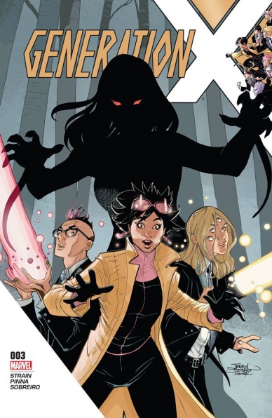
Generation X #3
Written by Christina Strain
Illustrated by Amilcar Pinna and Roberto Poggi
Colored by Felipe Sobreiro with Nolan Woodard
Lettered by VC’s Clayton Cowles
Reviewed by Alexander Jones
Few comics dare to be as weird as some of the material I’ve seen so far in “Generation X.” The book has threaded some loose ends of X-Men together and has somehow managed to rise up from the ashes and become the most stable and consistent books in the problematic new X-Men line. Writer Christina Strain has doubled down on the weird in this series but has made sure to justify and explain why each character is being so odd and why they got mixed up with this weird cast of characters.
If there’s an artist that is a better fit for “Generation X,” Marvel isn’t going to be able to do better than Amilcar Pinna and Roberto Poggi. They feel tailor-made for this series. The two creators bring the weird and the causal together in a manner that is fascinating, sleek, and unsettling. Pinna and Poggi even manage to channel some previous X-Men material in this series, tapping into the influence of Frank Quitely and delivering on something just downright strange. Character expressions are odd, anatomy can be distorted and some lines look they are in the wrong place at times but this only adds to the surreal quality of the comic and imperfections emanate the tone of this comic so beautifully. While certain details of the interiors in the issue can be sparse and layouts can be simplistic, the dynamic character poses and framing of the book more than makes up for it.
Strain goes out of her way in this book to add characterization to each member of Jubilee’s new class. The different characters walk away from this issue better defined with a greater sense of purpose. While the villains of this comic have been something of an afterthought up to this point, Strain has so many soap opera elements tying the cast together in a serialized manner that the underwhelming rogues gallery has not yet been a problem. The writer manages to pace this series extremely effectively, adding in moments of weirdness, brevity, and loads of interesting flashbacks.
“Generation X” #3 gets very weird very quickly but somehow manages to keep focus by introducing new mysteries and fleshing out seemingly one-note characters. Each young member of Jubilee’s team now has a clear purpose and the book does a great job economically finding new ways to start up new storylines with each cast member while giving the overall narrative and some supporting players in the Xavier Institute some interesting things to do. Even though the main X-Men titles feel like they have been running in circles with no end over the past couple years, some of the fringe titles have allowed characters to age while introducing a new cast of classes to keep things fresh. Strain, Pinna, Poggi and the entire creative team have done a great job giving this new team of X-Men a distinctive purpose and vision.
Final Verdict: 8.5: “Generation X” #3 promotes a new team of X-Men to the forefront!

Grass Kings #4
Written by Matt Kindt
Illustrated and Colored by Tyler Jenkins
Lettered by Jim Campbell
Reviewed by Chris Partin
“Grass Kings” has been building toward a huge conflict since the first issue between the Grass Kingdom and their neighboring town Cargill. Readers have been getting little pieces of the reasons why Robert, the Grass Kingdom’s leader, and Cargill’s sheriff, Humbert, are at odds with each other, but it isn’t until this issue that we get really clear reasons. Those reasons make readers want to stand behind Robert’s position, but are the reasons he has to hate Humbert as clear cut as they are being presented, or will the next issue give readers more?
Matt Kindt has taken his time with this series to slowly build to where these characters are at the end of this issue, but it doesn’t feel like there have only been four issues. Kindt has been able to place so much into each issue that the story just feels like it has been around a lot longer than it has and shows the talent of Matt Kindt. Every issue gives the reader just enough history of the Grass Kingdom and just the right amount of backstory for the characters involved in this conflict, plus give readers the present day story. This series is a great example of how to manage a story and give readers everything they need.
Continued belowKindt’s words, even lack of words, in this issue are complemented by the amazing art of Tyler Jenkins. Jenkins uses so much space on these pages without overwhelming the reader and is fully capable of telling the story without Kindt’s words. Jenkins has such a great sense of storytelling with his art.
Final Verdict: 7.5 – “Grass Kings” is a great series that could easily be a television series. The characters are well defined and have the depth that readers can attach themselves to almost immediately. Kindt and Jenkins should be very proud of this series, and readers who aren’t reading this – they should.
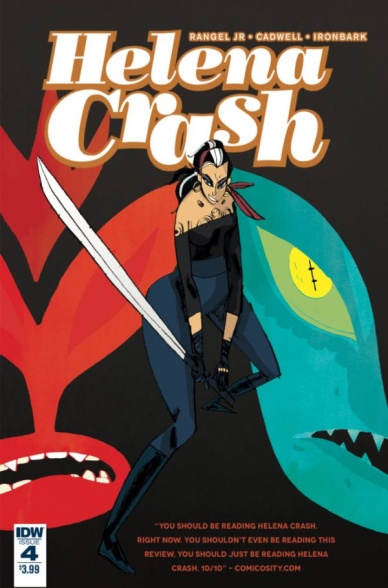
Helena Crash #4
Written by Fabian Rangel, Jr.
Illustrated by Warwick Johnson-Cadwell
Lettered by Ironbark
Reviewed by Kent Falkenberg
Caffeine-punk . . . is that a thing? It really should be a thing.
Contraband coffee, hot rods, aliens, luchadors, and samurai swords, the aesthetic tentpoles in place are all mashed to the fore as “Helena Crash” #4 careens across the finish line. But even if the trend begins and ends with this mini-series from Fabian Rangel, Jr. and Warwick Johnson-Cadwell, it’s been one hell of a full-throttle ride while it’s lasted.
It’s a credit to the frantic pace of both the issue and the series, that Helena’s mechanic friend, Lobo, can just throw out off-hand, “I upgraded the engine with alien components. You’ll be faster than ever,” and we never bat an eye or stop to ask exactly what type of extra-terrestrial aftermarket parts got bolted on. Johnson-Cadwell scrawls some hot-pink scribbles under the hood of Helena’s ride, and that’s all we really need. Enough said.
And that’s the greatest part about “Helena Crash” #4. There’s a universe out there that’s wildly unique, but things never get bogged down in world-building or back-story. Lobo shows up to a ramshackle gang clubhouse in the middle of a junkyard scratched onto the page like the artist was creating a mural by knifepoint on a bathroom stall. Lobo stands there looking badass, says nothing more than I’m back, and that’s that. Los Fantasmas are riding into war with Helena.
Exposition? Nobody here has time for that, especially when Rangel, Jr.’s plotting a head-on collision of Rojo and the White Demon. While previous issues have showcased how reckless a driver or how great a fighter she is, the finale characterizes just how shrewd Helena can be. It’s her machinations that ultimately lead to a showdown between the two crime lord nemeses. Now, this isn’t a nuanced, character-heavy work, but it is nice to see she’s got more than one way to make her enemies hurt.
As usual, Johnson-Cadwell’s angular style plays fast and loose with proportion. It’s all done purposefully in support of momentum and release, but it can be bit off-putting if you’re looking for something more realistic. For me, it creates a feeling of graffiti impressionism. It seems it was etched onto the page in a flurry, which is the perfect tone for a tale that’s been pedal-down since it started.
At only four issues, Rangel, Jr. and Johnson Cadwell’s work leaves the smell of spent rubber on the pavement as it roars off down the highway. In 2017, it’s truly been one of the most kinetic and frenetic series. Like racing the quarter-mile at the drag strip or slamming a tiny cup of espresso, “Helena Crash” #4 proves that the most energizing things in life don’t need to be the longest lasting.
Final Verdict: 8.0 – High-octane, over-caffeinated insanity. So much fun.

Hulk #7
Written by Mariko Tamaki
Illustrated by Georges Duarte
Colored by Matt Milla
Lettered by Cory Petit
Reviewed by Forrest Sayrs
I have really been loving this run of “Hulk.” It feels like “Hawkeye: My Life as a Weapon” but with a better mix of super heroics and daily life. And it tackles some serious issues exceptionally well. With its first major story arc behind it, Mariko Tamaki continues her exploration of superhero PTSD, thankfully independent of the continuity snarl that is “Secret Empire.”
“Hulk’s” first arc was focused on the struggle of getting back to ordinary routines after a trauma, but the second arc is shifting to explore having your support mechanisms disrupted. The way Tamaki writes Jennifer Walters makes it abundantly clear that she’s done her homework. Jen’s use of various kinds of emotional and physical outlets for her stress and pain, combined with a textbook need to reject offers of help, even when she knows she needs is are both quintessential PTSD behaviors. Her inner monologue, as written by Tamaki, is one of the strongest elements of the book, evoking both sympathy and frustration. It is incredibly compelling and speaks to an author who has a firm grasp on the psychology of her protagonist.
Continued belowDuarte’s no slouch on the art either. While there’s nothing quite as spectacular as the big finale fight from issue #6, his panels, and particularly his action sequences, look amazing. He has a very clean, slick-looking art style that shines brightest when things are moving: Jen’s hair whipping as she drives, or the wonderfully kinetic 2-page spread of the Hulk demolishing a scrap yard. Even when there’s nothing but dialogue, Duarte keeps things interesting with dynamic angles and strong perspective work. I also want to take a moment to praise John Tyler Christopher for his stunning covers. They are routinely highlights of the month for me, making great use of Jen’s new gray coloring to make whatever other colors he’s using really pop.
Issue #7 is a great place to pick up “Hulk” if you haven’t already. It definitely counts among Marvel’s more successful experiments with established characters, managing to feel both fresh, and still true to the idea of She-Hulk/Hulk. By limiting the scope of the issues she’s exploring, Tamaki has built a very tight narrative that keeps things moving forward, while still taking on serious psychological issues and approaching them in a realistic way. It’s hard to turn on the news without running into a story about the tribulations of those with PTSD, so it’s all the more impressive that “Hulk” manages to feel authentic, and more importantly, relevant. This is, without a doubt, my favorite thing to come out of “Civil War II.”
Final Verdict: 9.2 A very strong start to the second arc of an excellent book.

Jimmy’s Bastards #1
Written by Garth Ennis
Illustrated by Russ Braun
Colored by John Kalisz
Lettered by Rob Steen
Reviewed by Elias Rosner
Imagine, if you will, James Bond. Now, take all the things that make him PG-13 and turn that up to an NC-17. Got that? Good, you’ve now got a pretty good idea of the titular Jimmy of “Jimmy’s Bastards.” “Jimmy’s Bastards” #1 is a very effective satire of the James Bond spy thriller, capturing everything that makes Bond, Bond. Unfortunately, it is also a comic that is really hard to get a handle on. That may be due, though, to the fact that the comic is playing with and exaggerating every trope out there for the opening of a Bond movie.
As a first issue, it does an effective job of introducing us to everyone. The opening spy scenes use the two-page spreads to show the scale of Jimmy’s mission while also highlighting just how calm he is throughout. His face is almost always smug and composed and this serves to ground our character (as much as he can be while he fights a trigger-spewing magician, ISIS, and a murderous chimp with a human brain in a crashing blimp). We know who Jimmy is and what he’s like from the first reveal (although he does start to gain a little complexity during his first interaction with Nancy).
However, his smug face, as well as all the faces really, feel very taught. They don’t emote very much and move only very slightly. The same goes for the posing of the characters – it all feels very stiff. Maybe this was a stylistic choice, as each person’s expressions match their character trope/personality, but there will need to be more variety if this is to be a character-focused series, which seems to be where Ennis wants to take this…eventually.
Additionally, while the satire may be good, the issue isn’t particularly engaging. It’s all very predictable for the first 2/3rds, up until the army of bastards having a meeting in a cathedral. It just takes the craziness of some bond villains, ups the explicit nature of the violence, language and sex, and doesn’t challenge any of the tropes. He instead focuses on the aspects of Bond that are usually just a one-note gag in other satires, Bond’s relationship to women.
Instead of focusing on the spy work, the crazy villains, or his love of cars with spring-loaded axes in the steering wheels, Ennis wants to deal with and craft a plot around Bo-…Jimmy’s treatment of his female partners and the results of his inability to keep it in his pants. And as an illustration of this, an army of his bastard children gathering in a cathedral is a pretty funny one to begin on.
Continued belowFinal Verdict: 6.9. A decent first issue but will need to complicate its characters more in subsequent issues or it risks just being an NC-17-rated Bond parody. But I believe it can be done.
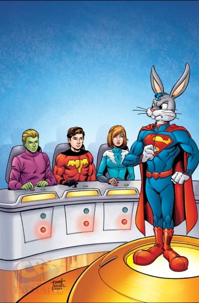
Legion of Super-Heroes/Bugs Bunny Special #1
Written by Sam Humphries
Penciled by Tom Grummett
Inked by Scott Hanna
Colored by Steve Buccellato
Back-up Written and Illustrated by Juan Manuel Oritz
Lettered by Josh Reed
Reviewed by Nicholas Palmieri
In the style of a Mel Brooks genre spoof, Humphries and Grummett manage to successfully satirize 1980s Legion of Super-Heroes comics in this “Legion of Super-Heroes/Bugs Bunny” special. Between the overuse of thought balloons, editor’s notes, melodramatic exaggeration, and calling attention to all of these outdated stylistic tendencies, the issue became both hilarious and endearing. Humphries infuses enough love of the original material to remind us why those stories are great, too, which also helped this story be more engaging. Grummett’s art also harkened back to that era, filling the issue with cluttered panels and overdramatic poses in a modern, self-aware way.
Bugs Bunny fits in so well here that I don’t even think of this as a crossover story — just a Legion story. This predominantly has to do with the story’s structure, one similar to other Legion initiation stories, combined with the genius move of having the characters interpreting Bugs’s antics as superpowers. Humphries also wrote the character remarkably well, retaining his characteristic wordplay and visual gags, which were all marvelously represented by Grummett.
The back-up, an 8-page 1960s Legion homage, was slightly less successful. My primary issue with it is that the story almost exactly duplicates that of the main feature. It also lacked the commentary and self-awareness of the main story, opting instead for a straightforward approach that ended up lacking both the comedy of a parody and any of the magical absurdity of those original stories.
Still, that main story alone is worth the cover price. This “Legion of Super-Heroes/Bugs Bunny” special might not be the new Legion title we’re still patiently waiting for, but it is a treat for old fans.
Final Verdict: 8.3 – A thoroughly enjoyable spoof of 80s Legion comics, this issue fully understands both the greatness and ridiculousness of its source material.

New Super-Man #12
Written by Gene Luen Yang
Penciled by Billy Tan
Inked by Haining
Colored by Gadson
Lettered by Dave Sharpe
Reviewed by John Schaidler
“New Super-Man” #12, part two of ‘The Zero Ultimatum’ arc, is unquestionably action packed. Driven largely by Billy Tan and Haining’s on-point illustrations, this issue overflows with stunningly rendered fight scenes, witty dialogue and a story-within-a-story that beautifully frames the action – all while serving up a potentially cautionary tale to our young hero, Kong Kenan, in the process.
It sounds like a lot to digest, and it is, but Yang’s compact writing style continually drives the action forward, even while revealing key background information and introducing tantalizing new threads. Yang even wraps it all up with a massive one-two punch, combing a major cliffhanger with a stunning reveal.
Incredibly, despite being part two of a whole new arc, this issue feels completely self-contained.
Things begin with a brilliant two-page spread. On the left, a full-page illustration describes the Buddhist concept of the six realms of existence. On the right, Superman Zero hovers high above Shanghai, already in the midst of an incredible battle with the massive, Godzilla-like turtle, Fahai. It’s a dazzling juxtaposition that situates a real-time struggle for the fate of Shanghai within a much larger, even timeless, cosmological context. It’s myth, on top of legend, interwoven with a damn fine story. And part of how Yang pulls it off is with the considerable talents of letterer Dave Sharpe.
Sharpe doesn’t do anything particularly novel or innovative, and that’s precisely why it works. By subtly changing fonts, background colors and the sizes and shapes of text bubbles, it’s immediately clear which character is speaking or whether we’re hearing internal monologue or an omniscient narrative voice. Yang tells the story from multiple points of view, switching perspectives quickly throughout the entire book, but Sharpe is in lock-step all the way, deftly weaving the disparate threads together while keeping each strand separate and clear. It’s highly sophisticated storytelling that feels both organic and seamless.
Continued belowThe paneling and colors are outstanding, too, placing the book squarely within the larger Superman aesthetic, while simultaneously carving out a subtly different space of its own. The characters and story have been compelling from the start, but suddenly it feels like “New Super-Man” has made a quantum leap, hinting at great things to come.
Final Verdict: 9.2 “New Super-Man” #12 is sophisticated storytelling that succeeds on multiple levels with outstanding contributions from the entire creative team. Even if you’re new to the series, you will love this essentially self-contained issue. Just buy it and enjoy.

Tekken #2
Written by Cavan Scott
Illustrated by Andie Tong
Colored by Mauricio Wallace
Lettered by Jimmy Betancourt
Reviewed by Gregory Ellner
The majority of the problems with “Tekken” #2 is the lack of any actual story. Cavan Scott forces the majority of the issue to be taken up by an extended fight scene, one that would be relatively hard to follow if not for the “cast of characters” introduction pages, and even that does not cover everyone.
Without much in the way of a plot, Scott relies upon an extended internal monologue from Jin Mishima, with very little reason to care for either side of the large battle beyond “the main person on one side wants to keep from becoming possessed by an evil entity.” Without much character, there isn’t much to care about, even with the humorous captions for incoming combatants. This issue is not easily explained away by it being a video game-related fighting comic, either, as the more balanced “Mortal Kombat X” shows.
Andie Tong and Mauricio Wallace’s artwork is the primary saving grace of the second issue of “Tekken.” The fight scenes are very dynamic, using a liberal application of blurring, in combination with lights of various sorts, to portray the chaotic nature of combat. The human nature of Jin Mishima is portrayed through the fear of his own potential rather well through facial expressions and thereby makes his more diabolic look in certain moments to be especially disturbing.
While the artwork is rather well done, “Tekken” #2 falls into the classic pitfall of “too much action, not enough plot” that can fit into battle-centric stories. Without much characterization to go on, there is little reason to care for the light and noise of conflict.
Final Verdict: 4.5- A well-drawn, but poorly written fight comic that leaves much to be desired in terms of characterizations.


