
There’s a lot to cover on Wednesdays. We should know, as collectively, we read an insane amount of comics. Even with a large review staff, it’s hard to get to everything. With that in mind, we’re back with Wrapping Wednesday, where we look at some of the books we missed in what was another great week of comics.
Let’s get this party started.
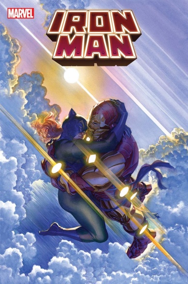
Iron Man #20
Written by Christopher Cantwell
Illustrated by Angel Unzueta
Colored by Frank D’Armata
Lettered by Joe Caramagna
Reviewed by Gregory Ellner
Following the extensive ‘Books of Korvac’ arc, Christopher Cantwell approaches 20th issue of the 2020 Iron Man run spinning out of the ‘Iron Man 2020’ event that takes its name from the eponymous series from decades past. With such a confluence of instances, albeit not nearly as momentous as reaching the year 2099, surely the plot will be of great import.
Well…no. Instead, we have some calmer moments of high emotional intensity of a romantic nature, coupled with Tony Stark being faced with a highly intelligent gorilla. This decision by Cantwell is not inherently a bad thing, as the relative lightness of the events acts as a good breather, and perhaps as a means of creating a good jumping-on point for new readers.
Highly charged or no, the story benefits greatly from Angel Unzueta’s intricate artwork. The somewhat thick inking helps to easily demonstrate where wharacters are, but the contrast between that thickness and the smooth nature of the illustrations within the line really helps to make the various personages come alive.
Even so, Unzueta’s artwork is enhanced even further by Frank D’Armata’s colors. The smooth nature of those hues and tones really drive in the light sources and tone of scenes, while never pulling away so much to make it seem too cartoonish or otherwise over-the-top. Yes, this is for a story with a talking gorilla, which makes the effect more impressive still.
Final Verdict: 7.5– A relaxing story combined with beautiful artistry really helps draw in a new potential audience to whatever is next for Tony Stark’s journey forward.

Seven Sons #1
Written by Robert Windom & Kelvin Mao
Illustrated by Jae Lee
Colored by June Chung
Lettered by Simon Bowland
Reviewed by Quinn Tassin
“Seven Sons” #1 is running almost entirely on vibes. It’s the Second Coming but the world is in a suboptimal place. If there’s one thing this issue is capable of, it’s telling us what kind of a world we’ve entered. A lot of that is thanks to Jae Lee’s incredible artwork. The center of New Canaan (formerly Las Vegas) is a massive gothic church with the harshest architecture you’ve ever seen. There’s a grey hue over everything, creating a genuine sense of dread. The colors that do pop are advertisements which you can find in one place or another on nearly every page. There’s a hyper-capitalist, über religious government in power and it’s touching every aspect of life. Religious healings are for sale, as are second coming hats. You get free mugs when you’d donate to a church and massive displays of weapons hang over televangelists plush chairs. There’s a thick grime covering every person and place that isn’t of religious importance, though. This is clearly a world even more economically stratified than our own and living under a terrifying government.
But for all that visual splendor, there’s actually not all that much going on in “Seven Sons” #1. We get acquainted with this new government and see some of the figures that this world is organized around. But really, that’s it. There’s a Muslim terrorist group that may or may not be extremely offensive. It’s hard to tell because every character is so thinly rendered; Allah’s Watchmen may be tired tropes or they may just become more fleshed out later on. The long term plans of the series are unclear but in a way that doesn’t quite feel intriguing.
It’s hard to deem “Seven Sons” #1 a clear success or failure. On the one hand, there’s a clear style here that really works. There’s a strong, eerie atmosphere and looking at most of these characters makes your skin crawl. The pacing and tone are solid. On the other hand, the comic is a bit hollow. There’s some interesting messaging about capitalism but it’s not particularly creative. And the characters feel almost nonexistent. Taken on the whole, it feels worth checking out another issue, but “Seven Sons” is on thin ice.
Continued belowFinal Verdict: 5.6- Strong vibes and an intriguing world can’t quite make up for thin plot and characterization

Spider Man 2099 Exodus: Part Two
Written by Steve Orlando
Illustrated by Marco Castiello
Colored by Antonio Fabela
Lettered by VC’s Joe Caramagna
Reviewed by Alexander Manzo
“Spider-Man 2099: Exodus” #2 feels similar to the first chapter in this mini-series, where Steve Orlando gets to create a one-shot storyline for a character that Marvel fans are familiar with but with a quirky but futuristic twist. Loki is the last survivor of Asgard and is on a redemption mission to find a way to bring it back to its glory and enlist the help of a valkyrie who is helping a small village known as Undertown. While Steve Orlando’s concept and the goal are upfront for the audience, its pacing feels drawn out and slow that by the time the audience gets told the big reveal, it’s not so much a surprise as it is a relief to move forward. Orlando’s slight twist with Loki’s sacrifice to restart the city of Asgard feels like a missed note as the valkyrie continues to re-explain the point of the sacrifice again as if it hadn’t been drilled into them. The bigger arc of this Exodus storyline about Norman Osborn’s mission for the Celestial Garden is only mentioned in the first and last pages of this story.
Marco Catiello’s work in this story helps keep the reader’s attention with a mix of post-apocalyptic “Mad Max: Fury Road” vibes and the old-school “300” city views. Castiello’s artwork for the character designs and expressions has this shadowy and dirty look that fits with the storyline because it helps bring this hardened and uphill battle vibe. Given that this is a redemption story, Antonio Fabela’s colors move to a brighter tone after Loki’s sacrifice, which shows that it was not in vain.
Final Verdict: 5.8 Redemption only goes so far, especially when it’s still a mystery for the overall arc of the storyline.
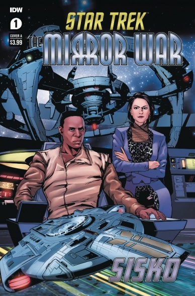
Star Trek: The Mirror War – Sisko #1
Written by Danny Lore
Illustrated by Hendry Prasetya
Colored by DC Alonso
Lettered by Neil Uyetake
Reviewed by Chris Egan
This spinoff of “The Mirror War” gives us a more in-depth look at the Mirror Universe’s version of Benjamin Sisko, and his partner both in politics and romantically, Kira Nerys, the Intendant of Terok Nor.
This one-shot issue plays on the motifs and tropes of many a spy movie, down to tuxedos, ballroom dances, and backroom brawls and negotiations. Double talk and espionage are all over every single page. It sounds more fun than it ultimately ends up being, mainly because the Mirror characters are all villains at some level. It’s hard to root for any of them, even this Sisko who tries to do things for the right reasons, or at least things that will save him from death or a tortured existence.
Lore does a decent job of layering the intrigue throughout and Prasetya’s illustrations and character likenesses are on point. Their work truly feels like the 90s era of Trek and the mirror episodes of Deep Space NineI. All around it is a solid entry in this on-going miniseries and adds a lot of new stuff to think about. There is a wonderful amount of action and the plot is nicely fast paced.
Final Verdict: 7.0 – It all works as well as most of the MU episodes ever have. A mid-level dark Trek adventure with plenty of spy action.


