
There’s a lot to cover on Wednesdays. We should know, as collectively, we read an insane amount of comics. Even with a large review staff, it’s hard to get to everything. With that in mind, we’re back with Wrapping Wednesday, where we look at some of the books we missed in what was another great week of comics.
Let’s get this party started.

BRZRKR #3
Written by Keanu Reeves & Matt Kindt
Illustrated by Ron Garney
Colored by Bill Crabtree
Lettered by Clem Robins
Reviewed by Henry Finn
“BRZRKR” #3 takes us deeper into the carnage and the psyche of our titular hero without a name, with writing duo Keanue Reeves and Matt Kindt focusing on what makes him tick. The extreme violence, while initially seeming to be a feature to excite you, is revealed in this issue to be the very thing that tortures our hero and gives him a tragic dimension. He wants it all to stop and all the people around him just want him to continue for their selfish purposes. This is true thousands of years in the past and still true today, where the government has offered a reverse-Faustian bargain to find a solution.. but with a price.
The combination of narrator and character dialogue helps to firmly establish the bridge between past and present. This is done particularly well because the narrator is revealed to actually be the scientist tasked with discovering the origins of the berserker. With that literary technique we get a sense of never-ending weariness of our berserker. Combining the narration of his bloody history step by step with introspective scenes where he questions his purpose, we get a sense of loneliness and sadness which helps to add more dimension to his character. The fact he was introduced as a hero who speaks little and looks permanently gloomy makes sense once we learn that he has been used as a tool and a weapon for thousands of years.
With issue #3, Ron Garney continues to shine in his use of strong line work and depth created in each panel. Because we spend the majority of the time in the past, he makes sure to fill the frames with foreground and background elements to surround our characters with decorative elements to always remind us of the time period we are in. As we develop themes of fatherhood, purpose, and identity wrapped within scenes of extreme violence, Garney alternates between canted panels and strong traditional framing to keep focused on not just the content, but the emotion.
Final Verdict 8.0 – A slow-burning but emotionally satisfying issue

Captain America Annual #1
Written by Gary Duggan
Illustrated by Marco Castiello
Colored by Ruth Redmond
Lettered by VC’s Joe Caramagna
Reviewed by Alexander Manzo
Although this is a “Captain America” issue, the majority of the issue is from the perspective of the antagonist, Hector Bautista. The beginning is in Cap’s head, but then it shifts over to Bautista to the point where he becomes a sort of anti-hero due to being infused with the time stone. Gary Duggan creates a character that isn’t trying to hurt anyone, he’s just trying to fix the mistake that got him in jail. As the story progresses, the reader is almost rooting for Bautista to get away rather than let Cap or Black Widow get him because he’s not hurting anyone. Duggan does bring it full circle at the end, when it’s back to Cap’s perspective, reminding the reader of the power of the stones and how, if misused, they will do much more harm than Bautista may realize. For this being an issue that deals with the time stone, Duggan does a good job of shifting perspective for the reader to get an idea of both sides of this story.
Marco Casitello does a great job with the art in this issue. His line art is crisp and spares no detail when it comes to the scales on Captain America’s costume, the creases on a jacket, or Black Widow’s hair when she is being shot at. He also has excellent control when it comes to his point of view, especially for a story that involves stopping time. He does not simply alter the previous panel but when Hector stops time for the woman with her child, he shifts the scene in several panels, almost giving it the feel of a camera panning in a movie. On the negative side, Casitello draws character’s eyes in a way that they tend to look a little off or uneven.
Continued belowRuth Redmond does a great job with color choices and the use of shadows in the issue as well. The shift from the motorcycle chase at night to the use of daylight in the thrift store is rather smooth. There’s also a great palette of green she uses for when time is frozen to not simply use one shade of green but to change the tone with light as well.
Final Verdict8.0 A solid issue that hooks the reader into caring about the remaining Infinity stones.

Perhapsanaut: Second Chances #1
Written by Todd Dezago
Illustrated and Lettered by Craig Rousseau
Colored by Craig Rousseau and Rico Renzi
Reviewed by Conor Spielberg
The core appeal of “Perhapsanaut: Second Chance” #1 is its appealing art style, drawing traditional monsters in a cartoonish way. It’s main flaw is that newcomers to the series will find this issue one has a steep learning curve, which will detract your enjoyment from the story. Perhaps “second chances” should have given that away. The assumed baseline of knowledge is tested even further when the story begins in medias res with no clear context as to why we the audience are surrounded by explosions.
There is a satisfying use of the nine panel grid near the end of the issue that has punchy dialogue with effective art sequencing in the space the grid provides. The use of two squares for two characters, or one panel with two reaction panels after are two of many examples on how paneling can make the artwork on the page flow. The words on the page definitely add to the art on the page. But when there is a sense of urgency trying to be established, the time it takes to read the dialogue takes that urgency away
Unfortunately, the many pages of the comic up had far too much dialogue that made the pages feel less engaging. The artwork does manage to utilise different genres, slotting into elements of action, comedy, and horror, depending on the overall mood of the scene.
Final Verdict: 6.0 – Perhaps an earlier issue might be a better entry point for the series.

Planet-Size X-Men #1
Written by Gerry Duggan
Illustrated by Pepe Larraz
Colored by Marte Gracia
Lettered by Clayton Cowles
Reviewed by Quinn Tassin
Every now and then, you get to read a comic book that leaves you sitting in awe of just how much this medium can accomplish. “Planet-Size X-Men” #1 is, without a doubt, one of those comic books. This issue is great for a number of reasons- it tells a great single-issue story, serves as an incredible midpoint in the Hellfire Gala story, and marks a massive status quo shift within both this X-Men run and the Marvel Universe as a whole.
In “Planet-Size X-Men” #1, scribe Gerry Duggan, illustrator Pepe Larraz, and colorist Marte Gracia are all operating at their absolute peak. To say that Larraz and Gracia’s work is cinematic undersells what it achieves. The art in this issue envelops you, whisking you from Earth to the far reaches of the galaxy to Mars and you feel that sweeping scope in large part because of the art and layouts. The momentum of the issue doesn’t let up for even a second because Larraz and Gracia are either giving you motion or presenting a moment so stunning that it’s it’s just as good as action. The terraforming of Mars is the most obviously striking sequence here but there are great touches like the trippy (literal) birth of the new S.W.O.R.D station and the trip into James Braddock’s mind. The last page, too, with the fireworks on Planet Arrako that mirror the Krakoan fireworks in Dawn of X is striking. In making a comic about establishing a whole new world, you have a responsibility to give it a lot of character and Larraz and Gracia do that and more.
The story itself manages to thread the needle of being straightforward, dense, and wildly exciting. The mutants taking over Mars, giving it to the Arakkii mutants, and establishing it as the capital of the solar system technically describes the issue but also doesn’t quite get at how mind blowing it is. Summarized in a vacuum, it sounds wild but not necessarily dumbfounding. When you step back and consider the implications and just examine how it’s executed, though, it’s a triumph. In “Planet-Size X-Men” #1 we see 3 awesome things. First, a very cool concept that now impacts the whole Marvel Universe. Now whenever someone goes to Mars in any comic, they’re going to Planet Arakko and that means something. Second, a narrative step forward that was utterly unpredictable but makes perfect sense which this reviewer sees as the mark of a truly great story. Third, a thematic step forward that brings up questions about sovereignty and self determination that don’t have easy answers. This is comics at their best and it’s an absolute blast to read.
Continued belowFinal Verdict: 9.5- “Planet-Size X-Men” #1 tells an epic, electrifying story that reminds you what superhero comics are capable of
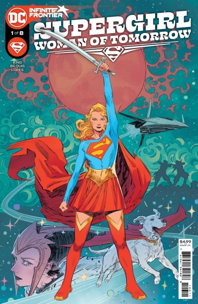
Supergirl: Woman of Tomorrow #1
Written by Tom King
Illustrated by Bilquis Evely
Colored by Matheus Lopes
Lettered by Clayton Cowles
Reviewed by Alexander Jones
Supergirl is back! DC is switching up the creative team and format of the series with former “Batman” writer Tom King joining the acclaimed Bilquis Evely on a new eight-issue limited series starring Kara Zor-El. In the past, writer Tom King has had a tendency to opt into more violent scenes that don’t appear to apply to Supergirl. Reading through the actual issue provided an interesting sense of tonal whiplash. King feels like he’s changing Kara’s personality to fit his story instead of finding a more natural plot for Supergirl’s character. The relationship between Kara and Ruthye is scripted adequately but these moments don’t make up for the needless violence. Bilquis Evely’s art gives “Supergirl: Woman of Tomorrow” #1 a more regal and stoic nature that helps downplay the violent themes of the series.
King’s supporting cast are made of members like Ruthye who have a tragic backstory and leads Kara down a dark path. King is able to establish emotional stakes and threatening villains relatively well in the title. However, King continues to craft moments of violence whenever possible in the story. These endless brawls don’t serve to inspire confidence that King has a direction worth taking. Possibly, the worst part of the issue is the final page that has a painfully obvious comic book ending. After closing the last page I don’t get the sense that King understands the lighter characterization needed for this hero. Supergirl should feel different from other icons like Red Sonja or Wonder Woman.
The silver lining of the entire story has to be the art. Evely’s work matches the immense quality of art from previous titles. The issue has a vivid color aesthetic thanks to colorist Matheus Lopes. The bright blues and yellows really serve to stand out from other titles on comic store shelves. Evely’s careful linework usually shows characters engaged in a complicated motion. Even Krypto has a personality thanks to beautiful expressions from Evely’s art. The issue even teases an interesting visual contrast still to come with Supergirl blending her modern designs with the alien technology. Anyone who is inclined to purchase “Supergirl: Woman of Tomorrow” #1 for the visuals alone will not be disappointed. Evely is in top form here and her rendition of Supergirl looks just right.
Final Verdict: 5.0 – “Supergirl: Woman of Tomorrow” #1’s fantastic visuals are sold short with a script prone to violence that misunderstands the protagonist.


