
There’s a lot to cover on Wednesdays. We should know, as collectively, we read an insane amount of comics. Even with a large review staff, it’s hard to get to everything. With that in mind, we’re back with Wrapping Wednesday, where we look at some of the books we missed in what was another great week of comics.
Let’s get this party started.
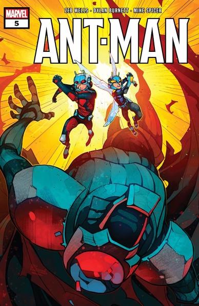
Written by Zeb Wells
Illustrated by Dylan Burnett
Colored by Mike Spicer
Lettered by Cory Petit
Reviewed by Quinn Tassin
You know when you’re reading or watching something and the main character is interesting and cool enough to be the main character but there’s another character who you wish the story was actually about? That’s the feeling I had when I read “Ant-Man #5” by Zeb Wells. Wells has written a relatively solid Scott Lang series so far. It hasn’t quite matched up to Nick Spencer’s work on the character but it’s been funny and fun and a pretty good superhero story. The best part of the book has easily been Scott and Cassie’s relationship but this issue very clearly displayed that the best part is actually just Cassie. In the midst of the medium-good conclusion to a story about Scott taking down a giant evil bug lord, the material that focused on Cassie was pretty great. She’s funny and brave and gets up after she’s knocked down- all the main traits of a good Marvel character. So while this story certainly works just fine, it ends up being pretty forgettable what with its main focus being a less interesting character.
Dylan Burnett and Mike Spicer deliver pitch-perfect art for this story. Burnett’s pencils and Spicer’s colors combine to form a sort of Saturday morning cartoon style that makes this a hyper-readable comic book. The whole sequence of Scott fighting Crematric in the water is perfect comic book nonsense and an absolute blast to read. They also do a great job at capturing smaller moments like Cassie realizing she just got saved by her dad and Scott and Cassie watching the sunset.
There’s this moment right after Cassie is about to get killed and Scott saves her where she’s getting ready to fight again and quips to Macrothax about kicking his teeth out and it felt like that was the comic I’d been wanting to read. Scott Lang is great! But Cassie Lang is greater. This is a pretty good issue of a pretty good comic and it looks really good. But it also left me wondering what might have been.
Final Verdict: 7.7 – The perfectly fine conclusion to the first arc of “Ant-Man” is proof we should’ve been reading a “Stinger” comic this whole time.

Written by Jeff Lemire
Illustrated by Denys Cowan
Inked by Bill Sienkiewicz
Colored by Chris Sotomayor
Lettered by Willie Schubert
Reviewed by Elias Rosner
Charlie has had a rough go of it these last two issues and issue #3 is no respite. Thrown back to 1920s Hub City, he’s a noir detective dealing with the usual tropes: threatening mobsters, corrupt to hell police, a “femme fatale” — who’s strangely reminiscent of Myra Fermin — with a missing brother who’s the spitting image of one Vic Sage. Before long, he’s stumbling across something much darker and, once again, oddly familiar.
Questions continue to pile up without many answers and while this can be frustrating for some, the deliberate lack of answers is refreshing. They’re obfuscated from us, not missing, and trying to puzzle it out before the characters can is one of the greatest pleasures a mystery can provide.
The whole “The Question: The Deaths of Vic Sage” team continues to fire on all cylinders with issue #3. Lemire’s script channels O’Neil’s with enough modernizations and genre concessions to make the issue work as both a greater part of this mini’s mystery and a stand-alone look at what a 40’s noir Charlie Sage would be like.
Cowan and Sienkiewicz are a match made in heaven, inseparable and yet distinct, imbuing the art with a dialog of styles that’s never messy but always full of gristle. Sotomayor’s colors do the very same, never feeling washed out but retaining the seedy and dreary feel of the city, while leaving room to pop, like with The Question’s Blue and Orange suit or when Charlie flashes back to the wild west from the previous issue. I could stare at these pages all day, taking in the details despite many panels being relatively sparse.
Continued below“The Question: The Deaths of Vic Sage” #3 gives the reader a lot to think about and consider, to see how the cycles of organized violence and injustice play out across time, across eras. How frontier justice gives way to police violence and a corrupt city government, all at the beck and call of the same types of powerful people. A timely theme that was timely back in 1986 as well. At the end of the issue, remains the question: how can we use that knowledge to make this time different?
Final Verdict: 9.4 – Sharp, contained yet a part of a greater whole, “The Question: The Deaths of Vic Sage” #3 manages to surprise and excite with each new issue thanks to a stellar creative team.

Written by Johnnie Christmas
Illustrated and colored by Jack T. Cole
Lettered by Jim Campbell
Reviewed by Jodi Odgers
“Tartarus” #3 continues the series’ remarkably strong beginning by expanding the fascinating universe of the comic while tailing complex characters at the heart of non-stop action.
After being smuggled onto Tartarus in sarcophagi by Khars, Tilde and Klinzu watch in horror as he is executed by a gang of kidnappers. They are left alone in this unforgiving, untamed world. They are then separated by a shift in the ground beneath them. They will be reunited later in the issue, but must each go on their own journey of discovery before they do so.
Johnnie Christmas and Jack T. Cole maintain the elegant, brutal balance that they have kept throughout the opening issues of “Tartarus”. The action in the story is perfectly paced, and is interspersed with enough world- and character-building to give said actions meaning and sufficient stakes. Cole’s art style perfectly captures both the grunginess of the cities on Tartarus and its mesmerizing natural features. His character work also adds to the impact of the story, rendering Tilde and Klinzu’s reactions to everything around them in ways that make them come to life. The issue builds to a final-page reveal is both surprising and entirely logical, and will definitely entice many a reader to pick up future issues.
After the end of this issue’s installment of the “Tartarus” story, there is the continuation of the single-issue-exclusive backmatter story, “Life”, written by Stephanie Cooke and with art and letters by Megan Huang “Life” contrasts the relentless energy of “Tartarus” with a more sedate and serene tale. This gives the reader time to fully process the impact of the events of this third issue and helps the reader put the issue down with a more complete sense of pathos.
Final Verdict: 9.2 – “Tartarus” #3 ends some plot threads while weaving a host more into this riveting series.

Written by Jason Aaron and Torunn Grønbekk
Illustrated by Ramon Rosanas
Colored by Jesus Aburtov
Letters by VC’s Joe Sabino
Reviewed by Alexander Jones
Writer Jason Aaron’s incredibly epic “Thor” run may have concluded but the series continues in spirit with “Valkyrie: Jane Foster” #10. This chapter features the finale of the series latest story arc entitled ‘At the end of all things.’ Aaron and Torunn Grønbekk seemingly set up a fairly pedestrian storyline where Thor is possessed by an ancient Asgardian evil. Despite the comic book cliches, the grounded nature of the arc hit a powerful emotional climax towards the end of the issue. Aaron and Grønbekk deconstruct Jane Foster’s role in The Marvel Universe. Foster’s transition to the Valkyrie may have initially come across as rushed but thankfully Grønbekk and Aaron have committed to the status quo and use this title to provide the characterization to get readers acclimated to the new premise.
Guest artist Ramon Rosanas clashes with the slick, polished line from CAFU in previous issues. Rosanas draws a lot of detail on the page with enough flourishes to accurately depict the lively realm of Asgard. However, I still struggle with the anatomy of his characters. Numerous figures like Sif are incredibly thin and tall and not quite as detailed as they should be. Rosanas does justice to Volstagg who carries incredibly stoic facial expressions in the issue. In the pages where the giant battle has consumed Asgard, it is disheartening how similar Tyr’s physical presence is to a character like Fandral. Some of the background details in the issue can be sparse as well. Overall, Rosanas still captures the important details and fight scenes and most of his shortcomings as an artist are only present if you look beneath the surface.
Continued belowJane Foster has been through a lot of continuity in the past couple of years but Aaron and Grønbekk find the emotional truth of Jane within “Valkyrie: Jane Foster” #10. Foster’s physical ability is pushed to the limit while the script also demands a tremendous level of courage and confidence from Jane. Thori’s minor subplot in the issue is also incredibly amusing and one of the highlights of this particular chapter. Rosanas illustrates a few excellent panels of Thori looking cute, sad, and even angry. Thori’s naive outlook is a great contrast to some of the serious heroes in the comic. With the news that “Valkyrie: Jane Foster”’s physical issue cancelation, I hope the series will be able to continue in a digital format for the sake of sheer quality alone.
Final Verdict: 8.0 – “Valkyrie: Jane Foster” #10 is an emotional finale to an arc that pushes Jane Foster to her limits as a hero.

Written by James Tynion IV
Illustrated and Colored by Michael Dialynas
Lettered by Aditya Bidikar
Reviewed by Gregory Ellner
For a series debut, James Tynion IV does a very good job of beginning the work of crafting a compelling world in “Wynd” #1. By using inherently biased in-world sources, he shows at least some of the supernatural aspects through subtlety and carefully-lain exposition. Although the story is named after a single character, this introduction is about bringing an entire world to life, a task that Tynion takes to with great success by utilizing different viewpoints. A purely human gardener’s son can look into higher elements of society, while our eponymous character sees a more down-to-earth approach to his neighborhood. There are also further hints to a far larger world, enough to entice without explaining too much outright.
The overall story appears to take on a fantastical approach to racism, though it is not too overbearing nor overdone. Tynion shows, primarily through the dialogue, that “Wynd” #1 is set in a world with discrimination against those who are somehow connected to magic, those called “Weirdblooded.” There is little focus on what can actually be done with said magic, or why this discrimination exists, but rather the concentration rests on it being a pervasive facet of the entire society, with no mercy given to anything remotely supernatural, making even the more benevolent characters with this prejudice thereby show a far uglier side to themselves in the process, a situation that can be uncomfortably relatable in the modern-day. Not everyone is taken with this behavior, but in its entirety, including the resultant hatred and fear, the writing makes absolutely clear how ugly such a though process makes a culture.
In contrast to the writing, or perhaps enhancing it, Michael Dialynas takes a relatively loose and almost cartoonish approach to the artwork on the debut. Smiles are wide, eyes much the same, and emotions are drawn with an intensity that works best with the children, though there are exceptions in very well-drawn adults. The Bandaged Man is portrayed with an intense foreboding befitting a hunter of sorts, and despite being in broad daylight is drawn as if he were some kind of boogeyman, which he may, in fact, be to some degree. The scariest of the artwork comes in with a gardener deliberately killing a magical vegetable, with a focus on the horrified, dying face of those beings as well as on the instrument of execution. To the gardener, this is a necessity in keeping with his hatred of all magical beings, but to an onlooker, it is appropriately terrifying.
The colors used by Dialynas are rather deceptively bright. In practice, these colors would often make readers feel at home, happy, or otherwise good about themselves. However, by using a soft pink alongside the destruction of a seemingly sentient being, or through the use of a cool blue to accompany both a nightmare from Wynd and his attire in the daylight, all that these colors end up showing is that all is not what it seems in this culture, bound by hate.
Final Verdict: 7.5– A deceptively scary look at a fantastical kind of racism, “Wynd” is definitely a series to look out for.


