
There is a lot to cover on Wednesdays. We should know, as collectively, we read an insane amount of comics. Even with a large review staff, it’s hard to get to everything. With that in mind, we’re back with Wrapping Wednesday, where we look at some of the books we missed in what was another great week of comics.
Let’s get this party started.

“Batman” #25
Written by Tom King
Illustrated by Mikel Janin
Colored by June Chung
Lettered by Clayton Cowles
Reviewed by Michael Mazzacane
As Batman stares down a potential new chapter of his life he reminiscences-confesses to a heretofore unknown incident in Gotham’s history ‘The War of Jokes and Riddles.’ Tom King frames this as an attempt at understanding, connection, for Bruce in a world that all think they know Batman. He insists otherwise. It’s an interesting thematic frame to hang this flashback epic on by King and the various artist on this series. Because this issue makes it clear that the Joker and Riddler understand one another, enough to go to war over.
For the start of an 8-issue arc, King, Mikel Janin, and June Chung all do an effective job setting things up for success. King’s script covers the requisite narrative ground so that this issue feels fulfilling to read as an episode and part of a large whole going forward. Mikel Janin’s page design has excellent flow and reinforces the unnerving feeling of tension that runs through the issue. June Chung’s pallet gives everything a cool, slightly unnatural, hue.
Janin’s page construction has a simple but well-executed flow to it. Primarily pages are designed for an easy vertical reading orientation. The smooth downward gaze easily tracking the motions panel to panel as a vehicle careen into a fountain or slowly pull the perspective out to reveal more. This smooth design fits for a story told by the Batman, one backed up by King’s listing of the sheer amount of legwork the character dose. At the same time, there are cracks in the exterior, sudden bursts, splash pages that disrupt the expected mode. The pace of the book slowly escalates as the reader weights for something to finally give. While the issue does have a couple nice explosions of action it’s how Janin and King undercut this tension that has developed only serves to ratchet it up. There is a pair of back to back spreads that are effectively jokes and references, but simply look so beautiful that complaining about eating up 4 pages for a gag seems petty.
Janin undoubtedly deserves credit for the visual quality of this issue. However, it is June Chung’s colors that tie everything together and really give this issue the veneer of cool. Her smooth color blends accentuate Janin’s light touch on his facials, creating a sense of depth and realism for an ever-smiling clown. The cool colors highly contrast with the solid blacks by Janin’s ink. This contrast creates for interesting textures and images as the smooth figures contrast with the harder-edged world around them.
Final Verdict: 7.5 – The fuse is lit, ‘The War of Jokes and Riddles’ has begun. As always it makes me wish Janin and Chung could somehow do this book all the time.

Black Hammer #10
Written by Jeff Lemire
Illustrated by Dean Ormston
Colored by Dave Stewart
Lettered by Todd Klein
Reviewed by Elias Rosner
Homage, deconstruction, and drama – the three best words to describe this, or really any, issue of “Black Hammer.” Although the present action of this issue is concerned more with the drama, the flashbacks continue the tradition of all three, this time dipping its toes into the shoulder-pad heavy 90s.
Abraham’s attempt to “keep up with the times” is shown as a joke, with the aforementioned shoulder pad popping off at the start of battle and him being entirely unable to fight due to the cumbersome and unfamiliar nature of his suit. It’s a jab at the 90s style of costuming heroes but it also informs us as to the emotional and mental state of Abraham. Plus, it helps us to understand why Abraham is content at the farm and why he doesn’t seem to want to investigate Talky-Walky’s “death” (I’m not fully convinced she’s dead just yet. Just very, very injured. This is still a superhero comic.).
Continued belowOne particular panel that I just loved was at the end of the first flashback. Ormston places Abraham in the bottom corner of the page, outside of any panel, as if he were lost in the empty whiteness of the page. He is small, looking down, his head in shadow. His business is failing and he is no longer the hero he once was, although Metalsmith treats his as if he were. The text seems joyous, thanking Metalsmith for his new costume, but the posing lets us know of his uncertainty, his weakness, and his shame. It is the perfect encapsulation of who Abraham is at that moment in time, why he wants to become a hero once again and is also (maybe) a deconstruction of the constant need for superhero comics to reboot its older heroes as “gritty” and “cool” versions of themselves, instead of leaving them the way they are and making them complex people.
The present action is also paced very well. Lemire and Ormston know how and when to let scenes breathe, with many panels remaining wordless to establish setting or focusing on character faces/actions. They further Tammy’s relationship, Barbalien’s attempts at a relationship, and deepen the mystery of what Madame Dragonfly knows. It’s all really compelling stuff and each conversation, flashback, and interactions reminds us that all of our trapped heroes have lived long lives prior to this, lives we have only been given glimpses into. Lives that, I for one, can’t wait to know more about.
Final Verdict: 9.5 – The mystery deepens, the characters face tragedy, and we get a Liefeld tribute variant cover that sums up the 90s in a much better proportioned image.
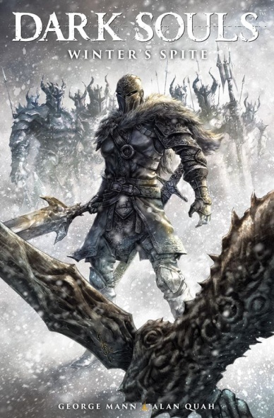
Dark Souls Volume 2: Winter’s Spite
Written by George Mann
Illustrated by Alan Quah
Colored by Komikaki Studio featuring Norah Khor and Sean Lee TCS
Lettered by Rob Steen
Reviewed by Gregory Ellner
As George Mann’s interpretation of the Dark Souls franchise goes, everyone is the hero of their own story. From Andred of Ithvale to the Lady Parnethia to even the antagonistic warrior that caused the plot to be set into motion, Mann gives a good reason for everyone’s actions, making the entire story rather tragic from nearly every angle. Mann’s cast is full of flaws, but also of moments of benevolence, demonstrating how horrid the world is to make such situations possible.
Aside from even the general characterizations, the cast of characters and inventory listed at the back of the volume, as well as in each individual issue, helps to both refresh readers on identities of certain pieces of the story and provide them with tidbits of tantalizing information going forward, as Mann further emulates the bread-crumb nature of the video game franchise at the source of “Dark Souls: Winter’s Spite.”
Alan Quah’s artistic focus seems to be on the pure visceral nature of the world, his paneling showing the uncertain, frantic nature of medieval combat as well as the overwhelmingly foreboding architecture of the setting, towering over the cast and emphasizing their fragility in the face of a harsh world.
In all, the trials and tribulations showcased in “Winter’s Spite” give a very good view of a tragic tale of swords and sorcery, intriguing both for fans of the video game franchise of Dark Souls as well as casual comic readers.
Final Verdict: 8.0- A well-drawn, well-written story that is self-contained and fits well within the world for which it is written.

Eclipse #8
Written by Zack Kaplan
Illustrated by Giovani Timpano
Colored by Flavio Dispenza
Lettered by Troy Peteri
Reviewed by John Schaidler
“Eclipse” #8 is a seamless continuation of the issue that immediately precedes it. In fact, if it weren’t for the relatively arbitrary way that comic books are sometimes structured and released, issues #7 and #8 could easily be a fast paced, tightly plotted double issue that closes out the series’ second arc.
It might work better that way.
The issue starts in flashback, then immediately cuts to the present, a momentarily disorienting jump that relies on the fact you’re fully attuned to the storyline. No recap, no exposition, just action. Don’t get me wrong, I’ll take a tightly written story over endless exposition any day, but if issue #7 isn’t fresh in your mind, you may be a bit confused for several pages as you reacquaint yourself with the plot.
Continued belowThroughout the rest of the issue, writer Zack Kaplan weaves together two major story lines: iceman David Baxter’s attempts to rescue the mysterious albino, Orson, who for some reason doesn’t burn to a crisp when he’s exposed to direct sunlight (unlike everyone else on the planet) and Rose/Cielo’s increasingly high stakes quest to learn the truth about her father and his potentially sinister business dealings.
As with the issues before it, sunlight (instant death to those not protected by special suits) and darkness (temporary respite from the sun’s killer rays) are gorgeously rendered by colorist Flavio Despinza. I can’t think of another book where the colors capture – and even drive – the intense dynamic of the action as much as they do in “Eclipse.” And I can’t imagine another colorist doing it better than Despinza. His blinding, white-hot yellows are truly terrifying. His deep blues, purples, and blacks, accentuated by neon magentas, are bizarrely comforting. Illustrator Giovani Timpano’s paneling and compositions are outstanding, but it’s Despinza’s colors that heighten the tension and encapsulate the constant struggle of a population forced to live in the shadows from the moment the sun first comes up until it finally slips beneath the horizon and the daily curfew ends.
It’s an uncomplicated but extreme dynamic that reaches peak intensity as Rose confronts her father high above the city just as the sun is setting. She stands trapped in a sliver of shadow, hemmed in by the sun’s deadly rays, with seemingly nowhere to go. Suddenly, she makes a daring, unexpected, leaving her father behind. “I’m going to clear myself and tell everyone the truth,” she thinks. “And if my father and his company are to blame – let ‘em burn.”
Up to this point, “Eclipse” has been Bax’s book, with the other characters relegated to supporting roles. With Cielo steeping to the fore, that seems about to change.
Final Verdict: 8.1 Flavio Despinza’s incredible colors drive the story as the focus shifts to Cielo and her quest to find the truth, beautifully setting the stage for an exciting new arc.

God Country #6
Written by Donny Cates
Illustrated by Geoff Shaw
Colored by Jason Wordie and Dee Cunniffe
Lettered and Designed by John J. Hill
Reviewed by Matt Lune
Perhaps the highest praise you can give the final issue of a mini series is a feeling of dismay that it’s all over way too soon. “God Country” feels like a series that had the potential to run alongside books like “Saga” or “The Walking Dead” as an ongoing, seemingly unending drama, and yet Cates, Shaw and the team have crafted a tale no less grand, no less sweeping in its scope, no less truly deserving of the word ‘Epic,’ and they’ve done it in merely six issues.
It wouldn’t be stretching too far into spoiler territory to say that this concluding chapter of “God Country” doesn’t have an entirely happy ending. There’s a weight to the proceedings, and throughout the run there’s been a bittersweet sense of finality as Emmett Quinlan – once disconnected from the world through dementia and now the wielder of Valofax: God of Blades – approaches his destiny at the Kingdom of Always. Through the omnipresent narrator that’s been with us since the start, we’ve always viewed this tale from the end, the enigmatic dialogue boxes telling the story of “God Country” like an epic poem; a mythical tale passed down from generation to generation, and it’s in this issue specifically in which that style really lands. Everything has very literally been leading to this, and it’s that weight that Cates plays on, sometimes subverting expectations and sometimes playing right into them.
The issue centers around Emmett’s ultimate battle with Attum, God of Kings, and the events of last issue led us to believe that Emmett saw this as a one way trip. There are some twists and turns getting there however, but there’s as much a battle of wills and words as much as muscle, Cates’s script channeling Kirby, Starlin and Claremont as Attum revels in his grandiosity. Despite the title, however, “God Country” was never about the deities above, but the very real mortals caught up in an eternal, cosmic conflict. This issue feels like a satisfying, if heartbreaking resolution to the family drama that’s been at the core of this series. A son, desperately trying to save his father; a wife, struggling to keep her family together and her daughter safe; a father, his mind and memories restored, overwhelmed with extraordinary responsibility. All of this feels like too much to wrap up in six issues, yet Cates manages it in a way that feels effortless.
Continued belowShaw’s artwork takes all that the script demands, all of the epic weight of this concluding issue, and not only meets but exceeds expectations. His depiction of a very real, mortal man battling against an incomprehensible power is perfectly structured. One page in particular sees Emmett, sword in hand, fending off a vicious barrage of godly might. Shaw slices through the panel with sharp black lines that batter the small frame of an elderly man who’s in way over his head. Each of the two subsequent panels close in on his face as a nosebleed and a clenched jaw depict a character pushed beyond his extreme. Wordie and Cunniffe’s colors are a vibrant, unnatural purple and the inks drag the shadows and form of Emmett back along the page and make you feel like the man himself is being unmade.
There are many moments in this issue that are like those described above – epic, godly battles – yet there are as many intimate character beats that feel just as large and important even if the scale is smaller. A double page spread depicting a lifetime of memories is captured by Shaw in a collage of overlapping panels, and it’s followed by a full page that utilises the illusion of depth to make the issue’s most emotional moment truly resonate.
“God Country” has been a series determined to craft a modern day heroic legend, one that feels as old as time but distinctly modern, and it’s in this final issue that the pieces all fall into place and the whole becomes fully realised. Cates and Shaw demonstrate an impressive economy of space, and in just six issues have told a story that could have run for years, but instead didn’t need to. This is the finale that other series dream of.
Final Verdict: 9.5 – An ending as intimate as it is grand, a near perfect concluding chapter.

Grrl Scouts: Magic Socks #2
Written and Illustrated by Jim Mahfood
Colored and Lettered by Justin Stewart
Reviewed by Christopher Lewis
At first glance a reader may not like this comic. It does not contain a story, but instead a debacle of crude women, violence, sex, drugs, etc. for no reason except to present the aforementioned things. However, Mahfood and Stewart give us something special with the art, which compliments the story so perfectly that the comic could be considered its own art form.
From a writing perspective, Mahfood gives the backstory to the magic socks, but barely moves the story forward. There also is no character development throughout, which is not a surprise because, as stated above, the issue is really about being crude and getting a reaction from the reader.
Mahfood and Stewart’s art is chaotic and at the same time beautiful. Each character is the epitome of insanity and the illustrations give the same feel complementing the story with precision. Stewart’s color schemes are phenomenal, changing with each main character shown on the page. Finally, Mahfood hand draws each panel using typical layouts in calmer settings, but in areas where the story is a faster paced or depicts a fight scene the panels skew giving a sense of disorientation and allowing the reader to feel what is happening on the page.
Final Verdict: 8.5 – A book which is an art form onto itself. However, the writing is really for people with a juvenile sense of humor.

Iceman #2
Written by Sina Grace
Illustrated by Edgar Salazar & Ibraim Roberson
Inked by Ed Tadeo & Ibraim Roberson
Colored by Rachelle Rosenberg
Lettered by VC’s Joe Sabino
Reviewed by Jake Hill
I was really into the Kitty and Iceman romantic relationship. They’ve both been treated like the babies of the X-Men for a long time, but they both have stepped up as adults as the team has needed them. They were there for each other, they’ve both got huge hearts; it made sense to me. Then Bobby came out as gay in a clumsy story by Brian Michael Bendis. Since then, I’ve felt a little betrayed on Kitty’s behalf. She’s my favorite X-Man. Was Bobby ever going to talk to her?
Continued belowThey finally have their heart to heart in “Iceman” #2. It’s not everything I could have hoped for, but their adventure together reads as super-real and full of heart. The two of them don’t resolve everything by the end of the issue, but they acknowledge that they are still good people, they still care about each other a lot, and they are still going to have each other’s backs no matter what. I got a little choked up.
Sina Grace fills his script with jokes. Awful jokes. That’s sort of the point, and every character is constantly calling each other out on how lame their “chill out” and “chill vibes” quips are. On the one hand, it reads as very true to Kitty and Bobby. On the other hand, it’s genuinely grating, and the bit overstays its welcome. While the humor is sometimes clunky, the heartfelt exchanges are perfect.
The art in this second issue feels like a big step up from the previous. Faces are more consistent for one, and Bobby loses that bad case of old man face he had in issue 1. I’m still having a tough time understanding what he looks like when he’s not in ice form, but everyone else has memorable features. Particularly Kitty, with her atrocious new haircut, but hey, she’s trying to look the older leader part.
One place where the entire team shines is in the use of mutant powers. In a book so driven by emotions and characters, it would be easy to spend the entire time in a diner eating pancakes, and never doing superhero stuff. The premise of the action- that Kitty and Bobby need to rescue a mutant kid from an angry mob in West Covina (Hey! West Covina!)- is as typical as an X-Men issue gets. But the situation is a background to let the emotional stuff play out while Bobby does clever things with ice slides, ice golems, and huge piles of slush.
So “Iceman” does a lot more right than wrong. Even when the writing gets as irritating as the main character, there’s a genuine core that makes this book feel important. I mean that in every sense of the word. It’s important in terms of being one of Marvel’s first books headlining a queer lead, it’s important to Iceman’s development, it’s important to the X-Men as a whole. When so many Marvel books feel inconsequential, “Iceman” manages to feel like an important chapter in the X-Men story.
Final Verdict: 8.2 – “Iceman” tries to do a lot, but succeeds most in its moments of emotional honesty.

Nick Fury #3
Written by James Robinson
Penciled by ACO
Inked by Hugo Petrus
Colored by Rachelle Rosenberg
Lettered by Travis Lanham
Reviewed by Nicholas Palmieri
A well done single issue story is the way to my heart. The “Nick Fury” team has my heart.
With a team working so well together, it’s difficult to point out any one person’s contribution as standing out, though the timeline of events can be deduced. Robinson wrote a script with only the necessary exposition at the front and action scenes paced out so ACO could come in for the kill on pencilling duties. Once ACO finished rendering his busy, hyper-detailed panels with surprising layouts on each page, Petrus inked to pop art perfection. Rosenberg then detailed each of the figures with neon hues, intricate where needed and bold where that would have the most impact. Lanham’s letters then worked their way into the pages, filling in the spaces ACO no doubt left for them and colored according to the rest of the art. While it’s simple to figure out what happened when, the final product’s overwhelming success can’t be attributed to any one person due to how seamless everything reads.
Was the story anything we haven’t seen before? No. But for those marvelous fifteen minutes it took to read this issue, I was bombarded with style, artistic skill, and a satisfying beginning, middle, and end. When executed as well as this, sometimes that’s all we need from a comic.
Final Verdict: 8.9 – A high octane single issue action tale so well crafted that it’s hard to tell where one creator’s influence ends and another’s begins. They don’t make ‘em like this anymore, folks.
Continued below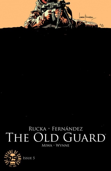
The Old Guard #5
Written by Greg Rucka
Illustrated by Leandro Fernandez
Colored by Daniela Miwa
Lettered by Jodi Wynne
Reviewed by Kent Falkenberg
“The Old Guard” #5 is an explosive and brutal issue. Greg Rucka and Leandro Fernandez close out the first arc of what’s arguably Image’s best new ongoing with the comic book equivalent of a jab-uppercut combo. Rucka’s writing packs an emotional punch with the left hand and Fernandez’s Darwyn-Cooke-via-Eduardo-Risso artwork delivers a knockout with the right.
If you haven’t been reading this – go now, catch up while there’s still time. And if you have, then take a deep breath, because it’s been one hell of an experience. Maybe a couple month’s hiatus is just what the doctor ordered, so we can sit back and take stock of the lifetime over lifetime over a lifetime of love, loss, betrayal, and kinship that we’ve just been witness to.
“Life means nothing, if it’s not worth living,” Booker laments in his own defense, as Andy confronts him over last issue’s treachery. Fernandez blocks out this confrontation immaculately against a backdrop of barren desert. Daniela Miwa baths the moonlit scene with a deep, melancholic blue. The sparse setting and color choice make a beautiful pair and they capture the sense of isolation and loneliness that’s become a life sentence for these unlucky few blessed with immortality. This sequence seems to perfectly encapsulate exactly what “The Old Guard” #5 is trying to say about the depths some may plumb to make it stop, and the lengths to which others might go to find something, anything to once again believe in.
And there’s a fantastic juxtaposition between the nihilism of those characters and the profound love between Nicky and Joe – that bond that’s been forged through century upon century. Strapped to a chair and an operating table, and having been subjected to all manner of torturous examination, their view could easily be as bleak. However, Rucka’s succinct dialog not only captures the voice of two characters that can say so little to one another because they already both know so much but implies an optimistic, everything-will-be-okay-as-long-as-we’re-together vibe without sounding trite or cliche.
“I’ve been thinking about Malta,” says Nicky.
“Which time?” Joe asks. Then, after a pause, “Oh. That time in Malta.”
“Yeah… We should go back.”
Rucka hits these quiet, emotional beats so well in “The Old Guard” #5 that it’s almost a shame that Fernandez comes along to shatter the silence with a gunplay ballet that seems to rival The Matrix for both inventive visual flair and total rounds spent. Almost a shame – except for the fact it’s one of the most riveting firefights I’ve ever seen drawn. Fernandez’s paneling and layout tactics keep leading the eye up, down, across and back over full pages. The sound effects rattled off by the weaponry fight for their own prominence, jumping from behind panels to the fore and bobbing and weaving around elements of the artwork itself. It’s thrilling and kinetic and visceral and given oh-so-much added weight because of the empathetic resonance of the overall storytelling.
Rucka’s writing and Fernandez’s art – they’re a lethal one-two punch. Come to think of it now, I was probably wrong up at the start – it’s really hard to tell which one is the setup and which one is the knockout. But either way, “The Old Guard” #5 hits hard and it hits to hurt. This is a heavyweight coming to take the title.
Final Verdict: 9.5 – Out with the new, and in with “The Old Guard.”

Red Sonja #6
Written by Amy Chu
Illustrated by Marcio Fiorito and Carlos Gomez
Colored by Mohan
Lettered by Tom Napolitano
Reviewed by Chris Partin
There’s a point when you think a story has reached it’s conclusion and you’re ready for it to end. You’ve checked all the boxes that you think needs to be checked and start looking for those closing character moments as you’re sure that the issue that you are reading is the final part, but then you get to the last page and realize – NOPE!
Continued belowRed Sonja #6 is what should have been the conclusion of the open arc of Amy Chu’s run on this series. Six issues in (seven if you count the #0 issue) and all things within the story point that this is the conclusion, and when all of the characters breathe that deep sigh of relief they realize things are not over. Chu is creating a very serialized series with Red Sonja and is not looking to just write story arcs that have a beginning, middle, and end. THere is something that ties one story to the next. Yes. This particular story arc of how Sonja makes it to the present day and how she defeats Kulan Gath, but at the same time there’s more to the story that Chu will show readers in the next issue. For now, this issue is an ending to an arc, but not the story as a whole. Chu’s decision to not make a hard stop with this issue is great, and just calls out to the readers to not stop here because she’s obviously not. Readers should show back up because there’s more to tell, and that’s what you want a writer to do. They need to be able to entertain the reader and then as the story arc concludes they need to convince the reader they want more. Chu does that with this issue.
The art in this issue is good. Both Marcio Fiorito and Carlos Gomez and strong cartoonists and have a style that blends well with one another. Last issue Fiorito’s art seemed a little stiff, but this issue there’s a solid blending between bother Fiorito and Gomez to the point where I’m not entirely sure who’s doing what in this issue which is a perfect example of having two artists working on a book together and neither being distracting. Both artists have created a very energetic issue. Mohan’s colors throughout the issue are great. Both Gomez and Mohan have been on board the series since issue #0 and that kind of consistency does wonders for a book this early in it’s run. Fiorito is a welcome addition to this team.
Red Sonja has been a fun ride so far and with the creative team taking Sonja on a road trip starting with the next issue there’s an endless amount of stories that can come out of it. If you’ve missed out on this series, jump on with this issue and see how it leads into the next story arc.
Final Verdict: 7.5 – Overall this issue is an entertaining book and helps keep this series in the top half of my pile of comics to read every month.

The Wild Storm #5
Written by Warren Ellis
Illustrated by Jon Davis-Hunt
Colored by Steve Buccellato
Lettered by Simon Bowland
Reviewed by Alexander Jones
The past couple of issues of “The Wild Storm” have really pulled the series together with an onslaught of interesting and characters and ideas that have finally started coming into place. Each member of the huge ensemble cast finally feels like they are finding their place in the overall Universe that Warren Ellis is reimagining with the framework of the Wildstorm characters and ideas.
This issue’s close look into the character of Michael Cray is an excellent character piece and a strong set of character work from Ellis. The book has some excellent pacing as Cray starts to deal with the foreboding nature of his diagnosis while his loyalty from one organization starts to waver, is it really worth making the world a better place if you aren’t going to be alive much longer? While Cray’s extremely personal struggles aren’t the only big plot thread of this excellent title, it is the main thrust of the issue driving the narrative forward.
Jon Davis-Hunt delivers on the big character moments, showing individuals that are expressive enough to handle the huge exposition dealt in this story. His art has a rough quality that is exemplified by the brighter backgrounds in the book a little too clearly. When the book goes for darker colors and backgrounds the imperfections become harder to spot and Jon Davis-Hunt’s pencils start to live up to their true potential. The artist gets his chance to draw the intense and supernatural, tapping into a psychedelic influence that he adapts nicely to the overall tone of the comic. Ellis asks a lot of him as the writer touches base with everything from the supernatural to new technology.
Continued belowIn addition to uncovering forgotten Wildstorm characters that we’ve already been following, this issue offers the slightest tease at some multiversal implications for the overall book. While the last issue was the installment that got to pay off some loose threads that have been building for a while, this chapter of the series becomes much easier to invest in now that the characters and sides of the conflict have been established better in “The Wild Storm.” Fans that have been following this set of characters since the original Wildstorm days are going to have a step up on newer readers just because of the previously established relationship with the individual characters.
This book is all over the map stylistically. One scene is going for the tone of a gritty crime drama, while the next brings supernatural elements home to roost. The book calls upon the “X-Files” in some moments with Lucy Blaze examining a crime scene and veers into some deep psychological trauma when Michael Cray spends some time figuring out what he wants to do with his last moments on Earth. “The Wild Storm” #5 is all over the map but achieves so much in the space of just one issue.
Final Verdict: 8.5: “The Wild Storm” #5 pulls disparate threads of the past few issues together to show off the fascinating ensemble cast filling out this great new series.


