
There’s a lot to cover on Wednesdays. We should know, as collectively, we read an insane amount of comics. Even with a large review staff, it’s hard to get to everything. With that in mind, we’re back with Wrapping Wednesday, where we look at some of the books we missed in what was another great week of comics.
Let’s get this party started.

Written by Jeff Lemire
Illustrated by Andrea Sorrentino
Colored by Jordie Bellaire
Lettered by Steve Wands
Reviewed by Quinn Tassin
It’s less than thrilling when a story’s premise makes you sigh heavily. Somehow it’s even more exhausting when that story is about one particular Caped Crusader. Maybe it’s that there has been such a plethora of Batman stories like this one and maybe it’s that Scott Snyder specifically wrote a story very similar to this one about a year ago but “Batman: The Smile Killer #1” is a generally disappointing outing for writer Jeff Lemire. The one-shot follow-up to “Joker: Killer Smile” tells the relatively uninteresting story of Bruce Wayne being locked in a mental hospital, told that his whole life as Batman has been a delusion. The whole thing is meant to seem mysterious, working overtime to be as impenetrable as possible as it thrusts us between a classic Batman story, the mental hospital, and a young Bruce Wayne being manipulated by a terrifying kids’ show hosted by the Joker. The thing is he’s Batman. Of course, he’s going to be Batman. Nobody wants to read a comic about Batman being gaslit where he doesn’t end up being Batman!
The saving grace of the book is Andrea Sorrentino’s art and Jordie Bellaire’s colors. The pair is able to imbue the whole issue with a dreamlike quality that almost makes the story work. When they show Batman and Joker facing off, only for that to melt into the “real world,” it’s a genuinely affecting sequence. The same goes for Bruce’s Shawshank-esque escape from the mental hospital and young Bruce murdering Thomas Wayne. Without Sorrentino and Bellaire, this would be an actively boring read. There’s probably an audience for “Batman: The Smile Killer #1,” but this writer is not a part of it.
Final Verdict: 5.7 – A tired concept is saved by gorgeous art in “Batman: The Smile Killer #1”
Written by Al Ewing
Illustrated by Butch Guice
Inked by Tom Palmer
Colored by Paul Mounts
Lettered by VC’s Cory Petit
Reviewed by Joe Skonce
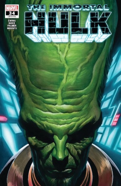
One of the highlights of Al Ewings’ run on ‘The Immortal Hulk’ is his ability to take the various characters who have had their lives impacted by gamma radiation and build a bigger mythology for the Hulk. It has largely been successful, showing how these characters are all connected to The One Below All, a demonic entity impacting the lives of Bruce Banner, Sasquatch, and others. In “The Immortal Hulk” #34, Al Ewing brings The Leader into the fold, connecting his history and past lives to the larger conflict. The issue has some problems but is a good story which is enhanced by the work of the art team.
“The Immortal Hulk” #34 covers a vast amount of time, pulling from Samuel Sternes’ past plots, teams, and desires to be a truly superior being. The majority of the issue is epistolary, with much of the narration being in the form of journal entries dictated by The Leader. The problem is that there were moments that were confusing. The entries indicate what life we’re following by simply putting the number and a slash before the entry. There were just moments where the timeline felt muddled as we saw not only the lives and failures but also his resurrections. Sometimes it was difficult to determine where the new life began. On second reading, it worked better, but on the first pass, it was confusing.
While the script was at times confusing, the art helped indicate that “The Immortal Hulk” #34 was borrowing from previous stories, which did clarify the sometimes confusing timeline. Butch Guice and Paul Mounts do a good job of replicating different art styles, this is best represented by the Ben Day dots of the first journal entries. The coloring is the best in the different resurrection sequences. It suggests a place out of time and with each visit it becomes darker and more sinister, with the face of the One Below All becoming more pronounced each time. The art helped to clarify the passing of time and how the different lives varied. Overall, Ewing does successfully fold The Leader into his bigger gamma story, there were just some problems in the execution of the issue.
Continued belowFinal Verdict: 7.5 – “The Immortal Hulk” #34 features good writing and impressive art, but a muddled timeline prevents it from being truly outstanding.
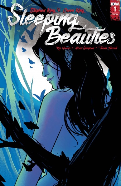
Written by Rio Youers
Illustrated by Alison Sampson
Colored by Triona Farrell
Reviewed by Kobi Bordoley
The three-person team working on “Sleeping Beauties” by IDW Publishing have a mission: convert the 700 paged Stephen King and Owen King source material into a 10 issue comic story. The task seems impossible, but based on “Sleeping Beauties” #1, doesn’t seem out of the picture. The story, while cluttered at times, pairs strong writing with impressive, stylistic art.
Plotwise, “Sleeping Beauties” #1 follows the typical pre-apocalyptic prologue script. Through rumors and news snippets, it’s clear that Something Sinister is Afoot. While this happens, the townsfolk go about their day, smoking cigarettes and side-eyeing reality, waiting for the hammer to fall. In the case of “Sleeping Beauties” #1, that hammer is a sleeping sickness that suspends its victims in an unshakable reverie, with the added touch of cocooning their faces in a sticky web. Gross. The kicker? Sleeping sickness only affects women.
Youers does his best to adapt the plot to the comic form, but one of the limitations here is that the Kings’ world is so character dense that it’s hard for us readers to keep up with who’s who. Luckily, strong characterization helps sort things out. The conversations between Dr. Norcross and Janice are especially quippy yet still feel hard-boiled enough for the genre. Regardless, I still found myself re-reading a few pages to get clear on what was going on. Some amount of ambiguity is good — that’s what gets readers to ask, “What happens next?” Too much ambiguity, though, and the reader only asks, “What just happened?”. This happens the most in “Sleeping Beauties” #1 when the sometimes eccentric panel layouts cramp the art, which is unfortunate because Sampson and Farrell do such a good job.
In fact, “Sleeping Beauties” #1 shines most in the illustration department. Sampson draws characters with a deft hand, molding each with a mix of expressionism and realism. Farrell’s colors are truly stand-out, and her emphasis on red, purple, yellow, and green-tinted Appalachian skies does so much to up the psychedelic atmosphere of the story. There’s a lot of magic in this world and the prospect of exploring that in future issues definitely has us excited.
Really, so much of “Sleeping Beauties” #1 feels like a foggy yet dazzling acid trip. Somewhat dense but always beautiful, this one’s worth a read just to see how the behemoth of a source material plays out in a comic form. We’re guessing it’s going to get weird.
Final Verdict: 7.7 – Sleeping Beauties” #1 offers a unique mix of trippy scenery and impending horror, which makes us curious to see where this Stephen and Owen King adaptation goes next.
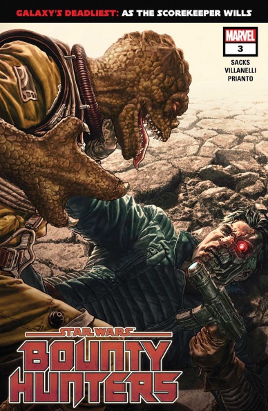
Written by Ethan Sacks
Illustrated by Paolo Villanelli
Colored by Arif Prianto
Lettered by VC’s Travis Lanham
Reviewed by Kerry Erlanger
One of the best things about Star Wars is there’s an infinite number of possibilities. It’s nice when a comic like “Star Wars: Bounty Hunters” steps out of the Rebels vs. Empire box to focus on something different. Though, if it wasn’t for little reminders, you might forget this was a Star Wars story in the first place. Is that a bad thing? Yes and no. It at least opens the comic up to readers who might not give a damn about the political machinations of the Galactic Empire, even while it leaves others longing for a more grounded story.
Issue #3 gives us our first glimpse of Lash, though we’re still left wondering why she assassinated the heir to Mourner’s Wail. Ethan Sacks is rolling that reveal out slowly — a smart move. Curiosity keeps you invested. He adds weight and dimension to what easily could be an issue-long fight scene through flashbacks and Valance’s light continual annoyance at his droid, Nine-Four-El, which gives the reader something to engage with beyond settling scores. The relationship between droid and human has always been one of the best Star Wars tropes. People are constantly yelling at their droids for being obnoxious as if they didn’t design them to be that way.
Continued belowAlso, the overarching theme where Valance’s cyborg body is constantly half functioning in battle is great. Where’s a palm blaster when you need it?
Paolo Villanelli draws some intense fight scenes in this issue, particularly with Bossk looking like a badass T-Rex. It’s fun to see Bossk duke it out, especially if your only exposure to him was in The Empire Strikes Back. One complaint is the fight scenes are sometimes a little too ridiculous. Artists like Will Sliney (“The Rise of Kylo Ren”) have taken arguably more powerful and volatile weapons (lightsabers, the force) than used here and managed to make his fight scenes look not as overdramatic. It wouldn’t be the worst thing if Villanelli toned it down a bit.
“Star Wars: Bounty Hunters” #3 ultimately ends where it began with a million scores waiting to be settled. With Lash found, it’ll be interesting to see where the story will go in issue #4. It feels like it’s already wrapping things up when it definitely isn’t.
Final Verdict: 6.5 – An enjoyable read if you’re a casual fan or big into the bounty hunters, but it’s a little lackluster in satisfying the need for a story more grounded in the Star Wars universe.

Written by Tom Taylor
Illustrated by Bruno Redondo
Lettered by Wes Abbott
Colored by Adriano Lucas
Reviewed by Michael Govan
For my money, “Suicide Squad” is one of the best ‘superhero’ comics out right now. It’s got great writing and artwork, an engaging premise, fascinating characters…I don’t even usually like the “Suicide Squad” comic but here I am, looking forward to every issue.
After the previous, (sometimes literally) explosive issues, #6 reads more like a lighthearted interlude. Task Force X detours through Gotham to get the bombs in their necks removed and have a run-in with Batman. Pretty straightforward but a fun time nonetheless.
Tom Taylor writes in several chuckle-worthy moments, my favorites probably being Deadshot holding up a dog so Batman doesn’t knock him out and Bruce not being able to disappear because Wink stole the Batmobile. While there’s a slight deviation from the regular mayhem and major plot twist in the previous issue, the story is still very engaging here.
The art team is definitely firing on all cylinders as well. Artist Bruno Redondo and colorist Adriano Lucas work beautifully together. Redondo draws an imposing Batman, glowering in his cave or rearing back a punch while Lucas adds dramatic effect by sometimes shining a light on the Dark Knight or completely obscuring his face in shadow.
A dingy, dirty back-alley doctor’s visit is still plenty colorful thanks to Lucas. I especially appreciated the ominous blood-red skies in Gotham, the ‘mood lighting’ immediately taking me back to Batman: The Animated Series. Speaking of callbacks, I don’t know whose idea it was to add Adam West-style sound effects to the fight with Bruce but it was an amazing (and hilarious) touch. Overall, another great issue for this title. “Suicide Squad” hasn’t missed yet.
Final Verdict: 7.5 – Come visit Gotham City! Get a bomb removed from your neck, get the crap kicked out of you by Batman…good times.

Written by Chris Condon
Illustrated & Lettered by Jacob Phillips
Reviewed by Christa Harader
“That Texas Blood” #1 offers us an initial one-shot peek into a new noir series with a lot of potential. Condon and Phillips work hard to blend the spacious, blasted landscape of the modern American West with the restrained sensibilities and hard realities of small-town life. It works, mostly.
There’s one scene in particular – a dream sequence that ends with a gruesome pop – that illustrates what works in comics versus what works in film or in prose. That much dialogue on a page is dizzying, even broken up as it is, and the focal point is meant to be the two characters conversing by the fire. It ends up being the balloons, and we start the scene with a broken mood and, thus, at an emotional deficit. The following page works much better, split up as the story’s end is throughout several strips and individual panels.
Continued belowThis moment aside, “That Texas Blood” #1 delivers on weirdness and restraint, with good art and style from Phillips. Borderless panels, vertical shading, and a bleached desert palette create an arid mood, while darker nighttime scenes punch up the drama. Condon’s dialogue is decent, and choosing a focal object around which the bones of the town are built is a smart introduction to this world. The main craft drawback here is the lettering. The book uses a font that’s cramped, both in terms of kerning and leading. As a result, it’s hard on the eyes. There’s too much padding and awkward connections between some balloons, and some odd overlaps as well.
Overall, “That Texas Blood” #1 has potential, and the one-shot delivers enough impact to pique our interest for more.
Final Verdict: 7.0 – “That Texas Blood” #1 gets a little wordy a little quick, but offers enough intrigue to keep reading.

Written by Donny Cates
Illustrated by Nic Klein
Colored by Matt Wilson
Lettered by VC’s Joe Sabino
Reviewed by Luke Cornelius
After four issues of build-up, “Thor” #5 gives us our first encounter with the multiverse-threatening Black Winter, and the creative team does not disappoint.
Cates’ script opens the issue in Asgard, where Sif is feeling powerless, Beta Ray Bill is praying for forgiveness, and the newly arrived citizens are struggling to fit in. These elements connect to give the issue a moment of calm that emphasizes the looming threat that the Black Winter poses before plunging us into the star plague. Klein’s artwork expresses the wavering resilience of these characters superbly; On the first page, he positions most of the action centrally, only for Sif and Beta Ray Bill to be shifted to the right. Wilson’s suitably bright coloring of Asgard works as a thin facade to cover the frailty of the situation.
Following this scene, we see Thor and Galactus struggling against the Black Winter and its inky tendrils. When the Winter speaks, Sabino’s lettering does an excellent job of using the word balloons to characterize its voice; they’re jaggedy and spiked, as well as outlined twice by white and grey lines to give the Winter a powerful but broken voice. Likewise, the font is sharply edged but scratchy and unevenly marked, furthering the distorted nature of its voice. The combination of Sabino’s lettering with Cates’ dialogue is crucial because the Black Winter’s true form is left almost entirely absent from the book, choosing to take the shapes of the plethora of characters who have defeated Thor in the past instead. Klein’s artwork excels throughout the action sequences between Thor and his foes and gives them a frantic, intense, and overwhelming energy that doesn’t relent.
In a superhero book, seeing villains resurrected, either truly or not, is not uncommon, but in “Thor” #5, Cates uses it to dig deeper into the mythology of the character, taking Thor’s numerous deaths and connecting them to something larger. With the Black Winter threatening the multiverse, the creative team had never struggled for scale in the series, but now there is a direct and personal attack on Thor building that explains the recent changes seen in Mjolnir.
With “Thor” #5, the creative team has combined for another exciting entry into the series that provides a pay off to the Black Winter build-up as well as a tease for an even larger threat.
Final Verdict: 8.7 – “Thor” #5 is a great comic that makes the Black Winter’s arrival as epic as anticipated.
Written by David Mariotte and John Barber
Illustrated by Alex Milne
Lettered by Jake M. Wood
Reviewed by Matthew Blair
Personally, the idea of having two of the most iconic robot franchises of the 1980’s meet and fight each other is an idea that makes my inner eight-year-old smile. It’s the robots in disguise against the cybernetic organism with living tissue over a metal endoskeleton. Let’s see how it turns out.
“Transformers vs. The Terminator” #2 has two writer credits. Normally, this could be interpreted as a warning sign, but writers David Mariotte and John Barner make it work. It’s very clear that both writers have a keen grasp of the mythology of both sides and they manage to make it fit together very well. While the comic doesn’t do a lot to add to the mythos of either of these properties, it does allow both sides to show off their skills and talents. The only potential downside is that Terminator fans might be a bit disappointed in that their favorite killing machine is kind of outmatched against the Transformers, but that’s what happens when a human-sized robot with regular weapons goes up against giant robots with heavy armor and lasers.
Continued belowAlex Milne provides the artwork for “Transformers vs. The Terminator” #2 and it is very pretty to look at. Milne nails the detail and looks of each of the characters, which is perfect for licensed properties that must have had strict rules on how they should be portrayed. Also, this is a very action-heavy issue and Milne does a great job of making each page look as dynamic and as energetic as possible. There are some times where the pages can feel a little bit crowded, but it’s still entertaining to look at.
“Transformers vs. The Terminator” #2 is a pure popcorn comic with a solid script that respects and understands its characters and is paired with some very good artwork. If you’re a fan of either of these franchises, it’s a book worth checking out.
Final Verdict: 8.2 – It won’t change your life, but it will appeal to your inner eight-year-old.


