
There is a lot to cover on Wednesdays. We should know, as collectively, we read an insane amount of comics. Even with a large review staff, it’s hard to get to everything. With that in mind, we’re back with Wrapping Wednesday, where we look at some of the books we missed in what was another great week of comics.
Let’s get this party started.

Cable #2
Written by James Robinson
Illustrated by Carlos Pacheco
Inked by Rafael Fonteriz
Colored by Jesus Aburtov with Federico Blee
Lettered by VC’s Cory Petit
Reviewed by Kent Falkenberg
Any opinion of “Cable” #2 will be contingent on how much mileage you get out of watching Marvel’s time-travelling, silver-fox throw down against a cadre of 16th Century ronin wielding flaming techno-enhanced weaponry. If that’s your kind of jam, then set your mind on auto-pilot and enjoy. James Robinson and Carlos Pacheco have put together a breezy, polished 20-plus pages, for the most part.
But if you take a closer look under the hood, you’ll start to notice a couple of cracks in the seals. The bulk of Robinson’s script focuses on Cable’s methodical takedown of the samurai troop who cut off his arm at the close of the last issue. Pacheco depicts this action with brutal efficiency and clarity, which makes for a smooth read. However, nothing much happens in terms of character development or forward plot progression. And unfortunately, the sequence leading up to the centerpiece melee suffers from a few misfires in the storytelling.
The mysterious figure that Robinson is setting up as Cable’s foil, storms a Japanese palace and demands the assistance of a Japanese lord. Pacheco’s costume design– a patchwork collection of warrior’s accoutrement most likely collected over time-hopping through the centuries – and the bold, centralized framing used within the first few pages imbue this character with a gravitas that suits a central antagonist for the series. But his defeat of the lord’s bodyguards happens awkwardly off panel. And the effect of a well-rendered, inferno engulfing the palace as this person walks silently away is almost wasted amidst the confusion resulting from Robinson and Pacheco never really addressing how the fire was started in the first place. To be fair, you can infer what happened in-between panels, but that doesn’t stop the need to read and re-read the section to make sure you didn’t miss something.
That sort of thing happens a couple times over the course of “Cable” #2. And it throws off the rhythm of an otherwise smooth issue. It’s something that could probably be looked past if there was a bit more depth to this issue, but ultimately, there’s not a lot going on beneath the surface level. Robinson can script an exciting fight comic with samurais and laser-swords and Pacheco can make it look slick. But when that’s all there is, and there are a few moments that come along to scuff that sheen, they unfortunately stick out more prominently than they otherwise might.
There’s little in the way of character motivation written into this series. And that’s fine. If Robinson and Pacheco want “Cable” to be nothing more than a violent game of hopscotch from one disparate past to another, there are worse ideas out there. But they need to smooth out the execution and really ramp up the adrenaline to keep people biting on that hook.
Final Verdict: 6.0 – Sometimes, just being breezy isn’t enough.

Defenders #2
Written by Brian Michael Bendis
Illustrated by David Marquez
Colored by Justin Ponsor
Lettered by VC’s Cory Petit
Reviewed by Alexander Jones
“Defenders” #2 still lacks the foundation to make readers invest in each member of the team. The element tying the book and the overall heroes together is Diamondback, a second-rate Luke Cage villain brought back from the dead. Instead of investing time into why Diamondback is a viable threat to this powerhouse team, the issue pits the characters together in a simplistic brawl.
There’s an interesting cliffhanger set up with Luke Cage from the last issue of the series that is resolved quickly here without enough resolution from the creative team. The worst part about this installment of the story is how a familiar street-level hero pops in at just the right time to save the day before exiting stage left at the resolution of the cliffhanger. A similar situation occurs later on in the issue, making it clear to the reader that Bendis is taking some shortcuts on the writing duties here. Moments like these make the story feel so convenient and safe when the “Defenders” should be pushing the envelope about as far as it could go. To make matters worse, the cardinal sin from the first issue is still present here: each character bleeds into the other’s personality. Last issue we saw team members finish each other’s sentences.
Continued belowThe simplistic plot spends so much time on resolving cliffhangers and having splashy action scenes these that there’s no room for Diamondback to be developed. If you were hoping for a happy ending to this downer of an issue I’ve got bad news; Bendis again introduces an unwieldy random element to the series that feels cheap and easy.
While David Marquez is a welcome addition to the book, his depiction of Linda Carter or Night Nurse’s uniform brings out an element of the narrative that is offensive and doesn’t match up with how male characters are drawn. Marquez draws some really beautiful panels here despite sparse backgrounds. His page layouts are experimental and Marquez adds excellent body language in his scenes–readers would be able to tell Matt Murdock and Ben Urich apart just from poses alone. When there’s an onslaught of words filling the page I can usually count on Marquez to make this script still fun to look at. The cliffhanger for the series is just ominous and well-drawn enough to be exceedingly memorable. The framing of this panel and the lack of text on the page shows some strong execution on Marquez’s behalf. Despite a hiccup with Carter’s uniform, this is a well-drawn comic book.
Bendis fails to tap into what makes the “Defenders” special again in the series’ second issue. Despite his fabled legacy with the team, each character lacks the memorable distinction that made them so profound back in the early 2000’s under his guidance. If “Defenders” is nothing else than a jolt of nostalgia, I’ll be sitting on the sidelines eating popcorn and enjoying the well-crafted artwork.
Final Verdict: 5.5 – Despite stellar work from David Marquez, “Defenders” #2 is out of touch with the individual personalities of Marvel’s Netflix heroes.

The Dregs #4
Written by Zac Thompson and Lonnie Nadler
Illustrated by Eric Zawadzki
Colored by Dee Cunniffe
Reviewed by Matt Lune
It many ways, it all comes down to this. “The Dregs” #4 is the end of this grisly noir dystopia, and in retrospect, it could only end this way. Despite a departing message that very much stresses the journey, not the destination, there’s a frustrating desperation felt by the main character that cannot help but be echoed by the reader. It’s an entirely intentional feeling on the part of the creators, and it’s a testament to their craft that this issue evokes such feelings, but nevertheless, those feelings exist. You want more: more from the story, more for the characters, more of anything resembling hope. This, however, is not that story.
“The Dregs” has been a consistently brilliant series. Here though, in its final issue, it feels as though everyone involved has raised their game. What’s even more amazing is the art of Eric Zawadzki, a creator that’s consistently played with form and structure, a creator that has never felt like he’s holding back suddenly feels like a man unleashed in this issue. His creativity, experimentation and dizzying page structure has always been the central focus that has perfectly captured Arnold’s investigations. As his story concludes and his case descends into increasingly desperate madness, Zawadzki twists and manipulates his landscape, his world and his form in ways that feel like an artist surpassing even his own expectations.
This is a book of two halves. The first half is a fairly linear narrative that all but concludes the self-imposed detective-like journey of our protagonist, and the second half is the fallout of his discoveries, the claustrophobic conclusion to the tale. The former section sees Arnold finally face the masterminds behind the mystery, and through an overconfident villain we’re privy to all the gruesome details, the only thing matching how low down these characters have sunk is how high up the conspiracy goes. Zawadski plays with the space between characters here, using hand-drawn borders to frame and separate the talking heads, the backgrounds stretching through several of the densely packed panels as the cast moves through them.
The second half of the book is a frantic, nauseating struggle by Arnold to make sense of what he’s witnessing, clinging unsuccessfully to his sanity as the weight of his grim reality tears him apart. About two-thirds of the way through “The Dregs” #4, the book ironically turns to black and white, cruelly mocking a world that could never be that simple and emulating the noir films that Arnold increasingly retreats into. At this point, Zawadzki breaks free of any formal page structure and instead relents to a distorted, bewildering depiction of Vancouver. What starts with a page faithfully recreating the urban landscape becomes a swirling, claustrophobic madness that feels like the city itself is turning on the protagonist, chewing him up and spitting him out. The city he has fought so hard for finally turning against him. It’s a stunning seven-page sequence that would sit amongst the best depictions of madness ever created for the medium.
Continued below“The Dregs” #4 is an ending that stresses the importance of the search for the truth rather than actually solving the case, a realisation that provides very little comfort for our wannabe hero. Arnold struggles to find purpose where there is none, which in a very real way has been his true journey all along. His need to become like his fictional heroes has been his way of making sense of the world, and when that fails him, when even his novels let him down and visions of hard-boiled detectives and sultry femme fatales provide little respite from the delirium, the fictional construct itself deteriorates, as if even the issue itself is turning against him. Stunning.
Final Verdict: 9.6 – A visually breathtaking tour-de-force that provides an almost flawless conclusion.

Jonah Hex/Yosemite Sam Special #1
Written by Jimmy Palmiotti and Bill Matheny
Illustrated by Mark Texeira and Dave Alvarez
Colored by Paul Mounts and Dave Alvarez
Lettered by Saida Temofonte
Reviewed by Gregory Ellner
Jimmy Palmiotti crafts a tale of an older Yosemite Sam, one who is more interested in prospecting than hunting Bugs Bunny (usually). Even with having calmed down slightly, the classic volatility of the mustachioed gunslinger often shines through. He acts as a good counterpoint to the cold, quiet actions of the famed Jonah Hex, whose tale is said far more with imagery than dialogue. With the added input of the anthropomorphic rooster Foghorn Leghorn, this wacky adventure has a lot going its way.
Where dialogue sometimes doesn’t cover enough, the combined efforts of Mark Texeira on pencils and Paul Mounts on colors settles the rest. While a fun journey, the issue’s relatively dark tone of violence carries through well with a lot of shading and guns poking into panels. Most poignant is an image of a cloud in the vague shape of Tallulah Black’s head, a reminder of times gone by that the creative team manages to forge without a single word.
Much like some of the other DC Comics/Looney Tunes crossovers, the mashup of Jonah Hex with Yosemite Sam is a combination so perfect, it is a surprise that the franchises had not come together to make the story of ‘Comin’ in A-Shootin’’ earlier.
Final Verdict: 8.0 – A fun, albeit violent story in “Weird West” style, with interesting panel angles and an interestingly moral look at an aged Yosemite Sam.

Mother Panic #8
Written by Jody Houser
Illustrated by John Paul Leon
Colored by Dave Stewart
Lettered by John Workman
Reviewed by John Schaidler
After a cold-blooded but creepy murder in the previous issue (by an unseen killer dressed in a coroner’s body bag), writer Jody Hauser slows things down to add layers of detail and complexity to Violet Paige’s character and backstory. Throughout the previous seven issues there were already plenty of parallels to Batman’s origin story, but now they’re unmistakable. Indeed, “the shadow of the bat” looms large over the “Mother Panic” universe. For many readers, in fact, Violet Paige has been nothing but a lesser, spoiled brat version of Bruce Wayne – born into wealth a privilege, hobnobbing with Gotham’s elite while carrying around a giant chip on her shoulder that also comes from having endured tragic loss during childhood.
To be sure, creating a brand new character in the iconic world of Gotham is a difficult task on its own. Building a book around a mysterious, caped vigilante who’s hell-bent on revenge is almost begging for trouble. And indeed, many readers thus far have found Violet Paige and her alter ego Mother Panic to be unoriginal and even unlikable. After a bloody glimpse into her hyper-intensive training regimen at Gather House, an incredibly well drawn scene with Otis (the “Ratcatcher” part of his life may be over, but he still has the teeth and whiskers of a rodent), and two hugely interruptive red-on-black, visceral panels of Violet overwhelmed by back-stabbing pain as her cybernetics fail, suddenly that all changes.
In this issue, Violet becomes a fully three-dimensional, wounded but resilient protagonist with fully relatable motivations and desires. We may not fully agree with how and why she does what she does, but get where she’s coming from. Now, we know who she is.
Continued belowJohn Paul Leon’s excellent line work (new to this series as of issue #7) absolutely amplifies this feeling of immediacy and connection. In virtually every panel, Violet’s emotions are written all over her face – droopy eyes as she sips coffee, apprehension as she contemplates recruiting a surveillance team of rats, and pure agony as she endures sudden shooting pain. Aside from his outstanding expressions, Leon’s framing and panels are similarly close and intense, forcing us empathize completely and feel everything Violet feels.
Dave Stewart’s earthy colors, on the other hand, are utterly infused with decrepitude and decay. The Gotham that Batman inhabits is often an almost a monochromatic world of moonlight and shadow that seems to only exist at night. Stewart’s colors are more nuanced and definitely less dramatic, but very much constrained. Everything feels rusted and faded, rotting from the inside out, tarnished with sickly yellows, tired blues, and rotted browns. You can almost smell the must and stench of a cellar wafting up from below. This is the Gotham that Violet decries as a “shithole” and we can’t disagree. We see and feel the disintegration that she so often rages against and as she becomes more likable, she seems less like a snobby brat and more like a valiant fighter that we want to get behind.
Final Verdict: 7.7 If you’ve either been holding out or possibly bailed out a few issues back, it could well be time to give “Mother Panic” a try. Ironically, in slowing down the action, things have picked up speed.
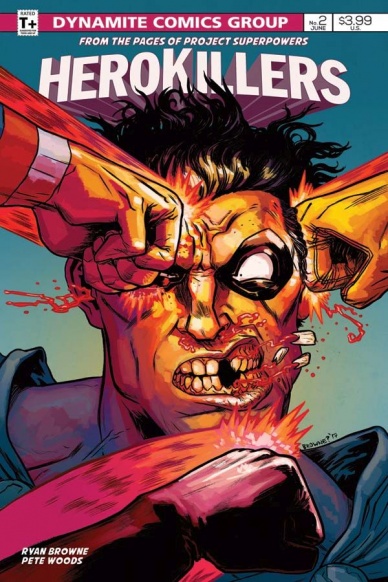
Project Superpowers: Hero Killers #2
Written by Ryan Browne
Illustrated and Colored by Pete Woods
Lettered by Crank!
Reviewed by Nicholas Palmieri
You know you have a special comic when it can make you laugh at loud multiple times while also keeping you on the edge of your seat. “Project Superpowers: Hero Killers” understands both satire and storytelling.
A book like can usually run the risk of getting too dark or too pretentious, but Browne and Woods always maintain a levity in the proceedings. These sidekick characters may have deliberately murdered a hero, and that may drive the tension of the story. But the funeral scene can still poke fun at the grimdark hero funeral tropes, inserting ridiculous speechifying over the images of crying heroes. Everything is dark and gloomy at the funeral, including the requisite rain and mournful angel statue, yet all we hear are lines about the hero’s “spooky-ass crimefighting” and how great of a pharmacist the man was. Beyond the funeral scene, all other parts of the issue are colored with bright primary colors, which only makes the insanity of the events stand out. Browne and Woods understand how ridiculous these conventions are and understand that an upbeat or bright delivery of dark humor can create a welcomingly idiosyncratic tone.
Likewise, as “Project Superpowers: Hero Killers” develops, we’re always given smaller jokes. The mayor keeps tearing the key to the city off the neck of the previous recipient and handing it to a different hero, complete with Woods giving each character a hilarious reaction face and Crank inserting unconventional sound effects. After the kids jump through a glass window, one stops to pick a shard of glass out of his shoulder, Woods positioning the moment in the panel so readers won’t miss it. There’s one particularly great moment making fun of hero disguises, leading up to a full-page reveal that I don’t want to spoil because I’m still laughing about. I had a great time with the satirical aspect here alone.
The story, as mentioned, keeps the tensions high with character decisions driving the scenes. Most tension comes from the sidekicks’ attempts to cover up a murder, including their interactions with others after having shifted the narrative to make themselves look like the heroes. With a plot set up, it’s now up to the character beats to take us through the story, and with Browne providing natural (or, with some characters, comedically stunted) dialogue and having his characters make unexpected decisions, the story constantly keeps you pushing forward to the next page.
A humorous tone, hero sidekicks, character-based dramatic tension, and well-formed satire. Even if “Project Superpowers: Hero Killers” isn’t as tailor-made for you as it is for me, I’m sure any comics reader will have enjoyed their time with the book.
Continued belowFinal Verdict: 8.9 – The best superhero satire you aren’t reading.
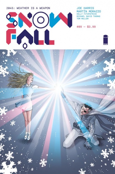
Snowfall #9
Written by Joe Harris
Illustrated by Martin Morazzo
Colored by Kelly Fitzpatrick
Lettered by Michael David Thomas
Reviewed by Forrest Sayrs
“Snowfall” was this really awesome premise that never really clicked for me. Issue #9 does very little to address the underlying problems as the series abruptly slams to a close. While looking for a word to describe this issue, I kept coming back to ‘unsatisfying.’ It’s a word I’ve used to describe the series as a whole, but it really comes to the forefront here. The science is too magical. The dialogue is too stilted. The characters are more like caricatures. All of these individual quibbles are then exacerbated by a sudden ambiguous conclusion that forces the question, “what was the point?”
Almost from the beginning of “Snowfall,” there have been a lot of issues with the ‘science’ of series, but here at the end of the road, things go very much off the rails. What was ostensibly a book about weather control ventures into the weird territories of mind control, sentient weather and even apparent resurrection. The Formulary at the heart of the story started out as mysterious science MacGuffin but ended up being a poorly written Deus Ex Machina, apparently able to solve all of the problems of the world in a single page.
Harris’ writing doesn’t really help matters. All of the characters feel very clichéd this issue. The recurring segment of the children’s story of the White Wizard has gotten so old by this point, that I was actually thankful for it turning out to be a brainwashing tool. The writing feels lazy. These are really simple tropes compounded with unfortunate stereotypes of corporate leaders, Japanese geishas, and eco-terrorists.
While the story elements of the book feel rushed and half-baked, the art remains much the same as it has throughout the series Morazzo’s delicate lines and superior background work are clearly high quality, but the style has never felt quite right. The combination of western style faces with panels that seem more like manga plays a big part of my personal discomfort with the art, but I think there’s also some uncanny valley issues, especially with Inspector Davitika. Her cybernetics, set against her otherwise realistic face, never seem to be the same size from panel to panel, which has the effect of dehumanizing her.
“Snowfall’s” biggest draw, the intriguing premise of weather as a weapon in a post-ecological disaster world, is almost completely absent from this last issue. It has taken a back seat to a mismatched collection of ‘-punk’ tropes and hurried resolution. While there was definitely something worthwhile here, #9 has stripped almost everything valuable from the series.
Final Verdict: 4.4 An undeniably poor ending to a series that had a lot of promise.
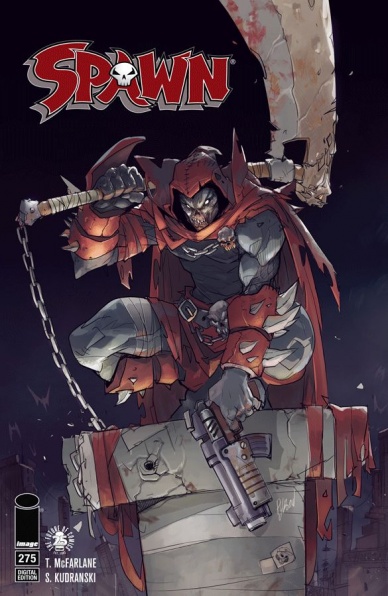
Spawn #275
Written by Todd McFarlane
Penciled by Szymon Kudranski
Inked by Szymon Kudranski and Todd McFarlane
Colored by Fco Plascencia
Lettered by Tom Orzechowski
Reviewed by Chris Partin
Spawn #275 is the last issue of the current writer and illustration team of Todd McFarlane and Szymon Kudranski. While McFarlane will continue to be involved in the plotting of Spawn he’s handing over the writing reign to Darragh Savage. The new artist will be Jason Shawn Alexander. Why open up a review on a book by telling you what’s coming in the next issue? As a reader, you need to realize this is the current team’s “hand-off” issue and it comes off as a very clean hand-off while keeping the story moving along and not using it as a means to wrap things up.
This issue is right in the middle of the Soul Crusher storyline and while the villain is not up front in this issue, his presence and threat to Cyan and all of those around her is very up front causing Al and Terry to make some difficult decisions regarding her safety. Acting on these decisions also causes Al to reach out to others he has helped and has been helped by in the past. Overall, the issue’s story touches on a lot of characters and a lot of events that are happening and giving readers a nice amount of information and interactions to digest. A casual reader or someone who may have been away for a while can easily pick up this issue and know enough of what’s happening with the characters.
Continued belowMcFarlane’s storytelling is very matter of fact with the characters. There’s not a lot of wasted space with the dialogue because there’s a destination he needs to get to by the end of this issue and he has a lot of ground to cover. The story does not feel saturated with dialogue or scenery. McFarlane is a talented writer and has shown a lot of growth as a storyteller over the years. This issue is a perfect example of that growth.
Szymon Kudranski’s art throughout this issue is just amazing. There is a dark tone and feeling that he provides without over using shadows and just muddying up the linework. Kudranski’s pencils are tight and allow a lot of room for Fco Plascencia to come in and breathe a different kind of life into the art with colors. The melding of the two is a very pleasing sight and one that will be a strong example of how the modern look of Spawn should be seen by readers as well new art teams that get a chance to work on this series.
Final Verdict: 7.5 – This issue a nice wrap-up issue for the current creative team and pushes the story forward giving the new creative team some new scenery to work with while staying firmly in the Soul Crusher arc.
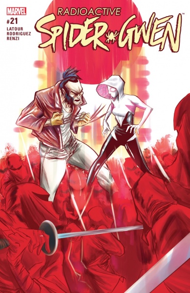
Spider-Gwen #21
Written by Jason Latour
Illustrated Robbi Rodriguez
Colored by Rico Renzi
Lettered by VC’s Clayton Cowles
Reviewed by Elias Rosner
The lines begin to converge, the gwenom approaches and nothing will ever be the same again! Seems like a tag-line for Marvel’s newest event instead of the next couple issues of “Spider-Gwen” but, here we are, midway through the Predators storyline with all the pieces of Murdock’s plan having finally been revealed…mostly. This arc seems to really be dragging its feet, maybe because we keep cutting between three different but interconnected plot points, with too much emphasis on Murdock.
While it is nice to finally be clued into the details of Murdock’s plans, Latour and Rodriguez are still keeping his long-term goal fuzzy but, based on him being, you know, the kingpin, I think it’s safe to assume he just wants more control over everyone, underworld or not. Rodriguez, this issue is given plenty of great opportunities to really play up the shadows on Murdock, drawing him in deep reds and purples. He’s always got a very smug smile on and when he doesn’t, he never breaks the façade of control he has over the other players in his game. Rodriguez even makes a phone conversation feel like an in-person confrontation, slowly zooming the camera in, building tension until Harry smashes the phone, leading us into the final fight.
The big scene of Gwen frantically trying her hardest to find another way to save Harry, only to realize that she can’t is probably the highlight of this issue, next to the return of some much-needed levity with the Bento bandit. In the panel that she realizes it, her eyes seem to talk, cluing us into the despair she just noticed in herself, while the looming threat of Murdock’s ninjas are just behind her.
Like I said last time, though, we haven’t had enough time with Gwen just dealing with her lack of powers and figuring out what spider-woman is to her. It’s always been seen through the lens of some other, bigger problem. That struggle continues to take a backseat here and instead, we get a lot of Murdock and Captain Stacy. Gwen’s worries about working with Murdock could have been made to parallel Harry’s slow mutation throughout the pages of this issue. How she fears that she might become a monster by accepting Murdock’s way of doing things. We’d get to ask if she is willing to become that monster in order to stop someone else from becoming one. That is a question that I wish was more central to this arc.
Final Verdict: 7.3 – Better than the last but still too much Murdock, not enough Gwen.

X-O Manowar #4
Written by Matt Kindt
Illustrated by Doug Braithwaite
Colored by Diego Rodriguez
Continued below
Lettered by Dave Sharpe
Reviewed by Michael Mazzacane
A change in artist, Dough Braithwaite taking over for Tomás Giorello, doesn’t appreciably change the aesthetic of “X-O Manowar” as it begins it’s new arc ‘General.’ Colorist Diego Rodriguez continues to color the book and apply that classic pulp cover texture to Braithwaite’s illustrations. Braithwaite is still clearly playing in the same key as Giorello’s previous art, except objects and figures, are given a bit more hard-edged detail. Faces are no longer slightly hazy from a shadow, instead they react with horror as they meet their untimely, violent (but not too violent), ends.
Where Braithwaite really separates himself from the previous artist is the chance to create the large vistas of Gorin like the Helio Fields and the sovereign lands of the Burnt tribes. With the Cadmium spider-like walkers in the distance on the Helio Fields, Braithwaite gets to do his rendition of the Battle of Hoth. These great vistas are contrasted with the sharper close quarters view of the action as combats get eviscerated, melted, and otherwise annihilated in an attempt to capture the Cadmium leader. The setting allows Braithwaite to build a real sense of scale compared to the cramped quarters of the Cadmium capital city.
While it’s clear that writer Matt Kindt has this series well planned, issue 4 feels slightly repetitive by reiterating the Azure battle principles of a win at all costs. It’s an echo of the backstab laden latter portion of the ‘Soldier’ arc and feels slightly needless. Azure suicide bombers are there to keep the action going after the walker sequence but drive no major revelation. Braithwaite draws Aric with a rather nice “Tired Of Your Shit” face as his superiors try to normalize the abnormal for the Visogoth. He already knew the people who pressed him into service where untrustworthy. It all feels like an attempt to repeat and emphasize a moral greyness which already existed if you stopped and thought about it for a minute. Perhaps this repetition is due to the Valiant sales pitch that issue 4 is a new jumping on point. Which in that regard it isn’t the worst place to start.
I’m not really an “art” person. Yes, this is a visual medium, but it’s about art in the context of the narrative and I’ve found it easier to follow writers. “X-O Manowar” is different this is a book I pull and enjoy reading for the art. Yes, it’s in service to realizing by a well-crafted story by Matt Kindt, but the art team comes together to make one of the best looking sci-fi titles currently being published. It echoes golden age sci-fi sensibilities with the work of artists like Jean-Claude Mézières. The fact the story, overall, is so enjoyable is a happy bonus.
Final Verdict: 7.5 – Great art and a narrative that creates the conditions for that art makes for a good read.


