
There’s a lot to cover on Wednesdays. We should know, as collectively, we read an insane amount of comics. Even with a large review staff, it’s hard to get to everything. With that in mind, we’re back with Wrapping Wednesday, where we look at some of the books we missed in what was another great week of comics.
Let’s get this party started.

Daredevil #31
Written by Chip Zdarsky
Penciled by Mike Hawthorne
Inked by Adriano Di Benedetto
Colored by Marcio Menyz
Lettered by VC’s Clayton Cowles
Reviewed by Alexander Jones
“Daredevil” is back with a brand new storyline entitled ‘Lockdown” in honor of Matthew Murdock’s new status quo. This issue is yet another fascinating piece making up Chip Zdarsky’s odd “Daredevil” run. Zdarsky is joined by artist Mike Hawthorne, inker Adriano Di Benedetto, and color artist Marcio Menyz. Hawthorne’s artwork is easily the best part of “Daredevil” #31. The issue is focused on some really heavy themes while Hawthorne’s expressions and body language make an issue that should feel boring, quick and exciting. Hawthorne has an eye for page design that complements his figure work really well. This installment of Daredevil has a lot of intrigue and noir that calls for great art and Hawthorne really shows he’s become a solid artist on this title over the past couple of issues. The script for this new storyline leaves something to be desired.
“Daredevil” #31 does not carry the art’s level of quality into the writing and dialogue. There are numerous scenes in the issue where people are screaming. Zdarsky’s sense of melodrama almost borders on parody here. There’s a moment trading screen time between Elektra and Kingpin where both characters are going through a similar amount of rage. These two scenes should feel different but both come off as generic and contrived. There are so many moments where Daredevil and the supporting cast take themselves way too seriously. The “Daredevil” television series was able to make the most out of the Kingpin character by focusing on the quiet moments. Zdarsky is also handling a ton of character threads and is not able to make the most of Elektra’s new role.
Over the past couple of runs on the character, the “Daredevil” series has had a hard time sticking to one idea. Zdarsky clearly has interesting pieces and an impressive sense of continuity with this run but he doesn’t seem focused enough on the plotting. Readers should expect to see a level of payoff now that we are so far into this story. Mike Hawthorne’s art is really impressive. After this issue, Hawthorne is now a Marvel talent to keep a close eye on. However, “Daredevil” #31 is able to juggle Matt Murdock’s plot more sufficiently. If Zdarsky was a little more thoughtful with the rest of his representation of anguished characters this story would be a lot better. The biggest issue with Marvel’s current “Daredevil” run is Zdarksy’s unbalanced tone.
Final Verdict: 5.7 – “Daredevil” #31 is a frustrating, unfocused issue with vivid art.
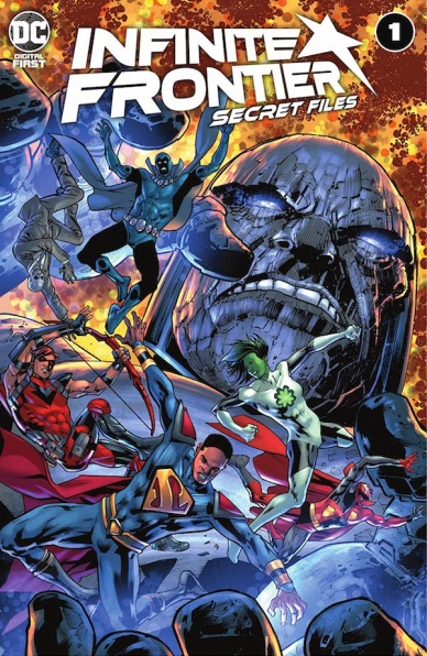
Infinite Frontier Secret Files #1
Plotted by Joshua Williamson, Brandon Thomas, Stephanie Phillips, and Dan Watters
Scripted by Brandon Thomas, Stephanie Philips, and Dan Watters
Illustrated by Valentine De Landro, Inaka Miranda, Stephen Byrne, and Christopher Mitten
Penciled by Phil Hester
Inked by Andre Parks
Colored by Marissa Louise, Triona Farrell, Nick Filardi, Stephen Byrne, and Dave Stewart
Lettered by Tom Napolitano
Reviewed by Brian Salvatore
The ‘Secret Files’ one-shots are a DC tradition going back to the 1980s, but they are often a mixed bag. For every story that really shines a light on a character, there is another that is mere recap and/or exposition. Luckily, “Infinite Frontier: Secret Files” is far more of the former than the latter.
“Infinite Frontier” scribe Joshua Williamson acts as showrunner of sorts for this title, co-plotting all of the stories and helping to ensure some tonal consistency outside of the framing device of Director Bones reviewing files. These six stories focus on characters that have re-emerged as of late: President Superman, Roy Harper, Jade and Obsidian, the Totality, Director Bones, and Psycho Pirate.
Continued belowOf those six stories, only the Roy Harper and Director Bones stories felt insignificant or unnecessary. And while those stories both looked great, courtesy of Inaka Miranda and Phil Hester, they didn’t really give us a better understanding of the characters themselves. The Bones story was a lot of fun, and since he’s a minor character who has been on the periphery for some time, it’s a nice refresher. But the Harper story is the definition of telling and not showing, and going over ground that “Infinite Frontier” #0, #1, and “Green Arrow 80th Anniversary 100 Page Spectacular” did better very recently.
While the Totality’s story was a lot of fun and the Jade and Obsidian tale a nice inversion of their usual relationship, the two standout stories were the first and the last. President Superman’s tale from Brandon Thomas and Valentine De Landro perfectly picked up the tone and ambition of Grant Morrison’s creation without it feeling like they were aping Morrison’s style. There were some really fun ideas on display, as well as some gorgeous artwork from De Landro, who has the ability to distill these characters into simple but beautiful renderings that emphasize storytelling.
Psycho Pirate’s story, by Dan Watters, Christopher Mitten, and guest colorist Dave Stewart, is a meta tale that doesn’t overstay its welcome or overplay its hand. The Mignolaverse art team really knocks this out of the park, with the illustrations mirroring the circuitous line of questioning that Psycho Pirate is spewing. This piece feels really special, even if there’s not a ton of new information revealed.
Final Verdict: 7.6 – This book works really well as a companion piece to “Infinite Frontier” and a nice primer on where the DC Universe is, and is heading.
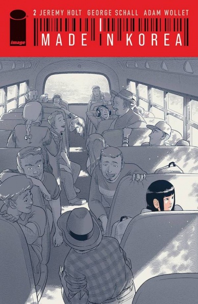
Made In Korea #2
Written by Jeremy Holt
Illustrated by George Schall
Lettered by Adam Wollet
Reviewed by Alexander Manzo
Writer Jeremy Holy gets the ball rolling by merging the two storylines from the first issue. Kim Dong Chul gets fired from his job and immediately heads to Texas to find and raise his creation. It feels like an emotional decision rather than a rational one due to his sudden job change. His actions in Texas feel similar to a parent who put their child up for adoption and immediately regrets it because he has no real plan and essentially tries to weasel his way into the home.
Jesse’s parents are shown in a more sympathetic light due to their lack of knowledge of being parents. Not only did they get a child, but one that immediately goes to high school so it’s tough to navigate all these new waters. There’s a moment when Jesse’s mom has to remind her husband that Jesse is their daughter and not an appliance when he feels a bit overwhelmed. It’s a moment for him to realize that, yes, he can return her, but the whole purpose behind her was to be their child and to be taken care of. The themes of adoption and teenage angst come out in this issue that shows even in this futuristic world still exists.
The art by George Schall utilizes a simple clean method that pairs nicely with the complexity of the story. Schall does a good job of filling panels with great details such as when Jesse is at the library and the books fill around her. He spares no detail that makes even crowded panels feel personal and focused. There is a page of Jesse’s journey throughout the school where there is no dialogue but the reader is able to feel the despair growing in her attempts to fit in.
Even the panels that are blank around the characters don’t feel like they are missing something; instead, they’re a good opportunity for the reader to really soak in the emotion or power of what is going on. The panel in which Kim Dong Chul has been fired and walking through the office utilizes the blank space by showcasing the shocked glimpses from his co-workers. The color choices that Schall makes fit the science fiction theme, with colorsa bit muted with small bright splashes to keep the reader’s attention. There is a strong shift in the last couple of pages with the wooded area filled with more color than previous pages that hints at new storylines emerging.
Continued belowFinal Verdict: 8.2 – A solid hook into the main storyline and with some breadcrumbs for it to go awry.

The Mighty Crusaders: The Shield #1
Plotted, Illustrated, and Colored by Rob Liefeld
Scripted by David Gallaher
Lettered by Jack Morelli
Reviewed by Henry Finn
“The Mighty Crusaders: The Shield” #1 in a reimagining that feels underwhelming and unneeded.
The story itself reads more like a pamphlet or filler episode of a bad anime. There is barely a plot to review, as half the book is filled with pages of people standing in place with a lazy character description overhead. We are never given a reason to care about any of the leads through words or actions. The other half is stuffed with action scenes punctuated with terrible punchlines. When being told to surrender his armor, the Shield replies “Since you asked so nicely…the answer is NO!”
Another moment of nuanced character development appears when he declares “I don’t fight for what America is, I fight for what it could be. That’s the kind of hero I am.” I could go on but thankfully, there’s only 22 pages, so eventually you’re put out of your misery. The only interesting twist is the spectre of a dark Shield hanging over the team, adding an edge that modernizes the property to at least the early 90s in sensibility.
Rob Liefeld’s art also underwhelms, most specifically showing a lack of sophistication in the page layouts. The dynamic panel designs in which Liefeld was well-known for early in his career seem to have given away to lazy placements all around. Pages that need gutters are not given them, and characters break panels without clear motivation. All the panels are drawn with straight right angles with no texture or stylization. The comic alternates between static splash pages and 3-4 panel action sequences robs the book of any sense of rhythm or energy to carry it from beginning to end. He does seem to put effort into the details of the characters but none in drawing any kind of backgrounds or environment to give you a sense this story is happening in a fully-formed world.
Final Verdict: – 2.0 this books feels like an impression of a 50s comic book company doing an impression of a 90s comic book.

Parasomnia #1
Written by Cullen Bunn
Illustrated by Andrea Mutti
Colored by Andrea Mutti
Lettered by Simon Bowland
Reviewed by Ryan Fitzmartin
Heavy on atmosphere but light on story or characters, “Parasomnia” #1 is a mixed bag. This debut issue follows an old man, a traveling adventurer, and an unhappy woman. How they are related, or their stories linked is left largely unclear. “Parasomnia” #1 leans heavy into the mystique, implying much but saying very little. Veteran horror writer Cullen Bunn gives us hints of a cult, magic, royalty, and something deeply sinister, but no sense of how it’s all related. This setup seems designed to leave the reader asking questions and wanting more, but is too vague to provide a real hook. There’s not enough character depth to latch onto or plot to engage with. It’s all too esoteric to be interesting. Perhaps later issues will provide illumination, but the introduction here doesn’t give enough cause to go out and buy them.
The art, drawn and colored by the highly talented Andrea Mutti is of more interest. Mutti’s art style is harsh, and well suited to this dark, mysterious comic. Mutti attempts to make up for the lack of plot with style, tone, and interesting locales. We get a decaying underpass, spooky forest, unwelcoming city, and dangerous inn. Mutti gives great care to the environments, creating a strong sense of place despite the vagueness of the script. Mutti casts a dreamlike vibe over the whole issue, leaving white, unfilled gaps in the backgrounds of panels to create a distant haze. It’s all very effective at creating this sense of mystery the creators were going for, but sadly the story and people aren’t there to create a hook for the next issue.
“Parasomina” #1 is for sure a bold and strong effort, but it’s hard to say it gets results. It is possible to have too much mystery, although fans of deliberately abstract and vague art might find something to like. Fans of David Lynch, perhaps might appreciate the dedication to atmosphere over clarity. Yet altogether, “Parasomnia” #1 feels like a big swing and a miss.
Final Verdict: 5.8 – “Parasomnia” #1 is a bold effort, but ultimately comes up short on story and character.


