
There’s a lot to cover on Wednesdays. We should know, as collectively, we read an insane amount of comics. Even with a large review staff, it’s hard to get to everything. With that in mind, we’re back with Wrapping Wednesday, where we look at some of the books we missed in what was another great week of comics.
Let’s get this party started.
Written by Gerry Duggan
Illustrated by David O’Sullivan
Colored by Mike Spicer
Lettered by Joe Sabino
Reviewed by Grace Taylor
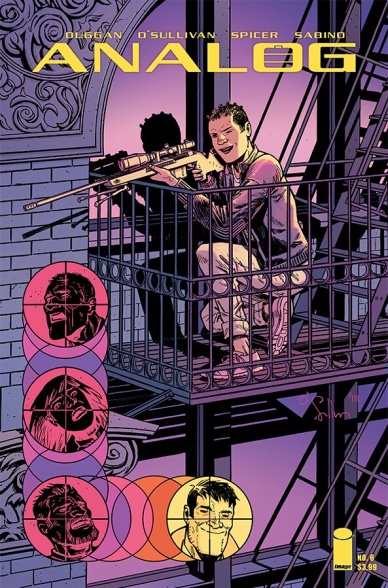
After the satisfying conclusion to its first story arc, “Analog” #6 continues its momentum with plenty of suspense, action, and surprises. At the beginning of the issue, we are provided a bit more of a glimpse into the world of “Analog,” which is eerily reminiscent of where technology is heading in the real world. Although this backstory section is brief, it reminds us of the stakes of the characters and pulls us back into the noir mystery.
A large part of the success of “Analog” is in all the details within Duggan’s writing and O’Sullivan’s artwork that compliments each other. This is especially true in the development of the characters. In this issue, for example, many of Jack’s wounds have healed and he’s grown a large beard, indicating that some time has passed by within the story. He’s cleaned up noticeably and is more focused in his eyes shown in a close-up panel on page 11.
These kinds of details also let us understand the personality quirks of each character. One of my favorite characters in “Analog” #6 is tiny, old, but hardass Sam who always has a cigarette in her hand – we can almost hear the gruffness of her voice. She’s small in stature but doesn’t take crap from anyone, especially when she threatens to “kick their dicks off.”
This new arc is a refreshing start as the female characters, Sam and Oona, take the lead in the story. With these ladies at the forefront, “Analog” #6 amps up the gore and violence by highlighting their combat skills and strengths. There is a full page dedicated to an assassin’s head exploding from a massive gunshot – dangling spinal cord and all.
The highlight of this issue is the focus on different characters, aside from our main hero, Jack. Along with their action chops, I hope that Duggan will dive deeper into Sam and Oona’s backstories as this arc progresses, and not just limit Oona to Jack’s love interest/work partner. I can’t wait to see how “Analog’s” world will continue to expand to other cities and how the mystery will further unfold.
Final Verdict: 9.0 – “Analog” #6 was worth the wait and amps up the action to another level as its mysterious plot moves forward. The supporting characters of Sam and Oona take the lead with this new story arc and do not disappoint.
Written by Bill Golliher
Penciled by Dan Parent
Inked by Rich Koslowski and Bob Smith
Colored by Glenn Whitmore
Lettered by Jack Morelli
Reviewed by Vanessa Boney
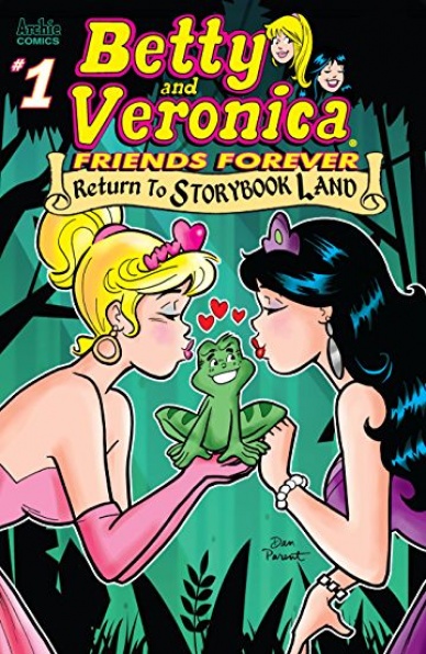
Traditionally, Archie comics are feel-good books, and unexpectedly, “Betty & Veronica Friends Forever: Return to Storybook Land” #1 magnifies the charm of the Betty & Veronica series with a reimagining of four fairytales in a way that only Archie comics can deliver.
Riverdale’s colorful cast is the perfect sandbox as Archie Comics characters include an array of personalities impeccably suited for the roles of the main characters in the original folktales. Bill Golliher’s spin on these fairytales stays true to the original stories, while simultaneously delivering on what is expected in a Betty and Veronica comic: tension (usually at the behest of Veronica), conflict, resolution, and happily ever after.
As effortless as the stories are in “Betty & Veronica Friends Forever: Return to Storybook Land” #1, the art as a whole is unquestionably stunning, and serves as an immaculate visual compliment for each script.
Dan Parent’s pencils are flawless, and Rich Koslowski’s and Bob Smith’s inks add the right amount of dimension. With clean lines and spot-on redesigns, the illustrations in “Betty & Veronica Friends Forever: Return to Storybook Land” #1 are immersive and transport the reader to whimsical worlds. Although Betty, Veronica, and co. take on somewhat altered appearances to fit their respective roles (such as Veronica being a genie in “Arch-addin”; the Aladdin retelling), they remain recognizable. Not only does this artistic trio stay true to the style of “Betty & Veronica” to which readers are accustomed, but they also successfully preserve what is known and loved pictorially about the originals. Even the layouts of the credits are impressive!
Continued belowUndoubtedly the icing on the cake, though, is Glenn Whitmore’s colors. Every turn of the page is an eyegasm. Whitmore’s colors are the very definition of the word “pop” with eye-catching, vivacious hues that reflect the definitive style of “Betty and Veronica” comics, as well as the reenacted fairytales.
Final Verdict: 8.5 – “Betty & Veronica Friends Forever: Return to Storybook Land” #1 is a fun and upbeat (loose) retelling of four classic fairytales with art that leaps off the page and wholly whisks the reader away to enchanting wonderlands.
Written by Jordie Bellaire
Illustrated by David López
Colored by Raúl Angulo
Lettered by Ed Dukeshire
Reviewed by Jhoan Suriel
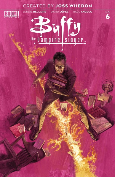
“Buffy The Vampire Slayer #6” is a fun and humorous issue with a nice between action and plot development. This issue trades in Sunnyvale High School antics for a Dungeons and Dragons-like adventure. Immediately, writer Jordie Bellaire wastes no time throwing us into a fight with the first several pages. Who knew that giant beetles make for great comedic fodder?
Furthermore, the humor in “Buffy The Vampire Slayer #6” is enhanced by David Lopez’s art. While his art style is slowly growing on us after Dan Mora’s departure, Lopez’s art is expressive and has a strong sense of weight. Plus Lopez draws some spooky backgrounds such as a marsh-like place complete with spider webs. If anything, Lopez’s artwork is endearing as a whole as panels flow well moment to moment.
Of course, the art is not complete with Raul Angulo’s fun colors in “Buffy The Vampire Slayer #6”. Indeed, Angulo takes us from a dimly lit brown, yellow, and, orange room to the aforementioned green marsh. Angulo incorporates liberal use of violet in this issue such as goo that the giant beetles spew and Willow’s dress. Thankfully, the colors are not distracting as it works well with Lopez’s art.
The witty banter between Buffy and Willow is endearing and smartly written in “Buffy The Vampire Slayer #6”. If anything this issue shows how much of a family the Scoobie gang is. Despite arguing at one point, Willow and Buffy care one thing: saving Xander which is what motivates them. Speaking of Xander, he too provides some comic relief such as a Florida joke at one.
Overall, “Buffy The Vampire Slayer #6” is a fun and entertaining issue. Bellaire carefully balances humor with action. Lastly, the art continues to delight as Lopez finds his groove.
Final Verdict: 9.5– Laugh out loud jokes, insect slaying, and BFF antics make for a fun and entertaining adventure in this issue
Written by Tom Taylor
Illustrated by Trevor Hairsine
Colored by Rain Beredo
Lettered by Saida Temofonte
Reviewed by Gregory Ellner
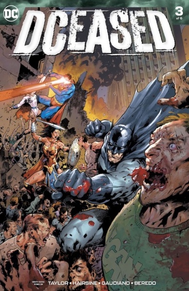
As always, Tom Taylor is a master of tone. He can insert humor into horror without losing either element and can apply heartwrenching dialogue and narration to action-packed scenes. Anything goes in “DCeased” #3, and, despite the Anti-Living technically not being the undead, Taylor is capable of making a unique, intriguing take on a zombie apocalypse narrative in a superhero world even more potent than 2010’s “Blackest Night.” Brief appearances like Perry White, Jonathan, and Martha Kent are a merger of horror and tears, with scenes slowing down significantly to demonstrate how awful the need to execute former friends and family can ultimately be, along with the psychological aftereffects of such actions as demonstrated by Alfred Pennyworth.
Trevor Hairsine’s artwork is absolutely perfect for the story being told. The fine details meshed with simple, yet realistic shadows create an air of either horror or awe depending upon the situation at hand. Sometimes, even indistinct images such as a silhouette of a famous person help to add to the realism, giving ever more raw emotional weight to each panel.
Rain Beredo yet again shows why he was chosen for the likes of “The Curse of Brimstone” and more with his use of color. A varied palette helps to keep an air of unease even in the brightest of days, creating an atmosphere that works well in the apocalyptic air of “DCeased.”
Final Verdict: 8.5 – Emotional ups and downs, magnificent pacing, and a fantastic illustration-colors team lend themselves to one of the most horrifying stories DC Comics has put out in a long time.
Continued below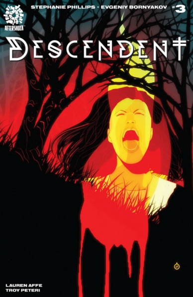
Written by Stephanie Phillips
Illustrated by Evgeniy Bornyakov
Colored by Lauren Affe
Lettered by A Larger World’s Troy Peteri
Reviewed by Elias Rosner
I want to like this comic more than I do. I want to like this issue more than I do. But, three issues in, it has failed to grab my attention or do anything particularly new with the conspiracy genre. However, there is the seed of an idea that is starting to be explored that is starting to change that. The idea that there is a cult of puritans that exist in powerful US places has a lot of legs, mainly because the United States is a very puritan country in its ethos, in both secular and religious society. Mining that question through the lens of the fantastic provides an opportunity to ask and examine why it is such as pervasive mindset as well as provide a believable backdrop for, well, a comic about a secret cult that dates back to Salem.
It’s just a shame that it’s surrounded by so much banal talking.
If the art were more stylized, or the conversation more revelatory or concise, “Descendent” #3 would flow much better but as is, it’s a bit of a slog to get through. Peteri’s lettering helps. It’s easy on the eyes and spaced well, the slightly slanted, sans-serif font making it just off enough to appear hand-lettered, yet small enough that it never obscures the artwork or swallows a panel. The varying sizes within the word balloons to express volume also remains readable throughout, which is very much welcomed.
Bornyakov and Affe do a good job of grounding the comic as well, with Affe’s muted palette of natural colors complimenting Bornyakov’s thick-bordered figures without making the comic appear dull. Additionally, when the comic allows itself to get dark, to lean into the mystical, supernatural underpinnings it has flirted with, the artwork livens up a bit, despite technically being darker.
Final Verdict: 6.0 – Nice lettering and the start to a couple of cool ideas still don’t make “Descendent” #3’s plot or characters particularly engaging. If you aren’t already sold, this issue likely won’t do much to change your mind.

Written by Gerard Way and Jeremy Lambert
Art by James Harvey
Colored by James Harvey and Sajan Rai
Reviewed by Kenneth Laster
After a hiatus, Young Animal’s flagship title, “Doom Patrol” is back and as weird as ever in “Doom Patrol Weight of the World” #1 written by Young Animal curator, Gerard Way with help from Jeremy Lambert, art by James Harvey and colors by Harvey and Sajan Rai. This new #1 serves as a decent recap of Way’s iteration of the Doom Patrol, where the characters are now and what the Doom Patrol is about at its core.
“Weight of the Worlds” #1 spends the majority of the first half of the book recapping the status quo of the core cast following the first 12 issue run and where the characters are following the shake-ups in “Milk Wars.” Newcomers may be thrown off with how bizarre the status quo actually is. However, if readers are thrown off by Rita dealing with living life as a “Space-Christ”, Negative Man getting an emotional support animal to deal with living full lifetimes and dying over and over again, and Lotion the Man-Cat’s whole…deal then the rest of the Doom Patrol might be a tough sell.
The second half of the issue splits between Cliff Steele dealing with having a human body and the Doom Patrol doing what they do best on a far off-planet. The plot tackling a planet obsessed with hiding their “shame forms” and plot of a universal fitness exploiting them for profit exhibits that Way has not skipped a beat in his offbeat Doom Patrol formula. Way does add some bitter flavoring in this return with the reunion of Cliff Steele and his mother in a scene that destroys Cliff’s assumptions of a normal life and leads to an incredible homage to Frank Miller’s “Dark Knight Returns” by James Harvey and Sajan Rai in the final few pages.
Continued belowJames Harvey and Sajan Rai as an art team do an excellent job at executing the weird world of the Doom Patrol through very inventive page layouts and incredible colorwork. The scene of Flex Mentallo and Rita demonstrates the synergy between Harvey and Rai in creating a captivating image. “Weight of the Worlds” #1 also features excellent lettering which unfortunately goes uncredited. The use of the retro Doom Patrol trade address in the latter half of the issue is an excellent moment.
“Doom Patrol Weight of the Worlds” #1 is an excellent return to form for the World’s Strangest Superheroes. This new #1 is a great jumping-on point for this version of the Doom Patrol and plays some of the greatest hits for fans of the first 12 issues. With captivating and colorful artwork this book gives a great sense of what this era of the Doom Patrol is and what it is going to be.
Final Verdict: 8.0 – “Doom Patrol Weight of the Worlds” #1 is a colorful and bizarre return and an excellent reintroduction to Way’s take on the Doom Patrol.

Written by Grant Morrison
Illustrated by Liam Sharp
Colored by Steve Oliff
Lettered by Tom Orzechowski
Reviewed by Shamus Clancy
Multiple universes colliding together. Characters ripped straight from the Silver Age. Yes, “The Green Lantern” #9 is surely a Grant Morrison comic.
Coming off the instant classic standalone story in “The Green Lantern” #7 and the retro-inspired throwback Hal Jordan/Oliver Queen team-up in “The Green Lantern” #8, Morrison has returned to crafting a multi-issue narrative. While that makes the first few pages of this story a slow-burn, Morrison quickly picks up the pace, bringing out characters forgotten decades ago and those only known to Morrison devotees, ending with a back page that will send readers counting down the days until “The Green Lantern” #10 drops. Morrison walks the line between reader intrigue and mystery with swift dexterity throughout.
Featuring Pre-Crisis Superwoman Luman Lyani, as well as Pre-Crisis stand-ins for Superboy and Supergirl in Power Boy and Marvel Maid, respectively, Morrison is pulling ‘50s and ‘60s cosmic characters out of a hat and thrusting them upon Liam Sharp, who is certainly up for the task. The fact that Sharp has illustrated every issue of “The Green Lantern” is remarkable consistency for an artist of today, showcasing that he and Morrison and are totally in-synch, ready to conjure up every panel of Silver Age magic to send readers spiraling with nostalgia (or to Wikipedia for required research).
This is a textbook case of Morrison loving to play with off-beat, seldom-used characters in the DC Universe, as seen prominently with the weird cast of heroes in his iconic run on “Doom Patrol,” along with Knight and Square in “Batman Incorporated.” Morrison continues his overall “every Grant Morrison series from the last 30 years is basically one interconnected story” template, which is rewarding for those steeped in Morrison’s work but makes for a daunting undertaking for anyone less acquainted with his DC mythos. “The Green Lantern” #9 is the least new reader-friendly issue of this series, but the promise of a Multiverse-level payoff should entice even those people to continue following along.
Moving the scope beyond just Hal Jordan operating as a space cop, Morrison is crafting yet another sci-fi epic that’s shooting for something larger than any sector of Prime Earth could contain. Morrison’s power battery should be charged up enough to stick the landing for yet another unique thrill ride in “The Green Lantern.”
Final Verdict: 8.5 – “The Green Lantern” #9 is a clear indication that Grant Morrison’s brightest days are nowhere close to being behind him.
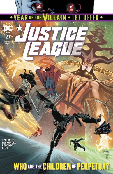
Written by James Tynion IV
Illustrated by Javier Fernandez and Bruno Redondo
Colored by Hi-Fi
Lettered by Tom Napolitano
Reviewed by Alexander Jones
“Justice League” #27 see’s the title finally enter a new phase in terms of the plot. Writers Scott Snyder and James Tynion IV recapped information and the origins of Perpetua’s children explicitly in the past few installments. “Justice League” #27 writer James Tynion IV is finally ready to start dispersing new information. In the latest installment of the title, readers are updated with recent progress pertaining to the Forgers while checking in on the larger scope of the DC Universe.
Continued belowOne place where “Justice League” #27 falters is in the art. Javier Fernandez and Bruno Redondo are not a good match together. Fernandez’s pages look beautiful across the board but when the roster shifts and Redondo come in, the styles don’t make for a cohesive whole. Redondo’s pencils come off simplistic while Fernandez was imbuing a gritter, more serious style into the issue. For a script less serious and foreboding that was penciled entirely by Redondo, the artist would have had a better chance to craft cohesive art. Fernandez’s action scenes are truly beautiful and a sight to behold within the issue itself. Redondo is an entirely competent artist that evokes strong emotion from a few important scenes including the mysterious final pages.
“Justice League” #27 is an incredibly ambitious issue that packs a lot of plot and references from past DC Comics together under one roof. I am skeptical that readers who haven’t been paying eagle-eyed attention are going to be able to enjoy this issue on a level it is intended for. There are times where I have seen DC Comics become so self-referential and insular that new readers can almost become discouraged in following the core title. While the issue can be rough around the edges and the art lacks a cohesive vision, “Justice League” #27 is a still an incredibly fun new chapter of the comic book series. Tynion IV finally feels like he is starting to get to some of the payoff readers have been waiting so long for in the main series.
Final Verdict: 7.0 – “Justice League” #27 starts to pay off important plot threads but carries an incohesive artistic line-up.

Written by Matthew Rosenberg
Illustrated by Szymon Kudranski
Lettered by VC’s Cory Petit
Colored by Antonio Fabela
Reviewed by Michael Govan
I’m of two minds on “The Punisher” #13. On one hand, I think Matthew Rosenberg does a good job writing the titular character. I rarely Frank Castle engaging but I’ve found him engaging over the course of this run. Frank is certain death, unwavering and uncompromising. Artist Szymon Kudranksi helps make the Punisher even more imposing. Batman looks like an avenging angel when he descends from the skies, cape flowing behind him. On the other hand, Frank looks more like a serial killer or horror movie villain when he lurks in the shadows. He’s terrifying, especially when you can’t see his eyes.
Even his fans give me the chills. In this issue, the Punisher is stopped by two police officers who reveal that they’re inspired by him. Now that is a truly terrifying notion to me. Frank himself recognizes that’s a really bad idea and denounces them on the spot. It’s a really dark idea that I might like to see explored in the future. Then again, I might not. You apply too much of the real world to the character, the whole concept might fall apart.
If this were the real world, Frank would be a heck of a lot easier to catch. It defies logic and makes the villains look particularly bad. This was the part I didn’t like. While Frank is on the rise, it’s at the expense of Baron Zemo (and Kingpin, to a degree). Zemo’s character is getting worse and worse.
I’m not even talking about his regression from anti-hero back to supervillain…that all happened over time before this comic. I’m talking about how he’s not even that competent a villain in this issue. He was run out of his country full of supervillains and now has to ally with the mayor to capture one guy with a couple of knives and bullets. Seeing the Thunderbolts on the final page is a sick ‘monkey’s paw’ situation. I’m always glad to get more of the characters but here, they look like bumbling idiots and are treated as a joke.
It’s public knowledge that the Thunderbolts were villains anyway, why even go with that brand? This is Zemo’s master plan? I mean, come on. I want the Baron Helmut Zemo who marched into Avengers Mansion with an army of villains behind him. The Baron Zemo who tore up the only photo Captain America had of his mother. If Zemo’s going to be a villain, he’s really got to step it up here.
Continued belowFinal Verdict: 6.0 – Zemo was born better than this.
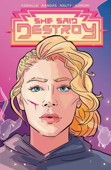
Written by Joe Corallo
Art by Liana Kangas
Colors by Rebecca Nalty
Letters by Melanie Ujimori
Reviewed by Matthew Blair
“She Said Destroy” #2 is a pretty straight forward story; setting itself up as a battle between the goddesses Brigid and the Morrigan in a science fiction setting. Sadly, when it comes to comic books, this is nothing new and this book doesn’t really do anything unique or special to set it apart from the pack. There are some bright spots, writer Joe Corallo demonstrates great skill at writing individual characters and his depiction of a ruthless, capable, and highly intelligent Brigid who refuses to underestimate her enemy is the highlight of the entire issue, but there really isn’t anything in here that would separate this book from a decent issue of “Thor”.
On top of that, there some pacing issues. There’s a moment near the end of the story that veers into a discussion about faith and history that seems very out of place and makes the pacing and story unclear. Also, for a story about a war between the gods, the comic makes the choice to tell a small story and focus on a few key characters against the backdrop of a larger conflict. It’s an interesting choice, but some readers might find it disappointing.
The artwork of “She Said Destroy” #2 doesn’t help matters. While artist Liana Kangas is very good at drawing expressive characters with a very loose and minimal line and colorist Rebecca Nalty gives the issue a very pretty neon palate to the issue, the art style just isn’t very well suited for the story it wants to tell. The artwork is at its best during the quiet moments when the panels focus on each character’s face, but when it comes time for the characters to fight, the action is difficult to follow and uninspiring when the reader can tell what’s going on.
“She Said Destroy” #2 is a valiant effort by the creative team that is creative and talented, but sadly it doesn’t do anything really new or special to grab a reader’s attention.
Final Verdict: 6.2-A decent comic with some good character work, but pacing issues and cliche subject matter prevent this comic from being anything better than alright.

Written by Mark Millar
Illustrated by Matteo Scalera
Colored by Marcelo Maiolo
Lettered by Clem Robins
Reviewed by Beau Q.
“The Eighties didn’t reach the Midwest until the Nineties,” and how to write strong female leads still hasn’t reached Mark Millar.
In “Space Bandits” #1, the newest sci-fi romp on Millar’s Netflix-adjacent IP redemption quest, we find ourselves in the Reebok pumps of Cody and Thena, two career criminals immediately spurned by misogynist co-workers and an emotionally abusive Lionel Richie lookalike, respectively. The betrayed vixens find each other on a god lobster penal colony, thus catalyzing the women in prison revenge film it so desires to be.
Where it can be said “Space Bandits” #1 looks respectfully on Cody and Thena’s lives is in their design a la Scalera. Cody and Thena are not space bimbos, but rather carry their naiveté and anger with confidence. They are the ‘80s woman Madonna preached at length with all the flaws and misfortunes that sentiment carries. ‘80s sci-fi is not a new look, nor is it fresh, but Scalera knocks out bold, expressive fashion statements for our heroines juxtapose the swamp neon of its non-dystopic cyberpunk slums. Maiolo chooses to eschew traditional ‘80s-inspired sci-fi approaches for a seedy blend of vibrant and textured paints– imagine the Richmond Lewis repaints for “Batman: Year One,” but now for Scalera’s wash-heavy dyes.
Aside from the beautiful art, “Space Bandits” #1 lacks originality in its worldbuilding. Replace the characters and backgrounds with any time period, any location, and the core tale still works, making everything else set-dressing, however lived-in they may be. Beside Scalera and Maiolo’s dulcet toned pacing, this is a run-of-the-mill female revenge story. I’d cross my fingers Millar won’t botch this into tone-deaf territory, but I’m not holding my breath, and neither should you.
Final Verdict: 6.5 – It’s immediately female-hatey, which is par for the course on female revenge stories, but this book doesn’t exist in a vacuum even if it’s in space.


