
There’s a lot to cover on Wednesdays. We should know, as collectively, we read an insane amount of comics. Even with a large review staff, it’s hard to get to everything. With that in mind, we’re back with Wrapping Wednesday, where we look at some of the books we missed in what was another great week of comics.
Let’s get this party started.

Written by Tim Seeley
Illustrated by Salva Espin
Colored by Israel Silva
Lettered by Travis Lanham
Reviewed by Gregory Ellner
In “Age of X-Man: Apocalypse and the X-Tracts” #5, Tim Seeley brings all of the developments of his five-issue arc to its culmination in tragedy and hope, in manipulation and revelation. Are the works of En Sabah Nur meant to be benevolent or malicious? Why was Apocalypse even a part of this “perfect” reality, especially considering his integral connection to Nathan Grey? What does it take to secure a loveless false utopia? Under Seeley’s pen, the answers to each question pan out as appropriately tragic, complicating the situation within the world of the ‘Age of X-Man’ itself.
Throughout the story, Salva Espin’s artwork has been highly animated, though rarely stretching into the vein of cartoonishness. That trend does not end here, with the thick, defined, dynamic work jumping from intense action to calm scenes before and after conflict without missing a beat, adding to the intensity of the X-Tracts’ battle and the world-ending circumstances in its backdrop.
And yet even Espin’s illustrations would be incomplete without the psychedelic colors provided by Israel Silva. Taking a varied palette ranging from the flowing rainbows of Unveil to the more solid, harder colors of Shadowcat, Apocalypse, and the rest, and Dazzler’s light making up the spaces between, Silva makes “Age of X-Man: Apocalypse and the X-Tracts” #5 an act of rebellion against a static, uncaring world that surrounds it.
Final Verdict: 8.0- An interesting story reaches its emotional conclusion in very good form.

Written by Jason Aaron
Illustrated by Jason Masters
Colored by Jason Keith
Lettered by VC’s Joe Caramagna
Reviewed by Alexander Jones
While I can acknowledge that “Avengers” #21 has a great sense of humor, I’m still confused about the overall direction of the narrative. Aaron has been building to a confrontation between the Avengers and the Squadron Supreme for several months now with no direct conflict on the horizon. Aaron has also been seeding an exorcism of Ghost Rider’s car and another huge vampire war. I really enjoyed the humor and build-up to what is coming next in the work, but my major criticism of this Avengers run as a whole is how unorganized it feels. Aaron has certain storylines seeded for too long and others not long enough. Sometimes the book can come off as hyper-silly and other times too serious. Despite any criticisms of the overall title, the hot tub scenes and individual moments of “Avengers” #21 pack great character moments.
Artist Jason Masters contributes pencils which showcase the irreverent tone of the issue well but lack detail. Faces are too simplistic and the background is lacking elements to capture the eye. Masters does a great job ensuring that his characters are always showcasing some kind of emotion. I also appreciate the more streamlined approach to the art that is a huge difference from a creator like Ed McGuinness who kicked off the series. Masters captured the more grounded tone the installment needed even if some of the finer details are missing from the interior art.
“Avengers” #21 was a much-needed breather before future events of the series return to a more plot-focused direction. The humor and more grounded approach to the art were inspired directions on behalf of Marvel and I hope future issues will guide this run into a similar direction. Aaron took an enjoyable diversion but future entries into the book are going to have to utilize this more grounded tone and fuse it with plot elements that are clear.
Final Verdict: 7.7 – “Avengers” #21 is an enjoyable, character-focused diversion and a great place to jump onto Aaron’s run.
Continued below
Written by Adam Smith
Illustrated and Colored by Alexandria Huntington
Lettered by Jim Campbell
Reviewed by Elias Rosner
“Beneath the Dark Crystal” has, from the outset, felt like a superfluous but fun adventure for the world of the Dark Crystal. Lighter in tone than the original or even the “Power of the Dark Crystal” series that preceded it, it has remained, nonetheless, an effective look at the difficulties of rebuilding after living beneath a toxic regime. In this, the penultimate issue, Kensho and Thurma find themselves finally embracing what it means to be a leader of their people.
For much of the issue, this works, with the ideological conflicts between Thurma and the Fire Who Walks being the stronger of the two plots, mainly because Kensho has essentially become Muppet Jesus, literally taking on the sins (or darkness) of the people and, as the comic seems to be implying, dying because of it. However, the slow pacing of the series leaves this one feeling padded out, despite the copious amounts of action and the inexorable march towards the final conflicts.
The artwork remains dynamic and consistent and, while the scenes with Kensho suffer for the simple linework and lighter, flatter visuals, a darker, more detailed style suiting the tone better, the other scenes pop and crackle with life and fire. That said, the coloring on the Kensho scenes remains fantastic, in both senses of the word, with a color palette that signals the rebirth of the land after the events of “Power of the Dark Crystal” and the otherworldly nature of it all, thanks to the pink and blue leaved trees. The lettering is also nice and consistent, looking like the house standard but clearly placed on the page in ways that compliment the art and support the eyelines.
Unfortunately, the story just isn’t quite there, feeling like is going through the motions more than building to a climactic and impactful finish. It still remains an entertaining read, and fans looking for more from this world will be pleased that the stories of Thruma and Kensho have continued, but beyond that, issue #11 doesn’t hold much power.
Final Verdict: 6.0 – A storyline that has been decompressed, perhaps too much, nears its end in a standard but technically well-handled manner.

Written by Jed MacKay
Illustrated by Travel Foreman
Colored by Brian Reber
Lettered by Ferran Delgado
Reviewed by Vanessa Boney
While the premise in “Black Cat” #2 is decent, the execution falls short. Jed MacKay includes interesting revelations; such as what Black Cat & co are stealing from the Sanctum Sanctorum, and the fact that they have the gall to steal from there in the first place, but the cliffhanger can be seen from a mile away. Moreover, the characters aren’t that interesting either as there is no explanation or exhibition of their skills to validate what they bring to the team. The one plus of “Black Cat” #2 is that there is a recap of the story thus far, which is good for new readers jumping on.
As for the art in “Black Cat” #2, it is neither good or bad – it’s fine. J. Scott Campbell’s and Sabine Rich’s cover is more along the lines of how I was expecting the interiors to look; but I was immediately disappointed. Instead, Travel Foreman’s illustrations in “Black Cat” #2 look simplistic; almost amateurish, and lack detail. The art style deviates from the typical Marvel house style, and that is a huge mistake. Most notably, Black Cat’s face is inconsistent from panel to panel. However, although Foreman’s pencils lack depth, his lines are neat, and he draws facial expressions well.
On the other hand, Brian Reber’s colors are outstanding in “Black Cat” #2. The muted tones are accurate for a heist comic, as the thievery (obviously) takes place at night. But when the story moves indoors, rightfully; the colors are more dynamic and less muted. Also, the use of light and shadows does not go unnoticed in Black Cat” #2 and is the best aspect of the main story’s art overall. Alberto Alburquerque’s art in the backup story of “Black Cat” #2 (which is only one page and serves as a sort of setup for the upcoming Carnage comic) is better by far and should be in the main script, as his art is smoother and has more dimension.
Continued belowFinal Verdict: 6.0 – Being that this is only the second issue, it’s still too early to conclude whether or not this comic is a worthy monthly purchase, but so far, nothing about it is intriguing enough to hook readers.

Written by Ed Brubaker
Illustrated by Sean Phillips
Colored by Jacob Phillips
Lettered by Sean Phillips
Reviewed by Christa Harader
“Criminal” #6 takes a look at the last happy days of Teeg Lawless – he’s in love, possibly for the first time in his life. Too bad he’s picked the worst possible person to experience it with. This issue is a nice slow burn, with Brubaker’s trademark crisp storytelling, as we watch Teeg get in decidedly over his head. Picking a specific, rotating POV for each issue in this arc is a neat way to tell a story from different angles, and that kind of choice really works well in this particular genre. Brubaker knows how to tell a story without too much meat on it, and chooses details with pulp precision.
Sean Phillips’s art is impressionistic and moody, with some nice loose line details and deep shadows that almost seem to swallow Teeg. Jacob Phillips’s colors are the good kind of neon, nighttime seedy to help amp up the drama and create the dreamlike state Teeg finds himself in. The daytime palette is a harsh contrast, on purpose, and it definitely works. The lettering is consistent, clear and stylized effectively, with a good balloon stroke to match Phillips’s art. Borderless panels are a nice choice in this comic and, surprisingly, the balloons don’t fight with that looseness. Rather, they draw the eye deeper into the panel and help give the book just the right hit of roughness.
“Criminal” is a fantastic series, and issue #6 makes good on the circular storytelling so far. Everything’s felt earned and it’s finally paying off, with some big noir goodness to come.
Final Verdict: 8.5 – “Criminal” #6 is another solid entry into the current storyline, with a moment of reprieve for Teeg as his death draws ever closer.
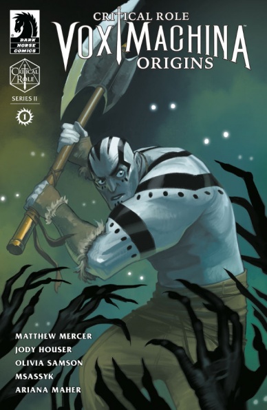
Story by Matthew Mercer
Script by Jody Houser
Art by Olivia Samson
Colors by Msassyk
Letters by Ariana Maher
Reviewed by Matthew Blair
The most impressive thing about “Critical Role Vox Machina Origins: Series 2” #1 is the amount of work that must go on behind the scenes in order to adapt the well-known Critical Role video series into a comic book. While it helps that Matthew Mercer is a fantastic storyteller and that the cast of Critical Role is incredibly passionate about their characters, the burden falls on the scriptwriter and editors to take hours of content and wrangle it into a series of twenty-two-page comic books that people will want to buy.
Fortunately, writer Jody Houser, along with editors Rachel Roberts and Jenny Blenk, are up to the task and they deliver in spades. Somehow, “Critical Role Vox Machina Origins: Series 2” #1 manages to be an engaging comic book that tells an exciting story in twenty-two pages while maintaining the spirit of the show and characters and being incredibly accessible. Anyone, whether they’re a diehard fan of Critical Role or have never heard of the show, can pick up this comic and be entertained and that is an incredible accomplishment.
While the work of writing and adapting this comic is impressive, the artwork on “ Critical Role Vox Machina Origins: Series 2” #1 is equally amazing. Artist Olivia Samson gives the fantasy world and action life in glorious detail, and a tiny hint of manga influence lets her deliver some fantastic facial expressions. Msassyk’s colors also deserve high praise, allowing the story to switch between dark and foreboding on one page and light and happy on the next.
If you’re a fan of the Critical Role series, this is a comic that you should absolutely read. If you’ve never heard of Critical Role, but you’re looking for a fun fantasy adventure, this is definitely a series worth checking out.
Final Verdict: 8.9 – A fantastic comic that is amazing to look at and captures the spirit and fun of the source material all while being incredibly accessible to fans of the show and new readers.
Continued below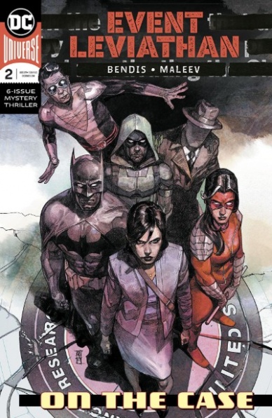
Written by Brian Michael Bendis
Illustrated by Alex Maleev
Lettered by Josh Reed
Reviewed by Kenneth Laster
“Even Leviathan” #2, the second chapter of Brian Michael Bendis’s DCU spanning spy mystery, demonstrates why he and longtime collaborator Alex Maleev are still at the top of their game when crafting a noir story. Joined by Josh Reed on letters, the creative team dives deeper into Batman’s team of detectives’ investigation into the mystery of Leviathan and the confrontation of their first suspect.
Bendis frames “Event Leviathan” #2 through a discussion between Batman and the Red Hood, Jason Todd, who is currently sitting high on Damian Wayne’s list of suspects behind the mysterious Leviathan persona. This framing narrative with brief vignettes featuring the Question and Plastic Man builds anticipation in the issue, with the reader waiting for the other shoe to drop in a direct confrontation with Jason which is never satisfied until the final moments of the book.
Bendis bucks the expected snarky dialogue for the majority of “Event Leviathan” #2 with Bruce and Jason’s relationship coming through in the dialogue, feeling as though there is a lot of baggage pushed to the side to focus on the evidence in this mystery. Bendis continues to build up Leviathan as an extremely fascinating antagonist for this event. We are only given peeks into this character’s backstory and yet they are given personality through laughing at Plastic Man’s attempts at humor. All of this draws the reader further into Leviathan’s orbit putting us in the place of the heroes to truly consider the new order Leviathan is selling which is rare for “supervillains” espousing hopes to reshape the status quo.
Alex Maleev treats us yet again with a beautiful comic book which is true for any book he works on. His realistic linework and use of shadows capture the tone of “Event Leviathan” excellently, however, his colors do the heavy lifting regarding storytelling. Maleev fills the bulk of the book with contrasting blues and reds with the present scene colored in a very cold light blue and flashback scenes with a more teal or blue-green wash. Reds pop in during action scenes, supported by Josh Reed’s lettering, shifting the panels to red and diegetically, through blood and the red in certain costumes, such as Red Hood and coincidentally Leviathan. This attention to detail in not just crafting dynamic action but creating visual connections to Jason Todd and his suspected alter ego marks Maleev’s work as more than just pretty pictures.
Maleev and Bendis are such a strong collaborative force in comics through making issues like “Event Leviathan” #2. “Event Leviathan” #2 is functionally just the second part of a much larger story but the issue is told so exceptionally that it keeps the reader hanging on for the next issue. This issue demonstrates Bendis, Maleev, and Reed are strong storytellers, we just have to wait and see if the whole story is just as strong.
Final Verdict: 8.0 – The creative team delivers a strong installment in this ongoing mystery that is visually creative and draws readers deeper in and waiting for the next issue of “Event Leviathan”.

Written by Ken Garing
Illustrated by Ken Garing
Colored by Ken Garing
Lettered by Ken Garing
Reviewed by Jhoan Suriel
“Gogor #3” continues to be a delightful, fantasy series that is a joy to read. Ken Garing continues to do some great worldbuilding in “Gogor #3” and it shows. We learn about the origins of the titular Gogor, the Hulk-like nature giant. But more importantly, we learn about the importance of Armano’s relationship to Gogor as the Keeper.
With “Gogor #3”, Garing’s lush artwork continues to be impressive. Notably, Garing’s panel work is extremely diverse. In this issue, we see varied panels such as five panels, and nine-panel grids. One of the highlights includes eight panels on page four. The panels bounce between a close up of a book before it shifts to a wide panels of Gogor and Grum, a master of the natural arts we met the last issue. Furthermore, Garing’s diversity of characters needs to be commended as we see characters of color and animal men in this issue.
Continued belowAdditionally, the colors continue to be quite a joy to look at in “Gogor #3”. While the colors look at simple at times, Garing carefully balances each panel. In this issue, Garing invites us to the steaming heat of a bowl of a broth for instance early on the story. In page seven, the steam of the nearly white broth melts into a seamless panel as Armano drinks the bowl. This is just some of the excellent color work in this issue.
Overall, “Gogor #3” is an excellent middle issue. Garing moves the plot along, packs in a tense action scene, and introduces us to some new characters. Plus there’s some good worldbuilding in this issue. All in all, Garing continues to do some great work in a series that more people should be reading.
Final verdict : 9.5 – Ken Garing delivers another colorful, great-paced issue with excellent panel work and even more rich worldbuilding

Written by John Layman
Illustrated by Afu Chan
Lettered by Pat Brosseau
Reviewed by Beau Q.
Once every blue moon, there’s a run everyone stands to the side and watches in awe, waiting for the masterpiece to stop, and their applause to begin. Better to save critique until after this lightning-in-a-bottle spectacle is over. “Outer Darkness” is such a series. Much like those highly vaunted runs that become legends unto themselves, there will be an inconsequential ebb and flow to the quality level as the series progresses. “Outer Darkness” #8 is lower on the spectrum in comparison to its predecessors, but when the spectrum ranges from high quality to instant classic, each issue is its own required reading.
Existing just after a sharp dramatic turn in its narrative, “Outer Darkness” #8 sits as the bottle ep– a standalone origin story with its sights focused on Ensign Hydzek. Fraught between her post-reincarnation PTSD and ulterior missions, Hydzek babysits a time-displaced nun from the WWII war front, Sister Magdalena. While we follow Hydzek navigate her newfound tour guide duties, Layman pulls the lid back to peek at other plots as they stew for another month. Really, only questions from previous issues are answered with the caveat of creating more questions which are left unanswered. For “Outer Darkness,” this is somewhat of a theme– the unknown counterweighs the known.
With such a self-contained drama hurtling towards no finite conclusion, “Outer Darkness” #8 could read flaccid on paper, but it’s thanks to Afu Chan for adding depth to their narrative experimentation. Afu Chan has spoken at length about only using widescreen panels for “Outer Darkness” to force better cinematography unto their work. In doing so, Afu Chan uses multiple match cuts to smooth out the otherwise jarring transitions. An orchestra of subtle, narrative-reinforcing camera tricks aligns subjects Hydzek and Magdalena by chapter end. Their horrors, struggle, and mysteries now intertwined. This alliance, much like Brosseau’s literally shakey, figuratively poignant lettering, will only deepen and enrich this absolute masterpiece run until it whispers its last secrets unto the ether, becoming another doubtless classic.
“Outer Darkness” #8 is far from the best jumping on point, but highlights the remarkably hateful crew with zero alacrity, swiftly positioning readers in the same cynical mindset as even seasoned “Outer Darkness” readers. Just know to hold your applause for the next movement, entitled…‘Slasher.’
Final Verdict: 7.8 – In space, only ghost nazis, insect gods, devil crewmen, and your phobias can hear you scream. TL;DR: pls read this comic.

Written by Donny Cates
Illustrated by Juan Gedeon
Colored by Jesus Aburtov
Lettered by VC’s Clayton Cowles
Reviewed by Shamus Clancy
“War of the Realms” is over, but life continues to beat down on Eddie Brock in “Venom” #16, just as it has throughout Donny Cates’s current “Venom” run. Armed with a superb fill-in artist in Juan Gedeon, Cates continues spinning a story that combines the popcorn movie elements that make the series such an electrifying read with the internal unraveling of a badly broken man.
Cates and Gedeon take a unique approach to the way they showcase Brock in “Venom” #16 even though he is detached from his infamous symbiote. Gedeon’s illustrations depict him as Venom during the most turbulent and anger-inducing moments of the issue, whether it be taking on a gang of human traffickers or begging for a freelance journalism gig, as readers see Venom’s thoughts and actions as Eddie imagines them. Eddie may be doing the fighting and talking himself, but the part of Venom that has left him scarred can still pull his strings at a moment’s notice. This allows for Gedeon’s summer blockbuster-ready penciling to take over, as his classic ‘90s-inspired linework, the same style made Venom the iconic character that he is, leaves readers’ jaws dropped with all its gory head-bashing glory.
Continued belowThe duo also demonstrates that, even without having a sociopathic alien disease fused with his body and mind, Brock still has Venom somewhere in him. That duality will never be gone from the back of his brain, the compromising moral code begging Eddie to scratch the itch that is bloodlust and murder. “Venom” #16 perfectly encapsulates the mental toll the symbiote has taken on Eddie throughout his life.
Battling his demons before taking part in the onslaught that is next month’s “Absolute Carnage” crossover event, “Venom” #16 rings the bell as an issue that simultaneously builds on Eddie’s newfound paternal responsibilities, stands alone as a single story of a man coming to grips with the monster lurking inside him, and serves as an excellent prologue for the carnage that is soon to come.
Final Verdict: 8.7 – The symbiote may be gone, but Donny Cates’s plan for the definitive Eddie Brock tale still remains intact in “Venom” #16.
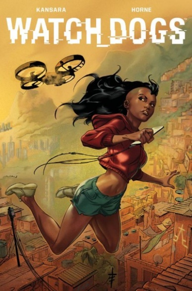
Written by Simon Kansara
Illustrated by Horne
Lettered by Lauren Bowes
Reviewed by Grace Taylor
Based on the Ubisoft video game series, “Watch_Dogs” #1 expands its international canon and bring us a story set in Brazil. Our main hacker, 17-year-old Sauda, returns to her impoverished and crime-ridden home of the Brazilian favela, Rocinha, to help eradicate crime and corruption in the town. The excellent storytelling and compelling artwork live up to the potential of this narrative, as we become invested in Sauda and the survival of the rest of the citizens of this town.
Simon Kansara’s ability to seamlessly move through exposition, flashbacks, and action is impressive. For instance, a great opening using a drone sets the stage of present-day Rocinha – we get the outsider perspective and the citizen perspective of life inside the favela. As part of this intro, we see Sauda in hacker-mode and soon learn about her tragic and violent backstory. The flashback doesn’t feel shoe-horned but flows well within the sequence while revealing meaningful details of the story.
The recurring theme of “insider” versus “outsider” is also effectively portrayed through Horne’s artwork in Watch_Dogs” #1. Whenever we view people outside of Rocinha or see the city from outside viewpoints, the art is colorful and vibrant. The early drone sequence shows the favela as a paradise nestled between beautiful green mountains and a crisp, blue ocean. In contrast, the inside of the city is heavily shaded with lots of black and brown and graffiti on walls; gang members touting guns and rifles are oftentimes dominant within the panels.
There are many exciting twists and turns in this first issue of “Watch_Dogs.” However, the heavy and graphic violence among gang members and law enforcement might not be for everyone. Despite the shock value, the violence does reveal the extent of Sauda’s pain and determination, juxtaposed against the high stakes for Rocinha’s citizens. Kansara does a superb job of making us invested in the safety and future of its characters, which I intend to see through until the end.
Final Verdict: 8.6 – “Watch_Dogs” #1 is thrilling and emotionally captivating with its strong-willed protagonist, Sauda, at the center of all the action. The violence may be unsettling to some, but it contributes to the understanding of the life-and-death stakes of the story.
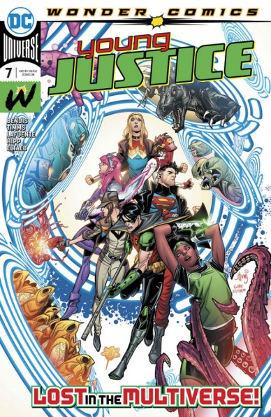
Written by Brian Michael Bendis
Illustrated by John Timms, Dan Hipp & David Lafuente
Lettered by Wes Abbott
Colored by Gabe Eltaeb & Dan Hipp
Reviewed by Michael Govan
While “Young Justice #7” isn’t all that plot heavy, it is a pretty fun time. The team is lost in the multiverse and travels to some fun dimensions. There’s an adorable dimension illustrated and colored by artist Dan Hipp, whatever earth Captain Carrot and the Zoo Crew is on and finally, the Kingdom Come dimension. It was fun how the art style changed across dimensions. Lafuente draws the Captain Carrot pages while Timms hops back in for the Kingdom Come stuff.
I also enjoyed seeing the team’s different reactions to the craziness around them. Superboy refuses to talk or even acknowledge Captain Carrot’s dimension. Jinny Hex and Teen Lantern spend the whole time freaking out, unused to such superhero weirdness. Impulse, as always, is Impulse.
I’ve enjoyed Bendis writing Bart Allen because the speedster is right up his alley. The writer excels with wisecracking characters, as his run on “Ultimate Spider-Man” will attest. However, sometimes Bendis writes all of his characters as quipsters, even if it doesn’t fit. Doctor Fate shouldn’t ‘forget to carry a two’ or whatever reason it was that he couldn’t get the team home. Still, fun as it is, the lack of plot makes it feel more like an annual or aside issue. It will be good to see where the plot goes in the next issue.
Final Verdict: 7.0 – Young Justice hopes that the next leap will be the leap home.


