
There’s a lot to cover on Wednesdays. We should know, as collectively, we read an insane amount of comics. Even with a large review staff, it’s hard to get to everything. With that in mind, we’re back with Wrapping Wednesday, where we look at some of the books we missed in what was another great week of comics.
Let’s get this party started.

Written by Zac Thompson and Lonnie Nadler
Illustrated by Simone Buonfantino
Colored by Tríona Farrell
Lettered by Clayton Cowles
Reviewed by Kenneth Laster
In “Age of X-Man: Omega” #1 the stakes are high for Zac Thompson and Lonnie Nadler to close all of the stellar mini-series in the “Age of X-Man” written by various creative teams and to act as a coda for the X-Men as we know them. Along with Simone Buonfantino, Tríona Farrell, and Clayton Cowles, Thompson and Nadler manage to stick an emotionally resonant landing that brings one of the best X-Men events from the past decade to a close.
“Age of X-Man Omega” accomplishes two main things with wrapping up the stories from the last few months and answering the overall question of “so what?”. Thompson and Nadler are not hinging this finale to be a big battle or have a ton of huge moments but the major draw is Nate Grey explaining himself and the characters confronting what they’ve seen and the X-Men have to question who they are now that they’ve seen a version of the world they have been fighting for. In a lesser writing team’s hands, this could have turned into a big punch fest with all of the heroes deciding that they need to get back to the real world but the X-Men are truly torn with Nightcrawler and Nature Girl being devastated to leave this utopia. Ultimately the statement is made by Thompson and Nadler that utopias are stagnant and people must always push for change which really resonates not just in the story of the X-Men but in the fight for marginalized people.
The art team helps deliver “Age of X-Man Omega” #1 expertly. Simone Buonfantino has incredible attention to detail with all of the non-X mutants running around Nate’s Utopia, keeping consistent the mutant kids depicted in the halls of the Summer’s Institute to being interviewed on camera. Buonfantino captures the facial expressions and body language that sells the grief and frustration by the X-Men. The body language alone in a scene with Dani Moonstar and Nate Grey sells the emotion of the scene. Tríona Farrell’s colors are fantastic. Her colors carry the weight and the beauty of the X-Men returning home to reality. Cowles lettering is excellent featuring sound effects that really enhance the storytelling with Gabby’s “krakPop” of her spine and the green “Grrr” of Nature girl’s powers.
“Age of X-Man: Omega” #1 is not only the finale to the Age of X-Man event, but the end of the Extermination Era of the X-Men prior to their new direction under the direction of Jonathan Hickman. This conclusion solidifies the point of Age of X-Man by reminding readers why the X-Men are special and what they mean not just to the Marvel Universe but to the world.
Final Verdict: 8.9 – “Age of X-Man: Omega” #1 is a great send-off for The Age of X-Man and for this era of X-Men.

Written by Kyle Starks
Illustrated by Erica Henderson
Colored by Erica Henderson
Lettered by Deron Bennett
Reviewed by Jhoan Suriel
“Assasin Nation #5” concludes with plenty of action, explosions, and humor to cap it off. Unfortunately, the humor that is central to its Battle Royale meets Hot Fuzz premise falls a bit flat in this issue. While Kyle Starks delivers some clever on-the-nose jokes, other jokes don’t land quite as well. Nonetheless, Erica Henderson’s art and Deron Bennett’s letters carry “Assasin Nation #5” forward. Plus the remaining killers learn a thing or two about teamwork in this issue.
As always, Erica Henderson continues to do some of her best work yet in “Assassin Nation #5”. Love it or hate it, Henderson draws some of the most expressive faces in the comic book industry. Notably, characters appropriately contort in pain when injured and show surprise when stressed. Additionally, Henderson instills a strong sense of weight to characters such bone-crushing blows that are prominent throughout this issue. Furthermore, Henderson’s colorwork retains a fun and moody feel throughout “Assassin Nation #5” much like the rest of the series. At times it feels like a film-noir fused with an Adult Swim cartoon series.
Continued belowLastly, the letters by Deron Bennett compliments Henderson’s art well in “Assassin Nation #5”. In fact, the letters are vital to the humor because this issue features some hilarious sound effects such as CRUSH’D and SLAM TOWN to name a few. Additionally, the diegetic sound effects highlight dramatic moments such as a giant, blurry KRAK in a dramatic panel.
“Assassin Nation #5” leaves the door open for more in the future. If you’ve never read the series, now is as good of a time as ever to check out the series. Otherwise, there’s always the trade paperback collection which comes out in September. Nonetheless, Starks, Henderson, and Bennett deliver a fun and entertaining ending with a few missteps.
Final Verdict: 9.0 — “Assassin Nation #5” barrels through its action-packed conclusion with style and teases the possibilities of more hitman action in the future.

Written by Bryan Hill and Matt Hawkins
Illustrated and Colored by Atilio Rojo
Lettered by Troy Peteri
Reviewed by Gregory Ellner
With “Cyber Force” #11, the writing team of Bryan Hill and Matt Hawkins isn’t trying to make any enormous message, as everything we needed to know had been lain out in previous installments. Instead of dwelling on the moral quandaries revolving around the Cyber Force team itself and their creators as abstracts, Hill and Hawkins instead face them head-on, indulging in brutal combat scenarios in a relatively simple yet fun issue that isn’t without its moments of comedic timing or relief either. From Stryker to Velocity to Aphrodite to Ripclaw and more, each of the combat-oriented members of the team has their time to shine, with even Dominique having her own quieter moment to worry before all hell breaks loose.
However, the real draw of “Cyber Force” #11 is Atilio Rojo’s artwork and colors. Merging flesh and metal nigh effortlessly, yet not looking away from how said collaborations can lead to a sense of inhumanity, every panel is beautifully designed, from holographic interfaces to views out a window to, in some cases, the ways in which the Cyber Force team use their powers, especially Aphrodite and Velocity. The sheer level of detail given on the variety of faces, from their facial expressions to how human they look, helps to show the ways in which even those who have been forced to be a part of Cyber Force can be seen as essentially human, regardless of how much of their body has been replaced.
Final Verdict: 7.0- An entertaining, action-focused issue to near the conclusion of this volume.

Written by Chip Zdarsky
Illustrated by Lalit Kumar Sharma
Lettered by VC’s Clayton Cowles
Colored by Java Tartaglia
Reviewed by Michael Govan
I didn’t much like Matt Murdock in this issue. Yeah, I know that Daredevil’s a mess of a person. Sometimes it’s intriguing, sometimes it’s not. I’d put this “Daredevil” #8 firmly in the latter category.
Matt ends up joining the Mafia for dinner and has an ethical debate. Maybe it’s just me, but he’s clearly the hypocrite here. He states the importance of rules and deplores violence. The only problem with that stance is that the guy regularly breaks the rules and beats the absolute crap out of people. Daredevil’s not the Punisher but he’s nowhere near as nice as Power Pack. After he gets off work, Matt’s putting people in the ICU.
Also, Matt’s a creep. It’s hard to look past. He even says it here…but acknowledging it doesn’t excuse it. He’s actively trying to get with a married woman, which seems out of character for a devout Catholic. I admit that I’m not familiar with all the tenets of the religion but I’m pretty sure adultery is a big no-no.
On the other side of the coin, ‘legit’ Kingpin manages to be plenty terrifying. In this comic, the government only considers making a beneficial move if they can make money off of it. That’s a very real, very depressing idea. Now I’m sad just thinking about it. To the credit of the story, this is the first time I’ve actually been worried about Wilson Fisk in government.
Continued belowI can’t say I was a big fan of the artwork this issue either. The style just doesn’t do it for me, it’s a matter of personal preference. In all fairness, there isn’t much action. The bulk of the issue is tense conversations…hopefully more goes on in the next issue and Daredevil is likable again.
Final Verdict: 5.5 – Seriously, Matt’s a creep here.

Written by Jeff Lemire
Illustrated by Andrea Sorrentino
Colored by Dave Stewart
Lettered & Designed by Steve Wands
Reviewed by Chris Egan
We are mid-freefall. The story of “Gideon Falls” has leaped further into the hodgepodge of insanity, paranoia, and translucent mystery. This is the first issue that will make readers feel as lost as its main characters. While the first fourteen issues had plenty of storytelling oddities, following the plot and having an idea of what’s next was more or less an easier feat. This week Lemire has delivered us a Silent Hill-cum-David Lynch pacing. He has taken a slight step back from the Black Barn itself and brought us more questions regarding Wilfred’s past, who is the tortured focal point in this issue. Lemire’s writing is still strong, but this was the first time “Gideon Falls” felt like it was toying with us just as much as the characters, rather than allowing us to follow along. Our understanding of this world has never been omnipresent, but he’s definitely not allowing us to know as much this time around. I don’t expect, nor do I want, him to hold our hand in this terrific series, but this issue left me on the outside looking in for the first time.
Sorrentino’s panels are choppy and disturbing through the entire issue, whether focusing on something typically mundane or monstrous; everything is haunted. He gives us horror movie pacing and nightmarish imagery. His ability to give us clear, refined details mixed with foggy, sketchy environments is what keeps this series uncomfortably moving through the fog of terror. Along with Wands’s layout design, they throw panels around and flip entire pages to keep it all perfectly surreal and unsettling. Their quality of work paired with Dave Stewart’s masterful coloring has not wavered at all. “Gideon Falls” has an absolute dream team working on it.
A still scary and upsetting, if not slightly disappointing chapter. Anytime the story has focused on Wilfred it has been an enjoyable read, hopefully this issue is leading to great and horrifying moments.
Final Verdict: 7.5 – The only way out is through, and this side-step only made the anticipation for what’s next that much greater. Like Wilfred, we are all ‘The Misplaced Man.’

Written by Daniel Way
Illustrated by Goran Parlov
Colored by Giada Marchisio
Lettered by Clem Robins
Reviewed by Beau Q.
A Millarworld book not written by Millar turns out to be better than those written by Millar. Who knew?
In “Hit-Girl Season Two” #6, Parlov builds the pacing in contrast to other much schlockier Hit-Girl reads. By slowing down to prestige tv pacing, Team ‘Hit-Girl in Hong Kong’ builds to some pure comedic brilliance amidst solid organized crime tropes. Parlov pulled the camera further out on trademark Millar single line splash pages to minimize Hit-Girl in her new world of danger. This effort builds especially well to the last page splash as Parlov finally pushes in on Hit-Girl– the ball is in her court now.
Boss Liu is a powerful antihero, not so much avenging her brother as much as defending her stake. Genderswapped, this is terribly transgressive, but currently, with a headstrong, respected female Boss Liu, it’s trending progressive in a relatable villain path, though an act of offscreen violence in attempts to villainize Boss Liu paints her as actively misandrist, though far more subdued or even justified than the caricature a fictional misandrist could be. However factoring in Inspector Wu Xiaopeng, the trademark Millar beta male cowardly enduring emasculation, Way’s view of empowering Hit-Girl is “yeah, fuck dudes, women run this piece” which works wonders here to set the stage for future “Hit-Girl Season Two” issues.
Continued belowAlligator clips, aka “less than/greater than symbols,” bookending every word balloon is a hamfisted, lazy method for illustrating non-English dialogue, but effective nonetheless in today’s comic-educated readership. “Hit-Girl Season Two” #6 has chosen an unattractive method that has become so prominent, there is no tonal difference for readers between it and English dialogue. In keeping with a consistent style issue-to-issue, Robins would be remiss to drastically alter its form now, but one hopes future issues will complement alligator-clip dialogue with more interesting methods of displaying non-English dialogue.
Much more story than action for Hit-Girl, but beautifully builds to a potentially satisfying conclusion clusterfuck in typical Hit-Girl fashion.
Final Verdict: 7.5 – Hit-Girl is the Battle Angel Alita movie. Brutal, imaginative, dumb action fun with an easy-to-be-entertained-by female lead.
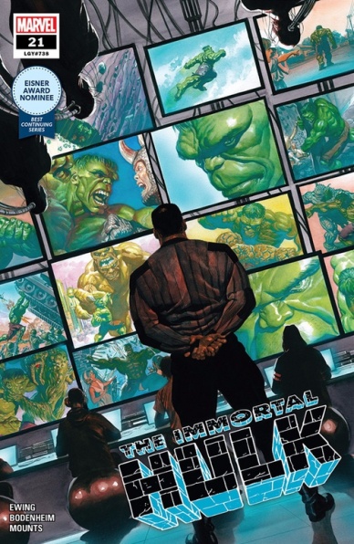
Written by Al Ewing
Illustrated by Ryan Bodenheim
Colored by Paul Mounts
Lettered by Cory Petit
Reviewed by Shamus Clancy
As the little Eisner Award Nominee medal indicates on the cover of “The Immortal Hulk” #21, Al Ewing has brilliantly crafted a Hulk series that reads like no other that’s come before it. Bruce Banner and his big green friend have become more like something out of a John Carpenter film than the fan-favorite Hulk seen in Avengers: Endgame. Gore, psychological anguish and pure savagery are omnipresent in “The Incredible Hulk” and that applies well beyond simply Banner himself.
Ewing effectively creates a bottle issue of sorts here: putting the existential dread of the never-staying-dead Hulk and the trauma it’s taken on Banner’s inner circle aside for a moment, Ewing turns his attention to James Fortean. “The Immortal Hulk” #21 has a non-linear structure that effectively depicts the way that the Hulk’s sheer existence has transformed the military man Fortean once thought himself to be into a science-gone-wrong brute akin to the one that he’s long pursued.
Fortean’s psyche, just as readers have seen with that of Banner over the last 20 issues, has become as deformed, altered and grotesque as his physical state is on the issue’s final page. This is where fill-in artist Ryan Bodenheim happens to shine the brightest. The linework seen in the slow burn of Fortean’s backstory is clear, crisp and straightforward, but it’s with the last image of “The Immortal Hulk” #21 that Bodenheim truly captures the gnarled horror that Ewing’s narrative has built up for the past year.
Even without the smashing and mashing of the world’s most-feared walking atomic bomb, “The Immortal Hulk” #21 continues to highlight the duality of man and beast in addition to exploring the boundary between horror stories and superhero tales like no other series on the market.
Final Verdict: 8.8 – The perils of what it’s like to become the monster you’ve always hated have never been so frightening as they are in “The Immortal Hulk” #21.
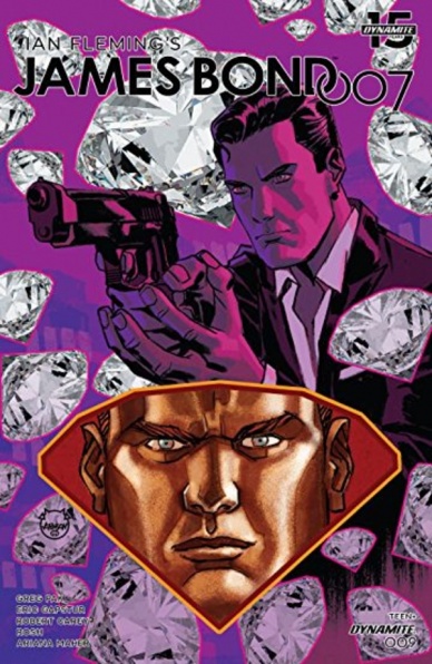
Script by Greg Pak
Art by Eric Gapstur and Robert Carey
Colors by Roshan Kurichiyanil
Letters by Ariana Maher
Reviewed by Matthew Blair
James Bond is one of the most iconic movie characters ever created, and any attempt to translate the strange mix of action fantasy and borderline sexual assault with a strong dose of alcoholism to another medium is going up against a lot of scrutiny.
Fortunately, Dynamite’s “James Bond 007” series doesn’t disappoint.
“James Bond 007” #9 brings us to the part of almost every James Bond film where the titular hero is deep in the lair of the bad guy and has made himself vulnerable in order to get more information. Writer Greg Pak falls back on his years of comic book experience to deliver a solid issue that blends gritty realism but throws in a few unique elements, gadgets, and all-powerful criminal organizations with a weird name to remind us that this is a Bond story. If this was one of the movies, it would probably be a more fantastical Daniel Craig film.
The artwork on “James Bond 007” #9 does have some issues. Artists Eric Gapstur and Robert Carey give the characters a cartoonish feel that looks more shaken than stirred (sorry, couldn’t resist) and doesn’t exactly scream spy thriller. Also, this James Bond doesn’t look like any of the actors. Instead, he looks like every other generic action hero. Still, the artwork has a sleek, modern feel that is fun to look at and while the book can be abstract in its art choices, it is never muddled or confusing.
Continued below“James Bond 007” #9 is a nice little surprise for comic book readers and James Bond fans alike. Comic book readers will enjoy a story written by one of the best writers working today, coupled with a unique and interesting art style, while Bond fans get to enjoy one of the more exciting and action-filled parts of the James Bond movie formula.
Final Verdict: 8.1 – It’s not Goldfingerbut it’s definitely better than anything Timothy Dalton ever did.
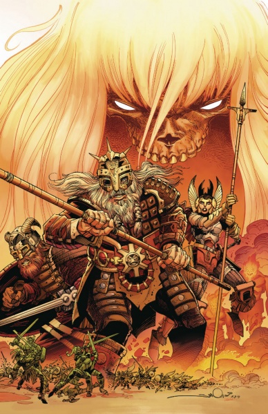
Written by and Illustrated by Walter Simonson
Colored by Laura Martin
Lettered by John Workman
Reviewed by Vanessa Boney
“Ragnarök: The Breaking of Helheim” #1 is an introduction to IDW’s six-issue min-series that sets up the story to come and explain what has happened prior to the start of the series. “Ragnarök: The Breaking of Helheim” #1 also begins with a major mystery. Although said mystery is not solved by the end of this issue, it does not take away anything from the story. Instead, it establishes the main protagonist’s (Thor’s) identity and the reason for the doom of the Gods.
Walter Simonson’s masterful writing in “Ragnarök: The Breaking of Helheim” #1 flows smoothly and maintains its pacing with bits of humor thrown in to keep the story from being consistently grim with the inclusion of Ratatosk, Thor’s talking squirrel companion, serving as the comic relief. Most notable is how Simonson is able to keep the story in the present while jumping briefly to the past through a telepathic connection between Odin and Thor in order to explain the events of Ragnarök to Thor (who was mysteriously M.I.A. for the past several hundred years) and to the audience simultaneously.
Simonson’s art is just as pleasing as his writing. The layouts in “Ragnarök: The Breaking of Helheim” #1 are some of the best in comics to date. He brilliantly incorporates a mix of splash pages and vertical tri-panels to illustrate the battles fought between the Gods and The Great Enemies, which works flawlessly as every God’s battle (and demise) is showcased, and each panel serves as Memoriam to the fallen allies of Asgard.
The art in “Ragnarök: The Breaking of Helheim” #1 bears no resemblance to what readers have grown accustomed from Marvel’s iteration of the Norse mythology. In this version, the characters truly look otherworldly. Simonson’s take is more appropriate as the cast of characters do not take on humanoid appearances; but instead consists of a plethora of various creatures, which is more imaginative and expected. Also, his version of Thor is quite unexpected, as he resembles a skeleton with no jaw, but it works. Moreover, Simonson’s level of detail in “Ragnarök: The Breaking of Helheim” #1 is telling that much thought went into the designs of each character. Laura Martin’s vibrant spectrum of colors are befitting to the story and the world Simonson has established.
Final Verdict: 9.0 – “Ragnarök: The Breaking of Helheim” #1 is a great start to what appears to be an epic tale to come that refreshingly deviates from the iteration of Thor comic fans are used to.
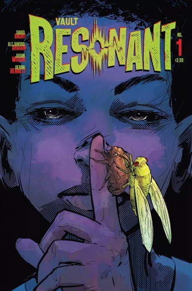
Written by David Andry
Illustrated by Alejandro Aragon
Colored by Jason Wordie
Lettered by Deron Bennett
Reviewed by Grace Taylor
In “Resonant” #1 we are introduced to a family struggling to survive in a dystopian world following mysterious cataclysmic events called “waves.” David Andry provides an interesting psychological twist to the dystopian genre that keeps us guessing at the end of this first issue.
Overall, Andry does a good job of establishing the isolation and destitute conditions of the story’s world through the eyes of the main family. Their vulnerability greatly adds to the suspense of the story and helps us sympathize with their peril – so much so, that we feel suspicious of anyone that comes across the characters’ path. In one scene, the father has an encounter that is gruesome and disturbing thanks to Alejandro Aragon’s haunting artwork.
The coloring by Jason Wordie also provides an intense feeling of panic to compliment Aragon’s art. At the start of the issue, everything is calm in the lush, green forest. However, once the infamous chirping starts there’s a wild rush of red, which almost looks like blood splatter across the last few pages. I almost wanted to cover my ears from the flood of chirping sounds loudly repeated across the panels.
Continued belowHowever, there are many unanswered questions in this first issue. What is the threat that sends everyone into such a state of panic? Why does everyone take specific actions once the chirping starts? The issue ends a bit too abruptly. Sometimes exposition can be a bit much in certain first issues, but in this case, I could use some more.
“Resonant” #1 starts off following the basic beats of a traditional dystopian story setup. However, the ending of this issue provides a surprising and unique twist that, unfortunately, leaves us hanging. Hopefully, the upcoming issue will pay off substantially.
Final Verdict: 6.9 – “Resonant” #1 is seemingly a typical dystopian story but flips the genre on its head at the very end. We’ll have to wait for the second issue for some important answers, which hopefully it can deliver to sustain our interest.
Written by Chip Zdarksy
Illustrated by Mark Bagley
Inked by John Dell
Colored by Frank D’Armata
Lettered by VC’s Travis Lanham
Reviewed by Alexander Jones
Following the first installment of the series, “Spider-Man: Life Story” has done an incredible job subverting pre-established expectations of what the title could be. Author Chip Zdarksy has offered up a comprehensively researched and cleverly designed narrative crafting a tragic alternate history where Marvel superheroes age in real-time. Getting to see milestone Spider-Man events with a much older Parker is an absolute thrill. Comic books so often avoid the consequence of age and seeing a title portray a more realistic alternative to the main continuity is interesting. Considering the fact that Zdarsky is retelling a Spider-Man story, the twists will likely catch a few readers by surprise. Zdarsky references and reintroduces important storylines in a fascinating new context.
Unfortunately, this is the issue where artist Mark Bagley’s pencils really start to lack the detail and clarity of previous installments. Bagley draws a significantly older Parker. His older Parker lacks some of Peter’s distinguishing features which are swapped out with unflattering wrinkles. The other characts who are also older lend the same set of problems. Tony Stark looks decrepit to the point where he lacks a certain charm or charisma. It is also disheartening to see some of the more exaggerated anatomies of the heroes. Bagley isn’t able to adapt to the different decades quite as well as Zdarsky can with his strong scripts in these later installments.
Zdarksy is able to invert Spider-Man continuity to make one story organically flow into the next. Seeing carefully plotted Marvel plot beats organized in chronological order will give readers a sense of wish fulfillment in seeing how older plot beats could have fit together. It is interesting to see how similar each script has been in regards to the plot beats and pacing. Towards the end of every installment, I can count on something awful happening to Peter. I wish Bagley’s art could be as precise and polished as Zdarsky’s scripts. Zdarsky only has one more decade left to go in “Spider-Man: Life Story” but he’s done an excellent job getting to the next point in the series.
Final Verdict: 7.5 – “Spider-Man: Life Story” #5 sheds light on the later years of Peter Parker’s life as Spider-Man as an older adult.


