
There’s a lot to cover on Wednesdays. We should know, as collectively, we read an insane amount of comics. Even with a large review staff, it’s hard to get to everything. With that in mind, we’re back with Wrapping Wednesday, where we look at some of the books we missed in what was another great week of comics.
Let’s get this party started.

Written by Brian Wood
Illustrated by Kieran McKeown
Colored by Dan Jackson
Lettered by Nate Piekos
Reviewed by Gregory Ellner
After multiple arcs in the Alien universe since 2016 across several different characters, Brian Wood has become accustomed to handing readers semi-complex story arcs that are nonetheless relatively self-contained. Even in this first issue of “Aliens: Rescue,” which relies upon “Aliens: Resistance” in part, Wood is able to provide the bare minimum of information to bring readers up to speed while simultaneously showcasing the trauma sustained by Alec Brand and limiting his knowledge to that which he could reasonably be expected to know. In the process, Wood is able to explain a lot about the impetus for the emergent miniseries without confusing newcomers. Furthermore, Wood is capable of utilizing the enthusiastic yet harsh life of the Colonial Marines to both demonstrate the nearly comical levels of over-acting in some elements of the Corps and examine the traumas sustained by even battle with seemingly non-sapient threats when similar to post-traumatic stress triggers.
Kieran McKeown continues to show a deftness with the pencil, creating a vast, diverse world of characters and appearances while at the same time using varied panel structure, images within images such as photographs, and differences in perspective to tell a story with a variety of different tones depending on the scenario being shown.
Meanwhile, Dan Jackson continues to demonstrate a keen ability with colors, utilizing a variety of different hoes in order to show different levels of focus, from a lighter set of colors for flashbacks to a similar one to show the glare of a muzzle flash on a handgun, and darker ones in other scenarios that have characters’ focus closer to their current situation than their past.
Final Verdict: 7.5- The follow-up to “Aliens: Resistance” is shaping up rather nicely, leaving enough to have readers wanting more.
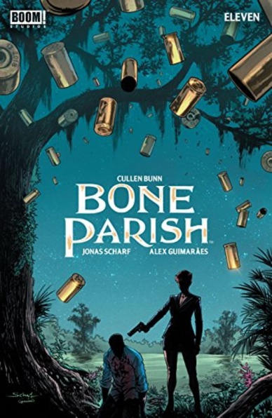
Script by Cullen Bunn
Art by Jonas Scharf
Colors by Alex Guimaraes
Letters by Ed Dukeshire
Reviewed by Matthew Blair
“Bone Parish” #11 is the second to last issue in the series and opens on the aftermath of a horrific gangland shootout. But while this violence is passed, there are still bodies to bury, vendettas to fulfill, and business to take care of.
Writer Cullen Bunn is the master of writing southern gothic horror stories and “Bone Parish” #11 is no exception. The addition of black magic elements to a New Orleans drug turf war is an inspired choice that enhances the terror and brutality of the situation. However, Bunn understands that really good horror isn’t just about blood and jump scares, it’s about personal drama as well and this comic delivers that in spades. Bunn mixes his violence with a deeply personal drama and shows the reader the tragedy of a family that is desperately trying to keep things together as their world falls apart around them, and their survival is not guaranteed.
The artwork for “Bone Parish” #11 is a perfect fit for the story. Artist and co-creator Jonas Scharf and colorist Alex Guimaraes work together to create character designs that look angular, heavy, and incredibly expressive which is all complemented by settings that are more shadow than substance. It all works together to create an environment that is dark, moody, and oppressive. But the artwork truly shines when it gets violent. The comic isn’t afraid to get bloody and the reader feels every spurt of blood, every blow, and every grimace as the characters stab, shoot, and pummel each a bloody pulp.
As a stand-alone issue, “Bone Parish” #11 provides plenty of action with fantastic art and gore and some truly heartbreaking family drama. As the second to last issue in the series, it lays the foundation for a brutal and nasty finale that shouldn’t be missed.
Continued belowFinal Verdict: 8.9- Fists, bullets, and black magic continue to fly in a superb comic book that shows a criminal family falling apart at the worst possible time

Written, Illustrated, and Lettered by Dash Shaw
Reviewed by Beau Q.
Murder is not without motive. Similarly, art, much less calculated multiform storytelling like comics, is not without motive.
In the same vein as its eponymous board game, “Clue: Candlestick” #3 is built, from the ground up, by Dash Shaw, as far more interactive a comic than expected from its static, stilted artwork and flat, graphic colors. The intent behind this murder mystery is to imply questions for the reader to answer. Why am I being shown Peacock’s back story? Why are so many panels devoted to the Clue murder weapons’ histories? Why use arrows to handhold the reader when the illustrations do the work? Shaw’s intent here, to great brilliance, is to imply questions with a great range of distinctive clues.
“Clue: Candlestick” #3 is the grand finale to Shaw’s monthly take on a household murder mystery. It’s an ode to board game mentality, a well-researched callback to puzzle books, and told by a comic strip cartoonist lacking influence from your Big Two house styles. What Shaw lacks in traditional rendering techniques, he more than makes up for with thoughtful, poignant panel construction, and dry-ass New Yorker humor that reinforces the narrative.
If you’re wanting a thorough understanding of Shaw’s process, “Clue: Candlestick” #3, thankfully, has an interview with the graphic novelist that absolutely validates all the museum/exhibition-like internal critique one could conjure upon facing a book so boldly bland. As for the murders and mysteries themselves, so long as you did the nonogram in “Clue: Candlestick” #2, you won’t be surprised by the ending. This is one mystery that can be solved by the reader while enjoying rather than using a deus ex machina to twist the ending for shock value.
Final Verdict: 6.9 – An act of pop art exhibitionism nostalgia huffing. I flipped the board when I saw Uncle Pennybags.
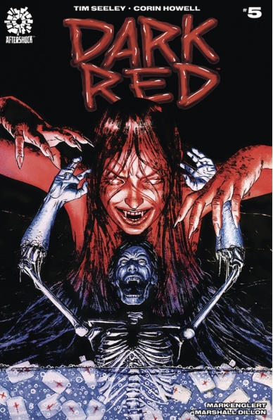
Written by Tim Seeley
Illustrated by Corin Howell
Colored by Mark Englert
Lettered by Marshall Dillon
Reviewed by Christa Harader
“Dark Red” #5 ends our first arc with some revelations and a whole lot of satisfying Nazi deaths, and it’s fair at this point to say that Seeley, Howell and the team know how to fuse catharsis with good storytelling.
Seeley’s dialogue flirts with proselytizing, but there’s far more going on here than a topical revenge fantasy. Seeley does a lot to elevate and illuminate the nuances of Middle Americans who are exactly that – trapped in the middle. Seeley shows how confusion, frustration and the limitations of technology and capitalism can drive folks to feel like they’re going it alone and fall prey to charming rhetoric that satisfies their deepest, darkest desires. And he does this without excusing bigotry. “Dark Red” explores its themes with moments of grace throughout, and there are a few beautiful ones in issue #5.
Howell’s art keeps the story engaging and just this side of cartoonish, with precise action scenes and a soft pencil-style line. There’s plenty of gore to go around and balance out the sweetness Howell brings to the cast, which makes for a delightful read. There are still some small issues with detail and shading in certain places, but they don’t detract from the overall experience. Englert’s colors have been a lot of fun, and all the blood and water in this issue are no different. With a lack of daylight, Englert pays special attention to ambient lighting and adds bright pops of color to Chip’s slaughter montage to keep the book from feeling too dismal or washed out. Dillon’s lettering is good, and the stylistic touches added to the vampire’s speech are a nice complement to the otherwise simple and clear font.
“Dark Red” will continue, and that’s a good thing. Especially considering we’ve more to see from the city folk, and Evie’s poised for some serious character development. Seeley, Howell, Englert, and Dillon have put together a very enjoyable and thematically sophisticated read thus far.
Continued belowFinal Verdict: 7.5 – “Dark Red” #5 is an action-packed and satisfying conclusion to a solid first arc.

Written by Peter J. Tomasi
Illustrated by Doug Mahnke
Lettered by Rob Leigh
Colored by Dave Baron
Reviewed by Michael Govan
In “Detective Comics” #1008, the Joker holds an amusement park hostage. Batman saves the day. That’s basically the whole issue right there. #1008 wasn’t terrible but it’s not great either. It’s a very average, pretty forgettable, self-contained comic. The Joker isn’t particularly terrifying or funny. Batman isn’t particularly clever or formidable. Joker hides a bomb, Batman finds it. End of story. It feels like it’s been done several times before.
In all fairness, Doug Mahnke does a solid job on the artwork. Batman looks very powerful and heroic even though he ends up doing very little here. Mahnke also draws a pretty terrifying Joker. In some panels, the guy does look like pure evil. The large, insane eyes, the impossibly wide smile that seems to take up his whole face…it’s just that the villain’s actions don’t match his appearance. He only gases one guy, hands out cotton candy…there have been comics as well as other media where the Joker has been absolutely chilling. That’s not here though. Batman is more of a supporting character this time around, just sort of going along with the Joker’s plan and humoring him…it’s just a so-so issue, in my opinion. Hopefully, next issue will be better.
Final Verdict: 5.0 – Joker needs to work on his material.

Written by Sam Humphries
Illustrated by Joe Quinones
Inked by Scott Hanna
Colored by Jordan Gibson
Lettered by Dave Sharpe
Reviewed by Alexander Jones
“Dial H for Hero” #5 continues the series streak of being self-reflexive with both the script and artwork. The script for issue #5 is all about the Secret Origins of DC Comics and Miguel Montez. “Dial H for Hero” is the finest work I have seen from writer Sam Humphries and artist Joe Quinones to-date. Montez’s origins are spotlighted on with The Operator who guides Montez through previous origins of the DC Universe while recapping the history of the publisher. It is thrilling to see the world of DC through the eyes of a younger character like Montez illustrated with ambitious visual design from Quinones.
I have always loved comics with Quinones-crafted interior art, but “Dial H for Hero” #5 shows just how versatile a creator Quinones is. Characters are climbing out of panels and defying the visual rules of comics. Seeing a seasoned creator who knows how to tell a story take such large chances is the true thrill of the issue. The pages carrying homages to past DC artists are gorgeous and important. Quinones appears to spend a great deal of time simply designing the ambitious layouts for each page. One particular double-page spread featuring a phone cord will serve as one of my fondest experiences with Quinones as a creator.
Humphries tells a script that isn’t afraid to defy reality and quickly veer into the supernatural. Thankfully, the characterization of Miguel and his friends keeps the narrative grounded. Quinones is able to get a lot of emotion of the scripts with bombastic facial expressions. The issue does spend a great deal of time explaining and retconning past stories instead of telling a new one. I feel that Humphries could have easily crafted new lore involving the H-Dial instead of trying to tie the mythology in with existing DC concepts outside of the ideas like the Speed Force, mainly centering around the Secret Origins.
“Dial H for Hero” #5 is a fine outing for both creators on the series. Quinones has never crafted art this ambitious in his Big Two work. Humphries does a great job referencing DC continuity to craft new mythology for a character like Miguel. There are a couple of really touching moments with Miguel’s Secret Origins that should not be missed!
Final Verdict: 8.0 – “Dial H for Hero” #5 continues to utilize the history of the DC Universe to tell a thrilling new story about the timeless H-Dial.
Continued below
Written by Seanan McGuire, Leah Williams, and Kelly Thompson
Illustrated by Claire Roe, Nina Vakueva, and Carmen Carnero
Colored by Rachelle Rosenberg and Tamra Bonvillain
Lettered by Janice Chiang
Reviewed by Grace Taylor
“Fearless” #1 brings some of our favorite Marvel female heroes together in a new anthology series. While the idea is promising, this first issues leaves little to be desired in terms of story and the humor it’s trying so hard to deliver.
The artwork – particularly the character designs – is the highlight of “Fearless” #1. In the first mini-story, our heroes look strong and feminine but not overly sexualized. My favorite portrayal is of Captain Marvel – she is killing it with her obliques! The coloring throughout all three stories is also beautifully vibrant and does justice to the rich character designs. Rachelle Rosenberg does a great job shifting the tones of colors from the more serious and action-driven “Campfire Song” to the light-hearted and bright “Style High Club.”
However, the strong artwork in this issue does not make up for the lack of interesting plot points or reasons why we should care about what’s happening to the characters. In “Campfire Song” for instance, Sue, Storm, and Carol all seem ho-hum about speaking at a leadership camp for female empowerment. Seanan McGuire beleaguers their indecision and reluctance, which makes the story drag. Also, Sue’s suspicion of the event is obvious and does a poor job of providing suspense.
One of the mini-stories in “Fearless” #1 I could have done without is the “Style High Club” featuring Millie the Model. While the story is a fun throw-back to those vintage Millie the Model stories from way back when, the satire of modern female stereotypes doesn’t quite land. Instead, this story comes off like a reality TV show, in the likes of America’s Next Top Model, depicting the typical Instagram model-type who only cares about dating and competing with other women. As a result, this mini-story feels like it takes a hard left after the first story that features empowered female characters.
The final mini-story is a large contrast to “Style High Club” and, again, misses the mark in terms of humor. Jessica Jones is an inherently dark character, so the joke at the end is abrupt and deflates any cool factor that Jones might bring to the story.
While there is some potential for fun and inspiring stories featuring some of our favorite heroes, the latter two mini-stories of “Fearless” #1 drop the ball in lifting up their protagonists. I would not recommend this issue as an entryway to these Marvel heroes, especially young women, as the last two stories revert back to negative female stereotypes, even if it’s in the name of fun.
Final Verdict: 6.3 – “Fearless” #1 does not deliver on the humor or female empowerment we might expect from a story centered around notable heroes like Captain Marvel. Instead, the story is dull and somewhat relies on female stereotypes for laughs.

Written by Donny Cates
Illustrated by Cory Smith
Colored by David Curiel
Lettered by Cory Petit
Reviewed by Shamus Clancy
Between the psychedelic “Silver Surfer: Black,” his previous thrilling ending in “Thanos” and the way his current “Venom” run is expanding itself into the cosmos, Donny Cates is in the midst of crafting a Jonathan Hickman-esque intertwining saga at Marvel. “Guardians of the Galaxy” #7 is yet another worthy installment in his out-of-this-world narrative.
Cates kicks off another six-issue storyline here. “Guardians of the Galaxy” #7 is missing the bombastic, black hole-inducing beginning of the series opener, as Cates eschews that approach for something a tad less chaotic and immediately gratifying. The pace is less quick, but that’s certainly not a critique. Cates leaves readers with more questions than answers this issue, but his previous writing leaves little doubt that he will deliver the goods with this Guardians run.
When it comes to a galactic epic, the Guardians deserve a Technicolor Dreamcoat to go with their cosmic adventures. Colorist David Curiel shines throughout “Guardians of the Galaxy” #7. The blinding purples of the cultish Universal Church of Truth that ravish the Nova Corps and this makeshift gang of Guardians bring vivid energy to Cates’ tale that only enhances his slow-burning vision. Curiel packs some extra juice that makes newcomer Cory Smith’s crisp penciling all the more impactful, as the trio forms a fresh team that has the strength of a Star-Lord, Phyla-Vell and Beta Ray Bill team-up.
Continued belowCates’s latest space opera continues churning along with summer blockbuster-style art and the heartfelt return of a fan-favorite character in “Guardians of the Galaxy” #7. An engrossing first arc has given way to what could be a defining (or fatal) story in the legend of Rocket Raccoon.
Final Verdict: 8.0 – Cates once again has readers hooked on a feeling and waiting for the payoff sure to come with these revamped Guardians of the Galaxy.

Written by G. Willow Wilson
Illustrated by Christian Ward
Colored by Christian Ward
Lettered by Sal Cipriano
Reviewed by Jhoan Suriel
Like the previous issue promised, we left the Sundog crew about to face off against a giant Lux vessel. “Invisible Kingdom” #5 picks up immediately with dogfighting, plenty of character drama, and some humor. With this last issue of the arc, we get some spectacular and dynamic artwork by way of Christian Ward. Wilson continues to deliver a tight-paced plot with snappy dialogue and leaves readers wondering what’s next for the series.
While Ward’s art remains a delight to look at, it tends to look a tad rough at times. For instance, some of the characters’ faces look goofy in “Invisible Kingdom” #5. But that’s always been the case with Ward’s artwork for the most part. If anything, Ward’s panel layout design in this issue is impressive. Some of Ward’s best panels instill a sense of motion and feels as if we’re getting pulled into a whirlpool. The four-panel sequence involves an invasive maneuver in which the Sundog avoids an incoming missile.
Additionally, the lush, painterly colors of space blend well with Cipriano’s letter work. It continues to quite a joy to watch Ward masterfully color “Invisible Kingdom” #5’s big battle. There’s something to be said about the way the giant black and red Lux battleship stands out against the sweeping auroras of dead space. We can also feel the heat of orange and yellow missiles as they move across the page.
Wilson and Ward’s Cowboy Bebop meets Star Wars space opera wraps up on high note. Even as “Invisible Kingdom” #5 leaves us with a few lingering questions, it’s clear that a much bigger adventure is in store for Grix and crew. It’s easily one of Berger Books’ best series. As such, the wait until the new arc in October should leave readers excited for what is yet to come.
Final Verdict: 8.8 – “Invisible Kingdom” #5 is a satisfying first act that successfully balances character-driven plot with high-octane artwork. It’s a must-read series for sci-fi comic fans looking for a good space-faring romp with a conspiracy element.
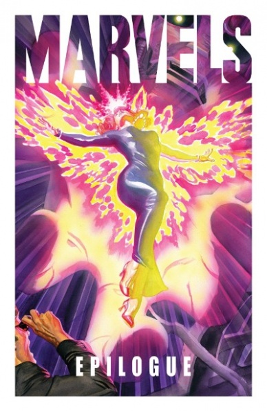
Written by Kurt Busiek
Illustrated by Alex Ross
Lettered by John Roshell & Richard Starkings
Reviewed by Kenneth Laster
On the 25th anniversary of “Marvels”, the creative team of Kurt Busiek and Alex Ross return along with John Roshell and Richard Starkings to put a final coda on their beloved mini-series in this 16-page feature in “Marvels Epilogue.” This issue features a number of interviews and behind the scenes material that make it a must-read for fans of “Marvels” and its lasting legacy.
Alex Ross has made Marvel comics pop off the stands in his career-best cover work over the past few years and in “Marvels Epilogue” he proves that he can capture that magic in interiors just as well. The conceit of the original “Marvels” series was capturing what it would be like to see all of the major Marvel events from the ground up and through the framing of Phil Sheldon, photographer, the book gives way to the realistic painting style of Alex Ross. Set during “X-Men” #98 Ross captures the calm winter scape and fun time out for the X-Men and slots Phil Sheldon and his family seamlessly into the original tale. While Ross can capture this somewhat mundane setting, the real treat comes when the action takes off. The two points Ross draws inspiration from are Banshee and Storm’s transformations in the original issue. Banshee’s signature sound effect that illustrates his scream is rendered realistically where it would seem that the air bends around his voice and the stark color of his costume marks him as a larger than life figure within the world Ross has painted. John Roshell and Richard Starkings have their work cut out for them in making word balloons and captions that fit with Ross’s painterly style but they do a serviceable job.
Continued belowIt cannot be overstated how much Ross grasps putting the reader in the perspective of the onlooker. Busiek and Ross do an amazing job at capturing exactly the information any bystander could see or overhear. This is not an X-Men story. If the reader wants that they need to pick up X-Men #98. What makes this issue not just fan art of the Marvel Universe is the coda that Busiek adds to stick the landing with this series. One of Phil Sheldon’s daughters asks if watching the X-Men leaping into action is what his life was like as a photographer and what follows is a beautiful two-page spread of Sheldon’s Forrest Gumpian life in the Marvel Universe with highlights from the series and events that we were not shown. And Busiek gets at the core of the series by having Sheldon sum up by reflecting that he wants to sum up the night’s event like a reporter but that night is for him, his children and the world.
The 25th anniversary of Marvels has seen a number of homage covers and efforts to honor this milestone but none are as meaningful as “Marvels Epilogue.” Ross’s commitment to crafting the Marvel Universe into a visually immersive and larger than life place has not waned in the intervening years and Busiek’s ability to take superhero mythology and craft a meaning story is just as strong as ever.
Final Verdict: 8.9 – Alex Ross and Kurt Busiek struck gold with “Marvels” 25 years ago and with “Marvels Epilogue” they put a worthy cap on Phil Sheldon’s story and the Marvel Universe through his eyes.
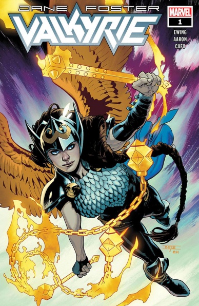
Written by Jason Aaron & Al Ewing
Illustrated by CAFU
Colored by Jesus Aburtov
Lettered by VC’s Joe Sabino
Reviewed by Chris Egan
In the wake of the “The War of the Realms,” Jane Foster’s own magical hammer was destroyed and re-formed into the All-Weapon. She is now a new type of hero. A human turned Valkyrie. She is the last of these magical beings, but what does it all mean for Jane and for the universe?
Jane Foster is juggling a life of coming back to her career as a doctor; leaving her battle with cancer and her temporary title of God of Thunder behind her. To say the least, her everyday goals are feeling a bit wonky as she tries to work her superhero responsibilities around them. With Marvel Comics heavy hitters Jason Aaron and Al Ewing co-writing a story like this, the best is expected. What we get is a decent start to a new series, but like Jane’s life, things are disjointed. As a continuation of previous series and story arcs, it works quite well. As a series opener, it is easy to get lost in the lore. Aaron and Ewing do a fair job playing catch up and keeping the script clear and easy to follow. However, unless readers are well-versed in the various storylines leading up to this point, there are moments that rely a bit too much on being an avid collector. It’s unclear where the series is heading, but right now it is mostly playing up on being a sequel to what’s come before.
The story works best when it focuses on Jane trying to maintain her dual life. It’s a trope as old as time, but it’s still great when used well and it is so here. The story does a good job of containing weighty scenes and moments of levity. Apart from a few choppy bits, the story does move smoothly between the two. The humor is truly great. Seeing Jane getting accustomed to her new role while going between speaking in god-like olde English and modern dialogue would typically be used as a change in personality attached to the usage of her new powers, but here it’s a conscious decision she needs to make depending on who she is speaking to. I found myself smiling and chuckling more than once.
CAFU draws a damn good superhero epic. Every panel is full of dynamic action, gorgeous details, and excellent narrative assists. It’s top-notch artwork that gives this book a step up above a lot of the other typical Marvel books on the shelves. His ability to make everything from a superhero battle to a discussion between doctors to a crisis in Asgard seem equally important and thrilling is a testament to his talent. Jesus Aburtov’s color work is something to behold. His talent for giving everything a near three-dimensional look with his usage of light and shading is perfection. His full use of color is outstanding. He evokes every single emotion and necessary nuance in every panel. If you removed all of the dialogue from this issue, CAFU and Aburtov’s team-up would speak for itself. I would be remiss to not also mention Joe Sabino’s lettering work throughout. The variety of text used for nearly every major character in this issue is simply astonishing. The amount of time and detail that went into should not be overlooked and I implore you to look at his work closely. Even if it takes you more than one read-through to pick up on all of it.
It is nice to see Marvel continue using a multi-faceted female hero in a book that balances big action, mildly adult emotional themes, and some truly funny humor. This is a character that has been, and will hopefully continue to be inspiring to many readers; it would just be great to see the series eventually stand on its own away from past plots. Luckily, having an excellent creative team across the board makes this book far better and more enjoyable than it would be in less capable hands.
Final Verdict: 7.0, A fairly solid hero story with a strong character at its center. It is only hindered by its reliance on previous stories throughout Marvel Comics.


