
There is a lot to cover on Wednesdays. We should know, as collectively, we read an insane amount of comics. Even with a large review staff, it’s hard to get to everything. With that in mind, we’re back with Wrapping Wednesday, where we look at some of the books we missed in what was another great week of comics.
Let’s get this party started.

Ant-Man and the Wasp #3
Written by Mark Waid
Illustrated by Javier Garrón
Colored by Israel Silva
Lettered by VC’s Joe Caramagna
Reviewed by Gregory Ellner
Much like the film of the same name out this past week, “Ant-Man and the Wasp” is a story that, while at times tense, is filled with sheer fun on a level that is rarely seen in many comics of late. Mark Waid crafts a tale with a variety of very comedic characters, from the happy-yet-vulnerable Pollyanna that is Nadia Van Dyne to the worried, but experienced Scott Lang, to even their other companions in the Microverse. The interactions between characters new and old are genuinely funny, with the weird science angles in use only going to make some of the goings on all the more amusing for readers and exasperating for the characters.
Javier Garrón crafts a very dynamic art style that takes advantage of the “action adventure” angle of the issue, with exaggerated movements and facial expressions adding to a rather hammy performance overall, in all of the best possible ways. The art style is so dynamic that it makes even a single panel include several different movements, such as Scott Lang trying to figure out one of the latest elements of quantum mechanics at work by having him in two overlapping body positions facing in different directions. The art is also very realistic, even to the point of it seeming to be more like a Renaissance painting than a modern comic, especially once we get into close-ups or some of the in-depth looks at Nadia’s powers.
Israel Silva’s coloring is just as responsible for the fantastic art as Garrón. Silva’s use of reds, blacks, blues, yellows, and greens make for a fantastical color palette that is both completely natural to the series and somehow exceptionally visually appealing for the type of comic that “Ant-Man and the Wasp” seems to be.
Final Verdict: 8.0- With a very fun story, great artwork, and beautiful colors, “Ant-Man and the Wasp” #3 does a good job of telling a weird science quantum physics tale that is complex, yet easy to understand, and even teaches readers a bit about quantum mechanics along the way.
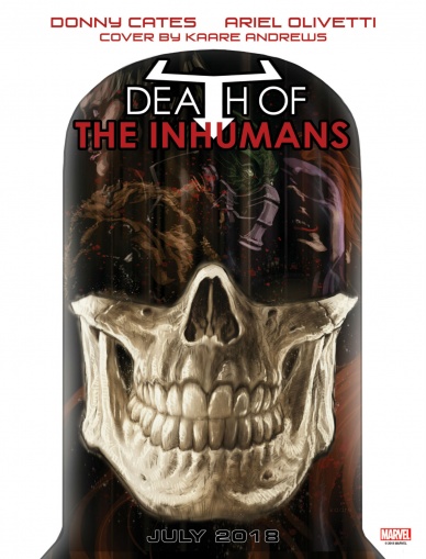
Death of the Inhumans #1
Written by Donny Cates
Illustrated by Ariel Olivetti
Colored by Jordie Bellaire
Lettered by Vc’s Clayton Cowles
Reviewed by Gustavo S. Lodi
Much has been said about the Inhumans as an intellectual property. The backstage discussions around the group’s potential as a major flagship-carrying status led to an interesting new series in the past. So when up-and-coming writer Donny Cates announced a series so bluntly called “Death of the Inhumans” attention was dully paid.
This debut issue is wise in taking only what it needs for its story. There are pieces of Inhuman history woven in here, from early Lee and Kirby to the more modern Hickman and Soule. By doing that, Cates is free to explore the narrative at his own pace – and what a pace that is.
Before going there, Olivetti delivers some of his best art as of late, especially on the outer cosmos parts, but mostly on character expressions. There is a certain style to his line that makes readers connect with those characters. Combined with the narrator choice chosen by Cates, the art almost reads like visiting a fairytale story that happened long ago. His character costume portrayal is also interesting to examine: while not exactly creating many new designs, there is enough tweaking in here to take pause.
Cates’s script is very successful in some areas but limited in others. Where it shines the most is on its unrelenting pace: the death toll is real in “Death of the Inhumans” and it is felt by the characters and most likely by readers as well. Cates’s creativeness on how Black Bolt used his powers and the manner he chooses to communicate are also highlights.
Continued belowPerhaps the major shortcoming is the use of an ominous narrator: while it serves to cover a lot of ground quickly, it adds a feeling of undesired inevitability, almost as if the characters actions are void and the resolution of the story is already a given. While this is true to any written tale, to be able to make it disguised on the eye of the readers is needed to keep interest elevated.
Final Verdict: 7.2 – An interesting and consequential story, “Death of the Inhumans” uses the race’s mythology to expand upon it. Hopefully, next issues will show a stronger balance on how lead characters influence the action around them.

Death or Glory #3
Written by Rick Remender
Illustrated & Colored by Bengal
Lettered by Rus Wooton
Reviewed by Alea Perez
Issue #3 of “Death and Glory,” like issue #2, helpfully provides a recap of the previous issue on the copyright page and Wooton accommodatingly color codes the lettering throughout the issue, differentiating between the narration and the clever, natural dialogue through the use of burgundy and black typefaces.
In terms of pacing, the action of issues #1 and #2 – rife with frenetic car chase scenes through open desert vistas – is no longer seen here as the creative team, led by Remender, makes way for exploring character background, what it means to do bad for the sake of being good, and for offering commentary on the perils of modern American life.
Glory, ever resilient, continues to be a flawed hero, good at heart but seemingly willing to do whatever it takes to save her father, Red. The reader is often left to question, throughout Glory’s interactions with Pablo – a nuanced and intriguing character whose story needs to be given more focus – if she has it in her to abandon him in his time of need or if she will stick with him, even when helping him no longer works to her advantage. Glory also continues to wear her heart on her sleeve and is skillfully and expressively drawn, sometimes only from one panel to the next, in various stages of joy, anger, terror, uncertainty, or determination.
As the storytelling draws in on itself to focus on the background, so too does the artwork narrow its scope. Fewer nature scenes, in general, are provided, in favor of more interior shots and an increase in silhouettes. Although this approach lends itself to a more minimalist style from Bengal, even his minimalist panels show a gift for intricacy and attention to detail.
The coloring moves, from start to finish, between a bright 70s palette of yellows, oranges, and avocado green while depicting the past to more muted grays, sterile whites, and icy blues. As scenes intensify and emotions flare, oranges and reds are cleverly pulled through. This is used to great effect near the issue’s end as Glory and Isabelle are literally and figuratively struck by the heat and gruesomeness of the scene that lies before them.
Final Verdict: 9.2 – Compelling and complex characters are coupled with a timely and heartbreaking story pertaining to capitalism, greed, and the migrant experience in this intricately drawn, suspenseful modern western.

Giant Days #40
Written by John Allison
Illustrated by Max Sarin
Colored by Whitney Cogar
Lettered by Jim Campbell
Reviewed by Tom Baker
Tackleford is my happy place. I make no bones about my affection for John Allison’s fictional locale and his cascading series of web (and now print) comics based there. Originally a trio of self-published comics, since developed into an ongoing series with artist Max Sarin, “Giant Days” hits an even sweeter spot by up-ending some of the same characters, their foibles, and Allison’s own singular comedic voice, to a real-life location, Sheffield, where I used to live.
With those acknowledged biases and potential conflicts-of-interest admitted, I am pleased to announce that “Giant Days” #40 is another very good comic book. In the aftermath of announcing his undying love for pale-skinned goth beauty Esther van Groot, being rejected and subsequently falling off a wall and breaking both his ankles (shades of Jarvis Cocker, frontman of Sheffield-based Britpop outsiders Pulp, doing the same in an attempt to impress a girl), this issue sees floppy-haired dork Ed Gemmel returns to his houseshare with his tail between his legs.
Continued belowEsther then conspires with homeschooled naif Daisy and pragmatic Susan, who make up the book’s core trio, to cheer him up. It’s a setup not unlike an episode of a sitcom. And similar to long-running TV comedies, at this point “Giant Days” has mostly done away with the more whimsical, high-concept premises, instead relying on the fact that the characters and their relationships are defined and familiar to the point that drama and comedy can be wrung by simply poking and prodding at them.
The Ed-and-Esther drama and subsequent bodily injury is an extreme example of this poking and prodding, but one which is nonetheless instructive to Allison and Sarin’s strengths. When original series artist Lisa Treiman departed after “Giant Days”’s first arc, I was concerned. I needn’t have been, however, for while Sarin has a style all their own, it also exists in a continuity with Treiman’s and also Allison’s own cartooning, with its focus on the details of sly facial expressions and exaggerated poses alike. They nail the relatable malaise of Ed, the flirtatious banter of fellow physiotherapy patient Nina (complete with not-so-subtle lip-biting), and Daisy’s genuine distress at the idea of joining somebody in the middle of a queue.
Queue anxiety is, of course, a classically British neuroses. While Allison’s sense of humor is particularly British, it is not on the insufferably twee tip of, say, the Very British Problems Twitter account. He’s loosely on the same observational/surrealist vein as Vic and Bob — see, for example, Ed mistaking a pep-talk about there being “plenty more fish in the sea” as a suggestion he sleeps with a mermaid — but with a generosity towards his cast that shades the familiar outlines with genuine warmth.
Final Verdict: 8.8 – “Giant Days” #40 is the delightful latest installment in a consistently hilarious, warm and cozy campus comedy.
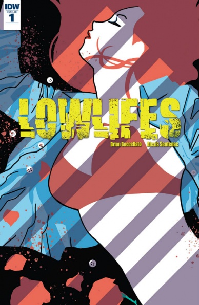
Lowlifes #1
Written by Brian Buccellato
Illustrated by Alexis Sentenac
Lettered by Neil Uyetake
Reviewed by Dexter Buschetelli
“Lowlifes” is an attempt to give a contemporary take on hardboiled crime-noir. You’re gonna wanna keep in mind I said “attempt”.
Black stories with gritty themes have a fine line to walk with the culture of 2018, but that doesn’t mean they can’t be told. Tales centered around detestable people doing horrid things to each other can often flourish with audiences. They speak to our most base nature by showing us a side of ourselves we hope to never see come into the light. In the right situations, or more accurately the wrong ones, anyone is capable of anything; and in the fantasy of cinema, literature, and comics, we live vicariously through those characters.
But the darker a narrative goes the more self-aware it needs to be to connect with modern audiences. We are not living in the prohibition era of Don Everhard. Good noir has to evolve. Even a film like 2000’s “Memento”, which is remembered fondly, is wildly problematic through the lens of today’s sensibilities. This is “Lowlifes” greatest flaw.
The first issue revolves around protagonist Richard’s desire for revenge for the rape of what is implied to be his wife, though this seems to be left intentionally ambiguous. Sexual assault has never been more of a hot-button issue than it is today, which it should be. That’s not to say that it can never be used as a story element, but we live in a post-Women in Refrigerators world. If you’re going to use violence and violation of female characters you need a firm grasp of the concepts and an original angle. “Lowlifes” lacks this. It is neo-noir without nuance.
This introductory installment focuses heavily on Richard and his reactions to the trauma, which is a shame; we’ve seen plenty of that before and the book does have more to offer. Richard’s partner is an interesting character involved in some intriguing personal relations, the pacing of the book runs smoothly, and the prolepsis of the first four pages leaves the reader wanting to know how we will get there even though the rest of the tale ruins that appetite. The art is also absolutely tonally appropriate to the story and a joy to look at. Alexis Sentenac clearly has an understanding of the world Brian Buccellato is building. Sadly, It just leaves one wishing to see this art in a better book by a writer who has more to say than a hundred other stories we’ve already read and watched.
Continued belowFinal verdict: 5.8 – Great art can’t salvage tone deaf and trite scripting.
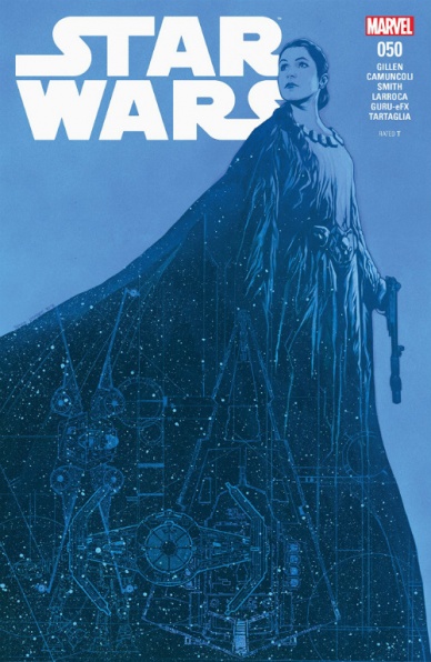
Star Wars #50
Written by Kieron Gillen
Illustrated by Salvador Larroca
Colored by GURU-eFX
Lettered by Clayton Cowles
Reviewed by Jacob Robert Nuckolls
The highest compliment that I can pay to Part 1 of “Hope Dies” is that it felt like watching a Star Wars film. Gillen and company have created a comic that mirrors the atmosphere, characters, and tone of the original trilogy. “Hope Dies” Part I is no exception.
Gillen’s writing quickly makes us familiar with the surroundings, the positions of the characters, and, most importantly – the risks involved. Titling an arc “Hope Dies” is a bold choice (particularly when fans know the beginning and end of this story), but he does a good job of ramping up the stakes in this issue in a truly cinematic fashion.
Larroca’s full-page spreads often find themselves in the neighborhood of breath-taking. His way of framing the action as well as smaller character moments reinforces the cinematic feel of the book. His ability to capture the subtle, Carrie Fisher-like expressions of Leia is astounding. However, this tends to be his pitfall as his attempts to re-create shots and images from the films can make his artwork come off as blocky or unoriginal. To help with that, GURU-eFX’s color brings an intense dynamism that we don’t always see – even in the films (Luke’s X-Wing scene is a prime example). His choice of colors makes every panel pop with an intergalactic aura that often distracts the reader from some of the blockier close-ups of movie look-a-like characters.
Final Verdict 8.0 – Despite some blocky artwork, Gillen and company ramp up the stakes and provide a solid, cinematic starting point for the “Hope Dies” story arc.

Submerged #1
Written by Vita Ayala
Illustrated by Lisa Sterle
Colored by Stelladia
Lettered by Rachel Deering
Reviewed by Reed Hinckley-Barnes
“Submerged” #1 gives a modern twist on the myth of Orpheaus. Instead of a man decending into the underworld trying to save his lover, “Submerged” #1 is the story of a young woman, Ellie, in New York City, descending into the subway, trying to save her brother before a storm comes and floods the tunnels.
When I describe it like that, it sounds a bit like all of the magic has been removed from the myth. But that is not remotely the case. “Submerged” #1 still contains a touch of the supernatural, though its main character, at least initially, doesn’t fully understand the journey she has begun.
The highlight of this first issue is the connection between the main character and her family. There are a series of flashbacks, interspersed throughout the issue, that show Ellie’s relationship with her brother. In this way, the issue is very effective. By the end of “Submerged” #1, you are invested in her story and her search for her brother, even though, if she follows the course of Orpheaus, it will end in tragedy.
There are a few problems in this issue when in the panel to panel action. There are a number of instances where the action doesn’t move quite as smoothly as one would like. It’s a nebulous art, making the movement that happens between panels flow in such a way that it makes sense and feels real, and in “Submerged” #1, there are a number of places where it doesnt quite work.
Final Verdict: 6.5 – “Submerged” #1 is a fun debut that draws the reader in, despite some hiccups in the sequential story telling.

Sword Daughter #2
Written by Brian Wood
Art by Mack Chater
Colored by José Villarrubia
Lettered by Nate Piekos of Blambot
Reviewed by Eric Goebelbecker
In ‘The Stone Hits the Skull,’ Elsbeth and Dag take a trip across the North Sea to Shetland. They are looking for revenge, but end up in a murder mystery.
“Sword Daughter” is sparse on dialog and narration. Chater shows us the nature of the father-daughter relationship rather than Wood telling us. In the book’s first few pages Dag assumes she’s gone, is wrong, and then scrambles to fix his mistake. An icy stare from Elsbeth tells us nothing is forgiven. Later, we see her weaken for a moment with an outstretched hand that is quickly withdrawn.
Continued belowWe don’t need dialog to see Dag search for his daughter. We don’t need to hear men chatter as they climb on the boat, or Elsbeth running through the shallows to catch it. The storytelling is tight, efficient, minimalist, but there’s still room for bad advice from a shipmate and two splash pages during a fight. The economy of words and pictures means a 28-page issue contains as much story as two or three 22-page issues in other titles.
Elsbeth’s narration is more limited than the premiere issue, and it’s an improvement. The action feels more immediate with less omniscient commentary.
Villarrubia’s color is part of the storytelling effort. Earth tones start out almost bleached but deepen as the sun rises. The sea is green, but Shetland is blue-grey with rain, and the colors suit the desperate situation.
Action sequences are brutish and utilitarian. When two men fight they remain planted on the ground, swords held over their head or in front of them as they heave into heavy downstrokes. The warriors hack and slash, and the winning is ugly.
In the end, Elsbeth points to Orkney and the next chapter. I’m right behind her.
Final Verdict: 8.6 – In “Sword Daughter” #2 the series finds its footing on good ground.
Transformers Bumblebee Movie Prequel: From Cybertron With Love #1
Written by John Barber
Illustrated by Andrew Griffith
Colored by Priscilla Tramontano
Lettered by Tom B. Long
Reviewed by Alexander Jones
The idea of crafting a narrative inside of the maligned Transformers film continuity is a truly odd and daunting task for any creator. Luckily, IDW’s Editor-in-Chief John Barber is stepping in to do the impossible and make the movie continuity work from a comic book standpoint. Veteran Transformers artist Andrew Griffith is also along for the ride. The series is actually a prequel to the first film centered around Bumblebee and his life during the ‘1960s. The one-shot is also a period-piece stepping into the spy genre with David Reeve serving as a charming replacement for James Bond and companion for Bumblebee.
The interactions between Reeve and Bumblebee are enthralling. It is interesting to see how the script is mostly spy-centric and with the lion share of the material centered around Reeve. This issue is a great jumping on point and does not carry any baggage from the films. While there isn’t truly any groundbreaking material in the issue, it serves as a nice diversion exploring Bumblebee’s past. The issue has an incredibly complex plot which twists, turns and contorts to Reeve’s current mission. The spy’s world is turned upside-down in the issue. With so much focus on Reeve, we don’t truly learn any new information about Bumblebee’s character and barely have a good idea of what his life was like during this time period aside from assisting Reeve.
Artist Andrew Griffith’s work is really wonderfully expressive. Griffith does a great job depicting the robots, but his art seems imprecise and inconsistent at times. There is something in particular about Griffith’s style of pencils which lend themselves wonderfully to a period piece like this one. Griffith’s curvy lines and expressive characters are suited nicely to the work of a period setting such as this one. This is a really unique script that calls for a lot of different talents from Griffith who manages to deliver each component adequately, but his execution definitely needs some fine-tuning. Scenes with talking heads are drawn imprecisely and show his limitations as an artist.
“Transformers Bumblebee Movie Prequel: From Cybertron With Love” #1 is a very surprising issue. The entry is especially impressive considering the Universe it belongs to. Stretching the role of the Transformers into the spy genre and a period setting is an incredibly ambitious move that pays off very well in this issue!
Final Verdict: 6.8 – “Transformers Bumblebee Movie Prequel: From Cybertron With Love” #1 breaks the tradition of the films and offers quality Transformers entertainment!
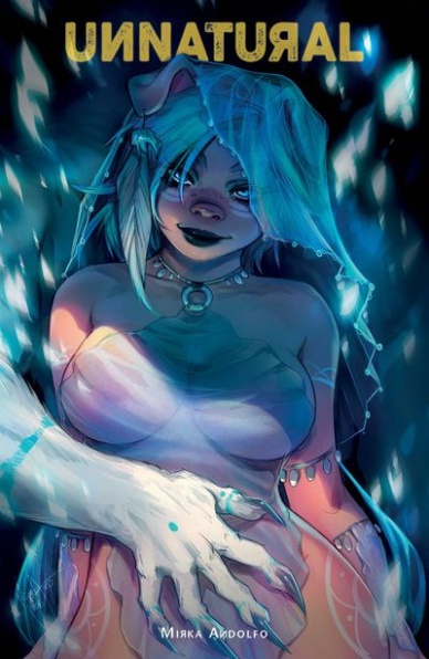
Unnatural #1
Written & Illustrated by Mirka Andolfo
Colored by Mirka Andolfo and Gianluca Papi
Lettered by Fabio Amelia
Reviewed by Michael Mazzacane
Things get hot and furry in “Unnatural” #1, the English translation of writer-artist Mirka Andolfo’s comic originally published in Italian as “Contro Natura.” If the idea of anthropomorphized animals having explicit sexual desires and fantasies about one another sounds like a non-starter, this likely isn’t for you. Because that’s what this issue starts with, Leslie, a pig-girl, having thirsty dreams only to be interrupted by a roommate and the horrors of daily life: the rent is due. While this isn’t run of the mill furry porn, this series and issue feature a fair amount of sexual content, so consider reading this in the same place you’d read “Sex Criminals.”
Continued belowI’m generally a little apprehensive about using anthropomorphized animals as metaphors for humanity, like any metaphor it has limits and faults. For this story about how patriarchal society lays claim to female bodies and enforces heteronormativity, it works so far. With the series Italian origins, it isn’t hard to draw parallels with the Fascist governments own programs and views of women. This becomes most explicit during a children’s television sequence that explains how heterosexual relationships are the “natural” and valid course by reducing it to a math equation that designates miscegenated and homosexual partnerships as invalid. While the State Leslie lives in is all types of bad, these views are filtered down to everyday acts as seen in the sequence at her job as a waitress. The manager has given all the women extremely revealing Lolita outfits, which don’t fit someone of Leslie’s body type comfortably leading to much racial themed mockery and generally sexist remarks. Which gives a sequence between her and a friend some extra shades of grey as he tries to help.
The fantastical setting Andolfo works in gives her a lot of leeway in terms of expressive eyes and general cartooning to get a point across. That range is what helps sell the characterization and emotion this story needs to survive. For all the high concept aspects, it’s fairly slice of life focusing on Leslie’s day to day experience as her birthday approaches. Without good emotive art, this story would fail. Special note should also be given to Andolfo and color assistant Gianluca Papi. Andolfo’s line work is excellent but the soft color blends that run through this issue give the world a lived-in feel without being ultra-textured.
Final Verdict: 8.0 – Obvious disclaimer aside, this is a well done first issue with good macro and micro world building and scenes that characterize and normalize Leslie’s supposedly unnatural wants.

The Walking Dead #181
Written by Robert Kirkman
Illustrated by Charlie Adlard
Colored by Stefano Gaudiano & Cliff Rathburn
Lettered by Rus Wooton
Reviewed by Chris Egan
The last few issues of “The Walking Dead” have been absolutely captivating and #181 is sticking to the current trend. It isn’t breaking extremely new ground for the series or zombie stories in general, but it has gotten back to what makes it so great when it is great. The new narrative that has been set in motion is moving towards something big, exactly what that is, is not perfectly clear yet, but we are getting there. When he’s focused and truly knows where to take the story, Kirkman has a way of making you feel it, like a nervous pang in your gut.
Seeing some of the longest standing and beloved characters move into completely new territory is wonderful, if not a little sad. Change can be uncomfortable at first, even when it’s desperately needed. Some changes may be permanent, others not so much, but it is great having the book move adjacent to some of the familiar grooves it has been set in for years. The character interactions are very strong. Everyone is making decisions that could change lives forever. Maggie, Carl, and co. are meeting with newly found survivors, Rick is coming to his own conclusions about new allies, and Michonne is trying to figure out the next chapter in this life. Some new, powerful revelations are brought to light as well. And the excellent walker action is the ribbon wrapped around this gift. All of these entwined moments and conversations have a movement to them, like a group of people bobbing in and treading water in an increasingly violent tide.
Charlie Adlard’s art is the same as it has been for some time now. Longtime readers seem to hardly pick up on it anymore, but he still does the best walkers in the industry. And in this respect, he is allowed to shine once again. Gaudiano & Rathburn’s inks and shading breathe life into every detail, perfecting the textures and lighting. The entire art team continues to make the book look better as time goes on.
This is what fans of “The Walking Dead” look for in the series. When it’s great, it’s great and when it’s not, well, we tend to discuss that in great detail. It is nice to be praising the book once again. Here’s to hoping they keep it up for as long as they can.
Final Verdict: 8.0 – A very good issue that moves this chapter along nicely that will surely keep readers craving the next.


