
There’s a lot to cover on Wednesdays. We should know, as collectively, we read an insane amount of comics. Even with a large review staff, it’s hard to get to everything. With that in mind, we’re back with Wrapping Wednesday, where we look at some of the books we missed in what was another great week of comics.
Let’s get this party started.

Written by Simon Spurrier
Illustrated by Chris Wildgoose
Colored by André May
Lettered by Jim Campbell
Reviewed by Kobi Bordoley
“Alienated” #4 is really heavy. Note that this issue centers heavily on self-harm and suicide, so be warned. In “Alienated” #4, we learn a lot about Samir, the lithe and good looking member of the protagonist trio — but of course, things aren’t as copacetic as they seem from the series’ onset. In a blistering 26 or so pages, we learn about his history of self-harm, his specific feelings towards his father who abandoned his family, and his skepticism towards Samantha and Samuel, the co-conspirators with whom he’s adopted the powerful but infantile alien, Chip. Surrounding this are Samir’s thoughts on assimilation, and the subplot of Sam’s angsty alt-something vlog. If that sounds like a mouthful, it’s because it is.
But it mostly works. The previous issues of “Alienated” have set the bar high, which is impressive to say the least: the story follows three main protagonists whose thoughts, by way of the plot, intersect and overlap. Each page has so much detail, both visually and narratively. Sometimes it feels like too much, and sometimes it feels like every page is just worth reading twice. In “Alienated” #4, it’s mostly the latter. However, given the emotional heft of the content, adding more room to breathe between scenes or panels would have gone a long way.
Our advice? Read “Alienated” #4 slowly. There’s a lot to take in. Rush the job and you’ll miss out. It’s clear Spurrier and the team have poured themselves into this story, and this issue has only upped the ante.
Final Verdict: 8.4 – Chaotic and emotional, “Alienated” #4 finds its throughline while navigating some pretty traumatic content.
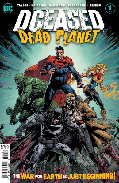
Written by Tom Taylor
Penciled by Trevor Hairsine
Inks by Gigi Baldassini & Stefano Gaudino
Colored by Rain Beredo
Lettered by Saida Temofonote
Reviewed by Quinn Tassin
Good lord “DCeased: Dead Planet #1” is good. Tom Taylor’s followup to his hit 2019 miniseries has so much goodness going on that it’s hard to enumerate everything. Let’s start with the obvious stuff. First, the art team is absolutely incredible. They sell the epic, cinematic nature of an intergalactic Justice League fight, the intimacy of a couple’s conversation, and the bone-chilling atmosphere of a planet filled with super-powered zombies with equal fervor. Their character design is also awesome- particularly the new Superman and Batman looks. Next, Tom Taylor is really really good at using comics as a medium- he has a command of pacing and tone that even some of the most well-known creators don’t and it goes quite the long way. This is a book that feels scary and awesome and depressing and fun all at once and it’s really a delight- and a testament to Taylor’s skill as a writer.
As great as all of that is. “DCeased: Dead Planet #1” is a masterclass in two particular things- being a sequel and being a superhero story. Regarding the former- too often, sequels feel like they’re picking up right where the last chapter left off. Sometimes, that’s okay but others, that happens even after a significant time jump. “Dead Planet” makes no such mistake. Where we pick up, it feels like the universe has really been lived in for the last 5 years. The state of the characters and their world is different (President Lois Lane!), and their interpersonal dynamics are, well, dynamic (everyone being annoyed at Super-Jon). And this feels like the starting point of a new story for this cast- the best indicator of a good sequel. Regarding that second point- Taylor just really gets superheroes. He knows that even when the human race barely escaped a zombie apocalypse, they’d still risk their lives to save someone else’s. He knows that they’d use diplomacy against alien attackers. He knows that they love their dogs.
Continued belowThere’s another, more subtle, but incredibly intriguing thing going on here; “DCeased” was almost all doom and gloom and sad sad superhero death that really overwhelmed you with a sense of dread. “Dead Planet”, on the other hand, gives us an inkling of hope. Now, that’s clearly relative in a book that features the violent death of Green Arrow and all of our heroes being stranded on a zombie planet. But it’s still there and it’s palpable- and that’s kind of the point of superheroes, isn’t it?
Final Verdict: 9.0 – “DCeased: Dead Planet #1” is a superlative sequel any fan of superheroes, zombies, or great storytelling should be picking up

Written by Jeremy Haun
Illustrated by Danny Luckert
Lettered by Ed Dukeshire
Reviewed by Christa Harader
“The Red Mother” #6 sees Daisy in London, deep into her esoteric art puzzle project, and trying to put her past behind her. The Red Mother has other plans, however.
Haun and Luckert continue their slow pace, but at this point in the narrative, we need a little more insight into the mystery to keep us going. We’ve reached the length of a standard mini, and while relying on the visual variation of the Red Mother and the omnipresent threat has delivered some interesting and sinister results, we’re starting to lose the thrust of the story. “The Red Mother” is an understated, tense book, and it’s important not to hold all horror comics to the same splashy standard, but a bit more reveal would do the story good.
Luckert is slowly refining a good style in “The Red Mother,” with a fine line and just a hint of abstraction. Over time, there’s a sense of fragmentation in faces, expressions, and even anatomy that doesn’t always work, but definitely adds to the unsettling mood. A lot of “The Red Mother” takes place in the light, too, and the choice to go for a brighter color palette and use sparing shadows helps hit the right oppressive note. Dukeshire’s lettering is clear and the font has just a hint of spideriness to it that complements Luckert’s line and adds to the unsteadiness of it all.
Final Verdict: 7.5 – “The Red Mother” #6 maintains a bit too much obscurity, but the book still takes its time in an organic way.

Written by Mike Costa
Illustrated by Nate Bellegarde
Colored by Tamra Bonvillain
Lettered by Sal Cipriano
Reviewed by Luke Cornelius
With “Stealth” #3, Costa continues the series with natural progressions in the story. We get to see Tony reaching out to discuss his discovery, his father seeking out the Stealth suit, and the Dead Hand escalating his conflict with Stealth. Each of these story threads feels uncompromising of the characters and makes for a compelling read as we cross the halfway mark in the miniseries.
Having been previously limited to only seeing Tony’s father in the Stealth suit, it’s interesting to see him venturing out into the streets of Detroit without it. With his deteriorating cognitive state, there’s a pervasive uncertainty as to what his intentions are, which stems from the character himself not being fully aware. Bellegarde shows him dressing to go out, only to then be wearing a different coat in the next panel. It gives a distinct visual cue for Tony’s father’s confusion by jarring against the reader’s understanding of continuity at the same time. Costa’s script deliberately delays Tony’s father becoming aware of this change until the next panel. There’s harshly realistic randomness to what Tony’s father can and can’t recall that brings a weight to the story being told.
With our superhero absent, our supervillain grows in stature. The Dead Hand’s feud with Stealth escalates from the first page of the issue, with his henchmen targeting neurologists who could help Stealth’s condition. Later, the Hand executes a doctor and posts a video to social media to further terrorize the city. His actions speak just as loudly as his dark, menacing, and maniacal video monologue that instills fear in the reader.
Bellegarde’s clean lines throughout the issue make this issue another smooth read, but more than that, his use of shadow generates the tense atmosphere in the nighttime scenes. When one doctor is killed by Dead Hand’s men, the background silhouettes to loom over the events of the scene, giving a sense of claustrophobia and dread. There’s a standout wide shot panel that draws away from the graphicness of the violence of the scene and serves to illustrate the isolation of the victim and the merciless nature of the act instead.
Continued belowOverall, with “Stealth” #3, Costa escalates the stakes of the series without losing sight of the human core of the story, with Bellegarde’s artwork telling the story in pitch-perfect fashion.
Final Verdict: 8.0 – “Stealth” #3 is another strong issue that keeps its twist on the superhero genre captivating.

Written by Skottie Young
Illustrated by Humberto Ramos
Colored by Edgar Delgado
Lettered by VC’s Clayton Cowles
Reviewed by Joe Skonce
It’s always disappointing when an exciting idea doesn’t work in execution. ‘Strange Academy’ is a good example of this. Having a school of magic users from the various realms of Marvel is a fun concept. But there is largely a problem in the execution. Skottie Young is trying to do too much, which makes everything feels slight. There are moments that work in “Strange Academy” #2, but the comic lacks a compelling hook to keep readers coming back.
In theory, “Stange Academy” #2 should work. We’re given a glimpse of the classes, learn more about the students, and are given hints that all might not be as it seems. The problem is that, with the exception of the classes, it’s all feels rushed. The classes work simply because they are a nice little snapshot into the vigor of the stressful day. You don’t need to know EVERYTHING about Scarlet Witch’s class, simply that for a young magician it’s going to be overwhelming. But there are just so many students that none of them really gets a chance to shine. This makes them seem like caricatures rather than characters. Finally, Young is building a mystery, but not giving a hook. What is the purpose of the school? Are they finding the next sorcerer supreme? Prepping these kids for a magical war? Messing with eldritch horrors that shouldn’t be comprehended? Who knows, but it’s not clear if we’re supposed to trust or distrust the professors. There’s a mystery, but no compelling narrative reason to keep following it.
That being said, there are some commendable things about the art of “Strange Academy” #2, namely the coloring. Edgar Delgado’s coloring helps to make the magic feel different based on the colors of the magic, though it would have been even better if Humberto Ramos made the magic look different. Perhaps the suggestion is that everyone is working from the same raw materials, but if the somatic components of the magic or the shape of the magic varied, it would be easier to know who is doing what. Clearly the school is trying to make well rounded magic users, but it all looks so similar it’s hard to know what is good at what kind of magic. Ramos does do a good job of making the students look overwhelmed, though, which is fun for a comic throwing so much at you so quickly.
Final Verdict: 5.0 “Strange Academy” #2 attempts to do too much, without enticing you to return with a good hook.

Written by Magdalene Vissaggio
Illustrated by Jason Smith
Colored by Harry Saxon
Lettered by Zakk Samm
Reviewed by Matthew Blair
The greatest accomplishment that writer Magdalene Vissaggio pulls off in “Vagrant Queen” #4 is just how accessible the story is to new readers. Even though it’s a fourth issue that needs to move characters and plot forward, the book still manages to provide just enough detail about the characters and what they’ve been doing for the past three issues to make sure new readers aren’t too confused about what is going on. On top of that, the characters are well written with clear motivations and desires while there is just enough mystery, most of it surrounding the enigmatic villain, to leave the reader wanting more at the end of the book. It’s not perfect, trying to keep everyone caught up on the story does make the dialogue clunky and slow at times, but it’s still a solid effort by a very good writer.
The artwork for “Vagrant Queen” #4 is an acquired taste that strives to forego the extreme realism and detail that has become something of a calling card in science fiction comics for something unique and a bit bizarre. While artist Jason Smith does demonstrate a keen grasp of layers and depth in the art, the characters themselves look flat with exaggerated features and small, yet bulky tech that looks like it was drawn in a kid’s school notebook. This, combined with Harry Saxon’s washed-out color scheme, creates a style that kind of evokes an underground and amateur feel that can be interesting for people looking for something a bit different with their sci-fi stories.
Continued below“Vagrant Queen” #4 continues a very interesting series and is a good comic created by people who know what they’re doing and who are established and capable comic book creators, but who want to push their boundaries a bit and try to create something new and interesting.
Final Verdict: 8.3- It’s an acquired taste, but if you’re willing to be a bit confused and look past some strange art, “Vagrant Queen” is a very good comic.

Written by Benjamin Percy
Illustrated by Joshua Cassara
Lettered by VC’s Joe Caramagna
Colored by Guru-eFX
Reviewed by Michael Govan
“X-Force” has been a consistently solid title since its debut and this is quite possibly my favorite issue thus far. This comic is dark, gleefully violent, and most importantly, a very fun read. There’s never a dull moment, that’s for sure.
If I have one complaint, it’s that a data page in #10 sums up a scene that really would be more compelling if shown in its entirety. This isn’t the first time either, Xavier’s resurrection was simply summarized instead of being shown a few issues back too.
In the grand scheme of things, that’s a small nitpick though. Again, #10 is my favorite issue for good reason. For one thing, Cassara’s artwork is firing on all cylinders. It’s great seeing Domino weaponize her luck powers or Jean flying fearlessly into battle. The plant monsters of Terra Verde, a dark mirror to the paradise of Krakoa, are truly horrifying. Vines suffocate a terrified Domino and creep into Logan’s mouth, spores break Quire’s skin and he barfs flowers and…words really can’t do the scene justice. The action and horror are all top-notch.
The characterization in this issue is just as strong. It was great to see the X-line’s overall theme of unity come into play yet again with the Marvel Girl-Sage-Black Tom combination. Their mindlink echoes the ‘communion’ back in “House of X” or the miraculous works of the Five. Mutantkind really is stronger together. They’re plenty unique all on their own too. Black Tom’s a weirdo and Quire’s a complete jerk. In the background, things are getting even darker for X-Force. Domino’s resurrection wishes were violated by Colossus and this guy’s supposed to be the new moral compass?
Beast, my favorite X-Man to hate, is becoming a supervillain if he isn’t already there. I actually loved his data page where he quickly absolves himself of any wrongdoing. It’s a fun look into his warped mind. The team’s in real trouble with him calling the shots. Also…I just have to point out that this is yet another experiment to completely backfire on Hank. Remember back when he tried to cure his powers and it had the complete opposite effect? Hank’s a bad scientist, guys.
Then there’s the ending with Jean and Logan… the two share a pretty significant moment, I have to say. Things that were implied are slowly being shown it would seem. Which means I’ll be getting some Scott and Emma content soon, right? Please?
Final Verdict: 8.5 – Seriously, don’t leave Beast in charge of things.


