
There is a lot to cover on Wednesdays. We should know, as collectively, we read an insane amount of comics. Even with a large review staff, it’s hard to get to everything. With that in mind, we’re back with Wrapping Wednesday, where we look at some of the books we missed in what was another great week of comics.
Let’s get this party started.
Amazing Spider-Man #30
Written by Dan Slott and Christos Gage
Penciled by Stuart Immonen
Inked by Wade von GrawBadger
Colored by Marte Gracia
Lettered by VC’s Joe Caramagna
Reviewed by Alexander Jones
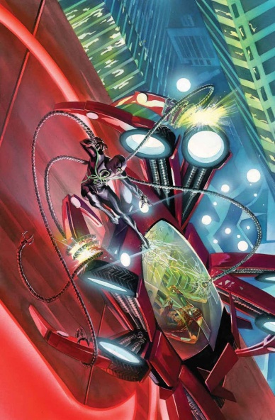
Whether you like it or not, “Secret Empire” has eclipsed the Marvel Universe. With some of that inherent darkness in mind, Marvel has decided to tie Spider-Man and his flagship solo series into the event. Even though it sounds like the results should be absolutely catastrophic, writer Dan Slott and artist Stuart Immonen take a surprising left turn and make lemons out of lemonade with a huge confrontation between the Superior Octopus and Parker. With the added depth and dimensions of “Secret Empire” this comic becomes even more alluring. Catching up with the series and seeing just how the main event ties into the story is something that makes reading this troubled volume of Spider-Man worth it.
This issue introduces a couple of huge new Spider-Man twists that are going to be key to the run going forward. Not all of them land as a new Spider-Man romance feels a little half-baked in execution. Parker gives a couple of cheesy speeches that are too saccharine and Otto Octavius is much too chatty in this comic. While the two characters have a lot of history with each other, there shouldn’t be quite so much dialogue in this issue. I wish Slott broke up some of the narrative beats of the issue and kept the dialogue more thin–he almost stuck the landing and pulled together a great comic against all odds.
Stuart Immonen’s set of pencils here are expressive, showing off a genuine sense of movement and slick depicting clean, anatomically-correct character figures. The work is detailed, creative and brings a beautiful sense of scope to this issue. With another artist tackling the pages of “Amazing Spider-Man” #30, I don’t think some of the last scenes depicting such a great sense of scope would ring true. In addition to everything else, Immonen’s page layouts are still incredible while delivering on a sense of clarity. Immonen slants panels sidewise, bleeds some panels into each other and meshes the whole thing with great letters and colors from VC’s Joe Caramagna and Marte Gracia.
“Amazing Spider-Man” #30 isn’t perfect but the story manages to pull lots of Spider-Man threads together that feel epic. Unlike what will happen to most ongoing series having to tie into the event, “Secret Empire” seems to have invigorated this comic. Slott also continues to shuffle around the supporting cast in some directions that might frustrate longtime fans. A romantic connection between two characters feels more convenient than anything else and doesn’t add to the story the way it should. The moments where Parker tries to rally the Parker Industries employees feel more cheesy than it should.
“Amazing Spider-Man” #30 looks great and pulls off some slick tricks with an event tie-in and an epic battle but still falls into some of the same traps as before. If Slott found a way to continue this momentum and position the overall supporting cast in a better place, Slott’s best issues of Spider-Man could still be ahead of him.
Final Verdict: 7.2 – Despite falling into the same potholes as previous installments, “Amazing Spider-Man” #30 is the best single issue of the comic in years thanks to Slott’s deft writing and Immonen’s slick and vivid art.
Black Cloud #4
Plotted by Ivan Brandon and Jason Latour
Scripted by Jason Latour
Illustrated by Greg Hinkle
Colored by Matt Wilson
Lettered by Aditya Bidikar
Reviewed by Kent Falkenberg
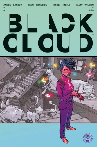
Growing up – and I mean real maturation, not just blowing out more candles on your cake – requires drastically recontextualizing one’s perception of change. It becomes less about tearing down the old regime and is much more about the building up of a new one. It takes maturity because one approach is infinitely more difficult than the other, even for one as powerful as Zelda. And that’s the epiphany that she’s drawn to through the course of “Black Cloud” #4.
Continued belowGoing home again is folly. Doubly so if you run away. And if, like Zelda, you never even bothered to look back after empowering your siblings to strike a pack of matches in defiance, then all measures of recompense are headed your way if you do return home. After sneaking back into the mystic realm through an unlocked back door, she’s confronted with an uncomfortable truth by an old friend. “We pointed out all the cracks in the story,” Frank says. “But no one knew how to fix them.”
Up until “Black Cloud” #4, this series has been a bit of a challenging read. And in many ways it still is. Now, it’s never quite as obtuse as Ivan Brandon’s excellent “Drifter” series – one can imagine Jason Latour’s scripting goes a long way to rein in the former’s compulsion towards esoteric, almost lyrical, ambiguity – but it’s never been an especially breezy read. By building the issue around Zelda’s reflection and reaction to what was left in her wake, Latour and Brandon tone down the abstraction and give readers a more palpable center than in previous issues. While it feels more focused, It’s still not a book you can read with one eye on your Twitter feed or a baseball score.
Not that you’d want to divert your attention away from Greg Hinkle’s art, anyway. His work here is gorgeous. The angular take on the mystical and fantastic is suffused with hints of melancholic longing and regret. The world building feels like an Escher painting fell into a wasteland. When Hinkle draws a drizzle of rain, attention is dedicated to the impacts and effectiveness of that shower. Raindrops splash off shoulders and hair gets wet. All the while, Matt Wilson colors make the work sing poetically. The blues and greens and purples have a sickly, depressed quality to them that almost feels resigned in defeat compared to the crackling, energetic neon palette used to depict Zelda’s powers. Throughout the book, Hinkle and Wilson deliver a stunning contrast between beauty and decay.
This feels like a statement of purpose. And it’s arrived at exactly the right time. While previous issues were a pleasure to look at, the narrative seemed to wander. The plot felt lost in a fugue. “Black Cloud” #4 lifts that fog. It might not be enough to see everything with clarity, but it’s enough to find the way. Brandon, Latour, and Hinkle are building something great here. I just can’t wait to see what it is.
Final Verdict: 8.5 – A more focused story is a great thing. But let’s be serious, Greg Hinkle’s art is otherworldly.

Bug! The Adventures of Forager #3
Written by Mike Allred and Lee Allred
Illustrated by Mike Allred
Colored by Laura Allred
Lettered by Nate Piekos
Reviewed by Forrest Sayrs
“Bug!” is fun. It is classic Kirby, retro action, zany hijinks fun. It’s also a masterclass in Jack Kirby’s DC lore.
“Bug!” has been hitting on all cylinders since issue #1, setting an almost breakneck pace through Kirby’s lesser-known bibliography. #3 slows things down considerably, providing a good chunk of previously missing exposition and revealing the big bad. It’s a very arc-focused issue. And that focus is exactly what the series needed to stick a landing after some hectic opening issues. The dialogue is also much stronger, building off some great banter between Forager and the Hooligan the teddy bear.
Mike Allred brings a great combination of retro and modern comic styles to the art. His figures are pure Kirby homage, but his action sequences have a broader variety of styles and eschew obvious nods like Kirby Krackle. Other elements, like the silent but hilarious visual gags of Kuzuko, would feel right at home in some of the other books in the Young Animal imprint. This fusion of artistic style and substance is really refreshing, evoking classic books without beating the idea to death like, for example, Allred’s other book “Batman ‘66”
Playing around in Jack Kirby’s footsteps has other advantages too, like a ridiculously deep bench of characters to draw from. “Bug!” has been exploring a new Kirby property every issue and part of the fun, at least for me, has been seeing these classic characters and discovering them for the first time. While I can’t speak for those readers who remember one of the earlier incarnations of Atlas the Great, for me, including these pieces of comic history in a story that returns to their origins scratches a satisfying continuity itch.
Continued belowFinal Verdict: 8.8 A fantastic ride through comic history that manages to stay modern.

Centipede #1
Written by Max Bemis
Illustrated by Eoin Marron
Colored by Chris O’Halloran
Lettered by Taylor Esposito
Reviewed by John Schaidler
Other than some guy named Dale Trell, everyone on planet Sty-Rek is dead. Before The Apocalypse, Dale worked as an intergalactic data miner, collecting myths for the government: “bits of film and torn magazine pages with their own topography of the imagination.” He has a fondness for Earth’s “pulp fiction,” particularly “that of a gigantic, malformed beast invading the planet and laying waste to civilization.”
In other words, Dale is the perfect guy to tell us (his “imaginary friend”) about what it’s like to be the sole survivor on a planet whose civilization has been laid to waste by a gigantic, malformed beast. Like a massive centipede, for instance.
And tell us about it, he does, for the next 18 pages. Sure, he fires his gun once or twice and there’s at least one big explosion, but mainly he just talks. He picks up a mushroom and says, “Shrooms. Really?” He sees a giant spider and says, “It comes with giant spiders?” He launches into a flashback by saying, “I suppose you might want to know more about me if I’m gonna drag you all this way.” And even then, he doesn’t so much tell us about himself as go off on a tangent about Joseph Campbell and The Hero with a Thousand Faces.
There are words and words and more words, and I’m still not even sure who this guy really is, other than the narrator and sole surviving protagonist.
Illustrator by Eoin Marron’s and colorist by Chris O’Halloran’s artwork is pretty decent, but to be honest, it lacks the campiness and retro-nostalgic look I expected. Not that the artists were given much choice. Writer Max Bemis basically positions Dale Trell as an “everyman” action hero reluctantly pressed into service by circumstances beyond his control. Some of the scenes begin to explore the book’s comedic potential (Dale looking at a lawn and mailbox splattered with colorful mushrooms), but for the most part, it’s not all that fun. The creators don’t seem to trust the inane, first-person-shooter concept they signed up for. Instead, they want to explore, “The common trope of a hero drawn into a strange environment, forced to face the odds, win the day and overcome temptation to find his true self.”
And we know this because that’s what they tell us as we watch Dale watch himself in four pages of tangential flashback that would have been better spent watching the centipede lay waste to the planet, setting up the inevitable showdown to come.
Final Verdict 5.0 – “Centipede” was a massively popular arcade game that captured the imagination of countless fans with its simple but quirky concept. After a debut issue that tries to layer the story with too much meaning and not enough “first-person-shooter” fun, it feels like a squandered opportunity.
Detective Comics #960
Written by James Tynion IV
Penciled by Alvaro Martinez
Inked by Raul Fernandez
Colored by Brad Anderson
Lettered by Sal Cipriano
Reviewed by Nicholas Palmieri
From the start, Tynion’s “Detective Comics” has been the Gotham team-up book I’ve always wanted, and this issue is the perfect example of how great a handle this team has on all of these characters.
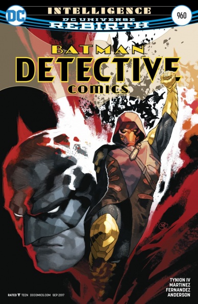
One of the run’s greatest strengths has been its willingness to add and remove characters from the cast as needed, and this continues that trend with the addition of Zatanna. Zatanna’s appearance is clearly designed to push the plot forward, but she doesn’t just give her exposition and leave. Tynion shows off what makes her interesting, bringing us into her world for some looks into her psyche portrayed with thrilling results by Martinez. As she explains the perils of magic using terse yet powerful anecdotes, Martinez has the visuals around her represent not the reality, but a subjective view of it which may or may not be real. Given that she’s trying to make Bruce debate the nature of reality, the visuals mix perfectly with the dialogue for a scene greater than either could have achieved on their own. Since Tynion and Martinez prioritize creating engaging scenes over anything else, the information never feels dumped on us.
Continued belowSimilarly, the creators show off the fun potential of Luke Fox and somehow, miraculously, end up making Azrael interesting. Luke may deal in technobabble, but damn if Tynion doesn’t make it a blast to read. Martinez also takes these opportunities to show off his expertise at drawing architecture and technology, breaking down a double-page spread so there can be a large widescreen panel in the center showing off the intricate set-up in Luke’s lab. With Azrael, Tynion has him slowly giving into madness, so the techniques Martinez uses for those scenes are less flashy. They are still equally as effective, though, setting most panels firmly in a grounded reality and letting the occasional odd detail or canted angle or unexpected zoom-in tell the story.
With a deft mixture of plot, pitch-perfect characterization, and stunning visual storytelling, this issue shows that Tynion, Martinez, and the rest of the creative team can build an engaging story around anything. Even Azrael.
Final Verdict: 8.0 – Even building a story around Azrael can’t slow down this team’s momentum. The fantastic portrayal of Zatanna doesn’t hurt, either.

The Flash #26
Written by Joshua Williamson
Illustrated by Howard Porter
Colored by Hi-Fi
Lettered by Steve Wands
Reviewed by Matt Lune
Sometimes, the villain of the piece is the one making the most sense. It doesn’t happen often, but here in “The Flash” #26 Reverse Flash makes some valid points. After last issue’s anniversary cliffhanger that revealed Barry Allen’s identity to Iris, Thawne show the would-be couple a dark future in which Barry and Iris’s twin children have turned into rogues because of Barry’s negligence. All those missed moments, those times when Barry’s responsibilities as The Flash took priority over his kids took their toll, and writer Williamson uses that as a sort of wake up call for Iris, who can’t help but empathise with her future kids.
Now, it’s obvious that Thawne lies, but is he wrong here? Iris deserved to know, and it sure looked like Barry wasn’t going to tell her. She expresses understandable disappointment in Barry, a man who she thought she knew who’s been hiding this massive secret from her. Finding this out would give anyone pause, but rather than give her time to process, Barry impulsively agrees to let Thawne take him to the Negative Speed Force where he’ll be isolated and alone forever. Which, I guess, ok? It feels like the sort of over dramatic gesture a child would make when things don’t exactly go their way. It’s an interesting and disappointing character turn for Allen, who often comes across as dramatic and annoying rather than flawed and relatable, and you can’t help but feel for Iris who’s been lied to and dragged into a world she’s intentionally been kept in the dark about, in some antiquated notion of protecting her.
Howard Porter captures the dynamic structure of a hyper-kinetic Flash issue well, and Williamson gives him plenty to do here. A dystopian city-scape destroyed by future flash twins, constant warring speedsters and a Flash museum full of trinkets and statues are all handled competently. Porter portrays the characters as quite ugly, their faces contorted in all sorts of overwrought emotions that take their toll on even the prettiest of people it seems, but for a book with such high-drama as this, I’ll forgive them for being a little ugly. The issue starts with Old Man Barry, a buff, bearded future Flash and wife Iris, both of which look great. The only fault with them is that they look so good, I want to read their book instead of snapping back to modern Barry and his self-inflicted drama. Buff, future Barry hasn’t got time for drama.
Williamson is doing a great job of building each issue on the foundations of what came before in his run, and despite Barry’s best efforts to sabotage his own life, the world of “The Flash” is entertaining and unpredictable. No small feat after decades of stories. Williamson runs the risk (no pun intended) of writing a book where all of Barry’s adventures are caused by mistakes he has made rather than giving him chance to be a real hero, but in all fairness the writer inherited that legacy to a large degree, and recent issues feel like Williamson is at least tackling that legacy head on. Here it feels very much like those mistakes are reaching a crescendo, and hopefully, it’s something that Barry can begin to walk away from. No pun intended.
Continued belowFinal Verdict:7.2 – Despite Barry Allen being, well, Barry Allen, this was an interesting time travel tale, with a fun cliffhanger

Hulk #8
Written by Mariko Tamaki
Illustrated by Georges Duarte
Colored by Matt Milla
Lettered by Cory Petit
Reviewed by Michael Mazzacane
“Hulk” #8 is the right kind of frustrating. Bookended by Jennifer Walters internal monologue and powered by social media, writer Mariko Tamaki has updated the classic monster antics of earlier “Incredible Hulk” stories with contemporary methods. Tamaki writes a solid procedural as Jennifer and her assistant investigate the mysterious monsterification of digital baking icon OliCakes. There’s just an understandable, but no less annoying, disconnect between Jennifer’s emotional journey and the plot of this issue. The issue is acting as a setup for a conclusion in the next issue or soon after. Which means issue 8 raises a lot of interesting questions and offers no real answers. This isn’t bad, but it’d be nice for a bit more direct tissue connecting Jennifer’s internal arc with the external one.
Still, Tamaki shows a deft hand at structure, effectively juggling 3 plot threads revolving around OliCakes monstrous transformation. While it doesn’t tie together as much as I’d want, the ability to cover all this necessary ground, ask these questions, and not have anything feel rushed or short changed is quality writing.
With this issue being very procedural there isn’t that much action, but that doesn’t stop the Georges Duarte from doing good work. His art is crisp and expressive as people converse. The simple vertical page for the scene where Jennifer and Bradley watch the gif is effective and fascinating. The page is surprisingly reflexive with sequential art refracting onto itself. The clean layout works to replicate the video graphic nature of gifs. It also reminds me of a time when gifs were chunkier. The dialog between the two breaks the illusion of time a little bit.
Duarte’s page design for the falling Jennifer follows a similar structure but more artistically unbound. Colorist Matt Milla gets a chance to shine here by showing the splotchy grey tone of the Hulk slowly seeping through as she transforms. While the size change in the transformation is obvious it’s Milla’s slowly enveloping gray color that sells the idea.
This is a frustrating issue, but only because I want satisfaction now, not later.
Final Verdict: 7.0 – Mariko Tamaki’s setup a monster mash, but things are more in the early decorating phase with this issue.
Kaijumax Season 3 #1
Written by Zander Cannon
Illustrated by Zander Cannon
Lettered by Zander Cannon
Reviewed By Benjamin Birdie
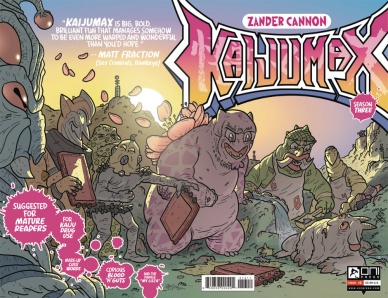
When you read a Zander Cannon comic cover to cover; between the ingenious ideas at play, the boundless energy of the cartooning, and even the I-hesitate-to-call-it-exhaustive-because-it’s-such-a-joy-to-read backmatter; you know you’re dealing with someone who loves comics. As a writer, artist, colorist, letterer, and even co-designer of every issue of “Kaijumax” (joined on the latter with perennial comic design legend-in-the-making Dylan Todd), every page is handcrafted with a passion for the characters, the subject matter, and all the details that go into how it looks.
“Handcrafted” is a key word here. Cannon’s linework feels warm and alive, as does his character design. There’s plenty of illuminating detail in every panel, but it always feels loose and bright in the way the best cartooning always does. Luckily, Cannon has given himself an incredible playground to create in. Centering almost exclusively on an island built as a prison for giant monsters, “Kaijumax” features creatures inspired by all kinds of monsters, not just from Japanese movie history. This “season premiere” focuses on the Creature from Devil’s Creek, a decidedly un-Kaiju monster. We learn a bit more about his life “on the outside” as well. For the most part, this issue serves as a setup for the rest of the season to come.
Like any great season premiere, it catches us up on our characters and sheds new light on a few of them. It’s rare that a comic as dense and compelling as “Peak TV,” but even rarer that it displays everything that makes comics unreplicatable as a medium: great art, limitless imagination, and phenomenal panel-to-panel storytelling.
Continued belowThey’ll definitely make a “Kaijumax” series someday, but luckily we have the better version right here already.
Final Verdict: 8.9 – “Kaijumax Season 3” starts by shifting focus to the stranger monsters on the island, and thus the already thoroughly imaginative world of the series expands once more.
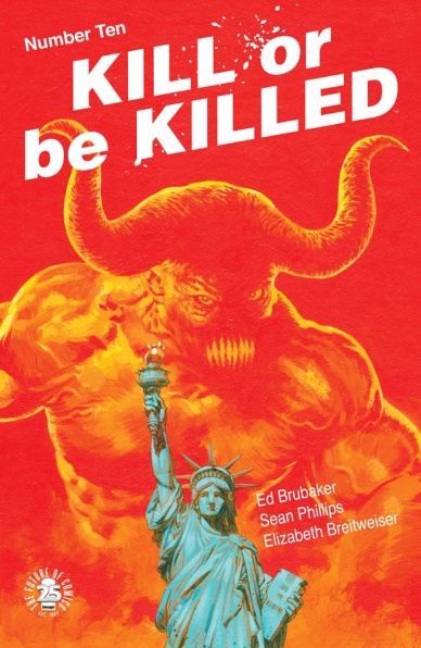
Kill or Be Killed #10
Written by Ed Brubaker
Illustrated and Lettered by Sean Phillips
Colored by Elizabeth Breitweiser
Reviewed by Devon Browning
‘Everyone has their own demons’ is perhaps the biggest understatement in the newest addition of Phillips/Brubaker’s “Kill or Be Killed.” Actually, it’s been the main theme among others in this haunting narrative-driven story following Dylan, a New Yorker turned ‘vigilante.’ Or, at least, that is what he wants to believe. Because, really, where’s the line between serial killer and vigilante when you’ve got a shadow-like demon lurking over your shoulders demanding that you kill people?
And then going through with it?
But it’s not so easy to throw any real label at Dylan when those turning up in body bags have forced strippers to work against their will, molested their own siblings, and poisoned neighborhood dogs. In every chapter of this story, it forces the reader to ask themselves a series of questions one might find frightening. And that may just be the beauty of the series so far, in that it is almost too easy to relate to the man with no extraordinary abilities taking a shotgun and choosing who belongs on the other end of it.
Dylan’s second life begins to draw the attention of his few friends, and the entirety of the NYPD. Hunted not only by the police but by the Russian Mob who aren’t too thrilled with two of their own dead at his hands. Reality catches up quickly, and there is a near overbearing feeling that Dylan can’t continue to be so lucky in slipping beneath the radar. And because you are in his head most of the time, it lacks any element of surprise when Dylan kills someone unintentionally. Or when someone close betrays his trust. It’s predictable in a story that could be amazing without it.
The art almost makes up for that, only with all of the dialogue and narrative, it’s very easy to ignore. The muted colors and grunge-like inks fit well with the mood of the story being told, but often times the styles shift and there are more pages than necessary where it’s too easy to overlook the art with nothing to draw to its attention. What does carry the issue on an artistic level, however, is the art of Dylan’s father who we’ve learned had a particular skill in drawing fantasy pornography.
That particular art gives a warm glow you’d find on the cover of an old sci-fi flick, and gives the last page the sort of popping color this series needs more of. Oh, and not to mention segues nicely into that betrayal I spoke of earlier…and will perhaps tell us just how real Dylan’s demon is.
Final Verdict: 6.8 – No real story progress, and the narrative is at times too heavy – not leading you to the art, which doesn’t amaze in comparison to previous chapters.

Unbeatable Squirrel Girl #22
Written by Ryan North
Illustrated by Erica Henderson
Colored by Rico Renzi
Lettered by Travis Lanham
Reviewed by Elias Rosner
Welcome to the jungle, we’ve got fun and games. Or to be more accurate, we’ve got dinosaurs and lots of Doom related puns. “Unbeatable Squirrel Girl” #22 is filled with such wonder that it’s almost impossible not to smile as you’re reading through the issue. Erica Henderson really pulls out all the stops for this issue’s flora and fauna, rendering the Savage Land in all its dinosaur glory across three consecutive two-page spreads. These are probably the best pages of the issue (save for the Kraven back-up that seems to be this arc’s Chicken vs. Bear) with clear paneling and simple, expressive faces.
This simplicity, though, is a double-edged sword for Henderson. Her faces can sometimes feel a little too simplistic, with small amounts of inking lines that only serve to make them feel a little uncanny and, to borrow an animation term, off-model. This issue has instances of this that is a little distracting, specifically when they first spy the Latverians at the airport, but for the most part, it works. It allows Henderson to really capture the smaller changes in her character’s, which really helps sell a lot of the comedy.
Continued belowNorth’s very specific brand of kind of dry, nerdy, pun-based humor continues to land, even 30? issues in (this is what happens when you split series by event Marvel). Between the gift shop, Savage Brands, the DOOM (his name must always be yelled) approved books, eat, pray, DOOM, and all the dinosaur facts slipped in as banter by a very excited Doreen and Nancy, there is just so much packed into this issue and it never feels boring.
Make no mistake, this is a text heavy comic, which can get a bit tedious at times and it isn’t helped by the emptiness of many of the backgrounds in this issue; they’re just solid blocks of orange or black, making the characters feel like their floating in a void of color. But, again, this isn’t too distracting and considering the detail put into the Savage Land two-page spreads, more understandable. Still, it’s always a shame when you’ve got a page where a half or more of the panels on a page consist of solid-colored backgrounds and two people talking back and forth, not doing anything too dynamic.
Luckily, that doesn’t happen too often and the strengths of the series outweigh the shortcomings. If you haven’t started this series yet, this is another great jumping on point. Most issues for this series are great starts but this one feels especially welcoming to newcomers.
Final Verdict: 7.4. “Unbeatable Squirrel Girl” continues to prove that it is funny, interesting and smart, all while being very accessible. It’s a welcome comic to be on my pull list each month.


