
There’s a lot to cover on Wednesdays. We should know, as collectively, we read an insane amount of comics. Even with a large review staff, it’s hard to get to everything. With that in mind, we’re back with Wrapping Wednesday, where we look at some of the books we missed in what was another great week of comics.
Let’s get this party started.

Written by Scott Snyder
Illustrated by Greg Capullo
Colored by FCO Plascencia
Lettered by Tom Napolitano
Reviewed by Gregory Ellner
With “Dark Nights: Death Metal” #2, Scott Snyder shows not apparent desire to slow down in the slightest in his epic tale of not only Batman, nor even the Justice League, but the DC Universe itself, through the central character of Wonder Woman and her small, potent resistance against a world populated by various Dark Multiverse Batman counterparts and forces far beyond. In doing so, he pulls out all the stops, throwing the story into a ridiculous horseshoe of superego and id, of reason and impulse, while being less focused on the idea of “Metal” as a form of music beyond the title. Holding a last, best hope against overwhelming odds beyond any seen in the DC multiverse, Snyder isn’t afraid to just go out and have fun.
Greg Capullo shows his mastery of illustrating Snyder’s scripts, as has been developed over approximately a decade. Thick or thin lines help to demonstrate the sheer intensity of emotional depth. Hope, fear, anger, despair, shock, and more come across a variety of faces, especially potent with the (as ever) unmasked face of Wonder Woman herself. On the other hand, Capullo’s experience from decades ago on “Spawn” help to add bizarre, alien imagery with stripped-down characters (in more ways than one). The lack of much distinct emotion, coupled with said alien illustrations, helps to add a kind of eldritch horror to the entire tale and its antagonists, especially those more down-to-earth. As this story is the apparent last hurrah for Capullo’s work with Snyder on this saga, he seems to be driving hard for awe and horror both, and succeeding in large measure.
FCO Plascencia’s colors add a lot to the already excellent illustrations. The bright colors around some of the Dark Knights act in disturbing contrast to their nature, while the more varied, though perhaps bright or at least diverse color palettes for the resistance movement adds hope for the future and helps to expand them beyond their normal appearance without completely abandoning the latter either. Meanwhile, the settings are given a darker shade, demonstrating the corruption of the entire universe by Perpetua and her forces.
Final Verdict: 7.5 – A strong story continues forward without relying too heavily on the past, all while continuing to just have fun overall.

Written by Al Ewing and Dan Slott
Illustrated by Valerio Schiti
Colored by Marte Gracia
Lettered by VC’s Joe Caramagna
Reviewed by Alexander Jones
After numerous delays and lots of anticipation, Marvel’s latest crossover event has finally debuted with “Empyre” #1. The title sees Marvel’s premiere aliens the Kree and Skrull to team up together and form an “Empyre.” Artist Valerio Schiti is joining writers Al Ewing and Dan Slott for the publisher’s first huge post-pandemic crossover event. Slott and Ewing are delivering an intergalactic event that features a slow beginning but tense cliffhanger that hints at some fascinating future Marvel developments. The script doesn’t start readers off on the right foot as the first couple pages deliver on boring exposition that doesn’t push the plot forward. After taking the time to establish where the Fantastic Four are, the title transitions into the current status quo for the Avengers. The script takes nearly two-dozen story pages to establish the plot and writing but the last half of the title kicks the series into gear.
Artist Valerio Schiti carries a really slick line throughout the issue. Schiti’s art becomes slightly derivative in the pages with the Fantastic Four in the beginning. Schiti’s faces look slightly dull in some moments. Schiti is adept at delivering really complicated page layouts. When the action starts to break out later on in the title Schiti’s pencils come to life. Sue Storm’s rage is as palpable as Hulkling’s realization that he is being manipulated. As the script progresses, the art becomes stronger with it. It is almost ironic to consider how detailed and energetic that Schiti’s action sequences are when they are compared to the exposition panels. The pages later on in the title have a great sense of framing and choreography than the moments where the Avengers and Fantastic Four are catching up with each other.
Continued belowThe issue’s script follows the same trend as the interior art. The book has a very slow beginning that culminates in a captivating finale. It takes an extended period of time before the issue is able to establish the stakes and different positions of the intergalactic species in the story. It is fascinating to see how Ewing and Slott establish the Kree and Skrull while showing the opposing relationship with the Cotati. The last couple of pages of the story bring the competing factions into direct conflict with each other. Towards the end of the first issue, “Empyre” comes together and leaves me curious about future installments of the comic book.
Final Verdict: 6.5 – “Empyre” #1 is an intriguing but methodical start to an important Marvel storyline.

Written by Jonathan Hickman
Illustrated by Ramòn Pérez
Colored by David Curiel
Lettered by Clayton Cowels
Reviewed by Quinn Tassin
Jonathan Hickman is a master of big picture storytelling. One-off issues are commonplace and often serve a genuinely important role in the larger narrative, even if we can’t see what that role is yet. The issue is that on the first read, those harder to suss out issues can be a bit of a slog. Sadly, “Giant-Size X-Men: Magneto #1” absolutely fits that mold. It’s not so much that this is a bad comic- Jonathan Hickman doesn’t really make those- it’s just not a comic that really justifies its own existence.
The story is pretty straightforward: Magneto gets a hold of an island from Namor on behalf of Emma Frost. He and Namor go to find a mysterious MacGuffin, he gets the island and builds a cool tower for her and that’s about it. Again, this is a Hickman endeavor so it’s certainly fun filler; there’s a Kraken fight and Magneto is very cool. But still, there’s just no clear reason for this issue to exist.
Ramòn Pérez and David Curiel do decent work on the art though neither of them does their strongest work in this issue. There are all kinds of cool landscapes in “Giant-Size X-Men: Magneto #1” but none of them seem to leap off of the page at all. The island landscape feels more muted than lush and the underwater environment doesn’t feel interesting which it certainly should. Even the action isn’t at the level it needs to be. The Kraken fight is cool because it’s a Kraken fight, but it’s not necessarily as cool as you’d expect Kraken fight should be. Again, none of this is actively bad, but none of it is particularly notable either.
All in all, this is a decidedly mid-tier entry in the current X-Men line. I’m sure it’ll all pay off at some point, but it’s still the issue’s job to hook me now. And this one just didn’t.
Final Verdict: 6.0 – “Giant-Size X-Men: Magneto #1” is a decent comic that also fails to justify itself quite yet.
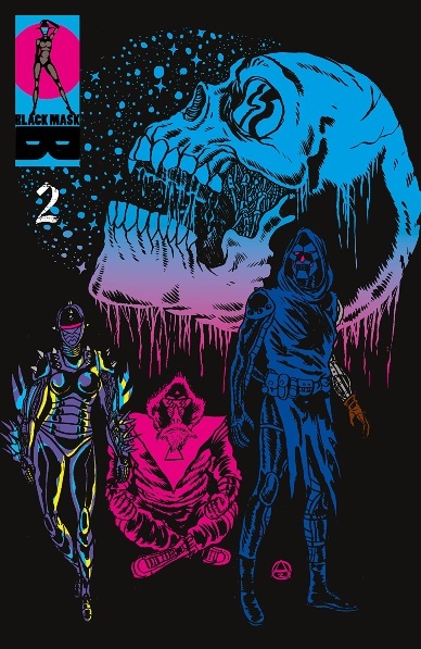
Art by Alexis Ziritt
Written by Carlos Giffoni
Letters by Jim Campbell
Review by Jodi Odgers
When the creative team for a project is changed, there is always a worry for readers that the series might lose some of its original magic. This was the case when I saw that the newest “Space Riders” arc was being written by Carlos Giffoni and not Fabian Rangel Jr., who penned the first two adventures in the universe. Would the series lose its bombast and pure sense of adrenaline-filled escapism?
The first issue of “Space Riders: Vortex of Darkness” proved my worries to be unfounded. After vanquishing the forces of universal evil in “Space Riders: Galaxy of Brutality”, our heroes set out to conquer the source of all evil in the universe – a woman who summoned, fornicated with, then murdered Satan, all with the aim of achieving dominance over the entire universe.
This second issue sees Mono and Peligro reunited with the android Vana (who has since become an undefeated gladiator) and Doña (who has been ruling over her own world for the past twelve years). While the issue is certainly primarily set up for the inevitable clash with the big bad, Ziritt’s neon, the blood-filled aesthetic remains the most intoxicating aspect of the series. Giffoni gives Ziritt excuses to draw images straight out of the most garish and radical corners of his mind, and it is a joy to behold. Jim Campbell imbues the text with the same energy that Ziritt is soaking into each page, without sacrificing clarity. “Space Riders: Vortex of Darkness” may be a cog in a larger machine, but it is a damn entertaining one.
Continued belowFinal Verdict: 7.8 – “Space Riders: Vortex of Darkness” #2 gets the skull-spaceship-riding gang back together, setting up for the inevitable fight against an entity eviler than Satan.

Written by Karla Pacheco
Illustrated by Pere Perez
Colored by Frank D’Armata
Lettered by Travis Lanham
Reviewed by Elias Rosner
To err is human, to be dull and uninspired is “Spider-Woman” #2.
OK, that’s a bit harsh. There are aspects of “Spider-Woman” #2 that are engaging, like Jessica vomiting acid(?) onto The Rhino or The Rhino yelling about just wanting ointment or Night Nurse actually following the Hippocratic oath and helping Rhino after tossing him out or… you know what, I think that is the one scene in the book that holds up, even if it still has massive problems. The main weakness of issue #2 is that every twist and turn refuses to carry the narrative weight behind it that it should. From Jessica clearly losing her shit as the tests go on and on to the appearance of Octavia Vermis, daughter of Otto Vermis, a deep-cut Hydra villain from Jessica’s very first appearance, which I HAD TO LOOK UP because Jessica seems to treat her with about as much emotion as a brown paper bag rather than the gravitas that history should bring, there’s nothing underneath it all.
Situations are vehicles for jokes without thinking about communicating why these characters are acting the way they are or developing them any deeper. Jessica, our focal character, is developed about as much as The Rhino and the sniveling, rich guy antagonist who “poisoned” Jessica. I commend Pacheco for getting to the point fast rather than drag this out for an arc but she has given little to make me care about Jessica’s plight because Jessica is empty of character, presumably expelled with all that acid, and the one who put her in this situation is so underdeveloped and one-note, I honestly forgot that he was the father of the rich party from the previous issue.
It’s amazing how little happens despite how much is established. Exposition is just dumped on us while there is little in the issue that holds one’s attention. Perez’s artwork is as much to blame for that. It’s not bad by any means but it’s at odds with the tone and his facial work rarely matches up with the dialog, creating a dissonance that is palpable on every page. On the montage page of Jessica training, it’s hard to tell if the face at the end is intentionally leading us to believe her amped-up powers are affecting her mental state, hence the extra anger and reveling in violence, or if it’s meant to be a strained grimace from all the training.
I’m inclined to believe the former, giving the creative team the benefit of the doubt, but then there are angling or consistency problems that were present two pages before — sudden cake pops and then an intense close-up from below establishing shock — and the uncertainty returns.
Jessica is a great character but none of that is on display here, relegating her to generic action, a generic plot, and a generic personality. It’s hard to buy into the story itself without the proper groundwork and “Spider-Woman” has yet to accomplish that, be it either with the comedy or the drama.
Final Verdict: 4.7 – A disappointing second issue that eschews Jessica’s more interesting aspects for a generic plot with little to say about the character.


