
There’s a lot to cover on Wednesdays. We should know, as collectively, we read an insane amount of comics. Even with a large review staff, it’s hard to get to everything. With that in mind, we’re back with Wrapping Wednesday, where we look at some of the books we missed in what was another great week of comics.
Let’s get this party started.
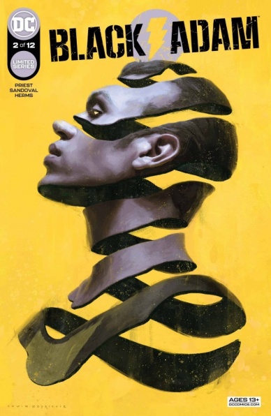
Black Adam #2
Written by Christopher Priest
Illustrated by Rafa Sandoval
Lettered by Willie Schubert
Colored by Matt Herms
Reviewed by Michael Govan
It is very interesting how reminiscent Christopher Priest’s “Black Adam” is of Christopher Priest’s “Black Panther”. That’s by no means a bad thing, Priest’s critically acclaimed “Black Panther” run redefined the character, there are much worse comics to be compared to. Still, the similarities cannot be denied.
We have political intrigue, the business of running a nation, secret back alley meetings with intelligence officers. Out of order storytelling that offers as many questions as it does answers. The book doesn’t aim to fire joke after joke like a Deadpool comic but Priest’s dry humor is good all the same. Black Adam christening his successor “White Adam” was a hilarious bit for sure.
There is also the fish out of water character and audience surrogate. In “Black Panther”, it was Everett Ross. Here we have Malik. The likable character isn’t performing or as big of a ham as he was in the first issue but is still hilarious, as are the strange circumstances he finds himself in.
While a great deal of focus is given to Malik, Priest gives the titular character plenty of the spotlight as well. The writer paints a clear picture of a villain who has realized he’s the bad guy a couple centuries too late. Theo Teth-Adam is literally haunted by his past sins. He’s so guilty he follows a ghost and flies across the galaxy into a clear trap. He’s so desperate to wipe the slate clean, he forces Malik to take the power by gunpoint.
The artwork is definitely solid as well. This is a bright, colorful comic filled with epic superhero action. Though we only see a glimpse of the fight between Black Adam and Darkseid, it looks epic, clearly a battle between titans. You can feel Black Adam’s power as he easily flies out of Earth’s orbit and leaves our galaxy. Sandoval’s expressions are great as well, especially on Malik. You can see the character processing the ridiculousness he’s going through, sometimes with slack jawed shock, sometimes with a skeptical raised eyebrow. This is all tied together with Herms’ brilliant colors. From the slight coldness of space to the bright lighting of Black Adam’s place or even the pristine white of Malik’s magic costume, it all comes together well.
Final Verdict: 8.5 – There may be no redemption for Black Adam but his journey is a fun ride all the same.
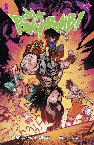
Do A Powerbomb #2
Written & Illustrated by Daniel Warren Johnson
Colored by Mike Spicer
Lettered by Rus Wooton
Reviewed by Alexander Manzo
Daniel Warren Johnson’s “Do A Powerbomb” continues to amp up the craziness and fun elements of wrestling mixed in with a supernatural element. The over-the-top necromancer with a strong affection for wrestling has shared the story’s overall arc with the reader with a tournament that allows the winner to bring back a loved one from the dead. Johnson’s Dragon Ball Z-like tournament and over-the-top antagonist pair well to keep the reader turning the page despite the slight cliche naive, young protagonist. As soon as the offer is presented, Johnson quickly switches back to the real world, where Lona Steelrose has to get some actual wrestling experience under her belt before she can compete. While the shift can feel a little rocky, it immediately follows with another, albeit one-sided, extreme wrestling match that gives the reader exactly what they want. Johnson’s formula of exposition, explosion, and heart continues in this issue as he keeps all three plates spinning.
Johnson’s art takes his story-telling to the next level as he grabs the reader by every page and panel. He has this purposely messy style that is almost like an old-school 80’s big hairstyle that looks funny from a distance, but if you take a moment, you realize that every line is right where it’s supposed to be. A splash page that stands out in that the audience gets a skyview aerial shot of the necromancer lair on a cliffside with a small town and wrestling ring surrounded by a coliseum filled with spectators that takes the breath from the reader. Then it follows with a page filled with panels filled with conversation that ensure to include the mesh top of the necromancer and looks of concern from Lona. Despite it probably being able to stand in black and white, Mike Spicer’s colors give it a strong tone with the reds for the deal with the demon scenes and then this gritty orange during the wrestling that offers the reader a scent of sweat from the wrestling ring.
Continued belowFinal Verdict:8.5 – The overall arc is on the table, and Johnson is still gearing up for more.

The Flash #784
Written by Jeremy Adams
Illustrated by Amancay Nahuelpan
Colored by Jeromy Cox
Lettered by Rob Leigh
Reviewed by Alexander Jones
Sometimes event tie-ins to main series can seem so forced that you wonder why the publisher even bothered. ”The Flash” #784 smashes event tie-in expectations to deliver a subversive issue that pushes the franchise limitations. Writer Jeremy Adams kicks the issue off with Jesse Chambers and Max Mercury in pursuit of Barry Allen. The modern run of “The Flash” has done an excellent job utilizing the full supporting Flash cast to tell interesting stories. This particular issue also continues the strong characterization of 784 is ambitious and changes as frequently as the art. All the scenes involve various Flash characters Irey, Jai and Wallace. Artist Amancay Nahuelpan shifts styles like a chameleon to accommodate the dense script.
Nahuelpan and colorist Jeromy Cox use a range of styles in ”The Flash” #784 depending on what the scene calls for. The bright hues of the scene with Max and Jesse contrast so nicely with the dreary world of Jai and Irey. The facial details are inconsistent in certain panels which is a disappointing blemish to a strong issue. Some of the anatomy from Nahuelpan appears to be imbalanced and distorted. However, the portion of the issue with Irey and Jai uses this to the issue’s advantage of the series in a clever way. Nahuelpan seamlessly switches between several styles in the issue, even using a classic approach to a story reinterpreting previous Flash tales.
The script of ”The Flash” #784 does a good job introducing you to the current status quo of the character. Adams and Nahuelpan cohesively utilize the light horror tones and goodhearted nature across each scene. ”The Flash” #784 is an ambitious next phase of Jeremy Adams and Amancay Nahuelpan’s impressive run on the series.
Final Verdict: 8.5 – ”The Flash” #784 utilizes the best aspects of the entire Flash franchise to tell a strong story.

Miles Morales: Spider-Man #40
Written by Saladin Ahmed
Illustrated by Alberto Foche
Colored by David Curiel
Lettered by Travis Lanham
Reviewed by Quinn Tassin
“Miles Morales: Spider-Man” #40 is fine. One would imagine with an alternate universe evil clone emperor antagonist and an underground rebel force fighting against him, this would be a solid or at least fun storyline. Instead, it lands with a thud. There’s a clear urgency to the story but it feels exclusively intellectual; the issue evokes no real emotion which means readers can’t engage with it in a meaningful way.
The real weakness in “Miles Morales: Spider-Man” #40” is that it reads like an outline for a story. There are events that happen in sequence, yes, but there’s nothing beyond that to latch onto. It lacks all of the texture that makes an issue strong. Characters are flat – they feel more like archetypes than fleshed out individuals. Selim as generic an evil overlord as can be. Miles and co. are trying to stop him because they’re good. But where’s all of the character detail? As for the plot itself, it’s so cookie-cutter that it can’t make up for other weaknesses.
The artwork, too, is wildly underwhelming. It’s competent, to be sure. Layouts control the pacing well and scenes are sufficiently well-staged to be easy to follow. Beyond that basic competency, though, is relatively dull art. This story should, at the very least, inspire strong art. While New York as a war zone/center of an evil empire should feed a rich environment, most frames of the issue are literally against blank backgrounds. The action is upsettingly static and the scenery that we do see is dull. Even Selim’s throne room is mostly bare and the details that are present are entirely uncreative. The most disappointing moment by far is Selim’s assault on the rebel camp. What should have been intimidating and filled with energy is uninspired.
“Miles Morales: Spider-Man” #40 is a competent issue, but generic and lifeless all the same. The worst thing a story can be is boring and this is an issue that clearly commits that sin. It’s especially a shame because it’s a waste of a good premise.
Final Verdict: 5.0- As generic and uninteresting as a story about fighting a dictator in another universe can be


