
There’s a lot to cover on Wednesdays. We should know, as collectively, we read an insane amount of comics. Even with a large review staff, it’s hard to get to everything. With that in mind, we’re back with Wrapping Wednesday, where we look at some of the books we missed in what was another great week of comics.
Let’s get this party started.

Gods of Brutality #1
Written and Colored by Rich Woodall
Illustrated by Mark Welser
Reviewed by Alexander Manzo
“Gods of Brutality” #1 is a fun, entertaining story that feels like it was an idea Rich Wood thought of in high school and held on to until he could make it. The protagonist initially comes off rude and angry, but Wood quickly shifts the narrative to being tired of people thinking of his career as a “gimmick.” The story’s heart starts when he’s in hell, and we realize how scared he is. The dialogue between Hercules and Thor is similar to the banter of Hobbs and Shaw. Both are arguing to see who is the alpha and who needs to kiss the ring. Everything is testosterone-fueled and ready for battle in every kind of setting. Once all three are together, it takes off into a crazy (in a good way) ride. All the characters, main and side, have these one-liner kinds of dialogues that can seem cheesy but also fitting responses to the unique story elements
For a first issue, it certainly opens the door with the adventure in hell, but there’s also a mystery of his paranoia in the present that still needs explanation. There’s this metaphorical force that the protagonist is running from after his final show that leads the reader to believe that he may not have left all his demons in hell.
The artwork by Mark Walter is done well once the story takes place in hell. Initially, the scene with the protagonist and the reporter was off-putting due to the shape of the reporter bouncing from chubby to skinny in every other panel. However, in hell, Walter was much more consistent and detailed with everything. He has one panel where all the humans are lined up, chained to a wall, and you can see the fear on their faces awaiting their fates. Walter does an excellent job of keeping everything focused for the reader to stay engaged. In the final battle scene panel, Walter does not waste any space with the various demons fighting Thor and Hercules. There’s also a rat fink element when the monsters start to torture them where it gets a bit exaggerated, but the characters are in hell, so still believable.
Final Verdict: 8.5 – A slow start with the first few pages but kicks into high gear right after.
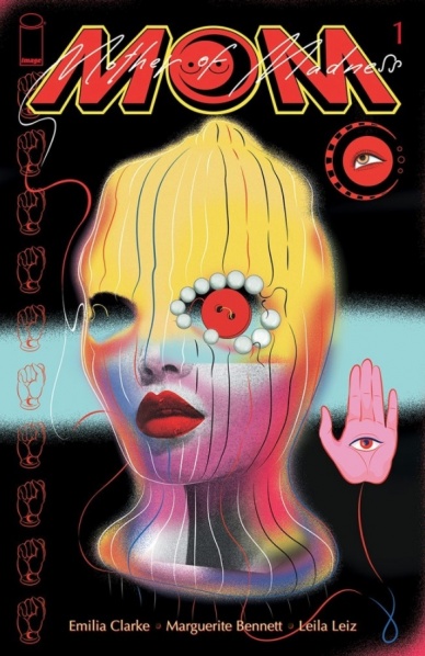
M.O.M.: Mother of Madness #1
Written by Emilia Clarke and Marguerite Bennett
Illustrated by Leila Leiz
Colored by Triona Farrell
Lettered by Haley Rose-Lyon
Reviewed by Gregory Ellner
Theoretically, “M.O.M.: Mother of Madness” #1 could be an intriguing origin story for a superhero set in the not-too-distant future. Unfortunately, Emilia Clarke and Marguerite Bennett seem more intent on treating the origin with no subtlety whatsoever, even if one were to ignore the repeated refrains of workplace sexism across the entire debut (a subject that is an issue, but not the primary problem with the storytelling here).
Rather than letting the narration act on its own, Clarke and Bennett inject their protagonist giving nearly every piece of the backstory in-world to the reader directly as if talking from an interview, even when people are clearly talking all around her and continuing to move. The fact that there is an extremely large amount of references to media and history relevant in the time of publication (mostly around 2019 to 2021), up to and including about comic books themselves in a particularly strange moment, makes it even harder to take the idea of a plot in 2049 seriously. The overall effect breaks past being relatable to the viewer, and straight into dissociating from any attempt at audience immersion in the plot, even seeming as though it might be looking down on its own audience for little to no reason.
Continued belowIn spite of the less-than-stellar script, Leila Leiz does a good job of the artwork around “M.O.M.: Mother of Madness” #1. The powers of the protagonist are disturbing as they are potent, the emotions readily visible on every character’s face. Such a focus is extremely important for an emotion-driven superhuman like the protagonist Maya, and so is the very dynamic, motion-centric illustrations, blurring or almost blending when important to do so. One page, with use of a jigsaw puzzle type of paneling, looks especially interesting, though readers may overlook it in the process of reading.
Triona Farrell, similar to Leiz, does a very good job of trying to salvage the story, in her case through her colors. The brilliantly bright gold of some powers helps contrast against the deep, foreboding shadows elsewhere. Beyond that, the colors seem more or less standard, but still very well put together.
Final Verdict: 5.5– Good artwork and colors cannot save a comic debut that lacks any semblance of reader immersion in its setting.

Moon Knight #1
Written by Jed MacKay
Illustrated by Alessandro Cappuccio
Colored by Rachelle Rosenberg
Lettered by Cory Petit
Reviewed by Henry Finn
“Moon Knight” #1 is a re-introduction to Marvel’s first major superhero with a dissociative identity disorder. Marc Spector goes by many names, and in this issue, those who are unfamiliar with him are treated to a concise look at his origin story as well as a few of his identities.
Writer Jed MacKay skillfully bounces back-and-forth between locations and time, which gives us a sense of forward motion even while having to spend a lot of pages explaining who Moon Knight is to the unintroduced. MacKay uses the trope of a conversation with a therapist (Dr. Sterman) to provide exposition and insight into what makes Mr. Knight tick. He continues wearing his mask even when his therapist knows his real identity and his whole backstory and this might reflect on his identity crisis; that he is more comfortable being Moon Knight than anyone else. MacKay is using the series to dive deep into the psychology of Marc Spector; he’s dealt with some terrible experiences in both his civilian and superhero life, and undoubtedly has PTSD. When Dr. Sterman voices this concern, and more importantly what will this lead to, I realized she is more than just an exposition device. She is a central figure for this series moving forward to help Marc face his fears and make change.
We are also provided an introduction to a brand-new character by the end of the issue who could provide a very clear counter-argument to the philosophy in which Moon Knight operates, so that is a potentially exciting addition to the franchise.
Artist Alessandro Cappuccio and colorist Rachelle Rosenberg provide steady hands with clean frames and a safe approach to the artwork. There is a noticeable lack of sound effects in many of the scenes, and actions like cars crashing or chainsaws disemboweling creatures have little to no sound effects laid on top. Every fight scene feels like a distant memory. For instance in one sequence spanning two pages, he cuts a zombie in half with a chainsaw, throws a villain off a rooftop, armwrestles Frankenstein in a rowdy bar, and smacks Vermin with a crowbar -all without sound. This fits with the aesthetic of Moon Knight’s current, more thoughtful approach, but also robs many of the fight scenes of energy.
One noticeable effect Rosenberg has provided is creating a very subtle glow around the head of Moon Knight in every panel, no matter what outfit he is wearing. This implies he is touched by a God, and is a visual representation of Dr. Sterman’s explanation that his contact with his God has fundamentally altered the structure of his brain. To me it also signifies his fervent and dogmatic participation in a cult that can lead to a certain form of mania, and I’m interested in seeing how this develops.
Final Verdict: 7.0 – A safe approach to a character with opportunity for growth.

Star Wars: The High Republic Adventures #6
Written by Daniel Jose Older
Illustrated by Harvey Tolibao and Pow Rodrix
Continued below
Colored by Rebecca Nalty
Lettered by Jake M. Wood
Reviewed by Conor Spielberg
Issue 6 of “Star Wars: The High Republic Adventures” successfully balances the mythological gravitas of the Jedi while incorporating the lighthearted pulpy tone that is also associated with Star Wars. It brings its readers up to speed in what they need to know with opening credits and natural exposition; as well as straight up labelling the crew on the Vessel. Daniel Jose Older’s script brings out the better elements of the Star Wars franchise, he also drags some of its faults.
No matter when the story is set there is often an instinct to explore aspects of the Star Wars Universe that have been seen in the movies. This can make it feel referential when there isn’t a new aspect being explored in these older themes. One aspect that does seem to get an adequate amount of variety is the alien species. Many of the Jedi Padawans and members of the Hutt Cartel have very unique and striking alien designs.
While the story is well paced and the panelling gives adequate space the the actions beats, there is always a lack of tension when the jedi are in combat with people as there is often limitation on what choreography they able to do when their opponents can’t parry their attacks or be sliced in two without an excess of gore. That being said, the tension in this issue stems more from the diplomatic instead of the conflict and certainly makes you want to know what will happen next.
Final Verdict: 7.0 A solid Star Wars story with the expected benefits and faults that come with it.


