
There is a lot to cover on Wednesdays. We should know, as collectively, we read an insane amount of comics. Even with a large review staff, it’s hard to get to everything. With that in mind, we’re back with Wrapping Wednesday, where we look at some of the books we missed in what was another great week of comics.
Let’s get this party started.
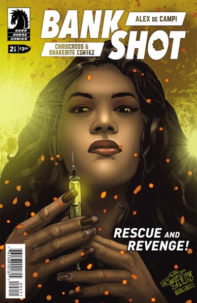
Bankshot #2
Written by Alex DeCampi
Illustrated by Chriscross
Colored by Snakebite Cortez
Lettered by Alex DeCampo
Reviewed by Kent Falkenberg
It’s fitting that Alex DeCampi circles back to Marcus King playing chess in “Bankshot” #2 – and no surprise either that King doesn’t seem to have a knack for the game, blunt instrument of violence that he is. Where last issue felt like a headfirst dive into the heat of a fire fight, this issue might read more like the initial few parries that grand-masters use to feel their way into a chess match.
Like I said before, though, that sort of fourteen-steps-ahead thinking really isn’t King’s game. “You lose every time, only confronting the threat directly in front of you,” an unnamed tutor chastises him in a flashback, while the panel itself zeroes its focus to the tightly crop a white chess piece violently knocking over King’s queen (a rather clever piece of foreshadowing in it’s own right). No, Marcus King is an all-in, head-first kind of guy. It’s an aspect deftly conveyed in a slick three-quarter page splash when he leaves to confront the nefarious Dutchman. As King launches off a hotel balcony, Chrisscross and Snakebite Cortez – probably the best named artist-colorist tandem around – frame the moment so that the crown of his helmet, the intensity of his eyes, and the grimace of his teeth against the air whipping past him all share emphasis as the sheer velocity of that forward thrust make us understand exactly what this man uses to lead his charge into battle.
But that’s about all we get for action in “Bankshot” #2. Much of DeCampi’s writing is devoted to King’s backstory. And while she’s able to drum up some chemistry to sketch in the history between him and the woman from last issue, there’s really nothing new to this story – and if I’m being honest, a lot of that chemistry comes from the emotive definition wrought from the smooth, confident lines Chrisscross uses for facial expressions and reactive body language. There’s a nano-technology developed by the military to create super soldiers… There’s a scientist who acts as the moral compass for when and where it can be used… Stop me if you’ve heard this one.
Now, I do appreciate this song being sung in North Africa, rather than literally anywhere else in the West. And I like that said scientist has taken up residence in a retirement home to dole out amounts small enough that these people can live out their remaining years with a little added verve in their step – that’s a quaint touch. But everything seems so rote. King’s foil at the CIA is given multiple opportunities to demonstrate the racist, lascivious lout that he is. I get it. It’s going to be really awesome to see King punch the guy’s ribcage out his asshole. Unfortunately, there’s no payoff like that in this issue. It’s mainly just moving some chess pieces into place. And it’s hard to be compelling when the formations on the board are so familiar.
I really believe there’s a solid bit of escapist, nano-tech espionage in here. DeCampi has a proven flourish when it comes to the old ultraviolence. But “Bankshot” #2 isn’t there yet. It’s fine if this story boils down to supersoldier done wrong – might not be reinventing chess, but people have done more with less – and if that’s the case, then just let Chrisscross and Snakebite Cortez cut loose. They’re clear and precise and inject their panels with a healthy dose of velocity. It’s too bad they had to stop right as they were building up steam.
Final Verdict: 6.0 – Let’s hope this is just the ricochet and the real impact is on the other end.
Continued below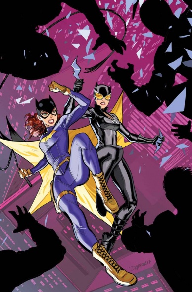
Batgirl #13
Written by Hope Larson
Illustrated by Inaki Miranda
Lettered by Deron Bennett
Reviewed By Benjamin Birdie
When Batgirl moved to Burnside, one of the most successful things about the book was updating Barbara Gordon’s world into one that resembled the one that most women her age were experiencing. Her world as a hero was also populated with villains and problems that better reflected the 21st century. It wasn’t always successful, but it certainly felt fresh.
Hope Larson’s tenure on “Batgirl” follows the same approach but isn’t blessed with the same consistent art team. Still, Larson has brought her own sensibilities to the book and continues to do a great job portraying Barbara as a believable woman in her twenties with a cool city life and an even cooler side gig as a vigilante.
This particular issue features a fairly ingenious crime, one that reflects the best of this new ideation of Batgirl. It seems that there is someone kidnapping the Instagram cat and dog celebrities of Burnside and holding them ransom. It’s an idea so brilliant, I can’t believe it hasn’t actually happened yet. Batgirl is joined by Catwoman and a precocious girl to solve the crime, and a light but delightful adventure follows. The art by Inaki Miranda is nice, with a bit of a David Lopez vibe that’s always nice to see, but I do miss the kinetic style of some of the previous artists that have worked on “Batgirl”.
Overall, the issue is helped immensely by the cleverness of its conceit and stands as a good example of a perfectly fine single issue story.
Final Verdict: 7.3 – “Batgirl” is at its best when it finds an interesting way to adapt the trends of today into the structure of a traditional Bat-story. This issue does that very well indeed.
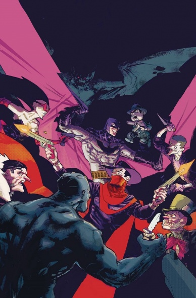
Batman/Shadow #4
Written by Scott Snyder and Steve Orlando
Illustrated by Riley Rossmo
Colored by Ivan Plascencia
Lettered by Clem Robins
Reviewed by Nicholas Palmieri
What do you get when you stick some of your top talents on a book starring two of the most important American fictional characters? A damn good book, that’s what you get.
“Batman/Shadow” seems perfectly tailored to each creator’s strengths. It has some of the wild imagination and fast-paced action that Orlando is known for, works in some of Snyder’s signature secret history, and boasts a visual world ripe enough for Rossmo to get stylish with his page and panel-to-panel layouts. Plascenscia’s colors do wonders, sticking to a dark palette which he makes lively through contrast and giving each scene a different secondary glow. Everyone on the team also knows how to work together: the writers pace the story so the artists can get their best work in, going as far as including two double-page spreads which, while light on story, pack the punch they need and let the artists deliver their best work. Likewise, the artists can stick to supporting the story in some places and then let loose where possible.
If there’s one negative to this issue, it’s that most of it is spent in an action scene. But with an action scene as inventive and well-paced as this, and with the intriguing plot developments that do get thrown in, that negative turns into a positive.
And I think that’s the perfect way to describe what these creators are doing here: turning negatives into positives. This isn’t your run-of-the-mill cash grab crossover. This is some quality comic book-ing on all fronts.
Final Verdict: 8.5 – With unique visuals and unexpected plot developments, these creators keep this crossover from being anything close to predictable.

The Damned #3
Written by Cullen Bunn
Illustrated by Brian Hurtt
Colored by Bill Crabtree
Lettered by Crank!
Reviewed by Christopher Lewis
This issue continues to push the main narrative forward by showing Pauly Bones and Eddie going out to try to make a deal with the demons for the return of damned souls. However, the real purpose of this issue is to give more context to Eddie and Pauly’s relationship. We know that Eddie and Pauly are old friends, however, there was some kind of unknown falling out between them in the past. This issue doesn’t explicitly explain their background but instead presents contention between them that lets us know that each still has hard feelings from whatever transpired. This is presented through Cullen Bunn’s pointed dialogue and scenes that show the characters looking at each other disdainfully whenever the other has his back turned.
Continued belowIn addition, this issue has an overarching theme that shows up within each subplot regarding being trustworthy/untrustworthy and not breaking agreements. Since the main story is about trying to make a bargain with the demons, and we know that Eddie and Pauly don’t like each other, this theme points to some kind of foreshadowing of a potential double cross or redemption in future issues.
Otherwise, Brian Hurtt’s art does a good job of demonstrating the 1920’s prohibition era. My one critique is that the panels and imagery are very straightforward and I see opportunities for the artist to use perspective or other tools in order to make the reader feel the frustration of the characters and the evil of the demons.
Final Verdict: 7.0 – A good middle act of the story arc.

Go Go Power Rangers #1
Written by Ryan Parrott
Illustrated by Dan Mora
Colored by Raul Angulo
Lettered by Ed Dukeshire
Reviewed by Matt Lune
There are a few things that “Go Go Power Rangers” needs to accomplish. First, it needs to provide a satisfying origin story for these characters that are now nearly 15 years old, as well as please the fans that have been there since the beginning. Second, it needs to fit in with the current continuity of comics that Boom studios has been producing. Finally it has to work as its own standalone series, and as a jumping on point for readers that have perhaps never ventured into the world of the Teenagers With Attitude. Amazingly, it succeeds on all fronts.
Set after the very episode of the TV series – Day of the Dumpster – in which the Rangers are first given their powers and they fight against an over-sized Goldar, “Go Go Power Rangers” aims to flesh out the show in the same way that most of the Boom comics so far have done. This isn’t a rewriting of anything that’s come before, and in theory this can all sit neatly between episodes. Where this series succeeds in ways that go beyond the original show, however, is in the characterisation of the cast. “Mighty Morphin Power Rangers” is a comic that has done really well to expand the characters beyond the fairly cardboard stereotypes seen on TV, imbuing the cast with hobbies and interests we’d not seen before. Here, after a few pages recapping episode 1, Parrott and Mora introduce each member of the team with a few caption boxes that explain their likes and dislikes in a fun way that’s picked up later in the plot.
Dan Mora’s art is open and engaging that gives this the feeling of a book that’s geared towards an all-ages audience, which is the smart choice here. Boom already have a more serious take on the franchise with their ongoing, and in the spirit of this being a more introductory approach to the Rangers, Mora’s light and approachable style really suit the tone. Each of the characters has had a slightly more modern redesign, and along with Raul Angulo’s colors there’s a vibrant energy that not only suits the franchise but helps give “Go Go Power Rangers” a fresh aesthetic.
Perhaps the hardest thing for an origin tale like “Go Go Power Rangers” to achieve is that important feeling of relevance. You can’t help but think that if the tales they’re aiming to tell were important to the overall story then they would have been included in the original show. The gift afforded to the comic, however, is that it doesn’t suffer the two biggest constraints that held the TV series back: the complex use of footage from a Japanese series, and time. “Go Go Power Rangers” has more time to expand the characters and essentially an unlimited budget, which combine to produce a book that expands what is a critical time for these characters in a way that feels relevant and important to the franchise.
Final Verdict: 8.6 – A welcome expansion of the story of the early days of the Power Rangers, presented in a fresh and engaging way.

Justice League of America #11
Written by Steve Orlando
Illustrated by Neil Edwards
Continued below
Colored by Hi-Fi
Lettered by Clayton Cowles
Reviewed by Forrest Sayrs
“Justice League of America” always feels like it has a thousand things going on in every issue. And other than the first one, the story arcs have all been unusually short. How short? Well, issue #11 is the end of the fifth arc, and the first arc was four issues. All of this is in service of a longer storyline that’s really just starting to take shape, but the reality of the series now is a set of deeply unsatisfying, glorified one-shots.
#11 concludes the “Curse of the Kingbutcher,” an arc that seems to exist only to provide an explanation for the nebulous threat of ‘The Might Beyond the Mirror,’ but the issue is so congested with other character-specific plot scenes that the main story just kinda folds in on itself. This is an example of too much continuity. Vague references to ‘The Red’ and the ‘Lords of Order’ give comic book veterans some meat to chew on, but leave new readers utterly baffled.
The character specific arcs aren’t going anywhere either. The most disappointing of which belongs to Killer Frost, who was supposed to be the breakout character of the series, but has been stuck with a going-nowhere story for the last five issues. Her one page of plot advancement has nothing to do with anything and includes, not one, but two entirely irrelevant continuity callbacks. It’s a mess.
The art team does it’s best to hold things together until the narrative gets its act together, but there are problems here too. The design of the Kingbutcher villain feels like its straight out of a Spawn book, which might be okay if there were more narrative logic behind it. As it stands, he feels more like something designed to look like a comic book villain, which is confusing when he is ostensibly a magical enforcer of Order, which has historically been on the side of good. Even the colors, which in general are really quite good, get messed up this issue when Lobo gets human skin coloration for a full page.
Final Verdict: 3.0 There is so much wrong with this issue that I’m running out of word count to deal with it.

Mother Panic #9
Written by Jodie Houser
Illustrated by John Paul Leon
Colored by Dave Stewart
Lettered by John Workman
Reviewed by Gregory Ellner
As an imprint in the DC Universe, Young Animal has been similar in some ways to Marvel’s MAX titles: dark, mature, and unafraid to deal with coarse language or some of the darker parts of the mundane over the fantastic. Much like in its earlier issues, Jodie Houser’s writing on “Mother Panic” #9 shows how well this kind of attitude can fit virtually seamlessly into the greater scope of Gotham City.
As Houser writes protagonist Violet Page, she showcases the danger that the heroine is in on a daily basis by having her solve a crime outside of her costumed identity, demonstrating that she does not require a cowl to be dangerous and effective. However, Houser does not make her invincible, building in flaws that help keep tension even in moments of triumph.
John Paul Leon’s artistry is comparable in some ways to that of Andrea Sorrentino, using panel-in-panel structure to illustrate the brutality of combat. The use of objects, rather than written sound effects, to reveal the sounds of injury is an interesting twist on the “show, don’t tell” mantra of many an artist and writer. Dave Stewart’s coloring, with its dark tones punctuated by moments of a brighter one, especially a bright red, emphasizes how gritty and brutal Page’s life really is, while allowing the issue’s famous cameo character to fit in very well with the color scheme.
In all, “Mother Panic” #9 is a very interesting look at the world of Mother Panic, not to mention a good jumping-on point for anyone who wants a basic look at the character.
Final Verdict: 7.5- A dark, gritty, engrossing look at a relatively simple catch-a-killer plot that demonstrates some of the protagonist’s capabilities for new readers.

Shirtless Bear-Fighter #2
Continued below
Written by Jody Leheup and Sebastian Girner
Illustrated by Nil Vendrell
Colored by Mike Spicer
Lettered by Dave Lanphear
Reviewed By Kate Kosturski
The flapjack-eating, bear-punching, bearded forest god is back and ready for more in the next installment of the #WaronBearror. With bears on the loose throughout the country (and not just the kind that are fuzzy and live in the forest), our hero gets right down to some good ol’ bear punching (and now kicking)…but they are a tough crew to defeat. Where did these super-strength fuzzballs of terror come from? Who is supporting them? And what does a pig-like man with bad dental hygiene, a Thor cape, and a couple of spells in his back pocket have to do with all this? When Mr. Bear-Fighter decides it’s time to find answers, it may not be his smartest decision.
Leheup and Girner continue the let’s-not-take-ourselves-seriously fun of the first issue with puns and dialogue that you make you laugh without realizing it, along with clever Easter eggs reminiscent of John Layman’s recently concluded “Chew.” The colors and letters continue this sense of in-your-face fun, working hand in hand with dialogue to provide a tight, balanced package of words and pictures that play off each other. Spicer’s aggressively bright color palette and Lanphear’s jagged block letters for both action and dialogue take their inspiration from 1960s Batman. Subtle is not in the Shirtless Bear-Fighter dictionary. This is your most extroverted friend in comic book form.
This creative team exceeds expectations with both these issues – can they keep up this momentum and genius for issue 3? It is hard to continue at this same pace of intensity, and now that we’re getting deeper into a story arc (as evidenced by the cliffhanger at the end of this issue), I hope none of this sense of classic, natural fun gets lost in the shuffle.
Final Verdict: 8.5. A solid BEAR PUNCH! And BEAR KICK! of staggering genius.

Spider-Gwen #22
Written by Jason Latour
Illustrated by Robbi Rodriguez & Jorge Coelho
Colored by Rico Renzi & Lauren Affe
Lettered by VC’s Clayton Cowles
Reviewed by Elias Rosner
This is it; the issue that brings all the threads to a head before we rush, webs a-twipping, into the finale of Predators. It’s been a wild ride so far, with a lot happening, and this issue is no exception.
If last issue was all about the reveals of all of Murdock’s plotting, then this is the aftermath issue. The results of each of his plots are fully dramatized and it leads to probably the most emotional issue we’ve had in a while. So much happens in this issue once again and, rather than go over, again, my many problems with the way this storyline has been structured, as at this point we’re too far in for them to be fixed, I’m going to dwell on what made this a much stronger issue than the last two, the emotions.
Rodriguez is always really good at portraying emotion and I think Foggy, whose face is only visible in two panels in this issue, is the best example of this here. In just one of these panels, we know everything he is thinking jbyfrom the way he holds himself and the way he stares at George Stacy. He is horrified by what has happened and feels immense guilt at the crime that he, inadvertently, allowed to occur. In the same panel, we see Detective DeWolff standing behind him, her face partially in shadow, her eyes practically burning with rage.
We also get some more backstory for this universe’s Shadowcat and Wolverine and thank goodness we do. Spider-Gwen is at its best when it is redefining characters for us instead of letting us fill in gaps based on prior-Earth-616 knowledge. It’s just two panels, bathed in an eerie gold and orange glow, but it tells us all we need to know about Shadowcat’s motivations and why she chooses to help Gwen save Harry instead of killing him. It’s a mirror to Gwen’s struggle, giving us a thematic link and giving Shadowcat some much needed depth.
Continued belowIt all culminates in a fight sequence drawn by Lauren Affe who does a great job of drawing a fight scene that is clear and easy to follow. Rodriguez’s style is very busy in the foreground with large, rubbery movements, which while visually interesting, can get difficult to follow, especially since he likes close-ups. Affe sticks to mid to long shots, giving us a sense of scale with each panel and a clarity to the action. Unfortunately, what we gain in action clarity, we lose in emotional clarity (as well as backgrounds, which, for Spider-Gwen, is nothing new). Affe doesn’t let Gwen emote through her mask and the only one whose face really changes in the Lizard, who goes from one growly face to another. It’s a shame but, considering the focus of the fight, not too surprising.
I’ve gone on a bit long so I’ll just wrap things up and save my thoughts for the purposes of this arc as a whole for either the next issue or its aftermath issue but I do have thoughts. Either way, next issue should be a doozy.
Final Verdict: 7.1. A busy issue but filled with great moments and welcome amount of emotional scenes.

Star Trek: Boldly Go #10
Written by Mike Johnson
Illustrated by Tony Shasteen
Coloured by JD Meddler
Lettered by AndWorld Design
Reviewed by Frida Keränen
The possibility to explore an aspect or a character that wasn’t given much attention in the movie or TV series is what licensed comics are often great for. “Star Trek: Boldly Go” #10 does just that by giving the spotlight to an alien of the Teenaxi race called Kevin, who appeared in Star Trek Beyond.
Mike Johnson and Tony Shasteen are an experienced pair that works together like a well-oiled machine by now and contribute to the storytelling equally. Shasteen manages to make all the characters look like their movie versions but thankfully avoids drawing them so realistically that it would look static and boring for the most part.
Similarly, Johnson writes the characters in a manner that is faithful to the movies but adds his own twists.
In previous issues of “Boldly Go” drawn by Shasteen, parts of characters occasionally seemed to be a bit out of shape, but that problem is nowhere to be seen here. The colouring of the characters and objects works fine enough, but the backgrounds are where the colouring really shines.
There are no high stakes or big threats in this story, but that isn’t a flaw at all since the whole plot cleverly revolves around there being a misunderstanding about how disastrous the theft of a certain U.S.S. Enterprise object would be. The Teenaxi alien Kevin who was featured in two brief but hilarious scenes in Star Trek Beyond gets to be the main star of the issue and thus is given some characterization besides being a small ugly creature that does not wear pants. (He still doesn’t wear pants, though.)
Final Verdict: 7.0 A light and funny one-issue story that brings some depth to a very minor character.

Teen Titans #10
Written by Benjamin Percy
Penciled by Khoi Pham and Pop Mhan
Inked by Trevor Scott and Pop Mhan
Colored by Jim Charalampidis
Lettered by Corey Breen
Reviewed by Devon Browning
For all of those involved with “The Lazarus Contract”, tremors are still felt through both teams of Titans from the crossover’s events, leaving the Titan’s Wally West with a weakened heart and the Teen Titan’s Wally West booted off of the team and sent straight into the arms of Deathstroke: the man who caused all of this in the first place.
Strangely enough, our Wally West II may be in better hands with the now “former” assassin and his new superhero team Defiance. As opposed to the Teen Titan’s newest member Jackson Hyde who, in this chapter, encounters one of DC Universe’s most lethal villains: Black Manta. A character we don’t see as often as one would like, considering his ruthless tactics and vicious personality bring a satisfying dynamic between his arch enemy Aquaman, and previous teammates on the Suicide Squad.
Continued belowWhile Benjamin Percy does an effortless job in portraying that nefarious attitude, the credit goes to the artists here. You’d expect that having two artists pencil on a single issue would show obvious differences in style, but we don’t see that here. The transition from artist Pham to Mhan is seamless. The style stays consistent and does justice for all characters, but more specifically Manta and Jackson. Panels including the two do well in representing the broken bond between father and son. Both of them seemingly working together against their will, but watching the two converse and even fight briefly suggests otherwise.
Comic book art is most admirable when you can understand the story without the words, and this chapter for Teen Titans is one of the best examples of that. And while Pham and Mhan work together to provide memorable expressions and movements between Manta and Jackson, a disheartening call between Batman and Damian, and the tension fueled moments between Jackson’s concerned teammates, Jim Charalampidis ties up every moment with his alluring addition of colors.
Warm and vibrant through panels of the Teen Titans together where help and optimism are themed, the colors transition beautifully into a dark and sinister glaze where Manta appears and more so when he leads his son into the depths of a distant ocean. Charalampidis also does an impressive job of distinguishing past events and presents ones with subtle washed out colors that aren’t restricted within panels, allowing for a fluid transition between flashbacks and current time.
Percy gives us a chapter revolving around the struggle with fathers. Whether it be Damian and Bruce Wayne, Jackson and Black Manta, and even Manta’s frequent comments on his own father and their relationship. Despite this standing as the main theme, we also get a surprisingly welcome moment from Starfire who steps up in the absence of Jackson, briefly working as the team’s leader while Damian’s own leadership is questioned. An inevitable and necessary moment that sets up potential conflicts in the future of the Teen Titans.
Final Verdict: 8.5 – Another strong issue with flawless and vibrant art, along with a complex story that introduces a rattling villain that will surely challenge the team of Titans, this is definitely a run that should be on your radar.

Your Pal Archie #1
Written by Ty Templeton
Illustrated by Dan Parent and Ty Templeton
Colored by Andres Szymanowicz
Lettered by Jack Morelli
Reviewed by John Schaidler
In a lot of ways, “Your Pal Archie” can be defined by what it’s not. For starters, it’s definitely not anything like the darker, more mature, overtly sexualized TV series “Riverdale.” Nor does it try to mimic the high stakes, high concept, Mark-Waid-authored franchise reboot “Archie.” Visually, it’s similar to some of the other contemporary spin-offs like “Betty and Veronica,” “Jughead,” or “Josie and the Pussycats,” but it’s clearly not any of those books, either. Rather, “Your Pal Archie” is an all-ages, distinctly uncomplicated modernization that squarely puts the focus back on “America’s Favorite Teenager” and his utterly wholesome pals.
Meaning – unfortunately – that the book is also not reflective of America’s demographics in 2017. Meaning, whatever work has been done throughout the Archie line-up over the last 10 years or so to make the books, TV series and other properties more inclusive, has been completely thrown out the window.
In other words, if you’re a fan of classic “Archie Comics,” as experienced by most contemporary readers via the many digests, annuals and paperbacks, it probably fits right in. But if you’re looking for a more diverse – not to mention edgier and more imaginative – reinterpretation of teenage life in Riverdale, you’ll be sorely disappointed.
What stands out most of all, naturally, is book’s fresh, updated artwork, starting with the core characters. Artist Dan Parent and inker Ty Templeton do an outstanding job of rendering the characters with an immediately recognizable, iconic look that expertly balances classic 2-D techniques with a more nuanced, detailed style in which less is definitely more.
Archie’s freckles are drawn with two or three tiny circles. Jughead’s nose retains the long, pointy quality that we’d recognize anywhere, drawn with one swooping line. Betty and Veronica’s hairstyles are the same as they ever were. But again, that’s the problem. Everything pretty much feels the same as it’s always been, and the world is no longer like that.
Structurally, the book consists of three stories. The first is a stand-alone piece that focuses on Jughead learning to drive and his infamous lack of effort and attention to detail. The second piece is part one of a serialized story in which Archie tries to impress Veronica by writing an opera and possibly winning the lottery (complete with the requisite cliffhanger). The third piece is 100% throwback, reprising a classic “Betty & Veronica” strip that inadvertently reiterates how little things have changed between that original strip and this reinterpretation.
Final Verdict 6.8 There’s nothing wrong with “Your Pal Archie” #1, per se. Mechanically, the book is solid and well constructed, clearly written and drawn in the vein of classic Archie strips and books. With most of the other Archie properties feeling more inclusive and reflective of contemporary demographics, however, this books stands out for what it’s not and that’s disappointing.


