There’s a lot to cover on Wednesdays. We should know, as collectively, we read an insane amount of comics. Even with a large review staff, it’s hard to get to everything. With that in mind, we’re back with Wrapping Wednesday, where we look at some of the books we missed in what was another great week of comics.
Let’s get this party started.

Written by Greg Rucka
Illustrated by Nicola Scott
Colored by Chiara Arena
Lettered by Jodi Wynne
Reviewed by Gregory Ellner
It has been over a year since the release of the prior issue of “Black Magick,” which left readers on a tantalizing cliffhanger. With the return to the fore, Greg Rucka has the two-sided task of bringing readers up to speed and providing what appears to be a possible jumping-in point for those who may have missed the original two-part ‘Awakening’ arc. While he manages to succeed in the former, providing an unnervingly dark and potentially amoral new perspective for protagonist Rowan Black, along with coming back to several other supporting characters both mundane and fantastical, the roughly sixteen-month hiatus is still palpable, and the in-universe use of a time-skip of an indeterminate period does not entirely cover it up. The nameless infernal entity pestering Black is disturbing, and our police officer-slash-witch’s new perspective is enough to make returning readers notice something isn’t quite right with her, but despite being the first installment of a fully new arc, there is sadly a lot of prior reading necessary to understand the context behind most of what is going on.
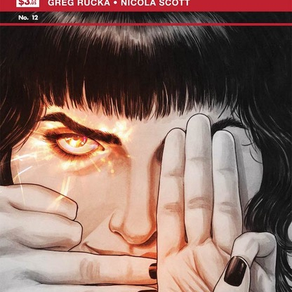
Despite problems with the storytelling, Nicola Scott crafts beautiful, highly realistic images to go along with the script on “Black Magick” #12. From the cover to the interiors, her use of primarily grayscale illustrations help to show the relatively unimpressed senses of witches who are aware of the true vibrance of magic, with Chiara Arena’s assistance on colors filling in the blanks and creating the familiar duality of color and its lack that has been present throughout the series thus far. Detail helps to focus in on exactly what each and every person is feeling, from disdain, despair, and depression to joy and love. In particular, the way in which the infernal creature around Rowan changes its entire appearance from panel to panel is highly unsettling, and yet is something that may have been overlooked by readers who do not pay close attention. Rather than having the script tell it all, Scott provides ample room for her artwork to fill in the blanks where dialogue simply will not do enough.
Final Verdict: 7.5– While this story does not give much room for newcomers, returning fans will be likely very interested in the developments as they go along with the famed extreme detail in illustrations and color usage.

Written by Gerry Duggan
Art by Phil Noto
Lettered by Joe Sabino
Reviewed by Quinn Tassin
Thank goodness we have proof that this book is worth it. The first issue of “Cable” was better than it had any right to be, but a second outing is really important to proving the worth of any serialized story. “Cable #2” keeps the fun, youthful energy of the first issue and puts a noir filter over it. The issue follows Cable as he tries to find a missing mutant baby while navigating a relationship with the Stepford Cuckoos and carrying the weight of having the coolest sword in the universe.
The book succeeds in large part because of a very smart decision that Gerry Duggan- not to take this whole thing too seriously. Teen Cable is, of course, a pretty self-serious guy, but that’s part of the fun. Many teenage boys take themselves very seriously but that seriousness is undermined by their teenage boy-ness. Duggan gets that and he writes a character like this version of Cable.
The highlight of the “Cable #2” isn’t the space knights, nor is it the missing baby search, it’s the Cuckoos. The moments of exploring that relationship are fleeting but hilarious. The immediate cut from Esme telling Cable the sisters don’t watch him going on dates with one another to the other Cuckoos laughing at the fact that they’ll inevitably break his heart is golden. Emma Frost telling Cyclops that Cable can’t break their hearts- except for Esme’s- also gold. Duggan makes this book feel light and in a line with so many heavy books, lightness is really nice.
Continued belowPhil Noto’s art is as beautiful as ever. His work is great for a number of reasons- it’s distinct and gorgeous and captures so many types of things so well. Cable’s fight with the space knights is cool and exciting and his kiss with Esme is incredibly sweet. An underrated talent of Noto’s though is his ability to draw facial expressions; he captures Cable and Esme’s post-kiss interaction with small details that make big impacts. The subtleties in Cable’s expression when he tells Esme he’s not worried about being judged are really great. It’s not like Phil Noto is the only comic book artist to show facial expressions but few capture them in such human ways. Noto also shows off the versatility of his coloring when we cut to Old Man Cable’s story in the last handful of pages. He’s so good at doing distinct styles, in fact, that I had to double-check the credits page to make sure that there weren’t two colorists on the issue after I finished.
What this is all building up to is a big question mark, but if everything is as fun as this, it’ll be worth the ride.
Final Verdict: 7.8 – A rock solid “Cable #2” proves that this book is really worth it.
Written by Cullen Bunn
Illustrated by Andy MacDonald
Colored by Nick Filardi
Lettered by Crank!
Reviewed by Jodi Odgers
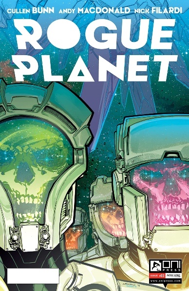
Many of the best horror properties bring to life grotesque amalgamations of various things people fear, to amplify the terror they can induce. Alien has its xenomorph. The Exorcist has the corrupted young girl. Even Bunn’s own “Harrow County” has its unique haints and witches. In this third issue of “Rogue Planet”, the ever-dwindling crew of the Cortes is dragged deeper into the clutches of the titular, Cronenberg-esque monster at the heart of the story.
The creative team has brought a truly horrific entity to life in the pages of “Rogue Planet”. MacDonald’s images of a skyscraper-sized totem of flesh gorily resplendent with organs and viscera are captivating, with Nick Filardi adding to their with balanced coloring. Around this central figure, Bunn continues to tell a tale straight from a top-tier creature feature. The crew of the Cortes reacts in highly believable ways to the horrors they have unwittingly exposed themselves to. The culture of the aliens worshipping the rogue planet is intriguing, with the end of the issue teasing deeper revelations to come.
“Rogue Planet” #3 is an entertaining read and moves the overarching plot along whilst feeling substantial in its own right. It may not be breaking new ground in horror, but Bunn shows that he understands what makes a good horror comic, with MacDonald’s grotesque visuals, Filardi’s bold palette, and Crank!’s clear and expressive lettering all adding to the strength of the book.
Final Verdict: 7.8 – Like the flesh totem itself, this series is full of heart and is hard to look away from.

Written by Tom Taylor
Penciled by Daniel Sampere
Inked by Juan Albarran
Colored by Adriano Lucas
Lettered by Wes Abbott
Reviewed by Alexander Jones
Floyd Lawton is an anti-hero and DC Mainstay. Over the years Lawton has become more derivative as a flawed anti-hero. In order to redeem or say something interesting about the character, a writer would have to craft a thoughtful story. Thankfully Tom Taylor has a fascinating point to address with Lawton that the issue poses thoughtfully and honestly. Artist Daniel Sampere continues the trend of epic layouts and beautiful artwork that the series has been known for. It is shocking to compare and contrast the legacy of Deadshot on-screen and versus his personality in the comics. Taylor’s characterization of the hero walks a thin line between portraying him as a joke-peddling badass versus a complicated family man. Throughout his run on “Suicide Squad,” Taylor has subverted expectations to make the characters deeper and different than they have been portrayed in other stories while having their personalities line up with continuity.
Daniel Sampere’s art lines up with previous artist Bruno Redondo’s visual direction incredibly well. Sampere draws a couple of wonderful page layouts and features a boldly designed title page. The page layouts are so innovative that they can make up for a lack of motion in certain elements of Sampere’s line. At times Sampere’s characters can come off as too simplistic but these shortcomings are supplemented with beautiful panel bleeds and creative layouts. Sampere is great at drawing motion with the different characters of the story. Daniel Sampere is a great addition to the title’s roster of artists and I hope to see his pencils again soon. The main drawback of Sampere’s art is the lack of detail present in Redondo’s work.
Continued belowThis one-off story with Deadshot could have felt subpar and likely would have been in the hands of a lesser creative team. Lawton has all the cliches of an anti-hero but Taylor makes his pain feel real. Instead of weaving a typical narrative, Taylor fleshes out who Lawton is as a person. Taylor connects Lawton’s personal life with his relationship as part of the team quite well towards the end of the issue. Taylor also draws a straight line with how Deadshot can be extremely serious and very funny. Sampere’s art continues the colorful and innovative direction established by Redondo incredibly well. Lawton’s multifaceted personality aspects allow for one of the best interpretations of Deadshot as a hero that readers have seen from DC in a couple of years. Taylor’s script has drama and humor in the right places that make for a fascinating interpretation of the “Suicide Squad” comic book.
Final Verdict: 7.8 – “Suicide Squad” #7 is a strong deconstruction of Floyd Lawton as a hero and father.
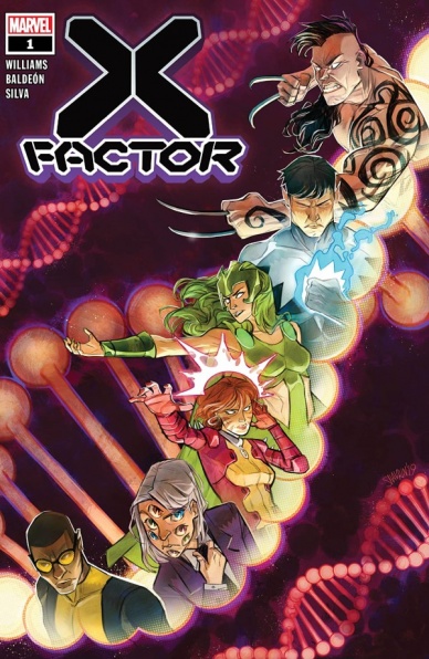
Written by Leah Williams
Illustrated by David Baldeón
Colored by Israel Silva
Lettered by Joe Caramagna
Reviewed by Elias Rosner
Now that’s how you kick off a new X-book.
Can I leave my review at that? Does it fill the word count? Final Verdict: 10/10.
. . .Fine. I’ll critique the book beyond the annoying $5 price point ~Marvel~.
“X-Factor” utilizes its extended page count to accomplish in one issue what many Marvel books struggle to do in 6: set-up the conceit, establish the team, build the dynamic, and create a guiding drive for the team. Baldeón’s artwork is less bouncy and out there than it was on “Gwenpool Strikes Back” but the more restrained style, though certainly no less well-constructed, is fitting for a team that isn’t constantly breaking the 4th wall like it was cheap drywall. Williams and Baldeón continue to be a dream team, with the verbal humor being bolstered by the visual gags, and the character’s physicality and malleable faces bringing out the hidden meaning in the words.
My critiques mainly lie in Silva’s coloring, which can be a bit drab and muted, and I often found myself losing characters like Amazing Baby in the background. It seems like a choice, rather than a mistake, as the book is a sort of detective series and so it may just take some getting used to. The other place “X-Factor” #1 falters is Williams’s wordiness. Sometimes it works, other times it pushes out the artwork and quite literally swallows it in massive balloons. The ills of trying to cram in so much into the first issue is that to get there in any sort of efficient manner, there’s gotta be a lot of explaining, especially in the second half.
There are also a few moments where I quite literally lost the plot in between all the banter that didn’t quite click. It also took me a minute to figure out Amazing Baby was a name and not a pet name for Amazing Baby. That’s my bad.
Oh, did I mention the book is hella gay? Because it is and y’all, I think it’s only gonna get gayer and better.
Final Verdict: 8.7 – Does what every good #1 does, even if it did have to go to a $5 price point, with only a few hiccups and bricks of text to hold it back.


