
There is a lot to cover on Wednesdays. We should know, as collectively, we read an insane amount of comics. Even with a large review staff, it’s hard to get to everything. With that in mind, we’re back with Wrapping Wednesday, where we look at some of the books we missed in what was another great week of comics.
Let’s get this party started.
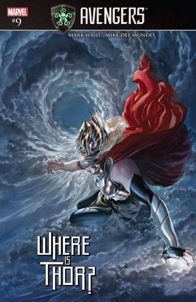
Avengers #9
Written by Mark Waid
Illustrated by Mike del Mundo
Colored by Mike del Mundo and Marco D’Alfonso
Lettered by VC’s Travis Lanham
Reviewed by Matt Lune
This issue of “Avengers” is a ‘Secret Empire’ tie-in, but before you roll your eyes and keep scrolling, this issue of “Avengers” also has very little to do with Marvel’s big summer event. Nothing to do with it, in fact. Sometimes tie-ins weave themselves intrinsically into a major storyline, making them feel essential and reminding you of the grander narrative, while others use the conceit (and slight boost in sales) of an event as a sort of springboard into their own thing. “Avengers” #9 is firmly in the latter category, but unfortunately that doesn’t mean it’s that good.
One of the big narrative beats – not to mention one of the biggest, “Oh snap!” moments in ‘Secret Empire’ is seeing HydraCap lifting Mjolnir high above his head, proving definitively that he’s worthy. Aside from the big question surrounding that (namely, “…what?”,) the second biggest surely has to be “well, what happened to Thor?” This issue answers that question: she’s been mysteriously teleported to an alien world! What follows is a strange, quest-like issue that holds no real weight for anything that surrounds it. There’s no real character growth – if there were this would all happen in her own title – there is no connection to ‘Secret Empire’ aside from the banner on the cover and by the end of the issue Thor’s exactly where she started.
Mike del Mundo’s art here is the issue’s saving grace. His alien landscapes look truly wondrous and strange, his character design is spellbinding and his big-bad is actually pretty scary to look at. His colors – with Marco D’Alfonso – make every page pop with a vibrancy you just don’t get from many other creators; this is what comics should be. There are a couple of really cool moments, the main one being Thor catching a bolt of lightning in mid-air as it’s about to strike, and del Mundo’s full page depiction of this makes it a moment that looks as thrilling and as monumental as it sounds. It’s just a shame that the script can’t support the art.
There are narrative hurdles that Waid sidesteps in order to tell this tale, the first being just how Thor became trapped on this planet. There’s no answer because the actual answer is “we need her off the board during ‘Secret Empire.’ The second hurdle concerns just how Thor can survive as Thor for an extended period of time without Mjolnir, and again there’s no answer besides “because the story demands it, therefore something-something alien atmosphere.” Taking all of this together leaves you with a gorgeous looking issue with a couple of wonderfully illustrated moments that is let down by a lazy script hampered by the moving pieces of a larger event.
Final Verdict: 6.5 – An elevated score thanks to stunning art, but even that can’t save what is frankly a pointless issue.
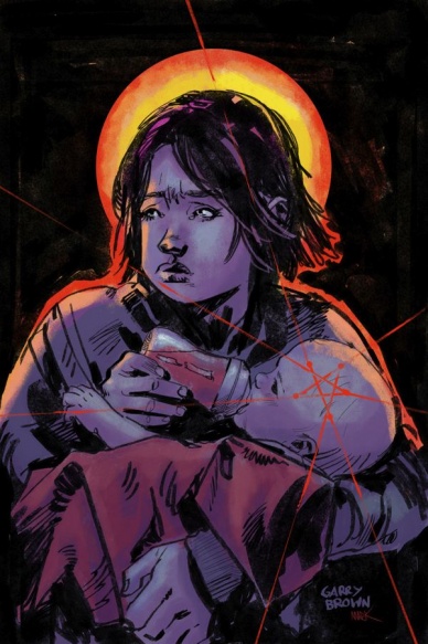
Babyteeth #2
Written by Donny Cates
Illustrated by Garry Brown
Colored by Mark Englert
Lettered by Taylor Esposito
Reviewed by John Schaidler
Writer Donny Cates has a knack for putting regular families in supernatural predicaments. He did it brilliantly in the limited-run series “God Country” (an aging widower with dementia battles otherworldly creatures with a massive enchanted sword); he’s currently working his magic again with “Redneck” (an extended family of vampires just wants to lay low and blend in by surviving on diet of cow’s blood while running a BBQ joint); and now he’s topping it all off “Babyteeth,” in which a 16 year old single mother is trying to raise the newborn Anti-Christ with the help of her Desert Storm veteran father and drug dealing hard-ass sister.
Continued belowThe common thread in all of these character-driven creations is fantastic dialogue, relatable family dynamics, likable characters and a highly compelling, multifaceted narrative voice. “Babyteeth,” especially, demonstrates the last element perfectly. The story itself may be considered “high concept,” but the tale is in the telling. The plot is entertaining, no doubt, but the undeniable hook lies in how the story is told. And in issue #2, the narrative voice of The Void Lord’s young mother, Sadie, really takes center stage. In fact, even though the story is told at a distance, some number of years in the future, clearly Sadie still struggles to wrap her mind around what really happened, accentuating everything with an urgency and immediacy that feels frighteningly palpable.
The inks and colors, too, have an “edge of your seat,” trepidatious quality that guides your eye from panel to panel and page to page. Even when specific scenes and images are mundane – feeding baby Clark his bottle, having a simple conversation, Sadie drifting off to sleep – you almost feel the need to avert your eyes for fear that something terrible will suddenly appear (even before the chickens get their heads blown off to the sound of Michael Fucking Stipe).
Indeed, Garry Brown’s inks have a rugged, menacing quality (especially in the chiseled faces of the many antagonists), but it’s Mark Englert’s blacks that give the book an ominous, unsettling weight that feels nearly claustrophobic. Throughout the entire book, certain characters in certain scenes are encapsulated – almost walled-in or trapped – by smudgy, uneven blacks that feel hastily, crazily drawn, creating a weird “halo effect” that feels anything but holy. It’s like the whole story takes place in a world that’s been redacted, stripped of anything light and airy or even the least bit cheerful.
And then suddenly, wham! You turn to the very last page and everything comes together in one brilliant full-page reveal that you had to know was coming, but didn’t quite want to believe or witness (or secretly cheer for). The Final Son is here. The Ash Lord has appeared and there’s no going back.
Final Verdict 8.8 – Narrator Sadie Ritter’s voice takes center stage as writer Donny Cates and the rest of the creative team continue to weave a brilliantly ominous tale of dark supernatural forces overwhelming the lives of an everyday family.
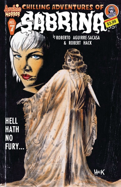
Chilling Adventures of Sabrina #7
Written by Roberto Aguirre-Sacasa
Illustrated by Robert Hack
Colored by Robert Hack
Lettered by Jack Morelli
Reviewed by Elias Rosner
What goes bump in the night in the woods of our fair Riverdale? It’s been a little over a year but we finally have a clue. The clock strikes 11. The wind howls. Blood is spilt. A past is revealed. All the while, the title character isn’t even seen except for as a child. Sabrina, the creepy, creepy versions of you have been missing for over a year and now you can’t even be bothered to show up in your own comic? I kid but this issue certainly suffers from the extended hiatus it took. It took a bit to reorient myself to the world.
The first issue of a brand new arc, Witch War, “Chilling Adventures of Sabrina” #7 takes us through a journey of demons, ambition, and through the life of a very cruel man. Robert Hack has a knack for drawing the unnatural in ways that are familiar enough to recognize them but just different enough to be unsettling. The best example of this is when he draws the demon Beelzebub. He shows us a fly, towering over Edward, but instead of the usual fly mouth, it has a wide open human mouth and chin.
The whole comic has this feel and I think part of that is due to the scratchiness of the art, like it was drawn on parchment or wood. Old, ancient and dark, like the book itself was dragged from some damp archive that it should never have been pulled from. Unfortunately, Hack’s faces leave a lot to be desired. They tend to be stuck with very stoic faces that, while helping with the unsettling nature of the comic, makes it so that when a character has to emote, it comes off as flat.
Continued belowLuckily, Aguirre-Sacasa’s writing (and the conniving nature of the characters) makes up for that. We get a tightly woven story of how and why Edward came to be who he was and why it is that he was sentenced to witch jail through an imagery laden tree. He was a cruel man and now we know all the details, which is as good a way as any to get new readers and old into the action. Plus, we got to see an exceptionally tall goat Satan in a tuxedo with a cane, offsetting much of the more gruesome imagery of the comic.
Final Verdict: 7.1 – Archie Horror is back with a creepy beginning to a new arc (that will hopefully takes less than two years to complete).
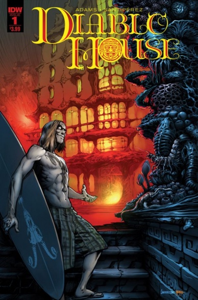
Diablo House #1
Written by Ted Adams
Illustrated by Santipérez
Colors by Jay Fotos
Lettered by Robbie Robbins
Reviewed by Christopher Lewis
Adam’s Diabo House is a cheap version of Tales from the Crypt, except the narrator isn’t the Cryptkeeper, but instead a California surfer dude named Riley who gives tours of the Diablo House. The narrator has nothing about him that is sinister, and seems to be a poor choice for the main character of the series.
This first six pages of the issue are exposition where Riley explains who he is and gives some background about the Diablo House. Afterwards Riley intros the main horror story which is about a guy named RC, his horrible wife, and how she wants him to make more money. At the end of the story there is twist, which is obvious, and also an explicit explanation from the narrator regarding the couple’s connection to the Diablo House. This explanation is necessary because at no time during the story is there a clear connection to how these characters came into contact with the Diablo House. Overall, the story was shallow, poorly executed, and at no time demonstrated anything that made me care about the characters or even the story.
Santipérez’s art and Foto’s colors in this book are very typical and forgettable. For a horror comic there was nothing about the art or color that gave a feeling of eeriness to the Diablo House or tension during the story.
Final Verdict: 3.0 – A really bad attempt at a horror comic.

Giant Days #28
Written by John Allison
Illustrated by Max Sarin
Inked by Liz Fleming
Colored by Whitney Cogar
Lettered by Jim Campbell
Reviewed by Kent Falkenberg
Lovers’ fights and bumps in the night make for another fantastic walk on the wildside with Esther, Susan, Daisy and Ingrid. “Giant Days” #28 is a perfect example of how wonderful comics can be when a simple premise is executed with infectious verve. John Allison and Max Sarin capture the whirlwind of excitement and world-shattering (but not actual) catastrophes that make up life when you’re young with a whole world ahead of you (in spite of how starved for sleep you are).
Granted, all is not idyllic to start this week’s issue. That initial loverly glow has dimmed a bit for Esther and Ingrid. Following an off-panel row of most-likely minor import, Jim Campbell uses ballooning sound effects to track a path of floor stomping and door slamming, while Esther looks up overhead from the living room and remarks on Daisy’s tendency to explode when she finally hits her breaking point. Sarin punctuates the moment with a cheery-pink mushroom cloud blowing up in the background as she says this. It’s a prime example of how these creators seem to do hundreds of little things right within the confines of a twenty page comic.
Even more indicative of this is a three-panel sequence that squeezes tighter and tighter and tighter onto Daisy’s face stewing as she lies wide awake in the middle of the night, with Ingrid sleeping presumably like an angel beside her. Sarin carves her grimace increasingly more fierce as the artwork pulls in and her ranting narration ramps up to a boiling point of hurt, frustration, and indignation. Allison’s script here is irrationally hilarious, but the searing emotion of it becomes heartfelt through Sarin’s steady pattern of closing in on that scowl. It’s a fantastic beat in “Giant Days” #28 that registers all-too real.
Continued belowWorked-up and unable to sleep, Daisy becomes a nighthawk and stumbles across shadowy figures lurking behind the house and a mystery in the garage that tracks all the way back to when the flatmates first rented the place. Allison does a fantastic job balancing the relationship drama with the pseudo-sleuthing (Susan, Esther, and eventually McGraw get drawn in, obviously). At the same time, Allison’s slingshot characterization of Daisy’s manic energy thrown into the case is tempered by her naivety in believing Susan’s being awake during the wee hours as well is because she’s working extra shifts at the Night… Hospital… (and not anything else, extra-curricular).
Throughout “Giant Days” #28 Sarin’s panels seem to roll and pitch into one another with an effect that mimics the imbalanced, floating-on-water feeling that of being sleep deprived, yet moderately alert at 3 in the morning. It’s a fantastic style choice that works perfectly for the characters, but also contributes a unique aesthetic that makes this book so damn fun to read.
“Giant Day” #28 glides along with heartfelt irreverence. Allison’s script and Sarin’s fantastic cartooning, each somehow matching the other’s off-kilter cadence, are delivered with a contagious lust for life.
Final Verdict: 8.0 – Consistency wins the day. Seriously, this series is always fantastic.

Hawkeye #8
Written by Kelly Thompson
Illustrated by Leonardo Romero
Colored by Jordie Bellaire
Lettered by VC’s Joe Sabino
Reviewed by Forrest Sayrs
“Hawkeye #8” is a bit of a muddled mess. Combining the coda of the ending storyline with the opening moves of the new one is always a risky gamble when the page count is so low. Kelly Thompson actually does an admirable job of keeping the suspense and drama of both pieces really high, but the end result never really rises above ‘okay.’
Putting that aside for a moment, “Hawkeye” is in a really good place as a series. Kate Bishop has always been a great character and pulling her out from her safety net has done some great things. The supporting cast is a major highlight of this issue, thanks mostly to a great scene that reminds us that the regular people in a superhero setting are still real people and capable of doing more than standing off to the side or being rescued.
The problem with the A-plot is that the ending arc goes out with a whimper rather than a bang. A climactic confrontation feels prematurely aborted due to the bulk of the new story thread unfolding. Not that we needed a whole issue of villainous exposition or a big fight scene, but the mystery-to-answers ratio definitely tipped more towards new mysteries. The psychological impact of the confrontation also feels inconsistent with the content of the climax. Kate is visibly off her game in the ‘Now’ story, but that doesn’t track with the meat of the confrontation.
Leonardo Romero’s panels have kept this book on my ‘must read’ list, and #8 is no exception. I love how he handles Hawkeye’s costume, which could easily turn into a constant series of pinups. He somehow manages to keep it realistic and functional in spite of the cutouts. There’s a great double-page spread of Kate escaping from a skyscraper that highlights both his eye for detail and great realization of the human form. Add to that the suitably creepy Stepford vibe that Kate’s dad oozes in every scene and you have an amazing combination of positives that keep this somewhat lackluster issue shining.
Even a so-so issue can’t stop “Hawkeye.” Thompson has captured a lot of what made the most recent run of “Mockingbird” fun and interesting, and grounded it much more firmly in the Marvel universe. But more importantly, this book is doing what Hawkeye does best: street level heroics with style.
Final Verdict: 6.9 A somewhat messy tangle of plots, kept aloft by impressive art.

Jessica Jones #10
Written by Brian Michael Bendis
Illustrated by Michael Gaydos
Colored by Matt Hollingsworth
Lettered by VC’s Clayton Cowles
Reviewed by Gregory Ellner
Some of Brian Michael Bendis’ classic David Mamet-esque overly long speaking style for characters can be excused in this issue of “Jessica Jones,” given the private detective internal monologue that could be classic of a style like “Alias”’ heroine. Unfortunately, his use of overly repetitive and at times somewhat juvenile dialogue leaves something to be desired, especially when it comes to such people as the mature Roderick Kingsley as the Hobgoblin. The need to add additional dialogue on top of statements makes even the most mature characters seem as though they just left school to enter the workforce, with a lot of the profanity used seeming in a style of a teenager who just learned what verbal profanity actually is and how offensive it can be. There is no room given for a scene to speak for itself, for the artwork to tell a story that almost half a panel of dialogue won’t do instead.
Speaking of the artwork, Michael Gaydos is the saving grace of “Jessica Jones” #10. The linework and use of shadows tells a story of grit and low-tier heroism in a superhero story, the idea of a private detective who has powers but prefers to do things on a street level rather than flying through the air, as she likely could.
In summary, while the writing of “Jessica Jones” seems to have fallen far under its creators from its start as “Alias,” Michael Gaydos’ artwork helps to keep things at least interesting to look at.
Final Verdict: 6.0 – An immaturely-written story that nonetheless has interesting artwork.

Justice Inc: The Avenger – Faces Of Justice #1
Written by Kyle Higgins and Joe Gentile
Illustrated by Alexander Shibao
Colored by Natalia Marques
Lettered by Troy Peteri
Reviewed by Michael Mazzacane
The problems found in this issue can be explained by looking at its title: “Justice Inc: The Avenger – Faces Of Justice.” That is three separate titles all wrapped up in one. The first issue to the latest Justice Inc/Avenger mini is a mishmash of moods and plots that didn’t come together in either Kyle Higgins and Joe Gentile’s script or Alexander Shiabo’s art. There are clever ideas in this issue, but with so many foci something was bound to stick.
The pale Avenger, Richard Benson, finds himself arrested by the F.B.I. for the murder of a doctor. And it’s up to his crack team of fellow vigilantes, the titular Justice Inc., to figure it out and get their boss out of jail. The Benson half of this issue is effective and presents the usual interrogative beats in a slightly different manner. Justice Inc.’s portion of things read like a camp rendition of a Hanna–Barbera mystery team.
The creative team’s decision to design the pages of Benson’s interrogation around wide panels and not the more typical grid layout is the smartest thing in this issue. Normally these types of sequences would use a grid layout to frame each character’s face, creating a ping pong like rhythm. That method condenses panel size, giving the artist and comic a chance to build an emotive range and show the tension in the questioning. Benson isn’t the emotive type. By using wide panels, Alexander Shibao turns just about every panel into a twofer and play Benson’s steely exterior against his exuberant interrogators.
That artistic craftsmanship isn’t found in the Justice Inc. sequences, in particular when they go investigate the deceased’s house. The confrontation between Justice Inc. and party’s unknown is a presentational mess. A mystery man is rummaging around in the office. While another comes out of the shadows with a gun seemingly pointing it at that trespasser … except they end up shooting at Justice Inc!?! The physical geography of this sequence and how that geography is narrated to the reader is amazingly poor. Multiple people get shot and maybe killed, it’s hard to figure out the particulars. It reads like panels are missing.
This is supposed to be a mystery and not having all the answers in the first issue is fine. Except, nothing about this first issue hooked me or laid a foundation for the story going forward. It’s a hodgepodge of moments that never came together.
Continued belowFinal Verdict: 4.5 – Some nicely executed moments and some supremely poor ones.

Rock Candy Mountain #4
Written, Illustrated, and Lettered by Kyle Starks
Colored by Chris Schweizer
Reviewed by Nicholas Palmieri
“Rock Candy Mountain” has constantly been proving something that I mistakenly didn’t realize before: Kyle Starks can do so much more than funny.
With this issue, things turn into a gritty prison drama where Jackson and Slim have to find their allies and break out. Starks uses the opportunity for some heartwarming moments where motivations and actions become clear through small beats. The pieces don’t get put together in front of you, but you can piece together for yourself just how connected Jackson is in the hobo world. Starks also engineers an inventive way for the characters to get out, to where the slow, funny build-up makes the break-out scenes all the more exciting. His technical writing skill extends far beyond his creative one-liners to make the entire issue an engaging blast to read. Of course, he still finds the time for those hilarious one-liners, too.
Starks tends to use a lot of panels per page, but he always knows why and how to use them. During the dialogue-heavy scenes, his high amount of panels help to pace conversations. Starks tends to have a lot of back-and-forth with short sentences, so the panel choices allow the character reactions to sell each exchange. During the action scenes, the amount of panels allows him to break down action beats for clarity, leaving us with some tense, breathtaking action. And with little to no dialogue in these scenes, they still read as quickly as they should. On the flipside, Starks also knows when to stop and let the big moments take up a smaller number of larger panels. Every panel choice Starks makes is in service to the pacing, likely a result of him both writing and drawing “Rock Candy Mountain” himself.
Schweizer changes up his color schemes depending on what would help each scene. Some have a flat color scheme that works with Starks’s cartoony style, where skin tones are a peach and the prison buildings and clothes are shades of gray and light blue. In the later nighttime action scenes, he switches to a monochromatic scheme, utilizing one main color in each room (red, purple, gray) along with one darker shade of that color for shadows. He also occasionally throws in an unrelated accent color for something like a gunshot or a spot of blood. These choices sell the action scenes for me, breaking them up into different sections based on the room color and allowing us to notice more of Starks’s linework than the normal flat scheme would have.
I’m completely enamored with this book. At once fun, gritty, cartoony, and engaging, Starks and Schweizer combine comedy and legitimate story like no other.
Final Verdict: 8.8 – Don’t let the hilarity fool you: This book knows how to tell a story.
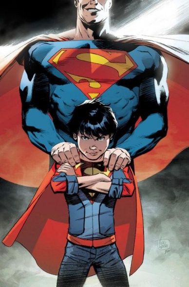
Superman #26
Written by Michael Moreci
Illustrated by Scott Godlewski
Colored by Hi-Fi
Lettered by Rob Leigh
Reviewed by Alexander Jones
“Superman” #26 by Michael Moreci and Scott Godlewski has a clear intention and point of view. Having a comic with such a distinctive message and draw is a great way to tell a story and get readers interested, but enveloping them in a message can make for some preachy storytelling. “Superman” #26 features a lot of direct emotion and Moreci oftentimes makes the mistake of telling readers exactly what to think about the story through Superman’s direct narration–the book doesn’t give readers readers the chance to see the world through his eyes, we’re told exactly what to think. In previous issues I’ve seen usual “Superman” writer Pete Tomasi strike a better balance of having something to say and not be quite so obvious.
If there’s any book that Moreci could really draw some inspiration from it’s the current “Archie” series that always has a clear message, seldom using a character as a direct mouthpiece to tell you exactly what to think. Overall DC Rebirth has had an incredibly strong editorial presence in showing lighter stories with relatable characters but seeing a comic look this set in Hamilton and not up to par with the writing of Tomasi or the art of Patrick Gleason and Doug Mahnke make this comic feel like a lesser version of an ongoing series that I love. Instead of having a fill-in creative team tell the same kind of story it would have been great to Moreci and artist Scott Godlewski embark on an entirely new direction.
Continued belowGodlewski’s pencils are solid but lack the detail and finesse of regular series artists Gleason and Mahnke. Some moments shine through stronger than others. The introduction of some of the aliens in this comic are a great way for Godlewski to show off what he’s truly capable of. However some of the anatomy and facial expressions from Superman and John are incredibly warped. Clark’s face never quite looks the same from panel-to-panel and John’s hair flops all over the place in this comic. There are huge, incredible splash pages that make me wonder if Godlewski was on some kind of time crunch when the artist shows a Chris Sprouse influence early in the issue.
The framing device that Moreci uses to center the comic around is an aspect about this narrative that pushes on the theme too hard. By directly contrasting from present to future and having the characters reference these different moments in time, the message becomes too prominent to ignore. The comic becomes less of a character study and more of a way for Superman to teach the reader a couple of life lessons. There’s certainly some excellent moments of intrigue peppered through the story and a few beautiful moments where Godlewski punches above his weight class. “Superman” #26 has the bones of a great story but is too honest, good-natured and direct to produce something truly substantial.
Final Verdict: 5.5 – Despite some good intentions and solid art, “Superman” #26 prefers to tell instead of show.

X-Men Gold #7
Written by Marc Guggenheim
Illustrated by Ken Lashley
Colored by Frank Martin
Lettered by Joe Sabino
Reviewed by Chris Partin
This issue of X-Men Gold is the first part of a “Secret Empire” tie-in and you would probably struggle for a while to find what those ties are in this issue. If you put that part of the book aside this issue isn’t a bad issue.
There is a lot to unpack with this issue. Marc Guggenheim does not shy away from breaking the issue apart and giving every character a few moments to bring readers up to date with what is going on with their personal stories while also being able to bring a threat that pulls them all together and tell the team’s story. The immediate threat to the team is a serial killer, a new X-Cutioner, that has found his way into the mansion and is hunting mutants.
The real pull for this issue is the amazing artwork by Ken Lashley and Frank Martin. Lashley’s use of body language and facial expressions elevates the storytelling in this issue. Martin’s colors take what Lashley puts down on the page and just cranks it up to “eleven”. The panel with Rachel Grey in her Hound persona really is a perfect example of what Martin brings to the book.
Final Verdict: 7.0 – The story itself is okay. The art in this issue really saves this issue from being so-so.


