
There’s a lot to cover on Wednesdays. We should know, as collectively, we read an insane amount of comics. Even with a large review staff, it’s hard to get to everything. With that in mind, we’re back with Wrapping Wednesday, where we look at some of the books we missed in what was another great week of comics.
Let’s get this party started.

Written by Zhou Liefen, Greg Pak, and Alyssa Wong
Illustrated by Keng and Pop Mhan
Colored by Keng and Federico Blee
Lettered by Joe Caramagna
Reviewed by Gregory Ellner
Both of the stories in “Aero” #2 are pretty simple, yet fun nonetheless. In the main story, Zhou Liefen looks back on Lei Ling’s past, both in terms of her civilian life
In the secondary tale by Greg Pak and Alyssa Wong, the opposite occurs. There is some action, specifically in conflict with Red Feather, but instead, the main focus shifts toward a more low-key narrative about Wave (Pearl Pangan)’s family and her own interaction with her powers and the corporation that gave said abilities to both her and Aero. Pak and Wong concentrate on the different personalities between the relatively pacifistic Aero and the more hotheaded Wave, bringing their friendship to the fore while also adding in more supporting cast members, as minor as they may be.
Taking both the illustrations and the colors for the primary story, Keng truly shows the manga-like stylings of this Shanghai-based heroine. The heavily action-oriented script lends itself well to the flowing, dynamic artwork, with the colors, especially the light blues of the air, flowing effortlessly as if on a wind current to enhance the feeling of speeding from one area to the next, as well as overall feeling like watching a cartoon.
On the other hand, illustrator Pop Mhan shows a slower, slightly less animated style more similar to American and European comics, allowing for some more familiarity for readers in those areas who may not have been as thoroughly exposed to manga. Mhan shows some of that style, albeit with more room to slow down, especially in the focus on Wave’s home.
Complementing Mhan, Federico Blee’s colors are cool but less bright than those used by Keng, and more focused on realistic representations of how a place would look than stylizing it. There are some oddities in the coloring, such as Ling’s plainclothes shirt changing shades of blue, and even to nearly white, seemingly at random and with too much of a drastic shift to be purely a trick of the light, but such a difference is only really noticeable for those looking for such a thing.
Final Verdict: 7.0 – A pretty fun set of tales about a manga-esque superheroine in the Marvel Universe.

Written by Michael Uslan
Penciled by Dan Parent
Inked by J. Bone
Colored by Glenn Whitmore
Lettered by Jack Morelli
Reviewed by Rasheda
The story begins ten years after the event where you see what happens when Archie proposes to Veronica Lodge and then, in another side, where Archie proposes to Betty Cooper. This comic splits into two parts, we see life after ten years of marriage to Veronica first, then Betty. All the gang’s here for Archie’s adult adventure.
Archie’s love for both Betty and Veronica are on full display for each of these storylines. It’s not an “It’s A Wonderful Life” montage, we see the full picture of both marriages. With Veronica, Archie has remained in Riverdale working for Mr. Lodge. He is trying to be a husband and a great father but working for Mr. Lodge, Archie is missing his family. Marriage with Betty sees them living in New York City trying to expand on his music career. Archie and Betty are called back to Riverdale, though, and decide to celebrate their anniversary there. We see familiar faces like Jughead, Midge, Reggie, and Cheryl. In both stories, in true Riverdale style, trouble was brewing leaving crazy cliffhangers at the end of each story.
Michael Uslan keeps the stories light and fun, which is what we expect from an Archie comic. It is light fare, you don’t need a lot of backstories to understand what is happening. Uslan has captured the friendship everyone has and has paired off the once teenagers nicely, you feel that this is what would have been the outcome if it were real. You have a sense of comfortable familiarity with the group, this is what this comic is like. You get to revisit with old friends, some you may not like, but it’s nice to catch up. Uslan keeps them in character; Archie is always the good guy, Veronica outer stuck up attitude hides the kind heart, Betty is helpful, sweet and caring, Reggie is still a jerk.
Continued belowJ. Bone has worked on past Archie comics and he compliments Dan Parent’s pencil work well. Nostalgia is the word that comes to mine with the art. It brings me back to when reading Archie as a comic stripe in the newspapers. It is a little detail, but the way their teeth are drawn is kind of a throwback to comic stripe, it’s one big tooth. Bone’s ink lines are on the thick side, it gives it the comic strip feel. Glenn Whitmore’s bright and bold color use brings cheerful life to the story, These are the colors used to add to the playful feel of Riverdale and it’s citizens if you are having a bad day just open an Archie comic and it will lighten your mood.
Final Verdict: 5.8 – Neither here nor there, it is a familiar face on a crowded comic rack

Written by Donny Cates
Illustrated by Garry Brown
Colored by Mark Englert
Lettered by Taylor Esposito
Reviewed by Christa Harader
It’s been a while, but “Babyteeth” #15 reminds us that we’re knee-deep in some serious cosmic BS pretty quickly as all Hell breaks loose in this issue. Literally.
Cates’s plotting hits the crescendo we’ve been waiting for in this issue without sacrificing any of the humor or quippiness the book’s maintained so far. It’s tempered pretty well by a vengeful God and an army of incredibly strange apparitions. Brown’s art feels a little rushed this time around with a few odd angles and facial expressions. The splashes and spreads work well, and he has to be credited for handling a large cast with his usual clarity. Englert’s colors get a little wilder to pump up the surreality of the external scenes and Heather and Mike’s noble moments, and the crayon quality of the hellfire is a perfect note. Despite some of the book’s tenderness, specifically around Sadie’s development and point of view, “Babyteeth” still has its tongue planted firmly in cheek, and Englert helps maintain this mood very well. Esposito’s lettering works well, with a thicker stroke on some of the effects balloons and his usual keen sense of placement.
“Babyteeth” needed to hit a strong action beat to continue succeeding as a serial and as a larger work, and Cates and the team deliver pretty well. There’s a bit of looseness around the edges, but it’s also a messy and chaotic moment in the story and the issue is an entertaining success.
Final Verdict: 7.0 – “Babyteeth” #15 pushes the plot forward with some good, weird and unholy action, with a few art stumbles along the way.

Written by Jed MacKay
Illustrated by Travel Foreman & Michael Dowling
Lettered by Ferran Delgado
Colored by Brian Reber
Reviewed by Michael Govan
It’s hard not to love a good heist. There’s the valuable heist-worthy object to snatch. The mastermind and their crew. There are always, ALWAYS complications, of course. Sure, a lot of heists we see on film and television or read in books follow the same beats but that’s fine. What’s important is that it’s fun.
“Black Cat” #3 is definitely fun. It’s not so much an in-depth look at Felicia Hardy’s character as it is a fun romp across the Marvel Universe. In this issue, Doctor Strange’s mystical Sanctum Sanctorum is the place to get robbed. Felicia and her crew are joined by guest star, Bats, Stephen Strange’s talking ghost dog. This character is one of the newer additions to the Marvel Universe but is always highly entertaining. He’s more fun than Wong any way and his interactions with Black Cat are pretty funny. I laughed out loud when he mistook her for Silver Sable. The D-list sorcerer Xander the Merciless surprisingly made for a pretty good villain and Black Cat inventively uses her powers to take him down. You see, the bad luck cancels out the magic. Does bad luck even work like that in the Marvel Universe? It’s vague and I don’t really know but it was cool to see all the same.
Travel Foreman’s artwork is strong on this issue. I’ve liked him best on weird, out-there titles like “Ultimates²” or “Justice League United” and this issue of “Black Cat” is sort of weird. His Bats looks sort of like a Looney Tune-esque cartoon character and that just makes him all the more endearing. The expressions he draws on Felicia’s face as everything goes wrong are hilarious. Those Doctor Strange nightmare goblins are pure nightmare fuel. The writer and artist both hit all the right notes and I was entertained for the whole issue. It seems that the Fantastic Four are getting robbed blind next and I can’t wait to see.
Continued belowFinal Verdict: 7.5 – It’s even more fun if you hum the Mission Impossible theme.
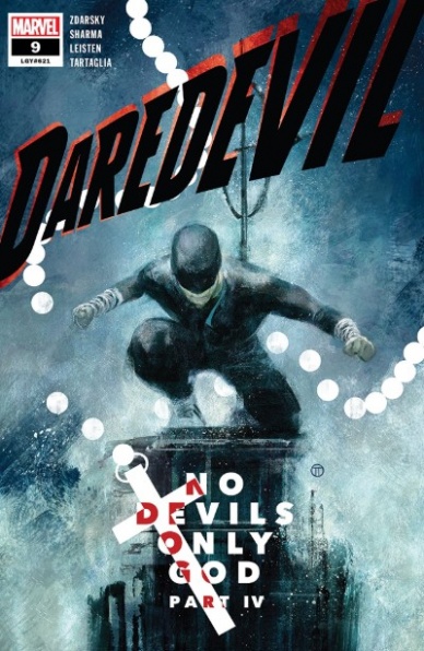
Written by Chip Zdarsky
Penciled by Lalit Kumar Sharma
Inked by Jay Leisten
Colored by Java Tartaglia
Lettered by Clayton Cowles
Reviewed by Kenneth Laster
Guilt & Sex: The Matt Murdock Story. Chip Zdarsky, Lalit Kumar Sharma, Jay Leisten, Java Tartaglia, and Clayton Cowles are playing all the Daredevil hits in “Daredevil” #9 which readers would get tired of if it was not done so well.
Zdarsky’s status quo has Matt Murdock as the Parole Officer Without Fear after hanging up his horns after accidentally killing a man. Zdarky has played with this status quo in some interesting ways, testing Matt spiritually and emotionally with his recent interactions with the Libris crime family. Everything Matt has been going through in this story arc seems to come to a head in “Daredevil” #9.
Zdarsky opens “Daredevil” #9 with a cameo readers were likely not expecting with Matt conversing with the Fantastic Four’s Reed Richards, the smartest man in the Marvel Universe, about the existence of God. Zdarsky follows this scene with Matt meeting with Mindy Libris, a bookstore owner and reluctant member of the Libris crime family lamenting her inescapable situation. Matt then finds himself in church speaking with Sister Elizabeth about signs from God and at the same time a fellow sister cries over a boy who ran away. Like an addict, the rest of the issue follows Matt in a makeshift version of Daredevil’s iconic Man Without Fear look made famous by Netflix’s “Daredevil” rescuing the boy from a dire situation before further succumbing to his passions in the arms of Mindy Libris.
Zdarsky gives readers a classic Daredevil tale in “Daredevil” #9 without it feeling like fanservice by changing the dressings and adding enough new elements to keep this story fresh. Detective Cole North and the growing threat of the Owl keep up a sense of claustrophobia and distrust that feels right in a Daredevil story.
Sharma and Leisten do a great job on art duties. They do a really interesting outline on characters in darker scenes which can be seen in Matt falling down the stairs and around the boy Matt saves. Rather than just giving characters and outline that fits neatly to their form the black that surrounds characters are more chaotic that put more emphasis on the action and the emotion of the figure rather than the figure themselves. Java Tartaglia’s colors do an excellent job in capturing the grime needed for the noir tone that “Daredevil” #9 is going for.
“Daredevil” #9 has Matt Murdock regain his horns in more ways than one with Zdarsky, Sharma, Leisten, Tartaglia, and Cowles giving readers the kind of Daredevil story they crave. Zdarsky brings the “No Devil’s Only God” arc to its crescendo by having Matt relapse into his crusade as Daredevil. Sharma, Leisten, and Tartaglia give the book the noir grit and grime expected out of Daredevil and the book is all the better for it.
Final Verdict: 8.0 – The creative team for “Daredevil” #9 is paying off the status quo shift of this arc by putting Matt Murdock through his usual paces in a new and satisfying way.

Written by Don Handfield
Illustrated by Leonard Rodrigues
Colored by Dijjo Lima
Lettered by DC Hopkins
Reviewed by Chris Egan
“The Dark Age” #1 posits a world in which all metal instantly turned to dust one day. All of human civilization collapsed and started a new stone age and tribal living. The issue opens on a family having dinner when the event happens. The story then jumps ahead thirteen years and shows us how the world was forever changed by the loss of metal and how humanity, and that family, have moved on and survived in that time.
End of civilization stories are always going to be popular and have a place in the world of sci-fi and comic books and this is the latest series to grab onto that wave. With “The Walking Dead” recently coming to an end, there is an opening for something new in the sub-genre. Handfield takes common ideas (people splitting into tribes/factions, the collapse of the government, survivalist mode) and gives us a new and interesting catalyst for this take on the end of the world. For the most part, the plot is very similar to other stories of this nature, but with some truly original ideas and problems that have rarely or never been touched on. The main characters are easy to relate to, and we get a nice amount of time with each to understand who they are on the surface, with hints of deeper aspects to come. There is a good amount of world-building here without it being overbearing or underdone. It leaves you wanting more.
Continued belowRodrigues draws a strong and nicely detailed world that is now destroyed and over-grown. Characters are distinct and varied in their looks. His style is reminiscent of more than one action/sci-fi animes but is ultimately his own. Overall his work is excellent and is more than expected from this book. His great talent is refreshing to see coming from a smaller publisher. His pages are enriched by their detail and given character by his scratching pencils. He leaves certain aspects of his drawings almost unfinished adding to the movement and kinetic tone of the whole issue. Lima’s color work is also wonderful. He speaks Rodrigues’s artistic language breathing full life into these illustrations, inking and coloring them to accentuate their full depth and atmosphere while adhering to the more sketchy aspects of each panel, rather than covering all up in solid colors. This team is impressive all around.
Final Verdict: 7.5 – A premiere filled with been there, done that ‘end of civilization’ beats with an original point of origin and some fantastic ideas throughout. Paired with a talented art team, this is a book that can hit new heights with the right choices.

Script by Gerard Way and Jeremy Lampert
Art by James Harvey
Reviewed by Matthew Blair
It’s almost scary talking about “Doom Patrol: Weight of the World” #2 because of how weird the comic is. How weird is this comic? The main characters have to mediate divorce proceedings between two planets…and that’s only one of the three weird things to happen in the entire issue!
In all seriousness, “Doom Patrol: Weight of the Worlds” #2 is a great comic. Writers Gerard Way and Jeremy Lambert are veterans of the Doom Patrol books, and their work on this issue is easily on par with anything that came out of Grant Morrison’s legendary run on the title back in the 1980s. However, while these two writers aren’t afraid to go nuts with concepts and ideas, they also know the importance of keeping the story grounded with relatable themes such as the importance of family, positive thinking, and robot flamethrower arms. It’s a book that is zany and wild, but at the same time easy to follow and understand.
The artwork of “Doom Patrol: Weight of the Worlds” #2 reflects the tone and style of the script, in that it’s weird and crazy but easy to follow at the same time. Artist James Harvey has an aesthetic that looks like it combines modern high-end pop art with images that look like they’ve been cut out of a well-produced indie zine. It’s art that demands attention and forces the reader to spend a good chunk of time pouring over each page instead of skimming over it.
“Doom Patrol: Weight of the World” #2 is a special comic that is doing great and interesting things that deserve our attention. The imagination, thoughtfulness, and skill that went into producing this comic is palpable, and it deserves to be placed on a pedestal as a shining example of what the medium of comics can be.
Final Verdict: 8.9-This is the strange, kooky, and crazy breath of fresh air you’ve always wanted to read.

Written by Grant Morrison
Illustrated by Liam Sharp
Colored by Steve Oliff
Lettered by Tom Orzechowski
Reviewed by Alexander Jones
The Green Lantern doesn’t follow any particular trend from issue-to-issue and few installments illustrate that point as vividly as the newest chapter. Grant Morrison and Liam Sharp’s newest storyline entitled ‘Guardians of the Multiverse’ is weaving together previous plot threads to tell an epic new story with the Green Lanterns. Morrison’s scripts are even pulling from well known previous stories like “The Multiversity” and a litany of other Green Lantern tales.
Liam Sharp’s art in this issue shows off the versatility of the creator. The first story pages of interior artwork show off a relatively polished approach to Sharp’s visual direction. The vivid interior artwork in some of the splash pages of the story shows just how insane some of the layouts and page compositions can get. The Green Lantern scripts and visual direction from Sharp are pushing the creator’s abilities to the limit.
Continued belowMorrison’s script for the issue brings in so many elements that it requires additional read-throughs. It is a delight to see superhero scripts and artwork that are dense and creative. Morrison and Sharp introduce elements from throughout the multiverse leading all the way up to the very last pages of the issue. Evaluating only the first chapter of the two-part story-arc proves difficult as Morrison appears to have a wild plot for the second installment of the arc.
Over the next two chapters, it will be fascinating to see how Morrison is able to gear the series towards a conclusion. There is also beauty in some of the sheer enthusiasm Morrison and Sharp imbue into the script. The final page carries an intriguing sense of mystery and an excellent cliffhanger.
Final Verdict: 7.9 – “The Green Lantern” #10 prepares the series for an endgame with a legion of Multiversal Green Lanterns.

Written by Jonathan Hickman
Illustrated by Pepe Larraz
Colored by Marte Garcia
Lettered by VC’s Clayton Cowles
Reviewed by Shamus Clancy
Jonathan Hickman is playing 10-dimensional chess in his definitive take on Marvel’s most famous mutants. While “House of X” #2 is just merely the third installment in a 12-issue prologue to Hickman’s true run on “X-Men” in October, this issue still works on so many levels. It continues as the follow up to last month’s “House of X” #1, while also immediately intertwining itself with the foremost event of “Powers of X” #1, Moira MacTaggert’s first (or 8th? 9th?) meeting with Charles Xavier, providing the ying to the companion series’ yang. The comic even stands on its own as a reimagining of the life (or lives) of Moira.
Hickman is intentionally crafting a tale that is prime to make readers scour Reddit for theories as to what happened during Moira’s sixth life, but there is more weight to this story than simply the future of the mutant race. It, like any great X-related work, is a commentary on life too. No matter what preventions people may take, evolution in its various forms (technology, global warming, the mutant gene) will still always come. “House of X” #2 a chilling, nihilistic touch on top of the already ever-present doom facing the X-Men.
This is to say nothing of Pepe Larraz’s art, which lives up to Hickman’s much-hyped story. If someone were to close their eyes and imagine what it would look like if Sentinels became Earth’s new blood-thirsty overlords, they would imagine Larraz’s penciling. “House of X” #2’s artwork is the alley-oop slam dunk that comes from Hickman’s perfectly lobbed pass.
Whether acting on a philosophical level and depicting the inevitably of a world run rampant with artificial intelligence or simply existing as a high sci-fi, timeline-blurring X-Men tale, “House of X” #2 is a triumph for Marvel’s true premier franchise.
Final Verdict: 9.1 – Only Jonathan Hickman could make X-Men fans love charts and graphs as much as a 10th-grade Chemistry teacher.

Written by Aubrey Sitterson
Illustrated by Fico Ossio
Colored by Fico Ossio
Lettered by Taylor Esposito
Reviewed by Jhoan Suriel
With the last issue promising high energy fights, rich worldbuilding, and Dragonball-like charm, “No One Left To Fight” #2 continues that trend. Much like the last issue, “No One Left To Fight” #2 is full of vibrant colors and slice-of-life-inspired dialogue.
While “No One LeftTo Fight” #2 gets carried away with too much dialogue, it’s balanced out nicely by Fico Ossio’s art. Particularly, the few silent panels and splash pages do wonders to let Ossio’s art breathe. Additionally, it’s always a treat to see Ossio introduce new denizens to the world. Particularly, we see anthropomorphic rabbits, frogs, and fishes. But that adds charm to the Akira Toriyama influenced world. Lastly, Ossio’s colors are quite fun to look at as panels pop out with the levels of detail he puts into this issue. Notably, one of the splash pages early in the story bathes Vâle in yellow, angelic light as he emerges to greet an adoring crowd of fans. Even on this page, Ossio uses bright colors to pull readers into the world.
Continued belowIs it a stretch to say that “No One Left To Fight” #2 is the comic you always wanted as the creators’ tout? That can go either way but certainly, there are enough elements to keep readers wanting more. Namely, questions about Vâle’s relationship with the energetic Winda, Timór’s relationship with Mistress Harga, and Vâle’s past are a few. Then there’s the question as to why Vâle is taking the road trip.
But the bigger question is when are fights going to happen? So far, we’re only given a small tease in this issue so readers have that to look forward to. Otherwise, despite new locations and characters, some readers are bound to get turned off by “No One Left To Fight” #2’s slow pace.
Final Verdict: 8.2 – No One Left To Fight #2 reveals some new characters as its post-saved-the-world road trip adventure continues to intrigue at a glacial pace.
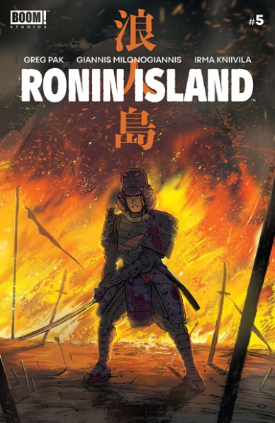
Written by Greg Pak
Illustrated by Giannis Milonogiannis
Colored by Irma Kniivila
Lettered by Simon Bowland
Reviewed by Beau Q.
The islanders of “Ronin Island” live by the culturally significant mantra, “together in strength,” but much like the at-odds protags, Hana and Kenichi, this book should adopt the mantra, “together in strength, weakness in separation.”
“Ronin Island” #5 is not a jumping-on point, which may subtract from its immediate worth, but adds to the overall strength of this breezy read– think reading Bleach weekly vs in tankobon form. With sparse dialogue and simplified panel flow, this book is built for the trade but finds ephemeral weight in its single form thanks to the feeling out process of the art team, Milonogiannis and Kniivila.
Milonogiannis, mostly known for his wonderfully monochromatic cyberpunk rip, “Old City Blues,” is maybe the last artist you’d assume tells a mean samurai drama in glorious technicolor, though, much like our Hana and Kenichi, venturing out past his artistic stomping grounds wields a perplexing treat. Singular in its effort to streamline eyelines and panel flow, “Ronin Island” #5 could feel like a disappointing single, but in minimizing detail and choosing wide shots instead of closeups, “Ronin Island” overall is not only concerned with its intended reading format [trade], but reflecting its novel-length pacing back into the narrative– humanity is on its last crutches, and here’s how little these samurai villagers stand in contrast to a much larger, albeit drifting world.
Shout out to Irma Kniivila here particularly for finding a way to render Milonogiannis’s disconnection and hatching heavy style with the weight of the drama within. A lesser colorist would flat, add texture, and call it, but Kniivila seems moderately interested in turning Milonogiannis’s detail-lite backgrounds into a clinic on pushing the narrative with natural light from every solar position. A third of “Ronin Island” #5 takes place in the golden hour where Kniivila’s painting is prime chef’s kiss.
If you want an unobtrusive samurai drama slowly rendering these souls, Hana and Kenichi, in paths so separate as if to lead to a cathartic near-end showdown between the two, then “Ronin Island” #5 is for you.
Final Verdict: 8.1 – Strength in trade-waiting, weakness in done-in-one.

Written by Jason Aaron and Dennis Hallum
Illustrated by Stephen Green
Colored by Rico Renzi
Lettered by Jared K. Fletcher
Reviewed by Grace Taylor
In “Sea of Stars” #2 Gil Starx is on a harrowing journey to survive being lost in space while holding on to hope that his son, Kadyn, is still alive. The book not only provides lots of action in the form of space monster battles, but there’s a compelling emotional side to the story that makes the series more enriching than just a regular space adventure.
In this second issue, we gain a better understanding of the stakes involved in Gil’s survival. In just a few panels, Stephen Green provides heart-wrenching flashbacks of Gil and his wife, and he does an excellent job of laying the groundwork for the bond between Gil and his son, Kadyn. There’s not much dialogue in this section, so the images have the most direct impact on our emotions. Green’s artwork also shines in the designs of the various space creatures. For instance, we get to see the inside of a giant Levithan – sort of like a giant space whale – which is also filled with monkey-like gut parasites. Like Gil says, “Space is so #$%& terrifying.”
Continued belowThe coloring by Rico Renzi in this book is also a standout. Renzi gives an interesting twist on the typical black void of outer space that we’re used to seeing, and instead fills the background and character designs with vibrant purples, oranges, pinks, and blues. These colors offer a more adventurous and sometimes playful tone, as opposed to one of complete hopelessness and desperation. Also, Renzi skillfully switches back and forth in tones, such as the flashback panels where he uses a sepia tone to convey the melancholy memory.
As in the first issue, “Sea of Stars” #2 mostly focuses on the story of the separation of Gil and Kadyn, both emotionally and physically. While this plot point is compelling on its own, we’re left to wonder what else can propel the narrative forward. Luckily, there is a promising cliffhanger at the end that hints at a possible expansion of the story and I’m curious as to what this might mean for Gil and Kadyn’s independent journeys.
Final Verdict: 8.5 – “Sea of Stars” #2 is another imaginative and compelling installment to the series. The ending cliffhanger shows the potential for a shift in the storyline, and I am eager to find out where it may lead Gil and Kadyn and their chances of reuniting.


