
There’s a lot to cover on Wednesdays. We should know, as collectively, we read an insane amount of comics. Even with a large review staff, it’s hard to get to everything. With that in mind, we’re back with Wrapping Wednesday, where we look at some of the books we missed in what was another great week of comics.
Let’s get this party started.

Written by Gerry Duggan
Illustrated by David O’Sullivan
Colored by Michael Spicer
Lettered by Joe Sabino
Reviewed by Your Name Rasheda
As this on-going series continues, Jack McGinnis has an assignment in Miami. When he runs into trouble, he must fight his way through to figure out who double-crossed him. Meanwhile, Sam and Oona are meeting contact to find out about a new A.I. that may bring the world’s online system and messaging safe again.
Gerry Duggan keeps readers on their toes with this seventh issue. The technology world that he has created, which is only four or five years from where we are now, is too realistic. He writes about messaging via the internet no longer being safe, personal information being doxxed (unauthorized publishing of private information about an individual, if you didn’t know) hence the government taking over. Duggan’s writing is flowing, when switching from the story of one character to another; there are different types of tense scenarios happening, neither slowing down the momentum.
I like the simplicity of David O’Sullivan, the line art he uses are on the heavy side, but it feels like it adds to the dystopian atmosphere of a world controlled by the government and there were few elements of a machine run world, like the nacho stand and the little robot at the bar. Michael Spicer’s colors are purposely muted which flows with the story. The almost grey undertone used by Spicer is moody and perfect for this comic. Although the artwork and colors are great for this story, I find it a little lacking in expressions on the characters. There are some panels do have close-ups of the characters’ faces, but there are few. This, however, does not deter from the story.
“Analog” is a gripping story and according to an online article and maybe optioned for a movie (awesome!)
Final Verdict: 6.9 – A glimpse into the not too distant future that’s worth a read right now.

Script by Michael Walsh
Art by Nate Piekos of Blambot
Reviewed by Matthew Blair
The ‘Black Hammer’ books have only been around for a couple of years, but the trials and tribulations of a group of superheroes trapped on a desolate plane of existence have managed to capture the imaginations of enough comic book readers for them to suddenly switch places with one of the longest-lasting, and most popular, superhero teams in comic books. Now, readers get to watch as the heroes of Black Hammer struggle to become useful again, while the heroes of the Justice League learn what it’s like to be helpless.
The writing on “Black Hammer Justice League” #2 is fantastic. Jeff Lemire continues to prove that he is one of the best creators in the business and manages to walk the fine line of giving each of the characters a proper sense of history while introducing readers to a new world in a way that is both intriguing and easy to follow. The two highlights of this particular issue are how Lemire manages to make the mightiest heroes of the Justice League feel helpless and a rather entertaining scene where a half-crazed astronaut explorer comes into contact with the Green Lantern Corps.
Artist Michael Walsh chooses to stick to the independent roots of this comic and portrays the heroes in a softer, gentler style that is a direct contrast to the cleaner, crisper, and much more dynamic artwork readers would see in more mainstream comics. While this doesn’t serve the story well when it comes to action and flashy set pieces, it works very well for the quiet melancholic moments when the characters need to brood and reflect on their feelings.
“Black Hammer Justice League” #2 is a fantastic book that helps expand and build a great story where the new superhero franchise on the block come face to face with some of the world’s greatest heroes in ways that are engaging, funny, and heartbreaking all at once. This is something special, don’t miss it.
Continued belowFinal Verdict: 8.8- One of the most ambitious comic book series in the past decade and proof that there is still room for originality in the superhero genre.
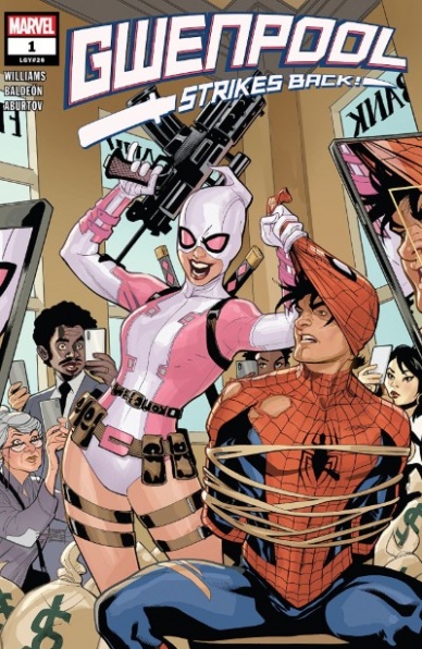
Written by Leah Williams
Illustrated by David Baldeón
Colored by Jesus Aburtov
Lettered by Vc’s Joe Caramanga
Reviewed by Kenneth Laster
Gwenpool is back and she’s still trying to extend her stay in a Marvel Universe that keeps trying to kick her out. Leah Williams, David Baldeón, Jesus Aburtov and Joe Caramanga assemble to take on Gwen Poole and play with one of Marvel’s most interesting recent characters as she fights Marvel editorial itself from trying to retcon her out of existence in “Gwenpool Strikes Back” #1.
Leah Williams has proven herself with her previous Marvel credit in the “Age of X-Man: Extremists” mini-series to be a writer to watch out for and her first issue with Gwenpool proves that she is not losing any momentum in “Gwenpool Strikes Back” #1. Williams has a lot to work with following previous series writer Christopher Hastings taking Gwen and her spiritual predecessor Deadpool’s ability to break the fourth wall to the extreme of not only having full acknowledgment of being inside a comic book but being from our reality and having the ability to manipulate the mechanics of comics themselves. Williams has a lot of fun with this power set in the comic using a panel displaced Gwen from page 15 to deliver the “to be continued” teaser for the next issue.
Despite the inventive use of Gwen’s abilities, the premise for “Gwenpool Strikes Back” #1 does not feel entirely new or entirely clear. William’s doubles down on Gwen’s fear of being retconned out of her life and sets up the stakes which are familiar to those familiar to Gwen’s previous series, however the ability to retcon herself and flashback to things that have not happened seems to be the game-changer, but the way it is presented is unclear and also unclear how exactly different this ability is to Gwen’s power set before this discovery. Williams also strides the line between over the top and inventive with Gwen’s dialogue and very Twitter-inspired dialogue with Joe Caramanga even pulling in emojis into Gwen’s word balloons. Williams does lampshade how “with it” the writer of Gwen is attempting to be and has fun with it by presenting Gwen flossing and dabbing but veers into early 2010 ifunny Deadpool memes with the yearbook photo gag which again was called out by Gwen as being “S-rank of cringe culture.”
David Baldeón and Jesus Aburtov have a big task in giving Gwen a look that is distinct from the duo of Gurihiru who defined Gwenpool’s look for the majority of her previous series. Baldeón’s pencils veer closer to Marvel house style than Gurihiru’s Japanese influenced style in “Gwenpool Strikes Back” #1. However, Baldeón is able to capture the energy and facial expressions necessary for the comedy of Gwenpool. Baldeón and Aburtov also pull off Gwen’s fourth-wall-breaking abilities by rendering Gwen looking behind panels and looking at the linework and even artboards that her story is being drawn on. It’s an incredible challenge to pull off visualizing a character whose power is to break the rules very visual the visual medium being used to render them.
Gwenpool’s return to a solo series is very much both what is expected from her antics but Williams, Baldeón, Aburtov, and Caramanga give her enough difference on the surface to differentiate it. We are curious to see where the story is going in the future of this mini-series because right now it would seem “Gwenpool Strikes Back” may retread familiar territory for the character.
Final Verdict: 7.0 – “Gwenpool Strikes Back” #1 is a different, more “online” take on Gwenpool that threatens to cover familiar territory but the humor is still chaotic and the fourth wall destruction is still very satisfying and inventive.

Written by Chip Zdarsky
Illustrated by Carlos Magno & Butch Guice
Lettered by VC’s Travis Lanham
Colored by Alex Guimarães with Dono Sánchez-Almara
Reviewed by Michael GovanContinued below
Personally, I’ve always felt that the Invaders were better in theory than in practice. The team is definitely an interesting concept but none of their previous titles have really caught my interest. Maybe because the roster is locked in with no real changes, maybe because WWII stories feel stale after a while. Zdarsky’s “Invaders” manages to do what all its predecessors could not. I am actually interested to see where this story goes.
I like the artwork. The flashbacks have a classic feel to them that fits the time period while in the modern segments, you can practically see Namor growing more and more unhinged in real-time. Speaking of ol’ ‘ankle-wings’, I appreciate the strong focus on Namor’s character. Cap, Bucky, and Jim Hammond are all the Pips to Namor’s Gladys. The Prince of Atlantis has often been depicted as an anti-hero and a flawed character. Now the character wades into even murkier waters (Let it be noted that I am pretty proud of that pun) as he goes to war with the surface. At the same time though, you can appreciate that he’s doing it to save the world and that he’s being tortured/manipulated by a psychic projection of his dead best friend. It will be interesting to see how this story resolves itself and what state Namor will end up in.
As for the other Invaders, I just appreciate that they stop treating Namor with the kid gloves this issue. From a common-sense standpoint, they have all been way too nice. Namor’s starting a war and they’ve ignored logic in favor of giving their war buddy the benefit of the doubt. Now they’re finally ready to take him down. I don’t know who to root for but I’ll be here with my popcorn, ready for the main event.
Final Verdict: 7.5 – Soon, Namor or the rest of the Invaders will sleep with the fishes.
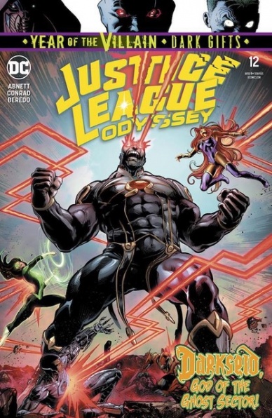
Written by Dan Abnett
Illustrated by Will Conrad
Colored by Rain Beredo
Lettered by Andworld Design
Reviewed by Gregory Ellner
“Justice League Odyssey” has had some serious ups and downs, resulting in wildly differing tones and a near ever-shifting direction for the series. However, with “Justice League Odyssey” #12, Dan Abnett truly appears to have hit a good stride. By focusing in on Darkseid, rather than the League themselves, Abnett is able to tell a story that chronologically likely takes up at most five minutes, but in extreme detail to the point that said time seems to slow to a halt as things get steadily, drastically, horrifically worse for the heroes. Together, Abnett tells a great story amongst the small cast in a very short time frame, leaving a lot open to entice readers for what comes next.
Will Conrad’s artwork is at once highly dynamic and extremely centered on perspective, from a top-down view of an assailant to a close up of either a triumphant villain or a struggling, but determined hero. Wide angles from a bit of a distance help to show the sheer hopelessness of a situation, while also emphasizing the heroism involved in trying to fight, even if the situation is beyond all ability to solve.
Rain Beredo, as ever, excels in sheer terrifying situations such as the one presented in “Justice League Odyssey” #12, using bright lights as well as dower, dark shadows and variable shades of steam or smoke to draw increased focus on the emotional weight of every action. Coupled with Conrad’s artwork, even the inevitable comes across as heart-wrenching and terrible to behold.
Final Verdict: 8.0 – Darkseid is, and the story of the Justice League Odyssey has truly hit its stride for moving forward.
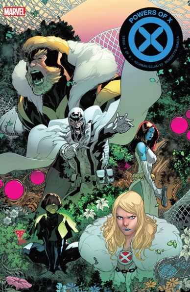
Written by Jonathan Hickman
Illustrated by R.B. Silva
Inked by R.B Silva and Adriano Di Benedetto
Colored by Marte Garcia
Lettered by VC’s Clayton Cowles
Reviewed by Beau Q.
Normal Brain:
Where the “House of X” books are concerned with the timeline known as X1 or “The World,” the “Powers of X” books are concerned with the four major timelines in this New Gods styled rejuvenation of the X franchise by the cabal of Hickman, Larraz, Silva, Di Benedetto, Garcia, Cowles, and Muller. IT’S GOING WELL.
Advanced Brain:
Using the audience’s expectations from “House of X” #2 and “Powers of X” #1, this issue continues the thread of Moira influencing Xavier to follow his dream with a time-honored Xavier/Magneto meeting of the minds. For the other three timelines, the collab traces NIMROD’s creation, Apocalypse’s plot against said NIMROD, and when NIMROD meets The Phalanx. Remember them? MAYBE IT DOESN’T GO WELL FOR SOME.
Expanding Brain:
Tying together all X-men continuity in a contrived, reading order specific series built with two different artists would, on paper, do more to harm the franchise than reinvigorate it. But it’s due to the homogenization of Silva’s and Larraz’s styles that has kept “HoX/PoX” consistently engaging throughout its publishing cycle. From ditching house style hatching to limiting character designs like an animation production, it becomes difficult to tell the two apart. Marte Garcia is the hero of the series for volunteering to render volume in places they will not and keep the team’s use of back-lit lens flares consistent. Garcia’s use of purple in “Powers of X” #2 ties Xavier’s abilities to Magneto’s regality and trademark standoffishness to NIMROD in his various forms– showing how one man’s idea can have far-reaching consequences. Silva and Di Benedetto’s use black to express The Phalanx’s encroaching nature of their oppression as much as Hickman and Muller’s graphic, which depicts The Phalanx intelligence level in comparison to other Marvel proper nouns like Technarch and Worldmind. FASCINATING.
Galaxy Brain:
In classic Marvel fashion, “Powers of X” #2 creates more plot holes as it fills in previously laid plot holes. This is not a knock. In creating more plot holes, it allows the upcoming X franchise revival ample toys to play with narratively. This Marvel construction work helps keep IP from fading into obscurity and rewards long-term readers alike. With demolition and remodeling on this scale, the new digs will bring a new audience from sheer word of mouth. What the HoX/PoX team is doing might feel like brainwashing, but it’s okay– WE HAVE NEW GODS NOW.
Final Verdict: 8.5 – It’s pronounced “Powers of Ten,” because it makes you 10 x [X-men] smarter.
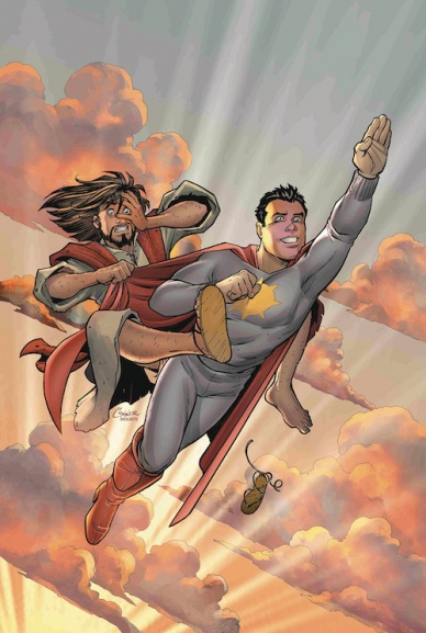
Written by Mark Russell
Penciled by Richard Pace
Inked by Leonard Kirk
Colored by Andy Troy
Lettered by Rob Steen
Reviewed by Alexander Jones
Mark Russell and Richard Pace’s satirical examination of religion and the superhero genre continues this week with “Second Coming” #2. Russell utilizes the issue to tell a story with Sunstar, God, and Jesus that is poetically ironic. Russell’s characterization of God trying to motivate and encourage Sunstar is fascinating. Seeing how Sunstar takes the wrong lessons away from a witty speech from God is a novel concept. There’s an ironic element fueling the story. The issue is also full of sight gags seen in some of Russell’s previous writing.
Russell’s depiction of Sunstar as someone who means well is endearing. Sunstar can often fall short of the goals he’s trying to achieve and looks poor in front of the impressionable state of Jesus. The complicated, dense script full of memorable situations shows just how creatively thoughtful Russell’s scripts can get. Russell’s resolution to the story where a man is stalking his girlfriend takes a couple of twists and turns to line up with the usual humor and irony from Russell.
Pace captures a couple of fantastic facial cringes and groans. Pace gives his characters an expressive look that captures the strengths of the premise. For a comedy title, Pace evokes the melodrama from the last page with haunting beauty. The pages in Heaven are remarkable in how different Pace’s art can be. Pace draws a much more realistic art style where he retains full artistic control of the visual direction. These pages are full of emotion and lent a foreboding, surreal element to the narrative.
The bitter irony and witty superheroics of “Second Coming” are interesting and humorous but read a little too close to some of Russell’s previous work. I was able to guess some of the tone and humor in the script just based on past series like “The Flinstones” or “Wonder Twins.” Richard Pace is a great artist at capturing Russell’s darkly comedic vision of the world. Thankfully, despite some of the familiarity in tone, Russell still has things to say about religion and superheroes.
Continued belowFinal Verdict: 6.7 – “Second Coming” #2 is a predictable yet insightful commentary on superheroes and religion.

Written by Donny Cates and Tradd Moore
Illustrated by Tradd Moore
Colored by Dave Stewart
Lettered by Clayton Cowles
Reviewed by Shamus Clancy
Towards the end of “Silver Surfer: Black” #3, Norrin Radd’s narration reads, “The black growing in the bright.” That thought process applies to both the story and artwork in this comic, as Donny Cates and a killer art team craft yet another space epic in their five-issue limited series.
Cates’s script acknowledges the inner turmoil that sits at the heart of the Silver Surfer. In the early pages of “Silver Surfer: Black” #3, readers get a glimpse of Norrin’s pain: his eroded relationship with his beloved Dawn, the weight of his past actions as the herald of Galactus that are thrust upon his shoulders and board, as well as the nightmare that is one’s home planet realizing its inescapable doomed fate.
Coupling Norrin’s damaged psyche with the more imminent threat of Knull, the overarching adversary that looms over every single one of Cates’s Marvel comics, the writer is able to balance the best of both worlds (or timelines or galaxies) in “Silver Surfer: Black” #3. Tradd Moore, co-plotting the issue and laying the foundation for the book’s eye-popping art with his Steve Ditko-inspired linework, aids in walking the line between the Surfer’s intimate woes with the inevitable cosmic battle brewing.
Dave Stewart is the most versatile colorist in comics. Whether it be the gritty reds and black of his Batwoman-led “Detective Comics” work and the Hellboy universe or the technicolor rainbow of “DC: The New Frontier,” Stewart’s palette is perfectly suited for the grim and dark or the fantastical. The coloring in “Silver Surfer: Black” #3 feels like the stuff that Eisner Awards are made of. From the trippy double-page spreads to the minute details, such as the funky coloring of Ego the Living Planet’s word balloons, Stewart’s coloring is the soul of the series.
The incomparable art team of Moore and Stewart takes readers out of the silvery blue of the Surfer and into the black of Knull’s void, as Cates’s script seamlessly blends internal personal conflict and planet-sized galactic problems. There is no finer superhero series on the shelves than “Silver Surfer: Black.”
Final Verdict: 9.3 Little known fact: “Silver Surfer: Black” #3 perfectly syncs up with Pink Floyd’s Dark Side of the Moon.

Written by Robbie Thompson
Illustrated by Stefano Landini
Colored by Neeraj Menon
Lettered by VC’s Joe Caramagna
Reviewed by Chris Egan
Keeping the story and action fresh as soon as possible, Thompson takes issue number two in a new direction giving us a look into Beilert Valance’s childhood as the descendant of slave miners who was freed by the Empire. Though he and the miners were paid for their work under the Empire, he was still used as child labor for their own gains. Showing us that he was not always partially cybernetic, he becomes a near parallel to Vader. Forced to work a hard job on an unforgiving planet is what set them both on similar paths and leads them to become the men they are today.
Typically similarities to Darth Vader are used in a heavy-handed, and unsuccessful way, but Thompson keeps this piece of information brief lending itself just enough to the story just enough for us to understand its importance and moves on to the next part of Valance and the bounty hunters next phase of their hunt. This team of renegades don’t work together easily but are willing to come together to take out Vader. Looking to contacts from Valance’s past for information on both how to accomplish their task and learn more about The Hidden Hand, things start to come together. Thompson keeps the dialogue clipped and to the point throughout the issue, keeping the story on track. It’s a well-balanced issue that doesn’t sacrifice one detail for another. We get a nice helping of character drama, action while moving the story forward and exploring details that touch on the greater story spanning the galaxy at this time.
Continued belowLandini gets to explore the “Star Wars” sandbox giving us new settings that feel at home in the famed galaxy, ships, species, and even beloved characters are all at play here without feeling like overt fan service. He details the characters and settings nicely without overdoing it or making it difficult for Menon to come in with his fantastic colorwork. Like the story building we get in this issue, Menon’s colors are layered. Each panel is painted giving us deep colors that still seem to allow light to pass through and shadows to form.
“Star Wars: Target Vader” #2 gives us some breathing room for the famous titular baddie, focusing on those that hunt him and showing us that both sides know more about their opponent than either side could imagine. Excellent art is elevated even further with outstanding colorwork throughout. This miniseries continues to be a great source for a fun underworld adventure.
Final Verdict 7.5, A wretched hive of scum and villainy that may be more than anyone expected.


