
There’s a lot to cover on Wednesdays. We should know, as collectively, we read an insane amount of comics. Even with a large review staff, it’s hard to get to everything. With that in mind, we’re back with Wrapping Wednesday, where we look at some of the books we missed in what was another great week of comics.
Let’s get this party started.
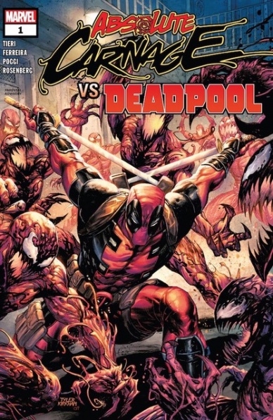
Written by Frank Tieri
Illustrated by Marcelo Ferreira
Colored by Rachelle Rosenberg
Lettered by Joe Sabino
Reviewed by Gregory Ellner
Writing Deadpool takes a special kind of touch. Going too far into inanity, references, and fourth-wall breaks can be irritating while being too serious can be overly dour for him unless handled right. Couple that with a horror story revolving around Carnage and his cult, and Frank Tieri has his hands full. Fortunately, he follows through admirably, creating a hilarious story rife with black comedy and at times just flat out utter ridiculousness as Spider-Man, and then some prominent members of the aforementioned cult, have to deal with the Merc with a Mouth.
Marcelo Ferreira’s artwork is dynamic and expressive, despite the dearth of actual faces in the story. His use of body language and paneling, coupled with different “camera” angles and an intricate view into the Carnage-infested Ravencroft Institute, help to showcase both the depravity of Cletus Kasady and the curious and kooky antics of Wade Wilson himself.
Rachelle Rosenberg provides an excellent, dark color palette to the darkly funny story, focusing particularly on blacks, reds, and a minimal amount of whites for Deadpool and the cult, with some yellow, blue, and green thrown in at times to vary things somewhat. There is more variety toward the start, long before Carnage’s reign hit its fever pitch, but by assuming direct control of the Institute, Carnage’s influence seems to permeate through Rosenberg’s color choices as well, to violent and silly effect overall in a way that Spider-Man’s more serious response to Deadpool dissuaded.
Final Verdict: 8.0 – Horror blends into black comedy in this first installment to an awaited showdown between maniacs.
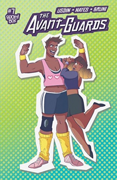
Script by Carly Usdin
Art by Noah Hayes
Colors by Eleonora Bruni
Letters by Ed Dukeshire
Reviewed by Matthew Blair
‘The Avant-Guards’ is a sports story, and the very first page of “The Avant-Guards” #7 lets you know that we’re at the part of the story where the team suffers some crippling set back and has to find a way to bounce back in time for the climax. It’s something we’ve all seen a thousand times before, but there are plenty of people out there who enjoy a good trope fest and who will definitely enjoy this comic.
“The Avant Guards” #7 is not subtle. Every trope, character archetype, and caricature that ever appeared in a famous sports movie is crammed down the reader’s throat and some of the dialogue can be awkward and slightly cringe-worthy. However, what the comic lacks in subtlety it makes up for with enthusiasm. It’s very clear that writer Carly Usdin has a keen understanding, if not outright admiration, for sports movies, especially ones with female leads, and each of the characters have a well-defined personality and tons of heart and concern for their teammates.
While the writing of “The Avant-Guards” #7 may be relishing in the tried and true sports formula, the artwork goes a long way towards making the comic stand out. Artist Noah Hayes has a very cartoonish style allows each of the characters to have their own unique character design, and allows an incredible range of emotion when each of the characters starts talking about their feelings. To put it simply, it’s the perfect art style for this book.
“The Avant-Guards” #7 doesn’t really offer anything new to sports stories or the medium of comics, but it does succeed in taking the traditional formulas of the genre and making the reader see them through a new lens. And that’s worth something.
Final Verdict: 7.7 – Fun artwork coupled with tons of heart and pep elevate what would otherwise be a fairly boring sports story about working as a team and overcoming adversity.
Continued below
Written by Michael Green & Mike Johnson
Illustrated by Andres Guinaldo
Colored by Marco Lesko
Lettered by Jim Campbell
Reviewed by Chris Egan
Green and Johnson give us a lot to consider in this issue. We see the quiet cop story focusing on Ash and the LAPD’s perspective of the Selwyn case versus what is actually happening. They add a layer to the greater plot that leans into the cyberpunk detective sub-genre Blade Runner is known for. There is even intense, and explosive action as the issue comes to a close. The narrative styles blend nicely as Ash makes her way through the city and begins to realize that there may be far more to this case than she expected. The writers use Ash’s inner thoughts as a key storytelling device, the noir style narration that never really worked in the original version of the film flows nicely here because it doesn’t overpower the imagery, nor is it redundant.
The writers craft a new story, touching on important elements in the “Blade Runner” universe like memories and childhood. Having the issue open on Ash’s memories of being a child, too sick to leave Earth, and her mother, who leaves for a better life off-world – not to escape the troubles of their lives, but to better their lives by getting a more lucrative job to send money back to Earth. Making sacrifices for a better life is a theme that is carried through the issue in different ways.
Guinaldo re-creates the gloomy, broken L.A. we are accustomed to. Walls are cracking, everything is rained on and grimy. Even in the opening flashback that shows Ash being cared for by doctors, lying in a futuristic MRI machine, the hospital itself is falling apart. He perfectly blends high-tech and the poverty-stricken world of “Blade Runner.” Lesko’s color work is right at home here. He gives us the muted, dirty palette, darkened by the polluted nights of L.A. 2019. His work brings Ash and her city to life. And he truly shines when showcasing the city and Ash’s Spinner. The final four pages are some of the best we’ve seen thus far.
This series continues to feel right at home within the established universe without the need of fan service. Without the need for world-building, the writers can move right along giving us the story they want to tell. Telling an interesting detective yarn within this setting is the key to this franchise and this entire creative team is up to the task. Hopefully, it continues to remain strong on its own without becoming nothing more than a replicated plot. “Blade Runner 2019” #2 moves confidently through its story with compelling writing and great art.
Final Verdict: 8.0 – I need the old blade runner, I need your magic.

Written by David M. Booher
Illustrated by Drew Zucker
Colored by Vittorio Astone
Lettered by Deron Bennett
Reviewed by Christa Harader
“Canto” has suffered from an abundance of intricacy so far, but issue #3 smooths the edges a little. Canto and his companion meet the Hermit at last and learn that Canto’s masters might also be themselves enslaved. Booher’s work to deepen the narrative does well here, and Zucker’s previous crowded pages ease off a little as the belly of the beast doesn’t afford much background intricacy. However, the insets are still too small and the splashes remain confusing. Committing to an external point of view would help this ongoing issue instead of leashing our lens to Canto, who’s far too small to capture the richness Zucker and Booher want to put into this book. Astone & Bennett’s work on colors and letters help clarify and add interest. Astone picks a great purple for the lake monster, and Bennett keeps this info-heavy issue tight.
“Canto” remains a contradiction. The team strives for earnestness and heart but buries some of that desire and yearning under an ornateness that feels brittle when compared to the book’s aims. Canto’s almost subsumed by the overbearing knight narrative, and we lose his character often in contrast to others or in service of the larger plot. There’s time to salvage this, of course, but we’re halfway through and with the climax to come, there’s not too much time left to draw us in.
Continued belowFinal Verdict: 6.5 – “Canto” #3 dials back some of the detail, but not enough to make this series pop.

Story by Sina Grace
Art by Derek Charm
Colored by Matt Herms
Lettered by Jack Morelli
Reviewed by Rasheda
January McAndrews has betrayed the present-day Jughead, she has a plan with the future Jughead to eliminate him. Present-day Jughead makes his escape by using a time cap, being careful knowing if he interacts with anyone from the past he can damage the timeline. Just when he thinks the brigade is going to catch him, a stranger comes to his rescue.
Writing for a long-standing series has its appeal; characters have a solid story, there is a personality for everyone, and it’s familiar. Sina Grace writing is solid and witty for Time Police, but it feels a little lackluster. The space-time continuum genre has been explored countless times in many comics and their storylines, Grace uses the standard form, including running into another version of the main character that is evil. Grace’s writing is good, as mentioned, but it feels like I have read this before. The protagonist is a messiah in the future, a time traveler in love with the protagonist, the protagonist has an evil version trying to kill the other, the stranger there to rescue just in time. There was a Time Cop series in the 1990s that featured Jughead with a completely different story, so I understand Grace wanting to separate her story from that, but the fun is somewhat missing.
Derek Charm brings back the classic drawing of Jughead so the reader isn’t completely confused, which is a kind of genius. There is a mix of classic with modern character art in this comic; Charm updates the present-day Jughead’s look with a nod to the classic art style, you see some of the classic styles in the later panels when Jughead time jumps. The style is endearing, nice and sometimes hilarious, just look at these styles when the two Jugheads are in the same panel. Also, the colors by Matt Herms nods to the classic style as well; the classic Jughead’s coloring is solid but the present-day Jughead’s coloring has more definition. The colors by Herms is bright and fun, brings the lighthearted feel of the comic alive.
A good try with updating a classic, but it is missing the originality.
Final Verdict: 5.7 – A nod to the classic, but this title is no blast from the past.

Written by Bryan Lee O’Malley
Illustrated by Leslie Hung
Colored by Rachael Cohen
Lettered by Mare Odomo
Reviewed by Beau Q.
TW: dramatized murder of closet gay
Opening on a massive shot of Zord-flashing dbag Ashley Von Frick with SNOTGIRL boldly emblazoned across the shot, “Snotgirl” #14 sees the culmination of several plot threads play out over the course of not one, but two bachelor parties– only one of which is as massively gay* as you expect it to be.
*The word gay is being used in this review as a pro-LGBTQ+ term.
A series marred by production setbacks, I tentatively justify Team Snotgirl’s sliding release schedule as relating to predictive and narrative reinforcing fashion choices for every. Single. Character. Three or more months ahead of street date. Where “Snotgirl” #14 for some might play out as another romp through Lottie Person’s Precious Little Life, for others, this issue continues to find new ways of using faux pas to reveal Lottie’s personal affliction towards our cast, and watching that unravel naturally.
Having seen Hung’s original artwork up close– she uses B4 paper that is shorter and skinnier than most 11”x17” Western art– in doing so, she works almost 1:1 to the intended print size with a focus on strong, confident strokes, which allows Cohen and Odomo their space to shine individually. Team Snotgirl is a neo-shoujo harmony where individual strengths are heightened while the sum total is as great as its parts. Cohen splits color moods here between the demure Normgirl kickback and Ashley’s spiraling bachelor night– this makes for immediate contrast when side-by-side and an all-encompassing big mood when not. Odomo’s decision to open on a non-diegetic SNOTGIRL screams that “Snotgirl” #14 is, for all intents and purposes, a statement book. That statement: “we make good comics our way.”
Continued belowThis then, begs the question of why Team Snotgirl decided to end “Snotgirl” #14 on a dramatized murder of a recently outed gay character…in a nightclub. The murder is NOT presented as a hate crime, but rather a turning point from a gay character to fully commit homicide. In trusting that Team Snotgirl more than likely hired sensitivity readers for this issue, we can understand the decision-making here in order to move the plot forward cognizant of this world, this America we live in where hate crimes run aplenty– the standout detail here is the use of a knife over a gun to reduce imagery and comparison. The answer to our framing question, “why end #14 this way,” is then: “Trust us. We’ll get there together. With grace.”
Final Verdict: 9.3 – Instant classic. Also, everyone is decidedly gay and that’s great.

Written by Jody Houser
Illustrated by Rogê Antônio & Juan Gedeon
Lettered by VC’s Joe Caramagna
Colored by Arif Prianto & Dono Sánchez-Almara
Reviewed by Michael Govan
This issue marks the end of the mini-series. What can be said about “TIE Fighter” #5? Personally, I thought it was just so-so. I can’t call it bad, I can’t call it good. Most of the issue revolves around a massive space battle complete with explosions and lasers. It’s all very chaotic, as it should be, but the action is fairly hard to follow. If it were a video of some sort, a movie or television show capable of displaying movement, the action would probably be more dynamic but here there’s just the still page.
The characters aren’t particularly interesting this issue either. The rookies are just there to flesh out the cast but they don’t really do much. The three characters who’ve been part of the squadron since the beginning of the issue don’t do much to show the personality we’ve seen in issues past. My favorite part is, without a doubt, the end. Their mission was successful but at the same time, the events of Return of the Jedi have played out. Emperor Palpatine is dead, the Empire’s pretty much destroyed and it was all for nothing. That’s actually a pretty solid, dark ending but the pages before it wasn’t the best. Another so-so Star Wars comic.
Final Verdict: 5.5 – Did you see the trailer for The Mandalorian though? That’s the Star Wars content I’m looking for.

Written by Matt Fraction
Illustrated by Steve Lieber
Colored by Nathan Fairbairn
Lettered by Clayton Cowles
Reviewed by Shamus Clancy
In a series showcasing his return to mainstream superhero comics, Matt Fraction takes an unconventional path with “Superman’s Pal Jimmy Olsen.” As someone who’s been the architect beyond major storylines for some of The Big Two’s highest-profile characters, it’s encouraging to see that Fraction picked his spot for something that felt like a perfect fit. Just two issues in, Fraction is rapidly illustrating that he’s been worth the wait.
Fraction, even for those readers less familiar with the constant hijinks that Jimmy Olsen gets himself into, quickly hits at the essence of the character. With a handful of vaguely connected narratives running through “Superman’s Pal Jimmy Olsen” #2, Fraction is able to demonstrate that Olsen is one of the most versatile characters in the DC Universe. Outside of Fraction’s current maxi-series, Olsen can come off as just a relic of Silver Age wackiness, an ill-fitting character in contemporary superhero comics, but that’s simply not true.
Sure, Olsen is often Superman’s (or Clark Kent’s) clumsy, goofy friend, but he’s so much more than that. He can create a moment of levity for Superman in midst of the Kryptonian’s never-ending battles, a respite from the constantly dire situations populating Prime Earth. Making the Man of Steel crack a smile counts for something, right? Jimmy can be doing detective work in Gotham, as he’s seen doing in “Superman’s Pal Jimmy Olsen” #2. He can be traversing across the galaxy. He can have love affairs with a member of an alien species. Jimmy Olsen is as malleable of a character there is as long as a storyteller’s creativity is there to match it, making Fraction and Olsen an ideal pairing.
Continued belowSteve Lieber’s linework captures the concept of Jimmy as an everyman. His awkwardly untied pair of knockoff Sperrys and argyle socks are a perfect proxy for a well-meaning guy who thinks he’s dressing well but in reality actually can’t dress well. Every reader has a pal who’s Jimmy Olsen! Lieber’s art is quintessential retro DC, adding a dose of Silver Age-inspired fun to a contemporary superhero tale.
“Superman’s Pal Jimmy Olsen” #2 is low on stakes, high on comedy and a breath of fresh air compared to the grim stories that populate the DC Comics line.
Final Verdict: 8.3 – A superhero comic for people who are burned out on superhero comics.

Written by Christopher Priest
Illustrated by Ergun Gunduz
Lettered by Willie Schubert
Reviewed by Alexander Jones
Christopher Priest’s nonsensical approach to “Vampirella” made the first chapter of the series invigorating. The second entry doubles-down on some of the irreverent and insensitive terminology from the first book. Priest places Vampirella in a speed-dating scenario eliciting more than a few creepy conversations from desperate men and women. These questionable scenes do not serve to enhance the overall plot. Hearing a group of individuals make sloppy advances at Vampirella associates the wrong tone with the title and calls out for an editor.
When Vampirella takes a woman home with her artist Ergun Gunduz focuses on the sexual nature of their encounter. Gunduz spends a lot of time with Vampirella in this specific context that highlights the adult nature of the story but doesn’t show readers anything about the character that they didn’t already know. The flat approach to some of the colors in the issue also does not serve the story. The action sequences in the second half of the book carry a great visceral nature and play to the strengths of Gunduz as an artist. A couple of scenes with vicious werewolves are beautiful and intense. These moments are negated by several panels in the opening page showing Vampirella sitting still. Gunduz also draws quite a few panels where characters are barely emoting.
The narrative structure of “Vampirella” is truly interesting. Priest breaks up the scenes at random, swiftly introducing new aspects of the story and bringing readers back to the framing device with the therapist. The main problem I have with the story lies with the framing device itself. Priest’s therapist character calls Vampirella a derogatory word for comedic effect. This insulting word is peppered in an issue with gross violence and creepy advances at “Vampirella” that do not help Priest tell a good comic book story. One of DC’s longest-running Rebirth titles, “Deathstroke” uses extreme violence and sexual situations to prove a point and illustrate the true nature of Slade Wilson and the supporting cast. “Vampirella” does not carry the same level of focus and fails to use these elements to tell a good story.
Final Verdict: 2.4 – “Vampirella” #2 is a study in how adult themes are not the only elements of a great comic book.


