There’s a lot to cover on Wednesdays. We should know, as collectively, we read an insane amount of comics. Even with a large review staff, it’s hard to get to everything. With that in mind, we’re back with Wrapping Wednesday, where we look at some of the books we missed in what was another great week of comics.
Let’s get this party started.

Written by Mairghread Scott, Celia Lowenthal & Alexa Sharpe
Illustrated by Ornella Savarese, Celia Lowenthal & Alexa Sharpe
Colored by Wesllei Manoel
Lettered by Jim Campbell
Reviewed by Chris Egan
The world of “Buffy the Vampire Slayer” is getting a new set of tales set across various time periods that are meant to expand the history of the long line of Slayers. “Chosen Ones” #1 is a hefty 42-page issue giving us these new history lessons with three new stories about the girls who have been called to rid the world of vampires and the other evils that lurk in the dark.
‘The Mission’ takes place right in Buffy’s hometown of Sunnydale, California in 1808. Scott (“Batman: Secret Files”) writes a great horror tale that follows a new Slayer and young Watcher sent to check in on her as the forces of darkness converge on the fledgling settlement and the innocent families that live there. Wrapped in a blanket of loose historical fiction, it’s a dark and multi-layered story that takes up the majority of the issue. In both the writing and Ornella Savarese’s (“Animosity”) artwork, it leans into the more animalistic nature of the vampires at the center and sheds any sense of the typical dry humor and romantic elements that so often come up in the various incarnations of “BTVS.” Matching the darker writing, Manoel’s (“KISS: Forever”) colorwork is dripping in a threatening night. Shadows and minimal light sources are used to build tension and allow the monsters to hide until the perfect moment to strike. It is a well-told short that gets both brutal and nasty.
Set in Bologna, Italy in the 14th century, ‘The Eating of Men’ written and illustrated by Celia Lowenthal (“The Storyteller: Fairies”) feels like a European fairy tale. It’s an unsettling and unhappy story straight through and for being on the shorter side it packs a nice emotional punch. Lowenthal’s writing feels at home in both the greater Buffy universe, and adult fantasy, but her artwork, both pencils and colors, is on the softer side. It adds to the deception of what kind of story this is. Like many stories that have been passed down through generations, this one deals heavily with the loss of the home, family, and innocence. On the surface, Lownethal’s art feels out of place, but once you’ve taken in the story, it doesn’t feel as friendly or innocent as it may have upon first glance.
‘Behind the Mask’ is the shortest of the three stories and it closes out the issue like a swift stake to the heart. It is Paris 1820 and a young woman meets a mysterious man at a masquerade ball. Each one thought they knew how their night would turn out, but nothing is as it seems in Sharpe’s (“Lumberjanes”) mini Slayer tale. Both her dialogue and line work is sparse, leaving room for thought and interpretation. Along with a minimalist palette, her work across the board is placed deliberately and no element overpowers another. It is a purposely quiet tale in both plot and setting and it achieves a subtle, yet powerful narrative.
Industry veteran Jim Campbell (“Giant Days”) letters the entire issue, lending his talents for both dialogue and title designs.
This is a welcome spin-off for fans of the franchise. Whether you are someone who has devoured every iteration of this universe or have yet to take the plunge into Boom! Studios newly created re-telling, this comic is accessible to any and all fans of Buffy the Vampire Slayer.
Final Verdict: 8.0 – “Buffy the Vampire Slayer: Chosen Ones” #1 is an excellent compilation put together by a creative team comprised of pros and new-comers, all of whom are wildly different, yet equally talented storytellers. This is exactly the type of spin-off Buffy fans should be waiting for.
Continued below
Written by Peter J. Tomasi
Illustrated by Christian Duce
Lettered by Rob Leigh
Colored by David Baron
Reviewed by Michael Govan
Remember the Batman: The Brave and the Bold cartoon? I really enjoyed that show when it was on. It centered around Batman but at the same time put the Caped Crusader out of his comfort zone and into vastly different settings and situations. Now “Detective Comics” isn’t as lighthearted as the children’s cartoon but it’s still doing something different with Batman.
This time around, Bruce crashes on an island and has to free several hostages from the assassin Deadshot. There are lots of fun bits in this issue. There are two WWII veterans who have been stranded on the island since the war who bond with Bruce. Without his usual wardrobe, Batman decks himself out in their old pilot gear and leaps into action. Oh yeah…and Deadshot fights a panther. I’ll repeat it: Deadshot fights a panther. Comics, man. You never know what you might get. Christian Duce does a solid job drawing the high stakes situation. The dangerous jungle animals, the smoking plane wreckage, the fearful hostages at Deadshot’s mercy…at the same time, there wasn’t nearly enough of Batman confronting Lawton. The two foes are separated for the bulk of the issue. In that way, this issue feels a lot like a trailer for the upcoming feature presentation. Still, that feature presentation is probably going to be awesome.
Final Verdict: 6.5 – Next up we have Batman v. Deadshot in the rumble in the jungle!

Written by B. Clay Moore
Illustrated by Fernando Dagnino
Colored by Jose Villarrubia
Lettered by Jeff Powell
Reviewed by Rasheda
The Jonin has offered a reward to any of the remaining powerful ninjas to find an artifact that may extend his lifespan. He has sent his daughter to contact Ninja G. J, F, and I made promises to them all. As alliances are made to find the artifact, but these ninjas have to survive each other.
B. Clay Moore has presented a new spin on a ninja story. He has taken the concept of ‘ki’, the belief of channeling your energy to perform impossible tasks, and elevated to these specific ninjas accessing unique powers. Moore uses this information and makes a very interesting story and create characters that you want to follow. Yes, this is a very familiar formula but the spin Moore gives is intriguing. A mysterious man trains these individuals, from various backgrounds, to access powers but eventually, they turn against each other. This series has the potential of a captivating story, I look forward to seeing these characters’ powers and how strong they will become.
The illustrations/artwork are a reminiscence of comic art in the 1990s, Fernando Dagnino uses heavy lines and ink to create a gritty looking atmosphere in the comic. He also does excellent work with portraying expression on these characters faces, there are a lot of close up panels where you can see the details given by Dagnino. Jose Villarrubia applies the colors well in Dagnino’s artwork, the colors add to the crime drama feel. The colors are muted, except for when the ninjas access their ki, the colors are bright. Shout out, also, to Jeff Powell’s lettering as well. The lettering is even and easy to read, there are some panels that have a lot of dialogue. What stands out is the Japanese characters used when the ninja access their powers, the are beautifully lettered.
Final Verdict: 7.5 – This is a killer start to a new series from Valiant, it is definitely worth the space in your pull box.

Written by Cullen Bunn
Illustrated by Scott Hepburn and Superlog
Colored by Israel Silva
Lettered by VC’s Travis Lanham and Gaigan-Yamazaki
Featuring Illustrations by James Stokoe, Nick Bradshaw and John Rauch, Becky Cloonan, Jacen Burrows and Mat Lopes, Clayton Crain, Eduard Petrovich, Gerardo Zaffino, Michael and Laura Allred, Stephanie Hans, Juan Jose Ryp and Rain Beredo
Reviewed by Beau Q.
With a story pale enough to warrant the phrase, “nothing to write home about,” Kid Kaiju is back for 10 pages in “Marvel Monsters” #1 to face Max Frankenstein of “Wolverine and the X-Men” fame. Where there could be witty banter, a firm framing sequence, or an “epic showdown,” there is nothing save for knowing that Fin Fang Foom’s pants are unbreakable and “fit any size Fin Fang Foom.” What there is to “write home about” is the 20 pages of kaiju illustration gracing this $4.99 book.
Continued belowServing more as an “Official Handbook of the Marvel Monsterverse-Lite,” “Marvel Monsters” #1 mixes its simply unnecessary narrative with a kaiju compendium that will make Marvel statisticians weep in joy. Bunn and Hepburn missed a step here not vying for the book to be printed at a larger size on perforated, recycled paper. As fiscally irresponsible as that sounds, there is nothing more a Monster Marvel fan will want more than to clear some wall space for these Superlog illustrations.
If you’re buying “Marvel Monsters” #1, you’re buying it for Superlog and Gaigan-Yamazaki’s Showa-era Kirby-adjacent cutaways. Boldly inked monsters set atop intentional palette shifted red-oranges with subtitles in English AND furigana– the only quality distancing these pages apart from literal lost treasures is the glossy paper they’re printed on.
Final Verdict: 5.0 – ガオーガオー、where’s my DRM-free copy? I want to adorn my cave with these giant monster pictures.

Written by Dennis “Hopeless” Hallum
Illustrated by Emilio Laiso
Colored by Rachelle Rosenberg
Lettered by Travis Lanham
Reviewed by Gregory Ellner
Off of the heels of his work on the direct adaptation of Marvel’s Spider-Man in “City at War”, Dennis Hallum proves to be a natural at handling recurring characters from the “Gamerverse,” specifically Peter Parker and Mary Jane Watson, to the point that fans of the game can almost hear the voice actors in their roles. His work on newcomers such as the Swarm (only seen briefly before) and Ben Urich is likewise very good, though perhaps we could have seen a bit more of the former’s personality.
Emilio Laiso’s artwork steals the show, using highly animated poses to showcase the fun nature of Spider-Man in even the direst of circumstances. His close-ups of faces, especially MJ, have a lot of emotion behind them, aided by Rachelle Rosenberg’s colors. Various angles on the set pieces help to give a defined sense of “place” while also creating a variety of different moods, ranging from fear to humor to a general sense of a larger mystery.
Speaking of Rosenberg’s work, the varied palette used shows the difference between the daylight and the night very well, and the vibrancy of the various hues and shades further heightens Laiso’s illustrations to create heightened drama and comedy both.
Final Verdict: 8.0 – The continuation of the adventures in Earth-1048 is off to an amazing start blessed with the spectacular.

Written by Andrea Fort and Michael Christopher Heron
Illustrated by Sam Beck
Colored by Ellie Wright
Lettered by Andworld Design
Reviewed by Matthew Blair
The two greatest strengths of “The Necromancer’s Map” #1 are its main character and its world-building. It feels like writers Andrea Fort and Michael Christopher Heron care about the world they’ve created and spent a lot of time ensuring that it would be as different and unique as possible and it shows in details like the order of magic butlers who use their magic to be better servants and caretakers.
This commitment to breaking the traditional fantasy molds extends to the main character: a necromancer named Bethany. Bethany eschews the traditional garb and attitude that long-time readers of fantasy might expect of someone who raises the dead and is presented as a kind-hearted magician who genuinely cares about the impact her skills have on people.
Where “The Necromancer’s Map” #1 falls apart is in the story mechanics and plot. There’s no real sense of urgency, no real idea what the characters want, and the book has a nasty habit of jumping back and forth between providing too much background for its characters to not enough in the blink of an eye.
The artwork of “The Necromancer’s Map” #1 is very pleasing to look at and is reminiscent of a high-quality European children’s comic that could be placed on the shelves right next to something like ‘The Adventures of Tintin’. Sam Beck provides an art style that accomplishes the difficult task of not being too crowded or overbearing while enhancing the incredible world-building of the comic through richly designed costumes and tiny little details that tell a separate story from the dialogue.
Continued belowWhile “The Necromancer’s map” is light on urgency and isn’t the best-paced story out there, it’s a richly detailed world with beautiful artwork that creates a comic that is unique and very interesting.
Final Verdict: 7.5 – It’s a comic that suffers from a confusing story and too much exposition, but the world-building, artwork, and commitment to breaking traditional fantasy molds make it a worthy read.

Written by Christopher Sebela
Illustrated by Jen Hickman
Colored by Harry Saxon
Lettered by Hassan Otsmane-Elhaou
Reviewed by Christa Harader
“Test” #3 throws Aleph into the heart of Laurelwood, on the brink of answers, but that clarity’s hard to come by for an external audience. Sebela and Hickman craft a world chock full of existential questioning and cool symbolism that’s gradually becoming obtuse without motivating the reader to unwind its intricacy.
Hickman’s art is visually pleasing and interesting, and Sebela’s lyricism should be noted. However, the layout tricks in this issue pile onto the overwhelm of repeated treads into Aleph’s past and create a somewhat muddied experience. There’s marrow to this book, but so far it’s been calcified. There’s an argument to be made that “Test” bucks clarity as its main point, but it doesn’t quite hit pure delirium to help carry us through. It’s stuck in its own exposition, and Aleph feels inaccessible as both a scion of weirdness and a sympathetic character. Saxon, Hickman, and Otsmane-Elhaou all put in good work on this book, but the balance is hard to hit. There’s too much dialogue to let the art carry the work, and not enough punchy text to balance what’s otherwise necessary visual crowding. Amping up both leads to clutter, unfortunately, and a tension point that provokes weariness instead of interest or intrigue.
We’re due some sort of narrative pause, and it doesn’t come in this installment. “Test” is aiming for something, and maybe that something pays off in the end. Maybe it doesn’t, and the tragedy of the mess is its own reward. However, we’ve had three issues of intrigue and noise and the repeated refrain of isolation, and we’re flirting with exhaustion.
Final Verdict: 6.0 – “Test” #3 piles more symbols, narrative and longing into Aleph’s story without the fine control needed to elicit pure chaos.

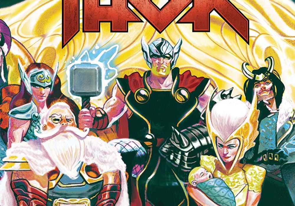
Written by Jason Aaron
Illustrated by Mike Del Mundo
Colored by Marco D’Alfonso
Lettered by VC’s Joe Sabino
Reviewed by Alexander Jones
“Thor” #16 serves as author Jason Aaron’s swan song for the proper “Thor” title. The issue features the fallout from “War of the Realms.” Aaron continues a trend of having the Odinson perform good deeds for the common man. Instead of catching up with Asgard, the son of Odin is more interested in saving lives and rebuilding what was lost. The melancholic, euphoric sense of sadness is an idea and tone Aaron has been honing with Thor for years. Aaron establishes virtually no physical, superhero conflict in this entry. The script is focused on catching up with old characters and changing directions for each hero. Aaron prepares “Thor” for the next creative team but does not simply return to the most obvious status quo.
Mike Del Mundo’s art has never felt more like a natural fit on “Thor” than it does in this particular issue. Aaron’s sad portrayals of the Asgardians brood really well thanks to the visual direction from Mundo. Mundo’s characters have a more fluid sense of movement than in previous chapters as well. The page compositions for “Thor” #16 are in service of the overall story. Each page only has a couple of panels but Aaron is able to pack the prose and concisely into the page. The color palette from Mundo and artist Marco D’Alfonso is incredibly vivid and surreal in this story. One standout page contains the neon greens of Loki that contrasts beautifully to the chilly aesthetic of Jotunheim.
“Thor” #16 does a solid job giving the Thor series an actual ending before teasing what is next in “King Thor” #1. Aaron ended a lot of story threads by giving readers a slight tease at what could be coming next. It is truly astonishing to consider the full breadth and scope of this amazing run of “Thor” comic books. Jason Aaron’s run on the property will likely go down as one of the most celebrated entries with the character. This emotional climax full of Thor doing good things in the wake of Asgard’s destruction is a heart-warming tale. “Thor” #16 delivers a stunning climax to Aaron’s tenure on the main title while establishing new ground for the next creative team. If the script wasn’t enough, the issue features incredibly beautiful and sad visuals.
Final Verdict: 9.0 – The melancholic tone of “Thor” #16 evokes sheer beauty.


