
There is a lot to cover on Wednesdays. We should know, as collectively, we read an insane amount of comics. Even with a large review staff, it’s hard to get to everything. With that in mind, we’re back with Wrapping Wednesday, where we look at some of the books we missed in what was another great week of comics.
Let’s get this party started.

Written by Evan Dorkin
Illustrated & Colored by Veronica Fish
Layout Designed & Lettered by Andy Fish
Reviewed by Chris Egan
As the battle for Blackwood University rages on, our remaining heroes have quite a bit on their plate; reversing the curse placed on them and the school, stopping an evil insect god, solving the mystery of Blackwood and trying to survive the night. The fourth and final issue in this tale of fantasy and horror brings us a lot of information. Which is a positive for wrapping up the entwined plot threads, but it does make for a very wordy issue that almost feels like it could have been spread out into an additional issue instead of being crammed in here. My main complaint is that with so much exposition, it takes your eyes away from the great artwork for too long.
This brings me to another point. With the amount of excellent storytelling and world-building that was found in each of the four issues, this feels much less like a little mini-series and more like a beginning to a longer limited or on-going series. Although a lot of material and information is thrown at us in issue #4, the writing quality never wanes. It is intelligent and interesting from start to finish. Veronica Fish’s dark, yet whimsical art brings us home rounding out the excellence. Teamed with husband Andy’s panel layouts, the design of the book is perfect for this style of story.
While there are many nods here to horrors past, most notably Lovecraft and Poe’s, everything here is more homage than straight plot lifting. This might be the finale of this story, but I truly hope we see more from “Blackwood.” Like a mix of “Harry Potter,” The Magicians, and Todd & the Book of Pure Evil, this is a truly clever, unsettling and thoroughly enjoyable read.
Final Verdict: 8.5 – “Blackwood” #4 is a great, if not text-heavy final issue in the wonderfully creepy mini-series.
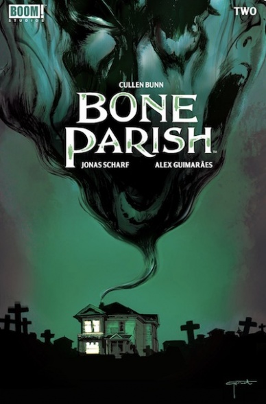
Written by Cullen Bunn
Illustrated by Jonas Scharf
Colored by Alex Guimarães
Lettered by Ed Dukeshire
Cover by Lee Garbett
Reviewed by Christa Harader
“Bone Parish” explores the story of a burgeoning, home-grown drug empire in New Orleans – with a bit of a kick.
I like what Bunn sets up in this book, and this issue delves into small character moments for each member of the Winters family. From Brae, who’s filling his father’s shoes, to Brigitte, the scientist and source point for the Ash, every family member appears to have secrets that they’re going to struggle with throughout. I appreciate the attention given to each person, though the book needs more time to escape some common “crime family” tropes.
The second issue packs less of a punch than the first, despite the cultist drug trip. Dante’s grisly death in issue 1 is the kind of pop that reminds us while we’re meandering through the complexities of drug and crime politics, the people who snort the remains of the dead are in serious danger. Issue 2 does some narrative lifting, with flashbacks for several characters measured out in double-page spreads that showcase Guimarães’s good color work in two highlight panels each. Scharf’s smart with his art and keeps facial expressions and backgrounds rich to add depth to what would otherwise be just a stack of conversations. Dukeshire’s lettering suits as well. There is room for more style in the typeface, but it’s easy to sink a book with too many flourishes. What’s there is a smart choice.
I hope the next few issues bring a little more horror and less crime, because the book could tilt either way at this point. If Bone Parish skews crime-side, that’s fine, but the premise means I have certain expectations for how grisly this is going to get. The drug trip itself is an interesting device, and I am eager to see just how Brigitte makes it and how it comes out so clean. I’d expect more hallucinatory oddities, but perhaps that’s to come once the control, both for the Winters family and the plot itself, starts to unravel.
Continued belowFinal verdict: 7.0 – “Bone Parish” delves into family histories and crime complexities, and a second issue is the right time for it. This book is promising, but what unspools next will be critical to set it apart from the pack.

Written by Bryan Hill & Matt Hawkins
Illustrated and Colored by Atilio Rojo
Lettered by Troy Peteri
Reviewed by Elias Rosner
“Cyber Force” is a tricky beast, having to balance the inherent insanity and over-the-top, earnest violence of its predecessor while also crafting a modern tale that is engaging; spectacle can only take a serialized comic so far. In issue #5, that spectacle takes the form of RP, the unnamed cyborg, hunting down and killing Colombian mercenaries and cartel members. Rojo’s artwork is detailed and fierce, turning the jungle night into something to be wary of. His use of coloring to convey light and shadow is perhaps the best part of the issue. The light from the candle dances on the page, bringing a warmth to a comic that could easily slip into a cold, brooding mess.
There are moments in this comic that make me think that Hill and Hawkins are trying to play with the image “Cyber Force” and others like it have crafted over the years. This assassin seems to be a cold, killing machine ala Bloodshot but then, in the next scene, he’s sharing a beer with an old man. Yes, he’s still obnoxiously broody, responding to “she’s beautiful, amigo” with “so is solitude,” but there’s a heart there. Then, in the next scene, the creative team flips the expectation on us yet again, with him having a tender moment with his pet mountain lion/cougar.
It’s the choice to have the “reveal” be on a splash, with the rising sun turning the clouds a luminescent shade of orange and pink and the vulnerability in him that makes it seem plausible. Unfortunately, that’s about all the praise I can give to this comic.
There’s still a sterility to the narrative, one that hops from well-trodden path to well-trodden path, hoping to say something new but falling short each time. We aren’t given a reason to care about any of these characters so far and the moments that try to, see the above “She’s beautiful” comment, come off as trite and ill-thought out. RP might have the starts to a personality but we’re not given enough time to explore it nor are we given time to explore who the doctor is. It all feels very surface level, hence the hesitation on intent earlier. It’s hard to tell what is purposeful and what is not, what is them going through the motions of this kind of plot and what is them trying to work within the confines of it to make the narrative shine. While that may become more apparent later, it’s not enough to keep me going now.
Final Verdict: 5.0 – The spectacle of the artwork can’t save an overdone plot and one-dimensional characters that skirt the line between semi-realized and flat as a board.
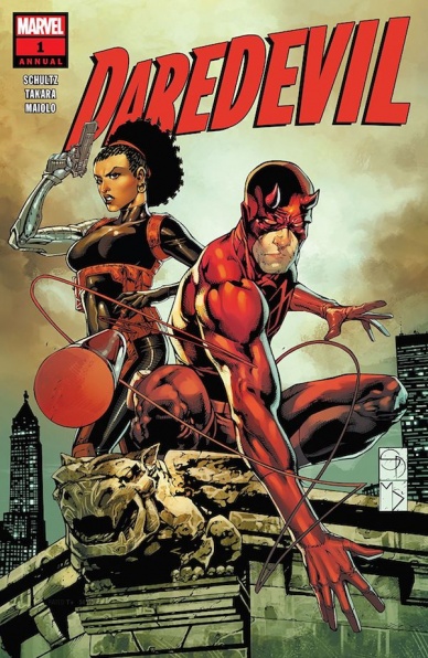
Written by Erica Schultz
Penciled by Marcio Takara
Colored by Marcelo Maiolo
Lettered by VC’s Clayton Cowles
Reviewed by Eric Goebelbecker
“Daredevil Annual” #1 takes us back to when Misty Knight was a still a New York City cop, and Matt Murdock was new to his role as Daredevil. It’s the story of how they met, told from Misty’s point of view. The extra-sized issue is a nice break from the ongoing epic in Daredevil’s regular title.
Erica Schultz’s Daredevil smiles and dishes out wisecracks with his kicks and punches. Misty Knight is the no-nonsense police officer we expect, fortified with a helping of scorn for “super-freaks.” We get some backstory about why Misty feels that way, but without getting bogged down with continuity and exposition.
Takara guides us through the story’s two big fight scenes with fast action sequences. When Daredevil spars with two juiced-up thugs on a rooftop, we’re close to the action. The fisticuffs are at eye-level, with wide panels that emphasize hard hits and huge misses.
Continued belowSchultz frames the story with a touching subplot that gives Takara a chance to show off. The story begins and ends with a light-hearted splash page filled with fanciful versions of Marvel’s heroes, including a hilarious Punisher on one and an old-school Luke Cage on the other. It’s also worth noting that Takara populated a story set “years ago” with huge 1970s sedans.
Maiolo’s colors work well with this story’s different settings. The police precinct is tinted with an off-white reminiscent of fluorescent lights. Harsh spotlights light a Manhattan pier and cast deep shadows on a nearby building.
The real treat in this issue, though, is how Schultz tosses enough twists in to keep an otherwise predictable story interesting. We’ve all seen heroes meet; heroes fight; heroes team up; heroes win, before. This story adds a little extra to the old Marvel Team-Up and comes up with something that’s a call to the good old days without just being a pastiche.
Final Verdict: 7.5 – “Daredevil Annual” #1 is a fun interlude for Daredevils followers and a must-read for fans of Misty Knight.

Written by Tini Howard
Illustrated by Nick Robles
Colored by Eva de la Cruz
Lettered by Aditya Bidikar
Reviewed by Reed Hinckley-Barnes
While I enjoyed the first issue of “Euthanauts,” I wasn’t sure whether it was a series I was going to stick with. There was just too much information and not enough context crammed into that first issue and, once I was done reading it, I wasn’t entirely sure what had happened. After reading “Euthanauts” #2, I’m in for the long haul with this series, even if I’m still not one hundred percent sure what is going on.
The art in “Euthanauts” #2 is, on a structural level, beautiful. This issue, like the last, does some great work with its panels and borders, keeping things easy and clear when they should be, and strange and drifting when the story calls for it. Nick Robles’s layouts, combined with his detailed, beautiful art, bring this issue to life. The colors, from Eva de la Cruz, make Robles’s art explode off the page. The coloring of the everyday world is great, but it’s when the story drifts into the afterlife that de la Cruz’s work really shines. The few pages in this issue that are spent in the afterlife are where the entire art team really shines. The letters, from Aditya Bidikar, even get a chance to shine during these afterlife segments, giving the letters a chance to be a little bit flashier than they normally are.
Tini Howard’s story in this issue is a little bit more grounded than in the previous one, which is welcome. While the previous issue convincingly simulated the main characters feelings of being lost in this strange world of drifting in and out of the afterlife, it was also pretty confusing for a lot of the issue. This issue, the story is a bit easier to follow, and that’s very welcome. Now that the book has let me get my footing with what this world is and given me a better sense of who some of the characters in this series are, the series has really started to take off. “Euthanauts” #2 is a fantastic looking book that I’m excited to read the next issue of.
Final Verdict: 8.0 – “Euthanauts” #2 achieves the promise of the first issue, and if you were on the fence, is definitely worth continuing.

Written by Matt Kindt
Illustrated by Tomas Giorello and Renato Guedes
Colored by Diego Rodriguez
Lettered by Dave Sharpe
Reviewed by Michael Mazzacane
The loud proclamation of “Harbinger Wars 2: Aftermath” as the wrap up of the larger “Harbinger Wars 2” series at the end of this issue, captures my feelings on this not-quite-finale. It technically should be, as the end of the main numbering for the series, but it isn’t, so there is no real sense of catharsis to be derived from this. Instead, it feels like the equivalent of a clips episode that recaps and leads everything into that finale. Structurally it makes a lot of sense with the talent they use but still feels like Valiant playing with the worst ideas of Event Comics. The titular war may be over, but it isn’t the end and you’re going to have to wait and buy one more comic to find that out.
Continued belowThe fourth issue of “Harbinger Wars 2” is framed by Capshaw debriefing the higher ups on the loss of the Loveboat and everything else that went down (literally and figuratively.) The use of this frame was a smart move by writer Matt Kindt considering he is working primarily with Tomas Giorello. Giorello’s line art mixed with frequent colorist Diego Rodriguez reads like modern-day pulp covers. Their art is great for capturing big moments. Iconic is the fitting adjective to describe the spread of the Loveboat making landfall. Their art isn’t the best at creating a sense of motion or layered emotions. Which is fine for this retrospective view of things. Their pages as X-O Manowar and Livewire have a mech fight in space play to this strength by going big but not detailed in choreography. This sequence has the pages generally broken up into thirds, with the upper two-thirds focusing on their present battle with the lower third flashing images of their childhoods. For how different they are, their upbringing was similar and it’s why they both can recognize how far things have gone. This final fight is some of the strongest sequential work Giorello has done, that I’ve seen.
Renato Guedes is one of Valiant’s best artistic weapons, but his style is so stylistically dissonant compared to Giorello and Rodriguez that his three pages standout in a bad way. Kindt was smart to give him pages that are bit more dialog driven and require emotive faces but they stick out like a sore thumb. There is no unity between the art styles, even if it’s the best of a bad situation.
“Harbinger Wars 2” has been through a lot of turmoil in its production and issue #4 is no different.
Final Verdict: 7.0 – It isn’t the end that was promised, but does what it was made to do in an overall effective manner.

Written by Charles Soule
Illustrated by Ramon Rosanas
Colored by Guru-eFX
Lettered by Joe Sabino
Reviewed by Brandon Arnold
Debate the value of such a sprawling, wide-cast event like “Hunt for Wolverine” all you like, “Dead Ends” finds a way to end four separate and distinct stories together in a way that feels fun and genuine – if a little uninspired.
The book begins with Daredevil and Tony Stark meeting Kitty Pryde at the X-Mansion. While there, the school gets attacked- because of course it does. While Daredevil and nightcrawler evacuate the school, Stark, Storm, and Firestar work together to stop some massive kinetic weapons from vaporizing everything in sight. One weapon gets away from them, and Kitty is forced to phase it to the center of the planet- which is one of the coolest things to happen in this entire event. The attack, as it turns out, was a distraction, and we get introduced to the story’s new villain: Persephone. She reveals herself as the head of Soteira, a clandestine organization that made appearances across the entire “Hunt” event. She tells the X-Men that Logan is alive and under her control before warning them to stay out of her way. Standard X-Men stuff, really.
The biggest problem with “Dead Ends” is its inability to actually end the story. If “Hunt for Wolverine” is supposed to be the second installment of a trilogy (“Death of Wolverine” being the first,) it misses that mark. Instead, it feels more like “Return of Wolverine: The Lost Stories.” In fact, most of the ‘major’ events of the “Hunt” stories get one or two glancing mentions in the book, and one doesn’t get referenced at all.
Having said that, “Dead Ends” meets, if not exceeds, expectations. Ramon Rosanas’s art is arguably the best this entire event has been privy to. His character designs were rock solid and his action scenes were high-octane. Alternatively, Soule’s Tony Stark was shockingly natural, along with his reliably consistent depiction of Daredevil. Other high points include Persephone’s design and a little bit of fire-claw action on the last page.
Overall, its biggest flaw is its unapologetic Marvel-ness and its context in a convoluted event that asked a lot of labor from its leaders. Even so, it serves its purpose, acts as a nice set-up for the final act of the “Death of Wolverine” trilogy, and leaves readers with an overall good taste in their mouths.
Continued belowFinal Verdict: 7.0 – “Hunt for Wolverine: Dead Ends” is a solid super-hero book.

Written by Brendan Fletcher & Karl Kerschl
Illustrated by Kerschl & Msassyk
Lettered by Aditya Bidikar
Reviewed by Ken Godberson III
“Isola” reaches the conclusion of its first arc with this issue and to be honest, it leaves this one a bit up-and-down.
We should start with something that we can all agree on: the artwork. The team of Kerschl on pencils and Msassyk’s colorwork have been stellar ever since I saw them together on “Gotham Academy” and they’ve only approved. Kerschl’s linework manages to be detailed without ever going overboard and maintains that same animated feeling. The scripting is kept at near minimum so it allows Rook and Olwyn’s expressions tell more of the care they have for each other. Msassyk’s coloring adds a deft layer to the world that makes it fit the fantasy genre the book is steeped in but still sets a grounded atmosphere. The scenes such as Rook and Olwyn leaving the village they had refuge in and traversing the swamp really sell this.
While the artwork is top notch, the place that leaves me a bit more unsure is the story itself. The question I had to ask myself at the end of this issue and was arc was “Does this make me want to pick up issue #6 in 2019?” And the answer to that is “…Maybe?” Like I said above, Kerschl and Msassyk’s artwork do wonders to sell the bond between Rook and Olwyn without words, but the words that are there kind of leave me a bit unsold. The world still feels unformed, despite the great artwork. I should say that while the story isn’t there for me yet, it can easily get there. It’s just taking a bit longer than most books.
Final Verdict: 6.8- Great artwork picks up the pace for a world that is taking perhaps a bit too long to fully come together.
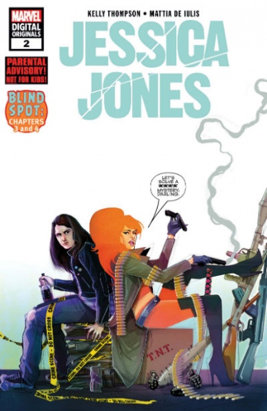
Written by Kelly Thompson
Illustrated by Mattia De Iulis
Colored by Mattia de Iulis
Lettered by VC’s Cory Petit
Reviewed by Gustavo S. Lodi
Stepping in a series so associated with an original creator can be daunting. How to infuse one’s voice into a character that is known to sound in a very peculiar way? And how to make stories fresh and not a rehash of what came before?
Thompson and Iulis succeed on both accounts. This new “Jessica Jones” series get the lead particularly well and takes her adventures to parts of the world that are new, and yet connected to what she is known for.
On this extra-sized issued, Iulis has a lot of talking heads to manage, as Jessica largely focuses on her investigation of how dead people keep coming back… and how one victim does not. The artist is masterful in parallel paneling, where just slight modifications are made between them, showing the subtle emotion changes characters are experiencing. This can be seen on main characters Jessica and Bloodstone, but also on unnamed club bouncers.
When given the chance to break out his action chops, Iulis delivers big. A confrontation with sea monsters at the Hudson River is an excellent mash of in-panel action, to movement guidance for readers, with ax throws working as “look here next” type of cues. Hard to do it in quieter moments, harder to coordinate in a busy scene and, yet, Iulis makes it work.
Thompson story feels fresh. This is a Jessica Jones on a mission, solving a brand new case and meeting characters she never met before. Nonetheless, she is still the same person, with the strengths of the characters her audience expects. Thematically, there are some interesting undertones of power appropriation that are very timely. It never feels preachy but is rather woven into the story to move it forward.
A surprisingly accessible third issue, with dialogue and minimal exposition bringing readers in, “Jessica Jones” #3 reads alarmingly quick, and ends in an exciting cliffhanger. This mystery will not solve itself, so the audience will need to head back to see where it goes!
Continued belowFinal Verdict: 7.9 – With dialogue bits and action that’s beautifully drawn, and a plot that is fresh but true to characters, “Jessica Jones” #3 is a great issue that will pull old and new fans alike.

Written by Scott Lobdell & Joey Cavalieri
Illustrated by Brett Booth & Luciano Vecchio
Inked by Norm Rapmund
Colored by Andrew Dalhouse
Lettered by Wes Abbott
Reviewed by Dexter Buschetelli
Teaming DC Comics characters with Warner Brothers’ Looney Tunes has yielded varying results since these specials began being published, and “The Joker and Daffy Duck” issue is a mixed bag itself. The main story tries to simultaneously emulate both styles. Scott Lobdell pens a semi-serious story with jokes peppered throughout, most of which fall flat. The characterization of Daffy feels off from his cartoon counterpart and his lisp is grating to read, often taking you out of the story as you struggle to figure out what he is saying.
The art by Brett Booth, Norm Rapmund, and Andrew Dalhouse is competent, and a DC-style Daffy is played with well throughout the story though at times can feel unsettling to look at. While the characters themselves are dynamically illustrated the pages feel too busy throughout, both in Booth’s layouts and Wes Abbott’s lettering. Between the visual problems and an uninteresting plot, the main chunk of this special is a slog to labor through.
The backup story, however, is a real treat. Luciano Vecchio is able to present both a comic-book and a cartoon style in the same panels without the art feeling disjointed. The story is played purely for laughs while also being incredibly self-aware, taking potshots at DC from its marketing to its movies. Fans of Looney Tunes and Batman’s rogues alike will get a real kick out of Daffy playing therapist to the Joker in Arkham Asylum.
Unfortunately, eight pages of a $4.99 special can’t exactly make this book a justifiable purchase for anyone who isn’t purely buying these for collecting purposes. This special would likely have done well to have its main story played more serious like the much-lauded “Batman/Elmer Fudd Special”.
Final Verdict: 6.7 – Why not theriouth enough?
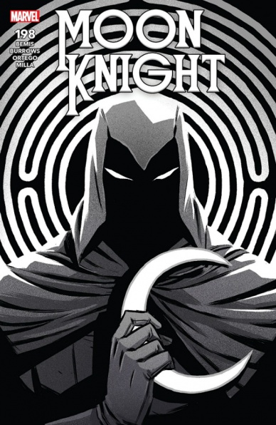
Written by Max Bemis
Penciled by Jacen Burrows
Inked by Guillermo Ortego
Colored by Matt Milla
Lettered by VC’s Cory Petit
Reviewed by Luke Cornelius
“Moon Knight” #198 continues Marc’s journey into his past with the induction ritual to the Société Des Sadiques.
The first thing I’d like to note about this issue is that Bemis seems to nail the balance between Moon Knight and Marc Spector in this issue. Throughout his run on the series, while Marc Spector’s character has been developed nicely, sometimes I’ve felt that we haven’t seen enough of him as Moon Knight, but since #195, this has changed and this issue continues in this vein.
This is demonstrated well with the opening page of the comic where Ernst gives a monologue about his “pet project” while literally toying with a Moon Knight figure. Here we can see the complicated history that Ernst shares with Marc/Moon Knight is going to be at the forefront and gives the audience more to root for; we desperately want Marc to get revenge on a figure so pivotal in his troubled life.
However, without spoiling the issue too explicitly, there isn’t a full conclusion to this conflict at the end of the issue which is dissatisfying. The final page clearly indicates the “End.” and with Bemis only having two issues left of his run, it remains unclear whether there will be a more definitive conclusion to Marc’s attempts to close the old chapters of his life.
But then, the journey that Marc is enduring mentally, and has been since Bemis took over, is one that he seems to be winning and the lack of physical victory makes the spiritual outcomes all the more important.
The artwork in the book, however, does not disappoint at all. Jacen Burrows’s pencils are great throughout and only enhanced by Ortego’s inks which give everything a strong definition. Despite the trials pushing Marc closer and closer to his ethical limits, the clear and crisp artwork never distorts or disguises the horrors that Marc has to commit in order to progress and leaves us questioning whether Marc does have any limits. Milla’s colors give the scenes even greater impact with the blood in the issue, particularly the dolphin’s, staining the blue and purple tones that fill the issue.
Continued belowOverall, #198 is a dark but enjoyable exploration of Marc Spector’s ethical limits told through strongly defined artwork although the ending may leave some underwhelmed.
Final Verdict: 8.0 – “Moon Knight” #198 continues the recent good form of the series.
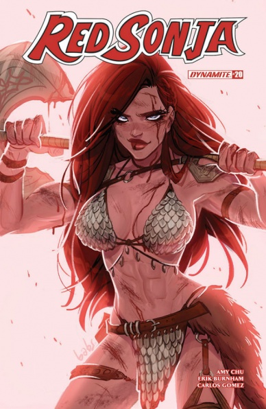
Written by Amy Chu and Erik Burnham
Illustrated by Carlos Gomez and Vincenzo Federici
Colored by Mohan
Lettered by Taylor Esposito
Reviewed by Jim St. Pierre
Despite being resplendent with the visual cliche of a voluptuous, scantily-clad Red Sonja in her highly unrealistic, albeit revealing, armor (or maybe because of it), the comic “Red Sonja” #20 is thoroughly entertaining. Though intellectually limited in its scope, the comic sticks to a tried and true formula that works. Red Sonja finds a down-and-out warrior lord whose lands she promises to help regain. She confidently takes control of the situation and shows her stuff. Writers Chu and Burnham embrace her limitations as a character who has become a caricature of herself and embellish her with a lively group of similarly constructed companions. The story moves quickly and simply with a few twists that add dimension to what is, essentially, a predictable storyline. Nevertheless, the dialogue is snappy and true to the personalities of the characters. Their voices are developed even further by the artistic flair of letterer Esposito whose offset words sometimes jump off the page.
The coloring of Mohan is vibrant, though lacking in depth and shading, and is used consummately to transition between scenes. The layouts are often frenetic, even thrilling, which further enhances the energy of the panels and pushes the story forward.
Final Verdict:7.0 – “Red Sonja” #20 is a fun comic that doesn’t disappoint but doesn’t offer anything new. It is what you expect and that’s ok.

Written by Simone “Sio” Albrigi, Bob Karp
Illustrated by Stefano Intini, Al Taliaferro
Colored by Disney Italia, Digikore studios
Lettered by Nikole and Travis Seitler, Al Taliaferro
Translation and dialogue by Jonathan H. Gray
Reviewed by Tom Shapira
I’ve recently started falling in love (again) with Scrooge McDuck thanks to the Fantagraphics “Don Rosa Library” collections, so I thought this as good opportunity as any to check out a more modern take, as seen in the ongoing IDW title. This issue has two stories – a feature-length modern story from the European Disney comics branch, ably translated from Italian by Jonathan H. Gray, and a short story taken from the history vaults.
There’s some fun to be had in “The Colossal Coin Calamity,” that’s the lead story with Scrooge going down under (ground) in down under (Australia). It has all the classic Scrooge elements – historical background, traversing unknown paths, family bickering etc. Unfortunately, Stafeno Intini’s art really lets the whole thing down – the wild takes start at ten and never really go down. All the reactions, movements and expressions are always pitched to the nth degree and thus the story ends up feeling one-note.
Unlike some puritans I don’t have any particular strong feeling about these characters using modern technology. But if you’re going to give them iPhones and apps just make it a natural part of the story rather than have them explain it over as if no one had seen this type of thing before. There’s also a sense of rashness to the storytelling as Simone “Sio” Albirigi keeps pitching up more and more ideas (giant moles! Robots! Technology vs old-school explorer spirit!) and thus has no time to properly develop any of them.
The short, 1962’s “It’s all Relative,” is a rather straightforward-gag, but at two pages it doesn’t overstay its welcome and it feels true enough for the spirit of the characters to work. In fact, I rather wish for a few more pages – as the selling of the main joke, the officer’s mild breakdown at the realization of the Earth’s movement, happens pretty much between panels. I ended up liking Al Taliaferro’s more naturalistic approach to comedy in the short more than Stefano’s maniac energy; sometimes it’s just better to not oversell the joke.
Final verdict : 5.5 – at 36 story pages It’s not a bad package and one that’s obviously pitched at a younger audience than myself, but the lead story is simply not strong enough.
Continued below
Written by Donny Cates
Illustrated by Juanan Ramírez
Colored by Felipe Sobreiro
Lettered by VC’s Clayton Cowles
Reviewed by Gregory Ellner
Following up from certain revelations in “Venom,” Donny Cates is back with a one-shot origin issue for a supporting character, back in the days of the Vietnam War. The issue is action-packed in its nearly 40-page span, ranging from alien horror in the form of the symbiotes themselves to high-octane action scenes befitting a classic hero tale, to more in the range of paranoia due to the fact that the symbiotes can disguise themselves as anyone. Utilizing not only the relatively new character Rex Strickland but also Nick Fury (the original) and Logan, the story feels less of a pure “Venom” story and more of a Marvel Universe tale set in the late 1960s. By bringing all of these people together, Cates is able to play to their strengths, from Logan’s prowess as a soldier and healing ability to the espionage angle given by Fury, and even more besides those.
Juanan Ramírez provides a rather realistic art style, albeit one that is not without its use of an uncanny valley effect in the case of certain non-human entities. Certain angles, especially in the opening pages, give an increased sense of the terrors of the Vietnam War, as more or less literal monsters are on the prowl that others cannot see easily.
Felipe Sobreiro’s colors do a marvelous (pardon the pun) job of portraying the truly alien nature of the symbiotes, with their black structure and inhumanly pink mouths, by contrast, are a harsh difference against brown and grey trees. The pink and red of various injuries are also shown in detail, from horrific scars on Strickland’s face to the ways in which Logan is, as per usual, grievously injured before piecing himself back together.
In all, “Ve’Nam” is an amazing look into another side of the Venom story, leaving open room to continue into other side stories under the “Web of Venom” label like the to-be-released “Carnage Born.”
Final Verdict: 8.5- A phenomenal tale of horror, conspiracy, and alien biology that serves as an origin story for a key character in Donny Cates’s “Venom” run.
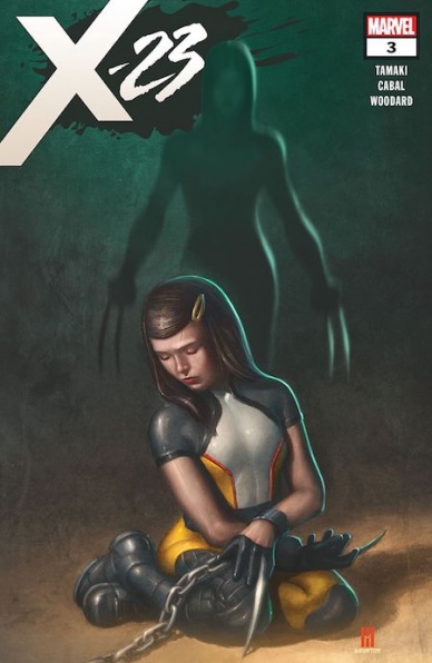
Written by Mariko Takamaki
Illustrated by Juann Cabal
Colored by Nolan Woodard
Lettered by VC’s Cory Petit
Reviewed by Alexander Jones
“X-23” isn’t the headiest title around, but it is still pretty complex as far as superhero comics go. The title has done a great job telling a noir story and showing you the pieces without connecting using a straight line. The first issue brought together Laura, Gabby, and The Stepford Cuckoos but didn’t show readers exactly how the pair would intersect. “X-23” #3 connects these pieces wonderfully and still makes sure to add lots of layers of intrigue to the plot.
The new installment brings some of the lingering elements of the series to the forefront. Readers get to know some of the scientific elements propelling the story from beneath the surface. Also, the Cuckoos are never played as hollow villains. These individuals have a very specific purpose and motivation behind some of their intentions. Tamaki unfurls their plot like a noir story, showing flashbacks and harrowing fight scenes between moments of exposition.
Juann Cabal is the perfect artist to realize the creative vision of the series. Cabal’s ambitious layouts and fluid action sequences make each page flow really quickly. Getting to each moment of the series is really intriguing with the great sense of movement he lends to each page. Colorist Nolan Woodard adds lots of great small details and allows for the book read as suitably epic. The final sequences where Laura is dropped from a high point in the air is a particularly wonderful moment for the issue.
Cabal and Tamaki both seem to be on the same page, as the opening action sequence does a great job of using art to craft an impressive level of subtext and suspense. Tamaki crafts a harrowing, sinister voice through the dialogue and Cabal follows-up on the feeling with a sense of paranoia and dread. Each creator adds a touch of humor in some of the more suspenseful moments of the issue as well with the Cuckoos and Gabby exchanging silly remarks despite the fact that they are in a dangerous situation pitted against each other.
“X-23” is a pitch-perfect noir title ranking among some of the best comics Marvel is currently publishing. With just a couple issues, the complex plotting and fascinating level of intrigue have made me highly invested in the story. Cabal’s excellent pencils and Woodard’s great colors further contribute to the impressive end product from Marvel and Tamaki.
Final Verdict: 8.8 – “X-23” #3 effortlessly connects the dots from previous issues while adding an impressive level of intrigue to the narrative.


