
There is a lot to cover on Wednesdays. We should know, as collectively, we read an insane amount of comics. Even with a large review staff, it’s hard to get to everything. With that in mind, we’re back with Wrapping Wednesday, where we look at some of the books we missed in what was another great week of comics.
Let’s get this party started.
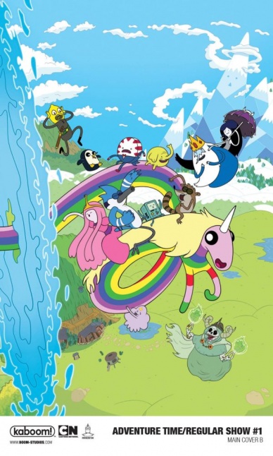
Adventure Time/Regular Show #1
Written by Conor McCreery
Illustrated by Mattia Di Meo
Colored by Joana Lafuente
Lettered by Warren Montgomery
Reviewed by Elias Rosner
An Adventure Time and Regular Show crossover feels like it should be a match made in heaven. Both are very popular Cartoon Network shows, both have had a pretty long comic run at BOOM! Studios and both are shows whose surrealist humor made me enjoy them so much. So why doesn’t this comic work for me?
I think a lot of that has to do with two things: the art and the character writing. All the Adventure Time characters are just so annoying, especially LSP, Ice King, and the dictator children, and none of them really feel like the characters that are in either the comics or the shows. There is this mean-spiritedness to all of them that feel out of place. It works with the Regular Show characters because that show already has an undercurrent of meanness that is just baked into them.
It kind of reminds me of Batman V. Superman in that, here we have these characters that should be very different and that is where the conflict for the comic comes from. But, instead, we’ve got characters that are way too similar and so the conflict loses its edge and instead becomes a slog to get through.
None of this is helped by the artwork either, which is a shame because the art is very good at capturing the styles of the shows. The flow of the panels never gets confusing and everything is very clear. The action and slapstick lands because all of the characters have this extreme squash and stretch, letting the physical comedy really shine.
However, the facial expressions of all of the characters are too detailed. Let me explain. Part of the charm, and aesthetic, of Adventure Time and Regular Show, although more so Adventure Time, is a simplicity to their faces. Because of this, when they want to really sell a joke, they’ll up the detail on the expressions, breaking from the norm. Here, all of the faces jump from one overly-cartoonish face to another, never letting up for even a second. It’s exhausting and just isn’t a good fit for these characters.
Hopefully, the interactions between the two shows in the next issue can alleviate some of these problems.
Final Verdict: 4.9. A slog of a first issue that doesn’t quite grasp the show’s characters, which, as a fan, is disappointing.
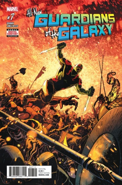
All-New Guardians of the Galaxy #7
Written by Gerry Duggan
Illustrated and Colored by Greg Smallwood
Lettered by VC’s Cory Petit
Reviewed by Alexander Jones
After seeing “Guardians of the Galaxy Vol. 2”, I was worried that Drax the Destroyer was going to devolve into a mindless joke machine. He was the delivery system for some of the crudest aspects of the film and lots of times portrayals of character in film bleed straight into comics.
“All-New Guardians of the Galaxy” #7 takes a hard left turn with Drax, showing that there can be depth to a character no matter how green they are. Writer Gerry Duggan continues to follow-up on lots of good work with each hero, but he also taps deep into the continuity of Drax and the Guardians as a whole. Better yet, the writer doesn’t beat readers over the head with the reason why he suddenly became a pacifist or why he has been looking back at his life in such a profound way. Duggan even switches up the tone of the narrative ever-so-slightly to give this chapter of the title a more subdued feel than we usually get from this comic.
Greg Smallwood’s pencils give this story the seriousness and level of depth needed for Duggan to explore the character in such a manner. Smallwood’s astonishing color palette and vivid depiction of the battle between Drax and his captors explores the darkest tone that the series has ever wandered into. Drax’s pursuit into an ill-advised fight shows off Smallwood’s vivid color palette and command of the medium. This comic isn’t all doom and gloom, as Drax is more than sure that he can be redeemed at some point in the future. There’s more than a few times in the comic where he beams a beautiful smile.
Continued belowDuggan has been twisting “Deadpool” into some interesting directions in the main solo title, but in “All-New Guardians of the Galaxy”, Duggan’s work has felt more mature and refined than ever. Even with a dark core subject matter, there’s something epic about the work. Duggan has made sure that every piece of the narrative is leading up to the big Infinity Gem story, but we’re going to take our time and smell the roses until we actually get there. The ongoing mysteries of the overall book surface in this issue as well, making sure that the comic intersects with past issues.
There’s something magical about “All-New Guardians of the Galaxy” #7. I have never read a run on this property that has felt so confident and refined as Duggan’s current tenure on the series. In addition to being enjoyable from issue-to-issue, the comic is promising a wild story that couldn’t make readers more excited. This installment of the series even spends some time in making sure that Drax the Destroyer has the depth and nuance to push him away from his shallow cinematic Universe depiction.
Final Verdict: 8.0 – The newest installment of “All-New Guardians of the Galaxy” offers readers a deeper look into the tortured mind of Drax the Destroyer.

Archangel #5
Written by William Gibson
Illustrated by Wagner Reis
Colored by Wes Dzioba
Lettered by Shawn Lee
Reviewed by Forrest Sayrs
Another three months after issue #4, “Archangel” finally drags itself to an overdue conclusion. The five issue limited series wraps up almost a half-year after its trade paperback was originally due to be released. While I don’t know for sure what caused the delay, the shifting in art staff gives us a pretty good idea.
In the interim, “Archangel” had been nominated for an Eisner in the category of best limited series, which makes its art troubles all the more tragic. I can’t say for sure if the series as intended would have beaten out Tom King’s utterly stunning “The Vision,” but the inconsistency of the art almost certainly took it out of contention.
In #5, Wagner Reis takes over the illustration but seems to have a lot of trouble trying to match Bruce Guice’s style. The first pages are plagued with facial inconsistencies, strange limb contortions and a return to the superhuman physiques that Gibson himself railed against in the first issue. The action scenes feel more dynamic, but at the expense of clarity, as limbs flail about the panels and it becomes increasingly unclear who is doing what. The issue is, quite simply, a huge mess.
Having said that, it’s hard to say if the story is suffering from the medium, or if it was always going to end like this. Gibson’s final act feels anemic, lacking the introspection or insight of the early issues, let alone his greater body of work. It is an action-packed conclusion to what had been a much more meditative piece. So, when the action looks so hastily done and poorly executed, it makes the writing feel all the thinner. There’s also something deeply unsatisfying about the coda, establishing our present-day Earth as the result of all the time travel shenanigans. Our reality isn’t that far removed from the future the protagonists were trying to avert.
As a stand-alone issue, “Archangel #5” is a failure. It drags down the rest of the series and undermines some of the good things that came before. But it’s also not egregiously bad. The flaws are all the more glaring, and painful, because of the quality of the first three issues. It is unfortunate that Gibson’s first foray into comics had to go this way, but hopefully, it wasn’t so bad that it will chase away a talented storyteller and futurist.
Final Verdict: 4.8 A completely unpleasant issue that does a lot to undermine the quality of the whole.

Deathstroke #22
Written by Priest
Penciled by Diogenes Neves
Inked by Jason Paz and Sean Parsons
Colored by Jeromy Cox
Lettered by Willie Schubert
Reviewed by Devon Browning
For a story surrounding a villain with a funny bone yet to be revealed, this month’s issue of “Deathstroke” will have you grinning through every page. That could very well be because we get to see Slade’s kids, or perhaps better named victims, suited up and in action to save hostages. It might even be because while Power Girl, Kid Flash, Ravager and Jericho are learning to work aside one another and showing off what their powers can do combined, Slade is enjoying himself a warm cup o’ joe in a cozy house with an old pal: Dr. Light. There’s…no exaggeration there. That is exactly what he does. The whole time.
Continued belowAnd it’s hilarious! Perhaps because of Priest, who has been serving justice for the long time assassin, gives us a delectable side of Slade that doesn’t entirely have the reader questioning whether or not they love or hate him. That, and Neves providing the reader with memorable expressions and panels featuring Slade cross-legged and relaxed like a perfect houseguest, give the assassin a depth that we’ve yet to see in the run so far.
While Slade does have enjoyable moments that somewhat answer the question of legitimacy regarding his newfound path, and form just a hundred more with his obvious respect to Dr. Light, and his mentioning of a potential new threat, the real treat of the issue is the Defiance team. Neves offers action-packed panels of the team both struggling and succeeding in their fight against the Radiant Men, a team up “Teen Titans” fans have been waiting for. Especially when Terra joins in the thick of the battle with an entrance Neves and Cox deserve the utmost credit for.
Both the color work and pencils go hand in hand, making it easy for the reader to follow along without getting lost in the dialogue which is fairly easy to do in a “Deathstroke” issue as Priest tells a compelling story. Just as well, Neves offers a style that doesn’t divert too uncomfortably from alternate artists working on the run, yet gives a uniqueness to each character, most notably in their movements.
While I won’t ruin the specific moments that had the muscles in my face do all sorts of things, you’ll find that Priest has provided another gem in the “Deathstroke” series. Terra’s rightful introduction, Slade’s reunion with Dr. Light, the Defiance team taking on their first “contract”, and an offshore plot revolving Rose’s heritage lurks within the pages, leaving the audience on the edge of their seats while waiting for the next chapter.
Final Verdict: 9.3 – “Deathstroke” continues to beeline to the top with stories that keep your eyes glued to the page and art that has you reading it more than once. A run that, without a doubt, everyone should be reading.
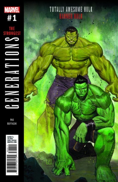
Generations: The Strongest #1
Written by Greg Pak
Illustrated by Matteo Buffagni
Colored by Dono Sanchez-Almara
Lettered by VC’s Cory Petit
Reviewed by Matt Lune
Releasing the issues that immediately precede a major event before said event is even over seems to be pretty standard procedure for Marvel over the last few years. It’s especially confusing when “Secret Empire,” the event in question, is still at least three issues away from finishing, and it hasn’t suffered any major delays to speak of, so the release of these post-event, pre-Legacy one-shots at this time seems to be intentional. It’s a confusing practice that can’t help but distract your reading of the issue. After all, you’re struggling to piece together just how and why Amadeus Cho is face-to-face with Bruce Banner in what appears to be his fighting-the-army-in-the-desert prime.
The blurb at the start of the issue states “Make your choice! Select your destination!” as though the characters themselves have a say, however, Cho is playing catch up as much as we are. He seems genuinely confused by where he is, and later claims that he doesn’t know if this is “science or magic or a dream…” There’s every chance that Greg Pak hasn’t got all of the answers either, which only adds to the confusion. Despite all of this, the purpose, at least of this installment, is to give the characters a moment where – again, as the opening blurb states – “true insight can be gained.” Does it achieve that? Well, yes and no.
On the one hand, “Generations: The Strongest” portrays both Cho and Banner at their best. Pak has written both characters many times before and knows the beats of their emotions and motivations. Banner is driven by guilt and anger, Cho by scientific curiosity and a need to help others. The question tackled here though, is if they are really that different. Cho is presented with the concept that he’s perhaps not as in control as he thought he was and is forced to confront the idea of this “gift” actually being a curse all along.
Continued belowBuffagni does a great job of depicting two worlds colliding, illustrating each Hulk in a very distinctive way. There’s an angular style to Banner Hulk which feels like a deliberate throwback to a more traditional art style, perhaps hinting at a Hulk pulled from the past. There’s also a strong flow of the action which, to everyone’s credit, is constant throughout the issue. The Hulks are relentlessly pursued by Thunderbolt Ross and his military forces, and there’s considerable high-octane fighting between Cho and Banner, all of which is well choreographed and illustrated by Buffagni.
If you follow Cho’s Hulk adventures, then “Generations: The Strongest” feels like a vital part of his continuing development. The importance of this issue, however, depends entirely on how these lessons are utilised moving forward into Legacy. There’s also a sense that Cho didn’t really need to have this adventure in “a place where time has no meaning!” in order to learn that being a Hulk isn’t completely without its downsides; that, unfortunately, takes a lot of the weight out of the lessons learned. Overall though, there’s a sense of fun in “Generations: The Strongest,” and if the rest of Marvel Legacy adopts a similar classic-yet-new feel then we might be in for some great comics.
Final Verdict: 6.9 – A fun issue that feels like a classic Hulk issue, but lacks the intended substance.

Gumballs #3
Written, Illustrated, Colored, and Lettered by Erin Nations
Reviewed by Nicholas Palmieri
“Pop in your quarters and see what pops out,” says IDW’s official description of “Gumballs.” This comic is less a coherent story and more a collection of whatever happens to fill these 32 pages, and we’re all the better for it.
“Gumballs” ends up being a playground for Erin Nations to create whatever might be on his mind at the moment. From visual diary pages to real-life moments made into comic pages to random illustrations, the only thing connecting all of the content is Nations’s peculiar blocky style and bright, flat colors. The experience of reading this is akin to reading a friend’s illustrated blog, often breezy and lightweight but with a clear personality and perspective.
Nations’s perspective shines the most here, mostly delivering stories culled from personal experience. Some are familiar to many others, like the small moments he illustrates interacting with strangers. Some are much less common experiences for the general populace, like the pages detailing his physical changes while transitioning from female to male, or the pages dealing with his experience being a triplet. It’s a nice mix, allowing anyone to jump in and relate to some sections and be informed by others.
Erin Nations is the only creator who could possibly make this comic, and as such, reading it is a fascinating and unique experience. Just by being itself, “Gumballs” single-handedly proves why we need diverse voices in comics.
Final Verdict: 8.2 – With Nations’s singular voice in both writing and art, this one-man anthology shows the importance of diverse voices in comics.
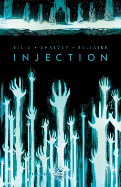
Injection #14
Written by Warren Ellis
Illustrated by Declan Shalvey
Colored by Jordie Bellaire
Lettered by Fonografiks
Reviewed by John Schaidler
“Injection” can be a challenge. It’s not the most complicated book in the world, but it’s not the most straightforward either. It doesn’t help that the characters can be a bit opaque and somewhat difficult to connect with. And that’s okay. Whereas the Ellis-Shalvey-Bellaire trio’s work on “Moon Knight” was absolutely character driven, “Injection” is a plot-driven book, packed full of action and big ideas.
All of that said, “Injection” #14 focuses more on the character of computer hacker Brigid Roth that it does on any truly crucial plot point, and it’s fantastic. Roth is exactly the kind of brilliant, tough-as-nails, sharp-tongued protagonist you want to follow throughout an issue, an arc, or even an entire series. She’s not only a gifted computer hacker, she’s quick witted, deadpan and able to dispatch a pair of shovel-wielding killers with nothing but a box cutter and a screw driver. She’s also a great surrogate spokesperson for writer Warren Ellis.
In the calm interlude that follows a massive explosion, Brigid succinctly explains, “[M]yth is how we used to transmit knowledge. Myths are facts embedded in stories worth retelling. That’s how the facts survived in oral cultures.” It’s a statement that wouldn’t be out of place in an Ellis interview or a scholarly review of his work, and yet it doesn’t feel forced or crammed into the script. It flows naturally from the story, providing a sort of meta-commentary on the action and the series itself.
Continued belowIronically, as great as the dialogue is, it’s the wordless full-page spreads that are truly gripping. Well placed throughout the book, they give the issue an excellent sense of visual rhythm, slowing things down in some cases, efficiently propelling a fast paced action sequence in another. On one particular page, Brigid surveys a pile of twisted metal wreckage (the result of her own handiwork) as ambulances depart in the background. She carries a plastic sack of sandwiches for herself and her bewildered colleague, who sits on a plastic chair wrapped in a blanket. It’s an utterly human moment that communicates everything we need to know without a single word. Artist Declan Shalvey’s line work is incredible. Colorist Jordie Bellaire’s grey-green palette is melancholy and haunting.
Visually, the book is strong throughout, with the only stumble coming when Brigid interacts with the Injection itself. Shalvey and Bellaire play it safe, creating a multicolored series of screen shots that feature a staticky Injection/syringe logo. It’s fine, but not very imaginative or up to the caliber of the rest of the book. Thankfully, the sequence is brief and we’re right back into the action.
Final Verdict 8.1 “Injection” #14 is a character-driven installment in a book full of big ideas. Centered on computer hacker Brigid Roth, it’s a refreshing change of pace that showcases excellent artwork in several gripping, yet wordless sequences.
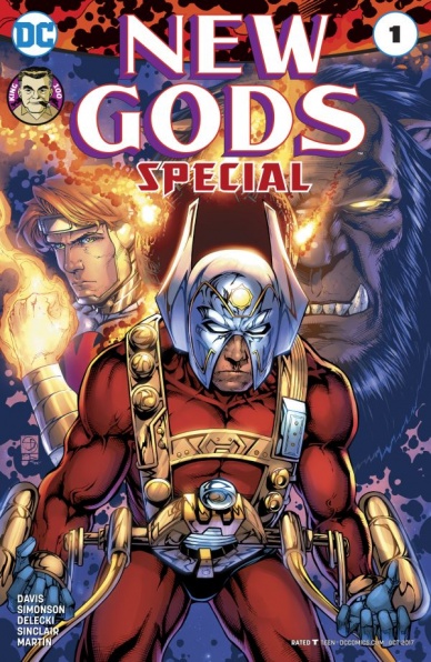
New Gods Special #1
Written by Shane Davis, Walter Simonson and Jack Kirby
Penciled by Shane Davis, Walter Simonson and Jack Kirby
Inked by Michelle Delecki, Vince Colletta and Mike Royer
Coloured by Alex Sinclair and Laura Martin
Lettered by A Larger World’s Dave & Troy and John Workman
Reviewed by Frida Keränen
The 28th of August this year is the day that would be the 100th birthday of Jack ”The King” Kirby, a man whose vast imagination and talent influenced all of American comic books. In Kirby’s honour, DC Comics is putting out specials dedicated to him, the first being the rather mediocre “New Gods Special” #1.
The main story by Shane Davis isn’t necessarily bad but fails to bring anything new into the New Gods mythos, as the plot about Orion and Kalibak facing off isn’t very fresh. Lightray and Forager have quite small roles in the story. Davis’ art carries the story fine and he manages to make Orion’s true form look terrifying. Thankfully he isn’t trying to copy Kirby’s style at any point, but it feels like his art style isn’t the best fit for the story. The colouring is very vibrant and shiny, almost over the top. The lettering team has used a lot of different and splashy fonts, which gives the comic a bit of a dated feel. Overall it’s a quite basic story.
The young Orion backup by Walter Simonson is only a few pages long so there isn’t much happening in it, but it’s a rather charming tribute from a comic veteran to another. Simonson draws all the deep sea beasts in the story in a very detailed and breathtaking manner but the faces of the New Gods are mostly sketch-like. The colouring is much more subdued compared to the main story.
At the end of the issue, there are a few reprints of short Kirby classics about Lonar and a heartfelt text by Kirby’s former assistant Mark Evanier. The parts about Lonar aren’t Kirby’s best pieces but showcase his style well for any reader who isn’t familiar with his work.
Final Verdict: – 6.5 The “New Gods Special” #1 isn’t very special despite its title and intentions to honour one of the greatest comic creators of all time.

Seven to Eternity #8
Written by Rick Remender
Illustrated by James Harren
Colored by Matt Hollingsworth
Lettered by Rus Wooton
Reviewed by Michael Mazzacane
Even without Jerome Opena’s art, “Seven to Eternity” continues to be an artistically strong book. Artist James Harren and colorist Matt Hollingsworth bring a Mignola-esque aesthetic to titles continued decent into if not hell, debasement. Harren’s designs are more cartooned and less ornate compared to Opena. His line weights are a bit thicker. There isn’t a real sense of three-dimensional depth. Hollingsworth’s pallet isn’t nearly as blended compared to when he colored Opena’s art. All of this leads to an aesthetic that is more stripped down but no less evocative.
Continued belowFor a book centered around the continued personal failings of its heroes (and just about everybody else) brought on by mere contact with the Mud King, Harren makes these moments of realization quite small. It’s the physical action that gets the big splashy large panels in this issue. As they should, you can’t quite make a chase sequence roar without enough space to show the hunter and hunted. This contrast in size is equally contrasted with the emotional impact these two intercut sequences have. One is bombastic and entertaining but surprisingly hollow compared to the tête-à-tête between Jevalia and Lovro.
Personal failings in “Seven to Eternity” are rarely the maniacal arch-melodrama kind. They are smaller, slower, affairs, born out of small decisions over time, like looking the other way for continued financial gain. Harren creates quite the claustrophobic scenario in the paneling for Jevalia’s interrogation of her brother, Lovro, it crackles with tension and the accumulation of these small failings until it finally bursts. Here his more cartooned style really plays, it lets him accentuate facial features – particularly Jevalia’s eyes – and just get to the raw emotion of the scene. His ink work this issue also helps articulate the melodrama, the black doesn’t so much add shading or texture to the figures, as act as a creeping barometer of violent and dark will. As Lovro slowly loses his cool from his failings, the darkness creeps over him revealing his duplicitous nature. As Jevalia takes vengeance on her brother, her silhouette is figured almost completely in darkness.
There has yet to be an issue where someone comes out clean, I doubt there ever will be.
Final Verdict: 7.5 – Things are looking terrible for everyone in a very good way for “Seven to Eternity.”
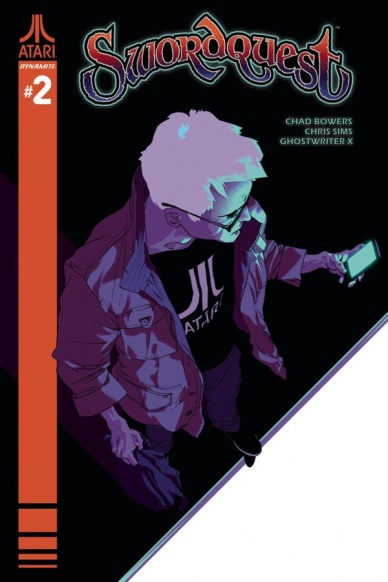
Swordquest #2
Written by Chad Bowers & Chris Sims
Illustrated by Ghostwriter X
Colored by Karl Fan
Lettered by Josh Krach
Reviewed by Kent Falkenberg
Cosmic crackle rips holes through space and time as Chad Bowers and Chris Sims posit an alternate history for “Swordquest” #2’s namesake – okay, technically Peter and his childhood crew are plotting a heist for the sword, not a quest, but close enough. Sitting around a kitchen table, the friends listen as a stranger sips coffee from a #1 Mom mug and recants the creation myth of the mystic realm, Atara.
Ghostwriter X delivers this tale with aplomb. His confident line work captures the essence of mid-80s fantasy comics – like the ones drawn by George Perez that was bundled with the original Atari games – with a deceptive economy. Those steady lines, combined with a color palette that’s muted, rather than retro, give the sequence more of a melancholic, indie feel rather than a throwback, throw-everything-against-the-wall one. It’s a wonderful aesthetic that’s in the same vein as Rich Tomasso’s sandled sorcery sequences from the second arc of “She-Wolf.” Of course, Ghostwriter X is not as bluntly graphic. Sure, the amazingly-named Rulero struts around naked for his portion of the narrative, and another character gets slightly decapitated by a strand of moonlight strung between two trees, but it all comes across with a sense of wistful, nostalgic charm.
“Don’t stay up too late,” Peter’s mom says politely as the story of minotaurs and magic swords, regicide and fratricide, prophecies and evil wizards comes to a close. She cinches up her bathrobe, excuses herself from the table, and retreats upstairs to leave her son and his friends with their flights of fancy as if they were all still eager 11-years-olds playing in a basement den instead of being middle-aged and jaded with varying degrees of ennui, regret and illness between them. Bowers and Sim’s matter-of-fact dialog, along with Ghostwriter X’s rather mundane pacing as she ascends a staircase in the background of the panel provide a perfect foil to the epic gravitas splashed across the first half of the issue.
It’s in that stark contrast that “Swordquest” #2’s brilliance shines brightest. I’m not gonna lie; I’m a sucker for nostalgia. And anytime a work looks back on childhood passions with bittersweet longing, I’m all in. It’s silly sure, but all our childhood interests were. Plus, Ghostwriter X’s deadpan expression on Peter’s and Amy’s faces, when Alvin confides his belief in the story is fantastic. It spans two silent panels, and it’s awesome.
Continued belowChad Bowers, Chris Sims, and Ghostwriter X know the whole damn game might be silly. And they treat it as such. But they also show how liberating it can feel to dive into those compulsions of youth with all the knowledge and facilities afforded by age.
Final Verdict: 8.5 – Game Tip: If you’re missing out on this comic, you’re really missing out.
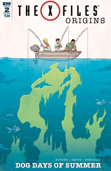
X-Files Origins: Dog Days of Summer #2
Plotted by Matthew Dow Smith and Jody Houser
Scripted by Jody Houser
Illustrated and Colored by Chris Fenoglio
Lettered by Dezi Sienty
Reviewed By Kate Kosturski
What were Mulder and Scully like before they were, well, Mulder and Scully? “X-Files Origins” goes behind the curtain to show the upbringing of the famous believer and skeptic, and in “Dog Days of Summer,” readers get two full on mysteries with a hefty helping of beachside adventure. In Martha’s Vineyard, Fox Mulder is spending the summer finding out why a deaf girl from the community has been wandering the woods at night. On the left coast, newly arrived teenage Dana Scully is trying to figure out who killed her Sunday School teacher and the origins of a very mysterious plane crash on the beaches of San Diego. The link between the two? A mysterious friend named Mercy that seems to float effortlessly between the two coasts (shades of Eleven from Stranger Things, perhaps?).
If “Dog Days of Summer” was intended as a jump on point for new fans of the “X-Files Origins” series, the result is uneven at best. By this second issue, we have a good backstory to both characters, but some aspects (for example, how Fox’s sister disappeared, which fans of The X-Files know is integral to every part of Mulder’s life) are left untreated. I hope this is explored in future issues. TV fans who are used to the dynamic duo as just that will not take well to the parallel stories – Mulder is not who he is without Scully, and vice versa. As a fan of the show from my college days, I found the two of them separated by distance rather hard to take.
The colors and letters emphasize that these are two separate stories within the same book. Kubina and Sienty bring us Martha’s Vineyard adventures in a classic pastel New England summer palette with more of a cartoon feel in art and letters, and the California side of the story in bluer tones with more precise detail and a heavier-hand pen – perhaps to kick up Scully’s teenage angst over moving to a strange new place? Perhaps. I was disappointed to find nothing iconic of 1970s color and style in the art – where are those avocado, gold, and burnt orange tones that were on every couch and appliance throughout the decade? Where are the bell bottom pants and folk dresses? If you’re going to write a period piece, the art needs to back that up, and that’s not here with these issues.
“Dog Days of Summer” has the feel of a teen detective story with the X-Files brand shoehorned in to get some name recognition. Show fans will appreciate the iconic typewriter font throughout and early appearance of some famous show characters (a young Cigarette Smoking Man), but you can take that all away and it doesn’t make a difference to the plot.
Final Verdict: 5.5 – Tweens and teens who like Stranger Things will like the story of kid detectives, but hardcore X-Files fans will be left quite cold.


