
There’s a lot to cover on Wednesdays. We should know, as collectively, we read an insane amount of comics. Even with a large review staff, it’s hard to get to everything. With that in mind, we’re back with Wrapping Wednesday, where we look at some of the books we missed in what was another great week of comics.
Let’s get this party started.

Written by Dan Watters
Illustrated by Dani
Colored by Brad Simpson
Lettered by Aditya Bidikar
Reviewed by Jodi Odgers
It is not often that an issue dealing with police brutality, God in the form of an illicit drug, and the inimitable EarthEater is one of the more meditative in a series, but “Coffin Bound” is not your average fare.
Taqa seemingly replaces Izzy as a series protagonist after what seems to be a short period of time passing since the last arc. Taqa has found enlightenment through a needle and is given a holy quest to save her church – to find the Vulture that accompanied Izzy during the first four issues, in order to prove the existence of God and save the church from unbelief and legislative damnation.
“Coffin Bound” continues to define itself, rather than submit to a convention. This second arc further carves out the series’ unique place in the comics landscape. Its curiosity about the consequences of death, faith, and mortality give it a distinct tone that has permeated all issues of the series so far. Watters’ literary dialogue (given additional clarity and weight by Bidikar’s stellar lettering) contrast Dani’s brutal, stylized depictions of the morbid world of “Coffin Bound”, with Simpson’s coloring adding the impact of the more brutal scenes of the issue with spatterings of blood, and bleakness to others with muted, washed-out color palettes. There are also delightful Himalayan soul sandwiches.
“Coffin Bound” delivers the perfect comic for a specific audience. Issue #5 sets up an arc that looks to explore similar themes to the first, through the lens of the new protagonist Taqa. Finding the Vulture will surely take Taqa down into the darkness once more, and the team behind “Coffin Bound” will surely make it an intoxicating journey for all who choose to follow it.
Final Verdict: 8.8 – The second arc of “Coffin Bound” shifts protagonists, but keeps the heady themes and tone that make it stand out.

Written by Kelly Thompson
Illustrated by Kevin Libranda
Colored by Chris Sotomayor
Lettered by VC’s Joe Sabino
Reviewed by Luke Cornelius
Kelly Thompson’s run on “Deadpool” so far has instilled a sense of responsibility and heart into Wade and his supporting cast, rightfully earning plaudits for doing so. With “Deadpool” #6, this weightier overtone is eased to let the Merc with a Mouth mock the X-Men status quo.
Stepping away from what has been so distinctive about the series so far sounds like a potential misstep, but instead, “Deadpool” #6 delivers a really entertaining standalone story. It quickly establishes its setup with Deadpool discovering Jelby, a mutant under his King of the Monsters jurisdiction, who can hold an infinite number of things inside him, and literally climbs inside him to be granted access through a Krakoan gate. What follows is what you’d expect from a ‘crossover’ between Deadpool and the X-Men characters; ample jokes and an inevitable fight scene. As funny as Deadpool’s dialogue is in the issue, the highlight is Jeff the Land Shark who steals the hearts of the X-Men before becoming a funny and unexpected threat to them.
There are moments where the issue establishes the drives behind Wade’s actions but they are never too heavily examined and are only included to give the issue a satisfying arc. When the high-stakes cliffhanger is revealed, it becomes all the more effective after such a fun and largely inconsequential story.
Kevin Libranda provides the artwork for the issue and does a good job. His style, combined with Sotomayor’s colors, is congruous with the current Marvel ‘house style’ and the Dawn of X stories. When Deadpool arrives in the “very fancy council of deciders,” it feels like he’s wandered outside of his own series and into another, which adds to the humor of the situation. Libranda’s panel work paces the visual humor too, particularly when Deadpool climbs in and later out of Jelby’s mouth. While Thompson’s script promotes the influence of Jeff, he becomes the highlight of the issue as a result of Libranda’s portrayal of him, which is always undeniably cute, whether he’s being petted or leaping into action.
Continued belowOverall, “Deadpool” #6 is a funny, lighthearted, and satisfying standalone issue that gently pokes fun at the current X-Men status quo and has a cliffhanger that promises Thompson’s usual take on the character will be resumed in the next issue.
Final Verdict: 7.5 – “Deadpool” #6 is a fun and satirical look at the X-Men status quo.

Written by Mark Waid
Illustrated by Kev Walker
Colored by Java Tartaglia
Lettered by VC’s Corey Petit
Reviewed by Matthew Blair
“Dr. Strange: Surgeon Supreme” #6 is the last book of the arc and it seems to be the last book of the creative run as well. As a result, it would probably be a good idea to read issues 1-5 before reading this in order to make sense of what’s going on.
However, just because the book is very much a part of a larger picture doesn’t mean the quality of the comic itself has to suffer, and, with the creative talents on display here, that’s very much the case.
The writing on “Dr. Strange: Surgeon Supreme” #6 comes courtesy of industry heavyweight Mark Waid, and his talents are on full display here. This issue holds a climactic battle between Dr. Strange and a former Iron Man villain turned magical arms dealer named Madame Masque. The fight is well planned out, the story has enough twists to be entertaining, the lesson and emotional core of the story is engaging, and it’s all set in a strange and interesting magical setting that would be great for future stories. If the book has a problem, it’s that the stakes might be a little too low key for someone with the power and responsibility of someone like Doctor Strange, but it’s a nice change of pace from the massive, multiverse shattering stakes he normally faces.
The relatively low key stakes and threats are kind of exacerbated by the artwork, which is provided by Kev Walker. Again, the artwork is solid and functional, which chooses to show magic as a function and tool rather than a state of being or universe. Sadly, this means that the environments and some of the character designs can be kind of boring. It’s not the biggest letdown, but there’s a sense that an interdimensional trading city being occupied by a mask-wearing lunatic arms dealer could look a little more experimental and crazy.
Final Verdict: 8.5 – A great ending for a solid and functional palate cleanser of a story that doesn’t take a whole lot of chances, but does its job well.

Written by W. Maxwell Prince
Illustrated by Martín Morazzo
Colored by Chris O’Halloran
Lettered by Good Old Neon
Reviewed by Christa Harader
“Ice Cream Man” #20 is for kids, didn’t you know?
Morazzo, Prince, and the team subvert classic children’s stories in this latest issue. It’s both an exercise in dismantling (as so many issues of this comic are) and in showcasing Morazzo’s talents as an illustrator. “Goodnight Moon,” “The Giving Tree” and “Green Eggs & Ham” all feature, and Rodolphus’s parenting skills are on full display. “Ice Cream Man” is at its most interesting when it lampoons Americana, and it’s pleasant to dip back into this end of the pool from time to time. The book also works best when Rodolphus’s ability to bend reality and break the text surfaces, and when the rot at the heart of it all boils up into the light. O’Halloran tailors the palette to match each story’s iconic aesthetic, and the lettering changes to suit the original text as well. The team bookends this exercise with nighttime idyll, spoiled only by Jane’s breakdown.
Overall, issue #20 is a rich and satisfying entry in this timely anthology. There are issues that spiral off the main theme and become a bit too impressed with their device, but this one is a good punch to the gut and a reminder of why the series works so well.
Final Verdict: 9 – “Ice Cream Man” #20 delights young and old alike with a bit of a new spin on some classic tales.
Continued below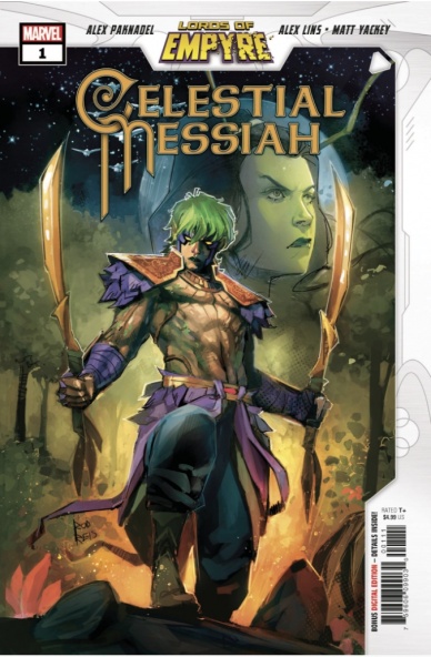
Written by Alex Paknadel
Illustrated by Alex Lins
Colored by Matt Yackey
Lettered by Ariana Maher
Reviewed by Christa Harader
“Lords of Empyre: Celestial Messiah” #1 (hereafter “Celestial Messiah”) takes what could otherwise be a throwaway one-shot and digs deep into family trauma, character backstory, and ritual life choices. It’s a lot to pack into a single issue, but Paknadel and the team do it well.
Paknadel favors narration and intricate dialogue but doesn’t lose sight of the marrow of the thing. It’s easy to fall into a Paknadel comic, and Lins’s ability to play with homages to different eras of comic art make “Celestial Messiah” a dense read that satisfies. Lins’ fight anatomy breaks down a bit but the choice to go with moody silhouettes in the initial combat scene between Mantis and Quoi is a good one. Yackey’s palette is broad, as is the norm with current superhero comics, but the vine borders are the perfect shade of green to draw our notice without intruding too much on the page. Maher’s lettering is concise and clear, with some good sound effects to add a little flair here and there. Her work always delights because it’s so easy to follow and because she brings minimalism to some of Paknadel’s dialogue.
Overall, “Celestial Messiah” adds flavor to the event and ups the stakes for Quoi. While he might not be listening to his mother right now, the initiatory experience will more than likely leave its mark. One-shots are useful to add breadth and depth to a bigger story, and Paknadel and the team deliver.
Final Verdict: 8.5 – “Lords of Empyre: Celestial Messiah” #1 gives us more nuance and backstory out of an event one-shot than we usually receive, and the emotional weight works.
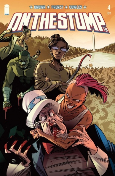
Written by Chuck Brown
Art by Prenzy
Lettered by Clayton Cowles
Reviewed by Quinn Tassin
There’s a whole lot about “On the Stump” that should work- it’s a clever, fun idea that lends itself pretty perfectly to comics as a medium; this high-concept of a story really wouldn’t work anywhere else. The thing about this clever, fun idea is that it doesn’t actually make a lot of sense when you build a whole world out of it. Sure, it would be the standout segment of an Interdimensional Cable episode of Rick and Morty but it doesn’t hold up under scrutiny as a piece of political commentary. And seeing as it takes its own commentary so seriously, that can’t fly.
Now, that’s not to say that there’s absolutely no merit to “On the Stump #4.” Fundamentally, a comic book about politicians who are also master fighters is very fun. Moreover, Prenzy’s art makes this read actively engaging. The fights are jam-packed with energy (the Blacksmiths surprise entry is awesome) and even the down moments have an unexpected dynamism to them (the FaceTime conversation between Jack Hammer and Thunder). For all its faults, you can’t say that “On the Stump #4” is a slog.
That being said, let’s talk a bit more about its faults. The big point of this issue, outside of introducing the Blacksmiths, seems to be to build out the world of “On the Stump.” In this world, the political system came out of an 1868 presidential debate devolving into a fistfight. It’s the kind of flimsy logic a world like this would have to be built on but again, it’s a project that takes itself too seriously to be this flimsy. There’s some promising stuff in this narrative (the Church of Death and War for one) and I’d love to be proven wrong. Until then, though, we’re left with a pretty weak, if fun, comic book on our hands.
Final Verdict: 5.0 – Pitch-perfect art is the saving grace of the generally weak “On the Stump #4”
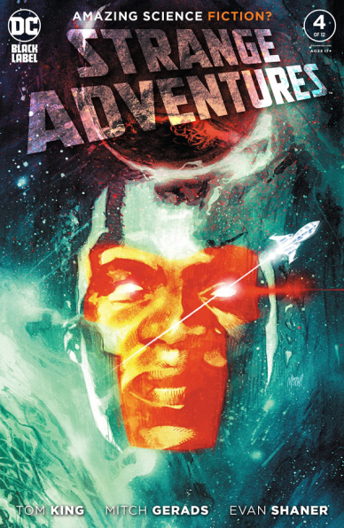
Written by Tom King
Illustrated by Mitch Gerads & Evan “Doc” Shaner
Lettered by Clayton Cowles
Reviewed by Michael Govan
One of the most impressive (and infuriating) things about “Strange Adventures” is that once I’m done, I immediately want to dive into the next issue. #4, like the issues before it, has piqued my curiosity. Tom King’s script keeps the questions coming and the tension building.
Continued belowI might be misusing it, but the word ‘tense’ definitely keeps coming to mind. The story is far away from its climax, but it’s clear that something, or several things, is very wrong. Mr. Terrific having to deal with the bureaucracy of Rann could have been a very boring affair but the creative team makes it engaging. From the second Michael touches down on the planet, it’s clear something is off.
Adam Strange is ‘off’ too. He’s regarded as a hero but every issue makes me wonder if he’s actually worthy of that title. Sure, he’s beloved by his fellow superheroes, and on the surface, he seems like one himself. The noble hero…that leads the Hellotaat into a massacre. The classic blonde-haired, blue-eyed hero…who was calling his new Hellotaat ‘friends’ any variation of ‘savage’ or ‘barbaric’ just an issue or two back. Not to mention Alanna is clearly scheming the entire time…
The only one being straightforward seems to be Mr. Terrific who definitely lives up to his name in this issue. King writes a very good Michael Holt, an unflappable investigator who could rival Batman and teaches himself alien languages on long trips. The investigation wouldn’t be as gripping as it is without him as our investigator, that’s for sure.
That’s just the writing though, as much praise could and should be given to the artwork. Gerads and Shaner, two artists with two different styles, come together and make something really special. Shaner’s art is a perfect fit for the flashback pages, his style both retro and timeless at the same time. His Superman is empathetic and powerful all at once. Adam Strange is a fully realized character that we see furious, desperate, and serene all in one issue. His Hal Jordan…man, I don’t even like Hal but I love Shaner’s depiction of the character.
Not to be outdone, Gerads is working hard to become the definitive artist for Mr. Terrific. His art is more on the ‘realistic’ side. At times, it felt like I was watching a movie. Michael is an impressive figure with his unique ‘T’ shaped mask, a cool jacket, and glowing red eyes. That close-up panel after Sardath slaps him…I can’t stop looking at it. It’s really beautiful. The sequence where Holt coolly lets his T-spheres handle the Rannian goons while he’s still waking up is both amazing and hilarious. The portrait of the hero and his departed wife on his wall is a great human touch too. “Strange Adventures” is a visual feast, no matter which artist you may prefer and the story is still heating up. This series knocks it out of the park yet again.
Final Verdict: 8.5 – “Strange Adventures” #4 really is AMAZING science fiction.

Written by Scott Snyder and Charles Soule
Illustrated by Giuseppi Camuncoli and Leonardo Marcello Grassi
Colored by Matt Wilson
Lettered by Crank!
Reviewed by Joe Skonce
It seems that one of Scott Snyder and Charles Soule’s biggest influences on ‘Undiscovered Country’ is Lost. Both feature a team fighting for their lives in a mysterious and hostile world and all is not as it seems as we’re given the true motivations of the team members through flashbacks. But in “Undiscovered Country” #7, we’re given more information about what America looked like in the early days after “The Sealing.” The problem is that the issue is doing too much, which ultimately makes it come off as feeling rushed.
There are two flashbacks of “Undiscovered Country” #7 which feature Sam Elgin as he tries to reason with the new American government, a cabinet of thirteen autonomous zones lead by a president. There are tidbits of information thrown about to give a sense of how the new government works, but it comes off as confusing, rather than intriguing. The main takeaway? The various “zones” are beginning to push the boundaries of what they are allowed to do, which begins to cause problems. Just as the flashback is getting interesting, though, it cuts back to how the main team is handling the fallout of the Destiny Man. While it’s nice to get a check-in with the crew, it seems like a mistake to try and give these two disparate parts equal balance. The issue would have been stronger if they had chosen to stick with one. It would have still been possible to devote an entire issue to Elgin without revealing everything, but as it stands both sides seem to equally get short-changed which means both stories feel incomplete.
That being said, the art of “Undiscovered Country” #7 is really good. Giuseppi Camuncoli and Leonardo Marcello Grassi do a great job of establishing character with the representatives of the different zones who don’t get a lot of dialogue. You get a feeling of what each of these various cultures believes in simply by the way they’re dressed. Destiny is the rugged individualism of the Westerns, Capital is the dark suits of espionage, and Unity looks like cartoonish scientists. It creates excitement to see how their zones have turned out as the team continues to the heart of America. The issue also ends in a stunning setpiece of bleached trees with red and blue veins. Matt Wilson’s coloring in that sequence is incredibly surreal, which helps to build tension. While the issue was unbalanced, the art certainly left an impression.
Final Verdict: 5.9 – “Undiscovered Country” #7 presents some big mysteries but has a difficult time balancing them in a satisfying way.


