
There is a lot to cover on Wednesdays. We should know, as collectively, we read an insane amount of comics. Even with a large review staff, it’s hard to get to everything. With that in mind, we’re back with Wrapping Wednesday, where we look at some of the books we missed in what was another great week of comics.
Let’s get this party started.
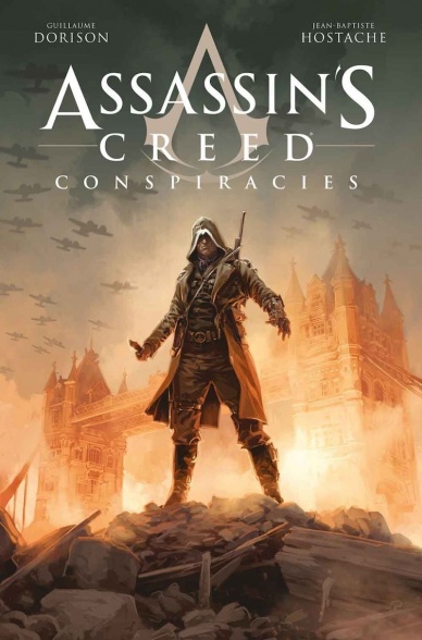
Written by Guillaume Dorison
Illustrated by Jean-Baptiste Hostache
Colored by Jean-Baptiste Hostache
Lettered by Amoona Saohin
Reviewed by Gustavo S. Lodi
The fifty-something pages first issue of “Assassin’s Creed Conspiracies” #1 introduces readers to several elements, from lead and supporting characters to a rich world set within the mythology of the ‘Assassin’s Creed’ video game universe during the events of World War II. However, for all that it tries to achieve, it falls short due to pacing issues and a lack of polish on plot and character moments.
Before going into that, this is a beautiful book. “Assassin’s Creed Conspiracies” #1 is fully rendered by Paris-based Jean-Baptiste Hostache and his style, reminiscent of European masters, is what makes it a worthwhile read.
There is a lot to appreciate in this area. His thin line work opens up a level of detail that rarely clutter the page, even in the middle of busy metropolitan areas or inside heavy-industrial buildings. Earlier in the volume, Baptiste shows the city line for London in 1940, with the horizon filled with short buildings and high chimney towers. The fact that he is doing colors as well makes it all come together, with the sense of a real-world unfolding before the audience.
However, problems with this volume lie on the unbalance pacing between conspiracies and assassinations. It seems as if Dorison was trying to explain all the rich world around the characters and the plot they are trying to unravel that he forgot to make the action pieces and revelations more exciting. “Assassin’s Creed Conspiracies” feels more like reading about a character and their world than to actually experience it. The stilted dialogue that manifests during the more dramatic moments also doesn’t help: it is unclear if that is the original author’s fault or the translation of the series to English (this and the following volume were originally published in 2016 on its original French).
At the end of it, despite an excellent delivery on drawings and colors, “Assassin’s Creed Conspiracies” becomes too much of an exposition journey with a weak sense of connection between characters and their audience.
Final Verdict: 6.0 – A beautiful package with confusing substance, “Assassin’s Creed Conspiracies” #1 would have benefitted from a more balance arc structure and focus on the main character’s key moments.
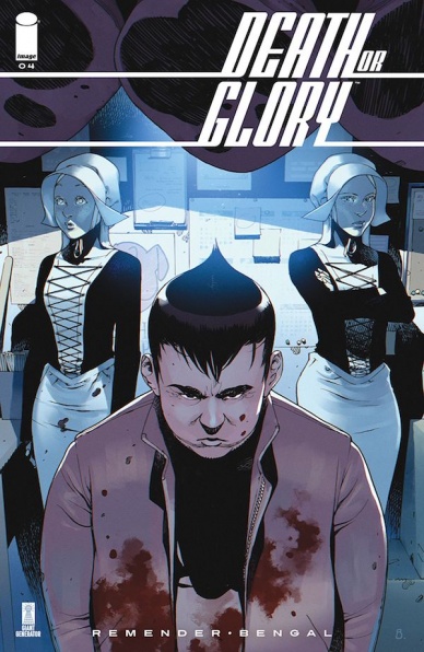
Written by Rick Remender
Illustrated by Bengal
Lettered by Russ Wooton
Reviewed by Eric Goebelbecker
“Death or Glory” #4 raises the stakes while turning the creepiness level to 11.
We already knew that Glory and Pablo had blundered into an organ harvesting operation when they broke into the “Chop Shop” last issue. That’s a solid eight on the creepy-meter for me. But this issue opens with a scene right out of Nightmare on Elm Street with bodies hanging from the ceiling, a burning furnace, and the blind Dutch Sister wielding a cleaver and calling for “Father.”
Where the last issue had a great deal of backstory, this one is fast-paced. Remender hits the gas (sorry, couldn’t resist) and gives us 22 pages of a chase scene, stopping only long enough to tell us how the Dutch Sisters ended up with Korean Joe. Here’s hoping they’ll be around next issue.
Bengal’s art pops off the page. Glory’s ’69 Camaro SS flies through the book, leaning into turns and popping up onto two wheels when required. The panel layouts are short and wide, helping convey the speed and carrying us down the street with the car.
Korean Joe gets what’s coming to him in the top part of a full-page spread and Bengal’s pencils and colors sell the impact (there I go again) of Joe’s fate.
Police and gangsters engaging in car chases means sound effects. Wooton is put to work in “Death or Glory” #4, and he’s up to the task. The lettering adds the extra bit of action we need. Glory’s bulletproof SS is peppered with handgun fire that has just a little bit of extra punch with Wooton help.
Continued belowThis issue is an example of great pacing. Even though it might cover five minutes (if that) in real-time, a lot goes on and it’s a cathartic release after a lot of exposition in issue #3.
And it sets us up for a heck of an issue #5 with a pair of curveballs in the last two panels.
Final Verdict: 8.0 – “Death or Glory” #4 is a wild ride that establishes “Death or Glory” as a pacesetter.
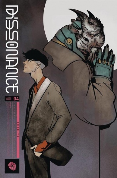
Written by Singgih Nugroho and Ryan Cady
Illustrated by Sami Basri
Colored by Kenaya Gabriel
Lettered by Jaka Ady
Reviewed by Gregory Ellner
For the most part, Singgih Nugroho and Ryan Cady have kept up a slowly rising level of intrigue and mystery, of a philosophical argument regarding what it means to be human, what it means to be alien, and the nature of empathy. For better or for worse, the subtleties of that conflict have been pretty much thrown out altogether in light of the revelation in “Dissonance” #3, resulting in a rather straightforward conflict.
Nugroho and Cady use some space to examine the true nature of the Fantasmen, giving a more apocalyptic air to their apparently lying goals, then spend a large portion of “Dissonance” #4 on the battle against the newest full-synch. Although the battle is entertaining, with arguments within each synch and without, perhaps it could have been kept more in the background with a heavier emphasis on conversation, as it was in previous issues. Roisia’s silence is palpable, but without much of a main character human voice to balance against Folke’s rebellion, things can seem a bit hollow. This difference is not to say that the issue’s writing is badly handled, but perhaps that it seems like an odd, abrupt shift in focus. The characterizations are still very good, with the stoic Folke being genuinely disturbing in contrast to the more emotive Ghaergos and other synchs, both full and half.
The artwork provided by Sami Basri is, as ever, very interesting. Perspective plays a bit part this time around, with looks from above or below showcasing the respective hierarchy in a particular scene, regarding who has the upper hand in a conflict.
Meanwhile, due to “Dissonance” #4 taking place over a short period during the nighttime, Kenaya Gabriel’s color palette is much darker, more subdued. This change is welcome given the change in tone of the story and its higher focus on direct conflict over political intrigue.
In all, the issue is handled pretty well, but perhaps the change in tone was a bit too fast for some.
Final Verdict: 7.0- “Dissonance” continues to build toward a climax, but the overt focus on action leaves something to be desired on the front of the philosophical and intrigue-based fronts seen earlier.

Written by Robert Venditti
Illustrated by Bryan Hitch
Inked by Andrew Currie and Paul Nerry
Colored by Alex Sinclair and Jeremiah Skipper
Lettered by Richard Starkings and Comicraft
Reviewed by Alexander Jones
“Hawkman” #3 dives headfirst into all the tropes surrounding cape comics in a manner that should make it seem redundant. However, the issue has a carefree, cohesive feeling and enough goodwill from the last couple installments to make the chapter still feel worth reading. Carter Hall’s brand new quest to discover who he is and how he relates to his ancestors fills the title with any number of cliches. The flying adversaries Hall takes down are the standard, run-of-the-mill villains tailored to the exact powers of the superhero. However, it is still compelling to see him get surrounded and become in over his head. Plus, the narration is so earnest and hokey that it should help readers progress further with the plot of the issue.
Whatever you do, you can’t accuse the issue of being boring thanks to the beautifully rendered Bryan Hitch dinosaurs Hitch’s work feels much more fluid and slightly less detailed than it has in the past. His style has been streamlined to allow Hawkman to look as beautiful as it should. Carter has lots of great, accurate poses that really stand out when compared to the work of other artists. Each page is carefully designed and retains a proper sense of majesty. The simpler style Hitch employs in the issue allows the comic to read more fluidly. It is easier to relate to the characters without a mass amount of detail which could have made the issue seem more robotic and stiff.
Continued belowAs a standalone experience, “Hawkman” #3 doesn’t deliver. The issue is crafted to be read in context with the installments proceeding it. The sense of humor and wild outlook carried by Hall makes the issue engaging from the first to the last page. Writer Robert Venditti makes sure to keep each moment in the series exciting with lots of set pieces and adversaries for Carter to go up against in the issue. Hitch and Venditti have seemingly found their stride and continue to deliver on the promise of a fun “Hawkman” solo title.
Final Verdict: 6.9 – “Hawkman” #3 is a slightly dull, but well-paced next chapter into one of DC’s most consistent ongoing series.
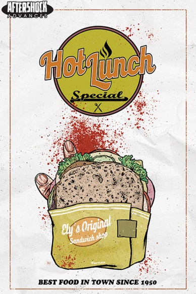
Written by Eliot Rahal
Illustrated by Jorge Forné
Lettered by Taylor Esposito
Reviewed by Dexter Buschetelli
You ever have one of those days where you wake up and everything seems normal, but it goes completely sideways? You have your coffee and eggs, take the dog for a walk, get dressed; this is as mundane as mundane gets. How does this all end with tracking a victim’s missing finger from Le Sueur County, Minnesota to a vending machine in Sioux Falls, South Dakota?
“Hot Lunch Special” spends its opening installment much like a season premiere of FX’s “Fargo” series, introducing us to a lot of characters with an underlying mystery beginning to unravel in the background. It does a good job establishing the setting for this play to take place, planting seeds of complicated families, questionable business practices, and severed body parts. And, like many serialized tales in this genre, the first issue ends with a literal “bang”; or, if I’m being more accurate, a “ratta tatta tatta” and a “bracka bracka bracka”.
“Hot Lunch Special” makes it clear with this debut that its strong suit will be in its character interactions, and that its window for the audience will be Deputy Olson, despite appearing in only six pages. Though I hope to see a fair amount of time devoted to how to pronounce “gyro” and what makes the tuna Mediterranean, I already feel comfortable viewing this drama mostly through Olson’s eyes.
This is the type of story that bad art could kill, though. Conversely, a competent artist with a story like this can coast you through it without looking at the nuances of their work. Here, the art does not stop at simply being competent, but there’s a punch lacking in certain scenes. Facial expressions like the Khourys yelling “SHUT UP!” are played well, but other panels feel lifeless on a second view.
I’m dead curious about this series. I bought the ticket, and I’m taking the ride. Let’s just hope it feels worth it by the end.
Final Verdict: 8.1 – 8 fingers is a sight better than 4

Written by Nicole Adelfinger
Illustrated by Maddi Gonzalez
Lettered by Ariana Maher
Designed by Marie Krupina
Reviewed by Jim St. Pierre
I am always hesitant to read a book that plays off anything by Shakespeare. I find they usually mimic his plots which, over time, have become a cliche. This issue of “Lumberjanes” is, unfortunately, nothing new. Adelfinger attempts to work some moral lessons into the story, which may be appropriate for a book aimed at the middle grades, but it comes off as preachy and insincere. The story is, from start to finish, slow-moving and predictable. Essentially, the characters are planning a dance at their all-girls camp and spend most of the time arguing. The Relationships among the characters devolve and improve without much believability and it is hard to believe that even middle graders would find the plot compelling, or even interesting.
The only redeeming quality of the book is art. The vibrant pastels and expressive figures that fill the pages of “Lumberjanes: A Midsummer Night’s Scheme” call out for attention. From the first splash page, the scenes engage the senses because of Gonzalez’s attention to detail and the whimsical busy-ness she works into her panels. The art itself is reminiscent of Saturday Morning Cartoons, the ones I worshipped as a kid and is so cinematic that at times I felt like I was watching a paused cartoon rather than reading a comic.
Continued belowFinal Verdict: 5.0 – The story is weak even for middle-grade readers but the art pulls you in.

Written by Brian Haberlin and Brian Holguin
Illustrated by Brian Haberlin
Colored by Geirrod VanDyke
Lettered by Francis Takenaga
Reviewed by Michael Mazzacane
With “Medieval Spawn and Witchblade” #4, the miniseries comes to a finale that left me somewhat wanting as it went through the climactic action sequence against the Trinity and their death knight. That want is built from artists Brian Haberlin and colorist Geirrod VanDyke ability to create emotive imagery out of the largely static Medieval Spawn’s visage and Haberlin’s page structure that weave past and present together as histories and connections are revealed. There is a clarity in these other pages that is lost as they battle what eventually turns into a gigantic monster. Spatial geography becomes surprisingly muddy, which is a byproduct of both the page breakdown overall and VanDyke’s coloring solid black mixed with dark earth tones and greys, there just isn’t enough highlights on some figures. Maybe it’s for the best that this sequence was overall short, climaxing in a Cross the Streams like moment.
The somewhat perfunctory staging of the action gets in the way of some overall effective sequences as Medieval Spawn remembers who he is and how he came to be. Haberlin shows some real craft in representing this overall sequence with matched or mirrored images between the Spawn and King he betrayed. The paneling in these sequences isn’t super fancy, mostly stacks of horizontal panels, but how he pieces together his script makes for good macro images and pages.
Brian Haberlin and Geirrod VanDyke art style feel like a throwback to the mid 00’s, it should be about time for that wave of nostalgia to come in anyways. With 3D assists from a trio of other artists, “Medieval” gives off that early Sejic after he discovered photoshop vibe. The hyper luminance and plastic sheen on everything isn’t there in VanDyke’s pallet, but it comes through the detail work on Spawn and his squire’s armor and Witchblade. The techniques used to texture them standout compared to the more normal comic book like the texture of the skin gives these pages a nice dissonance.
When given a title like “Medieval Spawn and Witchblade,” it is clear what you’re going to get. Which isn’t a knock, the creative team delivered on the promise. Maybe with an extra issue’s worth of pages things could’ve been a bit more impactful but overall this book delivers what you’d expect.
Final Verdict: 7.0 – The finale to “Medieval Spawn and Witchblade” does what is needed to be done.

Written by Robert Kirkman
Illustrated by Lorenzo De Felici
Colored by Annalisa Leoni
Lettered by Rus Wooton
Reviewed by Chris Egan
Fans of Robert Kirkman know that he tends to break his on-going series into 6 issue arcs, so with this issue, it was safe to assume that we would see some answers, some closure and some new questions and twists to ponder. And that is exactly what we got. “Oblivion Song” is a series that works best when shrouded in mystery. As new information is given the reader is forced to focus on the drama and action at hand while mulling over the greater puzzle. The reveals in issue 6 are decent and fairly satisfying. With the morsels we are given, it is clear that Kirkman has bigger things on the horizon and is doing his best to keep us at bay.
He falls into similar tropes that he tends to use in most of his books. There are trust issues, groups surviving in a desolate world, and mysterious creatures and villains waiting in the shadows. All elements used heavily in “The Walking Dead,” “Outcast,” and even “The Astounding Wolf-Man.” He does these types of stories well, but if you are a reader of all these books it can feel redundant here and take some enjoyment out of it.
De Felici’s art is a nice change from the work in Kirkman’s other books. It’s dirty, slimy, and gritty. He balances the ‘every day’ with the surreal quite well, but Leoni’s colors are the star here. Without them, the illustrations would not be as clear or terribly strong. The framing is kept tight in this issue. Intimate moments and private conversations dominate the narrative which is a hard turn from the big, wide-scope action of the last few issues. It works well for this issue and does not detract from the quality.
Continued below“Oblivion Song” #6 is a solid bridging issue that closes out the introduction arc and leads us into the future of the series. Hopefully, Kirkman can change things up and not fall into the same old story beats.
Final Verdict: 7.0 – A good issue, but not the strongest we have gotten from this series. New reveals and questions help to keep things fresh.

Written, Illustrated, and Lettered by Terry Moore
Reviewed by Elias Rosner
“Strangers in Paradise XXV” has never been a very fast series. It takes its time to let characters sit, chat, ramble and roam. Action isn’t its primary focus, allowing instead the conflict of the issue to come from the slow reveal of information and character-based decisions. Issue #5 is chock-full of this but leans too heaving towards stasis to make it as compelling as it could be.
Despite Moore’s exceptional attention to expressivity, it’s hard to make an issue out of two people sitting around a table talking exciting. He comes close, sucking us into Tambi’s story about Cleopatra & her mathematical genius through a mixture of cutaway flashbacks, casual conversation and that cadence of storytelling that can only come from years of practice, but in the end, it’s indicative of this issue’s purpose. It is a respite from the action, a chance to recalibrate, and, as any good spy story does, a chance to rethink what we’ve been told. It doesn’t move the story forward so much as it is about shuffling the deck, setting up what’s to come.
“Strangers in Paradise XXV” #5 is still a strong, strong issue. Moore’s linework has never been cleaner or more confident, his character work subdued but human, allowing their ever-shifting emotions to add a second layer to everything said and done. He allows the story time to breathe, wordlessly. One such page spends four out of the six panels having Katerina look at and then grabbing her charging phone.
The final two are just of Katerina gazing down at messages from Francine. The messages themselves are cries for comfort, hoping that Katerina will be there, at least in spirit. But we see through her inaction and her face that she cannot bring herself to respond. It’s not in her nature and thus the tragedy of the series continues unabated.
Final Verdict: 7.1 – Moore’s artistry and storytelling are as strong as ever but the slowness of the issue holds it back.

Written by Brian Michael Bendis
Illustrated by Ivan Reis
Colored by Alex Sinclair
Lettered by Josh Reed
Reviewed by Jacob Robert Nuckolls
Anytime Brian Michael Bendis gets his hands on an iconic character, he brings a sense of intimate introspection that gives us a deeper glimpse into the character’s world. “Superman #2” is a shining example of this.
The book begins by recapping some of the recent events in the past couple of Superman books and quickly turns to the inner-narration of Clark Kent himself. He plays over in his mind a conversation he has with Oliver Queen, a conversation in which Oliver sympathizes with Clark for always being able to hear the horrible things around him. Clark responds with a beautiful picture of how he sees the world – filled with tragedy and disaster, yes, but also the people who are constantly sacrificing to build up the pieces. In a way, this is Superman’s story: a character surrounded by destruction and tragedy but one who chooses to be a helper. Throughout this book, Bendis never fails to remind us that he himself loves these characters as much as we do (the banter between Flash and Superman is an absolute delight). He also proves himself to be a master at raising the stakes. Starting a book by tossing planet earth in the Phantom Zone – Krypton’s ancient, interdimensional wasteland – is a big card to play, but Bendis continues to double-down in this issue with several epic fight sequences and the looming threat of the environment itself.
Reis once again delivers strong illustration; his ability to capture the epic (the incredibly fights of Rogol Zaar’s, planet Earth being sucked into the Phantom zone) as well as the intimate (close-up shots of Superman, the limp body of an ailing character at the end of the book) is unparalleled. Likewise, Sinclair provides the vibrant color and otherworldly contrast that serves to strengthen the already stellar book.
Final Verdict: 9.0 – Bendis and company deliver another solid “Superman” issue with a distinct, intimate voice, a solid sense of characters, vibrant illustration, and an enticing cliff-hanger.


