
There’s a lot to cover on Wednesdays. We should know, as collectively, we read an insane amount of comics. Even with a large review staff, it’s hard to get to everything. With that in mind, we’re back with Wrapping Wednesday, where we look at some of the books we missed in what was another great week of comics.
Let’s get this party started.

Written and Lettered by Richard Starkings
Illustrated and Colored by Abigail Jill Harding
Reviewed by Elias Rosner
One thing I appreciate most about the “seasonal” model of comics is that it allows creators to craft distinct identities for each one and provide easy jumping-on points for new readers. It doesn’t always work, nor is it the “best” model for comics in general, but it is a different and useful way of considering the work. Season 3 of “Ask for Mercy” takes full advantage of this idea to diverge from the serious cosmic mystery of season 1 and the more ethereal, historical meditation of justice and conquest of season 2 to ask: what if the aliens came and fucked things up in 2023?
Right from the get-go, the tone of the story feels different. It’s still a serious tale about serious people in world ending danger but the ridiculousness of it all to a layperson on Earth is now more present underneath, successfully conveyed, for example, through the subtitle “Beasts of the North,” through both its construction as a clear riff on B-SciFi monster movies and the out-of-this-world-spooky-scary font Starkings chooses for the title.
As for the story, Starkings & Harding bring the reader back up to speed/introduces the central conflict to newcomers in a fantastic sequence that shows Harding’s great strides in sequential since the first season. Harding’s art is vibrant and scary, like an oil painting of a Cronenberg set. I love the way scenes are colored and lit as if the colors are lights being diffused on a foggy night. There’s a real tension to the action and a clarity to it that has been lacking from the rest of the series, perhaps due to the change in setting and mood to the aforementioned B-SciFi films. That isn’t to say there is no nuance, and the creative team demonstrates we will be getting both nuance and simple Nazi punching, but just that story will appear more clear cut than before.
However, my biggest complaint is that little actually happens in this first issue. It’s an interstitial, feeling too slight to be a true opener but also too full of new information to be a true “filler” issue. The scenes are done well but it reads like the prologue to a book and is paced as fast, rather than being a true item in and of itself. Were this in a trade or released as a graphic novel initially, there would be no need to comment as it would merely be the first scene of many, rather than a distinct object. Form and function change the way one reads and feels about a piece of art. “Ask for Mercy” understands this but, perhaps, not fully.
Final Verdict: 7.6 – A great return for a series that improves with each new season, even if it is more slight in content than one would prefer.

Written and Illustrated by Jason Howard
Lettered by Fonografiks
Reviewed by Quinn Tassin
Oh, the joy of stumbling across a great first issue- especially when that first issue has the very premise of “Pacific Rim but with a big lady.” “Big Girls #1” is an absolute surprising delight of a first issue- it’s a fresh idea with an exciting hook that’s willing to offer up some real thematic depth from the get-go. Creator Jason Howard makes a smart structural decision throwing readers into the middle of this world. There is, of course, plenty of exposition but there’s a whole lot more showing than telling. Readers are introduced to a society protecting itself from ruin- ruin that comes in the form of mutant boys that seem to become kaiju as they age. At the center of it all is our titular big girl, Ember, who fights the kaiju and has plenty of angst about her size.
Continued belowHoward pulls double duty on his series to great effect. He illustrates his world with imagery that sits at a very precise point between grounded and bold. His action sequences are strong, particularly the fight between Ember and the kaiju (her saving people left and right is a very nice touch). Also great is the amount of life that we feel in the Preserve. It has the feeling of a real city that people go about their business in though there’s nothing that truly stands out about it. Whatever lies outside of its walls will surely be something to behold whenever we get to see it.
The world Howard has created in “Big Girls” feels full and interesting and rife with potential not only for the plot, but for moral questions. The central plot point of the issue- High Marshal James Tannik killing a giant 4-year old that will one day be a monster- is swift and brutal and spurs some really meaty material. Questions of what’s acceptable in the name of safety and what it means to be a leader when the world is in shambles are brought up and we’ve barely read 30 pages of the comic. The issue’s closing revelation that there’s a group intentionally growing new big people is very cool and I, for one, can’t wait to see where this is all headed.
Final Verdict: 8.0 – With its debut issue, “Big Girls” proves itself to be a series worth getting keeping your eye on

Written by Mariko Tamaki
Illustrated by Natacha Bustos
Colored by Eleonora Bruni
Lettered by Jodi Wynne
Reviewed by Gregory Ellner
Mariko Tamaki’s writing on this “Buffy the Vampire Slayer” miniseries brings about a collection of emotional responses all at once. On the one hand, the eponymous character of the story, Willow Rosenberg, is very happy, and the story focuses in on her joy to be in this town away from Sunnydale. In that respect, there is time for hope and forward progress. However, she is so hopeful, so overwhelmingly happy, that her actions and the way she moves around this new location appear almost uncanny. There is an underlying foreboding atmosphere to even the greatest jubilation in the overall fun “Buffy the Vampire Slayer: Willow” #2, with the feeling that maybe things are not quite right… or are they?
Natacha Bustos provides lively artwork to Willow’s adventure, through the utilization of the background, foreground, and middle ground all at once. The use of changing backgrounds helps to indicate the existence of a story in a dream without outright saying it until several panels in. Magic is intriguing, never outright emphasized in the illustrations, as if focusing in on how it is just a part of Willow’s life as a witch rather than something to be afraid of or curious about, merely being a natural part of her life at this point. Even when the truly bizarre happens, such as transformations, there is never too much focus on what is actually happening or any horror behind it, just curiosity and confusion. Outside of magic, the rest of the artwork, from facial expressions to body language to even the settings all have a comforting, homey feel to them, helping to soften the creepier elements underlying the overall plot in a way that can help readers to feel as the main character does.
Eleonora Bruni does a lot to help with that sense of comfort. From the warm colors outside to the strange changes in a dream, nothing ever seems too odd, and even the magenta used as a background to featuring Willow as a silhouette seems more relaxing than scary. If “Buffy the Vampire Slayer” and “Angel” use a lot of horrors, Bruni’s colors work together with Bustos’s artwork to make for a style to which readers can just relax and enjoy their time with “Buffy the Vampire Slayer: Willow” #2.
Final Verdict: 7.75 – Despite the creepier underlying elements of the story and the hints toward possible malicious influence, on the whole Willow’s tale, seems to be very relaxing and comforting, while not leaving new readers too far in the dust.
Continued below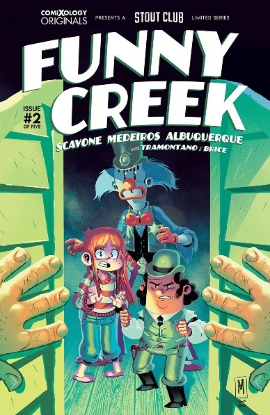
Written by Rafael Scavone & Rafael Albuquerque
Illustrated by Eduardo Medeiros
Colored by Priscilla Tramontano
Lettered by Bernardo Brice
Reviewed by Jodi Odgers
“Funny Creek” #2 brings protagonist Lilly deeper into the world of her favorite cartoon Western, complete with fists flying, a gunfight, and the questioning of loyalties. The reader sees that Clumsy is definitely not everything Lilly makes him out to be, which is a neat exploration of the perils of children’s idolization.
The premise of being thrust into the world of a children’s cartoon is explored slightly further than it was in the first issue. Clumsy is able to shoot off a rapid succession of accurate shots from a revolver despite not really aiming and even dropping the gun, with a final successful shot being fired upon it hitting the floor. This cartoonish logic is contrasted with the openly flawed Clumsy, who has at this point dropped any facade of clownishness and is embracing the trope of the world-worn hero. He is actively unlikeable in this issue. While this may be done to force Lilly to have a crisis of devotion in upcoming issues, it does make it harder for the reader to empathize with Clumsy’s frustrations with Cody, and generally a negative presence in the comic itself.
Medeiros’ art and Tramontano’s saccharine coloring add to the cartoonish nature of the world of “Funny Creek”, amplifying the absurdity necessary for a town with a disgruntled clown as its sheriff. Apart from the aforementioned problems with Clumsy, Lilly’s character is inconsistent between the opening scenes and the events later in the book without any apparent intervening events to cause this change.
Despite the strengths of the coloring, art, and overall premise of “Funny Creek”, some character and story beats leave it deflated. Hopefully, upcoming issues will bring some more punch to the mini-series and allow it to wrap up its wacky tale in a satisfying way.
Final verdict: 6.2: Some strange character choices and tropiness leave “Funny Creek” #2 stumbling.
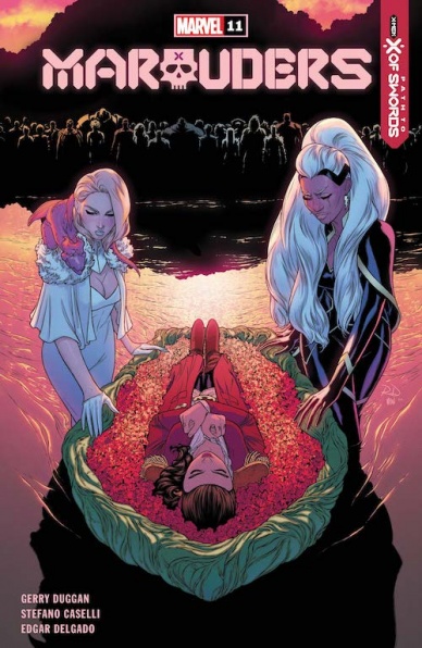
Written by Gerry Duggan
Penciled by Stefano Caselli
Colored by Edgar Delgado
Lettered by VC’s Cory Petit
Reviewed by Alexander Jones
“Marauders” #11 seemed like your average issue of an ancillary X-Men title until the twist ending that ushered in the new phase of the series showed up. “Marauders” #11 is here to resolve the thread and get readers ready for a big, upcoming crossover event. Writer Gerry Duggan is still responsible for the script in the issue with the excellent Stefano Caselli joining him on art duties. This is the chapter that contains answers for the overall structure of the comic book and the next steps of the story. Ultimately it is an important issue and one that should not be missed for anyone looking to understand the fuller X-Men line right now. However, the resolution for the twist feels a little easier than it should and doesn’t carry the same emotional weight as the actual twist.
My main gripes with the issue pertain to the actual plotting and do not lie with the art. Caselli is a strong artist of the Krakoa X-Men universe thanks to his attention to detail on the anatomy of his figures. His characters are easy to differentiate from each other and I really like the emotion that Caselli depicts on Storm specifically. This issue is full of really great moments with Storm as a character and Caselli taps into a full range of her emotions. I appreciate the details in anatomy and characters but Caselli’s strengths still don’t lie in some of the background details on the page. While the scene with Emma Frost captures really strong emotion, the details in these pages are lacking. Overall I don’t think readers will be disappointed with the emotion Caselli is able to stir from Duggan’s script.
Aside from a disappointing resolution later on in the comic, Duggan’s script on “Marauders” #11 is able to capture strong emotion. The end of this issue is headed in a much different direction on the last few pages hinting at upcoming developments in “X of Swords.” Duggan is still able to capitalize on the internal struggles and disappointment of Storm and Emma Frost in particular. The last page also offers a solid cliffhanger on where the series is going next. Duggan is particularly good at writing these twist endings that aren’t derivative and contain the right balance of melodrama and intrigue. “Marauders” #11 is a solid comic book that accidentally exposes a flaw in Marvel’s own editorial direction.
Final Verdict: 7.5 – “Marauders” #11 has a few great emotional beats with a flimsy plot device undermining the goodwill of the issue.


