
There is a lot to cover on Wednesdays. We should know, as collectively, we read an insane amount of comics. Even with a large review staff, it’s hard to get to everything. With that in mind, we’re back with Wrapping Wednesday, where we look at some of the books we missed in what was another great week of comics.
Let’s get this party started.

Written by Donny Cates
Illustrated by Garry Brown
Colored by Mark Englert
Lettered by Taylor Esposito
Reviewed by Christa Harader
Not every comic has to be in-your-face action, but quiet’s hard to do in a medium invented for bombastic dreamscapes and wild characters. “Babyteeth” takes a breath in its 12th issue, and it’s just right.
With the explosions and gunfire on hiatus after our previous arc, it’s nice to have a moment or two of introspection. Cates knows how to pace these before we’re back into the swing of things. We see a little more of Sadie’s mettle as she runs up against Olivia’s ultimatums, but we’re not going down the Sarah Connor road just yet. There’s a beautiful scene between Simon & Sadie that convinces me we’re not sacrificing any of Sadie’s emotional honesty and openness for future badass behavior – yet. And, as always, there’s just enough wry humor to test the story’s tension without breaking it and keep the characters real. Overall, Cates knows how to step back and let the art do the work that it needs to do to make a comic really work.
Speaking of art, Brown continues to delight. He can draw a moody kitchen scene just as well as he can do high action, and his loose line suits the comic’s tone. The marker-line panel borders add subtle weight to Sadie’s POV without being obtrusive. A clean line feels wrong in such a chaotic, personal story. Englert’s colors are great, and he continues to use texture to add depth to subdued backgrounds while directing focus to character expressions and body language. Interiority? Check.
Esposito’s one of the best letterers working, and his expertise shines in the subtle touches that enhance style without overpowering the page. The hand-drawn balloon style is consistent with this comic’s choice to buck clean edges, and the typeface is neat without feeling clinical. He puts the final touches on a solid package.
Cates, Brown, and team consistently deliver on this title, and this comic ticks all the boxes as a solid transition issue. We’re following a strange thread down an increasingly chaotic rabbit hole, and – bonus! – we’re finally going to get to see what’s going on in the red realm. Although, we might regret our eagerness to peek once we’re there.
Final Verdict: 9.0 – This issue’s a fine entry into the newest “Babyteeth” arc, and does some quick but effective character scaffolding to help us swing into the next high spot.
Written by Marguerite Bennett
Illustrated by Fernando Blanco
Colored by John Rauch
Lettered by Deron Bennett
Reviewed by Chris Egan
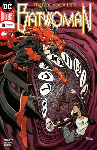
“Batwoman” #18 sees not only the conclusion of the ‘Time Of Your Life’ arc but the end of the current “Batwoman” series. With the major tonal shifts started only in the last issue we get a preview of the Batwoman Kate Kane was always destined to become. She will probably never be the type of vigilante that Batman would want her to be, but she is making strides in that direction; making changes for herself, on her own terms, not Bruce’s. She now speaks far more than ever before; allowing her to take control of certain situations in a more positive way. Mid-fight dialogue isn’t just violent threats or witty banter, it has real emotional weight to it. And when speaking to characters like Renee Montoya, just a few words can be beneficial rather self-destructive.
As her battle with The Clock King and his time-warping drug dealing robots comes to a close, revelations come to her that neither Kate nor the constant reader would have expected when this journey began. She grows as a person in both her civilian and Bat-life. This is a direction that will definitely make for some fresh Batwoman storytelling, no matter where the character ends up after this series.
Continued belowIt’s great to see such a change in the character knowing we will see more of her, even if it is in a different book. And for it to come from the current creative team and not newcomers is wonderful and a rare thing to see.
Blanco’s pencils continue to keep the classic Bat-tone while keeping some of the surreal whenever Batwoman is in the frame. When the costume is on she never fails to feel like she exists on another plane of reality. His use of panels and double-page spreads is cinematic, to say the least. The way he uses them to move a story is some of the best in the current DC books. Minor changes to the status quo make a huge difference here. John Rauch’s colors make for one of the more brightly lit Bat-books. It’s an excellent contrast to the character, who is typically angry, violent and a darker version of Batman. She hardly sticks to the shadows. The majority of colors used are muted and are reminiscent of when the Bronze Age of Comics gave birth to the Modern Age. Paired with Blanco’s modern illustrations keep the art nearly timeless. This is a team who have successfully married their talents.
“Batwoman” #18 is the necessary ending for both the current arc and the series as a whole. And if you stuck with most of this hit-or-miss series, you should absolutely ride it out to the end. Batwoman will return and there’s a chance it will be her greatest iteration.
Final Verdict: 7.5, A very good finale to a series with a character that hasn’t always gotten her fair share.
Written by Mark Waid
Illustrated by Jesús Saiz
Colored by Jesús Saiz
Lettered by VC’s Joe Sabino
Reviewed by Gustavo S. Lodi
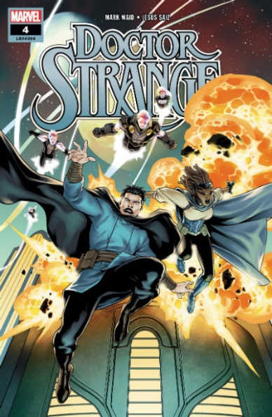
“Doctor Strange” #4 continues the interstellar saga of Stephen Strange in search for new sources of magic and artifacts. Unfortunately, despite the beautiful design and colors, the issue comes up short on showing a truly innovative mission statement.
Nearly all of the recent runs chronicling the adventures of the planet’s sorcerer supreme have been focused in one major aspect, that of the arrogant doctor losing the source of his abilities and having to learn how to reinvent himself. Despite the good-on-paper idea that magic is not an exclusivity of Earth, the plot still seems too familiar to past entries, with Strange roaming exotic locales, with a somewhat clueless companion by his side, collecting magical artifacts that might jump-start his mojo again.
Saiz’s art is truly beautiful and having him color his own work adds to the package. Alien planets feel unique, its inhabitants even more so, with body proportions, facial features and even how light reflects on their skins adding to this eerie display. The action is dynamic and the quieter moments benefit from the artist’s knack to present emotion effortlessly. Note also that some of the events set in the past use a different color palette – slightly more muted, focused on pale shades of green and blue – that quickly establish the different time periods.
It is on Waid’s scrip that the issue is lacking. Not to say that there aren’t fresh ideas at play – “Doctor Strange” #4 closes on the best one yet on this run – but they are few and far between. Dialogues are capable, but nothing that hasn’t been done many times before; there are only so many ways that the good doctor can keep secrets from his colleagues. Adding further complication, the script also needs to juggle the inherent inconsistency of Strange holding one of the infinity stones (some of the universe’s most powerful artifacts) and still appear to be in danger.
As a summary, “Doctor Strange” #4 simply lacks substance to make this a more compelling read, despite good ideas sprinkled throughout and its beautiful art design.
Final Verdict: 6.9 – Seems that the good doctor has run out of his usual tricks because this issue and run still have not hit its stride.

Written by Jed MacKay
Illustrated by Gerardo Sandoval
Colored by Brian Reber
Continued below
Lettered by VC’s Cory Petit
Reviewed by Elias Rosner
4 years ago, teetering on the “Edge of Spider-verse,” we were treated to a small taste of the Marvel multiverse’s many Spiders. Now we return, to follow-up on one of those spiders, The Anarchic Spider-Man aka Spider-punk. There is a lot of fun to be had in this issue. As with any alternate universe take on a familiar character, half the fun is seeing new characters in these unified but different ways.
Props to MacKay and Sandoval for making these characters click. There’s a grunge to the world, with sharp angles and everything is broken, ripped and all around beat up. The dialogue is kept snappy, except for Kang, and each panel moves with a frenetic energy. Poses are pushed to the extreme but are always kept clear, the action staying front and center. It’s punk vs the establishment, with Kang the Conglomerator coming from Marvel’s favorite future year 2099 to act as the primary antagonist.
It’s a shame, though, that we don’t focus on the non-superhero aspects of the Anarchic Spider-Man. It would have been really interesting to hear the full conversation started by Robbie & Brown about what happened to Spider-Man’s punk principals post-defeat of the President of the US on Earth-138. It’s a question about the punk movement, one which is echoed through other aspects of the issue: What happened when you become The Man?
For all its anti-establishment, anti-consumerist talk, it is still a piece of an establishment, consumerist media. It is the thing it critiques and while the critiques are hilarious, (the punk Tsum-Tsum Spider-Punks that have TM’s at the end of all their sentences), it’s hard to shake that feeling. Were this to be a piece of media detached from Marvel, the point would be more subversive. This isn’t a knock on the issue but something that I think it could have interrogated more.
My biggest gripe, though, comes when Spider-woman pops in near the end. She’s got boob-socks. Come on man, I thought we were past costumes like this. It’s a small thing but when it’s the first image of the first woman in the comic, it stands out.
Final Verdict: 7.3. A fun and energetic one-shot that gives us plenty of that alternate Spider action we’ve been craving. Punk gone global meets the Marvel Universe.

Written by James Asmus, Joseph Keatinge, and Christopher Sebela
Drawn by Joe Infurnari
Colored by Jordan Boyd
Lettered by Pat Brosseau
Reviewed by Jim St. Pierre
This is one of those stories that stays with you after the last page: the more you ruminate with it, the more depth it produces.
The story of “Evolution” #9 begins in media res, continuing with characters exploring changes occurring within humanity–some of the characters even catalyzing them in predatory ways. Though difficult to fully understand at first without being familiar with the rest of the comics, the plot eventually comes together and the characters begin to coalesce with the patient development that Asmus, Keatinge, and Sebela put into the panels. The story feels frenetic at first, from the energy produced by the quick transitions as well as the art, which is the most striking element of “Evolution” #9. Though not much happens in the course of this particular comic, the questions raised and the powerful ending help to move the story along.
Infurnari has a sketchy, textured style that brings a sense of entropy to the characters and the story. Though it is sometimes difficult to clearly identify characters because of this style, the holistic feel it produces compensates for the lack of clarity. Coupled with the work of Infurnari is the ghostly, fluid coloring used by Boyd. His change in tones allows for clear transitions between scenes without losing the tension that is sustained by the art and propelled by the story.
A unique element to “Evolution” #9 is the speech bubbles. Their rough-cut square shapes drain into the characters, adding to the textured feel created by the art and the coloring.
Final Verdict: 7.5 – Though somewhat slow in its pacing, the story and art come together to create a compelling episode in this series.
Continued below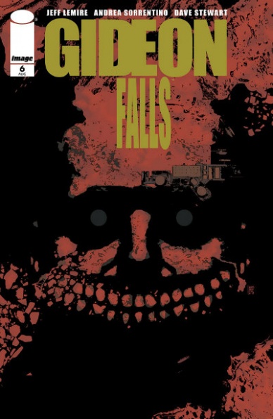
Written by Jeff Lemire
Illustrated by Andrea Sorrentino
Colored by Dave Stewart
Lettered by Steve Wands
With the previous five issues and his previous body of work, it isn’t surprising that Andrea Sorrentino, along with colorist Dave Stewart, is able to render “Gideon Falls” #6 as the arresting and horrifying trip that it is. The ability to create frightening surrealist images as Father Fred has very bad trip isn’t what makes this issue so good, the visual storytelling that leads up to that trip through the Black Barn door is phenomenal and part of the reason why that trip is so effective. The Black Barn is the unifying force for the two narratives between Norton and Angie and Father Fred. The concept is literalized at the start. The opening pages follow Norton and Angie’s trek to an oddly vacant lot, the duo is out of sync on what their next move with the Black Barn should. Sorrentino draws these pages in a way that is almost parody of how visual journeys are represented and the role gutters play in segmenting panels. The size of the gutters is nearly half the size of a panel. What the panels show are claustrophobic shots of their journey through the city, the lack of visual grandeur juxtaposed against the all-encompassing white.
When they reach the spot where the Barn used to be, the entire visual scheme changes. The page becomes a projection as small square panels ring the overall page that is the lot where the Barn stood. Time and space become one on this page, with the panels only highlighting minute actions. This page design holds true when the book travels to Father Fred’s neck of the woods. The barn is the page and everything else is just a projection onto it. Sorrentino’s tilting the panels as if they are going down a drain, is a great visual setup to the real bad trip that’s about to happen. What happens after that is too much to get into, but the image of Father Fred’s mind being visually blown is a good indicator of what happens.
The trip through the Barn is horrifyingly cool. It isn’t scary in the traditional sense. Sorrentino draws these pages like a fusion pop art and surrealism, Dave Stewart colors it all so bright that these pages don’t read as “scary.” Yet, at the conclusion of the issue, it left me with the same feeling of cosmic dread that the first season of True Detectives tapped into.
Final Verdict: 8.0 – What is the Black Barn? I don’t know and am scared to find out, but I need to find out! The finale to the first arc of “Gideon Falls” is the right kind of finale that took audiences on a ride and leaves them hooked for more.
Written by Sylvain Runberg
Illustrated and Colored by Belen Ortega
Lettered by Phillipe Glowgowski
Reviewed By Kate Kosturski
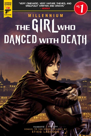
How do the late Stieg Larsson’s characters turn out under the pen of another? My devotion to his original work is one of the reasons I have yet to check out The Girl in the Spider’s Web (the fourth prose novel from the Millennium trilogy released in 2015), but I’ve been pretty satisfied with Titan’s Hard Case Crime adaptations of the first three Millennium books (in some cases, the comics were superior to their prose counterparts), which led me to “The Girl Who Danced With Death.” In the shadow of a far-right political party coming to power in Sweden (sound familiar?) Lisbeth’s friend Trinity is kidnapped. Just as her old friend Blomkvist is covering the campaigns in Sweden and trying to expose the atrocities of the Swedish Republican party and its radical star of the moment, Sten Windoff, Lisbeth calls her old friend for help. Seems that Trinity’s abduction goes deeper than your run-of-the-mill kidnapping . . . deep enough to the Swedish secret service. By the time this is over, no one’s secrets will be safe.
It’s a smart move to bring back Sylvain Runberg, writer of the original Millennium comics for this original story; he has an intimacy with these characters that will make adapting them into a new story smooth, not trying to fit them into something that doesn’t seem to work. It isn’t perfect; many of the plot points – – the far-right political rising star opposed to the press and immigration, a government that has an intense amount of private data on its citizens, a pick-up artist with a business in getting men into the “sex zone” – – are very 2018, possibly rendering this comic dated in years’ time. These plot points remain separate for now, but no doubt have a connection we’ll find out later, so patience is asked of the reader: all will be revealed in due time. Belen Ortega is a new artist to the Millennium series that has studied the predecessors, keeping continuity with the previous installments but putting a unique spin on certain characters, particularly Blomkvist, here a narrow, square-jaw man of confidence. Lisbeth, is, of course, as punk and anarchist-with-a-heart-of-gold as ever. If anything, this book features a great deal more color than those that preceded it; even the darkest of scenes still have a rich and varied palette.
Continued belowIt’s good to have you back, Lisbeth – – and even though you’re not the type to ask for help too often, this series has you in some pretty capable hands, and I’m not just talking about Super Blomkvist.
Final Verdict: 7.6 – Outside of a reliance on tropes common to the current age, this is a strong debut issue proving that Larsson’s treasured characters can continue their adventures, under the right pen.
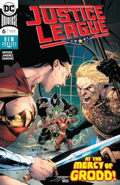
Written by Scott Snyder
Illustrated by Jorge Jimenez
Colored by Alejandro Sanchez
Lettered by Tom Napolitano
Reviewed by Alexander Jones
“Justice League” #6 is the next chapter of the new hyper-serious, manically-paced ongoing series from Scott Snyder and Jorge Jimenez. The current story-arc entitled ‘The Totality’ is an ambitious and rich plot featuring the return of The Legion of Doom. Snyder layers the plots carefully together. Each member of the antagonist group has a plan surrounding a force that is completely different from the next individual.
The issue does a great job retaining a manic sense of energy and getting readers to the next phase of the story. The main problem with Snyder’s writing is a large number of caption boxes. Bringing the caption boxes back to Big Two comics is a novel idea, but they don’t show anything readers wouldn’t have seen with the art. Batman also has a couple of self-aware lines in this issue bordering on parody.
Jorge Jimenez’s art is incredibly fluid and very detailed. The artist contributes beautiful work to the issue which is also dynamic. It is rare to get an artist to deliver work as polished as the interiors in this issue are while also conveying an impressive level of movement. Snyder’s script asks a lot from Jimenez who is able to fill in some of the gaps from the narrative.
Towards the last couple pages of the issue, Snyder brings all of the individual threats together and readers should get a strong sense of how all they all tie together. The different forces making up ‘The Totality’ have a strong science fiction feeling, but they can occasionally seem too hokey and loaded with small, ancillary details that make them uninteresting.
Snyder is still not letting up the pace of Justice League’s opening arc. Jorge Jimenez also makes sure each and every page of the issue is a joy to read. With more focus and fewer caption boxes, Snyder should be able to close out the debut arc for his Justice League run while retaining a high level of quality and craft.
Final Verdict: 5.9 – Even though “Justice League” #6 is filled with too many caption boxes, the strong art and pacing make this installment a solid contribution to Snyder’s run.

Written by Matt Rosenberg
Penciled by Andy MacDonald
Colored by Tamra Bonvillain
Lettered by VC’s Travis Lanham
Reviewed by Eric Goebelbecker
“Multiple Man” #3 picks up with the cliffhanger in #2. The Resistance is trapped in a bunker with evil Emperor Madrox’s security forces pounding on the door.
This issue keeps a tongue planted firmly in one cheek as Jamie scrambles to figure out a way out of the mess he created. One-liners litter the floor, falling between bodies that hit it at a rate that makes Saw feel like an episode of Sesame Street.
Andy MacDonald ably steers us through the carnage. His ability to draw different variations of Madrox that look just enough alike that we know they are dupes is a gift. Deadpool Madrox is one highlight. When his mask tears and only part of his face is exposed, it’s unmistakably Jamie.
There’s plenty of action as the Emperor’s forces lay siege to the Resistance. We’re treated to both a Juggernaut-infused duplicate and a gruesome display of power from the Warlock/Cable Madrox.
The issue wraps up with Jamie meeting the Emperor. The banter between them is both entertaining and revealing. Then Rosenberg cuts the encounter off with a surprise ending.
“Multiple Man” #3 is a fun story, and it builds anticipation for the final two issues. But it’s difficult to see where he is going, and that may be good or bad.
Continued belowGiven the story’s almost gratuitous body count and shock ending, the series is in danger of being more farce than epic. Will there be a payoff that makes sense of the insanity? Here’s hoping.
Final Verdict: 7.0 – “Multiple Man” #3 is filled with non-stop action and laughs but after the first two issues, we’re left waiting for more.

Written by Dan Slott
Illustrated by Valerio Schiti
Colored by Edgar Delgado with Rachelle Rosenberg
Lettered by VC’s Travis Lanham
Reviewed by Gregory Ellner
Dan Slott’s take on Iron Man is a pretty fun endeavor, with “Tony Stark: Iron Man” #3 being a story that, while tied to earlier issues, is both simple enough and self-contained enough to be accessible to new readers. Unfortunately, Slott does bring some of his worse habits from his Spider-Man run, namely an over-reliance on modern culture and a colloquial tone. While that type of behavior might be understandable within some segments of the cyberspace known as eSCAPE, its continued use even with robots outside, along with over-use of modern acronyms, can easily make the entire issue into a period piece, and not necessarily in a good way.
Valerio Schiti provides a wide variety of art styles, with each one dependent upon the location. A grainy style akin to early Iron Man comics is played up within eSCAPE, down to the inclusion of “Kirby dots” in the artwork. On the other hand, the areas outside are more fluid, yet similar at the same time. The lines are darker, the shadows deeper as if the art itself says that the world outside of eSCAPE is somehow a harsher place to live.
Edgar Delgado and Rachelle Rosenberg bring in a rather vibrant color palette, especially in eSCAPE. While the cartoonish type of art may be useful there, the overuse of glaring lights, of lens flares, can be very distracting, taking away from the rest of the story both within the eSCAPE and outside of it. The darker tones of some elements of a robot bar are more of a welcome change than was probably intended, as they at least allow the readers to rest their eyes.
Final Verdict: 6.5- While the story is fun and easily accessible and the artwork reminiscent of early works, overly colloquial tone and at times overly harsh colors take away from “Tony Stark: Iron Man” #3.

Written by Jody Leheup
Illustrated by Nathan Fox
Colored by Dave Stewart
Lettered by Steve Wands
Designs by Tom Muller
Edited by Sebastian Girner
Reviewed by Dexter Buschetelli
“The Weather Man” #3 stumbles after its incredibly fun first two issues. Still very much “spaghetti western in space,” it struggles as it introduces more characters and builds on the backstory of Nathan Bright. There’s still gunfights, car chases, mysterious bounty hunters, and Nathan scarfing down food like a human garbage disposal, but it lacks the punch it came out of the gate with.
It’s a shame that this issue isn’t more exciting given the art that accompanies it. Nathan Fox has a visual flair that really works with the tone of this world and its characters. His layouts smoothly guide the reader along and when it needs to feel jarring, it does, like when Azim’s father in law swings his stick out of the panel. All of this pops especially well with Dave Stewart’s color, just look at the scene of Nathan and Cross traversing the jungle and how the colors contrast with each other. And that transforming-car getaway is too cool.
The gorgeous art of the action scenes is saddled by the pages in between, though. Loads of expository dialogue and the introduction of elements like mnemonium chop up the pacing in an awkward way that makes the experience fall flat. I hope to see more fun out of this book, as it started off with a bang, but this very much felt a filler issue, like that episode of The Walking Dead where Morgan learns to use a bo staff.
Final Verdict: 6.6 – Not enough to love, not enough to wrap in layers of iridescent venomous lacquer


