
There is a lot to cover on Wednesdays. We should know, as collectively, we read an insane amount of comics. Even with a large review staff, it’s hard to get to everything. With that in mind, we’re back with Wrapping Wednesday, where we look at some of the books we missed in what was another great week of comics.
Let’s get this party started.
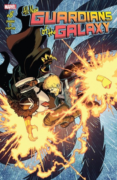
All-New Guardians of the Galaxy #8
Written by Gerry Duggan
Illustrated by Marcus To
Colored by Ive Svorcina
Lettered by VC’s Cory Petit
Reviewed by Kent Falkenberg
Gerry Duggan has quite the deft touch when it comes to blending severity with hilarity. His run on this title – still young, but definitely past that learning-to-walk phase – has proven to be one of the brightest lights in the Marvel’s cosmic reaches. For all the sci-fi shenanigans that are thrown into the mix, there’s always a sense of emotional weight and a feeling that the stakes have been legitimately earned within the context of the story.
“Guardians of the Galaxy” #8, might lean much closer to the lighter-side of Duggan’s wheelhouse, but there’s an authentic feeling of tension running throughout as Peter Quill races to track down an antidote for the poison that’s burning Rocket out from the inside. Sure, no one’s expecting this to actually be Rocket’s last flight. But the way Duggan crafts his story provides enough of an entertaining diversion along the way that that’s not really the point.
Especially when Marcus To illustrates the hell out things the whole while. The concern on Drax, Gamora, and Groot’s faces is palpable, and, therefore, helps manufacture some tension where there really shouldn’t be – we know that nobody will die, but the Guardians don’t. While To ensures Rocket writhes believably in weakened, pain-filled agony, Duggan makes sure he loses none of his trademark snark. “What a way to croak…” he moans. “Scratched by a poison bird man. So stupid. Tell everyone I was killed by a sentient venereal disease…”
There’s a sleekness to To’s line in “Guardians of the Galaxy” #8 that maintains a propulsive quality. Pages are packed full of detail, but those details never seem to overwhelm the forward progress of the storytelling panel-to-panel. And for as smooth as the artwork is delivered, it can still pack a punch – literally, there’s a fantastic four-panel sequence, stretching across a single page, that shows a nega-band assisted Quill haymaker to send a Raptor through a cargo hold, a wall, and, ultimately, a ship’s hull to be hurtled out into space. There’s also a playful dissonance between some of the more triumphant looking splash pages of Quill and Duggan’s script immediately following that moment, where triumph is undercut with the reality of Quill’s relative ineptness.
However, there seems to be one beat missing as that main fight closes out. It feels like there should be something else added to the sequence, because it’s not really clear how Quill gets the upper hand on his assailant.
Overall, though, “Guardians of the Galaxy” #8 is just a fun comic. Sure, there’s a storytelling hiccup that makes the conflict resolution a bit unclear. But since we’re never really fearful for Rocket’s life, it can be easily overlooked. What’s left is a slick, sleek looking adventure punctuated by a couple laughs and a couple bruises. Is there any more you need from a Guardians book?
Final Verdict: 7.5 – Worth it just for the shot of Rocket slung up in a baby carrier. “I only ask… Don’t let Quill see me like a baby.”

American Gods: Shadows #6
Written by Neil Gaiman and P. Craig Russell
Colored by Scott Hampton
Cover Illustrated by Glenn Fabry with Adam Brown
Lettered by Rick Parker
Reviewed By Kate Kosturski
The world of Shadow Moon, Mr. Wednesday, and the war of the gods continues in glorious dreamlike detail in “American Gods #6.” Following the carousel adventures from the previous book, Shadow finds himself in a surrealist dreamscape, meeting up with some of the older gods, including Odin. The first meeting of these old and new gods then takes place, and no one is sure how, when, where, or if they want to proceed with Mr. Wednesday’s plans for a war. As usual, Shadow finds himself in a rather large spot of trouble, and it takes his past to put him on the right step towards his future.
Continued belowScott Hampton captures the fantasy of Neil Gaiman beautifully, perhaps the best so far in this series. Shadow’s dream in the first third has colors that combine Impressionism and Surrealism into a single world – pastels of Monet with the odd shapes and fluid pen of Dali make for an equally wicked, divine, but yet radiant world. The oddly shaped panels – trapezoid, triangles, four-sided figures that may have a name but it’s been awhile since high school geometry, so I do not remember – add to the mystery and belief that nothing is at it seems. And when we meet Odin – who bears a very strong resemblance to Tormund from Game of Thrones – he takes over the page, as is expected by a god of his stature and power. Hampton continues to show his diverse artistry throughout the rest of this book – from Caravaggio-esque influences for the meeting of the old and new gods that are buried in shadows to a single-toned story from Mr. Nancy that has echoes of a 19th century aquatint.
As it has been a while since I read American Gods, I’m not sure if the comic plot aligns with the book (it definitely does not align with the TV adaptation), so I cannot comment on the accuracy of the source story. But I’m not in this to be impressed by the story – I’m sticking with it to see the Neil Gaiman world illustrated outside my imagination, and we’ve finally hit that stride with the sixth issue.
Final Verdict: 8.0 – Hampton has hit it out of the park with the art in this issue, and that convinced me to stick with the comic. Fans of the TV show may be a little disappointed to see that it is not a direct-tie in, but it is worth exploring to see another interpretation of the story.
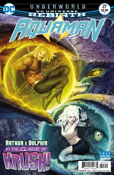
Aquaman #27
Written by Dan Abnett
Illustrated and Colored by Stjepan Šejić
Lettered by Steve Wands
Arthur Curry is still swimming with the weight of the world on his shoulders in “Aquaman” #27. The former sea King that lost his kingdom is trying to pick up the pieces and leave the slums of Atlantis in one piece. As usual, watching a more scrappy version of Aquaman holds an inherent appeal that invigorates this issue with a palpable sense of energy. As if that alone wasn’t interesting enough, Mera and the issue’s supporting cast are also trying to figure out how to get to Curry when the current regime will stop at nothing to keep the former royalty outside of the kingdom.
The incredible artwork of Stjepan Šejić has been elevating this title towards levels of quality that the book could have never dreamed of prior. His incredibly detailed work and expressive characters give the title a wonderful sense of life and majesty. There are lots of panels focused on more physical actions and cast members communicating through facial expressions. Lots of other titles could utilize these actions stronger to produce better and more consistent work in Big Two superhero titles. The bombastic facial expressions aren’t limited to just humans as some of the sinister ocean predators bubble up to the surface with ominous supernatural abilities.
Writer Dan Abnett has already has a strong chemistry with Šejić, as he carefully gives the artist a script best suited to his unique set of talents. The best thing about the light “Aquaman” reboot in issue #25 that brought this creative team together is how this book finally has clear stakes and focus. At this point, I don’t even think Arthur Curry has a game plan to try and usurp the new king. Mera is getting desperate to unseal Atlantis and this issue introduces a whole new side of the conflict that heats up the narrative. After this current storyline is resolved I really want to see Abnett go as far as he can in this new direction, keeping Curry paranoid and scared but not manufacturing drama for the sake of doing so.
The past couple issues of the series have also been giving readers some extra information on the supporting cast as well. Abnett finds a good amount of time to explore the politics of the current Atlantis regime while introducing a new ally to the former King. Side additions like the new characters introduced in the past couple of “Aquaman” issues is an exciting way for Abnett to expand the world and get closer to his vision of a “Game of Thrones”-esque narrative for the overall series.
Continued belowWith a renewed level of focus and dedication to the craft of comics, “Aquaman” #27 continues to succeed where other comics have failed. Abnett has continued to better flesh out the world of Atlantis and add more immediate stakes to the series. Šejić fills in the rest of the title, making each character expressive and vivid along the way. For a long time readers have been hearing asides about the aquatic landscape of of the DC Universe but this is one of the first times in the past couple of years that a writer has ever been able to strongly define what lies below.
Final Verdict: 8.0 – “Aquaman” #27 keeps up the momentum of the series’ soft reboot bringing some new ideas and cast members into the title.

Batwoman #6
Written by Marguerite Bennett and James Tynion IV
Illustrated by Renato Arlem
Colored by Adriano Lucas
Lettered by Deron Bennett
Reviewed by Nicholas Palmieri
The opening pages of “Batwoman” #6 promise an engaging read, one of consequence, stretching from the beginning of Kate Kane’s connection to the bat symbol up through a half-decade in the future. Unfortunately, the rest of the issue doesn’t do well by the premise.
Most of the issue is spent establishing the new status quo of this timeline five years in the future, and none of it is revolutionary. There’s a police state, warring factions of society, etc, etc. Kate’s role in it has some interesting story potential, as does the reappearance of her on-and-off girlfriend from past continuities, Renee Montoya. However, little is done to tell an actual story with these somewhat interesting plot elements. The moments with Renee ring most true to me, but even they are more concerned with exposition and random action.
Arlem’s art does a good job displaying the battle-hardened characters and the murky, militant world they now inhabit. He paces moments well, and his action panels are clear and dynamic enough to get the point across. Adriano Lucas does well with the coloring, letting Kate’s red costume stand out in a world almost exclusively consisting of yellows and blues.
But then there’s the biggest problem with the issue: it’s essentially acting as a zero issue for an upcoming storyline in “Detective Comics,” a completely different title. A zero issue, meaning a prelude which isn’t wholly necessary, and for another comic, which means the effects won’t even play out in this title That makes doubly insignificant. And we can tell, because of how little story we get. With so much exposition which will undoubtedly be repeated when that storyline comes along (which, again, will not happen in this title), the solid artwork and few decent character moments alone can’t make this glimpse into Kate’s future worthwhile.
Final Verdict: 5.5 – Primarily meant to hype an upcoming storyline in a different title, this issue is completely skippable unless you unconditionally love dark futures or the Kate/Renee pairing.

Catalyst Prime: Superb #2
Written by Sheena C. Howard and David F. Walker
Illustrated by Ray-Anthony Height
Colored by Veronica Gandini and Sotocolor
Lettered by AW’s Tom Napolitano
Reviewed by Forrest Sayrs
The Catalyst Prime Universe has almost hit full swing, with the last of four titles launching this month, but I’m still having a hard time pinning down what they’re going for. “Superb,” is doing a really job of feeling like the 90s X-Men TV show, but beyond that, it hasn’t really found its footing.
Part of the problem is moving kinda slow. We’re two issues in and the only thing that’s been really established is that kids with superpowers are being rounded up by a faceless corporation. Howard and Walker are actually doing a really good job of characterizing the villains, who seem to be motivated more by a legitimate desire to protect people. They’re dipping into some questionable totalitarian tactics to do so, but the urge to protect seems to legitimate.
The protagonists, on the other hand, aren’t as well established. There’s a ‘-punk’ feel to the action so far, motivated more by rebelling against authority than anything else, though that is changing by the end. Issue #2 works hard to raise the stakes of the series, but there’s still too much up in the air for it to be really successful.
Continued belowThe art is above average across the board, but Ray-Anthony Height still seems to be trying out different styles. Both Johnny and Kayla’s faces go through several iterations, and while Kayla is always recognizable, Johnny sometimes isn’t. On the other hand, the action sequences and scenes where facial details matter are pretty solid. Many of the enemy foot-soldiers are drawn with masks or full helmets, which helps.
My takeaway from this issue was that the series is still really nascent. It’s not a good issue, but that’s because there’s nothing really here yet to catch on to. A more experienced writer might have started us a little more in media res, and let the school scenes from #1 play out in a later issue, but there’s nothing fundamentally bad about “Superb” yet either. I’m definitely coming down on in ‘wait and see’ camp.
Final Verdict: 5.5 Too soon to say if this is going to be good or not.

Chilling Adventures of Sabrina #8
Written by Roberto Aguirre-Sacasa
Illustrated and Colored by Robert Hack
Lettered by Jack Morelli
Reviewed by Elias Rosner
If there is one thing that Roberto Aguirre-Sacasa has been incredibly successful at doing these last couple years, it’s been in turning the sit-com characters of the Archie-verse into something deeply and truly unsettling. Unlike last issue, though, there isn’t a lot of overt horror to be found in the artwork, though there are still plenty of gruesome images, especially with the Psychopomps and Sabrina’s aunts. No, most of the horror comes from the simple premise set up when Sabrina resurrected Harvey….Sabrina’s father’s soul is inside of Harvey. Sabrina doesn’t even know this thus making every action she takes in the name of love is rendered uncomfortable and worrying.
What makes it even more frightening to us is that this is a basic horror movie moment – the “Don’t open the door!” We have dramatic irony over everyone in the comic because we know who Harvey truly is which makes the actions Sabrina takes against her family and towards Harvey frustrating.
Sacasa’s narration only adds to the ick factor by giving us insight into “Harvey’s” thoughts. He’s cold and calculating but also kind of into the fact that his daughter is into the body he’s in. Uch. Just writing that made me want to take a long, cold shower. Hack really sells these scenes through his artwork, too. The date is very mundane but he keeps everything feeling off, like the one panel where we see Pops eavesdropping on the conversation. He also makes sure Harvey always has this look, like he’s trying just a bit too hard to emote in the way he “should” be which betrays the Edward Spellman underneath.
Even though Hack is able to do a lot with his faces, they still do tend to look a bit stiff and, especially in this issue, they warp, changing shape, most noticeably in the mid-shots. Sabrina’s cheeks sink in in one panel, making her look more like Edvard Munch’s The Scream while in other panels the heavily inked shadows make it seem like their eyes are missing, leaving only a hole. This can be very jarring and, while it certainly makes the scene feel more unnatural, it also feels kind of sloppy. This isn’t so much a problem in the second half of the issue but that’s probably because the creatures and Sabrina’s aunts don’t have to look uniform, they just have to look creepy as all hell.
Hopefully, the series can keep up a monthly-ish schedule so that we can find out what’s up with Madame Satan, what Edward is planning and just how much Sabrina is willing to sacrifice in order to save the man she loves…
Ick.
Final Verdict: 7.8. An issue that’ll make you squirm in discomfort but you’ll be unable to look away.
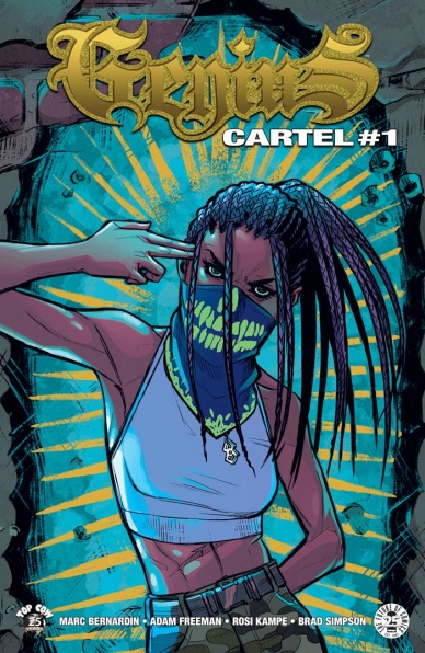
Genius: Cartel #1
Written by Marc Bernadin & Adam Freeman
Illustrated by Rosi Kampe
Colored by Brad Simpson
Lettered by Troy Peteri
Reviewed by Matt Lune
When “Genius” was first released in 2015, it was surrounded by the real life news stories of police brutality, racially motivated attacks, and Black Lives Matter protests. With that as a backdrop, “Genius” felt relevant, brave and unique. Now, with the political climate seemingly so much worse, and with the problems feeling even more ingrained in the very system sworn to protect the people, what message does “Genius: Cartel” try to convey?
Continued belowIt’s hard to pick up a sequel to a book that didn’t really feel like it needed a follow-up. “Genius” was a perfect mini-series that asked and answered its own questions, took the concept – young girl with a superb strategic military mind born on the oppressive and oppressed streets of South Central – and captured it in an extremely satisfying way. “Genius: Cartel” #1 follows on from Destiny’s war for the streets and places her under the command of the system she was previously fighting against. The government wants her mind, her skills, to work for them, but Destiny is obviously reluctant. This first issue has an uphill battle to prove that the protagonist’s story is far from over, and for the most part it succeeds; certainly, its unpredictability keeps you engaged throughout.
Artist Afua Richardson is missed here, her energy and exaggerated movement added a vibrancy that’s missed, but Rosi Kampe has a different story to tell, and her art is well-suited to the narrative. The opening pages that recap the previous series and the Siege of Los Angeles are really strong, with dynamic layouts, and here – as is the case throughout the issue – the facial expressions are subtle yet extremely effective. Later in the book, when Destiny is part of a team infiltrating a hostage situation, the action flows across the page in an exciting way, with just the right level of gore to convey the point without being distractingly graphic. Brad Simpson’s colors drench the panels in red when the blood spills, but also when Destiny’s mind is working overtime to take in the scene around her.
There’s a danger with “Genius: Cartel” #1 that Destiny sometimes comes across as childish, like a schoolgirl sulking in class rather than a prisoner of the government, being trained to work for them. The message that the series is going for isn’t immediately clear in this issue either, and as such it all feels less focused than the original series. It’s no coincidence, however, that this series is coming out now. The stronger narrative swing towards the white, war-driven government and Destiny’s place within it (and her abuse by it) feels like it’s building up to a message more relevant to our current climate. It’s a good start and takes the overall series in a direction that’s equally unpredictable and entirely inevitable. If “Genius” had to continue, this was the only way it could go, but where it’s going and how it gets there is yet to be told.
Final Verdict:7.7 – A solid start that takes this sequel in a vastly different direction to the original series.

Kill the Minotaur #3
Written by Chris Pasetto and Christian Cantamessa
Illustrated by Lukas Ketner
Colored by Jean-Francois Beaulieu
Lettered by Clem Robins
Reviewed by John Schadler
Early in “Kill the Minotaur” #3, King Minos says to his constant companion, Glaucus (ever the obedient soldier), “We must move forward, and slough away our mortal flaws as a snake sheds its skin. We are on the brink of a profound transformation, Glaucus. It may seem violent and painful, but in the end, it will be beautiful.”
Chris Pasetto and Christian Cantamessa’s script can be a bit confusing and even convoluted at times, but in the end, Lukas Ketner’s incredible artwork is indeed beautiful, and utterly captivating.
Visually, we can debate whether the Minotaur or the labyrinth itself is more uniquely and unexpectedly reimagined (both takes are incredibly fresh and vibrant), but Ketner is the real star. His character work is superb and the paneling always on point, but his creepy visual treatment of the living, breathing labyrinth and shape-shifting minotaur will make your skin crawl. Yes, there are some interesting threads and ideas in Pasetto and Cantamessa’s story, but Ketner’s illustrations elevate this book from a simple update of classic Greek mythology to something transcendent, artfully fusing multiple genres along the way.
I think some of the fusion/confusion actually starts with the title. The book is called “Kill the Minotaur,” but in truth, the labyrinth itself seems to be the real antagonist. And in issue #3, we absolutely see the fearsome external embodiment of its incredible power. Not only are the very walls roped with arteries, roots, and veins, after feeding on Theseus’ blood, one of the labyrinth’s bas-relief walls becomes a writhing, seething mass of human limbs and bodies, stained a sickening pale green by colorist Jean-Francois Beaulieu. It’s a brilliant full page image that serves as both a climactic moment and a harbinger of things to come. Princess Ariadne tells us that the labyrinth is dying. Obviously, it won’t go down without a fight.
Continued belowFinal Verdict 8.1 “Kill the Minotaur” is far from the sanitized, middle school Greek mythology you may expect. Pasetto, Cantamessa and Ketner’s bold reinterpretation fuses elements of sci-fi, fantasy, and horror to tell a truly original tale. And with a completely unexpected image on the last page, it’s a great time to surrender and lose yourself within.

Rat Queens #5
Written by Kurtis J. Wiebe
Illustrated and Colored by Owen Gieni
Lettered by Ryan Ferrier
Reviewed by Michael Mazzacane
The finale to the first arc of this soft rebooted of “Rat Queens” comes to an end, and it ends in very “Rat Queens” fashion: some legitimate character moments and cock and balls jokes. The typical qualities to issue 5 and ‘Cat Kings and Other Garys’ overall is likely the best possible outcome for the once popular series that has gone through a couple years of creative turmoil. Writer Kurtis J. Wiebe and new artist Owen Gieni needed to remind readers why they loved this series in the first place and largely succeed.
It’s nice to be reminded that for all the irreverent qualities in “Rat Queens” Wiebe doesn’t shy away from looking for the emotional scars these fierce adventurers carry. That he gets to wrap it in macguffery like the Mirror of Regrets is a nice exterior for actual character work. (Seriously who would make the mirror opposite of the Mirror of Erised?) While the moment of regret for each Queen isn’t always some dramatic affair, there is an emotional honesty to each of their sequences that would further inform new readers to the qualities of the Queens. Violet has to reenact leaving her home on less than stellar circumstances. Braga realizes mistakes she’s made in her love life. Betty really misses that meat pie.
These brief sequences let artist Owen Gieni flex and show some stylistic diversity. Their regrets are all rendered in a painterly water color aesthetic, there is no solidity to this world, it’s semi corporeal. Everything is not quite right, but too right at the same time. Gieni’s style gives Wiebe’s scenes legitimate nostalgia. Nostalgia is defined not by the act of going home but the emotional desire to return mixed with the pain of experience. That experience shows on Violet and Braga’s faces as well as the shades that haunt all of them. The Queens all desire their emotional home, they just can’t quite get to it.
And then things take a turn with penis humor and fish god wizardry. Like I said, standard “Rat Queens.” While I still can’t quite shake the feeling of this being eventually revealed to be some sort of extended dream sequence, that could just as easily be my own reader baggage.
Final Verdict: 7.0 – The “Rat Queens” feel like they’re back, maybe not the storytelling triumph of other late sequel franchise starters but if you were a fan and wanted more of the “Rat Queens” you remember this is pretty much it.


