There’s a lot to cover on Wednesdays. We should know, as collectively, we read an insane amount of comics. Even with a large review staff, it’s hard to get to everything. With that in mind, we’re back with Wrapping Wednesday, where we look at some of the books we missed in what was another great week of comics.
Let’s get this party started.

Hawkgirl #2
Written by Jadzia Axelrod
Illustrated by Amancay Nahuelpan
Colored by Adriano Lucas
Lettered by Hassan Ostmane-Elhaou
Reviewed by Quinn Tassin
“Hawkgirl” #2 is a little wordy. Of course, it’s not a problem to have a lot to say, but it’s not at all clear that this issue does. Where the story is reasonably straightforward, portions get so slowed down by needless clutter (those narration boxes are used about twice as much as necessary) that it can be frustrating. Dialogue, too, can be a bit overdone. Not all of this is bad by any means. Some of the narration really works and it can be nice to see so many little touches in comic book dialogue. These deficiencies are reflective of the prioritization of careful, character-based storytelling. But in the words of Kevin Malone: “Why use many words when few do trick.”
That one big critique is really the only thing holding “Hawkgirl” #2 from being . This comic is noteworthy for its focus on Kendra as a person living life, a rare event to say the least. It’s a treat to see see Kendra make friends, go out dancing, and get in touch with herself outside of the context of being Hawkgirl. Her dynamic with Galaxy, who’s much more well-balanced and fun, is really interesting and easy to engage with; it’s one that I hope we’ll see long past the end of this miniseries. The antagonist, Vulpecula, isn’t quite a great villain, but she’s serviceable and vitally, she connects to the story being told not only about Hawkgirl, but about Kendra. Kendra doesn’t feel like she can be a person outside of being a superhero and the villain of this series is here to crash dance parties to steal her Nth metal wings. Vulpecula isn’t a very compelling character in her own right, but as far as foils go, she’s a decent one. Add all of this up and you get a solid comic that has a strong balance of deep, character-based beats and bigger flashes of superhero action.
The best moment of the issue isn’t a big fight scene or even something that’s outwardly dramatic. It’s when Kendra starts dancing to Muna and finds that the crowd, and more importantly, the ghosts of her past selves (comics are crazy) fade away. It’s a grounded moment that anyone can relate to- one where the protagonist is overwhelmed and finds a way to just let go and have fun. It’s also visually striking. Kendra in über-casual wear is great (let female superheroes be ripped more often!), the ghosts fading is powerful, and the background going from being full of people, to just color, to pure white is incredibly effective. It sells the character moment perfectly while setting up the jarring nature impending action scene just as well.
The art is generally reflective of the quality of that dance scene. Colors are expressive and employed in thoughtful, often subtle ways. Galaxy is particularly well-illustrated and it’s just delightful seeing all of her various wardrobe-changes. The action is well-rendered, with a real sense of weight to every punch, throw, and fall. And better yet, there’s real care in the illustration of small, normal moments. There are all kinds of little details that add up to incredibly expressive body language which can be hard to pull of when a style isn’t exaggerated. But moments like Kendra being uncomfortable when she gets to the bar and the drunk men stumbling out of a bar at the beginning of the issue are sold beautifully.
Final Verdict: 7.9- Exciting but grounded in character.

Loki #3
Written by Dan Watters
Illustrated by German Peralta
Colored by Mike Spicer
Lettered by VC’s Travis Lanham
Reviewed by Alexander Jones
The God of Mischief is now The God of Stories. Loki’s latest comic book series has featured a fascinating premise depicting Loki’s struggle to recover his ship Naglfar. Author Dan Watters has continued to implement mythology from throughout The Ten Realms to make Loki’s latest title unforgettable. Watters echoes wonderful recent writers of the property like Al Ewing and Kieron Gillen in his thematic and dense approach to the mythology. Artist German Peralta adds the texture and detail to the page to make the issues feel just as climactic as the intense scripts. “Loki” #3 switches up the dynamic of the series by introducing Hulkling and Wiccan to the supporting cast, can the change in characters retain the high quality from part issues?
German Peralta lends tons of intrigue to the pages of “Loki” #3. Loki has a great expression in his debut page on the chapter. Peralta’s line has this great sense of texture that captures the complex and gritty emotion of Watters’ “Loki” well. Muck Mulligan’s hair style makes him look like an imposing character in certain moments. Peralta breaks up the panel borders and designs particularly well in the pages featuring the origin of Ko-Mir. On the first page of the series there are wonderful panel bleeds on the second panel. This panel with the bleed also serves as the background of the page. The amount of detail in the bookcases and architecture in The Palace of Emperor Hulkling made this location look intriguing. Peralta utilized a closeup of a character face in the second-to-last panel that managed to capture lots of dark emotion and really establish strong thematic elements.
“Loki” #3 has an epic opening sequence fleshing out the mythology of a Kree Warrior named Ko-Mir and the frozen planet Kava. It’s staggering to see how much detail Watters lends towards this plot thread throughout the “Loki” #3. During the length of time that Ko-Mir’s origin is explored, Watters finds a seamless way to tie the thread back to Loki’s search for the shards of Naglfar. The longer “Loki” #3 continues, the more tragedy that is placed on Ko-Mir. Ko-Mir has a rich history that “Loki” #3 goes to great lengths to explore in detail. Readers can see some expanded ties to the greater Marvel Universe in this issue aside from Hulkling and Wiccan that should intrigue eagle-eyed readers.
Final Verdict: 8.0 – “Loki” #3 utilizes Marvel’s vast mythology to craft an expansive narrative with wonderful art.

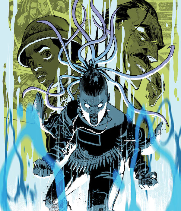
Sirens of the City #2
Written by Joanne Starer
Illustrated & Colored by Khary Randolph
Lettered by Andworld Design
Reviewed by Alexander Manzo
Joanne Starer comes in hot with the second issue with two objectives in mind, answering questions from the previous issue and giving details about the bigger picture. The first issue was uncertain what kind of series this would be, just a punk rock teenager trying to navigate young pregnancy. Still, Starer threw the fantasy element into the mix and changed it completely. There has been some clarity and confirmation that Mari, the protagonist, is a succubus, but slightly unknown to her about what exactly her powers can do and how to control them. There’s also some new information about her baby daddy Rome being an Incubus, the polar opposite of a succubus who can control women to his bidding. This latest bit of info automatically throws the Romeo and Juliet idea into the storyline, but with a twist, not only a half-breed baby but even in the womb, the child has power over the parents. It has successfully stopped Mari from terminating the pregnancy and seems to be feeding off Rome. Starer also creates this target on the protagonist’s back after both sides discover the pregnancy, partially because of Rome and partially because Mari is instantly too trusting, despite her rough upbringing. The ending was a good cliffhanger that reveals how she’ll escape from the leader of the succubi or if Rome’s incubi brothers will find her.
Whenever a creative gets control of both illustration and coloring, it feels like they’re in the director’s seat, dictating what the reader will see and feel. Khary Randolph has a great grasp of that ability with this story. Although the story has this dark, dreary, and almost too real heart, Randolph’s dynamic art style provides this upbeat vibe. The characters are depicted with slightly over-the-top emotional moments, but it’s not on a negative note; it helps give it this optimistic and curious feel. Randolph’s decision to have it depicted primarily in black and white help keep the punk rock vibes of the story that are emphasized during those small splashes of color when powers are being used. It’s not a rare occurrence in the book, but when they do happen, it locks the reader into what will follow. Such as when Layla and Mari confront each other and try to use their powers on each other, but it becomes an emotional breakdown for Layla. This fluidity with the artwork also fits the story’s fantasy elements.
Final Verdict: 8.5 – Solid follow-up that provides a lot of context for the previous issue and continues the set-up for the more significant arc.


