
There’s a lot to cover on Wednesdays. We should know, as collectively, we read an insane amount of comics. Even with a large review staff, it’s hard to get to everything. With that in mind, we’re back with Wrapping Wednesday, where we look at some of the books we missed in what was another great week of comics.
Let’s get this party started.

Elric: The Dreaming City #1
Written by Julien Blondel & Jean-Luc Cano
Adapted from the novels by Michael Moorcock
Illustrated by Julien Telo
Storyboarded by Julien Telo & Ronan Toulhoat
Colored by Stephane Paitreau
Translated and lettered by Jessica Burton
Reviewed by Elias Rosner
“Elric: The Dreaming City” is really a strange book. An adaptation of the very first Elric story, it comfortably sits at about the one-third mark of the official chronology, making it simultaneously the actual introduction to this classic sword-and-sorcery character and a pretty poor place to begin, seeing as there’s at least three volumes of story that precede it. It helps that Titan includes a recap page because it is necessary reading for anyone like me who wandered into it thinking this was the start. That said, the story is mostly self-contained, with minimal “lore knowledge” required to comprehend what’s going on, and readers familiar with the genre will fall into the rhythm of things pretty fast.
“Elric: The Dreaming City” #1 is an adventure to a lost city, complete with lost languages, strange curses, and tragic decisions that must be made for the party to survive. It’s truly a classic set-up that the team executes admirably. Telo’s artwork & Paitreau’s coloring are a perfect fit, able to capture the expansive wonder of an abandoned city, the claustrophobic dangers of the swampy jungle, and the big action and melodramatic reactions of the characters. It has all the hallmarks of a mythic tale, told like the “Conan” stories of old. I especially love how the layout of the word balloons – or word boxes in this case – provides a firm path through the page, working more like a snake than the usual typewriter mode of reading. It’s immersive and Burton’s lettering is to thank.
However, your mileage will vary with this story. Because the original work is 60 years old this past June, and this story is, from all accounts, a very faithful adaptation, there is little in the way of innovation to the fantasy formula as we know it today. That doesn’t detract from the enjoyment of the tale, as I found myself getting more and more into it as we went, nor from the well-done adaptation work, but it remains a very simple story that’s been done many times since. Unless you already have a buy-in to the work, be it a love of the genre or a knowledge of the character, I’d be hard pressed to recommend this story to newcomers such as myself.
Final Verdict: 7.6. – “Elric: The Dreaming City” #1 is an excellent adaptation of the 60 year old novelette, feeling appropriately grand and consequential, but lacks the novelty or simplicity to attract newcomers. Those who find themselves confused but enjoying the story should likely check out the preceding volumes before plunging further.

God of Tremors #1
Written By Peter Milligan
Illustrated By Piotr Kowalski
Colored By Brad Simpson
Lettered By Simon Bowland
Reviewed By Henry Finn
“God of Tremors” #1 is a 19th Century gothic horror story featuring exorcisms, demonic worship, and epilepsy that weaves together multiple themes pertaining to self-acceptance, religious fanaticism, and maternal love. Writer Peter Milligan does a wonderful job allowing the mystery of the Pagan God to unfold slowly as the story creeps forward, intercutting scenes of pain and suffering with a steady progression of violent imagery that creates a feverish nightmare page by page.
Milligan himself is an epileptic and this personal influence on the story makes its mark in the way that he render’s protagonist Aubrey’s internal struggle. He blames himself and allows his fanatical priest father to beat and flagellate him daily. However as these beatings get worse, Aubrey longs to escape his pain. But no matter how much he prays, his father’s God will not answer. He is hopeless until he comes across the Pagan God of tremors and this is when the central question is revealed. “God of Tremors” begs us to ask the question, when your own God forsakes you, whom can you turn to but the Gods that answer you? And if he does answer, does that make you good or bad?
Continued belowIllustrator Piotr Kowalski renders Milligan’s script with a special attention to the kind of details that immerse us into the period fully. He blocks out each page with thoughtful shots that move throughout the space with energy and clarity. While he is always changing the angle and distance between the reader and characters, we never lose place with where we are at. This is perfectly exemplified in the first 5 pages of the book as we are sped through an abridged telling of his backstory. We quickly learn about Aubrey’s relationship with his father, mother, classmates, and God and there are not two shots alike in the whole intro. Kowalski zooms around from wide to close-up angles, opting for whatever is the best angle to encapsulate the essence of each panel. His penciling work is intricate and delicately lined, favoring thick lines for the foreground and light for the background. This allows him to give each panel depth, but also achieves an effect that gives us the sense this book would be just as good visually in black and white.
Colorist Brad Simpson does add extra value to the book, as he is unafraid to alternate color palettes within pages. He is focused on the emotion of each moment as opposed to the technicalities. While most of the panels are realistic and somewhat flatly colored to give Kowalski’s linework the most effect, Simpson will enhance the nightmare by sliding in panels fully washed in red during key moments.
Final Verdict 8.0 “God of Tremors” #1 is a well-done period piece with a personal touch.

Killer Queens #1
Written by David M. Booher
Illustrated by Claudia Balboni
Colored by Harry Saxon
Lettered by Lucas Gattoni
Reviewed by Conor Spielberg
“Killer Queens” stars two very sexually promiscuous gay assassins in space trying to “go straight” (as in not kill people for money). The aesthetic is very retro futurism, particularly in the 50s diner where our story begins but also in the duo’s stolen space ship. The coloring by Harry Saxon is never anything less than bright and vibrant with the writing by David Booher often having a cavalier tongue in cheek sense of humour.
Despite the stakes often being life or death, this humour is never lost and bolstered by the lettering of Lucas Gattoni and panel layouts by Claudia Balboni emphasising a sense of rhythm often necessary to execute these comedic beats. The emotive dialogue by Booher is often expertly enhanced by Balboni’s expressive artwork and adds to the overall tone of the issue. There is little to no world building, with Alex and Max taking a more planet by planet approach and telling the reader only what is completely necessary at the given moment.
A very bold choice by Booher is having both characters tell each other information that they explicitly admit that the other knows in order to efficiently bring the reader up to speed. Surprisingly this brazen approach works well as it reinforces the idea that nothing should be taken too seriously and we should just sit back and enjoy the ride.
Final Verdict: 7.5 – Funny action packed space romp with a lot of potential
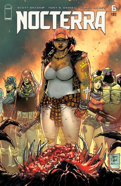
Nocterra #6
Written by Scott Snyder
Illustrated by Tony S. Daniel
Colored by Tomeu Morey
Lettered by Andworld Design
Reviewed by Alexander Manzo
“Nocterra” #6 is the final issue in Scott Snyder’s first arc and does its best to close up any loose ends within the story told to the reader while still leaving them with reason to come back. Right off the bat, it’s not going to make much sense to someone picking it up without reading anything prior because it starts right after the previous issue. However, if the reader has been reading, it’s an action-packed issue that feels like a season finale to a show. Snyder has been using narration throughout the story. This final issue feels like a direct conversation with the reader while also helping guide them to a satisfying ending. The protagonist, Val, makes her escape with her brother and a new friend by destroying the safe haven they were staying in and causing major carnage for everyone else. It felt like a bull in a china shop escape if the shop was run by a psychotic man willing to kill his family over an invitation to a more significant piece of paradise.
Continued belowSnyder leaves open the story for the next arc by letting the more dangerous and psychotic villain live. It now feels like a ravaged animal off its leash and on the hunt for Val and her convoy for the trouble they’ve caused him. Along with the clues of a new escape from the darkness, Snyder has plenty to work on within his next chapter of this dark world.
The antagonist’s motivations were typical of any lousy guy simply seeking power and money, so it was a nice treat when he got mauled by the brother he thought was dead. The kill scene by Tony S. Daniel was ruthless in the best ways. There was a build-up factor from the last panel on one page to the full splash on the next. Daniel creates this brief moment right before the attack happens with the claws of the “dead” brother that felt like a horror movie when the victim quickly realizes what’s about to happen. Then we get the monstrous blow with a full spread of blood flying around as the antagonist is ripped apart.
Tomeu Morey is put to the test with Daniel’s new faceless shades that resemble a mix of the creatures from A Quiet Place and the gorilla alien from John Carter. It has no details other than the claws that it uses to travel, but thanks to Morey’s glimpses of various greys on the outer parts, it gives these creatures a different level of fear. The reader can only see small outlines of a mouth at the very beginning to create these unknown monsters that tears through people like wrapping paper.
Final Verdict: 8.4 – An action-packed finale that leaves the reader wanting more.

X-Men: The Trial of Magneto #1
Written by Leah Williams
Illustrated by Lucas Werneck
Colored by Edgar Delgado
Lettered by Clayton Cowles
Reviewed by Gregory Ellner
“X-Men: The Trial of Magneto” #1 seems to be close to an entry point for readers to the current arc of the overall X-Men comics, but finds itself on an odd position. While the story takes place after the ‘Hellfire Gala’ arc of the X-Men books, Leah Williams does not require much, if any, prior information for the audience outside of the basics of what has been happening around the X-Men comics and Krakoa in the past few years. However, there is some background that goes unexplained fir newcomers, such as the existence of Krakoa and how it and its people both interact with the rest of Earth. On the other hand, overabundance of repeated exposition might be unwelcome, so the way of just diving into the crime scene investigation may be for the best.
Leah Williams writes the various characters to their best ability, using intriguing methods to mix their skills to try and solve the mystery of the murder at hand. Meanwhile, the conflicts around the prime suspect are wrought with tension, even as he appears more and more guilty while making mistakes and possibly beginning to fracture the Quiet Council.
Lucas Werneck’s artwork is at once meticulous and expressive, showing the intensity of emotion as much as the clinical nature of the murder investigation. Of particular note is Quicksilver and Magneto, both of whom are exceptionally stressed by the events. The latter has his helmet on, but his physical motions show his anger well, be it from a distance as he attacks others with his powers, or close up as he uses words instead. The former, on the other hand, has no helmet, and so his horrified and grieving articulations are on full display, in deliberate contrast to the intentional detachment of Charles Xavier or some other Quiet Council members.
The colors provided by Edgar Delgado are certainly varied, but lean on the darker side, fitting for the dour mood of the piece. They are never overly dark, relying on the lighting and bright outfits of the superhumans, but Delgado nonetheless does draw attention to deeper shadows, especially where Magneto is involved. In terms of the crime scene itself, the colors seem more muted, as if seen through a filter, a superpower-based version of camera footage in a crime drama that adds to the investigative feel of the entire issue.
Final Verdict: 7.0– While this story may be difficult to comprehend for those not up to date on X-Men comics, it still proves to be an interesting investigation.


