
There is a lot to cover on Wednesdays. We should know, as collectively, we read an insane amount of comics. Even with a large review staff, it’s hard to get to everything. With that in mind, we’re back with Wrapping Wednesday, where we look at some of the books we missed in what was another great week of comics.
Let’s get this party started.

Written by Bryan Hill
Illustrated/Colored by Jeff Spokes
Lettered by Troy Peteri
Reviewed by Christa Harader
Building on the momentum of Aphrodite IX, Aphrodite V is a standalone story that aims to hit cool cyberpunk high notes way too fast.
Issue #2 slows the narrative fire hydrant a little, but the plot still feels like a checklist of cool cyberpunk tropes. I’m intrigued by the good AI vs. bad AI theme, but the concept struggles with over-writing. Exhibit A: within two issues, Martin mentions his father putting “a pistol in his mouth” three times. The phrase lands on the side of melodrama the first time, and while the repetition might be intended to speak to Martin’s deeper character – is he obsessed? Traumatized? – it’s unsubtle and unnecessary.
The layouts are claustrophobic without a sense of intentional placement. We’re bombarded by close-ups, moody profile shots and fragmented anatomy that might be meant to clarify Aphrodite V’s precision combat style. As for the art, while I appreciate high contrast inks and moody colors, everything is too dark to follow and almost unreadable in high-action scenes. Black gutters suit the style of the piece but make it difficult to see where panels begin and end, especially when they overlap on the page. I keep wanting a few more colors for clarity, though the red/orange/green palette does strike a particular tone.
I have similar issues with the lettering, as it sacrifices some readability for style. There’s too much narration to justify the flat, broad typeface, and the brushstroke style is very hard on the eyes after a few pages – especially in the colored balloons. There are some minor placement choices that don’t feel natural as well.
Aphrodite V #2 just has too much going on, and the story’s not dialed in enough to make it stand out from the herd. Give this book a shot, but be prepared for an onslaught that feels less like choreographed cyberpunk future overload and more like an unfortunate jumble of over-scripted story fragments.
Final Verdict: 6.0 – what’s cool in concept falls flat in execution, and the book’s too eager to draw from a sci-fi smorgasbord to find its footing.

Written by Mike Carey
Illustrated by Kenan Yarar
Colored by Mohan
Lettered by Crank!
Reviewed by Reed Hinckley-Barnes
“Barbarella” #9 does a good job capturing the kind sense of flying by the seat of your pants that so many old science fiction serials had. Part of this makes this issue, and any issue of the series, a lot of fun. There are a ton of new concepts thrown into the mix with just barely enough space to explain them all, and there’s enough action to keep you from thinking too hard about any of those concepts. This, however, is also one of the problems with this issue, and this series as a whole. Nothing ever feels especially important. And it seems like Barbarella just has to keep moving the plot forward, and as long as that happens, everything will just sort of work out.
The art by Kenan Yarar is always interesting, especially the way he renders aliens. This issue has a couple of creatures that live on the surface of a star, and the strange amoeba-rhino-people he creates are a lot of fun. There are, however, some issue with the faces of the non-alien characters. Some places where the anatomy of the faces just seems a bit off. Overall, “Barbarella” #9 is a fun, old-school sci-fi story, even if there isn’t a ton of substance.
Final Verdict: 6.0 – “Barbarella” #9 is a fun science fiction story that is somewhat lacking in depth.
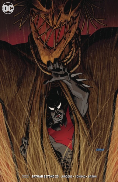
Written by Dan Jurgens
Continued below
Penciled by Will Conrad
Colored by David Baron
Lettered by Travis Lanham
Reviewed by Eric Goebelbecker
‘Target: Batman’ Part 4 continues with non-stop action. Thanks to a new Scarecrow, the entire city sees Batman as a monster. Terry spends most of this issue on the run, trying to save the town while protecting himself at the same time.
There’s almost no internal dialogue in this story, which helps speed the pace. Like the last 20 minutes of a film, things remain in motion; they’ll be time for introspection later. Pacing was something that made the 90s Batman cartoons special. Jurgens continues that tradition.
Conrad uses two splash pages to show us the scale of an early confrontation in the center of Gotham City. The first is a tight shot of the Scarecrow egging the mob on. The next page pulls back to show us the size of the crowd and the seriousness of Batman’s predicament. We see a similar scene on-screen in the cave from a camera on Robin’s belt. The shot’s framing and perspective elevate the tension.
Borderless panels draw our focus to the action in the story. Conrad uses one to anchor the destruction of a plane while Gordon and Wayne watch. With another, reaction shots to the Scarecrow’s fear signal frame Melanie discovering a mob outside her apartment.
Baron’s colors complement Conrad’s storytelling. Mobs are lit with the yellow fires of their torches. The Scarecrow’s tunic has a creepy green hue, and the room from where she spreads her fear has an olive tint that matches it. A little girl’s white dress draws attention to her during the riot, foreshadowing a near-disaster.
Final Verdict: 8.0 – “Batman Beyond” #23’s blistering pace and eye-catching art combine to create an exceptional story.

Written by Ta-Nehisi Coates
Art by Daniel Acuna
Lettering by VC’s Joe Sabino
Reviewed by Jim St.Pierre
“Black Panther” #3 has all the right elements for a compelling superhero comic: rising tension, dramatic action, dynamic layouts and great art. Writer Ta-Nehisi Coates fluidly works in grander plot possibilities without sacrificing the fast-paced formula that marks the first two comics in this series.
In this installment of the new MARVEL series about an intergalactic Wakandan empire, a former slave named T’Challa defends the Maroons against a surprise attack by the Empire. His history is unknown because the Empire wipes the memories of its slaves. Nevertheless, possibilities about his past keep the story moving and become a bigger focus in this issue. We also meet a new villain who threatens to destroy the Maroons.
Acuna’s artistic style is reminiscent of John Byrne, though lacking some of his sharpness because the panels are wrapped in shadow, playing the physical darkness of space against the metaphorical inner-darkness of the Intergalactic Wakandan Empire. From this darkness, Acuna erupts with sudden bursts of primary colors that make the panels explode off the page. Coupled with the art are dynamic layouts that energize the story.
Final Verdict: 7.5 – “Black Panther” #3 is a solid superhero book. There isn’t much here that is new, but it holds true to a successful formula.

Written by Bryan Hill
Illustrated by Miguel Mendonca
Inked by Diana Egea
Colored by Adriano Lucas
Lettered by Sal Cipriano
Reviewed by Michael Mazzacane
“Detective Comics” #987, the finale to ‘On the Outside,’ accomplishes what it set out to do: set up a new addition of the Outsiders and tell a Batman story. The emotional core to that Batman story may be a bit unoriginal, but Hill and artists Miguel Mendonca and Diana Egea execute it well and it gave the arc enough reason for being beside the larger meta machinations in the DCU.
With a book that features so many characters, the fact the creative team didn’t turn this into a big threat to Gotham City is a welcome change of pace. Instead, it’s a relatively simple kidnapping scenario that again strikes at the supposed vulnerabilities of Bruce Wayne/Batman. There’s a bit of a static quality to Mendonca and Egea’s art, which is put to good use in a series of pages as the not yet Outsiders takedown Karma’s henchmen. The macro design choices may take away a bit of fluidity, but Mendonca and Egea land their hits with strong thuds. These choices help sell Batman’s rope-a-dope strategy as he takes on Karama.
Continued belowThe art team makes good use of the single page spread representing mental inmates Batman lets out of his cell, echoing a page from Stuart Immomen’s run on “All-New X-Men.” Colorist Adriano Lucas gets to show some subtlety his color palette hasn’t this issue as he subtly envelopes the page in reddish pink. The page maybe playing the traumatic hits, but mixed in are more than scenes of loss that help show Batman as a character that is more than the cumulative sum of his various losses over the years.
‘On the Outside’ succeeded at what it was meant to do. Is it some spectacular opus on the nature of Batman or DC at large? No, but not everything has or should be, sometimes being an entertaining and well-done story is good enough. I and other readers will now anxiously await Bryan Hill and Dexter Soy’s team up on “Batman and the Outsiders” come December.
Final Verdict: 7.5 – A not so subtle backdoor pilot for a new season does it’s job well.

Written by Robert Kirkman and Scott Gimple
Illustrated by Chris Burnham
Colored by Nathan Fairbairn
Lettered by Rus Wooton
Edited by Arielle Basich and Sean Mackiewicz
Reviewed by Dexter Buschetelli
“Die! Die! Die!” is good, dumb fun. Like watching The Expendables (the first one, don’t @ me about the rest) for more reasons than one. It is bloody, it is explosive, and it is sexy; but it isn’t perfect, nor is it great.
It feels weird to say this about a Kirkman book after 182 issues of “The Walking Dead” and a finished run on “Invincible”, but the dialogue here feels very stilted. It’s saved by ridiculous lines like “we will do sex things together”, but others like the monologue about red blood cells are hackneyed and drag the experience down. The book excels in its over-the-top moments but slogs through the more quiet spots.
What is perfect here–or at least perfectly fitting–is the art. Chris Burnham and Nathan Fairbairn play with composition and color like a juggler with chainsaws. The panels are visually exciting and lead the reader’s eyes from corner to corner and page to page. Blood oozes, explosions are fiery, and facial expressions feel believable.
That art carries an excitement of plot that truly does work despite dialogue that fails. Dirty politics and double crosses drive a big story centered around triplets trained as assassins. What may sound like nonsense in concept is developed well in the short span of two issues so far. By the end of this installment, you know everything you need to without feeling like you’ve been beaten over the head with exposition.
This isn’t exactly “turn-off-your-brain” escapism, but it doesn’t demand much of the reader beyond a desire to enjoy some carnage. It’s the best story to come out of your crazy uncle’s conspiracy theories about Hillary Clinton commanding trained killers, and it is a blast. It’s no masterpiece, and it knows that and revels in it. A veritable “surgical explosion” of intensity that doesn’t take itself too seriously, or seriously at all. This book is not a must for everyone’s pull list, but for many, it will be an enjoyable popcorn experience.
Final Verdict: 7.6 – Crank up some Clutch while you enjoy this mindless insanity

Written by Tim Seeley
Illustrated by Mike Norton
Colored by Allen Passalaqua
Lettered by Crank!
Reviewed by Elias Rosner
Reading “Grave Danger” #2 reminds me that there are two ways to do technobabble. One is by making it easily accessible and explained so that when it returns, the explanation is no longer needed and the other is by throwing out a million words that, in the grand scheme of things, are just there to provide verisimilitude and, therefore, are meaningless in their own right. “Grave Danger” #2 seems to lean more heavily on the second. For much of the issue, my brain was processing what was on the page and the term “post-spoliation expurgation.” I think that speaks volumes to the type of story Seeley and Norton wants to present to us.
Continued belowWe’ve been thrust into the world of Headstone and we aren’t given much time to gather our bearings. So much is thrown at us that keeping it all straight is difficult. I found myself more than once stopping to ask, “Did I miss something? Was this in issue 1?” to which the answer was 50% yes and 50% no. There is a lot to love about “Grave Danger,” from the idea of a clandestine spy agency that fights supernatural beings based out of a flying weeping angel statue to the graveyard-themed everything. It reminds me of the best, most insane parts of early “Hellsing.”
Norton’s art is fantastic as ever, balancing action set pieces with subtle emotional moments. One panel I absolutely love it when the Worms is kissed on the forehead by the bloody mouth of the Wolf. Norton makes it tender and loving while Passalaqua’s coloring makes the moment more sinister. Despite this, “Grave Danger” still hasn’t found enough of a cohesive focus for me to care about any of this.
Part of that problem may stem from it being a five issue mini-series instead of an ongoing where they could spend the time doing one or two-parters that help establish the agency, the characters, and the larger stakes. As it stands, “Grave Danger” #2 is a comic with great ideas but not enough of a focus to really sell me on it. This is the kind of arc that works best later in a series, not right from the get-go.
Final Verdict: 6.7 – Norton’s art is in top form but the world, while fully-formed in the minds of the creators, isn’t conveyed well enough to make the story feel substantial enough. The ideas, however, are wonderfully out there.
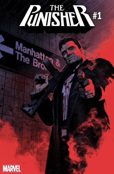
Written by Matt Rosenberg
Illustrated by Szymon Kudranski
Colored by Antonio Fabela
Lettered by VC’s Cory Petit
Reviewed by Gustavo S. Lodi
The Punisher is not an obvious character to get right. Stick too close to his usual tropes and readers will cry “same old story,” lean towards the experimental and the same audience will cast it aside. This is what makes this new beginning so inspired: it takes the best of Frank’s core aspects and mixes it with a different mission statement.
Before discussing the script, one must never forget that a “Punisher” series has to revel in violence, often graphically. These are the stories of a dark man with a dark trauma, so the world around him must show it. And does it show with the art of Kudranski and Fabela.
Kudranski has a semi-realistic style to his drawings that works wonders in a book like “Punisher.” Characters look real, facial expressions are very detailed and then… the most absurd, over the top action pieces emerge and those same realistic characters explode. It is mesmerizing to look at some of the pages detailing car chases and gun-fight. The artist also shows some inspired choices in angle shots, especially towards the half of the issue where Frank’s mayhem can be seen reflected from the visor of a motorcycle’s helmet.
Fabela’s colors blend the darkness and the explosive very well. “Punisher” is heavy on predominant blacks, almost as if the action bleeds in through that shadow into existence. It makes it even more rewarding when the light comes in… just to be revealed to be the smoking barrels of Frank’s guns.
Back to the story, Rosenberg has crafted: there is little direct reference to the recent ‘War Machine Punisher,’ but there is enough gravitas to explain that Frank is after bigger foes, especially as he executes his Hydra vendetta. This is the same driven Punisher, but on a broader scale and without losing sight that there is some personal enjoyment as he delivers his punishment… on some of Marvel’s truly big game. And with an art style that fits that canvas so perfectly, readers are in for a ride.
Final Verdict: 8.0 – Quickly establishing its new mission statement and voice, Rosenger, Kudranski, and Fabela make this one of the best “Punisher” issues in recent history.

Written, Illustrated, and Colored by Jeff Lemire
Continued below
Lettered by Steve Wands
Reviewed By Kate Kosturski
Warning: this review contains spoilers for events in the entire “Royal City” series
And just like that, Jeff Lemire’s deeply personal saga of the Pike family ends just as it began – – quietly, with deep reflection, and on its own terms. Each living member of the Pike family comes to their own “aha” moment about their lives, getting themselves out of the neutral they had been spinning in since this story began: Patrick ditches his book contract, one that was signed based on a lie (his books had not been his own work but that of the late Tommy Pike’s diaries), to write his own stories. His wife Greta makes plans to finish her film and return to Royal City with her husband to work on their marriage. Peter Pike moves his radios into the house, a small but simple gesture allowing his family to share in his passion. Tara takes in Olive, Tommy’s daughter sired on the last night of his life, Steve attends his first AA meeting, and Mrs. Pike says a final prayer to her lost son, while resolving to come to church not every day anymore, but now and then as there are people on earth that need her more. As various members of the family watch the factory that gave Royal City its life take to the wrecking ball, the various incarnations of Tommy that watched over the family members slowly retreat back to the water that claimed his life, satisfied that everyone has found peace.
The beauty of “Royal City” is in its slice-of-life moments, small, quiet times that provide just enough narrative to tug at your heartstrings and lead to personal introspection, and this final issue is no exception. The lessons each Pike family member learns – – from the joy in the complications and uncertainty of life to the ability to let go to the realization that your past should not define you – – are truths relevant no matter the time or the place. And yet, while there is that closure and a sense of both peace and forward momentum, the door is open just a crack for a few new stories, such as life in this town with the factory that defined it gone, or Olive and Tara’s new relationship. The art and color palette remains soft, the sketchbook and watercolor style that lends itself best to memories, providing another layer of meditation for the reader, even in louder moments such as the factory’s destruction. If there was ever a way to illustrate the word “closure” this would be it.
Pour one out for the Pikes, and raise a glass to Tommy, who in death taught more to his family – – and to us – – than in life. And pour one out for Jeff Lemire, for introducing us to their story. We’re all changed people as a result.
Final Verdict: 8.7 – Closure at its finest, but I do hope we’ll see the Pikes again someday, as there are plenty more stories to tell, I am sure.

Written by Cullen Bunn
Illustrated by Paul Pelletier
Colored by Jason Wright
Lettered by Pat Brosseau
Reviewed by Chris Egan
When the extremely violent and psychotic criminal Cadence Laramie escapes from the Belle Reve medical facility while Task Force X is busy in Atlantis, Amanda Waller must call on a group of D-list characters to form a new ‘Suicide Squad.’ Malcolm Merlyn, Ragdoll, Shimmer, Scream Queen, Tao Jones, Skorpio and Baby Boom are given the opportunity to shorten their sentences by finding the whereabouts of Laramie and returning her safely to A.R.G.U.S. Obviously, not all will go as planned.
“Suicide Squad” is a book that works very well when it delves into not only extreme sci-fi but the supernatural as well. The crazier the missions, the more fun the stories can be. Writer Cullen Bunn is on point with this special Annual issue. He starts the book off right away with a bloody and disconcerting surgery scene that would make Sam Raimi or Stuart Gordon happy. If you know Bunn’s writing, you know he loves monsters. Between half the new team being inhuman, green, surgically altered apparitions, Swamp Thing, and Laramie herself being a special kind of monster; there is an abundance of them in this issue and all are used perfectly to move the story forward.
Continued belowWe know the squad just about as well as we need to, readers new-to and well-versed in “Swamp Thing” will enjoy his part in this. He plays a key role that sets up possible future appearances. A brutal issue throughout, this is the kind of “Suicide Squad” story fans look for. The art team of Pelletier and Wright make a good looking book that is the standard for DC comics for the last 15-20 years. It truly looks great but is not going to challenge the norm. While “Suicide Squad” as a whole may be hit or miss, the Annual issues usually bring a great weight with them. Creative storytelling, real drama, and actual team member deaths and this issue is no different from that. One of the best Squad stories of the year, the action and horror blended together so perfectly it was impossible to look away; a perfectly balanced page-turner.
Final Verdict: 8.0 – A creepy, exciting, and wildly enjoyable Squad book that hits all the right beats and is easy to follow whether or not you read the series.

Written by Joshua Williamson
Illustrated by Christian Duce
Colored by Luis Guerrero
Lettered by Steve Wands
Reviewed by Gregory Ellner
Who is Commander Cold? First appearing in the pre-Flashpoint timeline, he hasn’t really been expanded upon in terms of his history beyond being “time cop who uses Captain Cold technology.” As such, Joshua Williamson is given a wide berth with which to provide an actual story behind this mysterious ally of Team Flash with his most common allies out of his life for one reason or another. With the skillful use of flashbacks (pardon the pun), Williamson gives ample reason for Cold’s hatred of super criminals and willingness to use any means necessary to achieve his goals.
At the same time, Williamson also uses this issue to provide some information about the relatively new “Strength Force” and how it operates, as well as to give some clues as to how the series will move forward with the new Forces. In all, the writing is fast-paced and interesting, both in terms of the science of “The Flash” and the development of relatively underdeveloped characters.
Christian Duce’s artwork is as dynamic as ever, with intricate, deep lines to an almost cartoonish degree around the Strength Force, slim, blurred ones around the Speed Force, and utilization of highly detailed expressions for faces when viewed up close. This kind of variety is essential for the Flash’s weird science basis and works perfectly.
The colors provided by Luis Guerrero are varied in both shade and hue, from darker ones inside Iron Heights to lighter ones out in broad daylight. The distinction helps to showcase the darker tendencies of Warden Wolfe, alongside a general show of the bright, at times ridiculous nature of super crime in Central City, especially when it involves the Rogues.
Together, this creative team seems to be doing a very good job with this arc, leaving a lot of excitement in the air for how the Strength and Sage Forces can develop and Commander Cold’s place in the Flash supporting cast can be further established.
Final Verdict: 7.5- An interesting story that leaves fans wanting more out of both Commander Cold and the Strength Force.

Written by Tom Taylor
Illustrated by Carmen Carnero
Colored by Rain Beredo
Lettered by VC’s Cory Petit
Reviewed by Alexander Jones
From the debut issue of the series, “X-Men Red” has kept up a fluid, fast pace. Author Tom Taylor has applied an innovative direction for the series, mapping out an expansive first storyline. The X-Men have been battling against Cassandra Nova since the debut of the series which could potentially span 12-issues. Taylor has imbued the story with an extreme focus allowing an issue only advancing the plot of the story marginally like “X-Men Red” #7 to still be entertaining.
The entire issue is framed around an action scene moving the plot of the story at a rapid clip. The title gracefully transitions from an intriguing plane sequence to an underwater battle between two strong characters. Getting to these sequences organically and making sure each cast member of the book gets their time in the spotlight can be difficult, but Taylor devotes just enough time and personality to each hero.
Continued belowCarmen Carnero’s artwork is a major aspect of why this title works. Carnero’s precise linework and strong technical ability allow for her to beautifully depict the different action sequences in the issue. The colors in the issue can be muted in certain sequences which can be slightly disheartening given the attention to detail the comic has in other aspects. The plane sequence is another marvel of the issue which splits between different modes of gravity and keeps the pace of the narrative. When the plane starts to land and the gravity shifts back down, I was able to actually follow the movement and buy into the illusion of motion. This is one of the very best sequences in the comic to date and I hope Taylor and Carnero will be able to craft similar moments going forward.
There is a litany of fantastic story beats woven throughout “X-Men Red” #7 which is why the long speech Jean gives towards the ends is a little strange. The aspects behind the tale are more politically-oriented but speaking directly to politicians is too on-the-nose. Despite the long-winded speech from Jean, the issue’s final beat is fantastic. Taylor and Carnero deliver another solid entry of “X-Men Red” this week.
Final Verdict: 8.3 – While “X-Men Red” #7 only advances the plot slightly, the issue’s unrelenting pace and action sequences are sublime.


