
There is a lot to cover on Wednesdays. We should know, as collectively, we read an insane amount of comics. Even with a large review staff, it’s hard to get to everything. With that in mind, we’re back with Wrapping Wednesday, where we look at some of the books we missed in what was another great week of comics.
Let’s get this party started.

Black Hammer #12
Written by Jeff Lemire
Illustrated, Colored, and Lettered by David Rubin
Reviewed by Elias Rosner
I know we say this a lot when it comes to “Black Hammer” but if you have even a cursory interest in superhero comics, you need to be reading this series. Each month brings in a new interesting story and deepens our understanding of the characters and this world.
I’m tempted to make comparisons to “Astro City,” as this is another indie superhero universe that is both a homage and a deconstruction of the genre. But “Astro City” is the ideal superhero universe, as seen from the streets, where the city is the main character. “Black Hammer,” on the other hand, is a superhero universe that has been beaten down, fallible, vulnerable and human in all the most tragic ways, and this issue captures that feeling so well.
David Rubin opens the issue on a former hero, giving a somber speech against the backdrop of a city in ruins. He uses a mid-shot to capture the nervousness that Doctor Star feels before focusing in on his face when the speech becomes less flippant. In the next two-page spread, we see the city in full, burning, crumbling, bathed in muted greens, yellows and reds. By doing this, we not only get the sense of the scale of the aftermath of the fights we’ve seen in previous issues but also a sense of how the people on the ground saw the loss of the heroes.
Throughout the issue, Lemire builds the world and Rubin fleshes it out with his detailed and textured backgrounds. We learn more about Lucy and Doctor Star as well as Black Hammer, getting motivations for their actions. We know now more why Lucy worships her father and what helped shape the actions that caused her to appear in the town with the other missing heroes. By having issues like these, we also get to see more of the world and sharpen the focus of the series onto an ever increasing cast of characters, with their own stories and mysteries. It makes this really feels like a universe that’s worth investing your time into.
Final Verdict: 8.8. Another fantastic backstory issue that shows builds the world, literally.

Written by Marguerite Bennett
Illustrated and Colored by Marguerite Sauvage
Lettered by Wes Abbott
Reviewed by Michael Mazzacane
Marguerite Bennett and Marguerite Sauvage are back with the continuing adventures of the Bombshells in “Bombshells: United,” a new ongoing digital first series that acts as a sequel to the previous “Bombshells” series and a new jumping on point. The idea of relaunches to long running series creating easy jumping on points is something of a thoughtless mantra in Big Two publishing, but the first chapter of “United” is a good on boarding experience.
Donna Troy’s narration lays out the basic history of the previous series, but more importantly when mixed with Sauvage’s art explains the mythic/magical realism the titular Bombshells and series operates with. It’s different wars but Savage’s art clearly quotes the Trench Sequence from Wonder Woman in introducing Dianna. In a couple of opening pages, “United” makes the case for what a series is than most first issues. Sauvage’s pastel colors give everything a lighthearted look and contrast nicely with the more mythic, darker pallet of the opening pages. With a different art style, the inherent fun of the series would be severely mitigated.
At its core “Bombshells” was already a delightfully queer alt-history series, just one that traded in action adventure and DCU aesthetics. “United” is still that, except now Bennett turns headlong into its status as a work of alternative history, with the first arc dealing with President Franklin D. Roosevelt’s Executive Order 9066 and the internment of Japanese Americans. Bennett’s going to comment on, and as Donna Troy proclaims, rewrite history with “United.” All of that sounds ‘S’ serious—it is—but that doesn’t stop the series from being playful. If you’re going to be rewriting history why not have a little fun with it? Some of the imaginary period specific punnery didn’t always land, but is consistent with the overall tonality of the series.
Continued belowThese DC digital first series have provided a rare outlet for experimentation for the publisher. Reading in landscape mode is certainly different, but there are some layout choices that make it feel handicapped by the eventual print editions. There’s a fair amount of open space in several pages that are segmented by vertical paneling which feels at odds with the full-screen effect associated with landscape position. There is also several “pages” leading up to a splash that are just sections of the eventual splash. These segments are not an effective crescendo compared to the overall impact of the splash. With touch interfaces just giving the reader the splash page would seem the most efficient storytelling choice.
Final Verdict: 7.75 – Bombshells sets itself up for a new and more impressive tour of duty.
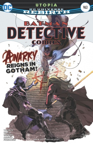
Detective Comics #963
Plotted by James Tynion IV and Christopher Sebela
Written by Christopher Sebela
Illustrated by Carmen Carnero
Colored by Ulises Arredla and Kelly Fitzpatrick
Lettered by Sal Cipriano
Reviewed by Jake Hill
Do you remember that uprising of Stephanie Brown super-fans who wanted to see her back in the Batman titles? That was me. It’s been thrilling to see her in the pages of Detective Comics, finding her place in Gotham City. So a new arc teaming Spoiler up with Anarky? Consider me first in line to read it.
As it happens, Detective Comics #963 is pretty O.K. It’s a bit confusingly credited, but the team of creators has proven in the past that they can craft a Bat-book. The story is credited to series-regular writer James Tynion IV, along with Christopher Sebela, who wrote the script. Carmen Carnero is on pencils and inks, and this is a vibrant Gotham City of adventure. Despite a swiftly paced script and engaging art, the issue feels like a bit less than the sum of its parts.
As a self-professed Stephanie fan, I like the version of the character who is independent, flawed, quippy and full of hope- and we get that version here! But by the end of the issue, nothing she really said or did stuck with me. We follow Stephanie as she meets secretly alongside Anarky, who is attempting to seduce her into joining his seemingly righteous crusade.
Anarky comes across a bit more memorable than anyone else. The creators decide to give the character a timely and political spin, and he’s cast here as an anti-villain, an activist that a lot of readers could probably see themselves getting behind. That’s pretty cool. One of the best features of this run of Detective Comics has been the streamlined re-imagining of some of the shakier members of the extended Bat-mythos (like Lady Shiva or Azrael). Despite my delight at putting Steph at the forefront, this story feels less gripping, less urgent, than what came before.
Maybe that’s because some of Steph’s agency has been sacrificed in order to connect her to Tim Drake, who’s presumed death casts a big shadow over the story. Readers will know that Tim is, in fact, alive, and captured by Doctor Oz, with big things in store for him. As such, a lot of the punch is taken out of the story. It feels like stalling before Tim’s return. There are no big surprises in the issue, and unless something drastic happens fast, it will continue to feel like a holding pattern.
If I haven’t said much about the art, that’s because it’s extremely effective. Like a good rock drummer, it totally supports the rest of the band without calling too much attention to itself. Colors (like Stephanie’s purple and Anarky’s red) are vibrant, but not garish. Anarky’s weirdo mask is drawn with a consistent frown (but Steph’s mask-eyes are constantly expressing like she’s Deadpool). Textures, like rubble or spray paint, are excellently rendered. Lights flare as if captured through a camera lens. It’s all totally cinematic, but maybe not as daring as something you’d see in a David Aja book. That’s fine though; Detective Comics is supposed to be the foundation of the Bat-line. An effective house style of art gets more mileage than something avant-garde.
It is possible that there’s a twist further down the line for this arc, but as it stands as an issue, Detective Comics #963 is predictable. The drama is undercut by the context of the ongoing series, making it a disappointing highlight for my dear, dear Stephanie Brown. It’s a still a fun Bat-book, and if nothing else, it’s made me more interested in Anarky than I have been in years.
Continued belowFinal Verdict: 7.3 – A predictable adventure that puts a neat twist on a so-so rogue.

Doctor Strange #24
Written by Dennis Hopeless
Illustrated and Colored by Niko Henrichon
Lettered by VC’s Cory Petit
Reviewed by Forrest Sayrs
I haven’t reviewed a “Doctor Strange” outing for this site yet, but in general, it’s one of my favorite Marvel books. It has also weathered the ‘Secret Empire’ continuity snarl really well, mostly by keeping focused on its small corner of the universe. In spite of a multi-hero team up, this storyline ultimately comes down to Doctor Strange versus Baron Mordo, exactly like it should be.
I think Dennis Hopeless has been reading the Dresden Files, and as a basis for a Doctor Strange story, it really works. All the beats are there: the collection of variously empowered allies, the distinctly urban flavor to the magic and even some unsubtle geeky references. Even the bit where Strange, our Harry Dresden stand in, gets the stuffing pounded out of him. And it’s glorious! Hopeless also does a great job writing the supporting heroes, from Daredevil to Wilson Fisk, with snappy dialogue that could have come out of a Whedon script.
One thing that has been missing a little from the rebooted and powered-down “Doctor Strange” was the epic; the grandiose clashes of magical might. “X-Men” veteran Niko Henrichon certainly scratches that itch this issue. Baron Mordo is in fine form, hurling eldritch beasties at our heroes and raining down some impressive fire on Strange. Henrichon’s art lends itself well to the magical conflagration, resolving into horrifying detail when needed, while embracing the nebulousness of all the spells being slung. There’s a great sequence that has a possessed and sketchily rendered Kingpin emitting tendrils of darkness at the top of the page, and a sharp-lined plane engine and chain gun at the bottom.
Now, don’t mistake my love of a big magical showdown for an indictment of this version of “Doctor Strange.” I love powered-down Strange, and the clever problem solving it has brought to the book. It’s also not absent from this issue, but the big show is definitely the main draw. I love the ‘Darkforce Dome’ sequence, and this is the spectacular finale it deserves
Final Verdict: 9.2 – A stunning conclusion to a great storyline, this issue has everything you might want from a “Doctor Strange” book.
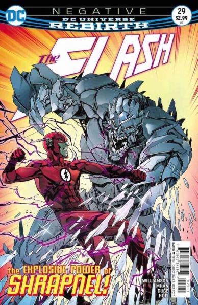
The Flash #29
Written by Joshua Williamson
Illustrated by Pop Mhan and Christian Duce
Colored by Hi-Fi
Lettered by Steve Wands
Reviewed by Nicholas Palmieri
With the first few pages rehashing the nonstop angst fest that Barry Allen’s life has recently become, I was completely ready to write off this issue as yet another disappointing entry in the chronicles of the Flash. Luckily, after only a few pages, Williamson finally pushes beyond that and delivers a solid comic.
I could see people being disappointed at the small amount of page time spent in costume, but it’s not until Barry dives into his detective work that I feel he finally becomes interesting again. With the latest plot developments forcing Barry to rethink his every super-speed move, he chooses to mope less and detect more. The angst is relegated to the scenes where it’s absolutely necessary, like to explain why he is working at normal speed. Once that’s done, he’s strictly building connections with his coworkers and following leads on a case, which I had a good time reading.
Duce and Mhan share the art duties here, and each does some fitting, solid work. I can’t tell for certain, but it looks like Mhan handles the action scenes towards the beginning of the book and Duce handles the detective scenes. Whoever handled them, they clearly split up the issue based on their strengths: the action looks dynamic, and the intensity of the moments comes across through distorted perspectives, tasteful rips in costumes, and flying debris. The detective scenes, like the one in the back corner of a crowded cop bar, naturally look much more reined in, letting the subtlety in the faces, the panel framing, and the details of the environment tell the story.
Continued belowMy biggest issue with Williamson’s Flash, and honestly with Barry as a character since his resurrection (and in the CW show), is that Barry spends so much time whining. So, since that was left at the beginning of this issue, I enjoyed this one more than most. I welcome more future issues like this one. Hopefully, Williamson can turn things more positive once the “Negative” storyline wraps up.
Final Verdict: 7.4 – A focus on detective work and a minimal amount of moping make this one of the better recent “Flash” issues.

Generations: The Thunder #1
Written by Jason Aaron
Illustrated by Mahmud Asrar
Colored by Jordie Bellaire
Lettered by VC’s Joe Sabino
Reviewed by Matt Lune
As has been the standard with these “Generations” one-shots, Jason Aaron has chosen this narrative conceit to focus in on the core essence of his title characters. When discussing the intrinsic motivations of either Thor, the subject of worthiness always comes up, and so that becomes the core of this issue, around which everything else orbits. “Generations: The Thunder” is a little different to previous entries in the series, due to the fact that Odinson is still around. If Thor wanted to have this conversation with her predecessor she doesn’t need to jump through any hoops, he’s right there. Aaron, therefore, has wisely chosen to travel back to an era where the Odinson had not yet earned Mjolnir’s grace, giving a more unique opportunity for Thor to dissect what it means to be worthy.
We still don’t know the exact circumstances of why these time displaced heroes are brought together, but to the credit of these standalone issues, the exact reasons are unimportant. Here, Thor comes from the modern era, where she is currently fighting a losing battle with cancer, and her inner turmoil concerns whether she should stay as her Asgardian alter-ego permanently, which would kill Jane Foster that much faster. Odinson, in the meantime, is still of an age where he’s unable to pick up the hammer and questioning his own life’s worth. These debates are framed by a battle in ancient Egypt against En-Sabah-Nur, aka Apocalypse, and Aaron manages to keep the pacing swift and the battle dynamic.
Mahmud Asrar creates beautiful superhero comics. There’s a deceptively complex panel structure employed by the artist that belies the simple power of a well-crafted page. As such, each scene flows in such an effortless way that increases the engagement by the reader. Each pivotal character, be they hero or villain, is introduced in a suitably dramatic fashion, and the fight with an oversized Apocalypse is appropriately epic. Both Aaron and Asrar channel their inner Walt Simonson for more than a few panels, especially the moment where both Thor’s unleash their battle cries and charge toward the reader.
With every issue of “Generations,” the question should be asked regarding what purpose the standalone adventure provides. In the end, both characters are approaching the same problem – what it means to be Thor – from two opposing angles. Odinson believes the secret is to be more like a God, and Thor learns, thanks in no small part to this diversion, that the secret is to maintain a closer link to humanity. The wider aim of the issue is to no doubt appeal to as broad an audience as possible, whether they are regular Thor readers or not, in order to lay the groundwork for the upcoming Legacy initiative. To that end, the issue also succeeds, and while it’s not as emotionally impactful as its Wolverine/All-New Wolverine equivalent, “Generations: The Thunder” is a satisfying stand-alone tale.
Final Verdict: 7.9 – Fantastic art supports a fun and engaging presentation of what it means to be Thor for new and old readers to enjoy.

Over the Garden Wall #17
Written by Kiernan Sjursen-Lien
Illustrated by Jorge Monlongo
Colored by Whitney Cogar
Lettered by Warren Montgomery
Reviewed by Kent Falkenberg
So, this is my first peek over the titular wall. And I have to say – that saying, the one about grass being greener, it’s never rung truer than it does here. The pastures that Kiernan Sjursen-Lien and Jorge Monlongo play in are lush and vibrant while lilting with strains of a bittersweet symphony. There’s a thematic depth belied by the deceptively simplistic wrappings of a kitten learning it’s perfectly okay not to be the world’s greatest fiddler. Or anywhere near it, in fact.
Continued belowThat is to say, “Over the Garden Wall” #17 is near-perfect in itself.
As narrated by the convivial equine, Fred the Horse – remember to tip him some carrots on your way out – Sjursen-Lien and Jorge Monlongo’s little ditty about a cat and a fiddle is far from the typical hey-diddle-diddle. In this succinct tale, there are wonderfully crafted messages about owning the reality of one’s abilities, the intrinsic worth of artistic endeavor, the tension between our passions and others’ expectations of us, the mountain-swells of pride that can be earned with the smallest of victories, and on and on. ”It still wasn’t anything incredible, but it was a start,” Fred says, once our feline friend finally carries a tune worth catching. “And a simple start is the kindling of dreams.”
While those myriad messages sit atop “Over the Garden Wall” #17, they never overpower the whimsy of a cat traveling to a ramshackle town through the deep dark woods to play terrible, horrible, godawful off-key music. Sjursen-Lien’s script deft handles this balance, but Monlongo’s contribution gives it breath enough to really sing.
Characters are wide-eyed and flatly rendered with a classically animated feel that’s quite in tune with one’s expectations of a Cartoon Network property. But from that base, Monlongo is able to run a gamut of expression from the pathos of self-reflection on fiddle-cat himself to the cartoonishly over-animated pain on a full splash-page worth of the townsfolk’s faces hearing a horrific SCREEEEECH! and recoiling/running our friend off in response. Page layouts are consistently varied, which keeps everything moving at a lively jig. Monlongo’s formal play – having the bushes and trees of the deep woods create panel barriers in those sequences – is an easy highlight, in that regard.
“Over the Garden Wall” #17 is a surprisingly mature tale. And while Sjursen-Lien and Monlongo’s work doesn’t have to be read like that – a surface reading can stand on its own legs much like the fiddle-cat tends to defiantly stand on his – it just makes the story all the richer. This is about as perfect a parable you’ll ever find in the form of four-color funny paper.
Final Verdict: 9.5 – Seriously, has the entire series been this good?

Shipwreck #5
Written by Warren Ellis
Illustrated by Phil Hester
Colored by Mark Englert
Lettered by Marshall Dillon
Reviewed by John Schaidler
Visually, “Shipwreck” has been stellar from the start. Actually, the more accurate term might be super nova, since many of illustrations explode across the page in a brilliant burst of color. Throughout much of the book, Phil Hester’s razor thin lines barely contain Mark Englert’s intensely over-saturated hues, as though there is literally no difference between a scene’s subject and its setting. To describe the effect as merely dreamlike feels like a vast understatement. The aesthetic is “otherworldly” in the truest sense of the word, bound by its own set of rules and physical laws. Even the book’s main character, Dr. Jonathan Shipwright – rendered in brilliant, solar-flare-yellows with deep red accents in one scene, vivid pinks and purples in another – seems to be but a mere slash of color that’s barely distinct from the technicolor parallel world on which he’s found himself stranded.
As much as the artwork continues to dazzle, however, the narrative can be a bit difficult to connect with, due in large part to the book’s erratic publishing schedule. Eight months into 2017, this is just the third installment. For a more straightforward story, a 2-3 month gap between issues may not be such a big deal. Given the narrative’s subtle, contemplative quality, however, the lack of momentum wreaks havoc. Picking up a new issue for the first time in months, it almost feels like you’re starting all over again, having to reacquaint yourself with the book’s characters and even the central premise.
Thankfully (for this issue, at least), writer Warren Ellis and the rest of the creative team seem to recognize this fact, beginning “Shipwreck” #5 with a brief but explosive flashback that immediately re-sets the scene. Once we’re all back up to speed, Shipwright is given a choice: reveal everything he knows to a pair of strangers (who may be friend or foe) and be led to the rescue site he’s been seeking, or keep wandering on his own with little to no hope of salvation. Shipwright makes his choice and we’re thrown right back into a post-apocalyptic dreamscape of disjointed, yet incredibly intriguing images before being gobsmacked, once again, with a brilliant cliffhanger that makes you wish you could pick up the following issue next week.
Continued belowFinal Verdict: 8.3 Both as a series and individually within each issue, the introspective pacing and reflective mood are well suited to the central story and “Shipwreck” #5 is no exception. The book’s erratic publishing schedule, however, makes it difficult to connect with. If the release schedule normalizes, this series will be brilliant. Otherwise, wait and experience it in trade paperback form.

Sisters of Sorrow #2
Written by Kurt Sutter and Courtney Alameda
Illustrated by Hyeonjin Kim
Colored by Jean-Paul Csuka
Lettered by Jim Campbell
Reviewed By Kate Kosturski
In the toughest of times, sisters – blood or otherwise – have to band together. 36 hours after the murder of Captain Nicholas Penn that ended the debut issue, Dominique finds herself in an interrogation room answering to her crime, while Greta, Sarah, and (a very reluctant) Misha plan to get her out. The short term plan to post Dominique’s bail involves someone from Greta’s past – which is part of a larger plan for Greta to get her revenge. Meanwhile, waffling Misha finds herself in a tough position – protect her friends or protect herself.
The first issue provided a great foundation for this Orange is the New Black-esque story, and Sutter and Alameda follow it up with a strong second offering that keeps the plot moving, introducing some timely social issues such as police corruption and incarceration of minorities, and some character development for Greta. I’m hoping we find out more about Ms. Always on the Fence Misha – what’s holding her back? It’s clear her life wasn’t all sundaes and sunshine, so what’s keeping her from fully joining the sisterhood?
Jean-Paul Csuka’s color sets the mood so perfectly here – with the actions of the issue mainly of a covert nature (hacking, undercover murder plot), bright colors would just make no sense. Everything seems to have been dipped in black to reflect the Dark and Disturbed nature of our story. It does appear that these colors are digitally rendered, but the line work by Kim adds enough depth that panels do not appear flat. I’m also loving the use of panels overlaying other panels to convey multiple conversations and narration, and letter Jim Campbell gets a chance to shine with some fine lettering work during fight scenes that make action leap right off the page.
Hell hath no fury like a woman scorned, and the men who have done Dominique, Greta, Sarah, and Misha wrong better stay out of their way.
Final Verdict: 8.0 – Sutter and Alameda keep things going with just the right balance of exposition for Greta and action. You can’t help but feel sorry for these four women, and I’m along for this ride to see if justice for them will be served.

Teen Titans #11
Written by Benjamin Percy
Pencilled by Khoi Pham
Breakdowns by Phil Hester
Inked by Trevor Scott
Colored by Jim Charalampidis
Lettered by Corey Breen
Since Rebirth started I’ve been scratching my head trying to figure out when and where the new Aqualad would appear. Jackson Hyde was redesigned and introduced in the new “Young Justice” television series nut lied dormant for a few years until his surprise “Teen Titans” appearance brought him back to comics just a few months ago. Benjamin Percy initially introduced Hyde hastily with a lack of context, but this latest arc of the title has done an excellent job cementing the character’s role and origin story within the DC Universe.
Percy has started to find a lighter tone in regards to the full team of Titans. The series also feels entrenched in the world of DC more naturally since the comic began. Seeing a more casual Beast Boy and reserved Hyde definitely shows that the character is taking the series in the right direction. With the more precise and polished pencil set of artist Khoi Pham, this title has improved drastically over the past few months of publication.
With breakdowns from Phil Hester, this book feels looser than it should. The story utilizes an inker, colorist, and breakdowns giving some of the individual lines and figure work some less precise than it should have initially. The faces in this issue are inconsistent, but the overall quality of the work is still high. Somehow the underwater sequences from the title stand out from the moments on land with darker colors, shading, and backgrounds. The layouts in this issue are fantastically creative, one page where Black Manta is towering over the team is particularly dramatic, showing the presence Manta has over the Titans.
Continued belowThe end of the installment firmly places the mantle of Aqualad into Rebirth and gives Jackson Hyde the fresh start that he desperately needed in order to be a current and long-lasting member of the new Titans team. While this issue is light on characterization for the rest of the Titans cast members, their presence is felt in the background of the story. The plot is very thin as readers aren’t even treated to Hyde’s in tremendous depth. There are a lot of caption boxes in the title and pages filled with pure action. The tease at the end of the comic is interesting but is ultimately too vague to be consequential in a meaningful way.
Final Verdict: 8.0 – “Teen Titans” #11 firmly cements the new Aqualad’s role and origin in the DC Universe but is light on action and the rest of the Titans.
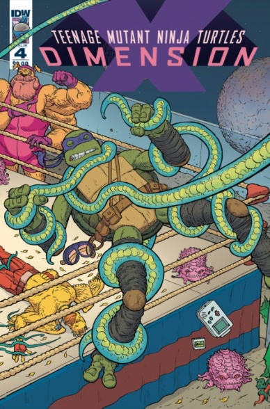
Teenage Mutant Ninja Turtles: Dimension X #4
Written by Ryan Ferrier
Illustrated by Chris Johnson
Coloured by Mark Englert
Lettered by Shawn Lee
Reviewed by Frida Keränen
Crime bosses, risky bets, and great colouring abound in “Teenage Mutant Ninja Turtles: Dimension X” #4! In this issue, fighter pilot Ace Duck gets his IDW universe debut when the Turtles go to find him to testify against the evil Krang.
The planet this issue is set on isn’t quite as imaginative and original as the ones in the previous parts, since planets where shady business is the name of the game are pretty common in sci-fi, but that doesn’t mean it’s boring. Chris Johnson makes the gambler-filled streets look dangerously intriguing. Mark Englert’s shiny and glowing colours amazingly add to the feeling of the pulsing nightlife of a huge city and really keep you in the mood of the story. My only complaint about the art is that the positioning of the characters is a bit weird in some panels.
The ‘Dimension X’ crossover has had a great time showcasing some fun and outlandish character designs both old and new. Johnson manages to make Ace Duck look very cool and suave despite him being, well, a duck with huge muscles and Ryan Ferrier gives him dialogue to match it. There aren’t any deep questions or serious themes at play in this issue, it’s here to entertain you, and manages to do just that with a nice balance of action, thrills, and humour.
Final verdict: 7.3 The whole creative team does a great job with offering us a fun ride in what is essentially space Las Vegas.


