
There is a lot to cover on Wednesdays. We should know, as collectively, we read an insane amount of comics. Even with a large review staff, it’s hard to get to everything. With that in mind, we’re back with Wrapping Wednesday, where we look at some of the books we missed in what was another great week of comics.
Let’s get this party started.
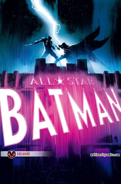
All-Star Batman #13
Written by Scott Snyder, Rafael Albuquerque, and Rafael Scavone
Illustrated by Rafael Albuquerque and Sebastian Fiumara
Colored by Cris Peters and Trish Mulvihill
Lettered by Steve Wands
Reviewed by Gregory Ellner
The two stories in “All-Star Batman” #13 have writers and artistic talent that show different sides of the “cape and cowl” crime fighting method.
In ‘The First Ally, Part 4,’ Scott Snyder’s writing does a good job of showcasing how Batman, though a very competent hero, can be in out of his depth when it comes to keeping his surrogate father safe. Using Alfred Pennyworth as the viewpoint character, Snyder draws attention to how dangerous the lifestyle of the Batfamily truly is. With a look in on the progressively deranged attitude of Briar, Snyder manages to create a very disturbing, yet rather mundane antagonist. Rafael Albuquerque’s pencils are relatively soft, allowing for light to shine through and giving an interesting, realistic view of shade in such a bright story for Batman. Cris Peters uses colors beautifully, with brilliant blues, reds, purples, and oranges seeming to flow around the pages and make them almost seem like a dream sequence at times.
In ‘Killers-in-Law Part 4: Beliefs,’ Albuquerque works together well with Rafael Scavone to tell a more run-of-the-mill gang busting story for Batman. Narration focuses on the hero’s perspective, rather than a sidekick, showing a more mission-focused attitude that does not focus on what could have been, or how high danger can be for him. However, its focus on the past makes the idea of actual serious danger hard to get behind. Sebastian Fiumara’s pencils are relatively mundane compared to those of Albuquerque, heavy and demonstrating an effective use of shadow. Trish Mulvihill’s colors are also relatively normal, giving the impression of this backup story being less important than the main one, which it probably would turn out to be anyway.
The story of “All-Star Batman” #13 is well written and well drawn, but more focus seems to be on the main story than the backup, as is likely intended anyway.
Final Verdict: 7.0 – An interesting pair of stories that contrast the perspective of Alfred with that of Batman.

G.I. Joe #8
Written by Aubrey Sitterson
Illustrate by Giannis Milonogiannis & David Lafuente
Colored by Lovern Kindzierski
Lettered by Tom B. Long & Gilberto Lazcano
Reviewed by Kent Falkenberg
“G.I. Joe” #8 is an unabashed fight comic.
Now, Aubrey Sitterson does juggle three separate storylines through the course of the issue. But if you’re looking for sinewy plot machinations, you best look elsewhere. If you’re in the mood for some kinetic, bombast, then best strap in. Giannis Milonogiannis and David Lafuente detonate a full payload across these pages.
The hook for “G.I. Joe” #8 is a sparring match between Snake Eyes and Quick Kick. Not being too familiar with the series up to now, I can’t say for certain if this has been a conflict brewing for some time. Sitterson’s dialogue, feathered into lulls between spinning roundhouse heel kicks and gun staff jabs and snake-style chest pokes, gives off a feeling of release from the tension that has long since past its boiling point. And that type of characterization is sufficient for a standard I’ll-kick-your-ass-to-show-I-can-kick-your-ass-without-actually-having-to-kick-your-ass brawl between teammates.
Realistically, that’s all just on the back burner though. It’s Milonogiannis’s art doing the heavy lifting. There’s just enough dust around the edges to round out his figure-work with a rough and tumble quality. There’s a distinct Manga influence – speed lines abound, and there’s a frenetic blurring of limbs, fists, and weaponry when blows are thrown – but it’s one that’s been scuffed up a bit. It gives the issue an energetic rhythm. And it’s all punctuated by Milonogiannis’s eye for little details that really sell a fight.
Continued belowSpit, and what might be a tooth, fly out of Quick Kick’s mouth after he’s decked with a right hook. But it’s the way Milonogiannis makes his check bulge up towards the nose as Quick Kick’s face snaps back and to the left that really makes that first connect. Similarly, when a blow fails to land, it doesn’t just die in the air. Milonogiannis makes sure to depict the follow through and counter-strike. “G.I. Joe” #8 might be dominated by a trope but damned if it’s not a fun one to watch play out. There’s a bit of a disconnect between Milonogiannis’s art and David Lafuente’s – the latter feels more posed, with a blockier, Saturday-morning cartoon feel. But since the art only switches when we follow Rock ‘N Roll’s thread, it’s not jarring enough to disrupt the flow.
And maybe that’s the most important part. “G.I. Joe” #8 sprints to its finish line with form, flash, and flourish. It never overstays its welcome, and it looks pretty damn good while doing it.
Final Verdict: 7.0 – Quite the energetic little ditty.

Go Go Power Rangers #2
Written by Ryan Parrot
Illustrated by Dan Mora
Coloured by Raúl Angelo
Lettered by Ed Dukeshire
Reviewed by Frida Keränen
In July BOOM! Studios launched a new Power Rangers comic, “Go Go Power Rangers,” which focuses on the high school life of the Rangers in addition to the world-saving. The second issue of the series expands that setup and teases about a new threat to the mighty morphing teenagers.
Writer Ryan Parrot deepens the main characters’ relationships and personal troubles in this issue, and hopefully, will continue with it in future issues. This development is a delight to see since most Power Rangers series haven’t really had a focus on the characters’ personalities, concentrating more on the action. Without these character moments “Go Go Power Rangers” could’ve had the danger of becoming a rather disposable addition to the franchise, but it knows its purpose and avoids that pitfall.
Dan Mora proves again to be the perfect choice to be the artist for this book with his easily approachable style. He brings the story forward and nails characters’ expressions amazingly. Raúl Angelo’s colours complement the illustrations well. Jason and Trini’s action-filled training montage, which moves from super-speed running to boulder-lifting to underwater fighting and has their conversation overlaid on it is something that wouldn’t work in any other medium than comics. A comic book creative team that manages to do something that is unique to their medium deserves a tip of the hat, so here’s one for Parrot, Mora, Angelo, and Dukeshire.
Final verdict:: 7.0 “Go Go Power Rangers” #2 knows what it’s doing and makes you want to read the next issue too.

Infamous Iron Man #11
Written by Brian Michael Bendis
Illustrated by Alex Maleev
Colored by Matt Hollingsworth
Lettered by VC’s Clayton Cowles
Getting a grip on an iconic character like Doctor Doom can be really difficult but taking Doom and shifting the status quo of the character around without defining him strongly is why I haven’t been able to connect to “Infamous Iron Man” the way Marvel has intended me too. After spending some time away from the series, there seems to be some definitive improvement in the latest installment of the comic. Writer Brian Michael Bendis has laced the series with lots of interesting Marvel supporting players from an assortment of different titles and seem to have all the ingredients to craft a strong story, but “Infamous Iron Man” #11 doesn’t have a cohesive vision to bring the books in the right direction.
Alex Maleev captures the psychological drama of Victor Von Doom’s new lease on life with the same minimal backgrounds and dark shading as we’ve seen in books like “Daredevil.” When Maleev is tasked with drawing the psychedelic double-page spreads of Doctor Strange’s world, he subverts his style to accommodate the wild backgrounds. Maleev captures a number of great splash pages in the issue, utilizing an impressive sense of scale two times to deliver a more grandiose element to the comic than it would have carried otherwise.
Continued belowWhile the first half of the issue exposes readers to another installment of this title that is heavy on dialogue and a more stationary, confined experience–the comic opens up towards the end, introducing some wild new plot elements. The last page of the book, in particular, brings the comic into an entirely new direction, teasing the end of “Infamous Iron Man” as we know it. The book ramps up the pacing until the final crescendo seen at the cliffhanger to the title.
While “Infamous Iron Man” #11 is a marked improvement over previous installments, the book has a sense of humor that gets in the way of the darker story. One joke from Doctor Strange, in particular, is a groan-worthy moment ruining the tone of an odd scene jammed with too much dialogue. The scene would have been better if Bendis had allowed Strange and Doom to have a more complex conversation that might take an entire issue of the series that paying stronger attention in preserving a better-balanced tone.
With one more issue left, Bendis and Maleev are going to need to pull all the stops together and say something interesting about Doctor Doom swimming angels instead of the demons. When issue #11 pulls the title into a more action-heavy direction it becomes more clear than ever before that “Infamous Iron Man” is a title positioned in an interesting place in the Marvel Universe despite the endless, muddled exposition telling readers otherwise.
Final Verdict: 7.0 – Despite off-putting characterization and humor “Infamous Iron Man” #11 teases an epic finale with a great cliffhanger.

Kim & Kim: Love is a Battlefield #2
Written by Magdalene Visaggio
Illustrated by Eva Cabrera
Colored by Claudia Aguirre
Lettered by Zaak Saam
Reviewed By Kate Kosturski
No promises, no demands – as the song goes. The follow-up to Magdalene Visaggio Eva Cabrera’s debut of the newest “Kim & Kim” story presents us with the Kims with a busted van and some even more busted emotional baggage. Kim D. comes up with a plan to get the necklace that they lost to her ex Laz in the previous issue back, and it’s a doozy: necromancy. A great idea on paper…but less than great in practice. Kim and Kim end up doing battle with some death shades along with some of their own friendship issues. Only one of those is successfully vanquished (guess which), but some other good news comes that should get our heroines back to their bounty.
Visaggio balances the action of her “Love is a Battlefield” debut with an issue all about relationships – Kim D. working through the residual emotional mess of her breakup with Laz, and the Kims dealing with their own friendship in light of their romantic entanglements (Kim D. and Laz, Kim Q. and Saar). This friendship is what draws me most to “Kim and Kim” and I’m happy to see that this is not just an issue of kicking butts and shooting bad guys (although it is what the Kims do best). Second only to stellar character development is this issue’s colors. While the debut was what could be best called as punk pastel, Eva Cabrera delivers bold neon technicolor for issue #2. Panel backgrounds are rendered in bright pinks, greens, and yellows that could only be pulled from late 80s fashion magazines. Symbolic of the escalating drama among all our major players? Perhaps. The punk pastel does make an appearance when our girls go to “pretty much literally hell,” which is a rather ironic choice. Zaak Saam still gets to show off with fine lettering for sound effects and action, using the non-traditional panel shapes to his advantage by straddling word balloons between panels that add flow to the story.
Drama follows the Kims wherever they may go, but I’m sure enjoying tailgating their drama. I hope there’s some room in the back of the van for me….
Final Verdict: 8.0 – Visaggio, Cabrera and company keep up the good work with this issue, advancing story and character development with complementary art.
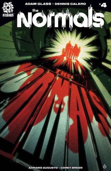
The Normals #4
Written by Adam Glass
Illustrated by Dennis Calero
Continued below
Colored by Adriano Augusto
Lettered by Corey Breen
Reviewed by John Schaidler
About one-fourth of the way into “The Normals” #4, as Jack Normal struggles to help his family understand just how abnormal they all really are, his son Aidan says, “I’ve always known that I wasn’t normal, that something was different about me.” Josephine, Jack’s teenage daughter, takes a different tack. “This isn’t possible!” she exclaims. “I’ve got a final in two weeks!”
At its core, “The Normals” is a fairly routine, classically constructed family drama. Jack, the patriarch, is the main character and narrative focal point. Mary, his wife, plays the role of nurturing mother and skeptic, not entirely convinced that her husband knows what he’s talking about. Meanwhile, the two teenage kids are too predictably caught up in their own lives to really know or care what’s actually going on.
In other words, on the surface, this is nothing that we haven’t already seen before. Unfortunately, on a deeper level, I’m not entirely sure it’s all that unique, either.
See, as it turns out, the Normals are robots. (Don’t worry, that’s not a spoiler. The big reveal was early on, which is simultaneously somehow refreshing, yet also served to diffuse virtually all of the story’s tension.) And with that reveal behind us, the only question now is whether the Normals will save robotkind from extinction before they are shut down themselves. It’s a fairly interesting plot, but not exactly groundbreaking. In that case, the artwork needs to carry the load.
On that count as well, however, “The Normals” continues to be pretty standard fare. It’s entirely competent work, in terms of both inks and colors, but there’s not a whole lot that really grabs you. There’s one wonderful panel that features a rodeo clown and a handgun, but other than that, nothing really stands out. The style is very straightforward and realistic, which certainly fits with the story, but it also fails to play with or subvert our expectations. Instead, the illustrations simply underscore the more or less conventional “robot reveal” trope. Hopefully, something will raise the stakes and the book – as well as the characters – will rise to the challenge.
Final Verdict: 6.8 – “The Normals” #4 is competent but conventional work. There are no major flaws, but with the story having plateaued, there’s not a whole lot to recommend it.

Ringside #11
Written by Joe Keatinge
Illustrated by Nick Barber
Colored by Simon Gough
Lettered by Ariana Maher
Reviewed by Michael Mazzacane
With maybe a little pretension, or perhaps the bombast of their colorful characters, “Ringside” claims a kinship with The Wire. And as far as setting up and weaving together a series of characters and threads surrounding the world or professional wrestling, “Ringside” does quite well. Except, as with The Wire, you really have to get through to the end of episode 4 for it to suddenly click. With the start of their third arc “Shoot,” I’d hoped things would pick up. In the parlance of pro wrestling, a “shoot” is when things get real. Shoots are wild, dangerous, theoretically unplanned, a real shot in the arm. “Ringside” #11 continues at the usual pace, the drama is certainly set to get more real but reading it collected appears to still be the best option.
“Ringside” measured pace would be tougher to handle without the aesthetic created by Nick Barber and Simon Gough. Barber’s minimalist cartoon style never makes anyone look pretty, they’re all beaten up. The only ones who look good are mediated by the magic of screens. Gough’s largely tri tone pallet, when mixed with the heavy inks of Barber, gives everything a neo noir vibe. A sensibility that fits the mishmash identity creation that is pro wrestling. With heavy shadows, everyone is shown to be two faced. A female TV executive becomes a haunting Jester as she offers notes and a new lease on life for Ragan. It’s only in private that one character gets to be open with themselves.
While reading it issue to issue may not be the most dramatically fulfilling, there is still excellent craftsmanship in this issue. The decision to cover the normally white gutters in pure black actually gives the appearance of connection and coherence to the panel filled pages. With spare coloring and heavy blacks, all that white would’ve been distracting. Barber’s page design is excellent. The debut of Hekate in CMW is mirrored in two pages from two perspectives, inter cutting the performance and differing reactions. Barber’s pages maximize character reaction and the emotions the story is trying to convey. Nothing about this books art is super flashy but it is effective.
Continued belowFinal Verdict: 7.0 – “Ringside” starts to get real, but stays true to its aesthetic sensibilities as it probes the lives of these broken icons or would be icons.

Teenage Mutant Ninja Turtles: Dimension X #5
Written by Devin Grayson
Illustrated by Craig Rousseau
Colored by Leonardo Ito
Lettered by Shawn Lee
Reviewed by Nicholas Palmieri
In her first full-length issue after a decade-long sabbatical from regular comics writing, Devin Grayson shows that she still knows how to deliver a solid comic book story.
The concept for “Teenage Mutant Ninja Turtles: Dimension X,” where a different creative team tackles the intergalactic search for a different court witness in each issue, allows each issue to be almost completely self-contained. Grayson uses this to her benefit, introducing an interesting alien race and using it to explore the concepts of teams, organisms, and free will. This being one of the only TMNT titles I’ve ever read (the only other one being the first issue of this mini-series), the voices for each character and the situations were well established for an easy read.
Rousseau’s art did well by Grayson’s concepts. He often extends one panel onto the entire page, with the other panels placed on top of the background that it provides. In many cases, this allowed us to understand and feel how connected the alien race was, and how submerged the turtles must have felt in these lush environments. Also, Rousseau did a great job creating new designs for these alien organisms from scratch, giving them a memorable mixture of floral and sentient aspects that helped me understand their viewpoint.
All said and done, I had fun with this final issue of “Teenage Mutant Ninja Turtles: Dimension X.” It established everything quickly, explored the themes it wanted to, and pushed us towards the next TMNT issue without requiring we read it to be satisfied. For a solid, quick, amusing diversion with a little something deeper going on below the surface, look no further than this issue. Glad to see Grayson back writing comics!
Final Verdict: 7.6 – A competent one-shot with some interesting concepts and themes that is sure to deliver a good time to those looking for some one-and-done fun.
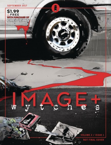
Wytches: Bad Egg – Chapter 1 (in Image+ vol. 2 #1)
Written by Scott Snyder
Illustrated by Jock
Colored by Matt Hollingsworth
Lettered by Clem Robins
Reviewed by Elias Rosner
It’s been a little two years since we’ve gotten the last installment in “Wytches” and, as the title of this micro suggests, it hasn’t quite returned in full yet. Instead, we have the first of a series of backup features in Image’s magazine Image+, which is supposed to tide us over until the return of “Wytches” proper. So this week, I thought I’d go off the beaten path a tiny bit and look at the first part of the return and see if it’s worth the $2.
If there’s one thing that Scott Snyder knows how to do well, it’s creating a sense of unease. Walking into this, you know it’s a horror comic but from the first page, the story itself sets you on edge; warnings about backlots, the repetition of how normal everything is so that once you reach the creepy white van chasing the kid, you’re expecting the worst.
The characterization, however, is pretty thin, which isn’t surprising given that this is an eight page, part one of a story but it would be nice to have something beyond our white bread suburbanites. Sebastian’s annoying narration in the first couple pages only compounds this issue. Thankfully, that all goes away once he hops the fence.
Jock’s art really helps to build that tension as well, keeping the reader in mind while composing his panels. He treats them like a camera, so when the van appears, we, the readers have been watching things unfold from a static point of view, having the van appearing as if it were coming at us instead of us going to it. He places people in shadows, hiding their true intentions.
The only art problem I have is with the coloring and this is a problem I’ve had with the entirety of the series. Hollingsworth does a phenomenal job at making each issue feel dirty and grungy, like we’ve just found an old, waterlogged journal in the attic that has some horrific tale of woe but, as with any old journal, that makes it hard to read. The splotches of water color can obscure the art, especially as the action ramps up but it also acts abstract cues, between the color and the presence of these splotches. It’s a hard balance and I don’t think the team has quite found it yet.
Final Verdict: 6.7. A decent return to the “Wytches” universe but maybe not enough to justify getting the whole Image+ issue. If you just wanted a little more Jock and “Wytches,” and are interested interviews and sneak peeks, it’s well worth the price.


