
There’s a lot to cover on Wednesdays. We should know, as collectively, we read an insane amount of comics. Even with a large review staff, it’s hard to get to everything. With that in mind, we’re back with Wrapping Wednesday, where we look at some of the books we missed in what was another great week of comics.
Let’s get this party started.

Written by Jim Zub, Jed MacKay & Ed Brisson
Illustrated by Max Dunbar, Djibril Morissette-Phan & Scott Hepburn
Lettered by Ed Brisson
Colored by Jim Charalampidis & Ian Herring
Reviewed by Michael Govan
I’ve never really been into Alpha Flight. I like them well enough in small doses but I wouldn’t want to read an ongoing from them. “Alpha Flight: True North” #1 is a good issue though with three solid stories. The writers clearly love the characters and even if you aren’t that familiar with the members of Alpha Flight, you get a good sense of who they are in just a few pages.
The first story follows Snowbird as she and teammate Talisman fight a powerful mystic threat. The artwork does a good job of showing off epic superhero action against creepy, demonic zombie-like creatures. The story reaffirms both Snowbird’s humanity and godhood all at once.
The second story shows that Puck is also somewhat ancient, a likable man plagued by foolish decisions he made long ago. This story was my favorite and I found Puck to be the most human. The artwork was fitting, more grounded in reality, and matched the tone of the serious confession Puck offered.
The third story is okay and probably could have benefited from more context but the twist at the end is pretty interesting. Overall, a good showcase for all the characters involved and a good read.
Final Verdict: 7.0 – Have a good old time up in the Great White North.
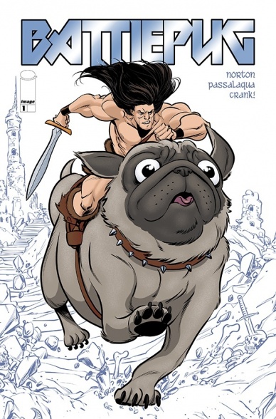
Written by Mike Norton
Illustrated by Mike Norton & Allen Passalaqua
Colored by Allen Passalaqua
Lettered by Crank!
Reviewed by Christa Harader
“Battlepug” #1 continues the humorous adventures of the last Kimmundian and his friends as a specter from his past rears its ugly, Winter Solstice-worn head.
That’s right, it’s Christmas, and it didn’t come to party.
This first issue has us checking back in with our cast from before and sets up an intriguing threat, which will no doubt lead to some good sword and sandal parody down the line. “Battlepug” is light, entertaining and well-built both as a convincing heroic narrative and “Conan” send-up. Norton and Passalaqua work well together with an accessible, cartoonish art style and bright colors to liven up the wry tone of the book. The style also works well when contrasted against the serious – and often violent – satire, and while this might not be a book designed for kids, it’s certainly accessible to teens and older folks. Crank’s lettering goes a long way to sell that youthful vibe, as well.
Overall, “Battlepug” #1 works well as a first issue and as a strong continuation of an established series. The new arc has a lot of promise, and the team’s putting their usual zeal onto the page, to good effect. Plus, it’s a giant pug. What kind of monster doesn’t want to read that?
Final Verdict: 8.0 – “Battlepug” #1 sets up a good antagonist and dives right back into the world of the last Kimmerian with enough gravity and humor to succeed as a first issue.
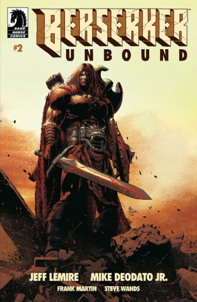
Written by Jeff Lemire
Illustrated by Mike Deodato Jr.
Colored by Frank Martin
Lettered by Steve Wands
Reviewed by Chris Egan
For a comic coming from a writer who is chock full of original ideas, this one feels like a movie you’ve sat through more than once. The hero from a land of magic and fantasy from a time long passed finds themselves in our mundane, modern world and comes across an outsider who becomes part companion and part guide. In this case, that friend is Joe, a homeless man who tries to look out for the Mongrel King in his own way, but just believes him to be a lost immigrant who can’t speak English.
Continued belowThis is an issue that is written specifically to the reader. As neither character can understand each other, even in a basic way, their dialogue is used simply as exposition and to make it clear to us that these two are getting nowhere with each other. Unfortunately, like the Mongrel King, this part of the story gets nowhere in its task. It ends where it began, getting us no closer to the ultimate goal. Now that the Mongrel King has found himself in our world, all he wants to do is find a way home to avenge his family and his people. While there should be problems and hardships that get in his way making it both difficult for him and interesting story for us, we should at least be getting some hints as to how things will unfold. With half the story already told there will be a lot of crammed into the last two issues, most likely resulting in a bottom-heavy miniseries. Right now this is paced out like it should be a (slightly) longer series than it is.
Issue two takes on a whole new storytelling style. Moving away from the open spaces and broad battle scenes of part one, the pages and panels focus on a more close-quartered and claustrophobic feel. Each page is mostly filled with smaller panels focusing on close conversation and facial expressions. It works well and it is nice to see the layout style changing and keeping things interesting. Deodato’s illustrations are a great throwback to fantasy comics of past decades, but with a modern style that is a bit sleeker and not as heavily detailed. It works for this series and Martin works with a palette that makes everything feel like a sunset in Autumn. It’s a highlight of the series and is truly beautiful.
A familiar concept that is enjoyable and fun, but this chapter peddles in place giving us a lot of information that falsely feels like the story is moving forward. It isn’t bad, but it is too comfortable and takes no risks. After the fast-paced, violent, and surprisingly different intro issue, this issue too predictable from start to finish. You’ll enjoy it while reading it, but afterward, it dissipates easily.
Final Verdict: 6.0 – Conan Alone 2: Lost in New York trudges along in search for answers.

Written by Justin Jordan
Illustrated by Albertus Tyasseta
Colored by Sarah Stern
Lettered by Rachel Deering
Reviewed by Matthew Blair
“Breaklands” #1 is a book that could have used a Star Wars style exposition crawl at the beginning of the comic. It thinks it’s being clever by showing the readers how the world works through a scene of brutal violence that probably takes place near the middle or end of the story, but the reader has no idea what’s going on, or who they should be rooting for.
While the beginning leaves the reader with too many questions, writer Justin Jordan does recover admirably. The rest “Breaklands” #1 introduces us to the main protagonist Kasa and her little brother Adam. Both of them are struggling on the fringes of society and wind up drawing the attention of a group of bandits, who wind up hunting Adam for his powerful psychic abilities. Kasa and Adam’s relationship is the highlight of the book. They are very easy characters to get invested in and root for, and even the bounty hunters chasing them get to have fully fleshed out and enjoyable personalities.
While the script lacks in world-building, the artwork goes a long way towards plugging many of its holes. Artist Albertus Tyasseta has an incredibly unique art style that I can only describe as Moebius with a dash of anime and a little bit of Avatar the Last Airbender. The landscapes, monsters, and technology on display are gorgeous and while the character design looks simple, they are incredibly expressive and relatable. Also, colorist Sarah Stern does an amazing job in giving the book a rich, yet simple, color palette that makes the characters and setting look like they exist in perpetual twilight.
The story of “Breaklands” #1 has some serious flaws, and while the artwork does a lot to cover them up, it doesn’t completely succeed. However, it is a solid book and it will be interesting to see where it goes from here.
Continued belowFinal Verdict: 7.6 – The script has some good character work, but serious flaws and world building issues. However, the artwork fixes most of the problems and helps to create a comic that tells a fun and interesting story.

Written by Jordie Bellaire
Illustrated by David López
Colored by Raúl Angulo
Lettered by Ed Dukeshire
Reviewed by Gregory Ellner
Jordie Bellaire continues to show her skill with the Buffyverse in this prelude to the ‘Hellmouth’ crossover, showing the multitude of tones present within the supernatural world of slayers and their targets. Using the setting of a (pre-)Halloween party, Bellaire is able to show joy and comedy at one moment, and terrifying monstrosity at another, without causing too much of an implicit whiplash between the two extremes. Furthermore, as is important for the beginning of a crossover, “Buffy the Vampire Slayer” #8 shows everything important to know about various central characters and manages to do so through the lens of a relatively ordinary night in Sunnydale that rapidly goes horribly wrong. More than just a killer of monsters, Buffy is an extremely awkward teenager, and Bellaire makes sure readers are well aware of her issues relating with normal people and parties in general.
David López’s artwork seems a bit too thick at times, with the faces of the teenagers just seeming to be a little too mature. People like Giles, Jennifer, and Drusilla are well drawn by comparison, but unfortunately, while the site of most of the action of “Buffy the Vampire Slayer” #8, the adults are not the key heroes (relatively speaking), so the builds of the teenagers stick out all the more.
Raúl Angulo’s colors have remained very well put together over this entire run, and the prelude to “Buffy the Vampire Slayer” #8 is no exception. Using dark palettes for the Halloween party, brighter ones for the trip through a museum, and a flash of far deeper, darker shades to indicate evil at times, Angulo’s colors help shape the mood of the series as a whole.
Final Verdict: 7.0 – A well-lain script and excellent colors continue through this event prelude, but some of the artwork just doesn’t quite fit.
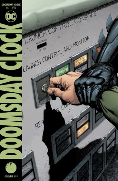
Written by Geoff Johns
Illustrated by Gary Frank
Colored by Brad Anderson
Lettered by Rob Leigh
Reviewed by Kenneth Laster
“Doomsday Clock” is back! And it’s the penultimate issue! Geoff Johns, Gary Frank, Brad Anderson, and Rob Leigh are working to wrap up what was supposed to be a universe shaking answer to “Watchmen.” But with delays throughout the whole series and the universe moving on, does this issue feel like the lead up to a grand conclusion or does it fall flat?
It would feel disingenuous at this point to ignore the effect that the delays on the story of “Doomsday Clock” have on the story. While “Doomsday Clock” #11 may feel like a key chapter when the entire story is read together, in the context of months between release from its predecessor it feels like dropping in on the season finale of a show you watched once maybe a year ago. Another aspect of the delays hindering the story is how much “Doomsday Clock” is supposed to be tied to the DC Universe and how much it is supposed to be a universe changing event but the natural progression of comics has changed the universe so much already. Johns attempted to write a get out of continuity jail free card by saying that these events are a year down the line in continuity but so much has happened in continuity to main players like Lex Luthor transforming into Apex Lex that it’s hard not to think about how we get back to certain status quos prior to this story. This is all not even mentioning the lack of impact of the Legion of Superheroes and Justice Society plots in “Doomsday Clock” #11 based on their return in main continuity through Bendis and Snyder’s plots refusing to wait for this comic.
“Doomsday Clock” #11, delays aside, does push forward the momentum of its self-contained story. John’s plot this issue feels intentionally chaotic and dissonant which comes with its benefits and issues. The chaos of the issue involves many panels jumping from scene to scene with a lot of dialogue overlapping to create very frenetic energy that leads to the climactic ending of the issue and the hook for “Doomsday Clock” #12. While the momentum is a great addition, there are some elements that the frenetic energy does not work quite as well for as Ozymandias lays out his grand scheme, the clarity of it is lost by being in the middle of the culmination of so many plots.
Continued belowGary Frank and Brad Anderson do an excellent job on art duties in “Doomsday Clock” #11. The two of them throughout the series have paid subtle homage to Dave Gibbons and John Higgins’s work on the original Watchmen with Frank’s noticeable increase of deeper blacks in shadow that Higgin’s uses to produce a starker lighting contrast that differs from their previous collaborations and ties the book visually to “Watchmen” without eliminating either of their styles. Speaking of “Watchmen” homages, Rob Leigh continues to ape the original lettering style of the original series but misses on certain nuances to how it was used. A major frustration for me throughout this issue and in the series is the lack of distinction between the lettering of the “Watchmen” characters and the ones from the DC Universe, whereas in the original story the jagged style of lettering was used to denote the time and place of the story, whereas, in this sequel series, the lettering just feels like a superficial addition with no additional weight.
“Doomsday Clock” #11 captures the momentum that is expected of it as a penultimate issue with a continued strong showing from the art team. Johns’s implementation of chaotic and rapid pacing in this issue creates a strong drive towards a conclusion. However, within the context of the larger DC Universe, too many questions of continuity have come up in the wake of these delays to solidify this issue and its follow up’s place in importance with regard to the larger DC Universe.
Final Verdict: 7.8 – “Doomsday Clock” #11 ticks ever closer to the conclusion with strong plotting, momentum, and art but gets lost in its own importance within the context of a universe that’s long moved past this story.

Written by Vita Ayala
Illustrated by Pere Perez
Colored by Rachelle Rosenberg
Lettered by VC’s Clayton Cowles
Cover by Ema Lupacchino & David Curiel
Reviewed by Linda H. Codega
In “Ghost Spider Annual #1” ‘Alone in Murderworld,’ Gwen gets caught in an old trap set for 616 Spider-Man by Arcade and has to fight through Parker’s hall of villainy in order to save a damsel in distress. The conceit of a narrative game is an effective premise, allowing Ghost Spider to verbalize her own misgiving about how heroes operate while fighting animatronic robots. She thinks about one villain “Does he feel? Does he wish things were different?” and later on, after defeating automatons of Daredevil and Punisher, asks; “Is this all we are? Fighting and struggling and failing?”
The art emphasizes Ghost Spider’s strength and athleticism, creating beautiful poses that really showcase the dancer aesthetic that Ghost Spider draws from. The moral quandaries are broken up in-frame by flashes, creating a lovely visual for the past-is-present narratives that Ayala sets up. The best marriage of both forms happens when Ghost Spider realizes that the woman in trouble is the 616 version of Gwen Stacy, and Ghost Spider has to fight Spider-Man. The next, masterful full-page panel shows the two Spideys midair, mirroring each other, as Gwen Stacy gets to decide what her story looks like.
There’s a broader meta to be read into ‘Alone in Murderworld.’ Every person that Gwen fights is a man. The entire game is designed and executed by a man. It’s a man’s world that Ghost Spider has to fight through, and after she saves herself, she learns to place value in her own story, no matter what it is. This is a powerful, engaging emotional climax about self-care and growth when everyone has already written their own endings for your life.
Ghost Spider’s punchy lines “I’m not fighting for a damsel in distress. I’m fighting for me. And I deserve better!” hits hard, especially with the visual of both Gwen Stacey and Ghost Spider side by side. Ultimately, in “Ghost Spider: Annual #1,” Gwen Stacy reclaims her narrative and rejects the stereotypes of the past. She fights for herself.
Final Verdict: 8.5 – When Gwen Stacy confronts the ghosts of Peter Parker’s past, she finally gets a chance to save herself.

Continued below
Written by Jody Houser
Penciled by Adriana Melo
Inked by Mark Morales
Colored by Hi-Fi
Lettered by Gabriela Downie
Reviewed by Rasheda
Harley and Pamela (Poison Ivy) are lying low in suburbia, Pamela is healing from her run-in after the “Heroes In Crisis” event. She is having trouble stabilizing her form, but a surprise gift from Lex Luthor helps her. Unfortunately with that help from Luthor comes an unexpected guest that neither was expecting. Poor Harley, just when she was ready to make a change.
Jody Houser is an excellent writer for female characters; she has a strong voice and it does not condescend them while making a statement. Houser is also a great read for lighter fare, which this comic is. When Harley and Poison Ivy are involved, something fun has to follow. Houser does a good job at capturing Quinn chaotic thinking and speech, then switching to Ivy’s calming and precise mannerisms. Houser writing something to look at as far as giving female voices different ranges; no two voices are the same, if she is writing for existing characters, she never strays too far from what the reader is used to and adds just enough to make you enjoy and continue to read.
Now, usually there are just illustrators and colorist for a comic, but for this series, there are pencils, inks, and colors. Adriana Melo pencil work has a lot of details in each panel, there is a lot of definition in the panels; Ivy’s different plants, Harley’s clothing, and room, the mall in the outset of the comic. What is a little inconsistent is the pencils of Harley and Ivy’s faces and features; in some panels perfectly executed, in other panels, their faces are almost too cartoonish. Mark Morales’ inks are heavy in the issue in the form of shadows. The lines are finished, but there is a lot of shadowing, again making the comic look a bit cartoonish. Colors by Hi-Fi are fabulous, though. Bright, colorful and fun; the different plants are mesmerizing, Harley’s room is girlishly pink and the flashback panels are appropriately muted. The use of colors to create light and explosions are really creative and visually cool.
This mini-series may be a good break from more serious stories in the DCU, which some readers may need.
Final Verdict: 7.5 – It’s always fun to ride the crazy train that is Harley and Ivy.
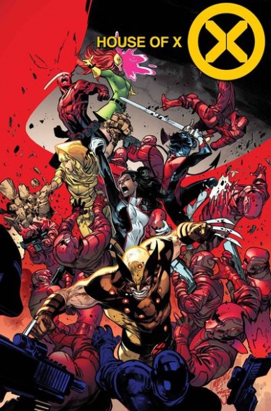
Written by Jonathan Hickman
Illustrated by Pepe Larraz
Colored by Marte Gracia
Lettered by VC’s Clayton Cowles
Reviewed by Alexander Jones
Marvel’s latest X-Men saga continues this week with “House of X” #4. This newest entry in the series is a culmination of several plot threads author Jonathan Hickman has established so far across the twin “Powers of X” and “House of X” series. The past couple of “Powers of X” entries have gotten readers more familiar with the antagonist Nimrod. This particular entry shows the X-Men heroes attempting to stop the birth of the nefarious villain. The newest chapter of “House of X” also reestablishes concepts like Mother Mold and contains interesting commentary on continuity from previous X-Men stories.
No discussion of this issue would be complete without mentioning the problematic revolving door of death in Marvel comics. This issue has more than a few incredibly dramatic death scenes. While these parts of the narrative strike a huge emotional climax, the scenes depict a few one too many mutant deaths in the story. Hickman and artist Pepe Larraz deliver on several death scenes that carry strong emotional consequences. The premise of the issue being a suicide mission leads to interesting dialogue and really high stakes. The structure of this issue is a Marvel to behold as the premise and action in the script are executed very quickly with concise pacing and dialogue.
Pepe Larraz’s beautifully vibrant and detailed pencils are astonishing. The very first interior page features characters posed in the background and foreground showing Larraz’s keen eye for page design. A sequence rendering a human face in the water is one of the most iconic sequences from “House of X” thus far. Marte Gracia’s color palette is incredibly vibrant and expressive. There are moments where a space station is covered in a fire that is burning in bright red contrasted with purple and blue hues of an empty space ship. Each character is expressing a lot of emotion in any given panel, drawing the reader in with the visuals alone.
Continued below“House of X” #4 is a fantastic comic book especially for those who are able to examine the issue outside the context of a larger Marvel Universe. The revolving door of comic book death will change the final outcome of the story but there’s no reason to not enjoy yourself along the way.
Final Verdict: 8.0 – “House of X” #4 carries pulse-pounding action, beautiful art and a massive amount of comic book death.
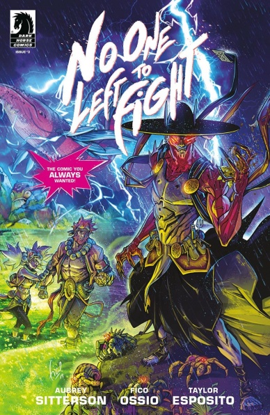
Written by Aubrey Sitterson
Illustrated by Fico Ossio
Colored by Fico Ossio and Raciel Avila
Lettered by Taylor Esposito
Reviewed by Jhoan Suriel
Sexual tension makes way for an explosive fight in “No One Left To Fight #3”. Continuing to build on teases from the last issue, “No One Left To Fight #3” introduces a mysterious, new character while Sitterson focuses on character motivation. It’s still not clear why Vâle chooses not to fight but there are elements of “One Punch Man” in this issue. Furthermore, this issue touches upon themes such as consent, rejection, and living with the choices one makes.
Once again, Fico Ossio’s art carries the story more so than the plot. In “No One Left To Fight” #3, we see a couple of nods to its “Dragon Ball” influences in the form of energy blasts, a familiar pose “Dragon Ball Z” fans will recognize, and of course, buff characters. Ossio’s expressive but realistic faces are always a joy to see as it keeps the story grounded. But this issue suffers from the repetitive use of five and six panels. Still, the panels are varied in different sizes.
The colorwork between Ossio and Raciel Avila remains quite excellent. The big fight of “No One Left To Fight” #3 features explosive, hot energy blasts accented with blue, orange, and red. As such, we can feel the searing heat sensation when Vâle gets hurt. Additionally, the colors communicate mood as Winda’s anger is accented with the aforementioned red, orange, and yellow to emphasize how she deals with rejection.
As a standalone issue, “No One Left To Fight” #3 is hard to recommend to someone new to the series. But for readers who continue to follow the series, “No One Left To Fight” #3 offers yet another taste of big fights to come. Furthermore, there are a few implications about Vâle’s encounter with The Hierophant. Nonetheless, it still seems to be a case of character-driven plot so far. We know Vâle is bound to reach a breaking point. The question is when?
Final Verdict: 8.3 – “No One Left To Fight” #3 provides additional insight to the enigmatic Vâle and crew while it tackles more serious themes as the road trip continues on.
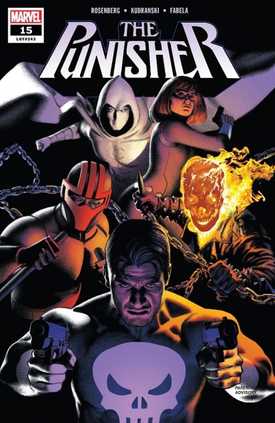
Written by Matthew Rosenberg
Illustrated by Szymon Kudranski
Colored by Antonia Fabela
Lettered by Cory Petit
Reviewed by Tanveer Kalo
At the center of the explosions and bullets hitting the streets are the Punisher and Zemo. This issue sets up the latest showdown between the two. However, violence is the only thing connecting the men. Rosenberg doesn’t offer any strong exploration of the relationship 15 issues in; rather the dynamic is the typical revenge tale so often seen with the Punisher.
Zemo’s relationship with his Thunderbolts and Fisk is comical, which provides the much-needed relief from the constant action. Rosenberg provides the humor with strong dialogue that flows well with the overall feeling he establishes for this group, but in combat, they are a force to be reckoned with.
One of the strongest aspects of this issue is the work of the art team. Szymon Kudranski’s line art and Antonia Fabela’s colors compliment the ambiance established by Rosenberg. Kudranski adding little details like the blood and debris bursting into different panels is a nice touch because it shows the violence touches everything regardless of how is pulling the trigger. His choice of mostly using wide rectangular panels helps the issue feel grounded. Most of the different panel boundaries signal to readers fighting is happening. Fabela’s colors add to the tension of the epic battle between the heroes and villains. The work particularly shines when Zemo and his team charge at the heroes with a tank. The lettering of Cory Petit and Anthony Gambino’s designs come through in the sound effects for the shootout between the Punisher and Zemo and Rachel Cole-Alves’s costume.
Continued belowFinal Verdict: 5.0 – A mostly action-packed issue that doesn’t offer much new.

Written by Jason Aaron and Dennis Hallum
Illustrated by Stephen Green
Colored by Rico Renzi
Lettered by Jared K. Fletcher
Reviewed by Shamus Clancy
For a creator who’s written some of the most violent and action-packed comics of the decade, Jason Aaron, armed with co-writer Dennis Hallum, is able to deftly construct poignant smaller moments in “Sea of Stars” #3. Even with a setting as big as space, something as intimate as the relationship between a father and a son can have a universal impact on readers.
While this comic’s spin on the archetypal young boy who’s been prophesied for years could’ve come off a bit more bland with lesser writers at the helm, Aaron and Hallum maintain a sense of originality to keep things fresh. It’s the humanity of Kadyn and his father, amidst a world of strange creatures and beasts, that holds “Sea of Stars” #3 together. Separated across space, the two of them have never been closer emotionally. Despite his youth, Kadyn grapples with guilt from straying from his father’s wishes and now misses him dearly. His father, at his breaking point and on his literal last breaths of air, is ready to fight a sea of creepy space Vikings to find his son. “Sea of Stars” is Pixar-like in its ability to bring out emotional gravity across all ages despite the bright packaging it wraps itself in.
Kadyn’s father for sure needs to sing the chorus to Harry Chapin’s “Cat’s in the Cradle” in a future issue of “Sea of Stars.”
When dealing with a cosmic tale, it’s so integral to have a skilled colorist as part of the art team. Space may be vast and frequently devoid of life, so it’s on the colorist to make a given issue pop with liveliness. Rico Renzi accomplishes that in a beautifully vivid way, as the galaxy of “Sea of Stars” #3 feels more akin to an oceanic landscape. Renzi’s coloring truly puts the “sea” in “Sea of Stars.”
At one point in this issue, Monkey, one of the two extraterrestrial beings who’ve “captured” Kadyn, states, “Nothing about space is fun or amazing!” That may be true, but everything about “Sea of Stars” #3 is.
Final Verdict: 8.5 – Space Finding Nemo is engaging and will have readers calling their fathers to say that they love them.

Written by Jody Houser
Illustrated by Stephen Mooney
Colored by Tríona Farrell
Lettered by VC’s Cory Petit
Reviewed by Beau Q.
Dear To Whom It May Concern,
Did you want Alias, the early ‘00s spy serial, but in comic form? Well, Jody Houser and Stephen Mooney have it in for you. No, it’s not Alias. Yes, it’s Black Widow. Yes, it’s still worth reading.
Existing shiftingly in Marvel continuity, “Web of Black Widow” #1 manages to tell a convoluted, though captivating tale of our lady Nat seeking retribution for her presumably soon-to-be retconned history. Featuring a chance tryst with Tony Stark, Houser has shown she wants to delve into Natasha’s past– the Red Room, Tony, past contracts, etc. A historical study through the lens of a penance quest may seem like your normal Black Widow fare, but with such high production quality, “Web of Black Widow” is undeniably intriguing.
In “Web of Black Widow” #1, Mooney and Farrell have joined the famed HoX/PoX team in establishing a strong neo-Marvel house style. Heavily realistic, in proportion, but with a focus on rendering lens flares in ink rather than an additive coloring element, Mooney’s line art exists in stark realism, choosing panel compositions to replicate single-camera television. Where Mooney holds himself back is in relying on rendering rather than consistency of form– there’s a Spot the Difference panel set that highlights this failing. Thankfully, Farrell (or Mooney) has chosen to blowout the neo-noir inking with this neo-Marvel house style’s love of screentone.
Add “Web of Black Widow” #1 to Farrell’s standout coloring performances, because her choice to restrain palettes to a TV-style, where color correction throws a blanket sheen on every frame, but doesn’t allow for experimentation, illustrates her ability to push the narrative from the backseat. Really, the only graphic coloring decision comes from using yellow (not gold) to render Iron Man– the colorful Marvel universe encroaching on Natasha’s dark neo-noir corner.
Continued below“Web of Black Widow” #1 may seem like a wait-for-the-trade miniseries, but with a team that clearly cares to tell a powerful and significant Black Widow story, regardless of its well-tread content, it’s difficult not to take a look for yourself.
From Natasha,
With love.
Final Verdict: 8.0 – Black Widow, the prestige television series.


