
There is a lot to cover on Wednesdays. We should know, as collectively, we read an insane amount of comics. Even with a large review staff, it’s hard to get to everything. With that in mind, we’re back with Wrapping Wednesday, where we look at some of the books we missed in what was another great week of comics.
Let’s get this party started.

Written by Tom King
Illustrated by Matt Wagner
Colored by Tomeu Morey
Lettered by Clayton Cowles
Reviewed by Alexander Jones
Author Tom King is great at telling a very particular story. “Batman” #54 is an excellent example of a script allowing him to write what he is best at. King focuses the narrative on Bruce Wayne’s immense level of compassion that allowed for him to raise the extended Batman family of characters. The point King wonderfully illustrates regarding the Batman family isn’t something a writer has ever fully explored before. The issue also takes the current status quo and artistic shift with Matt Wagner to establish a different kind of tone and direction than we have seen in the past couple stories.
King offers Wagner loads of interesting sequences to juxtapose with the past. The way the issue transitions to moments from the past is absolutely fascinating, featuring images with a muted color palette teasing a sense of existential dread. Wagner oscillates between the past and present rapidly, leaving it up to the reader to keep up with where he is going next in the story. Wagner’s loose approach to the art brings out a more expressive Batman that readers are going to be used too. The final moment image depicting Batman and Nightwing in action ties together all the threads of the story and pushes the greater points of the issue home.
Thanks to the restrained script and emotional core of the story, King’s approach to the issue never comes off as slight. “Batman” #54 achieves a greater emotional potency than previous more emotionally centered issues like ‘Rooftops’ because of the dual stories told in the issue. King also has more to say regarding the Dark Knight and his relationships with others. The idea of Bruce taking a young child under his wing and being so resilient and firm is a great point to illustrate. Bruce’s intense level of confidence portrays an important part of Wayne’s character. Had every issue of “Batman” been this focused and had such a strong point to make, King’s work on the character would be magnificent. Wagner and King’s emotional Nightwing and Batman story in “Batman” #54 is nuanced, interesting and captivating.
Final Verdict: 8.8 – “Batman” #54 is an impressive and emotional exploration into one of the most overlooked aspects of the relationships between Bruce and Dick.
Written by Ta-Nehisi Coates
Penciled by Leinil Francis Yu
Inked by Gerry Alanguilan
Colored by Sunny Gho
Lettered by VC’s Joe Caramagna
Reviewed by Eric Goebelbecker
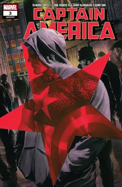
“Yep. It’s morning in America, Bud. Real America,” Joe Evers tells Steve Rogers as the hero visits a small town in “flyover country.” Captain America is stuck between those who insist he’s the man who led Hydra and those who miss them, as Coates continues the fallout from ‘Secret Empire.’ Leinil Yu shows Cap listening to Joe in rapt attention. He stares down into his beer bottle as the man talks about the how the fascist empire improved life in the heartland. Then he pulls back to a splash page of the town square. It’s made up entirely of white faces. It’s a powerful scene, the best in this issue.
Coates’s Captain America is troubled by what he sees and hears. While he reminisces about how different things were in the 1940s, he’s still surprised by the idea of there being a “real” America versus some other. This is the Captain America longtime fans remember, a principled man that is anchored in the past but able to adapt to the present.
But this book isn’t all introspection and talk. Cap, with help from Wakanda, faces the “Nukes” in their headquarters. Yu picks up the pace as the heroes storm the lab that manufactures the army of clones. Masks are donned, and panels expand to contain the action and follow Cap’s shield as it flies through hundreds of Nukes. The issue’s second splash illustrates the impossible odds the team faces. Nukes spill off the page in the background while Cap, T’Challa, and Okoye grapple with half a dozen in the foreground.
Continued belowAlanguilan’s inks and Gho’s colors set the mood for each scene. The downtown celebration is set at night, and the men share their beers in the shadows of a streetlight. Shadows line Cap’s face as he ponders Joe Ever’s words about Hydra’s fascist state. Heavy lines highlight the plates in Captain America’s chain mail when he breaks out of the panel twice during the battle in the lab.
‘Winter in America’ Part #3 is a turning pointing in the storyline, as Captain America heads to where Sharon’s mission took her. But the fallout from “Secret Empire” looks to be around for a long time. Under the stewardship of Coates and Yu, that’s good news.
Final Verdict: 8.7 – “Captain America” #3 balances action with powerful character moments in another exciting entry in the ‘Winter in America’ storyline.
Written by Zac Thompson & Lonnie Nadler
Illustrated by Piotr Kowalski
Lettered by Ryan Ferrier
Colored by Niko Guardia
Reviewed by Christa Harader
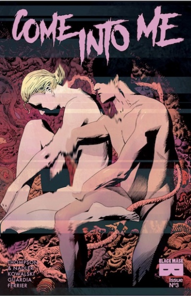
“Come Into Me” #3 is another great installment in a strong body horror series that’s stretching its legs beyond its initial conception as the love child of John Carpenter and Grant Morrison.
Thompson and Nadler work with some familiar imagery when Becky and Sebastian are forced to navigate the interior of Sebastian’s mind – screens, puzzle pieces, hallways, and miasmic oceans have all been seen before, but they’re deployed effectively as the two struggle for control. Kowalski’s art is on point, as usual, with great vignettes and enough EC-style sweat to make even the most skeptical fan enthusiastic. Guardia’s color work is similarly sophisticated, with judicious use of red throughout and a kaleidoscope of bright hues as Sebastian sorts through his memories. And, Ferrier’s lettering continues to impress, especially as the action heats up and things start to get weirder and less … defined.
What problems I have are minor, but worth mentioning. Both Becky and Sebastian are unpleasant people, which suits the horror genre, but as we continue to navigate the corridors of their minds, I’m wondering how long I can continue to sympathize with either of them. The conceit of a cam girl laughing at Sebastian because his body is a little weak, though I appreciate the deeper dive into his consciousness. I expect a bit of a pivot off of the issue’s cliffhanger to keep driving the series forward, but who can say? When two become one, things are bound to get a little messy.
Final Verdict: 8.0 – Thompson and Nadler do some interesting work on memory and connection in the digital age, bolstered by beautiful craft from the rest of the creative team.

Written by Cullen Bunn
Illustrated and Colored by Juan Doe
Lettered by Ryane Hill
Reviewed by Gregory Ellner
Using a non-chronological order, switching between an antediluvian era and the time of the Flood itself, Cullen Bunn enables readers to get into the minds of the Satanist sorcerer Shrae and his family. While his children are relative innocents, buffeted by the harsh world of monsters that they live alongside, Shrae shows himself to be a far more complex, conflicted individual, willing to lie and manipulate humans and monsters alike in order to stay alive, even if it means sacrificing some members of his own family to them. Does this make him a bad person? Probably, but Bunn’s writing helps even this ignoble man maintain a tragic air, one that leaves readers guessing how far he will go to achieve Satan’s mission for him.
Juan Doe’s artwork concentrates far more on motion and monstrosity, on the scenery and the ark itself than on individual faces. The result of minimizing focus on those elements is that when confronted with the gigantic monsters of myth, there is far less to miss in the far smaller images of humans and human-sized beings, creating a sense of horror and to a degree despair over the sheer disparity in power. Echidna herself, the mother of monsters, has the most significant focus, in stark contrast to the small eyes and mouths of humans. The colors are also given more focus by the limited look at faces, with the bloody reds clashing disturbingly against the green of the sea, but working well with the yellows of the sky.
Continued belowFinal Verdict: 7.0- Though the story itself doesn’t seem to move much, “Dark Ark” #10 is an entertaining enough issue, providing just enough information for newcomers to jump in.
Written by Zach Kaplan
Illustrated by Giovanni Timpano
Colored by Flavio Dispenza
Lettered by Troy Peteri
Reviewed by Gustavo S. Lodi
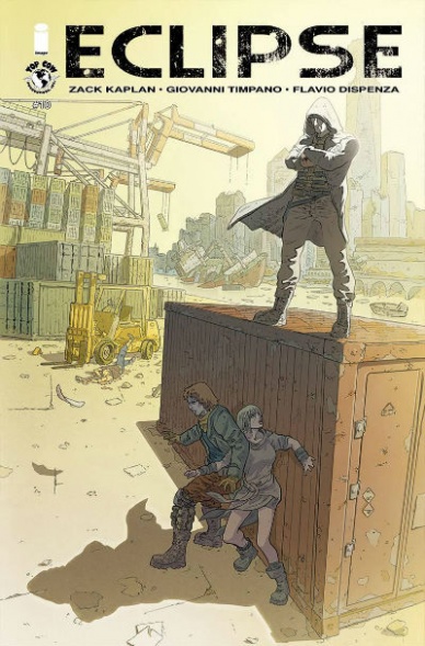
“Eclipse” #10 is a surprisingly accessible issue, considering how much of the story has already been published. The audience is easily pulled in by the cataclysmic event that plagues the world and the changes in society affecting the main characters. While a compelling premise, there are some issues that prevent it from being great.
Timpano’s art has an elegant line to it, striking a balance not usually seen, that of a very detailed paged, without the feeling of being cluttered. Instead, the world of “Eclipse” feels real and lived in, with most of those nuances going to an attention to background and settings. His page and panel layout could have some further polish, though. In some situations, characters break the frame border, touching multiple panels at once, confusing readers as to the order they should be read. It doesn’t help that speech balloons are also crossing the frame on those same pages.
Something unusual to comment, but that causes a perception of out-of-place, is the lettering by Peteri. Not the lettering itself – which is crisp, clear, and consistent – but rather how its font style and strength fails to blend with the art. It is almost as if the art style – that of a European book, with a thin line – demanded a looser lettering as well.
Kaplan’s world and characters are perhaps the strongest aspects of “Eclipse.” While some regular comic tropes can be found (such as the shady resistance leaders and military goons), the story is original and character’s motivations true and inspiring. It is also refreshing to see a writer actually tackle how a cure for a worldwide disease would be seen realistically: the economic, military and political implications of creating a commodity pursued by so many, in such short time.
At the end of it, “Eclipse” #10 offers readers a complex, yet accessible world and characters, with art that makes the settings seem real. It is unfortunate that some shortcomings hold the book back, but it is certain that those could be easily ironed out for future, even stronger issues.
Final Verdict: 6.9 – “Eclipse” shows tremendous promise, based on the quality of it’s writing and art, both with space to improve further as the series moves along.

Written by John Allison
Illustrated by Max Sarin
Colored by Whitney Cogar
Lettered by Jim Campbell
Reviewed by Elias Rosner
It’s nigh impossible to find a bad issue of “Giant Days.” Even at its lowest points, it’s funny and tragic and the art sings. This issue is a reminder, not of the low points (although it may feel that way to Esther), but of the highs and of just how far these characters have come since issue #1. Breaking hearts and advent calendars, “Giant Days” #42 continues to show the many facets of relationships, platonic or otherwise, between friends, partners and acquaintances and the trials and tribulations of navigation those waters. Add in a dash of Christmas and Babylon 5 based humor and the issue ends leaving a bittersweet taste in my mouth and tears in my eyes.
There isn’t much more that can be said about Sarin’s art that hasn’t already been mentioned but I think this issue really captures her ability to portray the smaller emotional moments. The best example is the conversation between Esther and Ed. Most of the time, the artwork is frenetic and built for humor but here, Sarin has toned down that energy and slowed the motion, allowing the seriousness and depth of the conversation to set in. It’s still funny thanks to Allison’s writing but it’s the kind of funny that elicits a smile and a chuckle between hushed words and a melancholic smile.
It is this scene, which acts as a culmination of their storyline, that the heart of the comic lies. It shows the growth of Ed & Esther’s relationship as friends and as people, with Esther being able to have a serious conversation and offer advice, good advice, no matter the personal cost. It’s only two pages but those two pages are where the magic of this comic is truly at play.
Continued belowFinal Verdict: 9.0 – “Giant Days” is consistently fantastic and issue #42 is no exception, showing the growth of not only the characters but of the artist and writer as well. A bittersweet issue, much like that Babylon 5 advent calendar and the embrace of Sexy Petrock.

Written by Al Ewing
Pencils by Joe Bennett
Inks by Ruy Jose
Colored by Paul Mounts
Lettered by VC’s Cory Petit
Review by Brandon Arnold
“The Immortal Hulk” has been a bit of a sleeper hit in the wake of Marvel’s “Fresh Start” relaunch. It hasn’t had the breakout success of Donny Cates and Ryan Stegman’s “Venom” series and it didn’t have the hype of a star artist like “The Amazing Spider-Man” had with Ryan Otley, but over the course of the last four issues, it has proven itself to be smart, original, and best of all, exciting, and its latest installment only keeps the up that trend.
After an admittedly somewhat tedious outing last month, the book is back in full swing this month and ready to SMASH!! “The Immortal Hulk” #5 concludes the Walter Langkowski (AKA Sasquatch) arc with a massive battle between Sasquatch and Hulk in the middle of the hospital, and it’s here that Joe Bennett proves, yet again, that he is the right man to be drawing this horror/hero hybrid book. Given that the majority of this issue is just a fight between two massive monsters, it’d be easy to assume that there wouldn’t be much emphasis on emotion, but that would be a wrong assumption. Yes, Bennett’s action sequences are high-octane, but it’s the genuine look and feeling of fear that prevails over all in this book. And and it’s not just the fear felt by the innocent bystanders of the book, it’s the fear that’s splashed across Hulk’s face after Sasquatch throws him through a wall, the same fear he has when Sasquatch reveals that he’s actually possessed by the spirit of Bruce Banner’s father, and it’s the fear the reader feels as the book ends and that same spirit is now inside of Hulk. It’s a fear that sits with you for the rest of the day.
Al Ewing has strewn together a story that, until this point, was almost entirely un-serialized, and then, at the last second, drops the curtain and shows his hand to reveal that the previous, episodic entries all tied into each other and into Bruce’s family history. So where one arc ends with Walter Langkowski, and other begins with the ghost of Brian Banner, and I, personally, am excited- and terrified- to learn what comes next.
Final Verdict: 8.0- Forget haunted houses this Halloween, just read this book instead.

Written by Jeff Parker
Illustrated by Bob Q
Lettered by Simon Bowland
Reviewed by Ken Godberson III
James Bond has existed for over fifty years and it has run the gauntlet from gritty commentary on Post-WWII international relations to the amazingly camp. Dynamite Comics has brought us another of their Bond series, with writer Jeff Parker, Illustrator Bob Q and letterer Simon Bowland instead winding back the clock to a Bond before MI-6, to a College-age Bond in the height of the Nazi Blitz on the United Kingdom. It’s a fine set-up, which is both the best and worst thing I can say about the comic from a story side: it’s fine.
We start with a cold opening of a Nazi bombing in Scotland before we rewind two days to James at college, already showing promise even as a student; teaching his own judo class. Parker does pepper in complexity within some more background details: the bullying his friend Maguire received for being Irish (a country that remained neutral in WWII) and the subversion of the German professor not being a spy, but it never feels enough to elevate the story outside of serviceable spy drama.
Bob Q’s artwork is the star in this comic. The artwork during the bombings really does play into the pulpy noir/spy genre very well, making great use of shadow and contrasting that with the bright yellows of bomb explosions. When it transitions back to time at the school, Q still makes great use of that shadow as a way of visually representing sinister intentions. I would actually like to see Q on more Bond works with a script that was a bit stronger.
Continued belowFinal Verdict: 5.4- Some nice art that, unfortunately, somewhat lifts a perfectly adequate start to a spy story.
Written, Illustrated & Colored by Sarah Graley
Lettered by CRANK!
Reviewed by Chris Egan
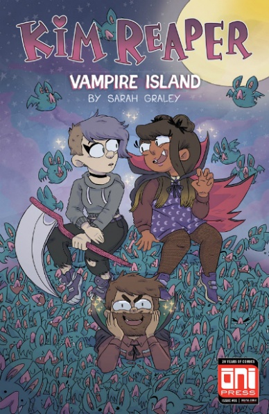
The new arc of “Kim Reaper” has Kim and co. coming up against a new adversary: vampires! This goofy supernatural-fantasy-adventure is the perfect mash-up of setting and humor of The Grim Adventures of Billy & Mandy, Adventure Time, and an artistic style akin to Regular Show. Triple threat Sarah Graley’s (“Our Super Adventure,” “Rick & Morty”) signature humor and art is on display with a wacky horror-comedy flair. While it isn’t completely necessary to read the first arc of the series to enjoy the start of this story, there are some plot points that will be a little fuzzy to new readers. Fortunately, the story moves so quickly that as you are getting some backstory thrown at you, you are already moving on to new threads. The writing is the perfect representation of a hyperactive teen chugging coffee and attempting to tell you something exciting all while showing you something completely different, but equally exciting. You can almost hear the deep breath being drawn in before any of the characters start to spit lines at each other. It’s tremendously funny in small doses and these mini-arcs are the perfect format for “Kim Reaper.” Graley’s dialogue is filled with purposely corny quips and funny jabs at pop culture, but it really shines when it comes from her own experiences with friendship and living through the college age. It’s easy to identify with the stuff that comes from a personal level all while reading about wacky vampires and grim reaper job descriptions.
Fans of Graley’s webcomics and the t.v. shows I mentioned above will definitely find something to enjoy here. This book is certainly not for everyone. It has a very specific sense of humor and energy. However, it is easy to appreciate the chosen style and it will speak to many young fans. Her art style will be familiar to anyone who has flipped on Cartoon Network (during the day or for Adult Swim) or Nickelodeon in the last 15-20 years. It’s a simple, easy to digest, yet nicely detailed American-Manga style that lives somewhere between “Scott Pilgrim” and Foster’s Home For Imaginary Friends.
“Kim Reaper: Vampire Island” #1 is an enjoyable read that will be devoured by fans of similar works, but will be hit or miss with a wider audience.
Final Verdict: 6.0 – A cute horror-comedy-fantasy that feels a bit too similar to things you’ve seen before, but with Sarah Graley’s own lively spark.

Written by John Layman
Illustrated by Nick Pitarra
Colored by Michael Garland and Brandon Daniels
Lettered by John Layman
Reviewed by Tom Shapira
After an underwhelming first issue, that never got past the basic premise of “there are giant monsters about” this one seems to course corrects by moving faster. Way faster. And while it is definitely a better problem to have it is still a problem. That the government knew that there’s a Hollow Earth with dinosaurs living below the surface and they have anti-dino mecha at the ready is quite a turn, and it is delivered in such an odd matter of fact manner.
Another problem, one that will probably dog this series for quite a while is the protagonist – Ryan is kind of boring mopey guy who seems to have nothing to define him other that he is, somehow, in the center of the story for reasons-yet-to-be-explained. Possibly he’ll get more interesting in the future, but I’m thinking of how fascinating Layman’s previous hero, Tony Chew, with his hardline professionalism and straitlaced approach, from his first appearance; Ryan just doesn’t measure up.
Still, there is a lot to like here: Pitarra is good at drawing mayhem, with his jagged lines and cartoonish design, and there is some fun to be had with the military robots chopping up dinos in half with giant swords. I also rather Enjoy layman’s willingness to set up long-term mysteries only to answer them straight away instead of dragging them on forever. Sure, he then sets up more questions – but we know he’ll answer them, and that answer might be ridiculous but it will make ‘sense’ within the terms of the plot.
Continued belowFinal verdict : 6.7 – fun it might be, but it needs to be even more fun if wants to get over the dull protagonist.
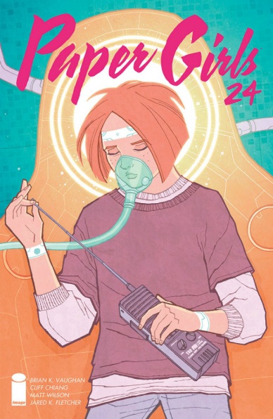
Written by Brian K. Vaughan
Illustrated by Cliff Chiang
Colored by Matt Wilson
Lettered and Designed by Jared K. Fletcher
Reviewed by Jim St. Pierre
“Paper Girls” is a high-tech, multi-layered scramble. Writer Brian K. Vaughan continues with his spot-on character development in “Paper Girls” #24 with nimble dialogue that breathes life even into static characters. It has the kind of energy that fueled the science fiction craze of the 50s but, instead of the campy lines and predictable plots, it has scrappy characters brimming with teenage personality and first-rate storylines.
Though separated by different needs, the Paper Girls communicate via walkie-talkies as they discover more clues about themselves and the Watch. Their spirits are undimmed by strange, even disturbing, discoveries and the book ends with the expectation of the team’s reunification despite some setbacks.
The action is minimal in “Paper Girls” #24 but nevertheless, this installment remains an engaging read. Vaughan weaves enough twists into the plot to advance the story while maintaining a sense of peril. And all of this is done patiently. The layouts are simple, based on a nine-panel page much like Moore’s “Watchmen,” but which only average five panels. Vaughan doesn’t rush through these pages, he swims lightly in a tidepool of events that feed inexorably into the ocean of his complex universe.
Supplementing Vaughan’s writing are Wilson’s coloring choices. His hues have subtle opalescent qualities that make the comic almost intangibly surreal. Were it not for the rigor of the narrative, the colors suggest it might be something more like a dream.
Final Verdict: 8.0 – “Paper Girls” #24 has great pacing and characters made all the more engaging by the nuanced coloring.
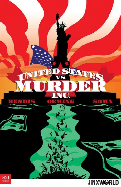
Written by Brian Michael Bendis
Illustrated by Michael Avon Oeming
Colored by Taki Soma
Lettered by Carlos Mangual
Reviewed by Michael Mazzacane
Despite the kaiju-esque naming convention for this newest iteration of “Murder Inc.”, the first issue has little to do in directly following up the events of the first series. Instead we flashback and explore the origins of Jagger Rose as she comes up to be an enforcer for the Family. This was a smart move for reintroducing the series to market even if it isn’t a clean one and done and opens up possibilities of multiple perspectives as the five families fight it out with the United States of America.
There’s a narrative bluntness to Bendis and Oeming’s work with Jagger as a grade-schooler. Her story time decision to talk about the defenestration murder of her father has all the hallmarks of a kid sociopath. As the sequence goes on, however, Oeming finds a nice way to juxtapose those trademarks against a girl who’s trying to figure out how to grieve in an environment of stoic masculinity. The end result is a story that has more nuance than you’d expect for such a highly stylized book.
Per usual Avon Oeming brings his expressive cartooned style, which continues to be perfectly paired with Taki Soma’s minimalist color pallet. His use of perspective is an interesting twist on the normally staid aesthetic conventions of noir and crime narratives. This stands out in his deconstruction of Jagger and Uncle Jake carrying out a sniper hit, a sequence clearly inspired by Leon. Uncle Jake taking out and assembling the rifle is a fairly straightforward concept. Except this isn’t straightforward for Jagger, it’s a first. Oeming represents that tension by exploding the image out into a single page splash, placing various panels of assembly off to the corners and out of order. The image is purposefully scattershot. It still remains a highly readable due to Oeming balancing it on the visually off the skyscraper and Carlos Mangual lettering their conversation straight down the middle. It’s chaotic, but with an analytical bent as things literally come together towards the bottom of the page. It primes the overall tone of the next several pages as Jagger peers through the scope and readies to pull the trigger.
Final Verdict: 8.0 – “Murder Inc.” returns with a solid introduction to one of the lead characters and features all the hallmarks of what Bendis and Oeming do together with this series.


