
There’s a lot to cover on Wednesdays. We should know, as collectively, we read an insane amount of comics. Even with a large review staff, it’s hard to get to everything. With that in mind, we’re back with Wrapping Wednesday, where we look at some of the books we missed in what was another great week of comics.
Let’s get this party started.
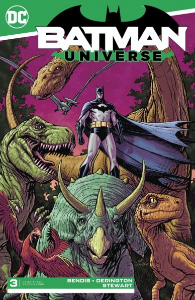
Written by Brian Michael Bendis
Illustrated by Nick Derington
Colored by Dave Stewart
Lettered by Carlos M. Mangual
Reviewed by Shamus Clancy
When Brian Michael Bendis made the jump from Marvel to DC Comics, it was easy to assume that he’d end up writing a comic about the Caped Crusader at some point. Known for his grim, street-level detective series like “Alias” and “Daredevil,” that transition was thought to be seamless. “Batman Universe” #3 is not what a typical reader would expect out of a Bendis-penned Batman tale, but that doesn’t make it any less of a fun superhero romp.
Incorporating a vast array of characters that have seldom interacted with one another is a staple of Bendis’s work. That’s exactly what readers get when they see Jonah Hex drawing a pistol on Hal Jordan in the Old West and Batman unknowingly transport himself to Gorilla City. Bendis is able to balance the pure, wholesome entertainment in “Batman Universe” #3 without falling prey to the campiness of frequent Silver Age-influenced stories.
Illustrator Nick Derington is a supremely understated artist. Even in an issue like “Batman Universe” #3 that has full-on superhero antics like gorillas, cowboys and the hawk people of Thanagar, there is something so simple, yet so rich in his linework. From the subtlety of Batman’s stubble, after Bruce Wayne has gone across the galaxy and back through a slingshot wormhole to the pterodactyls in this distance of Dinosaur Island, Derrington has a clear understanding that less can oftentimes be more.
Pairing any artist with Dave Stewart, perhaps the best colorist in comics, always makes for a gorgeous issue, but Stewart feels perfectly in-sync with Derington in “Batman Universe” #3. Stewart adds liveliness to Derington’s minimalist penciling that allows each panel to breathe on its own. The double-page spread of Dinosaur Island particularly shines with various shades of brown and orange galore.
While the day Bendis writes “Detective Comics” feels like an inevitability, readers should soak up the light-hearted adventure vibes of “Batman Universe” while they still can.
Final Verdict: 8.4 – The time has finally come for Batman to be shamed for the fact that he has wings, but can’t fly.
Written by Jeff Lemire
Art by Michael Walsh
Lettered by Nate Piekos of Blambot
Reviewed by Rasheda
What remains of the Justice League is questioning the Black Hammer team as to how they ended up in a place that is not familiar. Meanwhile, Colonel Weirdo is with Green Lantern to try and figure out where or what universe they are in. Both sides are trying to find out where they are and how to get back to each of their universes.
There is nothing better than a crossover that is well written and makes sense. Jeff Lemire takes the task of merging these two universes together, but also at task is how to explain the weirdness of alternate universes. What is great about this comic’s story is Lemire does not get bogged down with reintroducing the well-established characters of the Justice League or Black Hammer. It is also fun to see the contrast between the League and Hammer; the League wants answers, so does the other team but it is the approach of each that is quite humorous. We do enjoy Lemire’s “Black Hammer” series and the inclusion of the Justice League makes it that more enjoyable.
What is also enjoyable about this comic is the art by Michael Walsh. Looking at the artwork alone, it looks like it was painstakingly drawn panel by panel. Walsh has taken the complete task of illustration, pencils, and color for this comic. It has the look and feel of a dedicated student of the DCU and has mastered the replication of the characters. Walsh does not try the completely copy Jim Cheung or Jorge Jimenez, he has his own style that pays homage to them. Walsh’s handling of the “Black Hammer” characters are well done too, capturing facial expression, even when they are not close-ups, are well done. A standout in this comic as well is the lettering done by Nate Piekos of Blambot. Not only do we have a different voice written by Lemire, Piekos beautifully illustrates them, especially with Colonel Weirdo.
Continued belowFinal Verdict: 7.8 – A chaotic, cinematic crossover that will captivate DC and Dark Horse fans alike.
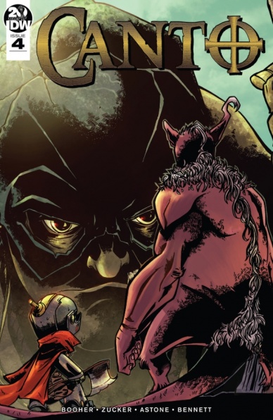
Written by David M. Booher
Illustrated by Drew Zucker
Colored by Vittorio Astone
Lettered by Deron Bennett
Reviewed by Matthew Blair
“Canto” #4 opens with its main character in the middle of his quest. It’s a journey that’s instantly familiar to anyone who loves the fantasy genre, which means the comic has two massive problems it has to overcome. First, it has to make itself different enough to separate itself from the hundreds of other fantasy stories out there and second, it has to entertain potential new readers and bring them up to speed while in the middle of its story.
The beginning of “Canto” #4 does a very good job of addressing these two problems. Writer David M. Booher does a very good job of making the main character’s purpose clear and understandable to any new reader and continues with very good dialogue and characterization, highlighted by the main character’s confrontation with two highly intelligent and annoyed giants guarding the city gates. Unfortunately, the writing does start to get a bit more predictable and fall flat near the end, but it knows how to pace itself well and promises a fun epic battle in the next issue.
The artwork for “Canto” #4 has a lot of the same strengths and weaknesses as the writing. Artist Drew Zucker presents the reader with a medieval-looking town that looks like something straight out of a Renaissance fair but has just enough twists and new inspirations to make it interesting. Aside from the standard collection of elves, humans, and giants, there are enough strange creatures and weird designs that make the reader stop and focus on how dark and nasty the world must really be.
“Canto” #4 tries its best to make itself different, and it mostly succeeds. Instead of trying to reinvent the wheel, it opts to take the tropes and ideas of traditional fantasy, fiddle around with the details, and rework it into a story that is familiar to the reader but still entertaining to read.
Final Verdict: 7.1 – If you’ve read any sort of fantasy this comic should be instantly familiar to you. However, well-written dialogue and great attention to detail make this comic just different enough to be interesting.

Written by Dan Watters
Illustrated by Dani
Colored by Brad Simpson
Lettered by Aditya Bidikar
Reviewed by Gregory Ellner
In “Coffin Bound,” Dan Watters has created a horrible, disturbing world with “Coffin Bound,” one that he delves deeper into with “Coffin Bound” #2. Through Izzy Tyburn’s attempts to get stay ahead of the Eartheater, Watters expands on her personality, showing a somewhat kind, well-spoken loner that provides an intriguing contrast against the rough way in which she both dresses and lives. The newer characters are very good for Izzy’s journey, showcasing the kind of people she regularly associates herself with on the one hand, and the people she avoids on the other. When showing conflict, Watters emphasizes the broken-down nature of the world of “Coffin Bound,” from cult-like people in pursuit of “symmetry” to weapons often taken for granted in other stories spontaneously breaking down in this one due to low quality or poor upkeep.
Dani’s artwork emphasizes the grit of “Coffin Bound” #2, being very detailed, but nonetheless bringing added attention to scars and wounds, as well as deep shadows and silhouettes befitting a noir tale as much as this kind of grindhouse storytelling. At times, deceptive angles enable Dani to portray shocking revelations with regards to sudden gore or situations that are otherwise violent or dangerous, helping to give an added chaos to the seemingly borderline dead world of “Coffin Bound” as a whole.
Brad Simpson brings his expert use of mood and tone to the colors, using a relatively dull color palette in many sections to show a calm, almost dead area while, on the other hand, emphasizing the sheer volatility that comes from one of our main antagonists in the sudden use of red for blood splatters, or a disturbingly sickly green for a serum of some sort or another.
Continued belowAditya Bidikar’s lettering is extremely well done, especially when it comes to the Eartheater’s narration sections. The calls of “Eartheater!” are shown in a very large font using two different warm colors that remind readers of a desert’s crackling rocks, almost seeming as if an announcer is shouting out from the very scene itself, rather than holding out from some far off distance outside of the story.
Final Verdict: 8.5 – From writing to artwork to colors to lettering, “Coffin Bound” #2 continues to be an enticing tale worth checking out and following going forward.

Written by Mark Waid
Illustrated by Jesús Saiz
Lettered by VC’s Cory Petit
Reviewed by Joe Skonce
Like the shrapnel in Tony Stark’s chest, the loss of Stephen Strange’s hands is an important storytelling device. Not only is it the start of his hero’s journey, but a reminder of his prior arrogance and current inability to heal the physical. In “Doctor Strange” #19, Mark Waid puts the good doctor in a challenging position; how much is Stephen willing to sacrifice to honor his first oath, “Do no harm?”
Mark Waid presents an excellent jumping-on point for Dr. Strange in “Doctor Strange” #19. We are given a recap of his origin, a reflection of the pain of his limitations, and a look at his quick wit and problem-solving. Doctor Strange’s struggle to use the spell reflects so much of his character, there is the arrogance of his surgical ability, a desire to help, but also a utilitarian debate over the nature of his role as protector vs healer.
The only issue in “Doctor Strange” #19 is the climax, which felt rushed. The issue presents the idea that moving forward he might have to make tough choices to heal or protect. In this story, the internal struggle of the decision was more interesting than the external conflict.
Jesus Saiz made some excellent art decisions in “Doctor Strange” #19. One of the key things in “Doctor Strange” as a while is presenting the world of magic as wondrous and horrifying. Stephen’s journey to confront Channok feels light and free, but the realm of Channok would not look out of place on a metal album or an 80’s horror flick. It’s eldritch and gross, which sells the danger.
The other highlight is the page where Strange’s hands disappear. It looks visceral and painful, while Dr. Strange’s face looks on in horror. He fears that not only has he lost the boy, but his dimension as well. That is an effective use of visual storytelling and one that sticks with you.
Final Verdict: 8.3 – While the ending felt rushed, “Doctor Strange” #19 is an excellent jumping-on point for new readers, featuring a compelling personal conflict and some excellent art of the world of magic.

Written by Sina Grace
Illustrated by Siobhan Keene
Colored by Cathy Le
Lettered by DC Hopkins
Reviewed by Linda H. Codega
With pastel-pop colors and dapper manifestations, “Ghosted in L.A.” #3 works hard to exploit it’s sweet, if almost saccharine, premise. Daphne, still recovering from the emotional fallout of a failed relationship that drove her to move cross-country, finally confronts the boy who dumped her. In a comedy of errors, when Daphne and Ronnie (the ex) eventually sit down and discuss the situation, Ronnie reveals that he’s gay, and that’s why he broke up with Daphne.
This scene is awkward at best, and while Sina Grace tries to make the dialogue work as an authentic expression, there’s something about Daphne’s millennial turn of phrase which makes the interaction feel stale. This short conversation neatly ties up the major conflict of the series, and the barely-there hooks placed within the earlier pages and issues aren’t engaging enough to pull the story forward. Even the final page, where a ghost becomes a dangerous ghoul, attacking Daphne, doesn’t feel threatening or intense enough to encourage picking up the next issue.
The art of “Ghosted in L.A.” #3 is exceptionally neat, but often relies on punchy pink and purple fills for backgrounds rather than fleshing out the set design. There’s a lot of emotion lost when most of the panels are medium shots of the characters with no background, rather than a fully fleshed-out scene. It’s a shame because the character design, clothing, and background (when it occurs!) are very well-drawn and well-colored.
Continued belowUltimately a solid premise and pretty art are not enough to drive this series forward. Daphne feels too isolated and immature (even for a college freshman), and is neither funny nor likable enough to sympathize with. Now that her major conflict with Ronnie has gone, there’s not much more to hang on to, and with very few friends and no prospects on the horizon, Daphne’s personal drama feels lacking. I was hoping for a soapy horror-comedy, but “Ghosted in L.A.” #3 has already resolved the problem presented at the start of the first issue, and the ghosts of Rycroft Manor feel too distant and too static to drive themselves, or Daphne, towards growth.
Final Verdict: 6.5 – “Ghosted in L.A.” is a well-drawn PG-rated comic suited for young teens, but might not deliver any satisfaction to the millennial audience it’s written for.

Written by Peter David
Illustrated by Francesco Manna
Lettered by VC’s Cory Petit
Colored by Espen Grundetjern
Reviewed by Michael Govan
As a kid, I got hooked on a new comic from the House of Ideas called “Young Avengers”. It only took one issue and just like that I was a fan of the brand-new characters. There have been other new characters I’ve instantly come to enjoy since then. Runaways, Miles Morales, Cosmic Ghost Rider, Riri Williams…Prince Prah’d’gul is not one of them.
It definitely feels like I’m missing something. I might be completely off-base here but the character seems angry, immature and pompous and not in a fun way. He’s the ‘star’ of this mini-event but I ended up liking his brother more. It’s easy to see the ‘twist’ of the issue coming but the reveal and condensed struggle for the throne between Luuk and Prah’d’gul was probably the most interesting part. I mean, the guy destroys his planet and displaces millions of people out of anger. It’s not a good look.
Likewise, the Guardians of the Galaxy aren’t at their best this issue. The one to get the most spotlight is Moondragon and she just uses her telepathy to sort of move the plot along. They allow the ‘Prodigal Sun’ to destroy his planet and do nothing. I get that they aren’t conventional heroes like the Avengers but come on.
In all fairness, the artwork and the action sequences were decent and there were some moments where Prodigal or whatever he’s called looked legitimately intimidating. Still, not enough to make me interested, unfortunately.
Final Verdict: 5.5 – The Prodigal Son returned but now he’s gone. Let’s just move on.

Written by Robert Venditti
Penciled by Pat Olliffe
Inked by Tom Palmer
Colored by Jeremiah Skipper
Reviewed by Tanveer Kalo
Tying-in with the Year of the Villain, Shadow Thief gets under Hawk Man’s skin with improved powers thanks to Lex Luthor, but the hero is not alone in his pursuit to bring the villain to justice. The Shade teams up with Hawk Man into the Shadowlands to find Shadow Thief.
Venditti provides a flashback of the Shade and Hawk Man’s earliest adventures against Gentleman Ghost to add depth to their relationship. Venditti also uses the flashback to let readers compare and contrast how the duo has changed.
Art in this issue is spot on for visualizing the Shadowlands and measuring up against the work of Bryan Hitch. The different shades of purple, black, and some blue are easy to the eye to understand the world. Olliffe’s pencils carry on the look set by Hitch for Hawk Man but stand out in their unique way.
Hawk Man’s emotional state in this issue comes to the forefront as pointed out by the Shade. Hawk Man becomes angrier and off-balance since the new arc started as he battles the shadow dragon. Some readers might recall this kind of behavior in different versions of the character over the years. Readers could expect a deeper exploration of Hawk Man’s emotional state in future issues.
Final Verdict: 7.5 – The creative team gives readers a classic Hawk Man tale set in the shadows.

Isola #9
Written by Brenden Fletcher and Karl Kerschl
Illustrated by Karl Kerschl
Colored by Msassyk
Lettered by Aditya Bidikar
Reviewed by Jhoan Suriel
From the very first page, “Isola” #9 wastes no time jumping into the action. Indeed, Fletcher and Kerschl know how valuable it is to take advantage of the 20 pages of the story. Like past issues, “Isola” #9 maintains a sense of mystery as nothing is what it seems. Additionally, the heightened sense of tension and danger in this issue is quite excellent.
With “Isola” #9, Karl Kerschl continues to draw lush settings and captivating creatures. Often an artist’s worst nightmare is drawing animals but Kerschl makes it look easy. In this issue, we get some kinetic panels of Olwyn springing into action. For instance, we get a panel of Olwyn baring her teeth with a tense posture. Plus Kerschl draws clean lines that emphasize realistic expressions.
Of course, “Isola #9” wouldn’t be complete without Msassyk’s excellent colorwork. In this issue, we get a nice contrast of a fruit field that initially seems pleasant with warm orange, yellow and a bit of green. But it gives way to a brown, unsaturated green, and yellow field to suggest the decaying reality of the situation. Later, Msassyk employs the series’ signature color palette of green and blue with selective use of red and magenta to great effect. Panels are further enhanced by Aditya Bidikar’s chaotic lettering work in this issue.
Although Rook and Olwyn strayed from the path to the titular Isola, “Isola” #9 continues to test their relationship. But it also continues to raise questions about what is real and what is an illusion. And much like previous issues, “Isola” #9 gets bleak and dark. But it’s part of the mystery and mysticism. Thankfully, it does not feel like Fletcher and Kerschl are spinning their wheels for the sake of it because the plot is going places. Where is anyone’s guess, but it is an intriguing series.
Final Verdict: 8.7 – “Isola” #9 is yet another well-paced and intriguing issue with fantastic art and excellent colors that should not be missed.

Written by Donny Cates and Tradd Moore
Illustrated by Tradd Moore
Colored by Dave Stewart
Lettered by VC’s Clayton Cowles
Reviewed by Beau Q.
Careful, reader! What lies beyond are the Three Stages of Herald Hell wherein Norrin Radd contemplates existence at its end and beginning!
Stage 1: Impression
“Silver Surfer: Black” #4 starts on a beautiful three-panel opening, Silver Surfer, the modern effigy of Atlas, faces his Titanic task: the Hitler Paradox. And his solution? Kill Baby Hitler (who is played by Galactus). The Watcher tells Surfer to reconsider, to which Surfer asks Baby Hitler/Galactus what he would do in his ability to know of the grand ending and earnest beginning. Now, this is where the Baby Hitler comparison falls apart– Galactus is a genocidal tyrant, but also a comic book character capable of foresight beyond that of man. Baby Hitler is a genocidal tyrant, but also a baby. If Cates and Moore meant to breach the subject of facing genocide in conversation, its failing is falling short of a concise resolution.
Stage 2: Expression
In the dark of existential nightmare, the world of Norrin Radd’s pain– the eponymous Black taking over Silver Surfer’s very form from the arm up– is illustrated with great exaltation by Moore and Stewart. Besides aping John Singer Sargent’s Atlas and the Hesperides, Moore shows an affectation for Frank Quitely and Jack Kirby in how he approaches Ego and Galactus’s rendering, respectively. The fluidity of Moore’s shape language let’s the narrative cosmic exist in feeling and voiceover rather than in literal visual– this incites readers to perceive the events emotionally rather than literally, which pushes the ambiguous ending of “Silver Surfer: Black” #4 to the forefront of their mindstate.
Stage 3: Resolution
Having seen Moore’s pages, especially his “Silver Surfer: Black” pages, there are no computer graphics involved in his inking. All the curves and fractals in Ego’s design or Galactus’s hell are hand-drawn in 0.1mm strokes at 1.85x the intended print size on 11×17” paper. Much like Norrin Radd’s thought process, Moore’s strokes are incredibly cautious and impeccably clean. Stewart’s colors make sense of Moore’s details, which, in black and white, are only separated by weight and space. This marriage of lithe, expressionistic art and pseudophilosophical science fiction are as old as the beginnings “Silver Surfer: Black” #4 visits. But, unlike space, this issue doesn’t exist in a vacuum, so the narrative doesn’t reach the heights the art does.
Continued belowFinal Verdict: 8.0 – Silver Surfer wouldn’t kill Baby Hitler.
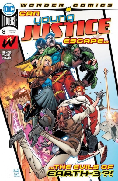
Written by Brian Michael Bendis
Illustrated by John Timms
Colored by Gabe Eltreb
Lettered by Wes Abbott
Reviewed by Alexander Jones
“Young Justice” #8 is an unfocused and crowded script brimming with ideas. The issue is dedicated to shaping and honing the strange status quo for the team of young heroes. Young Justice is still having an identity crisis due to characters retaining old memories from previous storylines. Author Brian Micheal Bendis brought this team of heroes back abruptly. Having a team of heroes established in a previous continuity is still an intriguing nostalgic fever dream but one that hasn’t been well explained.
This script places our heroes in the continuity of Earth-3, the home of the Crime Syndicate. Bendis riffs on existing continuity by adding some Young Justice doppelgangers in the tradition of the Syndicate. The book falters in some of the surface-level characterizations for these antagonists. Getting foils for existing cast members has the potential to be a truly fascinating twist on the traditional format of the comic. It is interesting to see an idea utilized in a continuity-heavy, dimension-crossing title like Young Justice. The script starts to fall apart when it pulls on a character study of Tim Drake. Bendis briefly focuses on Drake, abruptly switching gears toward characters like Jinny Hex and Teen Lantern. It feels like some of these scenes don’t take full advantage of the property and can come off as rushed. Instead of having a natural story progression where characters can go next, “Young Justice” #8 sprints towards several story-beats to fit as much content as possible in one issue.
Artist John Timms submits pencils bursting with personality which is lacking the polish of previous creator Patrick Gleason. Timms is a good fit for the tone and aesthetic of “Young Justice” but lacks some of the artistic detail to outperform or match previous creators who have contributed to the property. A page with Red Robin battling a doppelgänger is a particularly impressive array of tasteful silhouettes. Some of the odd facial expressions and anatomy start to detail where the issue is lacking artistically. The sequence with Red Robin displays how Timms is starting to come into his own as a creator who is improving with each chapter of the title.
While I’m disappointed that Timms and Bendis aren’t able to deliver a more profound and focused narrative, “Young Justice” #8 brings a lot of ideas to the table. “Young Justice” #8 is an entertaining story with technically competent art that contains lots of solid character beats.
Final Verdict: 6.8 – “Young Justice” #8 packs a lot of ideas but doesn’t contain enough space or focus to explore all of them.


