
There is a lot to cover on Wednesdays. We should know, as collectively, we read an insane amount of comics. Even with a large review staff, it’s hard to get to everything. With that in mind, we’re back with Wrapping Wednesday, where we look at some of the books we missed in what was another great week of comics.
Let’s get this party started.
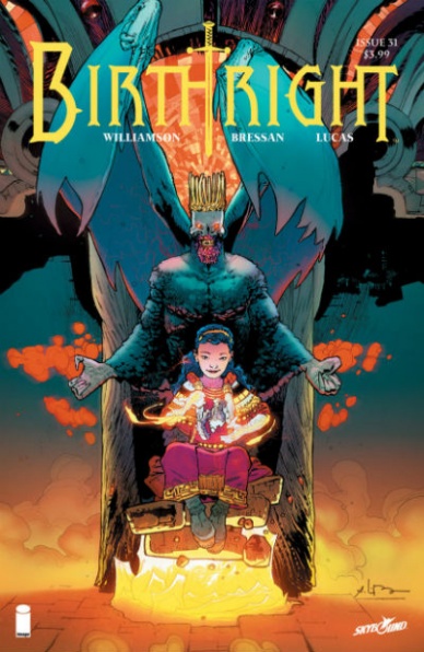
Written by Joshua Williamson
Illustrated by Andrei Bressan
Colored by Adriano Lucas
Lettered by Pat Brosseau
Reviewed by Michael Mazzacane
“Birthright” returns looking at things from a different point of view. Much of the series has been, understandably, wrapped up in the trials of the Rhodes family, and prophecy surrounding Mikey Rhodes. Issue #31 shifts the focus, removing a majority of the Rhodes family and looks at the story of the one Mage we have yet to see: Mastema, daughter of King Lore. The issue takes this shift in perspective one step further, by not having Mastema actually tell it but from the point of view of a Terrenos commoner. Someone who was meant to be her pet. This shift is a nice reminder of the larger effects and cost of war, and how it can make some truly strange bedfellows when all you want is for the fighting to stop.
Despite the potentially heavy themes, it still has that “Birthright” black humor and charm too it. Andrei Bressan pulls off a couple of excellent page turn reveals. Much of this humor revolves around the actions of Mastema, obliterating her teachers in gruesome fashion as if she’s trying to become a Sith Master. You can’t help but chuckle at the image of a tiny girl ripping people in half. Bressan gets a lot of mileage out of a minimal expressive range. That lack of expression is key to developing the ambivalent nature of the character. “Birthright” has played in typical high fantasy tropes before and cleanly sets up two ways to read the characters actions within that paradigm before obliterating it with a third far more interesting option.
It was good to see Williamson and Bressan show a different side of King Lore. Normally the arch antagonist is a ghoulish devil, but here he is made a confounded Father by his impudent daughter. He’s trying so hard to be a great and terrible Father and she will not acknowledge these sacrifices.
Final Verdict: 8.0 – “Birthright” returns with a strong first issue that reminds readers of the series core strengths while showing the nature and cost of destiny from a novel point of view.

Written by Dan Slott
Penciled by Sara Pichelli
Inked by Pichelli & Elisabetta D’Amico
Colored by Marte Gracia
Lettered by Joe Caramanga
Reviewed by Ken Godberson III
“Fantastic Four #2” is not a good comic.
I suppose we should get what good there is out of the way. The art team of Sara Pichelli, Elisabetta D’Amico, and Marte Gracia are really good. There’s a smooth and sleekness to the artwork that seldom compromises some of the emotional weights behind scenes. On top of that, the team gets to flex their muscles drawing a variety of universes created by Franklin Richards and Owen Reece, the Molecule Man. Marte Gracia, who sometimes be a bit muted with his colors, does provide an eclectic palate for the multitude of universe traveling going on, as well as when the action kicks into gear (even if there is one “Ehhh” part; we’ll get to it). This team continues to show that they are well worth being on Fantastic Four with a good script.
Speaking of…
Look, credit where it’s due, Dan Slott did a decent job with the first issue. This though, the problems immediately begin. I”m one that, on paper, am okay with aging the characters a bit, even if I’m aware there are creative and financial (which is the only thing Marvel cares about) problems with that. With that in mind, what I did not need, was an older boy, who is clearly coded as “native” (complete with a loincloth and -I wish I was kidding- red-colored skin) hitting on young Valeria, who even aged up is about… thirteen-ish maybe? It’s supposed to come off as cute, but when the boy is inviting Valeria to be his consort, it comes off as massively creepy.
Continued belowAfter getting past that we have the rest of the comic which the massive problem can be bogged down to one word: pacing. In that, so much is happening in this issue, nothing (except those first few moments that had the aforementioned “Gaaah!”) gets a chance to breathe. It does its best to get people caught up to speed with what happened post-“Secret Wars,” introduce a new villain, show this villain’s seriousness by hurting/killing a great deal of the Future Foundation kids (which pushed this comic further into the bad column) and have Reed rig a teleporter that brought all of the F4’s allies (Johnny, Ben, Black Panther, Medusa, Spider-Man, e.t.c) to the fight. That’s a story arc, not a story issue. It’s just too much and everything runs together after a bit.
Final Verdict: 5.0 – Good art does not make up for bad pacing and some very skeevy, tone-deaf moments.

Written by Larry Hama
Illustrated by Ron Joseph
Colored by James Brown
Lettered by Neil Uyetake
Reviewed by Tom Shapira
It’s a new G.I.Joe storyline, focusing on machinations of Cobra’s mad scientist Doctor Venom, and a chance to see whether this creative team is good at bringing readers up to speed with the plot. Considering I have not read a single issue since the classic “G.I.Joe” series had been revived in 2010 (starting with #156 – continuing directly from the Marvel numbering) they do an admirable job. This is definitely an old-school comic-book, for good or ill, with people talking through their motivations and histories in a way the helps any newbie reader to immediately understand who’s against whom and plays well to Larry Hama’s problem-solving approach as a plotter: Even as this new arc is being set-up enough happens within the issue to make it feel worthwhile.
On the other hand, it is also a series that’s now so deep within its own mythology, with decades’ worth of continuity, the story seems to be less about something related to the real world (even in a metaphorical manner) and more about addressing old issues. The art team does fine enough job as is, though considering the first few pages are all about establishing location penciler Ron Joseph could’ve done stronger work with local geography, I got to admit something about coloring just falls flat to me: the faces of characters, in particular, lack definition and have a plastic-y sense to them.
It’s hard for something like “G.I.Joe” to get from under its own shadow, the original run being one of the best team-books Marvel or DC published in the 1980’s; while it’s nice to see Larry Hama keeps moving the plot forward I am not quite sure this issue manages to transcend its legacy.
Final verdict : 6.5 – with strong fundamental storytelling and functional (but unexciting) art this issue reminds you of old glories but doesn’t quite reach them itself.

Written by Gerry Duggan
Illustrated by Mike Deodato Jr.
Colored by Frank Martin
Lettered by VC’s Cory Petit
Reviewed by Alexander Jones
“Infinity Wars” #3 is an oddly paced moment for the series that doesn’t reach any conclusions or significantly advance the plot in any major capacity. Gamora’s conflicted ideas make for a highly entertaining yet convoluted installment spiraling in a repetitious circle. While Gamora’s inner conflict and interaction with Loki is fascinating, the moments barely advance the plot and give readers the obvious status quo they had been expecting from the marketing materials in the event.
“Infinity Wars” #3 contains a lot of characters standing around with no secondary activity to break up the flow of the title. Part of the ownership for this lies in the hands of artist Mike Deodato. Deodato’s art features minimalistic facial expressions and posed movements. The detailed look of Loki and the rest of the supporting cast is solid but outside of a few facial details, the work could have used more distinctive features. While Deodato’s art continues to be infused with the right level of energy, I more work could have gone into his movement and facial expressions to allow for each aspect of his art to be as dynamic as some of the page layouts.
Continued belowThe issue largely picks up in the second half when author Gerry Duggan temporarily resolves Gamora’s plot thread and the book starts to explore some of the status quo changes Duggan implements. The ensuing pages are loaded with great ideas bearing “Infinity Wars’” manic, hyper-enthusiastic style. The last page, in particular, is a wonderful way to explore this concept in the main series. While I wish Duggan would better explain the role of each character in the story and what some of their motivations were, readers are definitely treated to a lively script.
“Infinity Wars” #3 is equal parts fun, convoluted and manic. While it is disappointing that Duggan wasn’t able to keep up the momentum from past installments, the entry still makes for an entertaining read. Hopefully, in future installments, Duggan will be able to better define his scope and purpose for the series. This installment serves as a relentless teaser at moments to come but ends up keeping readers at arm’s length.
Final Verdict: 6.8 – “Infinity Wars” #3 is a wild, mismatched and slightly tedious issue that still manages to entertain and carry a lot of momentum for the overall direction of the title.

Written by David J. Schow
Illustrated by Andres Esparza
Colored by Sergio Martinez
Lettered by Janice Chiang
Reviewed by Chris Egan
The third issue in “The Standoff” continues to be a serviceable dark, horror/sci-fi story that feels too much like a weaker episode of the 90s The Outer Limits, or The X-Files. Its text-heavy narrative is too wordy for a plot like this, where much of the story is more than adequately depicted through the art. Along with the messy exposition, there is not one likable character in the entire mini-series. Like an episode of Tales from the Crypt, but without the campy, tongue-in-cheek humor. You do not feel bad for or want anything to do with the characters With a plot centering on an alien ship crashing into a black-site maximum security prison with outside law enforcement coming to clean up the mess, it might be too much to ask for a “hero.” However, what we are stuck with is a guy who had his life ruined by the government and is a terrible anti-hero that the reader will find hard to root for. At the end of the day, even with John Carpenter’s name slapped on the book, it is clear he has little-to-nothing to do with the creative end of things and is in more of a host position of this anthology series. Schow’s writing isn’t so much bad as it is strictly unpolished. It’s a little clunky as it attempts to move things along, but he has some solid ideas and creepy elements. Those with a phobia of bugs, and more specifically stinging insects will find plenty to be disturbed by. The story plods along for being the midway point of a five-issue series with no clear progression. It sort of just hangs there as if it has all the time in the world to wrap up loose ends.
The artwork by Esparza and Martinez is good but ultimately forgettable. Decent illustrations that end up too dark, with some panels that are hard to make out with a quick pass. The palette suits the type of story, but it won’t have anyone raving about it. It does have a nice hand painted aesthetic, but it’s similar to too many other horror books. At least there are some great moments of gore and icky alien infections to keep horror fans mildly interested.
Final Verdict: 5.0 – An OK dark, sci-fi book with some decent alien designs, but the plot is uneven, wading through thick exposition when it should be focusing on its strengths: B-horror and violent action scenes.
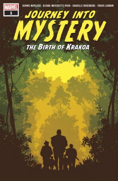
Written by Dennis Hopeless
Illustrated by Djibril Morisette-Phan
Colored by Rachelle Rosenberg
Lettered by VC’s Travis Lanham
Reviewed by Gustavo S. Lodi
Ever wondered what happened to the island known as Krakoa to make it the monstrosity that kidnapped the first generation of X-Men, leading to the events that prompted the more internationalized team of mutants to erupt? Maybe that is an interesting idea on paper with a promising story; unfortunately, the execution of this special issue is not remarkable.
Continued belowMixing Nick Fury and his Howling Commandos in a shady adventure during the time that Krakoa was born is a great concept. These soldiers were running around the Marvel universe in a number of unregistered missions, so the connection lends itself nicely.
The art choices by Morisette-Phan are part of the problems this special face: while not bad in any glaring way – panel design and page layout are aptly done – there is little to set it apart and, more importantly, to set the story on the desired timeframe. Had “Journey Into Mystery” been depicted in a more pulp-ish way, something similar to what Darwin Cooke did with “The New Frontier,” the tone and mood would hit the ground running. Instead, readers are presented with an overly dark art, with heavy uses of shadows and thick lines.
Hopeless’s script does one thing really well, which is the dialogue among Fury and his Commandos: there is a sense of camaraderie, and yet of deep respect for their leader, that is obvious and organic on every conversation. The manner that Fury also cares about his troops speaks volumes of the character himself.
But other than that, “Journey Into Mystery” adds little to the mythology or to any innovative narrative framing. The audience can probably guess how the story will unfold and they would miss little marks and cues.
At the end of the day, “Journey Into Mystery” is a perfectly fine book, but with little to set it apart or to link it to a past era of comics. It ends up reading more like a process to address a dangling plot point, rather than a truly inspiring idea.
Final Verdict: 6.5 – Something of a missed opportunity, “Journey Into Mystery” has its high notes, but even them feel too monotone on the overall package.

Written by Alan Moore
Illustrated by Kevin O’Neill
Reviewed by Jim St. Pierre
As with most of Moore’s work, “The League of Extraordinary Gentlemen: The Tempest” #2 is complex, psychedelic and thrilling. His cast of characters spans figures from two hundred years of literature and references settings from an equal number of books. Typical to his other “League” books, “The Tempest” #2 transitions among settings, both temporal and physical, to fill in backstories and further develop Moore’s convoluted plot, the point of which isn’t entirely clear. And not to be outdone, O’Neill matches these surreal shifts in narration with his almost hallucinatory art. Sometimes the pages are black and white, reflective of the journals used as artifacts for backstory; sometimes they are stylized in blocky, vintage comic form; and sometimes the art is more modern. All of these techniques come together like a patchwork quilt, filling in gaps to a story that skips around like an old movie reel. And though the story is often confusing, the characters are unique and compelling, even when they are, essentially, recycled. Perhaps that is Moore’s genius, his ability to give new life to classic figures. And Moore is never one to leave a comic only partially realized. The adds, the commentary, even the credits, all speak to the classic style of writing that popularized the characters he has conscripted into his narrative.
Final Verdict: 8.9 – Moore’s complexity is matched by O’Neill’s artistic vision and both keep the reader seeking for deeper meaning in the panels.
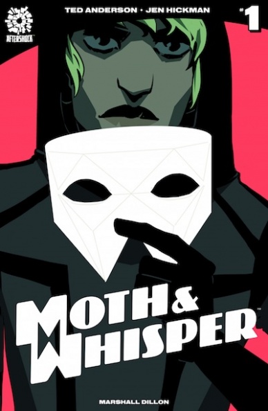
Written by Ted Anderson
Illustrated by Jen Hickman
Lettered by Marshall Dillon
Reviewed by Christa Harader
This issue is a bit of an info dump, but the premise is engaging enough to make it worthwhile. We learn all about the finest thieves the world’s seen, the Moth and the Whisper, as well as Niki’s efforts to track down whoever is responsible for their (pronoun intentional) parents’ disappearance. We also get a good dose of the tech that enables Niki to change their appearance at a whim, which is a fantastic device for a genderqueer protagonist and a clever way to allow Niki to express themselves. Nicely done on that front.
The cartoony art style and minimal color palette suit the stealth theme of the book very nicely. Hickman knows how to capture character expressions with just a few details and really make them pop, and the action moments are also chosen with the same level of precision. Lettering is serviceable, with some nice sound effects. Overall, the team’s put together a nice package with enough skill and style to suit the fun story that’s unfolding.
Continued belowAt the end of this first issue, we’ve identified Niki’s main target: the primo dirty crime boss in the city. I’m expecting some good action and, possibly, some fallibility on Niki’s part as the story progresses – they’re young, angry and relatable, and I’d like to see that trend continue as they grow from these experiences.
Final Verdict: 8.0 – a solid first issue and a good dose of intrigue to set up what promises to be a cool all-ages spy thriller.

Written by Gail Simone
Penciled by Adriana Melo
Colored by Kelly Fitzpatrick
Lettered by Simon Bowland
Reviewed by Eric Goebelbecker
‘Revenge of the Curse of the Horror of the Creature,’ continues “Plastic Man’s” run as one of the most entertaining books of 2018. Gail Simone always does an excellent job of combining humor with drama, but her skills are uniquely suited to this series. In this issue, she mixes character moments with slapstick, rising tension, and a one-two punch at the end.
Eel O’Brian is still close to the criminal community he lived in when an accident made him Plastic Man, and Simone mines this to significant effect. As the story progresses, he narrates his thoughts to us, and we hear his struggle to be a better man. He’s new to the hero thing and has to be reminded to “stop crime junk.”
Batman has Crime Alley; Plastic Man has Scum Alley. The name is amusing enough, but it’s also the scene for some signature “Plastic Man” sight gags from Adriana Melo. She channels Jack Cole, the character’s creator, with over-sized fists, an almost stolen tire, and a purloined ice cream cone. The sequence is almost entirely wordless and tells a one-page story of its own.
Melo’s use of facial expressions is extraordinary. An old pharmacist beams when he recognizes “Suitcase” Mizzola. A college professor’s face falls when he translates a letter. Plastic Man grins ear-to-ear as he tangos. Her gift for comedy and details make “Plastic Man” a visual treat.
Kelly Fitzpatrick works in a bright and colorful palette that suits “Plastic Man’s” light and fun atmosphere. Janet’s bedroom is a hot pink that contrasts what’s happening to her. A rooftop scuffle starts under a bright, blue, sky. Even Scum Alley is well-lit.
The back-to-back surprises at the end of this issue point toward two big confrontations in the final two issues of this series. I’m looking forward to seeing how it ends, but at the same time, I’m already wondering: why only six issues? I’d read the heck out of an ongoing “Plastic Man” title from this team.
Final Verdict: 8.8 – “Plastic Man” #4 is another gem from Gail Simone and Adriana Melo.

Written by Scott Lobdell
Illustrated and Colored by Pete Woods
Lettered by Troy Peteri
Reviewed by Gregory Ellner
To call this arc “Red Hood and the Outlaws” would be inaccurate. The ‘Outlaw’ arc, as it starts out, is entirely a solo operation, without the limitations proffered by Jason Todd’s tentative alliance with the Batfamily, and without much in the way of a support network as he seeks out the criminal Underlife first brought up in “The Silencer.” This story is dark, gritty, grim, and while the Red Hood is still a hero in that he goes out of his way to save someone’s life, his methods harken back to his “Punisher”-esque days, including fatal gunshots, immolations, and more, along with the signature weapon of a simple tire iron.
That said, Lobdell’s dialogue could use some work. The brutal murders do not mesh well with more kid-friendly dialogue like “butt” for hindquarters or awkward phrasing like “the drop-dead last thing you need.” Perhaps it can change, but this far into the series, that is unlikely.
Pete Woods provides visceral combat, with quick movement, minimal, realistic blood, and concentration on the nastier impacts like teeth flying from a strike. On the other hand, the quieter moments include the tactical use of shadows to hide Jason’s face, be it with or without his mask, adding an air of mystery and distrust to this lone outlaw.
Continued belowHe may work on the side of the angels, but Lobdell and Woods make sure readers know that the Red Hood is by no means one of them anymore.
Final Verdict: 8.0- Aside from some awkward word choice, the ‘Outlaw’ arc is off to a great start, an interesting jumping-on point for fans of the classic Red Hood.
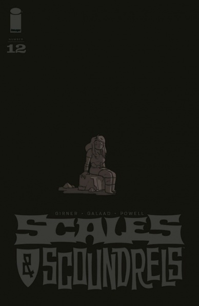
Written by Sebastian Girner
Illustrated by Galaad
Lettered by Jeff Powell
Reviewed by Elias Rosner
“Scales & Scoundrels” was an all-ages fantasy comic from Image. Fantasy from Image isn’t surprising. All-ages is. But alas, twas not meant to last for issue #12 is, for now, the final adventure of these scoundrels. To say this issue is a terrible ending is an understatement but not because the comic is bad, simply that it is ending too soon. It’s the conclusion to a smaller arc, one which focuses on a single character’s journey but leaves the others hanging.
It’s the second half of Dorma’s arc and the issue itself feels rushed and cramped. There are two issues worth of events in “Scales & Scoundrels” #12 and while Girner and Galaad do a valiant job of cramming it all in, there is a sense that much is glossed over. That the slower moments are forgotten in favor of moving towards a satisfying resolution. This is visible in the art and paneling. Large gutters separate panels, leaving pages sparser than they otherwise could be. Face, while varied, are missing eyes or a single eye when in the background or don’t match the dialogue well, producing a dissonance between them.
However, the faster pacing means that the action is more driving and Galaad’s rendering of the darkness was the right balance of visibility and shadow. That, perhaps, was the most effective part of this comic. Again, not enough was explored with the personification of the darkness, whether it was real or imaginary. The humor of the imaginary team, however, brought back the wonder of those first few issues. It also reminded me of what was missing. Were this an interstitial arc, I would be more satisfied with that ending but as is, it leaves me wanting more.
Final Verdict: 5.9 – Closing out Dorma’s emotional arc in an issue that should have been two, “Scales & Scoundrels” doesn’t end on a high note but it does leave me craving more. This series will be missed.

Written by Brian Michael Bendis
Penciled by Ivan Reis
Inked by Joe Prado & Oclair Albert
Lettered by Josh Reed
Colored by Alex Sinclair
Reviewed by Michael Govan
In “Superman” #1, it was revealed that Earth had been transported into the dangerous Phantom Zone. Two issues later, the fallout is still keeping Clark (and a bevy of Super Friends) busy. Ivan Reis is often put on DC Comics’s more high-profile books (New 52’s “Aquaman” and “Justice League,” DCYou’s “Cyborg” etc.) and it’s clear why. His style is perfect for superhero comics and is one of the book’s biggest strengths. Reis’s pencils and Bendis’s script make Superman feel properly…super. The Man of Steel runs damage control for the entire issue, performing herculean tasks where needed. The reader feels how powerful and heroic Clark is when Reis draws him stopping runaway trains with his immense strength, flying around the world faster than a speeding bullet, catching falling planes and rescuing civilians from certain death. Alex Sinclair’s colors really enhance the art through the entire book. They are vibrant on Earth but the colors in the Phantom Zone help it feel fittingly cold and alien.
This book is not without issues though. While Livewire is a welcome secondary protagonist, the dialogue at S.T.A.R. Labs feels repetitive, something Bendis has often been guilty of. While the book soars with Superman as the focus, it drags on for me when Rogol Zaar is given the limelight. Bendis’s new villain has been the primary antagonist through his “Man of Steel” miniseries as well as the three issues of this book. Rogol practically shares equal billing with Superman but is nowhere near as compelling. He has yet to achieve much depth beyond ‘super-strong alien warrior who hates Kryptonians.’ Bendis keeps hammering home that Rogol strikes fear in people but we have seen nothing that makes him feel very fearsome. The stakes would feel higher to the reader with a better villain.
Final Verdict: 6.5 – The Last Son of Krypton shines in “Superman” but the shadow of the bland Rogol Zaar keeps this good book from being truly great.


