
There’s a lot to cover on Wednesdays. We should know, as collectively, we read an insane amount of comics. Even with a large review staff, it’s hard to get to everything. With that in mind, we’re back with Wrapping Wednesday, where we look at some of the books we missed in what was another great week of comics.
Let’s get this party started.
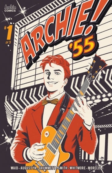
Written by Brian Augustyn & Mark Waid
Line Art by Tom Grummett
Colored by Glenn Whitmore
Lettered by Jack Morelli
Reviewed by Rasheda
It is the era of rock ‘n roll, Archie Jughead and Reggie are in a band a year after graduating high school. They have a great sound and after being approached by a radio DJ, Archie has set his sights on becoming a rock ‘n roll star. After seeing the great performance by a black rock singer, Archie is inspired by a new kind of sound.
After the ‘Archie 1941’, which took place during the war of Pearl Harbor, Brian Augustyn and Mark Waid have decided to continue this series and turned to lighter fare. Augustyn and Waid captured the excitement of rock ‘n roll with the young crowd, sticking to Archie wanting a career in music that has long since been in the comics’ history. This is the first in a five-part mini-series, so we have a lot to look forward to from Augustyn and Waid with these characters being the same likable group, but in the rock ‘n roll heyday.
Tom Grummett and Glenn Whitmore are the artist and colorist for this series and the imagery is very enjoyable. The characters are not drawn in their usual form, but they are still recognizable by Grummett’s art. You have the distinction of Jughead’s hat, Reggie’s sarcastic looks or even Archie’s hair and freckles. Whitmore’s colors are nice and colorful, it is appreciated when the focus is on the character so the background colors in some of the panels illuminate the character and set the mood. The art and colors art is especially enjoyable on the splash pages and long panels when the bands are playing and the lyrics are surrounding the characters.
Which brings us to the main letterer of the Archie Comics, Jack Morelli. The lettering acts almost as a character itself since this mini-series is based on music. Morelli has the lyrics of the song breakout of the panels, almost as if in defiance like rock ‘n roll was back in the 1950s.
Final Verdict: 7.0 – If you are a fan of genre comics, catch up with Archie and the gang in the 1950s, where the real hipsters thrive.

Written by Alex de Campi
Illustrated by Robert Hack
Colored by Kelly Fitzpatrick
Lettered by Jack Morelli
Reviewed by Christa Harader
“Archie vs. Predator II” #2 tries to up the stakes for the crew but doesn’t entirely succeed thanks to needlessly quippy dialogue mixed with muddy art and flat action.
De Campi’s quips managed to be in line with the original Archie tone in the first volume, but the choice of loose linework and muddy realism clashes badly with the setting and makes most of the dialogue feel painful and out of place. Hack’s faces are a continued disappointment, and with little in the way of dynamic action, a character losing his head and most of his spine feels humdrum rather than exciting and punchy the way it should. In a book like this, that’s almost unforgivable.
Fitzpatrick’s coloring is competent, with some nice color pops as accent backgrounds to help fill in the cartoonish vibe that’s so sorely missing, as is Morelli’s emoji dialogue for Predator Jr. Still, de Campi and Hack’s styles undermine rather than complement each other, and the book simply doesn’t work. Archie needs to either be crisp and realistic or cartoonish. Adding a bunch of shading and textures doesn’t mask the larger art issues, and does too much to soften the good artifice of what makes Archie and the crew enjoyable to a modern audience.
Final Verdict: 5.5 – “Archie vs. Predator II” #2 continues what’s shaping up to be a bit of a rudderless, disappointing look at multiple Predators on the Riverdale stage.
Continued below
Written by Jim Zub
Illustrated by Lan Medina
Colored by Marcio Menyz
Lettered by VC’S Joe Sabino
Reviewed by Matthew Blair
Marvel’s latest super team comes to us courtesy of “Black Panther and the Agents of Wakanda” #1 and is a fantastic blend of popular characters who are familiar to millions of fans, such as Black Panther and the Wasp, and obscure characters that only a few die-hard fans will know, like Fat Cobra and John Jameson III. It’s ambitious, engaging, and a lot of fun.
If it isn’t clear that writer Jim Zub is having the time of his life writing “Black Panther and the Agents of Wakanda” #1, he is quick to remind us at the very end of the comic with a very excitable letter to the reader where he shares just how much he loves working within the warped sandbox of the Marvel Universe. However, his palpable joy and passion for this project is tempered with years of practice and skill, which allows him to cram a metaphorical ton of humor, history, exposition, action, and emotion into a single twenty-page comic.
The fantastic and well-paced script is complemented by fantastic and well-paced artwork. Artist Lan Medina is a comic book veteran, and his talents are on full display in “Black Panther and the Agents of Wakanda” #1. His artwork blends old school dynamic action with modern facial expressions and shading, which is both easy to follow and fun to look at. More importantly, Medina knows how to pace the story with his art. Every moment has just the right amount of panel space it needs to make an impact, and his ability to condense some of the slower moments of exposition are what allow the comic to do so much with so little space.
“Black Panther and the Agents of Wakanda” #1 is a great comic that brings together a diverse and eclectic cast of characters and brought together by a veteran creative team that loves what they’re doing. It will a lot of fun to see where the book goes from here and to see if any elements from this book make it into the Marvel Cinematic Universe.
Final Verdict: 8.9 – A fantastic comic put together by an incredibly passionate, top tier creative team that brings some of the more obscure and diverse elements of the Marvel Universe into the limelight.

Written by Michael Legacé
Illustrated by Todor Hristov
Colored by Todor Hristov
Lettered by Computer
Reviewed by Reece Guida
Scout Comics has consistently been putting ambitious books on the shelves, and “The Forever Maps” #1 is no exception. It poses compelling questions: Would you abandon all responsibility to pursue an obsession? What would you do with the inevitable guilt?
“The Forever Maps” #1 is about a sixteen-year-old named John, who is basically a man since it’s 1777. He’s crumbling under the pressure to be exactly like his oppressive father and feels lost in life. When John finally makes a decision for himself, he can’t tell if he’s running away from fate or closer to it.
“The Forever Maps” #1 is a smooth blend of fantasy and Romanticism. Writer Michael Legacé uses mysterious maps to pull John into the wild, away from his relationships and sense of time. It’s understandable why John would want to flee his family, his life. His father is abusive and obviously terrible. His mother is battered and doesn’t have a word of dialogue in the story.
Despite this wet blanket of predictable characterization masking such a solid concept, the art in “The Forever Maps” #1 is triumphantly innovative. Each character is hyper-realistic but ethereal, almost like they were illustrated with rotoscoping. In extreme closeup panels, Hristov uses heavy shadows and crosshatching to amplify the relentlessly bleak tone of the story. The sepia color palette and historically-accurate costumes establish the setting even further. (There are plenty of breeches, cloaks, fur, neckcloths, and boots to go around.)
I have no doubt that Hristov’s art will be plastering the covers and interiors of Big 2 books soon enough. Unfortunately, the obviously typed lettering, and heavy bubbles surrounding it interrupt Hristov’s flow in “The Forever Maps” #1 — and the art’s message. Let’s just hope that Legacé’s storytelling, like John, takes the path less traveled, and gives these characters some dimension.
Continued belowFinal Verdict: 7.5 – “The Forever Maps” #1 is a rugged story, but character tropes dull that edge

Written by Mike Mignola and Scott Allie
Penciled by Christopher Mitten
Colored by Brennan Wagner
Reviewed by Tanveer Kalo
The mystery deepens for Hellboy and the B.P.R.D in New Hampshire, while Liz struggles to find herself. The writers give a bit more clues on what’s going on with the recently discovered bodies, but still leaves readers to pick up the final issue to find out the truth. Liz’s adventures in New Haven take a turn for the worst as her newfound companions get into some trouble forcing her to ignite. Readers get more insight into Liz’s mindset and what role the B.P.R.D played at this point in her life.
Newcomer Wagner’s colors beautifully capture New England and Mitten’s pencils invoke strong emotions from all the characters. Both work in harmony with the tone and pace set by Mignola and Allie. Wagner comes through in this series with the perfect shade for the colors. It is great to see how Mignola can work with any team to continue to expand one of his best-known creations.
Short tales like this help provide a full picture of Hellboy and B.P.R.D’s past adventures and gives other creators a chance to tell a story in a universe with a rich history.
Longtime Hellboy fans will not be disappointed with this short series and new readers will find an intriguing mystery story.
Final Verdict: 7.3 – A worthy Hellboy and B.P.R.D read that leaves readers wanting more.
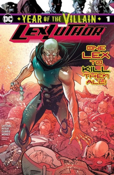
Written by Jason Latour
Illustrated by Bryan Hitch
Colored by Tomeu Morey
Lettered by Tom Napolitano
Reviewed by Gregory Ellner
With Lex Luthor’s “Year of the Villain” one-shot, Jason Latour delves deeply into what it means to be the eponymous character on different Earths in the DC multiverse, a rather daunting task when it comes to one of the principal antagonists in the several months-long events he is a part of. In doing so, Latour establishes Lex Luthor in a holistic sense, showing many different possible routes he could have walked down without ever making the primary “Apex Lex” of Earth-0 fully sympathetic. In fact, with each world he visits, Lex is shown to be ever more monstrous and inhuman, helping to further work within his thoroughly villainous role for the Year of the Villain.
Nonetheless, Latour strings a thread of tragedy into the entire narrative, as readers are made painfully aware of the ways in which Luthor could be happy and successful if he would only consider other options. At the end of the day, as one of his multiversal counterparts notes, Lex Luthor is his own worst enemy, and thus the focus of the Tragedy of Lex Luthor the Unwise.
Bryan Hitch makes excellent use of facial expressions and perspective, particularly in the emphasis on emotion. Apex Lex’s relative lack of any real reaction to nearly anything, contrasting against other characters’ terror, joy, anger, and more showcases how alien he has become, as well as making the rare cases where he actually does lash out in rage all the more frightening by comparison.
Tomeu Morey uses slightly different color palettes for the various Earths, though never truly distinct from one another, producing an effect of making a variety of moods rather than one of places.
Final Verdict: 8.75 – Monstrosity and tragedy insidiously slither through this holistic one-shot to intertwine at the heart of what it means to be “only Luthor.”

Written by Carlos Guzman-Verdugo & Alejandro Verdugo
Illustrated & Colored by Jorge Monlongo
Lettered by Christa Miesner
Reviewed by Chris Egan
After seeing Napoleon Dynamite in 2003, did you ever ask yourself what happened to Napoleon, Deb, and Pedro after the credits rolled to When in Rome’s “The Promise?” The new miniseries from IDW Publishing sets out to show us more of their senior year, picking up a few months after the end of the film. Penned by Carlos Guzman-Verdugo and Alejandro Verdugo jump right in, bringing these characters back to life in all their idiosyncratic glory, but does it serve a purpose beyond some early-aughts nostalgia? The first issue is 26 pages of quirky moments, scenes touching on where the characters’ lives are headed as we last saw them, and a new over-arching plot that brings up the possibility that Pedro unknowingly won the Class President election illegally. It’s silly, it’s cute, but unfortunately, there isn’t much of a point.
Continued belowThe first glimpse into the lives of these Idahoans was meant to be a funny display of oddball anecdotes with a beginning and an end; one and done storytelling. We get enough world-building to know that these characters exist beyond the boundaries of the movie and expanding on that with an unnecessary sequel ultimately feels empty. It isn’t a poorly written comic and the writers really nail the dialogue between the three teens. However, it is overly long for the story its telling and the pages are filled with drawn-out dialogue. It’s made up of a lot of story threads that no one was asking for.
Jorge Monlongo’s wonderfully bizarre and misshapen artwork definitely nails the tone, mixing the likenesses of the film actors with a design that would feel right at home in the middle of a programming block on Cartoon Network. Using a palette that is both pastel and decidedly drab, it all feels like “Napoleon Dynamite.” Outside of a few aesthetic choices, it all works.
Final Verdict: 6.0 – Fans of these characters will enjoy their return, but it offers nothing more than a sequel for sequel’s sake. It’s not bad, but there is a reason why the movie was a cult hit and anything beyond that like, 2012’s Napoleon Dynamite: The Animated Series, is destined to be forgotten.

Written by Jim Zub
Illustrated by Troy Little
Colored by Leonardo Ito
Lettered by Crank!
Reviewed by Beau Q.
For those RickMort fans seeking RickMort adventure, but aren’t DnD informed, I’m so sorry for your loss. For those DnD fans seeking a campaign featuring third-party television characters, I’m so sorry that it had to be Rick and Morty. For those RickMort fans who have at least one (1) campaign, congratulations, “Rick and Morty vs. Dungeons & Dragons II: Painscape” #1 is about what you love, filled to the brim with references to both Rick and Dragons and Dungeons & Morty!
Wait.
Jim Zub, perennial live play DnD panelist, and Troy “I Work in Animation” Little have come together, again, on “Rick and Morty vs. Dungeons & Dragons II: Painscape” #1 to not just further non-animated misadventures, but also “geek” about everything tabletop roleplaying [specifically DnD 5e]. This act of fan-turned-creator privilege would not be complete without Leonardo Ito churning out an entire animation studio’s worth of color fills, volumetric shading, and specular highlights. Not to mention, the invisible hand dealt by Crank!, the mysterious letterer whose work is unobtrusive, but carries the vocal performances of the anime adaptation, Rick and Morty.
Beyond this realm of studiousness and/or affection for the source materials, “Rick and Morty vs. Dungeons & Dragons II: Painscape” #1 throws more love into its writing and jokes than pushing farther as a comic, save for one sequence I will describe in detail: RickMort fall asleep, and wake up in chains. Such a transitional moment could be effortless and replaceable, but what Little and Ito settled on was the fluidity of a sleepless man’s world slipping away as easily as his agency. The stagnant, but efficient page compositions would do better to affect this creativity level going forward.
Licensed comics are often made in mini-series for the trade for The Fan, so they’re often limited, not by creator creativity, but by doctrine– this is all in sacrifice for consistency with the materials they’re adapting. But “Rick and Morty vs. Dungeons & Dragons II: Painscape” #1 has found a fun way to keep consistent with the Rick and Morty style while also giving you a reason to keep reading.
Final Verdict: 7.0 – Everyone take a d4 of damage for “SorceRick.”

Written by Jody Houser
Illustrated by Silvia Califano
Colored by Thomas Deer
Lettered by Neil Uyetake
Reviewed by Joe Skonce
One of the things that separates a good Star Trek episode from a great episode, is a good mystery. Mysteries show us that even in the future, with all of its scientific and technological advancements, humanity is still learning. It also allows characters a chance to showcase their intellect and skills, giving them a goal to work towards and proving why they have a position on the prestigious USS Enterprise. In “Star Trek Year Five” #6, Jody Houser writes a compelling mystery that fits the tone of the original series.
Continued belowOne of the strongest aspects of “Star Trek Year Five” #6 is that the mystery of the week allows Lt. Uhura to shine and proves the importance of the communications officer to a Starship. The mystery? People are saying their thoughts out loud because of an alien artifact. Due to this communication breakdown, the crew is getting hostile. When an early solution is to just remain quiet, the ship becomes inefficient. Communication is not only important in dealing with the enemy, but it also helps to build strong teams.
The other highlight of “Star Trek Year Five” #6 is Houser’s ability to capture the voice of the Enterprise Crew. It’s not hard to imagine these lines spoken by Shatner, Nimoy, and Nichols. This is best showcased in the showdown between Kirk and the Klingon captain. It showcases the quick thinking and creativity of the crew, but it’s also just fun. Kirk’s dialogue is filled with the right balance of confidence and humor, with just a drop of self-doubt to keep it interesting.
Similarly, Silvia Califano’s art in “Star Trek Year Five” #6 was spot on to the aesthetics of the original series. All the rooms on the Enterprise have nice clean angles with bright technicolor buttons. It was impressive to see how Califano and Deer captured the look of a Klingon bridge, with all of its low red lights and the constant fog. Even the brief view on the planet’s surface looks like a manageable set design. It was nice to see so the 60’s view of the future so perfectly captured on the pages of this issue.
Finally, the issue ends on a conversation of the nature of communication vs connection. The whole situation shows the importance of the words we choose and how they impact relationships, a conclusion that would work well in the original series.
Final Verdict: 7.6 – “Star Trek Year Five” #6 delivers an issue that feels like classic Trek, featuring a decent mystery and a solid Klingon standoff.
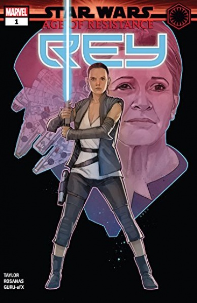
Written by Tom Taylor
Illustrated by Ramon Rosanas
Colored by Guru e-FX
Lettered by VC’s Travis Lanham
Cover by Phil Noto
Reviewed by Linda H. Codega
Star Wars is a difficult franchise to do well. Everyone has (and is entitled to!) their own opinion about the far-reaching sci-fi franchise. “Star Wars: Age of Resistance – Rey #1” is, unfortunately not a strong addition to the storylines mixed into this universe. The issue, ‘Alone,’ shows us Rey traveling from the resistance base on D’Qar to Ahch-To, where she will find Luke Skywalker, taking place just in between final scenes in The Force Awakens. The issue actually focuses not on her own struggles, but mostly on her interactions with other characters – namely Chewbacca, General Leia, and a villain-of-the-week, Ara-Nea. In fact, there are only 8 pages that show any kind of conflict not already seen in the last five minutes of The Force Awakens.
Likely limited by the production standards and the tight creative control that the Lucasfilm franchise has over the art, the illustrations inside the issue feel very standard. The art looks like it came from the early 2000s comics era, with clean lines, clear figures, cinematic angles, and a strict layout. It’s not badly done, and in fact, the ships and technical-like renderings of the Falcon and even a version of Boba Fett’s Slave 1 are very well drawn. The problem is that at this point, this style is just not exciting or much fun to read.
The coloring in “Star Wars: Age of Resistance – Rey #1” is likewise well-done but not experimental or even unique. It is totally derivative from the movie palate. Even when given the opportunity to create a new character during the encounter with Ara-Nea, both design and coloring both fall flat, rendering a bug-like villain and spaceship Necropolis in blues, greys, and dark, uninteresting colors.
‘Alone’ is a shallow version of Rey, lightly enjoyable and easy-to-understand. The feel-good ending of “Star Wars: Age of Resistance #1” provides a good look at Rey taking on a villain and seeing violence is not the answer. However, the fact that she uses a classic Jedi mind trick to overcome Ara-Nea is confusing – how did she even learn to do this? It’s not like Kylo Ren gave her any pointers during her captivity. Never explained and quickly moved past, ‘Alone’ never satisfies the desire to see a new side of Rey, or even reveal anything more about her character or past. Ultimately kind of nice, but not really worth it.
Continued belowFinal Verdict: 4.5 – Rey’s issue is another tacked-on side-quest to a franchise heavy on content and light on story.

Written by Dan Slott & Jim Zub
Illustrated by Valerio Schiti
Lettered by VC’s Joe Caramagna
Colored by Edgar Delgado
Reviewed by Michael Govan
I did not enjoy “Tony Stark: Iron Man” #16. To the credit of this issue, the artwork is good. Valerio Schiti draws superhero action scenes that can be both epic and fun. The enemies he brings to life (be it Ultron or the human/robot zombies) are all fittingly horrifying. I can also appreciate the levity that a drunken Machine Man brings to the comic. Aaron Stack is always a delight to have in any series, bring him back as much as you’d like.
That’s all the positives though from where I’m standing. The negatives all revolve around the villain: Ultron Pym. His plan of fusion is just dumb. It feels gimmicky and makes no sense to me. Remember in Amazing Spider-Man when Lizard’s ‘big plan’ was just to turn everybody into lizards? Yeah, it’s like that.
Furthermore, both the characters of ‘Hank Pym’ and ‘Ultron’ are made worse by this ‘Ultron Pym’ abomination. Ultron’s not as good a villain, nowhere near as menacing or cold and calculating. Then there’s Hank…oof, poor Hank. I actually really like the character of Hank Pym. I’m not defending his very infamous actions, he’s made mistakes and paid for them. It’s just…the godly Thor is amazing but in reality, we’re probably more like Hank. Flawed and insecure, struggling to get it right. Dan Slott actually penned one of my favorite Hank comics, “Mighty Avengers”, so you’d think that the writer has a handle on Pym’s characterization. It doesn’t show here though.
Tony and Jan both regard Hank as if he were always a monster. Jan says that Hank did nothing but hurt her which is not consistent with their (admittedly flawed) relationship. The ‘clever’ way that Tony tries to beat him, by crapping all over him, just seems even more excessive. Why is Hank even still merged with Ultron? If you don’t like the character, fair enough, but stop dragging the guy through the mud.
Final Verdict: 4.5 – ‘Ultron Agenda’ is already off to a shaky start.

Written by Jason Aaron and Al Ewing
Illustrated by Cafu, Ramon Perez, Cian Tormey, Roberto Poggi, and Frazer Irving
Colored by Jesus Aburtov
Lettered by VC’s Joe Sabino
Reviewed by Alexander Jones
“Valkyrie: Jane Foster” #3 is a slight change of pace for a book which has been devoted to action so far. Even without the battle scenes, there are still plenty of familiar elements tying the narrative together from the last installment. Writers Al Ewing and Jason Aaron directly follow-up on the cliffhanger from the last issue. Ewing and Aaron thrust readers into the middle of a touching narrative as soon as the issue opens. The script explores Jane Foster’s inner thoughts that elegantly recap everything readers need to keep track of. Ewing and Aaron continue to widen the scope of the narrative by visiting other realms and bringing Foster and Heimdall to the very edge of the realms. Seeing the story pick up on plot threads from “War of the Realms” in such a natural manner shows how focused the script is.
One of the biggest talking points about the issue is the massive set of pencilers in charge of interior art. Aaron and Ewing opt to change the setting every time a new artist jumps on board. Seeing a different visual interpretation of Foster’s section of the Thor mythology is intriguing. Not every contributor matches the grounded but regal approach that lead artist Cafu applies to the character. Ramon Perez’s contributions carry fascinating page layouts but lack some of the detailed nature from other creators. Cian Tormey and Roberto Poggi deliver a solid set of pages that can make their section of the book technically sound yet intriguing. Frazer Irving deserves to draw a full issue of the series as his psychedelic and beautiful couple pages stole the show from an artistic standpoint. While some of the art can be hit-or-miss, Marvel editorial assembled a sound group of creators for this issue.
Continued below“Valkyrie: Jane Foster” #3 has a touching major plot point and subject matter. Getting a story with less action and more character that retained a sense of urgency shows the strength of the title. Ewing and Aaron craft a sentimental script that still contains a complete story. Changing the setting for each artistic creator helped the chapter stay focused.
Final Verdict: 7.5 – The beautiful script in “Valkyrie: Jane Foster” #3 keeps focus despite carrying four different teams of artists.
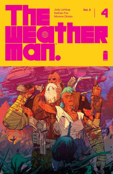
Written by Jody Leheup
Illustrated by Nathan Fox
Colored by Moreno Dinisio
Lettered by Steve Wands
Reviewed by Jhoan Suriel
“The Weatherman Vol. 2 #4” continues to be a fun high-octane adventure comic. Writer Jody Leheup continues to mix humorous moments with stylish action. In this issue, we visit locales such as the Canadian wilderness and the Arctic Circle with its frigid, icy crags. The pace is quite excellent in this issue as it feels like we’re on a roller coaster ride. By the end of this issue, Leheup manages to set up an intriguing cliffhanger.
Remarkably, Nathan Fox continues to bring the heat in “The Weatherman Vol.2 #4”. Some of this issue’s best panels emphasize Leheup’s humor quite well. For instance, there’s a gag that involves Nathan doing target practice early in the story. The character expressions, while exaggerated, do wonders to sell the humor and emotions they experience. Additionally, Fox continues to show his prowess for great creature work design. Let’s just say there’s a fish tank that involves a giant, mutant jellyfish in this issue. Lastly, Fox’s panel is quite diverse in “The Weatherman Vol. 2 #4” with characters popping out of gutters to pull readers into the story.
As for the colors, Moreno Dinisio complements Fox’s artwork with colorful and meaningful choices in “The Weatherman Vol. 2 #4”. Some of Dinisio’s best colorwork in this issue emphasize action such as Nathan’s iconic orange shirt and blonde hair that stands out in the frigid outskirts. As a nice little detail, Dinisio colors Nathan’s nose in red to emphasize how cold Nathan feels in the Arctic Circle. Every panel in “The Weatherman Vol.2 #4” is deliberately balanced thanks to Dinisio’s color work so it continues to be impressive.
Overall, “The Weatherman Vol. 2 #4” is a tightly paced issue with excellent artwork and colors. The plot thickens as the search for Ian Black continues. Definitely look forward to next month’s issue!.
Final Verdict: 8.9 – “The Weatherman Vol. 2 #4” continues to deliver stylish action and humor as the stakes continue to get higher for Nathan, Agent Cross, the rest of the crew.


