There’s a lot to cover on Wednesdays. We should know, as collectively, we read an insane amount of comics. Even with a large review staff, it’s hard to get to everything. With that in mind, we’re back with Wrapping Wednesday, where we look at some of the books we missed in what was another great week of comics.
Let’s get this party started.
Written by Nick Spencer
Penciled by Ryan Ottley
Inked by Cliff Rathburn
Colored by Nathan Fairbairn
Lettered by VC’s Joe Caramagna
Reviewed by Alexander Jones
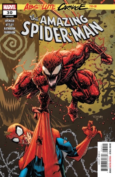
Now that readers are almost at the finish line on the latest Spidey crossover event, “Absolutely Carnage,” it is clear that the story has a huge focus on Peter Parker. Parker has struggled to keep his supporting cast safe from a symbiote threat infecting his enemies. This new issue sees Peter trying to help Eddie Brock’s son Normie escape from the clutches of Norman Osborn. The issue is a classic Spidey setup that plays on story threads introduced decades ago. However, the key problem with this current “Absolute Carnage” tie-in is just how similar the story structure is to the recent ‘Go Down Swinging’ towards the end of previous writer Dan Slott’s Spider-Man run.
Writer Nick Spencer has a great handle on continuity and references the ‘Go Down Swinging’ story and numerous other Spidey tales in the script. Writers have a bad habit of making Spider-Man too bleak when a symbiote is introduced. While this story is definitely darker than your average Spider-Man comic, it still comes off as important and seems connected to past stories. Spencer recaps a couple of epic Spider-Man moments from Peter’s past that gives the issue an authentic feeling. The biggest aspects holding the story from greatness is a sense of been-there, done-that. We have seen this same villain used in continuity extremely recently.
Artist Ryan Ottley is an expressive penciler that is able to depict strong emotions with the characters. Ottley’s pencils work surprisingly well in a darker Spider-Man context. Ottley’s huge expressions make the villains incredibly sinister and foreboding. The colors from Nathan Fairbairn are shockingly beautiful and make for an excellent final page. The way Spencer structures his scripts with flashbacks interspersed with fighting allowed for the art to earn a sense of momentum leading to the final page. The second half of the comic showed that Ottley and Spencer are strong collaborators jointly working to a surprising conclusion.
Spencer and Ottley work together incredibly well in a story that could have been a boring crossover tie-in. A different villain and concept behind the issue would have better served the level of craft behind what the creative team delivered. “Amazing Spider-Man” #30 is a solid crossover tie-in with a derivative antagonist.
Final Verdict: 6.8 – “Amazing Spider-Man” #30 brings out elements of Peter Parker’s personal life to deliver a formidable tie-in story.
Written by Bryan Edward Hill
Illustrated by Gleb Melnikov
Colored by Roman Titov
Lettered by Ed Dukeshire
Reviewed by Greg Lincoln
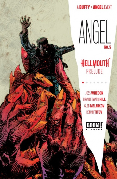
Bryan Edward Hill and his artistic collaborators created a great introduction for the fan favorite character Charles Gunn, despite a few moments that didn’t completely click, like when Angel first appeared. Gunn, in the original series, was a great human foil to the mostly supernatural cast around him and he remains that badass man on a mission for more than just vengeance in “Angel #5.” Hill, who wrote the new “Wildstorm: Michael Cray” and “Batman and the Outsiders,” is no stranger to writing badass action heroes but what he does best here is bring their personal stakes out in the story and let them bring characters together. After a brief introduction to To social media savvy urban explorer SJW, Gunn, the creative team shows us Gunn’s formative moments spotlighting both the IRL threat POC face from the police and the palpable supernatural that exists in this often cruel setting. Hill lets Gunn shine as the hero before bringing in the title character when the odds get possible too uneven, seemingly mostly for expediency. Between Angel and Gunn, we got some pithy, Wheadonesque, dialogue that exposes character and brings laughs with Angel’s opinion of sanity. Few quibbles aside there is a lot to like about the writing.
Continued belowGleb Melnikov and Roman Titov took a very representational and atmospheric approach to this story. Melnikov has a great grasp of character design, he chose features and gestures that capture the essence of the actors to define them. In some ways, this works better then attempts towards making them realistic. His Gunn Or Angel may not look exactly like J. August Richards or David Boreanaz, but those aspects he chose to focus on, the shape of the brow, eyes, nose, and chin suggest the characters in a way that realism might not have. The color palette chosen by Roman Titov is shadowy in muted tones that may not appeal to everyone but the suggest the tones you would see things in at night and suggests an air of danger and fear that pervades the story.
Final Verdict: 7.5 – “Angel” #5 gets so much of what made the characters of the show tick and puts it in a new fresh context that you can forgive any awkwardness of some of the narration.

Written by Roger Stern
Art by Ron Lim
Colored by Espen Grundetjern
Lettered by VC’s Joe Caramagna
Reviewed by Rasheda
The Avengers are in the works of fixing their headquarters when they receive a plea of help from Loki’s wife. Loki has been searching for a source of more power so he can rule Asgard, but trouble has formed with the ruler of the planet. The Avengers lend their assistance, along with Dr. Strange, to the planet to save Loki. When they think the battle is won, they encounter a being they were not ready for.
For a 32 page comic, this was some heavy reading. Roger Stern has tried to fit in a lot of information within the interaction within the Avengers, Loki’s soliloquies, and other characters that were written for this comic. The tone set for Loki Unleashed feels like Stern will have a different way for Loki to try to acquire the power to usurp the Asgard throne in each issue. Why not choose just one significant storyline to have throughout several issues? There is just way too much going on in this story by Stern and then the end is a mere ‘Well, glad that worked out, let’s finish rebuilding’. Loki was not forefront in the issue, which is a miss on Stern’s part.
The art from Ron Lim is very enjoyable, it makes you want to keep turning the pages to look at the new scenery. Lim’s detailing is fantastic, speaking, in particular, the layout of the galaxy, Captain America’s uniform, and Dr. Strange’s cap; the detailing is there and appreciated. Espen Grundetjern coloring is a great compliment to the artwork, it is bright and expansive. Take away the speech bubbles and almost every page is beautiful.
Letters by VC’s Joe Caramagna stand out in this issue. Caramagna has assigned different characters their own letter, which is a nice turn; Thor and Loki’s letters are in an almost old English style, Iron Man (when suited) is assigned red letters in a kind of robotic text and Dr. Strange, when in astral form, is assigned a blue text to match his form. With all the dialogue, it is nice to have Caramagna’s letters to break it up.
Final Verdict: 5.4 – For Loki to be a part of the title of this series, he sure does play the fool.

Written by Ed Brubaker
Illustrated by Sean Phillips
Colored by Jacob Phillips
Lettered by Sean Phillips
Reviewed by Beau Q.
For this review’s entirety, we will discuss a jacket color, its importance, and little else.
Little Else:
In “Criminal” #8, femme fatale, Sweet Jane, wanders the streets lost in memory and searching for something/someone just beyond the edge of her consciousness while the plot looms in the background, slowly twisting strings into knots that won’t see their importance for a couple few. As with all “Criminal” singles, there’s a lurid recollection of 1963’s Ladybug Ladybug by Kim Morgan. Fun fact: Brubaker and Morgan choose the back material on movies thematically similar in mood, scene, or thesis to the issue it’s printed in.
Continued belowLet’s get this out of the way as well– Brubaker’s internal monologues are captivating, Sean Phillips is the perfect example of an invisible hand comic artist, and Jacob Phillips is an Eisner-award caliber colorist. With that out of the way, let’s focus on the only thread (or threads) of importance.
The Jacket:
“Criminal” #8 opens on a scene full of men in natural light and darkness planning their heist, but what stands apart from the pack is the sole female clad in primary red. The jacket’s vibrancy is radiating Jane’s uneasiness in such a smooth environment. The red means she doesn’t belong.
At home, Sweet Jane takes a shower and shows a moment of weakness when it’s just her. There’s no jacket to wear, just the black and white suburbia brings to her emotional detachment. In a reveal, that primary red juts out. The red means danger here, and Jane’s lack of wearing danger at home shows vulnerability.
Back on the street with a renewed purpose, Phillips now renders Jane’s jacket closer to purple, drained of its vibrancy by blue shade. Here, Jane fits in. It isn’t until Jane visits an old stomping ground completely drowned in red hues that it sinks in; her hair is tinged pink red even. The dangerous streets are where Jane fits in most. The red jacket, her protection, means nothing to the world she’s known.
In “Criminal” #8’s final sequence, Jane’s jacket is dried and muted, fading into the dank scenery. We finally see her for what she is, and what it cost her. The red means blood, but not just bloodletting– the blood of family, having finally made amends to stay and protect rather than run.
Visually representing security, danger, and death with coloring choices is one of the many ways “Criminal” #8 keeps pace with the series at-large in a seemingly wheel-spinning issue, but this is “Criminal” where nothing is so simple.
Final Verdict: 8.0 – SHE WALKED THE STREETS WITH A WHITE JACKET, BUT AT THE END OF HER WALK, HER JACKET WAS STAINED RED.
Written by Nicole Andelfinger
Illustrated by Matias Balsa
Colored by Miquel Muerto
Lettered by Jim Campbell
Reviewed by Joe Skonce
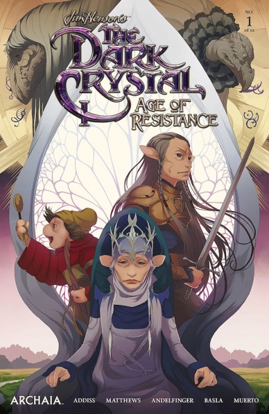
The Dark Crystal is an iconic cult classics that is an amazing balance of visual storytelling and dark fantasy that creates a world both beautiful and terrifying. It is also a world that was worth revisiting. Recently we were given a chance to return to Thra, and in “Jim Henson’s The Dark Crystal Age of Resistance” #1, Nicole Andelfinger begins to tell a story that matches the dark tone of The Dark Crystal and features art that matches Henson’s vision of “another world, another time.”
The only real problem with “Age of Resistance” #1 is that it is very much a first issue. It is by no means bad, it just has to do a lot of the heavy lifting of an epic fantasy quest. The threat is established, the McGuffin revealed, the quest given. Nicole Andelfinger does an admirable job weaving the new mythology of the recently released prequel into her writing, while also truly making it her own. One of the things that is enticing about the series going forward is the pairing of Ordon, a gruff and capable hero with Fara, a young naive adventurer wanted to prove herself to her mother and her clan. It’s simple but in this case, it simply works.
The real star of the issue, though, is Matias Balsa. The artwork in “Age of Resistance” #1 is stunning, capturing the beautiful landscapes of Thra. Everything feels lush and verdant but with just enough whimsy to remind us that we’re in another world. Balsa also successfully captures the terror of The Dark Crystal. The Arathim are sharp and terrifying, their menace felt in their blood-soaked conquest. Similarly, the Skesies that we see is wonderfully drawn, the low angels and close-ups really sell the size and eldritch nature of the Skesies’ as a group. The art speaks to the fact that the world of Thra, while beautiful, is a dangerous one, which helps to enhance the otherworldliness of the series as a whole. It will be interesting to see how the story builds from here.
Continued belowFinal Verdict: 7.8 “Jim Henson’s The Dark Crystal Age of Resistance” #1 features impressive artwork that showcases the beauty and terror of Thra, while featuring a story compelling enough to continue reading.

Written by Cullen Bunn & Brian Hurtt
Illustrated & Lettered by Tyler Crook
Reviewed by Christa Harader
“Manor Black” #3 slows the pace a bit as Ari tracks the totem and the new Sheriff tries to figure out why people are bursting into flames all over his formerly sleepy little town. Bunn & Hurtt go for external intrigue over internal character development in this book with some mixed results, and we really can’t wait any longer for a dive into Ari as a protagonist.
Crook’s art is an interesting blend of minimal cartooning and realism in close-ups, and the encroaching fire at the end of the issue is a nice way to ratchet up the tension in a visual way. The colors are slightly muddier and more mundane in this issue than the previous two, as most of the book takes place during the day, but the palette’s lacking some of that nuanced wash that made the first two issues so compelling to look at. Lettering is serviceable and we seem to be past what’s likely an attribution error in issue #2. The font’s economical and spare enough not to crowd the art, even when Bunn and Hurtt add dialogue that could easily be taken care of by what’s drawn on the page.
Overall, “Manor Black” feels like another crack at a transmedia pitch rather than an honest-to-goodness comic, though it’s got a bit more going for it in the mystery behind the Black family. What’s on the page so far feels like a mash-up of generic horror tropes, so we’ll have to wait and see if we can sink into Ari’s character enough to hang in there for the ride.
Final Verdict: 6.0 – “Manor Black” #3 slows the book’s pace but doesn’t give us the depth we need in Ari’s character development to truly dazzle

Written by Tom Taylor
Illustrated by Leonard Kirk
Inked by Cory Hamscher
Colored by Guru-eFX
Lettered by VC’s Travis Lanham
Reviewed by Christopher Egan
Kylo Ren leads the armies of the First Order to a planet that the legions of the Empire under the command of Darth Vader failed to take full control over many years ago. With constant guidance and assistance from an older soldier who was once an Imperial stormtrooper and sole survivor from the last battle on this planet, Ren is determined to succeed where his grandfather failed.
Taylor’s script keeps things simple, giving us just enough information to give us the bullet points from the past and present. This is a story that focuses more on the situation than the finer details. We don’t even get the name of the planet or indigenous species that the First Order is attempting to control. Working with the artwork of Kirk tells a story that goes back and forth showing the parallels of the two eras. It covers both wonderfully grand action pieces and quieter character discussions and is very good throughout.
Taylor’s illustrations are nicely detailed and fully captures the tone of the Star Wars films. His style is slightly softer and cartoonish, and not as sleek as other forays into the “Star Wars” canon, but it still looks nice. The full-color palette really pulls this issue together and it will no doubt draw readers fully into the narrative.
This one-shot truly does an excellent job of giving us a more complicated look at how Kylo Ren feels about his grandfather and the history of Vader and the Empire. He respects it and wants to build upon it, but he can see the cracks and is always looking to improve on its failures.
Final Verdict: 8.0 – ‘Out of the Shadow’ shows us a story of Kylo Ren both respecting Darth Vader’s legacy and looking to become an even greater figure in the eyes of the galaxy.
Continued below
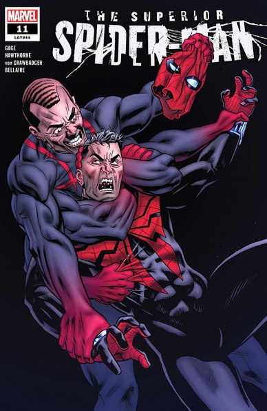
Written by Christos Gage
Penciled by Mike Hawthorne
Inked by Wade von Grawbadger
Colored by Jordie Bellaire
Lettered by VC’s Clayton Cowles
Reviewed by Luke Cornelius
The entire creative team is firing on all cylinders in what appears to be the penultimate issue of “Superior Spider-Man.”
“Superior Spider-Man” #11 opens in the aftermath of Norman Osborn’s attack and there’s a frantic energy that’s injected into the opening pages that linger throughout the rest of the issue. With the stakes seemingly being raised almost every page of the issue, it’d be easy for the story to become monotonous and littered with empty threats, but Gage anchors the story by focusing on Otto and his capability as a hero. It’s something Gage has always ensured was at the heart of “Superior Spider-Man” by pushing and pulling Otto in different directions to test him, but in this issue, he pushes Otto to his breaking point. This breaking point leaves Otto feeling that he only has one option left, one final roll of the die. This final roll of the die, however, is not to be taken lightly and so Gage devotes almost a third of the issue to Otto’s decision. By doing this, Gage ensures the magnitude of the outcome cannot be understated and, furthermore, it allows for Otto’s desperation, as well as Anna Maria’s fears about the outcome, to be fully formed and explored, which gives the decision the emotional weight that is required.
The members of the creative team providing the visuals for “Superior Spider-Man” #11 are equally as successful in this issue. Hawthorne’s pencil work, coupled with von Grawbadger’s inks, provide the book with an intensity that brings the script to life, primarily executed by limiting most of the panels to medium or closer shots of the characters. This draws a focus to the emotions the characters are experiencing and Hawthorne’s facial expressions are excellent in the book: even when Otto is masked, with a hole only exposing a single eye, Hawthorne manages to convey the desperation, anguish, or shock, that Otto is experiencing. Bellaire’s color work makes the book feel suitably dark and claustrophobic with the panels flooded with reddish tones, whether that be the smoldering embers of Osborn’s attack, the fumes from Osborn’s glider or Mephisto’s red smoke. Cowles’s lettering is unobtrusive throughout the issue and only enhances the dialogue, with the speech bubbles spaced perfectly to give the dialogue an even greater sense of voice.
All of these elements combine to make a fantastic issue and, while I won’t spoil it here, the final page of the comic gives a dramatic cliffhanger that leaves readers desperate for the next issue.
Final Verdict: 8.5 – Each member of the creative team produces great work in “Superior Spider-Man” #11 to make for a great read, filled with tension and drama, that closes with a fantastic cliffhanger.

Written by Tini Howard
Illustrated by Ariel Olivetti
Lettered by VC’s Joe Caramagna
Colored by Antonio Fabela
Reviewed by Michael Govan
“Thanos” was off to a solid start in the first issue but it lost me a bit in the following ones. Now, at the final issue of this mini-series, it more or less sticks the landing. Far from a perfect landing, but a good one nonetheless.
“Thanos” has really been Gamora’s story throughout the whole mini. In #6, Gamora sends the young Magus away instead of raising him, seeking to break the generational cycle and make the boy understand that she’s trying to give him better than Thanos gave her. She is more like Thanos than she wants to be, both are fearsome killers haunted by ‘ghosts’.
All of that is an interesting concept, though the execution is so-so. I would have liked more interaction between Gamora and the little Magus. The flashback scenes with little Gamora, Thanos and the original Magus take up most of the book but feel like the weakest parts of the book. Well, the weakest parts save for Thanos’s takedown of the Magus. That was fairly cool actually.
Proto-Ebony Maw and Proto-Proxima are pretty bland, far cries from the terrifying figures they grow to be. Gamora’s upbringing is skimmed over in two panels and I can’t help but feel like those years would make for a stronger mini. We could see more of Thanos’s take on fatherhood over time. “Thanos” really only looks at the awkward beginning of the twisted father/daughter relationship.
Continued belowThe artwork was okay and that final page really leaves an impression but I would have preferred if Ariel Olivetti handled all of the art himself. More often than not, Olivetti pencils and paints his work in works like “Cable” or the Skaar issues of “Incredible Hulk”. Here, he just pencils. When he does both, it’s really distinct but here it’s kind of forgettable overall.
Final Verdict: 6.0 – “Thanos” isn’t ‘inevitable’ here…he’s alright, I guess.

Written by Christian Ward
Penciled by Sami Kivela
Colored by Christian Ward with Dee Cunniffe
Lettered by Hassan Otsmane-Elhaou
Reviewed by Tanveer Kalo
Elliot Ness and his crew get the magical battle of their life, while the hero hides his use of the “lick” AKA magic. Ness’ use of magic in combat provides an exploration of the lengths he is willing to go for his ambitions. Not all heroes are what they appear to represent to the public. This aspect could be a reflection of the Probhiation era law enforcement appearing to uphold the 18th amendment while taking a drink off and even on the clock. Consumption of lick by Ness could also be a way of beating Al Capone at his own game. Capone is a lick user too through some powerful magical associates and Ness is just evening out the odds unofficially.
The introduction of new magical characters helps deepen the plot of the series. Each provides a different layer to a blossoming story. Ness’ duality on magic paired with new character Candice’s joy of killing through magic creates a strong set up for a possible ideological showdown.
Ward, Kivela, and Cunniffe continue to give pleasure to the eyes with their rich collaborative work. All three of their roles in this series compliments each other incredibly well. Cunniffe’s colors enhance Kivela’s pencils and give life to the magic in this book. Kivela and Cunniffe capture Ward’s narrative and words with ease to provide a beautiful book from start to finish.
Final Verdict: 7.8 – A beautiful action-packed issue that advances the plot.
Written by Tyler Belszinski
Illustrated by Livio Ramondelli
Lettered by Tom B. Long
Reviewed by Matthew Blair
“Transformers Galaxies: Contructicons Rising” #1 is a combination origin story for the Constructicons – a group of supposedly evil robots who have the power to join together Voltron style — and the main story where the Constructicons are stuck on a faraway planet mining energy for their overlords while complaining about how they aren’t given the respect and resources they need. It’s a comic about class struggle, indentured servitude, and free will.
Not bad for a story based on a 1980’s tv show designed to sell toys.
Unfortunately, while writer Tyler Bleszinski is good at introducing interesting themes and ideas in “Transformers Galaxies: Constructicons Rising” #1, the execution leaves a lot to be desired. The dialogue feels stilted, the plot structure is confusing, and the comic tries to show and tell too much too quickly. It feels like Bleszinski is terrified that readers will get bored with the comic, so he tries to cram in as much story as he can.
Just like the writing, the art has some good points but is hampered by some serious issues. Artist Livio Ramondelli has created a comic that looks good — the robots have a good blend of human and machine characteristics and the colors make the comic pleasant to look at — but a heavy emphasis on close-ups and a heavy panel count on each page make the issue feel crowded. The art doesn’t have a chance to breathe, which is a pity because there are some moments that have the potential to be massive and awe-inspiring if they had been given more space.
“Transformers Galaxies: Constructicons Rising” #1 is a comic with some good ideas and the potential to be a good series. Unfortunately, if this series wants to realize that potential, then these good ideas will have to be presented in a comic that is less crowded, less messy, and easier to read.
Final Verdict: 5.1 – While the comic has some interesting ideas and good artwork, it is crippled by a confusing plot structure, too much dialogue, and crowded pages.
Continued below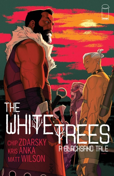
Written By Chip Zdarsky
Illustrated by Kris Anka
Colored by Matt Wilson
Lettered by Aditya Bidikar
Proofread by Allison O’Toole
Production Art by Shanna Matuszak
Reviewed by Linda H. Codega
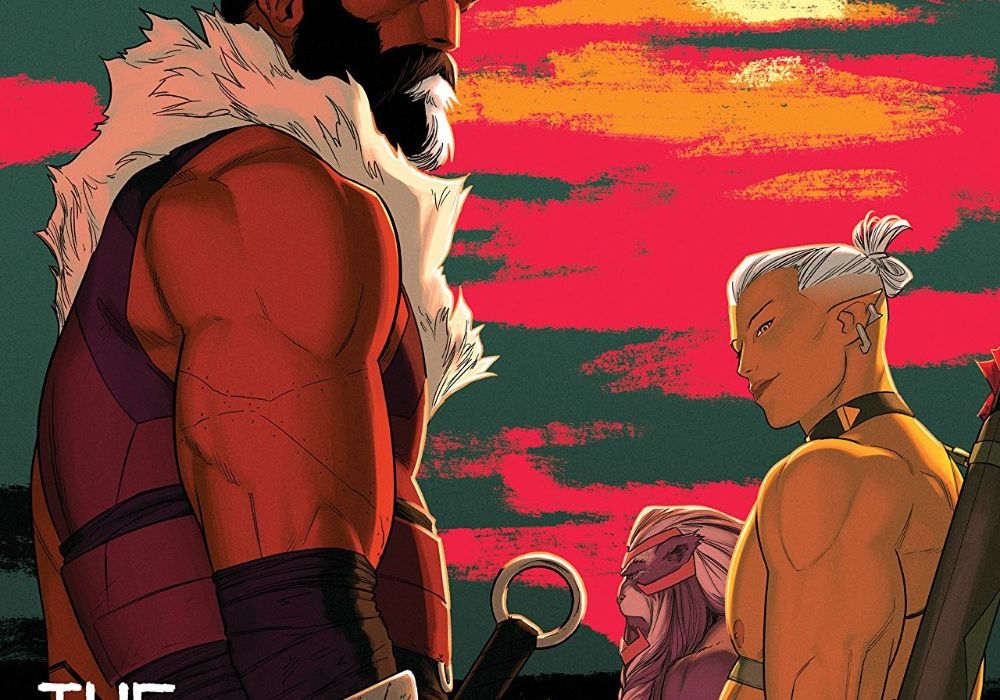
Full of amazing character designs, gorgeous colors, and effective pacing, “White Trees #2” is a satisfying conclusion to a well-written and enjoyable side-quest. Set in the fantasy land of Blacksand, this issue renders a world that is deep in lore, exceptionally beautiful, and full of blurry moral lines, a rich history, and thematic depth. The three heroes of past wars – Krylos, Scotiar, and Dahvlan – are well on their way to rescuing their children from the invading army, but all is not as it seems once they enter the stronghold of the enemy. This issue is not hurt by Kris Anka’s sexy and gorgeous characters and outfits.
“White Trees #2” doesn’t have the steamy scenes of the first issue, but it’s not any less intense for leaving them out. The emotional tension of the issue rides high, tying together family plots, old friendships gone sour, and the trauma of war into a story full of action, drama, and found love. Most of the pressure in the trio comes when Krylos, a legendary swordsman, refuses to draw his sword or kill anyone – a hard task when infiltrating an enemy prison amid the rising threat of war. The story is centered around his new stance, and Dahvlan, in particular, is pretty impatient about the entire thing. His partner, Scotiar, is a little more understanding, but still doesn’t stop Dahvlan from knocking Krylos unconscious to speed up the infiltration.
The entire story is well-written, easily followed, and wonderfully illustrated. The world is full of new species and wonderful interactions, and the script is tight and evocative. The art is clean, bright, and the panel layouts are evocative. The use of splash panels, select color, and pop details make “White Trees #2” an absolutely fantastic piece of work.
Final Verdict: 8.0 – A satisfying and gorgeous end to a two-part run that serves Dungeons and Dragons fantasy alongside deep, sexy characters and intense emotional conflicts.


