
There is a lot to cover on Wednesdays. We should know, as collectively, we read an insane amount of comics. Even with a large review staff, it’s hard to get to everything. With that in mind, we’re back with Wrapping Wednesday, where we look at some of the books we missed in what was another great week of comics.
Let’s get this party started.

Written by Brian Michael Bendis
Illustrated by Yanick Paquette
Colored by Nathan Fairbairn
Lettered by Josh Reed
Reviewed by Elias Rosner
One of my favorite parts of the Bendis era of “Action Comics” is his choices to open each issue on a different desk within the Daily Planet. There is something so quintessentially DC about the way these pages are constructed too; they’re covered in little details, some character related, some there to create verisimilitude, some as meta-jokes, and some, like the chalkboard in “52,” hold enigmatic clues to future events and plot points. For “Action Comics” #1003, it’s the possible tease of a future event entitled ‘Leviathan.’
Paquette, back on interiors for the first time in what feels like forever, absolutely makes this issue sing. His pages are lush with environmental detail and they make Metropolis and the Daily Planet feel like a living, breathing place. He knows how to pace the reveals and his Clark vs Superman reminds me of Frank Quietly’s portrayal, where the physicality is so drastically different, it’s easy to see how no one connects the two.
Additionally, for all the gripes one can have with the way Bendis handles dialogue, and this issue has some of his trademarked panels overstuffed with naturalistic banter, the care with which he treats the world and the characters more than makes up for it. An interesting mystery, an intriguing new character, and an artist with a strong grasp of using the structure of the page to evoke mental states as well as visualize the characters’ perceptions of the world doesn’t hurt either.
Final Verdict: 7.9 – After last issues’ missteps, it’s nice to see the story moving forward with an artist who really deserves more interior work.
Written by Brian Michael Bendis
Illustrated by Nick Derington
Colored by Dave Stewart
Lettered by Josh Reed
Reviewed by Michel Mazzacane
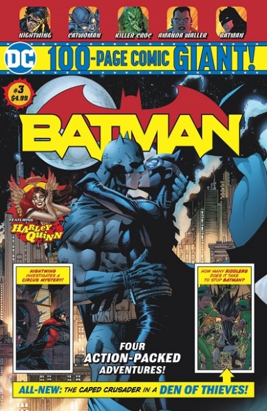
The original strips inside these “100 Page Giant” issues are supposed to act simultaneously as both a draw from current comic readers and an introduction for new readers, writer Brian Michael Bendis and artists Nick Derington and Dave Stewart do an excellent job threading that needle. The first 12 pages of ‘Batman Universe’ feature creative art decisions from Derington and a tight script from Bendis who does a good using each page to tell a scene.
‘Universe’s opening pages feel like Bendis and Derington poking fun at the common Batman in film refrain “I’m Batman,” with Derington also using it as an artistic flex moment. Everything is shown from Batman’s perspective. It is an inventive choice that gives a sense of energy to the early pages as Batman arrives on the scene of Riddler’s latest heist. This first-person perspective is somewhat undercut on the first page by Bendis and letter Josh Reed’s scripting, the Batmobile is cramped and so word balloons eat into a fair amount of panel space. The banter between Batman and Alfred, the latter lamenting that Riddler seems to not be putting in the effort anymore, is good it just makes every panel dense and a bit busy.
While the perspective choices are unique at times, the overall page designs by Derington are not. The panels are all either squares or rectangles. It is the dexterous use of these basic shapes that help give this strip some charm while still being utterly readable. Derington’s art feels close to the popular Batman: The Animated Series with slight nods to other art styles and when mixed with Stewart’s bright color palette appears to be an excellent fusion with “Batman ’66.”
The script for this first strip is bantery in the way Bendis generally is, his real skill shines through in writing one to two-page scenes to properly pace this 12-page episode. It is a skill that runs counter to the general perception of him writing in a heavily decompressed manner.
Continued belowFinal Verdict: – 8.0 – The start of ‘Batman Universe’ reads like a quintessential Batman comic, which is the idea these “100 Page Giant” issues are trying to develop.
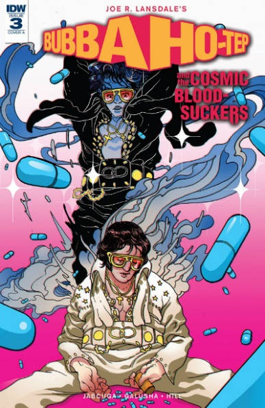
Written by Joe R. Landsdale
Script Adapted by Joshua Jabcuga
Illustrated by Tadd Galusha
Colored by Ryan Hill
Lettered by Tom B. Long
Reviewed by Chris Egan
The third issue in this five-part prequel dials up the action and monstrosities. The monster hunting team go full “Avengers Assemble!” on the giant Lovecraft-ian tentacle creature and skeleton army threatening their new southern plantation stronghold. This chapter makes up for the last two exposition heavy issues by finally throwing the team into a full battle mode and it works quite well. It is so much fun watching Elvis using a sword and mystical artifacts to hold back the forces of darkness…even if he is doing it awkwardly and naked. As great as the Bubba Ho-Tep movie is with an elderly Elvis going up against a soul-sucking mummy, it is wonderfully satisfying watching following him as a younger badass, adding some more levels to the character.
Landsdale’s story continues to become more wild and grand with each issue and it makes you wonder if this would have ever worked as a movie prequel or if a comic book is a perfect medium for it. The latter is preferable in this case, as a budget for another movie in this series would have probably held it back and we are allowed to see his true vision come to life. The 70s exploitation style used here is so perfect for this world that it feels like this should be a long-running series. It is reminiscent of classic horror comics like “Tomb of Dracula” and “The House of Mystery.” A few wisecracks and insane imagery keep the book in its horror-comedy lane, but for the most part, the action and characters are treated a bit more seriously than the story has been so far or its movie counterpart.
Tadd Galusha’s illustrations are fine. Clean and well crafted, and just detailed enough to give us great hard lines and shadows. Ryan Hill’s colors give it a style akin to Francesco Francavilla’s work on “Afterlife with Archie” or Bernie Wrightson’s on “Swamp Thing.” A blend of creepy and noir-ish and brings this book to new heights.
Some great imagery and concepts continue to make this an enjoyable read, especially for fans of the franchise. While it’s nothing that will shine through the crowd, it is still a good comic and readers that enjoy this genre will have fun with it.
Final Verdict: 6.0, A decent, campy horror tale that adequately continues the adventures of young Elvis Presley in his fight against evil.

Written by Simon Spurrier
Illustrated by Kev Walker
Colored by Java Tartaglia
Lettered by VC’s Joe Caramagna
Reviewed by Gregory Ellner
Much as the series has always gone, Simon Spurrier’s writing on “Doctor Aphra” indulges in both black comedy amorality and edge-of-your-seat tension that works well into the framework of a morally gray Indiana Jones archetype. As such, the fun of “Doctor Aphra” #24 is not just in what antagonists will do, but in the ridiculous, un-heroic ways in which Chelli Aphra will operate to escape from any given situation, even if it means sacrificing people or using them to get what she wants with little to no regard for their safety in the long run. This is not to say that Spurrier’s writing is lacking in more terrifying moments, as the quiet of the antagonists as they approach after a long time searching can create real terror in readers of this installment of ‘The Catastrophe Con.’
Kev Walker’s artwork is a bit odd at times. The faces are a little too cartoonish, noses getting a pretty big emphasis where visible, and characters getting relatively exaggerated physiques, from Magna Tolvan’s lanky appearance to Chelli Aphra’s shorter, less slight look. This style seems that it has a high probability to take away from the fun of the story, or the depths of its despair. On the other hand, the antagonists, through a very limited appearance, hold a lot more menace, concentrating on their silhouettes and the weapons they hold more than anything else, in a much better show of that which they are capable.
Continued belowJava Tartaglia’s color choices are relatively dull within the jail, with some exceptions. The majority works with muted oranges, maroons, and greys, excluding Aphra’s brown eyes or Tolvan’s grey hair. Those exceptions are beings like the Hook spoke fungus being bright aqua, and a bright orange coupled with deep shadows for some of the carnage that ensues with the antagonists.
In all, “Doctor Aphra” #24 is a well-done story, but the art seems too reliant on near caricature at times.
Final Verdict: 7.5- ‘The Catastrophe Con’ nears its conclusion with a fun plot, but the artwork doesn’t seem to quite match its tone.
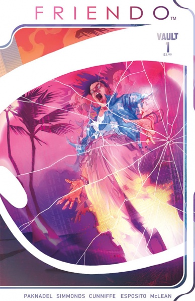
Written by Alex Paknadel
Illustrated by Martin Simmonds
Colored by Dee Cunniffe
Lettered by Taylor Esposito
Reviewed by Dexter Buschetelli
Dystopian neo-noir stories often are anything but subtle in their advocacy for post-consumerist culture, and “Friendo” is not exceptional in any way regarding that observation. The subdermal commentary of “technology is scary and one day we’ll take it too far” has becoming trite at this point. Creators in fiction have slowly pulled back in the last couple decades from the inevitable apocalypse to a near-future that is disconnected enough from our own world, but frighteningly close.
This is the titular “Friendo” of the story, a virtual assistant living in a pair of glasses who is actually made a small part of this introductory issue. Instead, we focus almost solely on central protagonist Leo, as writer Alex Paknadel leans heavily on exposition to explain how and where Leo fits into this world. Narratively there are no major issues, but there also seems to be little depth to “Chapter One: Depth in Venice.”
The art from Martin Simmonds quite literally lacks depth, especially when compared to the 80s neon nightmare aesthetic of the book’s cover. Interiors contain foreground characters short on detail, structures look as flat as a blueprint, and the sparsely used shadows are actually over-saturated in the few moments they are utilized. This is almost saved by the color work of Dee Cunniffe but it can only cover so much, and quite frankly it is not enough.
This book is an interesting, though somewhat passé, idea; but its execution leaves a lot to be desired. Hopefully, it will pick up as it continues its run but as a first issue, “Friendo” fails to stick the landing.
Final Verdict: 6.8 – Needs more Terminators.

Written by Matt Kindt
Illustrated by Adam Pollina
Colored by Diego Rodriguez
Lettered by Dave Sharpe
Reviewed by Ken Godberson III
“Harbinger Wars 2”: Harbinger Harder… was not great. As far as Valiant’s event comics since their return, it easily sits at the bottom of the pile, but one can’t really fault it too hard. By the end, it felt like the story felt like it was changed very drastically what with it coming out during the same period Valiant was changing hands behind the scene, both editorially and administratively. In the end, it provided a comic that provided ramifications but still felt a bit disjointed at times. The Aftermath here will put the final period on the event, but is it worth checking out?
The answer is: If you read the event, you can skip out on this one.
The big word I can think of with this comic is “serviceable.” Kindt, Pollina, et. al do a fine job of showing us where the big characters of the Valiant Universe stand, in particular, Livewire. We see her have scenes with XO and Ninjak that reaffirms her relationships with both of them and lays the ground for her upcoming series this December. With that said, these moments don’t feel particularly special or necessary, and one could make the easy assumption of Livewire’s status going forward from the end of the event proper without having to purchase an Aftermath issue.
Like the words, the artwork is perfectly serviceable. Pollina’s pencils do a fair job of capturing the more grounded Valiant world, helped by Diego Rodriguez’s more muted color palette. Where the art excels is when it shows off Livewire’s technokinesis, providing a balance of weirdness and a natural flow to her, depending on what she’s interfacing with. That said, the one spot that really troubled me was the scene with Peter Stanchek. The problem I found is that, being that there was no dialogue queue that it was Peter, it took me several rereads of a scene because the way he is depicted; he looks forty instead of twenty and I don’t think that was an intention.
Continued belowFinal Verdict: 5.7- A serviceable story if you hadn’t read the event, but completely unnecessary if you have.
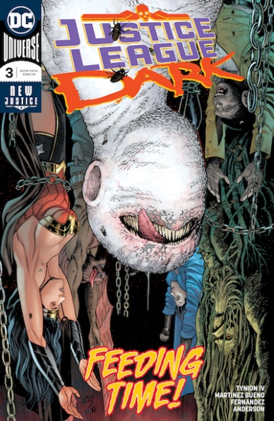
Written by James Tynion IV
Penciled by Alvaro Martinez Bueno
Inked by Raul Fernandez
Colored by Brad Anderson
Lettered by Rob Leigh
Reviewed by Alexander Jones
James Tynion IV’s new incarnation of “Justice League Dark” just wrapped up the series’ first art with this week’s issue. Was the shortened story able to reach an emotional impact that a 5-6 chapter story-arc would? Even though the series has carried a more grounded tone, early chapters of “Justice League Dark” still felt like it was holding back some of the best material for later issues. “Justice League Dark” #3 is the issue that finally puts all the pieces back together and slowly begins paying off huge plot threads readers have been wondering about for months. The re-introduction of The Upside-Down Man, in particular, was a creepy, compelling final touch earning some much-needed context.
This entry into the story carries enough drama and pathos to close out a much larger-sized arc of comics. Thankfully, Tynion does a great job paying off past installments while not making the narrative feel too rushed or drawn out. The flashbacks with Zatanna are a particularly inspired aspect of the plot allowing for the narrative to have a solid, more grounded tone.
Alvaro Martinez Bueno’s impressive approach to the pencils for the issue makes the title worth reading for the visuals alone. Bueno lends an impressive sense of scale to the Swamp Thing battle and the proper amount of drama to his confrontation with Constantine. Bueno’s ambitious approach to the pencils looks particularly great when The Upside-Down Man starts using effects to blur out or distort some of the characters in the issue. The last few pages where the effects hit a fever pitch are particularly inspired. Bueno has a firm understanding of the basics surrounding comics which allow for him to expertly invert the premise and approach to comics.
Bueno’s art and Tynion’s script amounts to a particularly impressive collaboration in the space of comics. The two creators that found their footing on “Detective Comics” and do excellent work establishing the world of “Justice League Dark.” Now that readers have a better idea of what the villain in the series is capable of, the narrative feels more genuine. Bueno’s gorgeous and action-packed approach to the art proves that he is one of the best artists currently working at DC. Tynion’s innovative approach to this property is an excellent approach to the story.
Final Verdict: 8.3 – “Justice League Dark” #3 is a creepy, strongly written and drawn conclusion to the eventful “The Last Age of Magic” storyline.

Written by Chip Zdarsky
Illustrated by Ramon K. Perez
Colored by Federico Blee
Lettered by VC’s Joe Caramagna
Reviewed by Eric Goebelbecker
Ben and Johnny’s search for the rest of the Fantastic Four comes to a close in “Marvel Two-In-One” #10. It was obvious from the start that the team’s reunion would happen in the relaunched “Fantastic Four” and not in this title. But Zdarsky brings the story to a satisfying close in ‘Being Fantastic.’
Before he could finish Ben and Johnny’s wild ride throughout the Multiverse, Zdarsky had a lot of threads to tie off. But the lack of trust Ben created by starting their search for the rest of the family under false pretenses loomed largest. Zdarsky not only resolves the problem but accomplishes it in a heartfelt scene at the end of the book. Even with two issues of the Fantastic Four already on the shelf, this story felt like a prelude to the return of the team.
As much as I look forward to Ben teaming up with other characters, I’m sorry to see the last of the fractured Earth he and Johnny were stranded on. We didn’t see enough of “Spider” and his Aunty Entity racket, and this story had the most interesting variation on the Mad Thinker I’ve seen in a couple of decades. His defeat by Johnny in this issue made him an even more compelling character.
Continued belowPerez animates the arrival and decimation of “Spider’s” convoy with borderless panels and splash pages that give the encounter a cinematic feel. The retrofit cars crash and explode in scenes right out of Mad Max: Fury Road. But when the action is over and Ben and Johnny make their peace, a sequence of panels portrays Ben comforting Johnny and slows things down. Perez captures the moment with a touching hug and a slow walk into the horizon.
Final Verdict: 8.0 – “Marvel Two-In-One” #10 is a satisfying close to an epic storyline.

Written by Marguerite Bennett
Illustrated by Simone Di Meo with Ink Assistance by Alessandro Cappuccio
Lettered by Ed Dukeshire
Colored by Walter Baiamonte with Assistance by Francesco Segala
Reviewed by Matt Garza
It’s tough to follow an arc as sprawling and epic as Kyle Higgins and Daniele Di Nicuolo’s ‘Shattered Grid.’ Higgins wrote a complete story that shockingly (to me), was one of the best comic book series of the past couple of years. Who would have thought that a Power Rangers comic would be so captivating? Then again, I was four when Mighty Morphin Power Rangers first premiered so I admit that I am part of the book’s targeted demographic, it’s safe to say that enjoyed his run very much.
So begins ‘Beyond The Grid,’ and Marguerite Bennett, Simone Di Meo, Alessandro Cappuccio, Walter Baiamonte, Francesco Segala, and Ed Dukeshire waste no time delving into the resulting chaos of ‘Shattered Grid,’ putting a group of Rangers in a Lost in Space situation on the space station Promethea. This is somewhat of a double-edged sword. On one hand, the new creative team is picking up the pieces (literally) of a great story arc and running with them head on to transform it into something unique and fun. Having said that, this book is NOT new reader friendly as it relies so heavily on the events of ‘Shattered Grid’ to tell its story. Because of this, the pace of the books fluctuates, starting with a slow burn with heavy exposition that hides some truly wonderful art, and later kicks into high gear setting the stage for the next issue.
The book also assembles a variety of Rangers from a few series that I’m unfamiliar with which takes away the nostalgia I felt reading Higgins’ stories. Bennett steps away from the original six Rangers we’re so accustomed to and replaces them with an assortment of characters, three of which I can only say I know for sure, including an alternate dimension Kimberly Hart, the team’s new leader. Don’t get me wrong, this is not a bad thing, however, I do wonder where the creative team will take this story moving forward. Will we see these Rangers get back to their own realities? Will Bennett dive deeper into the mythology of the Morphin Grid? Where’s Zordon? Who are the real villains? These are all questions I have and I’m eager to find out more.
Final Verdict: 7.5- Marguerite Bennett and Co. have definitely piqued my interest and “MMPR” will continue to be on my monthly pull-list, however, this issue suffered from some from heavy exposition and a jarring start to a new storyline, not meant for a new readership. I do look forward to where our heroes go next and what they discover within “The Void” as their time for survival dwindles.

Written & Illustrated by Chip Zdarsky
Lettered by VC’s Travis Lanham
Reviewed by Gustavo S. Lodi
Perhaps one of the best aspects of Spider-Man as a character is how well he lends himself to solo stories, told-in-one adventures or more dramatic ventures. Readers have seen this in the past – the seminal ‘The Boy who collected Spider-Man’ comes to mind – so when Chip Zdarsky says goodbye to this series, it was with one such tale he chose to bid farewell.
Taking full creative duty on this issue of “Peter Parker,” Zdarsky crafts an emotional and beautifully drawn story that explores the man behind the mask and the superhero behind the man. In a mostly quite issue, with some action thrown in just to explore some aspects of Spider-Man, the artist must invest extra effort on facial expression and environments, which he does extremely well. All the supporting and side characters that provide their views on Spider-Man look unique and, more importantly, all react in different ways as to how being around the titular hero changed their lives.
Continued belowZdarsky also utilizes some interesting framing devices on some pages, showing panels side-by-side that highlight the same place on multiple moments of time, showcasing how the absolutely mundane can migrate to the chaotic in a moment. “Peter Parker” #310 also uses mostly black pages with a two-by-three panel grid to illustrate the interviews that are being for the Spider-Man documentary, the core thread of the entire issue.
At its heart, this story is about how one human being can change the life of others, whether they know it or not, by their action or inaction. As the main story element of that, the compassion and heroism of Spider-Man shines the most away from the spotlight and far from what most would consider “superhero material.” And when life inevitably follows its own consequences, readers will be left moved before it ends.
Final Verdict: 8.0 – A told-in-one story, absolutely accessible to new readers or to anyone who just wants to understand what Spider-Man is about, “Peter Parker” #310 is a worthy farewell to an artist who obviously gets the hero and the good he can do – on these pages and beyond.

Written by Keith Richardson
Illustrated by Patrick Goddard
Colored by Quinton Winter
Lettered by Jim Campbell
Reviewed by Tom Shapira
A sniping duel. A sniping duel in a complete death trap of a town, with our protagonist alone and sporting one bullet with a dastardly Nazi commandant wielding a full rifle and support of his many men (who he will gladly shoot if they ruin his sport). It’s good that any pretense of realism is thrown face-front out of a window so swiftly, it means we can get to the fun part of Fairburn shooting and stabbing his way through several people who definitely deserve it. it’s an action story and Patrick Goddard is very good at delivering the right amount of action with a dash of nightmarish mood. His work can sometimes feel a bit too clean, I was first drawn to this series by the spiky and disheveled character of Carlos Ezquerra on the alternate covers, but he knows how to do the job. Deep, it is not, but it is fun.
The actual climax is exactly what you expect, I wish the creators would be a bit more assured and try and pull through something more imaginative, but the real star turn of issue is the scene with old lady in the middle (you’ll know it when you see it) – she should get a series of her own!
Final verdict : 7.0 – A little Nazi-shooting goes a long way

Written by Christos Gage and Jed MacKay
Illustrated by Clayton Crain and Javier Garrón
Lettered by VC’s Travis Lanham
Colored by Israel Silvia
Reviewed by Michael Govan
The cover of “Spider-Geddon” #0 excitedly promises that “The Spider-Event of 2018 Starts Here!!!” but it sure doesn’t feel like it. It reads like the lead-in or teaser to the main event, not part of it. This issue doesn’t do much to advance the plot and could probably be skipped altogether. In the first story, Gage and Crain’s ‘New Players’, the Superior Spider-Man recruits the Peter Parker from the PlayStation 4 Spider-Man game. The enemy they face, Tarantula, is really more of an afterthought.
He is devoid of depth and is almost a caricature of a villain. He wears a stereotypically villainous handlebar mustache, speaks in Spanglish, laughs maniacally and robs banks. That’s all there is to Tarantula. There isn’t much to the PS4 Spider-Man either. The main hook for ‘Spider-Geddon’, and its predecessor ‘Spider-Verse’ is watching distinctive versions of Spider-Man team up. Superior Spider-Man is Doctor Octopus as Spider-Man. Spider-Gwen is a twist on ‘The Night Gwen Stacy Died’ where her Peter is the one gone too soon and Gwen Stacy is the radioactive web-slinger tortured by it. Outside of his new costume and gadgets, PS4 Peter is basically just the regular Spider-Man. There is very little reason to have a story devoted to him outside of promoting his video-game.
Clayton Crain’s artwork is fine but there is scant detail in the background. Cars and buildings are often just smudges and shapes. The heavily populated New York is remarkably devoid of any people. Garrón’s art in the second story, ‘Check In’ is serviceable too though not much happens here either.
Continued belowThe five pages show various Spider-people observing the Inheritors over a few months, Pavitr’s growing beard and the deterioration of the Inheritors showing the passage of time. The story teases the Inheritors impending breakout but leaves the reader wanting more. A whole lot more.
Final Verdict: 4.5 – The cover promises the movie but readers end up with just the trailer instead.

Written by Erik Burnham
Illustrated by Ediano Silva
Colored by Dinei Ribeiro
Lettered by A Larger World Studios’ Troy Peteri
Reviewed by Jim St. Pierre
Dynamite takes two somewhat dated characters and brings them together in this enjoyable, albeit familiar, comic by Erik Burnham. Burnham’s story moves quickly as the astronomers of Helium spot a ship projected to land in the disputed area of Aanthor on Barsoom. They send their princess Dejah Thoris to investigate, who subsequently meets Vampirella.
In this unlikely pairing, Burham is able to forge a new story that introduces the potential for significant conflict in coming issues. And though the dialogue is campy, especially with the character of Vampirella, the pacing and the art propel the story forward. Despite these strengths, however, there is little here that is novel. The character development is sudden and unbelievable and the plot devices all too common.
Silva clearly does justice to the pneumatic, buxom women typical to the woman-warrior genre, and certainly typical for these characters in all their comics. But beyond the eponymous characters, Silva successfully couples the garb of classic Sparta with post-modern technology, all within a setting that is both familiar and exotic. His lines are light and the shadowing minimal though his figures are still engaging.
And the cover, for anyone above the age of twelve, is undeniably thrilling.
Final Verdict: 6.5. The story and art are fun though very much formulaic, both lacking depth or nuance.


