There is a lot to cover on Wednesdays. We should know, as collectively, we read an insane amount of comics. Even with a large review staff, it’s hard to get to everything. With that in mind, we’re back with Wrapping Wednesday, where we look at some of the books we missed in what was another great week of comics.
Let’s get this party started.

Deathstroke #23
Written by Christopher Priest
Illustrated by Diogenes Neves
Colored by Jeromy Cox
Lettered by Willie Schubert
Reviewed by Gregory Ellner
As Slade Wilson’s attempt to delve into a “Hero for Hire”-esque organization with Project Defiance continues, Christopher Priest’s writing of the arc seems to be disassembling somewhat. Priest’s style of anachronistic storytelling and splitting up chapters into distinct, named scenes does help somewhat, but it all seems to come together a bit oddly, in particular, with respect to Joseph “Jericho” Wilson’s role in the plot. However, this style of anachronistic, almost Quentin Tarantino-like structure, does help to get into the mindset of the “reformed” mercenary as Priest navigates his uncertain path toward attempted goodwill. The structure, while unwieldy, is in tune with Deathstroke’s grasping attempts at imposing order on his life and the lives of the other members of Defiance.
Jeromy Cox’s coloring does a good job of separating between different scenes, using relatively solid colors for backgrounds, but also by using harsh reds and softer purples in the most volatile combat scenarios to showcase how dangerous the “Dark Titans” of Defiance really are. The more vibrant colors around the black-and-white uniforms of Defiance help to even further divorce them from their situations, demonstrating how odd they are especially when contrasted against the more colorful outfits for individuals outside of Defiance (both Deathstroke in flashbacks and others in the present day). By having the color schemes play against one another, combined with Diogenes Neves’s solid, dynamic linework and fading backgrounds, the two sides of the art and colors work together to show just how much the people of Defiance struggle – and often fail – to fit in with the heroic community.
Final Verdict: 7.5- While disorganized, “Deathstroke” #23 showcases the unraveling world of Project Defiance with its structure and use of color more than its explicit words.
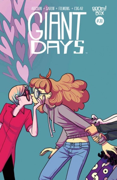
Giant Days #30
Written by John Allison
Illustrated by Max Sarin and Liz Fleming
Colored by Whitney Cogar
Lettered by Jim Campbell
Reviewed By Kate Kosturski
It’s appropriate that the 30th issue of “Giant Days” is as existential crisis-ridden as turning 30 can be for some folk. The carefree springtime is anything but that for our university threesome. Daisy is still madly in love with her German darling, Ingrid….but Esther and Susan? Not so much. Susan has also been sitting on a very big secret rendezvous that Esther discovers that has implications for relationships for both women. In short, things have come to a head for our co-eds, and things will not be the same for anyone come the end of the Easter holidays.
I’m happy to see that things are starting to come to a head, after several issues of one-off stories (Susan’s family woes, Esther discovering social activism) and hints of serious stuff bubbling below the surface. No one said college was going to be easy and this issue sets up a good denouement to Susan, Daisy, and Esther’s second year that is going to force change in all their lives. Illustration work of Sarin and Fleming continues to be lighthearted and carefree – just because we’re on the cusp of conflict doesn’t mean the art has to reflect that, but you see hints of college stress in Susan and Esther’s faces, while Daisy just radiates puppy love so much she could probably power the campus. Whitney Cogar’s color work remains bright, innocent, but full of emotional punch when needed, such as literal flames on the sides of their faces when angry.
The purpose for issue #30 is to set up for conflict resolution. In a way, it’s a gap fill for what comes next – I didn’t find anything innately good or bad about its quality, it just keeps chugging the story along, which is what is needed right now.
Continued belowFinal Verdict: 6.9 – This is really just a filler issue for whatever comes next – it’s a necessary read to keep up with story, but there’s nothing overly earth-shattering in these pages.

Harbinger Renegade #7
Written by Rafer Roberts
Penciled by Darick Robertson
Inked by Walden Wong
Colored by Diego Rodriguez
Lettered by Simon Bowland
Reviewed by Michael Mazzacane
After an odd detour to the Dark Ages, “Harbinger Renegade” is back and dealing with the fallout of the titular massacre in an unfortunately uneven issue. Much like the how the bloody, action packed, start to this arc let Darick Robertson lay into the melodrama of horror, the fallout of that issue lets Robertson and new inker Walden Wong play into the melodrama of grief. The transition between inker Walden Wong and Richard Clark isn’t too noticeable; the biggest difference being a lack in big blocks of black and cross hatching. Depicting grief and such emotional damage can be a delicate matter of degrees and in this issue, the art teams work waffles from affecting emotional moments to ineffectual cartoon. In particular, Robertson and Wong’s work with Animalia early in the issue is a too cartoonish. If there was a partial transformation occurring on her face that would be one thing, but her conversation with Peter visually reads as counter to the emotional truth everyone is trying to create.
Robertson and Walden seem to have issues depicting the main victims of the massacre, but are more easily able to render the shock and disbelief of its adjacent victims. Robertson captures the fragile, smallness, of the outwardly giant Torque as he lashes out at being kept in side. The teary-eyed reunion between Monica, Jim, and a parent of one of the fallen Generation Zero similarly works. They even mange to hit a legitimate moment of grace between Kris and her girlfriend taking a moment to love one another even as the world’s lost its mind.
By Valiant’s standards, we are three quarters of a way through this arc, and it doesn’t seem to be adding up too much. Yes, major important (plot) stuff has occurred in the overall meta narrative of the Valiant U that will surely punt things closer to “Harbinger Wars 2.” Plot isn’t the same as storytelling however, and that’s what this book has felt like thus far. “Renegade” comes off as plot not story driving things, which isn’t the kind of title Valiant normally publishes. The character stuff is in this issue it just isn’t integrated the same way other titles havee. Yes, this issue culminates with a fiery well executed speech from Kris that seems to, finally, be pointing towards a reason for this series to exist. That speech and other solid character moments feel late in the game as a reader.
A minor side note – there is an egregious coloring error where Kris is depicted as blonde instead of with black hair. It’s only for a page but made me wonder if I had suddenly forgotten some cast member.
Final Verdict: 6.7 – Inconsistent art and a lack of internal direction makes “Harbinger Renegade” feel aimless despite the extra textual marketing pointing toward a destination.

Star Wars: Captain Phasma #1
Written by Kelly Thompson
Illustrated by Marco Checchetto
Colored by Andres Mossa
Lettered by VC’s Clayton Cowles
Reviewed by Matt Lune
If there was one fault with Star Wars: The Force Awakens, it was that Captain Phasma got a raw deal. Much like Boba Fett in the original trilogy, a character that becomes an instant fan favorite gets far too little air time and seemingly meets an undignified end. If the casting announcements for The Last Jedi weren’t enough of a clue, “Star Wars: Captain Phasma” #1 is here to prove that the chrome-plated badass is going nowhere.
To give this issue its full title, “Journey to Star Wars: The Last Jedi: Captain Phasma” #1 is narrated from the eponymous character’s personal recording logs of the final moments before the destruction of Starkiller base. It waves away her apparent end in a single panel, giving more room to learn not how she survived being dumped into a trash compactor (Star Wars fans know that they don’t slow anyone down for long,) but how she survived the explosion that destroyed the First Order’s superweapon.
Continued belowWhat’s most interesting about this issue is the surprising amount of development Thompson is able to inject into Phasma. It’s true that the character’s limited screen time allowed a lot of room for such growth, but it’s refreshing to find an ancillary tale such as this – despite its canonical validity – feel so important and revelatory. Phasma is shown to be a cunning and ruthless antagonist, one unafraid to cover her own back by any means necessary. This feels like a significant departure from the grim taskmaster from TFA, who seemed like a stickler for the rules. This isn’t unwelcome growth, however, and provides some intriguing facets that will hopefully be explored in the upcoming sequel.
Checchetto’s art style helps “Captain Phasma” #1 slip seamlessly into the background moments of The Force Awakens. His pencils, along with Mossa’s colors provide an action-heavy plot with a thrilling visual style reminiscent of the movie which, again, adds validity to the story. Phasma is depicted perfectly as a formidable threat, a ceaseless warrior hunting her prey and displaying a set of skills not even hinted at in the movies. There are numerous times when the action spills out of the panels, and there’s a double page spread depicting the space battle from the end of Episode VII, and it’s a visual spectacle on par with anything onscreen.
Thompson, Checchetto, and Mossa have begun a side story in “Captain Phasma” #1 that feels every bit as relevant as anything from the movies. That status of official canon can provide its own burden of responsibility for a story, as well as hamper its freedom to tell a story that feels important. This issue waves away those problems effortlessly and provides an action-packed issue that deserves to be filmed in live-action. Now we just need a “new-canon” story explaining Boba out of that Sarlacc pit.
Final Verdict:8.0 – A thrilling insight into a supporting character that fits perfectly into the world of Episode VII

Mitch Hammer #1
Written by Chris Lewis
Illustrated by Fernando Pinto
Colored by K. Michael Russell
Lettered by Nic J. Shaw
Reviewed by Kent Falkenberg
This year’s already given us a shirtless hesher pounding the snot out of grizzlies and kodiaks, so I guess it was only a matter of time before a different be-mulleted, be-handlebar-mustachioed hero laced up his steel-toed shitkickers, threw on a fraying pair of Carhartts, and donned a reflective safety vest to punch respect into giant bugs and purveyors of mad science. He’s not the construction mutant we deserve, but the construction mutant we need.
“Mitch Hammer” #1 plays out like a mid-90s cartoon that your slacker, college-aged cousin, who never actually went to college, shouldn’t have let you watch when you were 6 (and you probably shouldn’t have watched at 16 either). Chris Lewis’s script rips along with winks and elbow jabs as it throws out everything from bad jokes (two construction workers ogle college girls… no wait, they’re actually ogling the building they just erected) to possibly the worst conceived lobby group of all time (CLOT, the Committee for Liberation of Organism for Thrombosis), and it’s a total blast because of it.
There’s a palpable Venture Brothers feel to this brand of irreverence and blending of mad-science-breaking-bad, blue collar ass-kicking, and dorky henchmen meeting ignoble ends. “They believe it’s their holy duty to end the threat of pulmonary embolisms and clot related strokes”, Mitch’s buddy Jorge points out, right before the minions of this militant group storm the college and get tuned up by a whole construction crew. Chris Lewis peppers in just enough of those lines to ensure that while this world might not make a whole lot of sense to us as readers, it sure does to them as characters. Grounding isn’t the right word; it’s more like helping to find a center that all the insanity can whirl around.
And Fernando Pinto gives “Mitch Hammer” #1 a fantastic looking whirlwind. Now, I’ll be honest – there are some rough edges. A few pages here and there look a little rushed. Some panels feel closer to colored layouts than finished art and at times Pinto’s heads and faces feel strained in oddly oblong proportions. But when he’s on, he’s really on. His bold linework, bolstered by a K. Michael Russell color palette that really leans into a rich Francavillian amber, provides emphatic bombast to nearly every action these characters take. When Mitch peels out in his front end loader, Pinto whips him around in his seat and throws in a closeup of a work glove punching a gear shift into place like it was an old-school drag race. When things explode or walls collapse, Pinto makes ground shake while dust and rubble feel like will plume out from the page alongside Nic J. Shaw’s bulky, swelling sound effects.
Continued belowIn the end, “Mitch Hammer” #1 is a book where a man’s mullet and handle-bar mustache sail in the breeze while he stands between tendrils of smoke and flame lapping at his legs and threatens a mutant bug-man, “Let go… less you’re looking to get hammered.” Everything else seems to hum along just fine to help bolster that aesthetic. If that’s not for you, then we’re done here.
Final Verdict: 7.0 – Wait… Before you go, can we all just agree that Fernando Pinto draws the hell out of a front-end loader with a backhoe scoop. Seriously, that guy makes construction equipment look cooler than the goddamned batmobile.

Seven to Eternity #9
Written by Rick Remender
Illustrated by Jerome Opeña
Colored by Matt Hollingsworth
Letters by Rus Wooton
Reviewed by John Schaidler
After a two issue hiatus, illustrator Jerome Opeña is back, and that’s a really good thing. Don’t get me wrong, James Harren did wonderful work on issues seven and eight, but he created his own aesthetic that almost felt like a different series. It definitely didn’t help that writer Rick Remender also went off on a tangent, but with Opeña back in the driver’s seat, the book fires on all cylinders.
Not coincidentally, the stakes have also gone up.
Without a doubt, writer Rick Remender is an accomplished world builder. He is masterful at creating richly detailed, nuanced worlds that ring true. (See “Low” for another example.) Indeed, the Land of Zhal, the setting for “Seven to Eternity,” seems more like something out of a 300+ page fantasy novel than it does a comic book. That said, one of the central criticisms that has followed this series from the start is its often simplistic portrayal of good versus evil. The universe in which the story takes place is artfully constructed, the morality, not so much. In this issue, however, that all seems to change, a fact we notice almost right away.
In a gorgeous full-page panel, as Adam Osidis and Garlis walk toward a glittering city bedecked with ornate spires, they discus Adam’s father’s death. Mere silhouetted specks against the towering skyline, Garlis, The Mud King – also known as “The God of Whispers” – makes an intriguing statement (especially since he was Adam’s father’s killer): “Perhaps Zeb’s death set you free.”
From that moment on, Adam’s mind is riddled with doubt. Right and wrong are blurred. Selflessness and selfishness are two sides of the same coin. After a lifetime of certainty, suddenly things aren’t as clear as they seem. And as The Mud King notes, “People hate complicated.”
People may hate complicated, but for comic book fans, lush, gorgeously colored illustrations paired with interesting discussions of right and wrong, good and evil and whether to cling to your unwavering principals or adapt to new conditions are what it’s all about.
In some ways, as the second arc comes to a close, it feels like too little too late. Things have been black and white for a very long time, with all of the good entities on one side, the bad ones on the other. On the other hand, who knows where this series will go and it certainly bodes well that Remender is escalating and complicating things for his hero. The world of “Seven to Eternity” has always been richly multilayered and truly captivating. Now, the inner lives of its characters are the same way.
Final Verdict: 7.8 – After a two issue narrative and visual tangent, “Seven to Eternity” is back on track and set up for wonderful things.
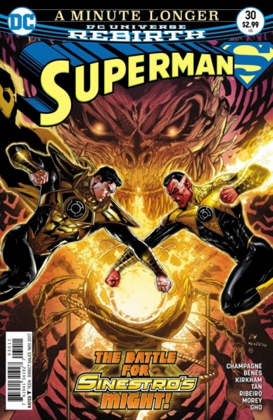
Superman #30
Written by Keith Champagne
Illustrated by Ed Benes, Tyler Kirkham and Philip Tan
Colored by Dinei Ribeiro, Tomeu Morey and Sunny Gho
Lettered by Rob Leigh
Over the past couple issues, DC’s flagship “Superman” title has been meshing the superhero genre with horror. The only time Superman has been exposed to the villains featured in the past couple of issue is during an event or in a different title. This is the second issue of A Moment Longer, which is combining the ongoing and family of characters with Sinestro and Parallax. This issue also features a different writer; Keith Champagne who also wrote the script for this comic as well as the last entry in A Moment Longer, the past couple installments marks the first time Peter J. Tomasi has not written the main title.
Continued belowThis installment wraps up the arc but also utilizes an army of pencil and color talent. Differentiating between the sets of artists is actually quite challenging because this installment feels so cohesive in direction. There is a middle scene where Superman has been captured that does look different from the rest of the series but retains strong tonal elements of horror and utilizes the page layout incredibly well. The sense of malicious dread in the book stays fluent throughout the talent contributing work to the title.
Watching the art stabilize at the end of the narrative also brings a nice sense of relief capping off such a heavy story. The flashback sequences notable change style, but the distorted lens of the separate realities make this art look different for story reasons. The facial expressions and horror-fueled look of the comic in the first couple of pages also give this book a dreadful tone right away. Without any mention from DC on which artist did what I’m unable to attribute who drew which aspects of the scene.
Champagne does a great job tapping into the voices or both Sinestro and Superman in this story. Even with minimal writing experience, the creator still accomplishes strong work here and the average reader likely wouldn’t notice a change quality of writing based on this installment alone. Some of the trouble Champagne falls into are scenes that have too much dialogue based on the amount of information the writer is trying to convey. While the last couple of scenes in the narrative have some strong art and nice lines of dialogue, there is still too much text on the page which could have been cut down by DC editorial or that would make “Superman” #30 a better overall reading experience.
Even though the book is too wordy and some of the additional characters and players added to the story didn’t contribute that much, “Superman” #30 was an extremely entertaining and short arc which proved to be a fun diversion while series regulars Peter Tomasi and Patrick Gleason prepare the next epic. Champagne kept the comic in line with the feeling of past issues while trying something ambitious with these characters.
Final Verdict: 7.0 – “Superman” #30 is a fun addition to the wild Parallax story thread opened up by Keith Champagne and a variety of artists last issue!
The Woods #35
Written by James Tynion IV
Illustrated and Colored by Michael Dialynas
Lettered by Ed Dukeshire
Reviewed by Elias Rosner
The penultimate issue of Tynion and Dialynas’s “The Woods” has arrived and man am I gonna miss this series once it’s over. I’ll save my meta-thoughts on the series for the next issue but for now, suffice it to say, that I have no idea how this is going to wrap up in one more issue.
Tynion and Dialynas have created a story where a lot has happened, especially since we started this final arc, and this issue is no exception. Balancing another series of character building flashbacks – filling in small details about Ben’s character and the decisions he’s made – with prepping for a war against a giant, green Isaac, as well as setting up the climax on Earth and deep beneath the mystery planet; this is no easy task and, for the most part, it is done well.
Dialynas’s art and coloring continues to make this planet truly feel foreign and threatening. Isaac, emaciated and looming large, has this self-satisfying grin on his face as he towers over the already large forest. Villagers are crying, soldiers are prepping their weapons, and the creatures of the woods are out for blood. If that doesn’t scream end-game, I don’t know what does.
There is also a rhythmic quality to the pages that depict the war (read slaughter) and its aftermath; They all have four, wide-screen, mostly wordless panels filled with action, blood and a sense of hopelessness. It doesn’t feel like a winnable battle, something that “The Woods” has always done a great job of conveying.
The only problem I have with the art this issue is Isaac’s face in the first page. It took me three or four double-takes to register that it was Isaac. Maybe he looked like that at first and I’ve just forgotten but it felt like Dialynas didn’t remember what young Isaac looked like and just sort of guessed.
Continued belowAdditionally, there is still a lot I don’t understand about this world they’re on. How does the power work? Why is it there? What was its goal? I have a vague idea based on the explanations of the characters but it’s always been unclear at best. It’s got the handwavy-ness of, it’s an evil alien planet computer, *waves hand back and forth* don’t worry about it. I hope we get a little more clarity next issue but, considering how much wrap up will need to be done, I’m not sure how they can. This might also just be me failing to remember every detail over the last 3-ish years.
As I said before, there is a lot to wrap up next issue and I feel that the denouement of the series might get a bit short-changed. I’m hoping that doesn’t happen.
Final Verdict: 7.3. Thank goodness Isaac is not Doctor Manhattan in this issue.


