
There’s a lot to cover on Wednesdays. We should know, as collectively, we read an insane amount of comics. Even with a large review staff, it’s hard to get to everything. With that in mind, we’re back with Wrapping Wednesday, where we look at some of the books we missed in what was another great week of comics.
Let’s get this party started.

Written by Mariko Tamaki
Illustrated by Natacha Bustos
Colored by Eleonora Bruni
Lettered by Jodi Wynne
Reviewed by Alexander Jones
After a rocky first issue “Buffy the Vampire Slayer: Willow” has finally begun to establish a solid ground for an interesting mini-series with a familiar genre of storytelling. Willow finds herself in a cult of witches where not everything is quite as it seems. Writer Mariko Tamaki recontextualizes this character in a new setting and is able to flesh out her story with more detail than what could be accomplished in the main “Buffy the Vampire Slayer” ongoing series. Willow is still in the small town of Abhainn attempting to find herself. The main difference that makes this issue stick out from previous ones is here interaction with Aelara. This installment reveals a sinister nature hidden behind the interaction between the two. There is also a sense of warmth coming from her at the same time. This kind of nuance is usually reserved for the main title and I’m glad to see Tamaki weave it into her scripts.
Artist Natacha Bustos is a great addition to this series. Bustos lends unconventional page layouts and a more simplistic line to the art that really captures the world of Abhainn beautifully. This issue is much more visually distinctive from the main series and I’m glad to the art continue to take chances. The pages where Willow is interacting with Aelara carry a sense of majesty with swirls of magical energy forming around the witches. Eleonora Bruni’s color palette changes on a dime to reflect the setting. The bright purples are swapped out for very dark red colors in the darker moments. Sometimes these palettes clash on the same page. My favorite artistic trick that I hope Bustos continues to experiment with are the silhouettes of the trees turning into hands. The level of craft in art elevates the quality of the title.
“Buffy the Vampire Slayer: Willow” #3 strikes a balance between telling a familiar story with defined rules while introducing enough elements to make the script unique. Willow’s interaction with Aelara finally carried enough subtext to say something interesting. Natacha Bustos and Eleonora Bruni carry an unconventional visual direction that makes “Buffy the Vampire Slayer: Willow” look unique on every page. Tamaki has a solid foundation established here now and I hope to see the second half of this mini-series raise the stakes as the seems of Abhainn are falling apart.
Final Verdict: 7.3 – “Buffy the Vampire Slayer: Willow” #3 carries the subtext and magic to make the setting of Abhainn finally seem interesting.
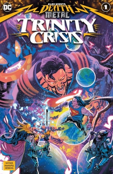
Written by Scott Snyder
Illustrated by Francis Manapul
Colored by Ian Herring
Lettered by Tom Napolitano
Reviewed by Gregory Ellner
From a writing standpoint, “Dark Nights: Death Metal – Trinity Crisis” #1 is a very fun story, and Scott Snyder is definitely pulling out all of the stops to make as dire a situation as possible as his apparent finale to his run on “Justice League” and the related “Dark Nights: Metal” story approaches its midpoint. Across a wide range of heroes, everyone seems to get some point at which they can showcase why they are important, with him reaching back into other stories such as his “Swamp Thing” run to take more material.
Unfortunately, the main problem with this one-shot is that it is being called a one-shot in the first place. Although Snyder writes a compelling script, this issue is so intricately tied into the main ‘Death Metal’ arc that it would have been better served to be the fourth issue of the main series, such that it does not give much, if any, room for newcomers to see what is going on, nor is it able to be excised from the main plot without losing an extremely large amount of context for anything going on.
Continued belowFrancis Manapul uses a much more animated art style than usual, focused on facial expressions and motion in keeping with the intense action of the main miniseries. Every visceral moment hits hard, every strike against a hero or villain can almost be felt. Even the brief look at the Flashes has an extreme intensity to it, in spite of that story being save for a different issue. While the story is already terrifying at times, the artwork helps to really sell humor and horror both in the multi-faceted tale.
Meanwhile, although the artwork is already extremely well put together, it is Ian Herring’s colors that really bring it all together. From the darkness around the covert team and its foreboding presence to the exhilarating bright lights of combat, Herring leads readers to different emotions with near-effortless precision. At times, such as during a lethal gunshot or the aforementioned page with the Flashes, his colors even seem very similar to the ones Manapul himself would lay out on other stories.
Final Verdict: 7.0 – Despite being an intriguing journey into the DC Universe, this supposed “one-shot” feels more like a real fourth issue to the story from which it branches than a one-and-done tale for people to jump in.

Written by Ryan Parrott
Illustrated by Jacob Edgar
Colored by Ike J. Diaz
Lettered by Hassan Otsmane-Elhaou
Reviewed by Ryan Fitzmartin
The Army of Darkness brand is synonymous with zany, wild fun, and that’s exactly what “Death To The Army of Darkness” #4 provides. Evil Dead franchise hero Ash Williams fights off legions of the undead and versions of himself in this wonky, wild issue. Relying more on funny dialogue and oddball comedy, this comic trades the series’ trademark gore for a more upbeat, lighter tone. There’s one panel with a bit of blood, but besides that, the violence is notably light.
Jacob Edgar’s art is clean and pleasing to look at. He draws action clearly and walks a neat line between cartoonish and realism. Ike Diaz’s colors are vibrant and warm, effectively accentuating Edgar’s line work. The comic is just nice to look at and gives off major Scooby Doo vibes. I particularly love how Edgar and Diaz have drawn the skeletons. They’re spooky and creepy, but not overtly terrifying. One gifted with huge milky eyeballs is just a delight.
All of the main characters spend the entire issue wandering a cave, which doesn’t make for much of a story. They get into some good hijinks, but largely the plot feels like filler before a conclusion. Given that the comic ends on a great cliffhanger, I feel safe assuming the finale will pack more of a punch. Still, with fun art and good character banter, this issue contains more than enough energy. This won’t stand next to the series’ greatest entries, and I don’t think it’ll be too memorable. All comics don’t have to be masterpieces though, and this one provides more than enough entertainment.
Final Verdict: 7.3 – Evil Dead fans will likely enjoy this goofy and energetic, albeit somewhat forgettable, comic.

Written by Jarred Luján
Illustrated by Orlando Caicedo
Colored by Warnia Sahadewa
Lettered by Chris Fernandez
Reviewed by Jodi Odgers
“Dry Foot” is a crime caper centered on a group of four teenagers blaring bright with 80’s nostalgia. It is not the kind of tense drama where we watch as the well-thought-out plans of our heroes are unraveled by the fact that a light breeze blew in the wrong direction on the heist day. It is the kind where you can see that the plan is a disaster waiting to happen, yet you watch it play out of morbid curiosity and concern for the characters.
Orlando Caicedo’s art works in unison with Warnia Sahaweda’s colors to capture the air of 1984 perfectly. The brightly-colored clothes. The sweat glistening from the perfectly primped characters’ skin. The big hair. Right from the cover, I can almost hear the new wave soundtrack that would inevitably be blaring as the credits rolled were this a television series. The strength of the atmosphere doesn’t quite carry through to the smaller visual moments though. The bright, plastic sheen over everything may work well to evoke the time period, but some of Caicedo’s character poses feel almost as artificial as the jewelry worn by El Viejo, the towering crime kingpin that our plucky band of youths is looking to rob.
Continued belowLuckily, this inflexibility and uniformity do not spread to the core of the characters themselves. While their initial descriptions are almost entirely comprised of 80’s pastiches, the characters grow into their own uniqueness, particularly when we meet their respective families and get a glimpse into their individual motivations for going along with Diego’s clearly hair-brained plan.
The concept of a band of underdogs infiltrating a bad person’s stash and robbing them blind is not new, but the creative team behind “Dry Foot” make it worthwhile by individualizing the underdogs, and making the reader care about what will happen to them when Diego’s scheme inevitably blows up in their faces.
Final Verdict: 7.1 – An immersive setting forms the base from which a group of engaging, humanized characters are about to make some very bad life decisions.
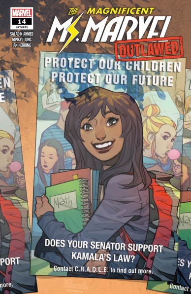
Written by Saladin Ahmed
Pencils by Minkyu Jung
Inks by Juan Vlasco
Colored by Ian Herring
Lettered by Joe Caramagna
Reviewed by Quinn Tassin
There’s a classic superhero story that happens where the hero is down for the count in some way or another and the main thing they need to overcome is their own mind. Anchored by their raw heroism, they overcome their plight, ready to fight once again. In “The Magnificent Ms. Marvel #14,” Saladin Ahmed gives Kamala Khan that moment. Kamala’s been in a coma for a while and while she’s been passed out, Anchored by the apparitions of various versions of herself and the thought of her friends and family, Kamala works through a series of her worst nightmares while her supporting cast visits her hospital bed working through their feelings (there are a lot of feelings). The result is a pretty good comic book, even if it is a little smaller than it could be.
Minkyu Jung, Juan Vlasco, and Ian Herring are maybe the perfect team to take on a Ms. Marvel comic. They bring the visual style that’s defined all of Kamala’s comics (komics?) but merge it well with a more classic comics feel. The opening page of the issue is one I keep revisiting in my mind- it’s a perfect display of who Kamala is as a character and the artwork is great- filled with energy and communicating the tone of her last memory beautifully. The rest of the issue does a great job at both illustrating her nightmares (Nakia being swallowed by some goo monster is gross and sad and scary) and keeping those hospital moments grounded (Bruno’s close-up plea is heartbreaking).
It’s been a while since we last saw Kamala and this was a rock-solid return. It’s not quite as triumphant as it might’ve been; I know I would’ve liked to see her get right back to heroics after waking up instead of having to wait for another issue. That being said, though, the issue does the smart work of giving her supporting cast real-time and dimension. All in all, it’s a good return for Ms. Marvel and I’m looking forward to seeing her super-heroics soon.
Final Verdict: 7.7- “The Magnificent Ms. Marvel #14” is a quietly triumphant, welcome return for Marvel’s most up and coming hero
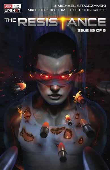
Written by J. Michael Straczynski
Illustrated by Mike Deodato Jr.
Colored by Lee Loughridge
Lettered by Sal Cipriano
Reviewed by Elias Rosner
It’s hard to talk about “The Resistance” without talking about the world of 2020. The book was always prescient, being written to reflect the modern era, but its core conceit and the extrapolations made are all the more terrifying once some version of that conceit occurs. “The Resistance” #5 offers hope for a world on the brink in the form of collective action to stand up to an overwhelming force and the right people noticing the right problems and acting in good faith. It offers hope in the form of an individual fighting an oppressive regime by utilizing their power. It also offers nuance, in the form of small groups protecting others ignored by the social order and of individuals working for their own, selfish benefit.
“The Resistance” #5 is a comic that delivers on Straczynski’s promise back in January to go from the broad to the specific, situating us more and more in the lives of people rather than numbers and statistic or the effects of decisions on countries and peoples and the world. I’ve become invested in these characters and I want to see how the Resistance forms and will continue to act and fight against those who only wish for the status quo to protect themselves to the detriment of all others.
That said, with a cast this large and a story that is focused on setting up many moving pieces about the titular Resistance, it can be easy to lose sight of the individual characters: who they are, what they want, what their names are. I know their archetype and powers when away from the page but not their likes and dislikes, wants and desires. That’s not necessarily a negative, though it can be frustrating for those who want to know more and be more invested in them as people, as the title makes clear, this is not the story of each person but of The Resistance and what they are resisting. That is what this book is drilling down into, slowly shedding the important parts of the greater universe that create a constant background awareness of what’s going on outside of the scope of the story without having to spend extraneous panels or pages on it.
That’s what other books are for.
Finally, while there are lines that come off as hokey, “there’s only one thing faster than a speeding bullet. Human thought,” and Deodato’s art can sometimes feel stiff, specifically, when a character is yelling with the same wide O mouth, the impact made by the rest remains. That hokey line, in conjunction with the stern slow zoom in on the as-yet-unnamed North Korean prisoner, works to prime the “HELL YEAH” moment of the prisoner bursting into flames, melting the bullets, and completely destroying the people who were sent to execute him. The power of the moment shines through the dubious nature of the statement, a fitting sentiment for all successful superpowered universes.
Not everyone will love this book, thanks to its breakneck pace and all over the place focus, and I’m sure there are critiques of the artwork and writing I have not gotten into, but for me, all those aspects strengthen and support the project of the book and its success. If this is the penultimate chapter of our way into the Axelverse as JMS called it, the end of the tunnel is looking mighty bright.
Final Verdict: 8.5 – Deodato’s art has its usual quirks and the narration can get a bit hokey but “The Resistance” #5 is a perfect example of how to tell a story that sets up others without sacrificing itself.


