
There’s a lot to cover on Wednesdays. We should know, as collectively, we read an insane amount of comics. Even with a large review staff, it’s hard to get to everything. With that in mind, we’re back with Wrapping Wednesday, where we look at some of the books we missed in what was another great week of comics.
Let’s get this party started.

The 06 Protocol #1
Written by Lee Turner
Illustrated by Cliff Richards
Colored by Matt Herms
Lettered by Cardinal Rae
Reviewed by Quinn Tassin
Now this is how you write a first issue. “The 06 Protocol” #1 makes a smart decision by starting things off with a literal bang. From the moment that we see the Mirino home invaded, the issue’s momentum doesn’t let up for a second. The fact that we’re whisked from the opening action to a couple of pages of grieving to Cat’s abduction by the government greatly benefits us as readers. For one thing, it tells us where the issue’s priorities are— this is a Bourne-esque conspiratorial thrill ride. There are solid character beats. But rather than slowing things down to expose us to the grooves of family life prior to Faust’s death or even deeply explore the depths of living afterwards, we get succinct, effective moments to communicate where things are at. This was a happy, loving family, and now Cat and her daughter, Missy’s relationship is rocky at best.
As for the quality of the thrill ride: it’s a blast! This is a really well-conceived conspiracy. A secret government agency accidentally making random people into sociopathic killing machines that will activate when they reach adulthood and building a team to hunt them down rules. One of those hunters finding his target, falling in love with her, starting a family, and secretly training her in all his spy skills mega rules. His death leading to the agency discovering the truth about her, making her fend for herself and go on the run is an incredible premise for a story that can easily last a long time. The conspiracy is easy to understand, the protagonist is easy to connect with, and the stakes are incredibly tangible which makes for an incredible hook. Better yet, the storytelling potential is through the roof. Cat has to protect Missy, both of them have to stay safe from the government, and there are still a bunch of those other accidentally produced killing machines somewhere out there. Within the span of 24 pages, a whole world has been played out in front of our eyes and it’s got a whole lot of promise.
The artwork is generally strong. Action sequences, particularly Cat’s escape from WASP, are exciting. There’s a cold efficiency to her fighting and shooting that’s communicated beautifully through her body language, a trait that’s difficult to capture so well in two-dimensional frames. The bullet going through the home invader’s neck is, of course, a visual highlight featuring some truly inspired framing. No environment we see is rendered with a particularly intense level of detail but they still feel full and exciting. The coloring is solid, though one can certainly see how it might bee used in a more evocative way. It’s certainly competent and varies from setting to setting in realistic ways. At the same time, it feels like a bit more work could be done using colors to control tone throughout the issue.
Final Verdict: 8.0 – Exciting, effective, and leaves you desperate to read a second issue
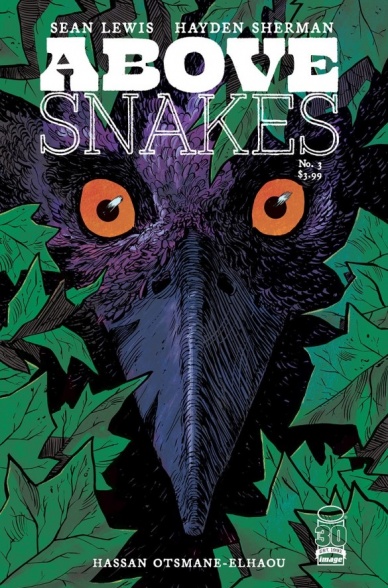
Above Snakes #3
Written by Sean Lewis
Illustrated & Colored by Hayden Sherman
Lettered by Hassan Osmane-Elhaou
Reviewed by Alexander Manzo
“Above Snakes” takes a different beat than the first two issues of this series by moving away from the “stranger in a new town” trope and focusing more on the relationship between Dirt and Speck. Sean Lewis uses this issue to add some depth to the two main characters and continue the camaraderie with Speck getting ready to try and find a mate in the forest. Lewis still hasn’t explained how exactly Dirt’s bird companion came to be, but he does share with the reader what it will take for Speck to disappear. Lewis makes sure to include a fight scene in the issue by introducing another character on the same mission as Dirt, revenge for his loved ones. It’s fitting for there to be a Native American character during this western saga and easy to believe in his mission for revenge, given historical facts. Lewis also gives the last couple of pages to one of the Above Snake gang members to break the fourth wall and hints at everything the reader has seen so far to come together soon. It’s a solid hook into the next issue and continues with an omniscient narrator for what else is to unfold.
Continued belowThere’s usually a great sense of freedom when an illustrator gets to color their work, and Hayden Sherman shows that in his pages with his work in “Above Snakes.” His rough hatchwork, in combination with his bright colors to offset every panel, brings this story to a completely different level. Sherman uses his offset style not only to grab but force the reader’s eye to what he wants them to see, such as the interaction between Dirt and Comanche. Comanche is shown towering over Dirt on the floor in their initial panel together. Still, after the two fight, getting in equal hits, and discussing their similar goals, the audience is shown how similar they are in stature. The sense that the two are more alike than they both realize at the moment is shared with the audience. Lewis’ grizzled western story, but the wise-cracking script gets to breathe and lose the rough edges that usually come from the stereotypical cowboy revenge story thanks to Sherman’s art style.
Final Verdict: 8.5 – The main storyline takes a slight pause, but the bond between the two protagonists is displayed to keep the reader clamoring for more.
Dark Crisis: Worlds Without a Justice League – Wonder Woman #1
Written by Tini Howard and Dan Watters
Illustrated by Leila del Duca and Brandon Peterson
Colored by Jordie Bellaire and Michael Atiyeh
Lettered by Troy Peteri
Reviewed by Gregory Ellner
The idea of heroes finding something fundamentally wrong with their world and pulling the proverbial thread is something of a common trope in more recent stories. In that respect, Tini Howard’s writing in “Dark Crisis: Worlds Without a Justice League – Wonder Woman” #1 is not particularly unique. Regardless, the concise way by which Howard explains the nature of Wonder Woman’s situation, and that of other supporting characters or villains in this world, really helps to quickly bring home the core essence of Wonder Woman as much as that of others around her. Still, while the emotions feel fulfilling, some of the details of the plot don’t really seem to make much sense. That said, given the reasoning for this “paradise” of a world, perhaps those possible inconsistencies are intentional.
Leila del Duca’s artwork emphasizes power as much as compassion. The highly detailed faces make Amazon empathy clear, as well as the shock and confusion of antagonists. Every strike seems to have weight behind it, as well as the flight seems to radiate power from its sheer speed.
Jordie Bellaire makes excellent use of color, showing the depths of despair as well as heights of Hope and determination. Through her colors, you can truly believe a lone Amazon can change even the worst of humanity.
In the Martian Manhunter backup story, Dan Watters writes what seems to be a cleaner tale. The world is only partly defined, but all of it seems to come together into a well-constructed whole.
The artwork of Brandon Peterson works hand-in-hand with the color choices of Michael Atiyeh, giving a realistic appearance to a quasi-alien setting. The high levels of detail help show emotion even in non-humanoid faces, and the use of color, barely having any save for important slashes of red and in one case green, focuses in on the film noir atmosphere of the entire piece.
Final Verdict: 8.0– A good story and an even better backup make this installment to the ‘Worlds Without a Justice League’ one to watch out for.

Iron Man #23
Written by Christopher Cantwell
Illustrated by Angel Unzueta
Colored by Frank D’Armata
Lettered by VC’s Joe Caramagna
Reviewed by Alexander Jones
In the modern era of Marvel comics, Tony Stark is concerned with the legacy he is leaving behind. “Iron Man” #23 see’s Stark pursuing a mission to dismantle the deadly weapons of Source Control. There’s only a few issues of “Iron Man” in writer Christopher Cantwell and artist Angel Unzueta’s run on the character so every page here counts.
“Iron Man” #23 is a sad story adding commentary to how arms of war are used to destabilize peace. Cantwell deeply explores the inner monologue of Iron Man, showing how obsessed he is with disarming Source Control. In fact, the best character in “Iron Man” #23 is none other than Stark himself. Cantwell reflects deeply on Stark’s hopes and regrets from the overall series. This run of comics has done a wonderful job humanizing Tony. I find myself interested in reading Tony’s analysis of any one situation. This issue also has a gambling theme that opens the story. Cantwell shares some fascinating musings about casinos. Stark’s relationship with Rhodey has become incredibly complicated from the last few morose storylines in Iron Man.
Continued belowAngel Unzueta delivers average pencils in “Iron Man” #23 but they are marred from the colors from Frank D’Armata. Armata’s bright hues on the computer screen are a distraction to the actual page in a scene with Tony and Rhodey. The shiny colors of Iron Man’s armor stand out so much from the other people who surround him. Unzueta’s art captures the expressions of characters well. There’s some fantastic framing and camera angles of certain panels. This issue starts to lose a step artistically when you consider how similar some of the faces look. Characters are also in sterile office environments, wearing clothes that appear dull in color tone and look. Unzueta and D’Armata appear to have difficulty interpreting Stark in a more casual setting.
Final Verdict: 7.0 – ”Iron Man” #23 has a strong script with visuals holding back the more complex elements of the story.

X-Men Red #6
Written by Al Ewing
Illustrated by Stefano Caselli
Lettered by VC’s Ariana Maher
Colored by Federico Blee
Reviewed by Michael Govan
“X-Men Red” #6 is an incredible issue, a tie-in so good it threatens to outshine the main event. Whereas the last issue marked Planet Arakkko’s darkest hour, an appropriately grim and tragic affair, this issue marks the Arakkii starting to make their defiant stand…and it is glorious.
The character work is especially strong in this issue. A furious Storm is great to see but even better, Ewing creatively uses Lactuca of the Stars’ powers to literally place readers in the mind of all of the characters. We get more insight into characters such as Wrongslide or Sunspot, who is perfectly described as a “gorgeous pile of secrets”. Even new characters we’ve never seen such as Dr. Craig Marshall, a human scientist, feels fully realized.
In “X-Men Red” #6, the greatest strength is arguably all of the new lore and worldbuilding. In “X of Swords”, the Arakkii were an interesting idea but “X-Men Red” and even other x-comics such as “Legion of X” have given the Arakkii more depth and richness. Their fascinating culture, their fascinating history helps make this such a rewarding issue. The data page on the Night Seats alone is worth the price of admission.
The art in this issue is just as fantastic as the writing. Caselli and Blee both knock it out of the park. The expressions are strong, from the defiant but adorable look on a young Loolo’s face to the smug grin on Sunspot’s when he knows he gets to pull off a big reveal. There are truly epic moments. The arrival of the Day Seats and Storm’s takedown of one of Uranos’ war machines is truly cinematic. The bright red of the lasers contrasts deliciously with Storm’s vibrant lightning. Magneto and Storm share a spectacular moment at the climax of the issue that is the true highlight of the book, a grand moment that just has to be seen to be believed. “X-Men Red” #6 is the best issue yet and there’s still more to come.
Final Verdict: 9.5 – The Red Planet makes its glorious stand.


